React Bootstrap Form
Overview
Forms are a fundamental element of any web application, enabling user interaction and data submission. React Bootstrap, a popular library that combines the power of React with the styling of Bootstrap, provides an efficient and fast method to create elegant and responsive forms. In this article, we'll look at how to utilize React Bootstrap to create forms that are easy to use and improve the user experience.
What is React Bootstrap Form?
React Bootstrap is an open-source UI toolkit that allows React applications to effortlessly include Bootstrap components. A popular front-end framework called Bootstrap provides a range of pre-made UI components, including forms. These components are modified by React Bootstrap to work with React's component-based architecture.
A React Bootstrap form is made up of different parts that work together to generate input fields, buttons, checkboxes, radio buttons, and other elements that are both aesthetically beautiful and user-friendly. These components were created utilizing Bootstrap's styling and are easily adaptable to the unique appearance and functionality needs of your application.
Basic Example of a Simple Login Form
Let us see a basic example of creating a simple login form using Bootstrap components. Below is the code example for the same.
Output:
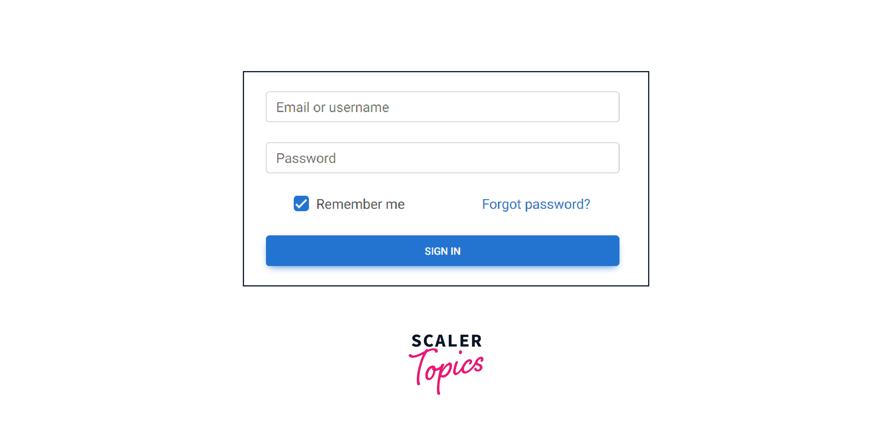
As you can see in the above output, we have created a basic form for the user to sign in to a website using Bootstrap components. We have implemented two input boxes, one for the email address and the other for entering the password. After this, we have implemented the "Remember Me" checkbox and "Forgot Password" options into the form using the divs. Finally, we have added a button to get the user signed in to the website.
Approach in ReactJS to Use the react-bootstrap Form Component
The approach that could be used in ReactJs to use the bootstrap form component is as follows:
Form Props
The following props are used to create a bootstrap form component in ReactJs.
- ref - It forwards the form-ref to the underlying element.
- inline - Using the inline prop, you can arrange several labels, buttons, and other items in a single horizontal row.
- validated - It is used to indicate that the form has been validated with a true or false value.
- as - It is a custom element type that can be utilized for the form component.
- bsPrefix - It serves as an alternative when using extensively customized bootstrap CSS.
Form.Label Props
- ref - It is used for forwarding the form-ref to the underlying element.
- as - It is a custom element type that can be utilized for the form component.
- htmlFor - If not expressly stated, it uses the controlId from the form-group.
- srOnly - It visually hides the label for the form.
- column - The FormLabel is rendered using it as a <Col> component using the column prop.
- bsPrefix - It serves as an alternative when using extensively customized bootstrap CSS.
Form.Row Props
- as - It is a custom element type that can be utilized for the form component.
- bsPrefix - It serves as an alternative when using extensively customized bootstrap CSS.
Form.Text Props
- ref - It is used for forwarding the form-ref to the underlying element.
- as - It is a custom element type that can be utilized for the form component.
- muted - It adds the text-muted class to the form.
- bsPrefix - It serves as an alternative when using extensively customized bootstrap CSS.
Form.Check Props
- as - It is a custom element type that can be utilized for the form component.
- id: The identification is made using the standard HTML id attribute.
- isInvalid: This property is used to manually style input as invalid.
- isStatic: The position-static style is added using the isStatic property.
- isValid: This function is used to manually style input as valid.
- type: It is employed for checkable kinds.
- bsPrefix - It serves as an alternative when using extensively customized bootstrap CSS.
- bsCustomPrefix: This is used as a different bsPrefix for custom controls.
Form.Control Props
- ref - It is used for forwarding the form-ref to the underlying element.
- as - It is a custom element type that can be utilized for the form component.
- custom - It makes use of the custom components of Bootstrap.
- htmlSize: It is applied to the underlying element's size attribute.
- id: It allows you to use the controlId from the <FormGroup>.
- size: It indicates the input size.
- type: It allows to identification of the input type for HTML.
- value: It is used for its value property as underlying input.
- isInvalid: It is used to add invalid validation styles for the control.
- isValid: It is used to add valid validation styles for the control.
- onChange: It is a callback function that is activated whenever a value changes.
- plaintext: It renders the input as plain text.
- readOnly: It puts the control in the read-only state.
- bsPrefix - It serves as an alternative when using extensively customized bootstrap CSS.
Examples
Now, let us see some examples of using the different props to create a react-bootstrap form.
How to Create a Simple React Bootstrap Form
We have discussed previously how can we create a form using simple bootstrap components. However, now we will be creating a simple react-bootstrap form.
Below is the code example for the react-bootstrap form for a better understanding.
Output:
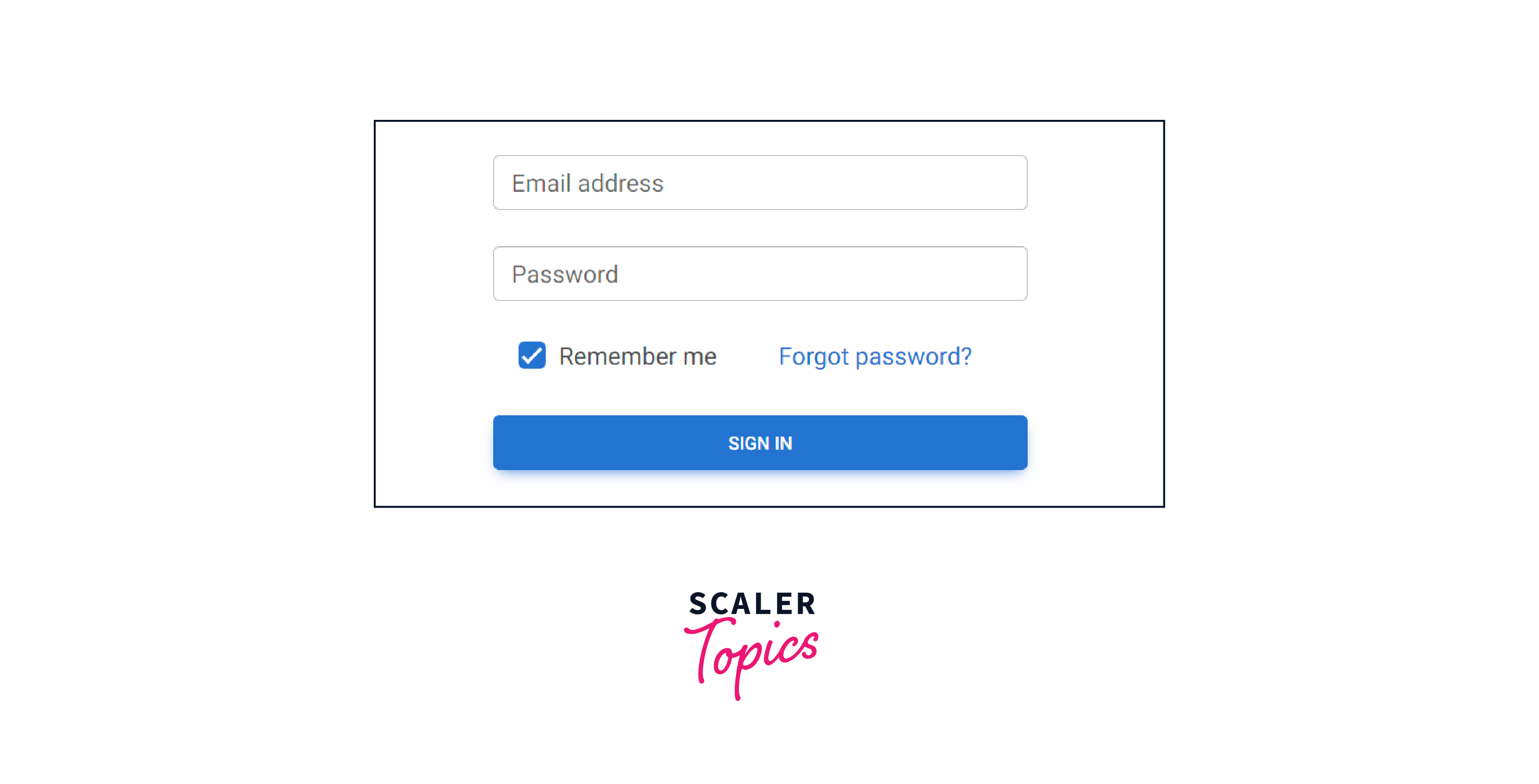
In the above example, we have created a simple sign-in form for the user. Each component of the form must reside under the <form> element. Inside we have used the MDB library for implementing the different components like input fields, buttons, checkboxes, rows, and columns.
How to Create a Multi-Step React Bootstrap Form
Now, let us see how to create a multi-step bootstrap form in React.
To create a multi-step react-bootstrap form, we need to follow the below steps.
-
Create a react app using the below command. After which move inside the folder and start the development server using the below command.
-
Make the components for the form. We will have four components which are SignUp.js, userdetails.js, confirm.js, and signedUp.js.
-
Now, let's make the signUp.js file. Inside this, we will have a state which will initially be 1, and empty strings with email and password.
The render() method should then be added, establishing the states of all the fields. To store the values related to the SignUp component, we utilize this.state. Then, assign each form field to the inputVal constant. The switch condition must pass the first step before declaring a case that returns each connected component for each page of your form. Send input values to every component.
-
Now, comes the functions that trigger the react-bootstrap form which will again go into the signUp.js file.
Each time nextStep is called, the step value is increased by 1. Every time it is called, prevStep deducts 1 from the same step value. The target's associated name and value are updated by handleChange in accordance with the event that is passed in and the state. Remember that the form component handles both these values and states.
-
Now, comes the UserDetails.js file.
Make the UserDetails component, which includes a React-Bootstrap form at the bare minimum. Ensure that each "Form.Control" has an onClick function that executes this.name attribute and handleChange. The file's bottom contains an export of user details. Add back and saveAndContinue arrow functions that, respectively, call the prevStep and nextStep and stop the default event.
-
Now, let's make the confirm.js file.
In contrast to the earlier components, the Confirm component operates differently. It just displays the values that were sent to form from the preceding phases.
-
Now, the SignUp components will go inside the App.js file.
Here, we have our multistep react-bootstrap form.
Conclusion
- React Bootstrap form is used to create a form for the user using Bootstrap components.
- The difference between a normal bootstrap form and a react-bootstrap form is that the react-bootstrap form takes props to make the components whereas a normal bootstrap form uses className for that purpose.
- The <Form.Group> component is used to create a group of form controls such as checkboxes.
- The required prop is used to make a form field mandatory.