React Native Card
Overview
React Native is a popular framework for building cross-platform mobile applications. One of its key components is the Card, which provides an intuitive way to display content in a structured and visually appealing manner. In this article, we will explore the various options and props available for the Card component, as well as its child components, CardTitle, CardContent, and CardImage.
Installation
To install React Native Paper run the following command in your project's folder:
Transform Your Career
Choose from our industry-leading programs designed for career success
Modern Software and AI Engineering Program
Master full-stack development with AI integration

 +1000 more
Modern Data Science and ML with specialisation in AI
Advanced data science techniques with AI specialization
+1000 moreAdvanced AIML with Specialisation in Agentic AI
Deep dive into AIML with focus on Agentic systems
+1000 moreDevOps, Cloud & AI Platform Engineering
Build and manage AI-powered cloud infrastructure
+1000 moreAI Engineering Advanced Certification by IIT-Roorkee
Premier AI engineering certification from IIT-Roorkee
Peer Dependencies
This library requires you to install react-native-safe-area-context and react-native-vector-icons. You can find more details for their installation on their respective guides.
PaperProvider Component
You need to wrap your app with a PaperProvider component.
Usage
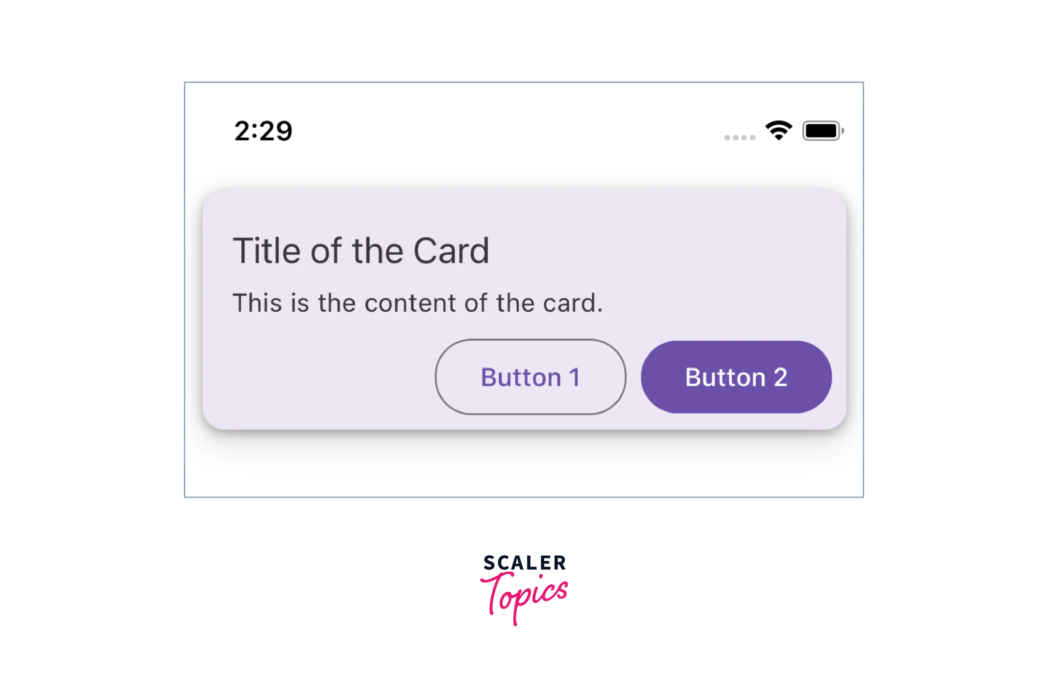
The React Native Card component is highly versatile and can be used in a wide range of scenarios, such as displaying product information, news articles, user profiles, and more. Its flexibility makes it a valuable tool for any React Native developer looking to enhance the presentation of their app's content.
Card Component Options
This React Native Card component offers several options that can be customized to suit your specific needs:
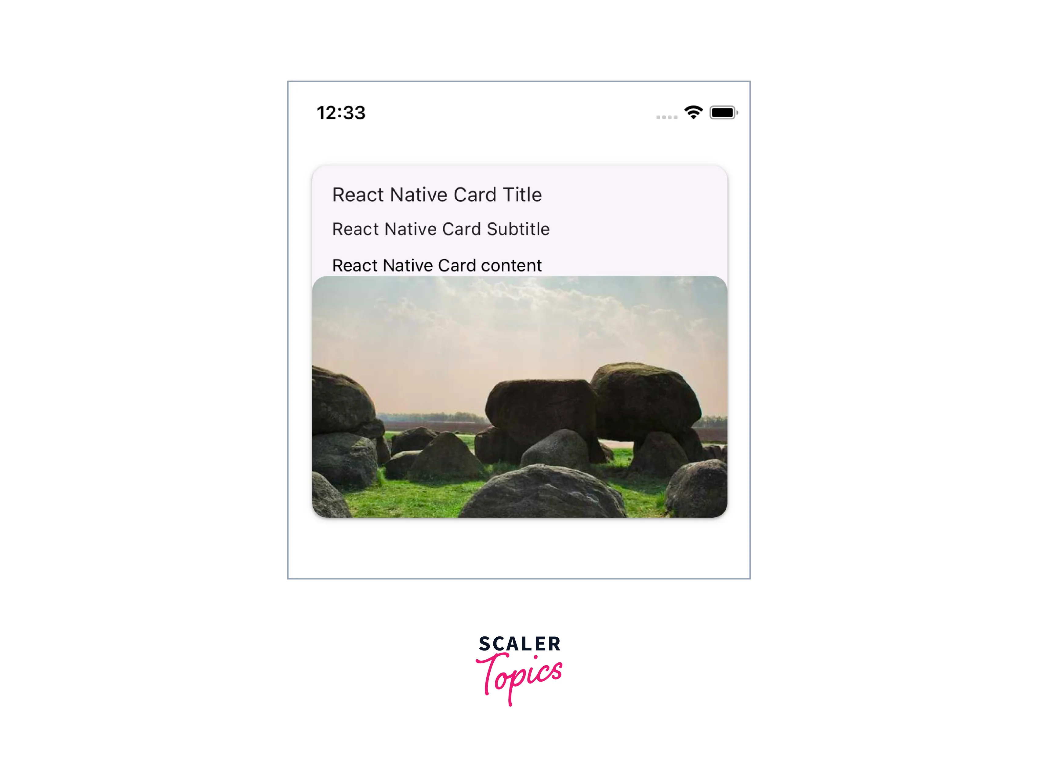
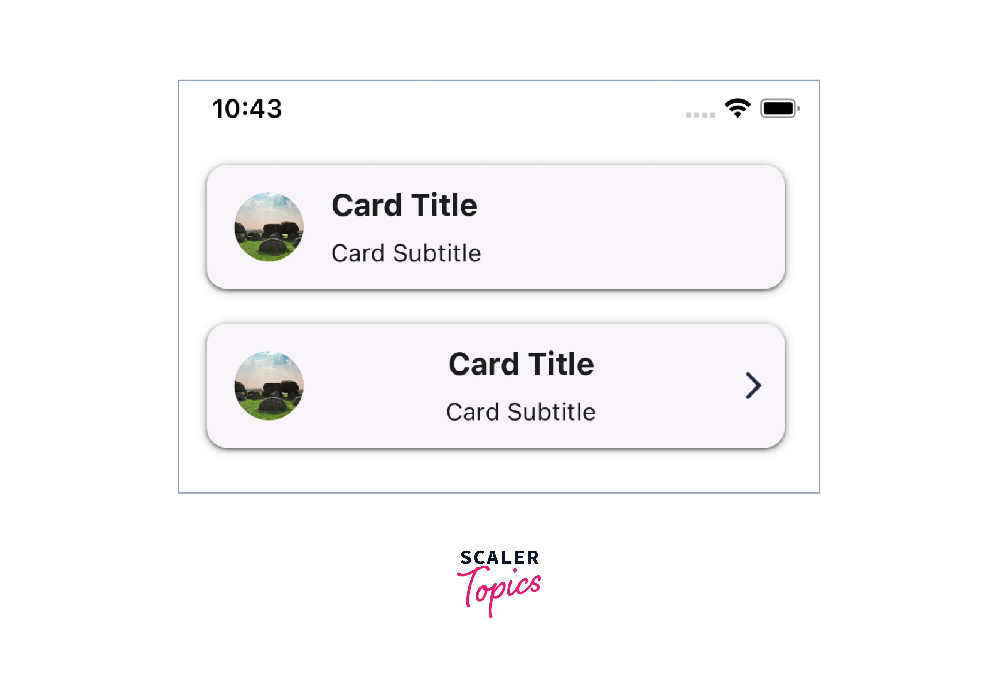
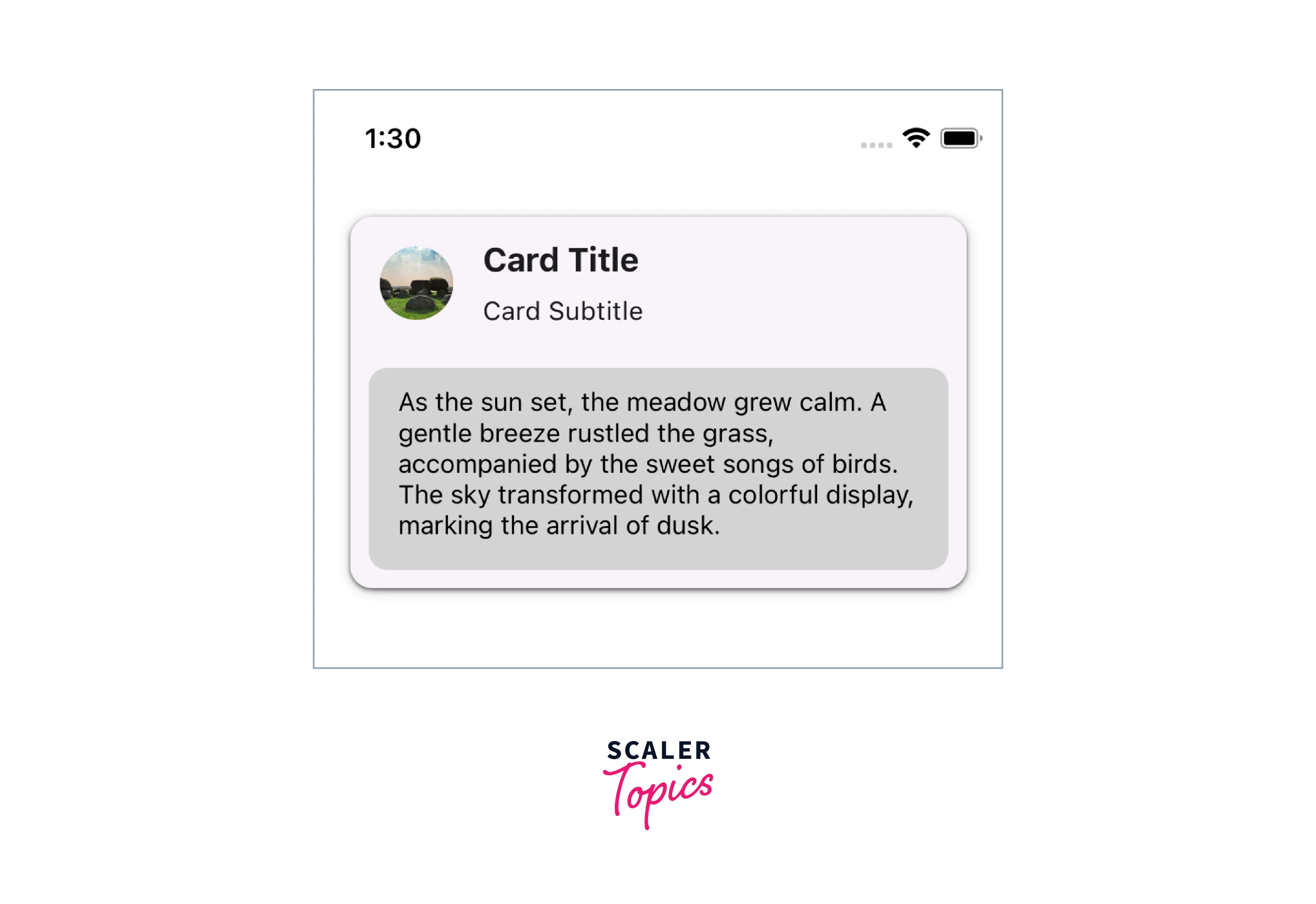
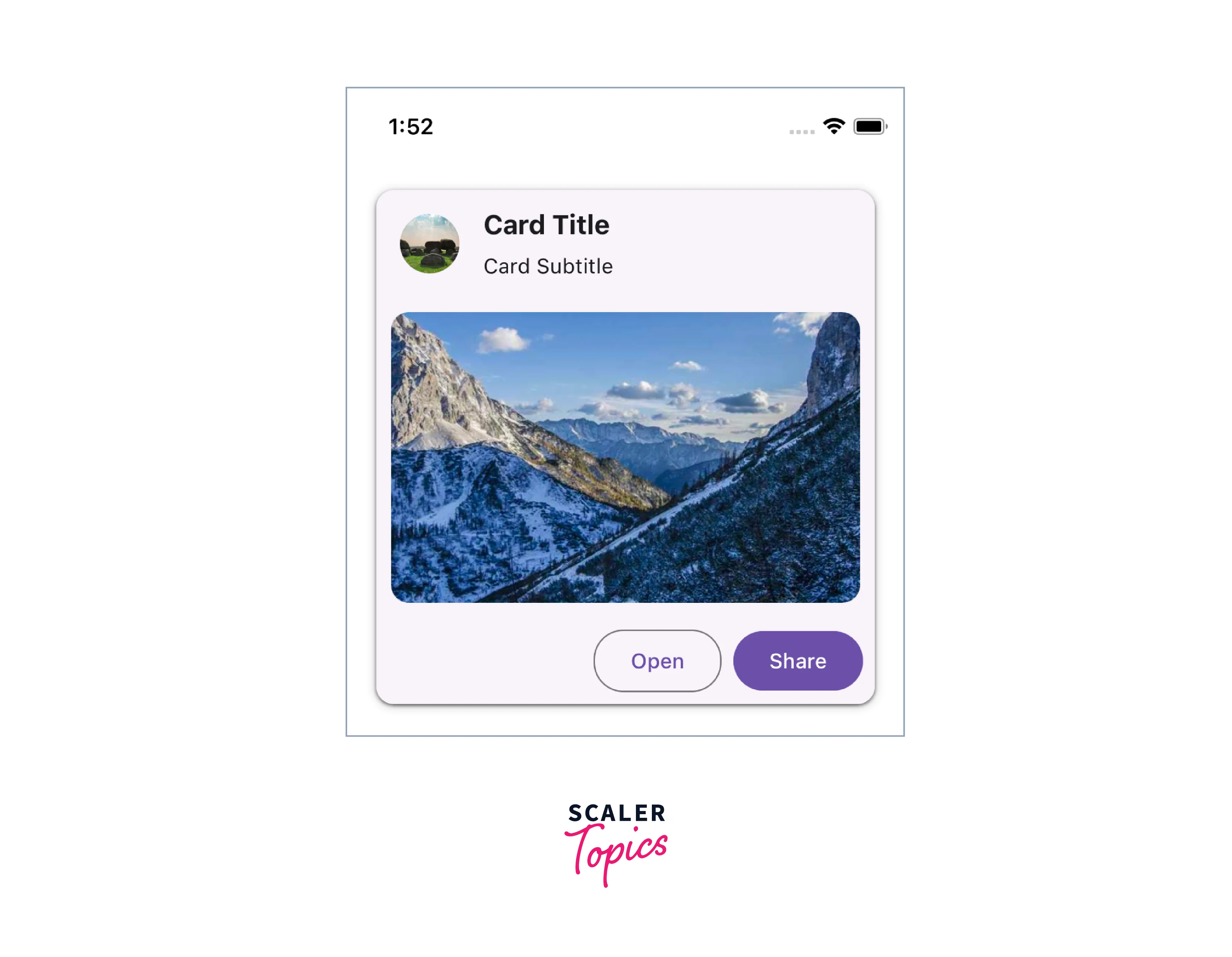
- Card.Title The Card.Title component is responsible for rendering the title and subtitle within the card.
- Card.Content The Card.Content component contains the main content of the card.
- Card.Cover The Card.Cover component allows you to include an image within the card.
- Card.Actions The Card.Actions component renders a list of actions inside a React Native Card.
We will go over the above React Native Card Component Options in detail below.


Card.Title Component Options
The Card.Title component is used to display a title, subtitle within the Card component. It provides a visual heading for the content inside a React Native Card.
Props for Card.Title
| Name | Type | Description |
|---|---|---|
| title (required) | string or <Text> based components | Title text. |
| subtitle | string or <Text> based components | Subtitle text. |
| titleStyle | StyleProp<TextStyle> | Styles for the title. |
| titleNumberOfLines | number | Number of lines for the title. Default 1. |
| subtitleStyle | StyleProp<TextStyle> | Styles for the subtitle. |
| subtitleNumberOfLines | number | Number of lines for the title. Default 1. |
| left | Callback Function | Callback function which will return a React Element to render on the left side of the title component. |
| leftStyle | StyleProp<ViewStyle> | Styles for the left element wrapper. |
| right | Callback Function | Callback function which will return a React Element to render on the right side of the title component. |
| rightStyle | StyleProp<ViewStyle> | Styles for the right element wrapper. |
| theme | ThemeProp | Prop to handle the Theme of React Native Card. |
Scaler Placement Report and Statistics
Scaler learners achieved 2.5x salary growth with average post-Scaler CTC reaching ₹23L.
 Google
 Amazon
 Microsoft
 Flipkart
 Adobe1200+ more
Card.Content Component Options
The Card.Content component is used to display the main content within the Card component. It typically contains the primary information or body of the React Native Card.
Props for Card.Content
| Name | Type | Description |
|---|---|---|
| children (required) | React Element | The content to be rendered within component. |
| style | StyleProp<ViewStyle> | Styles for the wrapper of the card content component. |
Card.Cover Component Options
The Card.Cover component is used to display an image or media content as the cover of the React Native Card component. It provides a visually appealing and prominent display.
Props for Card.Cover
Props of the Card.Cover component also inherits all the props provided by the React Native's Image component.
| Name | Type | Description |
|---|---|---|
| style | StyleProp<ViewStyle> | Styles for the wrapper of the card content component. |
| theme | ThemeProp | Prop to handle the Theme. |

Turn Learning into Career Growth
Card.Actions Component Options
The Card.Actions component is used to display action buttons or interactive elements at the bottom of the React Native Card component.
Props for Card.Actions
| Name | Type | Description |
|---|---|---|
| children (required) | React Element | The action buttons or interactive elements to be rendered within component. |
| style | StyleProp<ViewStyle> | Styles for the wrapper of the card actions component. |
| theme | ThemeProp | Prop to handle the Theme. |
CardImage Component Options
In React Native, the CardImage component plays a significant role in enhancing the visual appeal of your cards. It allows you to incorporate images seamlessly within your card layout. Here are some key options and properties you can leverage to customize the CardImage component:
-
Source (source):
The source prop allows you to specify the image source, which can be a local image file or a network URL. For local images, you might use the require function, and for network images, a simple URL suffices.
-
Style (style):
The style prop enables you to define the dimensions, positioning, and other styles for the image component. This prop accepts a style object or an array of style objects. jsx <CardImage style={{ width: 200, height: 150 }} />
-
Resize Mode (resizeMode):
The resizeMode prop dictates how the image should be resized within the specified dimensions. Options include 'cover,' 'contain,' 'stretch,' 'repeat,' and 'center.'
<CardImage resizeMode="cover" />
-
Fallback Component (fallbackComponent):
In case the image fails to load, you can provide a fallback component to display. It could be an icon, a placeholder, or any other React Native component.
<CardImage fallbackComponent={<Icon name="image-failed" />} />
These options offer flexibility and creative control, allowing you to tailor the CardImage component to suit the visual aesthetics of your React Native card. Experiment with these properties to achieve the desired look and feel for your card-based UI.
Props
The React Native Card component from React Native Paper accepts a range of props, allowing further customization and interaction:
-
mode Type: 'elevated' | 'outlined' | 'contained' Default: 'elevated' This prop allows you to specify the appearance mode of the card. The outlined mode displays the card with an outlined border, while the elevated mode adds a shadow effect to create a raised appearance. The contained mode is without both outline and elevation.
-
children (required) Type: React.ReactNode The content to be rendered within component.
-
onLongPress Type: () => void Callback function invoked when the card is long-pressed.
-
onPress Type: (e: GestureResponderEvent) => void Callback function invoked when the card is pressed.
-
disabled Type: boolean When true, it will disable all the interactions with the React Native Card.
-
delayLongPress Type: number The duration in milliseconds before the onLongPress event is triggered.
-
elevation Type: 0 | 1 | 2 | 3 | 4 | 5 | Animated.Value Controls the shadow depth of the card.
-
contentStyle Type:StyleProp<ViewStyle> Custom styles to apply to the content container of the card.
-
style Type:StyleProp<ViewStyle> Custom styles to apply to the card component itself.
-
theme Type: ThemeProp The theme object to apply custom styling based on the app's theme.
-
testID Type: string Default: 'card' Used for testing purposes to locate and identify the card component.
-
accessible Type: boolean Specifies whether the card is accessible by screen readers and assistive technologies.
Example
Conclusion
- The React Native Card component provides a versatile and customizable way to display content in a card-like format.
- It offers various options and props to tailor the appearance and behavior of the card to suit your needs.
- By leveraging the flexibility of the Card component, developers can create consistent and user-friendly designs that enhance the overall user experience.