React Native Material UI
Overview
When developing a cross-platform mobile app, it is advisable to base your app's user interface (UI) and user experience (UX) on Material Design. Material Design is Google's design language, utilized in all their mobile applications.
Prominent mobile apps like WhatsApp, Uber, Lyft, and Google Maps heavily incorporate Material Design concepts. By adhering to the same design language, your app will be familiar to users who are already accustomed to Material Design, enabling them to quickly grasp and navigate your app.
React Native Paper is a popular component library for React Native that encompasses Material Design. In this article, we will focus on utilizing React Native Paper to create a starter app with key Material Design features, such as a hamburger menu, a floating action button (FAB), a contextual action bar, and drawer navigation.
Getting Started with React Native Material UI
To begin, install the package 'react-native-material-ui' using the command.
For yarn users:
For npm users:
If you are already using 'react-native-vector-icons' in your project, you are good to proceed. For more detailed information, refer to the respective repository.
React Native Material UI Usage
To skip this step, you may choose the default theme.
React Native Material UI utilizes a single JS object named "uiTheme" to provide a high degree of customization. This object is passed through context. By default, the "uiTheme" object is derived from the lightTheme. Hence, making changes to various aspects is quite straightforward.
The "uiTheme" object includes several keys (for additional ones, please refer to the code):
It means, if you want to change the primary color of your application you can just pass it to ThemeContext.Provider object with your settings. The settings will be merged with the default theme.
Components of React Native Material UI
Let's disucss some of the most important components included within this library.
Action Button
The buttons refer to a user interface component that is used to trigger specific actions or functions within an application. It typically appears as a button with a distinct icon or label and is designed to catch the user's attention for performing a specific task.
Avatar
Avatar is a component that represents a user or entity with a visual representation, typically in the form of an image or an icon. It is commonly used to display a profile picture or a logo associated with a particular user or item.
BottomNavigation
BottomNavigation in React Native Material UI is a component that provides a navigation bar at the bottom of the screen.
Button
In React Native Material-UI, the "Button" component is a predefined element used for creating interactive buttons in a user interface.
Card
Card refers to a component that provides a visually appealing and structured way to present content. It typically includes a header, content area, and optional footer.
Checkbox
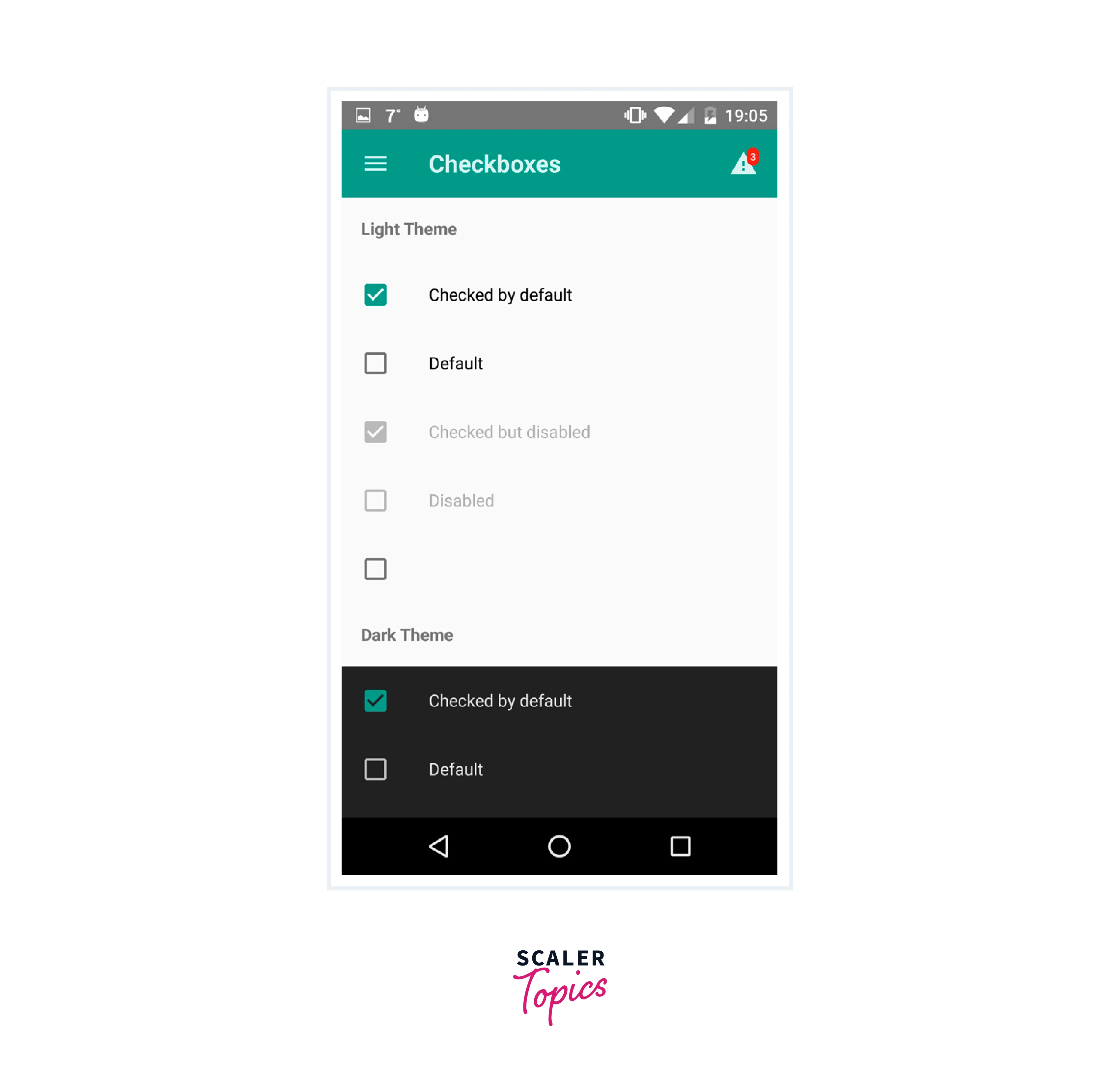 A checkbox in react-native-material-ui is a UI component that allows users to toggle a binary state, typically represented by a checked or unchecked state. It is a visual element that can be interacted with, and its state can be controlled and updated programmatically in a React Native application.
Divider
The Divider component is used to create a horizontal line that visually separates sections or content within the user interface.
Icon
Icon refers to a component that represents graphical symbols or images used to convey information or perform actions in the user interface. Icons in this library are customizable and can be used for various purposes such as navigation, buttons, or visual enhancements in the application.
ListItem
A ListItem is a component used to display a single item in a list. The component can be integrated into a FlatList or SectionList. Note that it is deprecated when used with ListView.
Toolbar
Toolbar is a UI element that provides a navigation bar or a header for displaying icons, titles, and actions in a mobile application. It offers various customization options and can be used to create a consistent and intuitive user interface.
Material UI React Native Initial Screens
I’m also adding React Navigation to this project, and I recommend that you use it as well. React Navigation is the most popular navigation library for React Native, and there is more support for running it alongside React Native Paper compared to other navigation libraries.
Create a pair of files named MyFriends.tsx and Profile.tsx within the primary directory of your application.
This guide demonstrates the process of connecting these screens using both a navigation drawer and a hamburger menu, while also incorporating MUI components into each screen.
Hamburger Menu and Drawer Navigation Using Material UI
To enable navigation between the My Friends and Profile screens, I will implement a navigation drawer by the principles of Material Design. To achieve this, I will use React Navigation's drawer library in the project.
For yarn users:
For npm users:
To activate the drawer navigation, the following code will be inserted into the App.tsx file.
The drawer requires a button for opening it, resembling the familiar hamburger icon (≡). When the button is pressed, it should trigger the opening of the navigation drawer. In the file components/MenuIcon.tsx, you can find an example code for implementing the button.
In this context, there are a couple of important observations. Firstly, we will utilize the useNavigation Hook provided by React Navigation to perform various navigation actions, such as screen transitions and opening drawers.
Additionally, the <IconButton> component from React Native Paper allows for the usage of Material Design icons by name, and it also offers the option to include icons from external libraries using React nodes.
To incorporate the <MenuIcon> into the navigation drawer, the existing code in App.tsx needs to be replaced with the following code snippet.
Finally, the navigation drawer can be personalized by utilizing the drawerContent prop within the modified <Drawer.Navigator> component. For instance, an illustration will be provided to demonstrate the addition of a header image at the top of the drawer. However, feel free to customize the drawer content according to your preferences. Please insert the following code snippet in the components/MenuContent.tsx file.
Now, I’ll pass <MenuContent> into <Drawer.Navigator>. To do so, I’ll change the code in App.tsx from the code block below to the following code block, respectively:
Below is the outcome of implementing a functional drawer navigation system with a customized image header.
Floating Action Button in React Native
Material Design is known for its distinctive feature called the floating action button (FAB). The floating action button is implemented by Material Design principles through the <FAB> and <FAB.Group> components. I will incorporate this feature into the My Friends screen with a straightforward setup.
To begin, I will include the <Provider> component from React Native Paper and enclose it around the <NavigationContainer> in the App.tsx file. The updated code will look like this:
To incorporate the floating action button into the My Friends screen, several components and variables are required. These include the <Portal> and <FAB.Group> components from React Native Paper, a state variable called "fabIsOpen" to monitor the FAB's open or closed state, and the "isScreenFocused" information indicating if the screen is currently visible to the user. Without the "isScreenFocused" variable, the FAB may mistakenly appear on screens other than the My Friends screen. Here is the updated code for the My Friends screen in MyFriends.tsx:
React Native Contextual Action Bar
Applications such as Gmail and Google Photos employ a design concept known as the contextual action bar. In our present application, I will promptly incorporate a similar version.
Initially, I will construct the ContextualActionBar component by utilizing the appbar component from React Native Paper. Initially, its appearance should resemble the following:
To achieve the desired outcome, I intend to render the specified component above the header of the current screen when an item is long-pressed. The code snippet provided below will add the necessary functionality to display the contextual action bar over the header on the My Friends screen in MyFriends.tsx:
In the provided code, the state boolean value "cabIsOpen" is toggled when a specific item is long pressed. Depending on this value, the React Navigation header is dynamically switched between rendering the <ContextualActionBar> or the default React Navigation header.
When long pressing the "Friend #1" item, the expected behavior is for a contextual action bar to appear. However, the title is currently empty and the actions in the bar are not functional. The <ContextualActionBar> component does not have access to the state of either the "Friend #1" item or the overall "My Friends" screen.
To address this issue, we will introduce a title in the <ContextualActionBar> component and implement a function to close the bar, which will be triggered by one of the buttons in the bar. To achieve this, an additional state variable will be added to the "My Friends" screen.
To utilize <ContextualActionBar>, it is necessary to pass the props selectedItemName and closeHeader.
Finally, it is necessary to assign the value of "selectedItemName" to the title of the item that has been subjected to a long press.
In <ContextualActionBar>, we can utilize the title and close props. Insert the following code into ./components/ContextualActionBar.tsx:
We have implemented a functional contextual action bar that takes inspiration from Material Design. This feature utilizes React Native Paper and React Navigation.
Theming with Material Design
Theming can be challenging when using React Navigation and React Native Paper together due to potential conflicts between their respective ThemeProvider components. However, there is a helpful guide available for theming an application that utilizes both libraries. Additionally, I will provide additional assistance for TypeScript users who may encounter obscure errors while following the aforementioned guide. To start, we can create a theme file named theme.ts, which includes the following code:
The combineThemes function combines ReactNavigationTheme and ReactNativePaper.Theme. I modified the primary and accent colors, impacting CAB and FAB correspondingly. Additionally, I introduced a new color, animationColor, to the theme. Declaring the global namespace is unnecessary if you prefer not to add a new color.
In App.tsx, I will apply my theme to the React Native Paper Provider component and the NavigationContainer component from React Navigation.
When utilizing Expo, incorporating the subsequent code into app.json is necessary for enabling dark mode. Nonetheless, it might not be required in every case.
Now, your application boasts a personalized theme with a dark mode feature, taking inspiration from Material Design.
FAQs
Q. Is React Native Material UI compatible with both Android and iOS?
A. Yes, React Native Material UI is designed to be compatible with both Android and iOS platforms. It leverages the native components provided by React Native and adapts them to follow the Material Design guidelines, ensuring consistent behavior and appearance across different devices and operating systems.
Q. How do I use components from React Native Material UI?
A. After installing the library, you can import individual components from React Native Material UI and use them in your React Native application. For example, to use a button component, you can import it as follows:
Then, you can include the button component in your JSX code and customize its properties according to your requirements.
Q. What is React Native Material UI?
A. React Native Material UI is a library that provides a set of pre-designed components and themes for building user interfaces in React Native applications. It follows the principles and styles of Google's Material Design, allowing developers to create visually appealing and consistent UI experiences.
Conclusion
- React Native Material UI is a powerful and convenient solution for building visually appealing and consistent user interfaces in React Native applications.
- The library follows the principles of Google's Material Design and offers a wide range of pre-designed components.
- Components such as buttons, drawers, floating action buttons, and contextual action bars are included in React Native Material UI.
- The library provides a comprehensive set of components to enhance both functionality and aesthetics of your app.
- React Native Material UI allows customization of themes and ensures responsive layouts.
- By using React Native Material UI, developers can create unique and immersive user experiences.