React Native Status Bar
Overview
The component React Native StatusBar is used to customise the React Native Status Bar. The StatusBar component from the react-native library is imported to utilise it. Multiple StatusBars can be used simultaneously. This article will demonstrate how to modify the React Native status bar's look.
What is React Native StatusBar?
A component called React Native StatusBar is used to manage the app's status bar. The area of the screen where the time, network information for Wi-Fi and cellular networks, battery level, and/or other status symbols are commonly displayed is called the status bar.
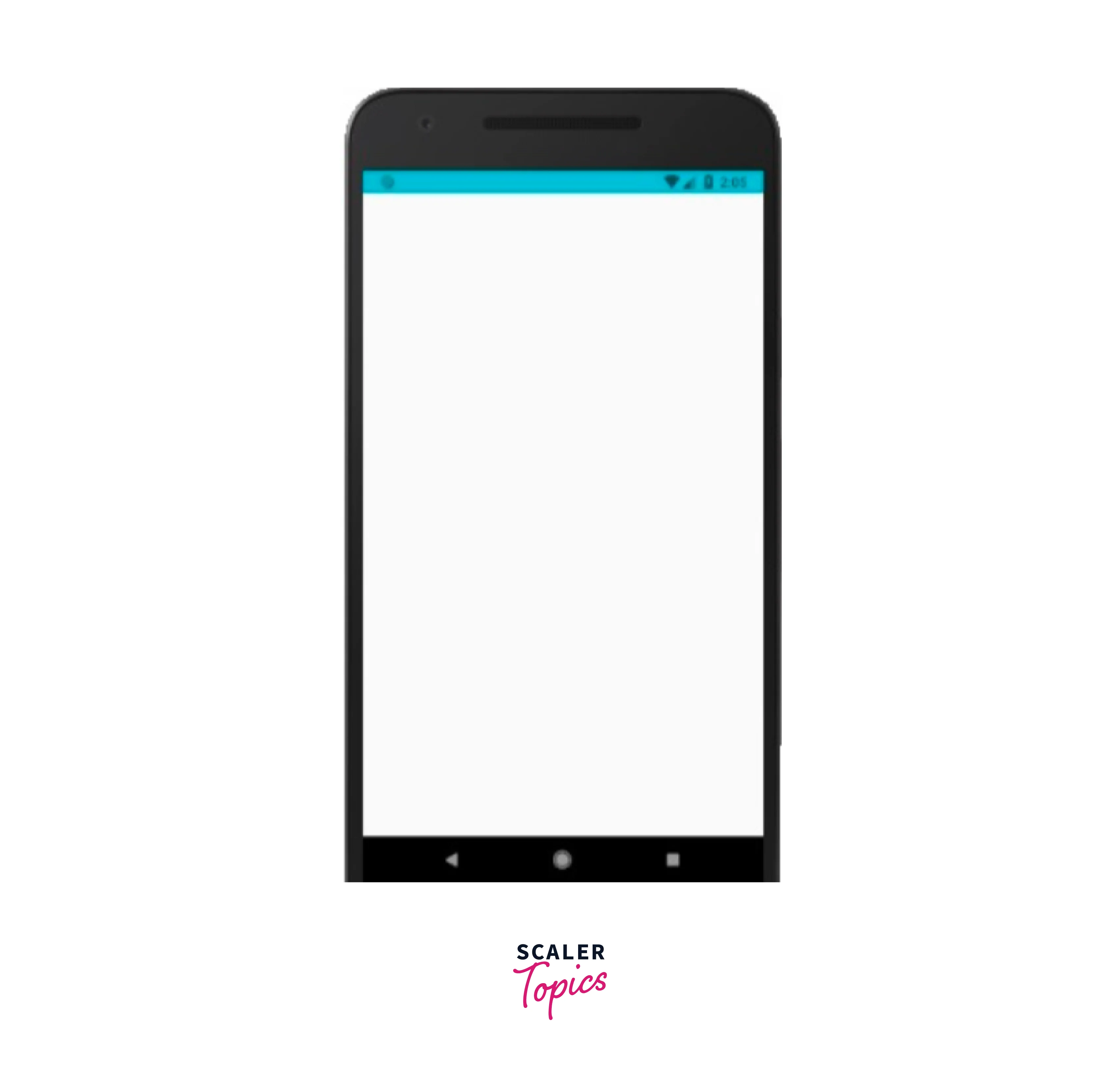
All you have to do to update the React Native Status Bar is to set its properties, which makes it simple to utilise. The status bar can be concealed using the hidden attribute. It is set to false in the given example below. This value is the default. There are a number of useful characteristics for this component. Some of them are tailored specifically for Android or iOS, which we'll cover in the sections that follow.
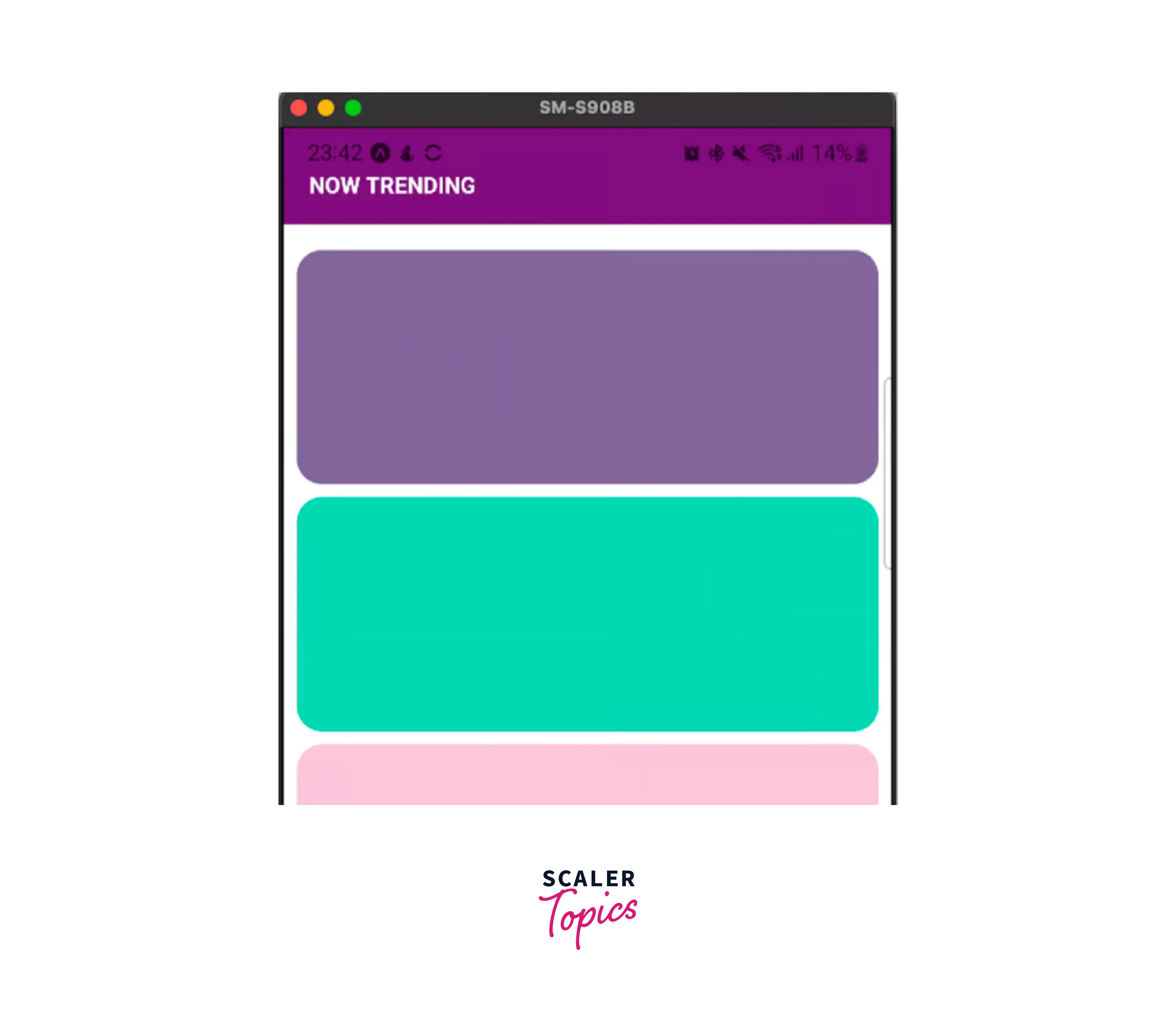
Example:
Output:
StatusBar Props
Here are the description of all the props :
- animated: If the transition between property changes in the React Native Status Bar should be animated. BarStyle, BackgroundColor, and hidden attributes are all supported. It is boolean type and optional prop whose default value is false.
- backgroundColor: This is specific to Android. It defines the background colour of the React Native Status Bar. It is also an optional prop and the default color is black if not defined.
- barStyle: The colour of the React Native Status Bar text is set using this prop. On Android, this will only affect API versions 23 and up. It is an optional prop with a default value as default.
- hidden: It is used to hide the React Native Status Bar. It is an optional prop with a default value as false.
- networkActivityIndicatorVisible: It is specific to iOS. It is used to show the network activity indicator. It is a boolean type prop with a default value as false.
- showHideTransition: It is specific to iOS. The transition effect was created by utilising the hidden prop to display and hide the React Native Status Bar. It has a default value as fade.
- translucent: It is specific to android. If the React Native Status Bar is transparent. When the translucent property is set to true, the app will draw beneath the React Native Status Bar. When utilising a semi-transparent React Native Status Bar colour, this is handy. It is a boolean type prop with a default value as false.
Transform Your Career
Choose from our industry-leading programs designed for career success
Modern Software and AI Engineering Program
Master full-stack development with AI integration

 +1000 more
Modern Data Science and ML with specialisation in AI
Advanced data science techniques with AI specialization
+1000 moreAdvanced AIML with Specialisation in Agentic AI
Deep dive into AIML with focus on Agentic systems
+1000 moreDevOps, Cloud & AI Platform Engineering
Build and manage AI-powered cloud infrastructure
+1000 moreAI Engineering Advanced Certification by IIT-Roorkee
Premier AI engineering certification from IIT-Roorkee
Different Methods in React Native StatusBar
-
popStackEntry() : static popStackEntry(entry: StatusBarProps);
It is used to get and delete the stack's latest StatusBar entry.
Description of parameters:
- entry: It is required. The entry returned from pushStackEntry.
-
pushStackEntry() : static pushStackEntry(props: StatusBarProps): StatusBarProps;
Place a StatusBar entry on top of the stack. When finished, the return value should be sent to popStackEntry.
Description of parameters:
- props: It is required. The StatusBar properties to utilise in the stack entry are contained in this object.
-
replaceStackEntry() :
Add new props to an existing StatusBar stack entry.
Description of parameters:
- entry: It is used to replace, use the entry returned by pushStackEntry.
- props: The StatusBar properties to utilise in the replacement stack item are contained in this object.
-
setBackgroundColor() It is specific to Android.
static setBackgroundColor(color: ColorValue, animated?: boolean);
It is used to set the background colour for the React Native Status Bar.
Description of parameters:
- color: Background color.
- animated: style change animation.
-
setBarStyle() : static setBarStyle(style: StatusBarStyle, animated?: boolean);
It is used to set the style of the React Native Status Bar.
Description of parameters:
- style: Status bar style to set.
- animated: style change animation.
-
setHidden() : static setHidden(hidden: boolean, animation?: StatusBarAnimation);
It is used to hide or show the React Native Status Bar.
Description of parameters:
- hidden: used to hide the React Native Status Bar.
- animation: style change animation only in iOS.
-
setNetworkActivityIndicatorVisible(): It is specific to iOS.
static setNetworkActivityIndicatorVisible(visible: boolean);
The visibility of the network activity indicator may be adjusted.
Description of parameters:
- visible: Show the indicator.
-
setTranslucent(): It is specific to android.
static setTranslucent(translucent: boolean);
It is used to control the translucency of the React Native Status Bar.
Description of parameters:
- translucent: Set as translucent.
Type Definitions
StatusBarAnimation: On iOS, the React Native Status Bar animation type for transitions. It is of the enum type.
Constants:
- fade: It is used for fade animation.
- slide: It is used for slide animation.
- none: It is used for no animation.
StatusBarStyle: Status bar style type. It is an enum type.
Constants:
- default: It is the default React Native Status Bar style.
- light-content: Dark background, white texts, and icons.
- dark-content: Light background, dark texts, and icons.
Usage with Navigator
Multiple StatusBar components can be installed at the same time. The properties will be combined in the order in which the StatusBar components were mounted.
Turn Learning into Career Growth
React Native StatusBar to Control Status Bar
The StatusBar component from the React Native framework is ideal for handling the status bar of the app. The StatusBar component allows the developer to control the appearance and behaviour depending on the user's position inside the app or the demands at hand, of the device's status bar.
For instance, if the user needs to concentrate while reading or watching something, we would want to entirely conceal the status bar and reduce interruptions while the user is on that specific screen. A React Native app has a second option for managing the status bar. Instead of utilising the React Native StatusBar component, you might utilise the imperative API to programmatically alter the React Native Status Bar's appearance.
We'll examine each of these strategies in the parts that follow, learn when to employ each one, and learn how to do it correctly.
How to Manage StatusBar for Devices with Notch?
We are aware that on devices with notches, our app's content may obstruct the React Native Status Bar. In this scenario, we must make sure to consider the status bar's height and refrain from adding any text or buttons to it. Otherwise, we can have the following situation:
React Native provides a SafeAreaView component to solve this React Native Status Bar problem. Instead of View, your screen's root component should be the SafeAreaView component. The rendering of the material inside the secure confines of the device screen will be handled automatically. However, it is only compatible with iOS 11 or later-running smartphones.
Consequently, the output of the following sample on iOS and Android will differ :
The output below illustrates how the above code may appear on each device. The Android result is on the left, while the iOS screenshot is on the right. On the iOS device, you can see that the SafeAreaView component considered the notch :
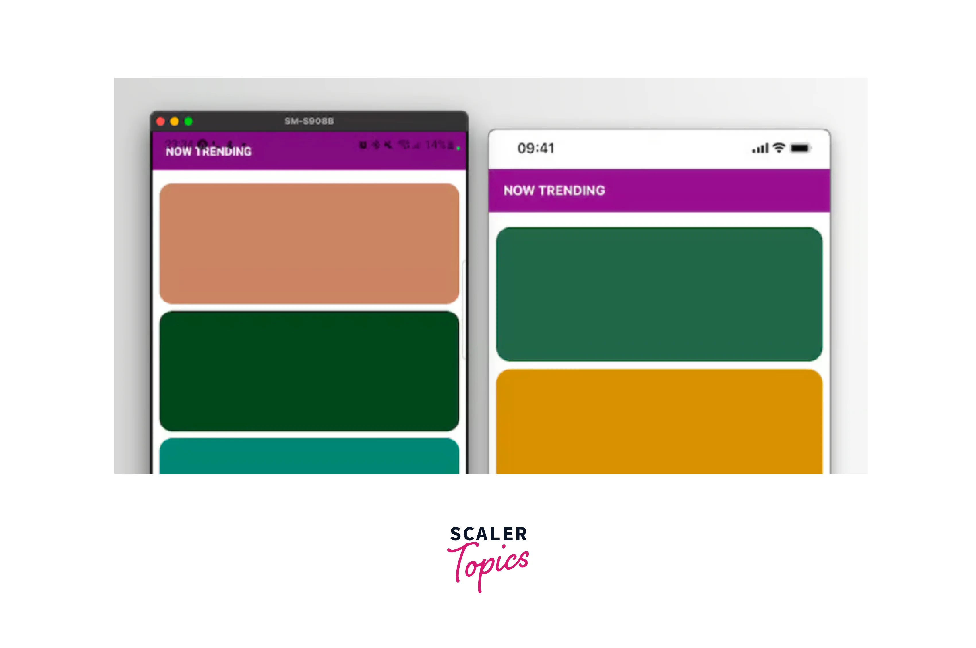
Therefore, we are aware that an iOS device will use the SafeAreaView component to automatically provide the required padding to the top. For an Android device, we must manually take care of this, though.
Modifying our snippet and adding a paddingTop to the SafeAreaView will prevent our content from covering the notch on an Android smartphone. Here's how we'll proceed :
The following outcome will be produced if our code is modified as indicated above :
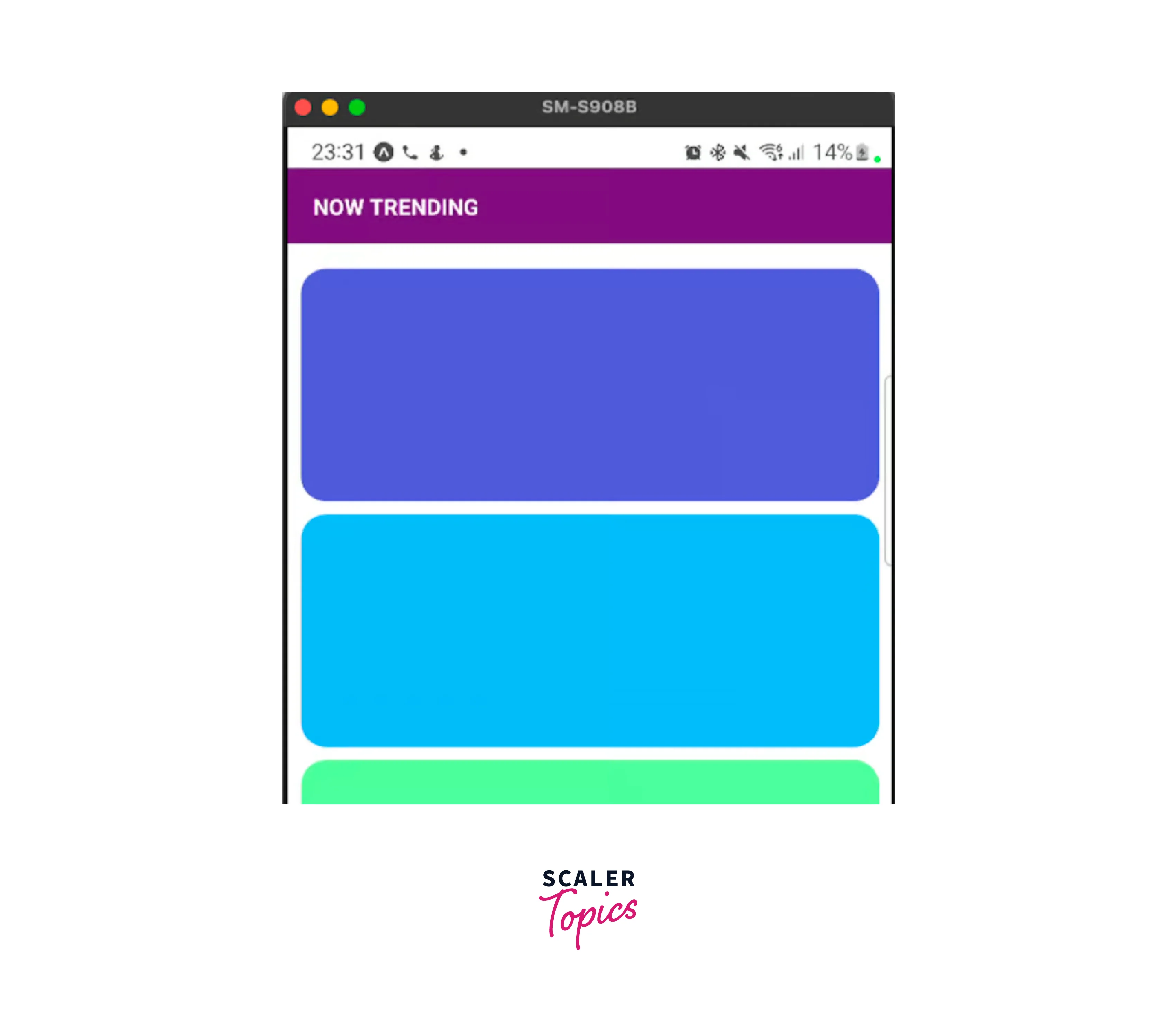
As you can see, we increased the top padding of our screen's root container to match the height of the status bar.
Normally, we'd also like to stretch the colour at the top of the status bar. The padding inside the component at the top, in this example the purple title header, needs to be moved to do this. Look at what follows:
The above code will produce the following output :
Without needlessly harming iOS, we managed the height of the status bar for Android devices properly.
Personalizing React Native Status Bar Dynamically
Consider that you are creating an app with content from many businesses, each of which uses a different set of branding colors. It would be logical to verify the path the app is presently on in such a situation. The React Native Status Bar appearance may then be customized based on the route to improve the UI and UX of the app.
How come you would want to do this? Let's look at the next illustration. We'll limit ourselves to just two screens for simplicity's sake: Home and Products. An approach that examines the existing route is being put into practice. In this instance, we are merely comparing two values. However, you could have several arrays containing routes in a real-world scenario. Every one of such arrays would have a unique style. Depending on the path, these various styles would subsequently be used as the backdrop of the current screen.
Now let's examine some code. To build our navigation and get the routes for our example, we must first add the necessary imports. They come from the react-navigation library and are added :
Please take note that React Navigation v6 is being used in this example. We'll employ a Stack navigator as follows :
Each of our displays has a root container implemented. This element will cover each of our screens, preventing the need for duplicate code :
We are going to use the ScreenWrapper component mentioned above to construct two fundamental screens :
You may have seen the navigation prop that the screens can get in the code above. The React Navigation library automatically passes the prop to the components used in a Screen component. This will be demonstrated below when we use our stack navigator.
Additionally, the navigator's default header does not benefit our scenario. We are offering the headerShown option and setting it to false to hide it:
You might have seen the navigation prop in the code above that the screens can access. The components used in a Screen component receive the prop automatically thanks to the React Navigation framework. The usage of our stack navigator will show this in the examples that follow.
The navigator's default header is also inconvenient for our circumstances. To conceal it, the headerShown option is being offered, and it is set to false:

When we press the button, the products screen appears, as follows :

As you may have seen, we are altering the React Native Status Bar look depending on the route. More specifically, when the backdrop colour is lighter, we set the status bar text to black; when the background colour is darker, we set it to white.
Consider the case when you wish to further alter the status bar for your React Native application. To specify a different backdrop colour from the background of your component, you can also provide the StatusBar the backgroundColor argument.
Scaler Placement Report and Statistics
Scaler learners achieved 2.5x salary growth with average post-Scaler CTC reaching ₹23L.
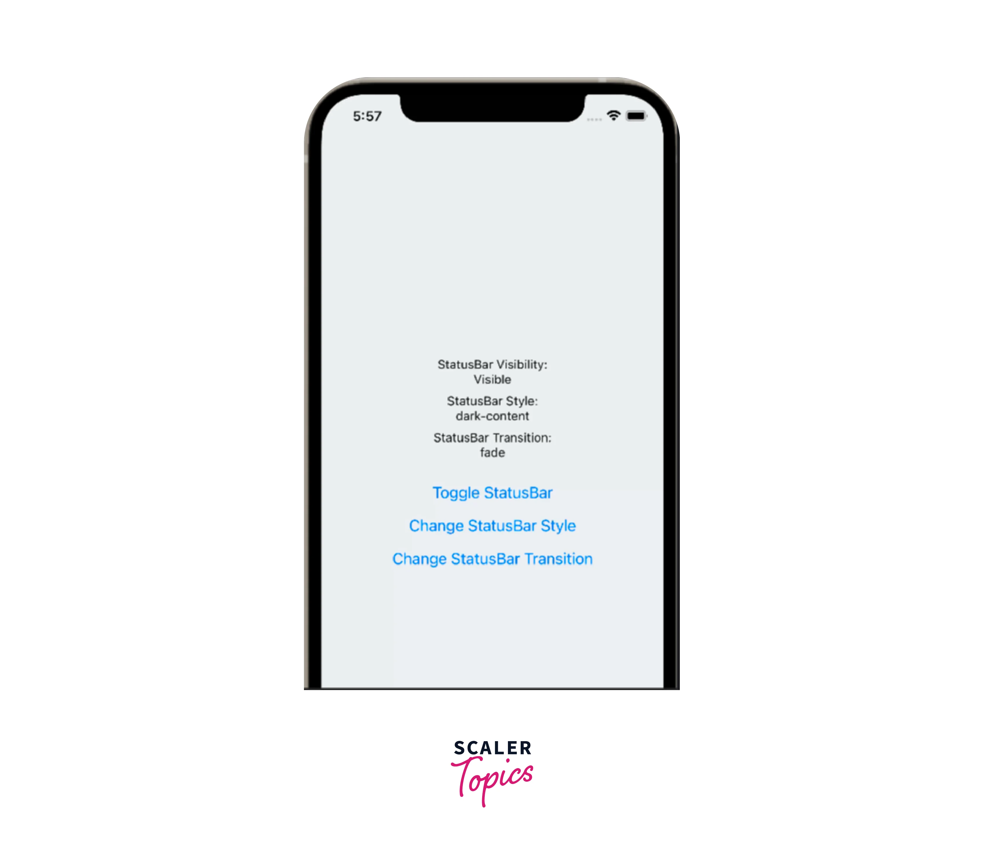
Imperative APIs Instead of React Native StatusBar
If you would prefer not to utilise the StatusBar component, we also offer another choice. The React Native Status Bar look may be changed by pushing different styles to the stack using the imperative API.
The official documentation lists all of the many properties that we may modify for the status bar. Now that we have a better understanding of how this API will be utilized, let's look at some sample code.
Let's go back to the earlier illustration. It would be simple to add a useEffect to the ScreenWrapper component so that, based on the current path, a new set of props would be pushed to the status bar's stack :
Be aware that we are also integrating a NotificationsScreen as a third screen into our StackNavigator. Include the following line in your stack navigator:
The NotificationsScreen component must also be used :
Let's examine the switch in the useEffect right now. What precisely are we doing there? We are pushing a distinct aesthetic for the React Native Status Bar stack, depending on the current path. We completely conceal the bar once we are on the notifications screen. As we go between the other two displays, the theme is adjusted to reflect the contrast between the dark and light content.
Using popStackEntry, you may also remove the most recent entry. The style that was most recently added to the React Native Status Bar stack will be removed as a result. It is also important to note that there are several other techniques you can use to achieve the same results in addition to using pushStackEntry and giving an object that holds the configuration for the React Native Status Bar style.
Instead of calling pushStackEntry() with an object containing backgroundColor and hidden, for instance, you may use setBackgroundColor and setHidden.
Depending on your needs, use case, and personal preferences, you may choose to utilise the imperative API or the StatusBar component.
For instance, there are times when utilizing the imperative API is cleaner. You may safely use the imperative API method and manage the status bar from the same location if you don't want to duplicate the StatusBar component in different locations.
Otherwise, you can just use the StatusBar component at the top notch level, and it will work perfectly if your status bar has a fairly constant appearance across the app. To decide how much you will dynamically customize the status bar, talk to your designer. You can make the best decision by using the information provided.
One thing to bear in mind is that you shouldn't combine these strategies. If you combine both, everything you indicate in the StatusBar component will take precedence over any settings you make using the imperative API. Consider that you have added a StatusBar component to your screen. On the same screen, the status bar must be changed immediately following an event like pressing a button. After a re-render, the status bar will be restored to its default StatusBar component style, overriding your imperative API settings.
FAQs
Q: How to Manage StatusBar for Devices with Notch?
Ans. React Native provides a SafeAreaView component to solve this status bar problem. Instead of View, your screen's root component should be the SafeAreaView component. The rendering of the material inside the secure confines of the device screen will be handled automatically. However, it is only compatible with iOS 11 or later-running smartphones.
Q: What is React Native StatusBar?
Ans. A component called React Native StatusBar is used to manage the app's status bar. The area of the screen where the time, network information for Wi-Fi and cellular networks, battery level, and/or other status symbols are commonly displayed is called the status bar.
Conclusion
- The component React Native StatusBar is used to customise the app's status bar.
- All you have to do to update the Status bar is to set its properties, which makes it simple to utilise.
- Some of the important statusbar props are animated, backgroundColor, barStyle, hidden and networkActivityIndicatorVisible etc.
- We also looked at how to set up a stack navigator to leverage the current route for changing the Status Bar's appearance and feel.
- We also had a look at an example that omits the StatusBar component in favor of using the imperative API.
 Google
 Amazon
 Microsoft
 Flipkart
 Adobe1200+ more