React Calendar
Overview
React-calendar is a simple React calendar library. It offers features that make it easier for you to work with and manage time and date. End users can choose a day, month, or year with React-calendar in the format Month Date Year.
Introduction
React is a front-end JavaScript library that is open-source and free to use for creating user interfaces. Facebook, along with a group of independent programmers and companies, maintains it.
The majority of real-world applications contain a method for managing and manipulating dates. In your web app, you'll frequently wish to manage and work with dates. You could do tasks like add events or create reminders. A calendar is frequently the best solution in these situations. React-calendar can be included in many different apps, including to-do lists, e-commerce websites, ticketing websites, and more.
Pre-Requisites
You will require the following to proceed with this article:
Transform Your Career
Choose from our industry-leading programs designed for career success
Modern Software and AI Engineering Program
Master full-stack development with AI integration

 +1000 more
Modern Data Science and ML with specialisation in AI
Advanced data science techniques with AI specialization
+1000 moreAdvanced AIML with Specialisation in Agentic AI
Deep dive into AIML with focus on Agentic systems
+1000 moreDevOps, Cloud & AI Platform Engineering
Build and manage AI-powered cloud infrastructure
+1000 moreAI Engineering Advanced Certification by IIT-Roorkee
Premier AI engineering certification from IIT-Roorkee
What Is React Calendar?
React Calendar is a basic calendar library that allows you to select days, months, years, and even decades. For use cases that require more advanced functionality, it additionally supports choosing a date range and a range of languages.
Since React-Calendar is not reliant on moment.js, it is a very adaptable and flexible library that can be used in almost any application.
Installation
You can install it by executing:
or
Creating A React Project
You must first set up a react development environment before you can proceed.
In your coding editor's built-in terminal, enter the following command.
Be patient while the development environment is installed; it can take a few minutes.
Next, use the command below to start your application.
Adding A Calendar With React-Calendar
You will integrate a calendar into your React project in this section. Users will be able to choose a date using the calendar.
Let's perform the following steps to include a calendar in our project:
- Navigate to the src/App.js file.
- Replace the boilerplate and add the below code to the App.js file.
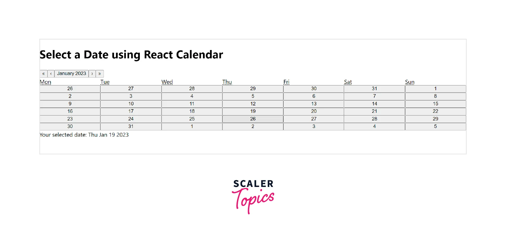
Notice how we add a react-calendar calendar component to App.js.
The date was stored in the code above using useState, and its initial value was set using the Javascript Date object with the current date. The date is then passed to the Calendar component as a value.
The value which is of the date is changed to the user's chosen date when they choose a date. Then, below your calendar, this value is displayed.
Your application must look like the below image:
Output:
Turn Learning into Career Growth
Styling Your Calendar
The simplest calendar implementation has been completed. However, as you see, the calendar does not yet have a design, making it appear quite plain.
You can use the default styling that React-Calendar offers by importing its stylesheet. To accomplish this, include the following line in your App.js file:
You can override the classes and include your CSS attributes if you wish to add your custom styling to the calendar.
Styling React-Calendar with custom CSS
React Calendar has some interesting custom styles. However, we always prefer for our components to match a product's overall design. There are several classes already applied to the React-Calendar elements that we can use to apply our styles.
The ideal way for adding your styling is to override Calendar.css. You can copy the whole calendar CSS file from node_modules/react-calendar/dist into your App.css file or import that file into App.js rather than using the default calendar CSS.
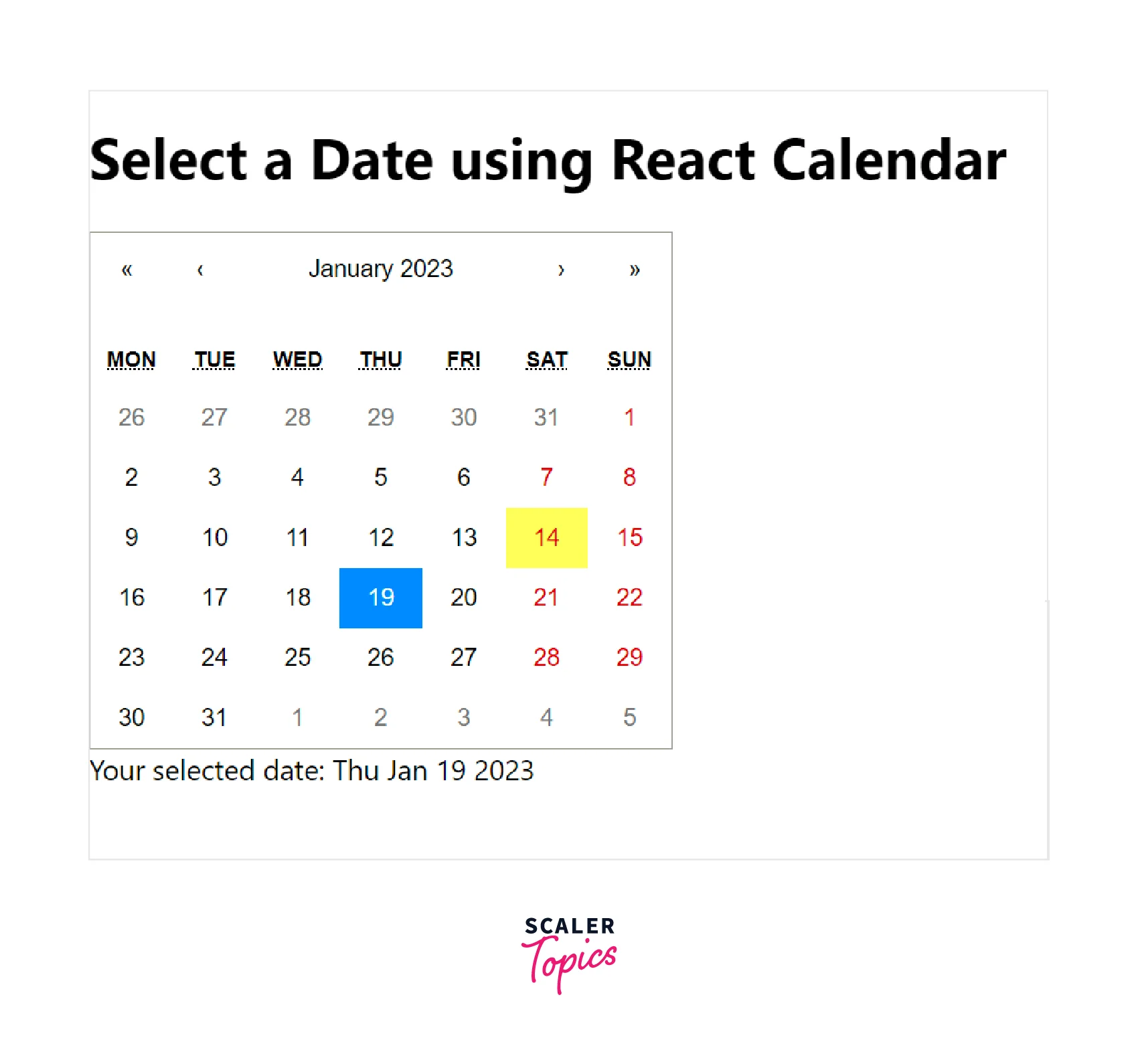
So we modified the calendar's default font colour, font size, and background colour, and we decided to add border-radius to the range selection. Here, we overrode a few classes and inserted our custom styles to produce the following outcome:
Selecting A Date Range
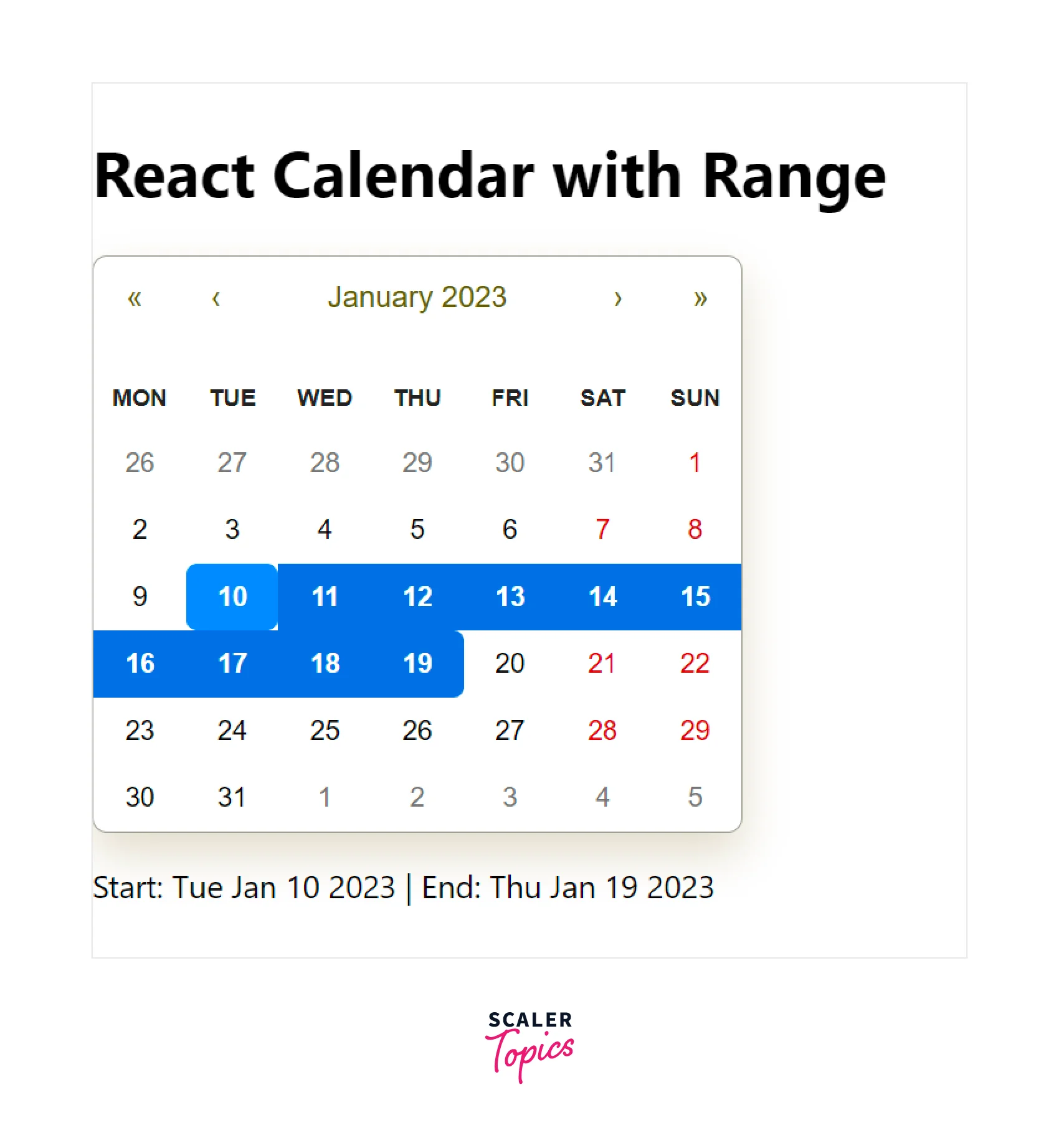
Think of a scenario in which you must deliver some data within a specific date period. The user chooses the date range they want, which you can accept and carry out the remaining tasks. This functionality is extremely well supported by React Calendar.
Taken as an example, let's make our application to choose the date range better. The start and end of the date range will be printed at the bottom of the displayed calendar. This is how your App.js should look like:
We provide our Calendar component with the selectRange attribute to enable the date range capability. selectRange is initially set to false by default. An array is returned providing the start date and end date by React-Calendar when this prop has been enabled. To help the user know the selection, the chosen range is highlighted.
This is how the calendar will be displayed after adding a date range feature:
Customizing React-Calendar
We've covered the most important features of React Calendar, so let's dive a little deeper and look at how you can design your calendar.
defaultValue
You can specify a default chosen value using the defaultValue prop. This parameter also accepts the default date range selection. A date object can be passed if you just wish to choose one date. If not, you can provide a date array with start and end values.
This is how to add defaultValue:
defaultView
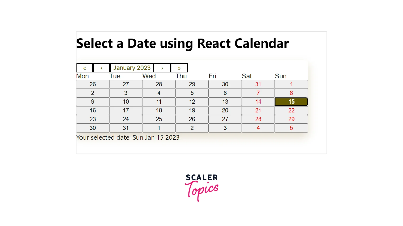
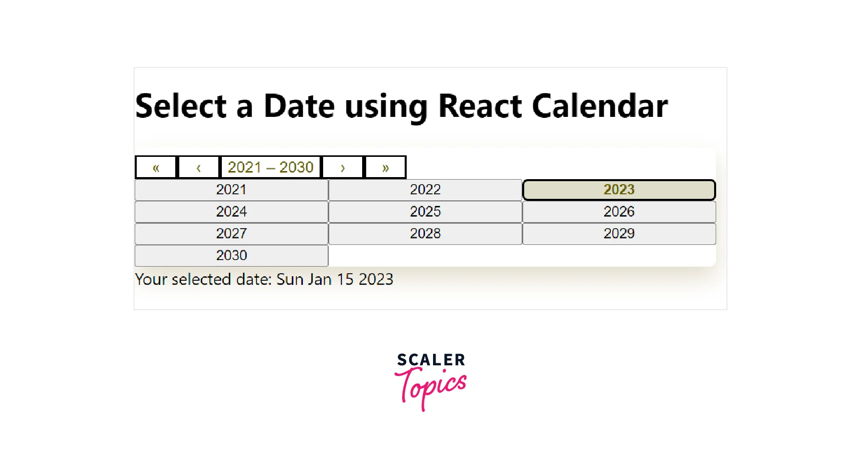
The defaultView prop allows you to customize the calendar's date view. It is initially set to month. As a result, the calendar displays a month view if the defaultView prop is not given.
There are four choices offered by defaultView: month, year, decade, and century. You can navigate through various dates/months even if the defaultView prop is set to a certain value.
Here's how to use defaultView in your application:
The defaultView prop will alter the calendar's initial rendering such that it looks like this:
maxDate and minDate
You can prevent the user from choosing a date after a specific day by including a maxDate attribute in your calendar. The minDate attribute, as you might have guessed, restricts the earliest start date that the user may choose.
If the app has the date range enabled, the user may be allowed to choose a date that is either after the maxDate or before the minDate. React Calendar avoids this by only accepting values for the maxDate or minDate and nothing else.
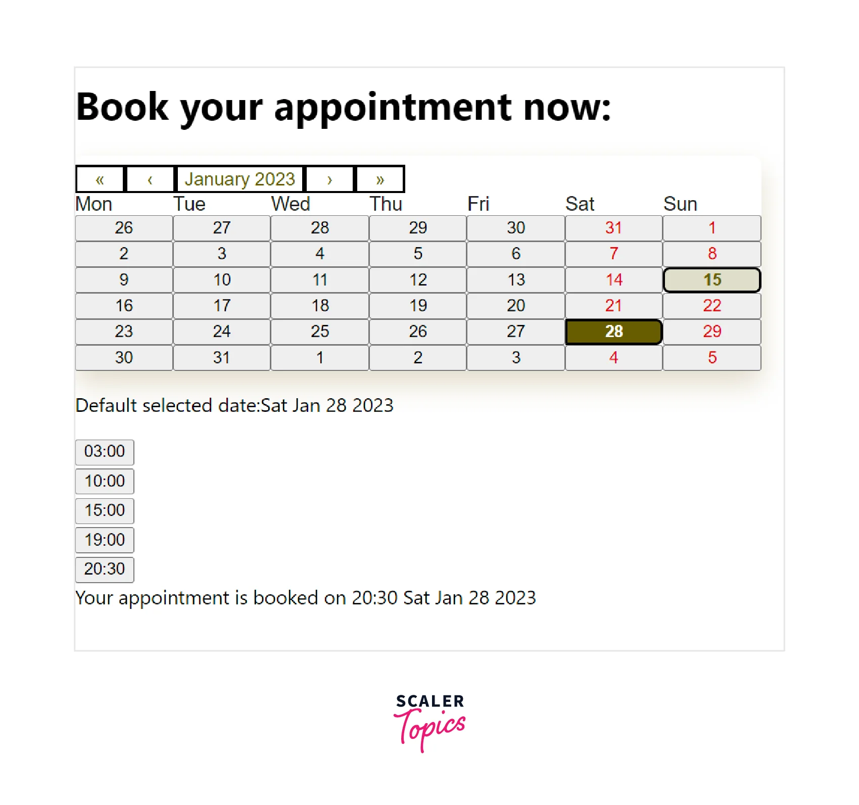
Build Booking Application With React Calendar
React-calendar can be combined with other elements to create applications with complicated features.
We'll show this by creating a booking app. The booking app allows customers to book an appointment.
The application will show the open time window after you choose the preferred date. After that, users can choose a time slot.
Finally, after selecting a time window, the appointment's date and time will be shown on the screen.
Add the following code to the App.js file.
We used useState in the preceding code to set the initial value of showTime as false.
The Calendar component includes an onClickDay property by default. When a user clicks, this listens for it. setShowTime was provided in the onClickDay prop. When a day in the calendar is clicked, this sets showTime to true.
When the showTime parameter's value is changed to true, the Time component shows the time slot. In the Time component, we passed the showTime and date as props.
Construct a Time.js component. This will show the Times.js component's elements. When the showTime parameter in the code above is set to true, it will display the Times.js component elements. They aren't shown if they're false.
To create Time.js, you can copy the code below:
The Times.js component will contain a time slot array. In the Times.js component, paste the following code.
An array with time slots is written in the code above. Each time slot appears as a button element once we map across the array.
The button element also includes a handler for the onClick event. When a user hits any buttons, the dislayInfo method is triggered.
There are two useState in the displayInfo() function. When displayInfo is triggered, the value of info becomes true, and the value of the event becomes the innerText of the button element.
From App.js through Time.js and finally, to Times.js, we passed the date as a prop. The application shows the user-selected time and date when the value of info is changed to true.
This is how our finished application will look:
Scaler Placement Report and Statistics
Scaler learners achieved 2.5x salary growth with average post-Scaler CTC reaching ₹23L.
Conclusion
- React Calendar is an excellent package that offers lots of implementation flexibility. React Calendar is simple to integrate into any application due to its flexibility and it depends on the JavaScript Date object.
- For some challenging React-Calendar examples and use cases, refer to the official documentation.
- You can use the default styling that React-Calendar offers by importing its stylesheet.
- However, you can also override its classes and insert your custom styles according to your application.
- Lastly, you can also customize the React-Calendar using different props: defaultValue (specify a default chosen value), defaultView (allows you to customize the calendar's date view), maxDate and minDate (prevent the user from choosing a date after a specific day).
- I hope you've learned the basics from this article so you can use React Calendar in your project and customize it according to your requirements.
 Google
 Amazon
 Microsoft
 Flipkart
 Adobe1200+ more