React Datepicker
Overview
The React date picker is a React component that displays dates on the screen in the calendar dialog format. It is used to pick days, months, years, or decades. The date picker, as the name suggests, is used to pick up a date. It renders a calendar where the user can browse between dates and choose them. The calendar can be in the form of a modal dialog or a popup.
What is React Date Picker?
When we fill in our details on a website, we often come across choosing the dates. Be it our date of birth, admission year dates, or appointment date it revolves around choosing a date. We can see a calendar icon pop up. This work can be done by the React date picker component in our React app.
The React date picker is a React component that displays dates on the screen in the calendar dialog format. It is used to pick days, months, years, or decades. The date picker, as the name suggests, is used to pick up a date. It renders a calendar where the user can browse between dates and choose them. The calendar can be in the form of a modal dialog or a popup.
Installation
We can install the React date picker component, we need to do it through npm(Node Package Manager) or Yarn.
The package can be installed via npm-
The package can be installed via yarn-
It is required that React and Node.js are to be installed on your system.
Configuration
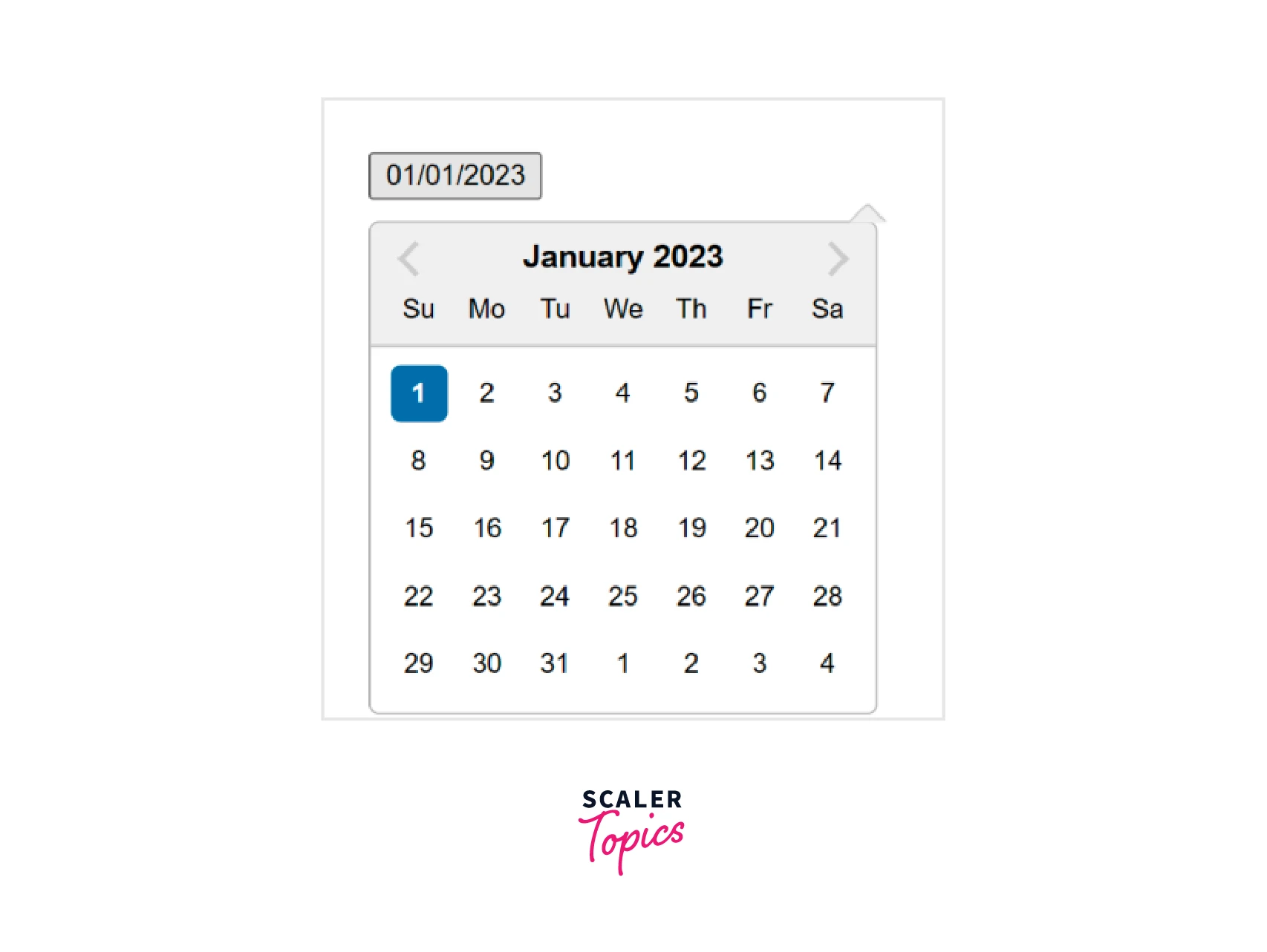
The most basic form of the DatePicker is as follows-
Here, we have seen how to create a date picker.
We can also choose the onSelect event handler which is triggered whenever a date is selected.
Here, date, handleDateSelect, and handleDateChange are functions that get called when the user selects the day or changes a value.
Transform Your Career
Choose from our industry-leading programs designed for career success
Modern Software and AI Engineering Program
Master full-stack development with AI integration

 +1000 more
Modern Data Science and ML with specialisation in AI
Advanced data science techniques with AI specialization
+1000 moreAdvanced AIML with Specialisation in Agentic AI
Deep dive into AIML with focus on Agentic systems
+1000 moreDevOps, Cloud & AI Platform Engineering
Build and manage AI-powered cloud infrastructure
+1000 moreAI Engineering Advanced Certification by IIT-Roorkee
Premier AI engineering certification from IIT-Roorkee
Localization
The React date picker is dependent on date-fns internationalization to display the local components. By default, the language setting is English. There are three ways by which we can set the locale-
- registerLocale (string, object)- It is used to load an imported locale object from date-fns
- setDefaultLocale (string)- It is used to set a registered locale as the default for all date picker instances
- getDefaultLocale- It is used to return a string showing the currently set default locale
Compatibility
React
The date picker component is compatible with the latest versions of React. The latest compatible versions are-
- React 16 or newer- The corresponding version of date picker is React-datepicker v2.9.4 and newer
- React 15.5- The corresponding version of the date picker is React-datepicker v2.9.3
- React 15.4.1- The corresponding version of the date picker is React-datepicker v0.40.0 as the newer versions will not work due to react-onclickoutside dependencies.
- React 0.14 or newer- All versions above React-datepicker v0.13.0
- React 0.13- The corresponding version of the date picker is React-datepicker v0.13.0
- pre React 0.13: The corresponding version of the date picker is React-datepicker v0.6.2
Moment.js
The React date picker package was earlier using Moment.js till version 1.8.0, but later they switched to date-fns. The date-fns uses native Date objects which reduces the package size also.
Browser Compatibility
The browsers compatible with the date picker are the latest versions of Chrome, Firefox, etc. Many legacy browsers are not supported.
Turn Learning into Career Growth
Examples
Basic Usage
The basic step is to import packages related to the date picker library. We will import React and the Component library from React. The date picker and packages related to the date picker will also be installed.
Form Props
In this, we have used the form props in our code.
Example-
Output-
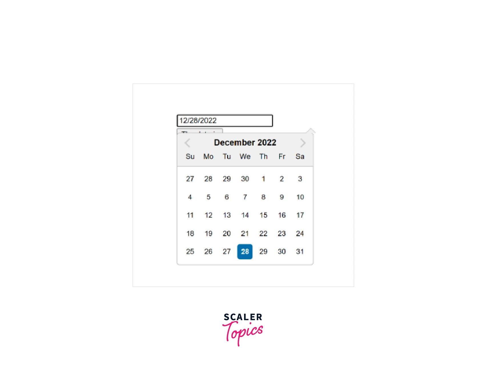
Here, in the above code, we first imported the Datepicker package. We have also used CSS from external packages so that the Datepicker looks good on the screen. We have then written a function handleChange which was then bonded to handle change and submit the component. The above events will be triggered when the user submits or changes the values. After it, we initialized the datepicker form state. The output is in the form of a calendar format.
Localization
If we want to localize the date, we will make it dependent on internationalization. We will be using the date-fns library to localize the elements. The default is en-US localization. We will first need the date-fns library import in our project.
The three ways in which we can set the locale are-
- registerLocale (string, object)- It is used to load an imported locale object from date-fns
- setDefaultLocale (string)- It is used to set a registered locale as the default for all datepicker instances
- getDefaultLocale- It is used to return a string showing the currently set default locale
Example-
Output-
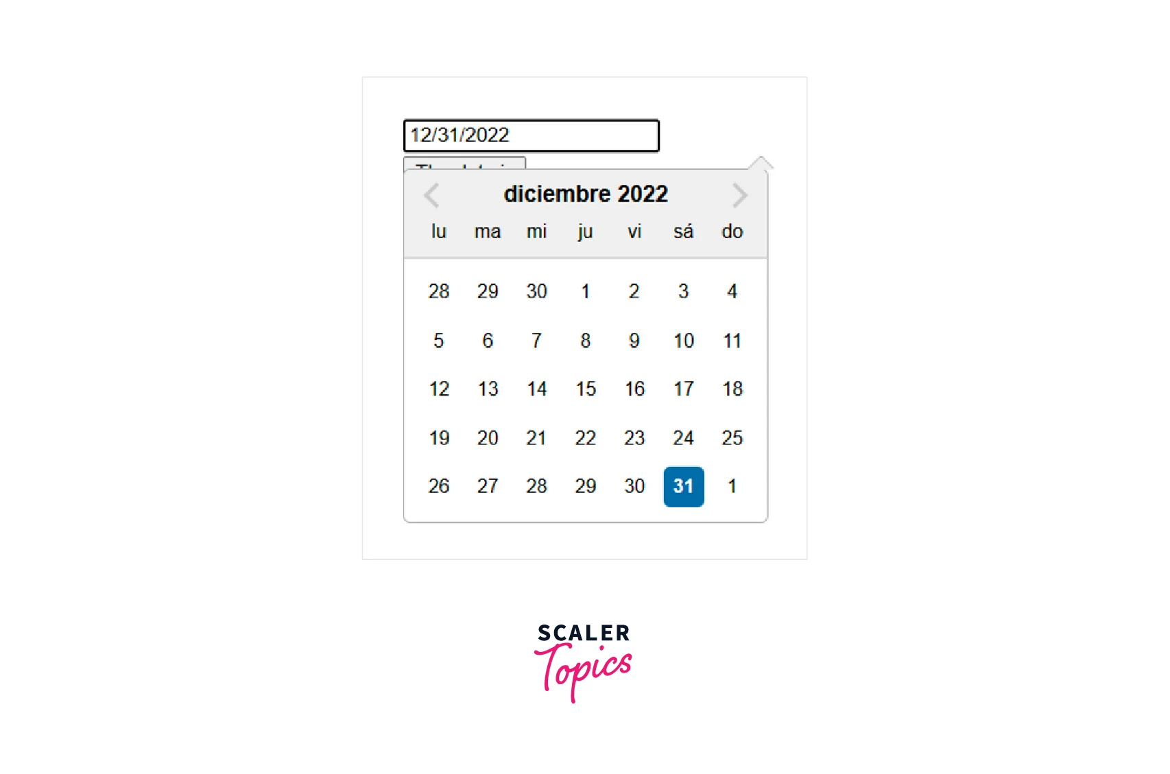
As you can see in the above image, we have set the local date using the registerLocale function. Here we have set the language as Spanish whose code is 'es'. We can see the calendar in Spanish which is set for us.
Setting Calendar date range in Datepicker
We will define a particular range in Datepicker. We will import the addDays API from the date-fns library. So, we will be using the minDate() and maxDate() functions to set the minimum and maximum date limits. We will use the addDate() function. The addDate() function takes in two parameters- the date to be updated and the number of days to be added to that date.
Example-
Output-
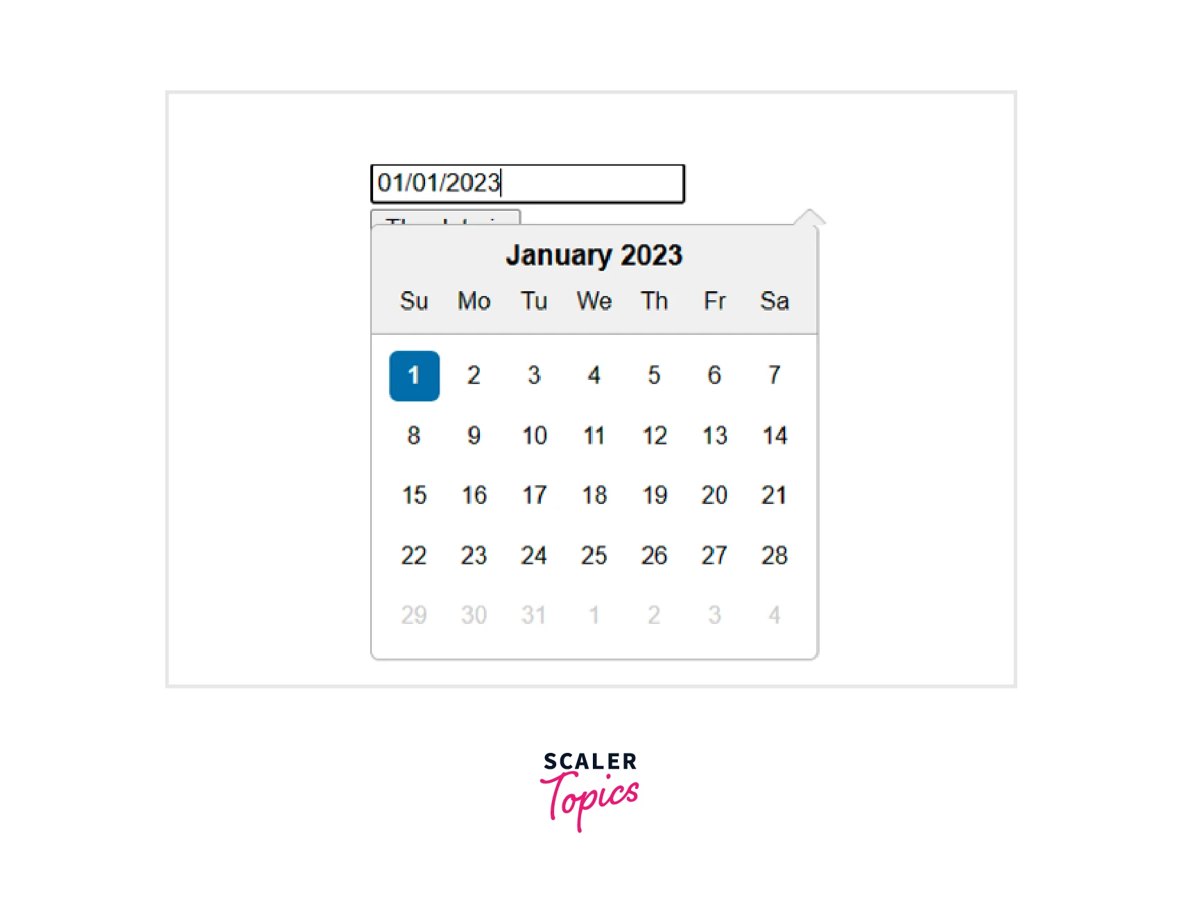
As you can see, the minimum date is set to the current date, and the maximum days are set to the current date + 27 days. The user can pick any date within the range.
Sub-Components
In subcomponents, we will be defining components inside components.
Example-
Output-
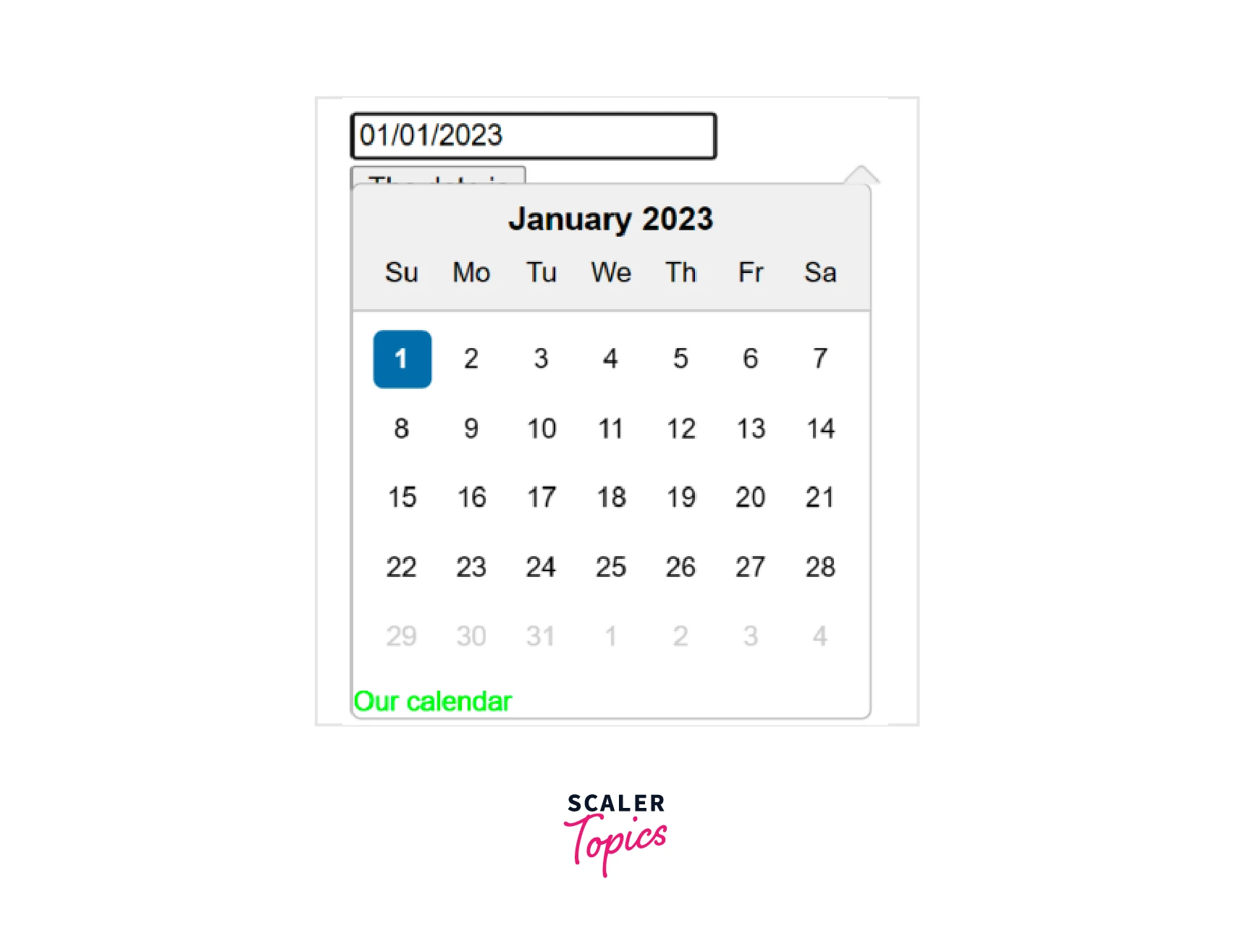
Here in the code, we have created a datepicker component and then we have declared another component div that we have styled that appears inside it.
Custom Input Component
Here we have created a custom input using a button. Earlier, we could change the value but here, we have to choose a custom input from the dates.
Example-
Output-
Conclusion
- The React date picker is a React component that displays dates on the screen in the calendar dialog format.
- The React date picker is used to pick days, months, years, or decades.
- We can install the React date picker component, we need to do it through npm(Node Package Manager) or Yarn.
- The React date picker is dependent on date-fns internationalization to display the local components. By default, the language setting is English.
- The React date picker package was earlier using Moment.js till version 1.8.0, but later they switched to date-fns.
- The date picker component is compatible with the latest versions of React.
- The basic step is to import packages related to the date picker library. We will import React and the Component library from React. The date picker and packages related to the date picker will also be installed.
- We can use the date picker using sub-components, form props, localization, and custom input-components, and can also set the date range.
 Google
 Amazon
 Microsoft
 Flipkart
 Adobe1200+ more