React-Dropdown
Overview
Dropdowns are UI components used to display a list of options in a compact format that can be opened and closed on demand. They are commonly used in forms, navigation menus, and other user interfaces where users need to choose from a list of options. The dropdown can be implemented in a react application in many different ways, and we will be seeing how it is implemented using a library called react-dropdown.
Introduction
React-Dropdown is a highly customizable and simple dropdown component for React. It allows developers to create a react dropdown menu for their web application that can be triggered by a button or a link. The component provides a list of options to select from, and it can be styled according to the needs of the application. React-Dropdown supports keyboard navigation, and search functionality, and works with a wide range of event handlers and callbacks to provide maximum control and customization to the developer.
Why do You Need React-Dropdown?
React-Dropdown is needed when a web application requires a dropdown menu for selection to a React application without having to write complex code. It provides an easy way to add a dropdown component to a React application, with many customizable options for styling, behavior, and interaction so it can be tailored to meet the specific needs of the application.
Having a dropdown menu can simplify the UI of the application provided by react dropdown, making it more user-friendly and efficient. A dropdown menu can be used for tasks such as selecting a language, a category, a date, or a range of values. With React-Dropdown, developers can add a dropdown menu with minimal code and maximum flexibility, making it a convenient and powerful tool for building user-friendly applications.
By using a standardised dropdown component, developers can ensure that the look and behavior of dropdown menus are consistent across their application. React-Dropdown supports keyboard navigation and accessibility, ensuring that users with disabilities can interact with the dropdown menu effectively. React-Dropdown is a reusable component that can be easily added to multiple parts of an application, reducing development time and effort.
Installation
To install react-dropdown use the following command in your terminal:
Alternatively,
Transform Your Career
Choose from our industry-leading programs designed for career success
Modern Software and AI Engineering Program
Master full-stack development with AI integration

 +1000 more
Modern Data Science and ML with specialisation in AI
Advanced data science techniques with AI specialization
+1000 moreAdvanced AIML with Specialisation in Agentic AI
Deep dive into AIML with focus on Agentic systems
+1000 moreDevOps, Cloud & AI Platform Engineering
Build and manage AI-powered cloud infrastructure
+1000 moreAI Engineering Advanced Certification by IIT-Roorkee
Premier AI engineering certification from IIT-Roorkee
Usage
An example code to see the usage of react-dropdown is mentioned below:
In the code above, we first import the Dropdown component from react-dropdown. Then we define an array called options which stores all the options that we want to display in our dropdown, and we pass that array in a prop called options. The value prop is used to return the selected value, and also it sets the default value of the dropdown, which is the value that would already be selected. placeholder prop contains a string that will be displayed until an option is selected. onChange is the callback that is triggered whenever any item is selected in the react dropdown.
Note that we have also included a CSS file called style.css which is residing inside the react dropdown directory. It contains styling for some particular classes, which you can customise as per your need. The CSS file looks something like this:
In the CSS above you can observe various classes. So let us understand about how they work. The Dropdown-control class is applied when we use controlClassName(you will learn about this in detail in the following sections of the article). When this class is applied properties like padding, border, color etc. are also applied. Similary all the classes mentioned here are default classes and can be applied as well as customised as needed.
Options
All the elements that we want to display in the react dropdown are stored inside the options array, which we pass to the options prop. There are two ways in which we can declare this array:
Flat Array Options
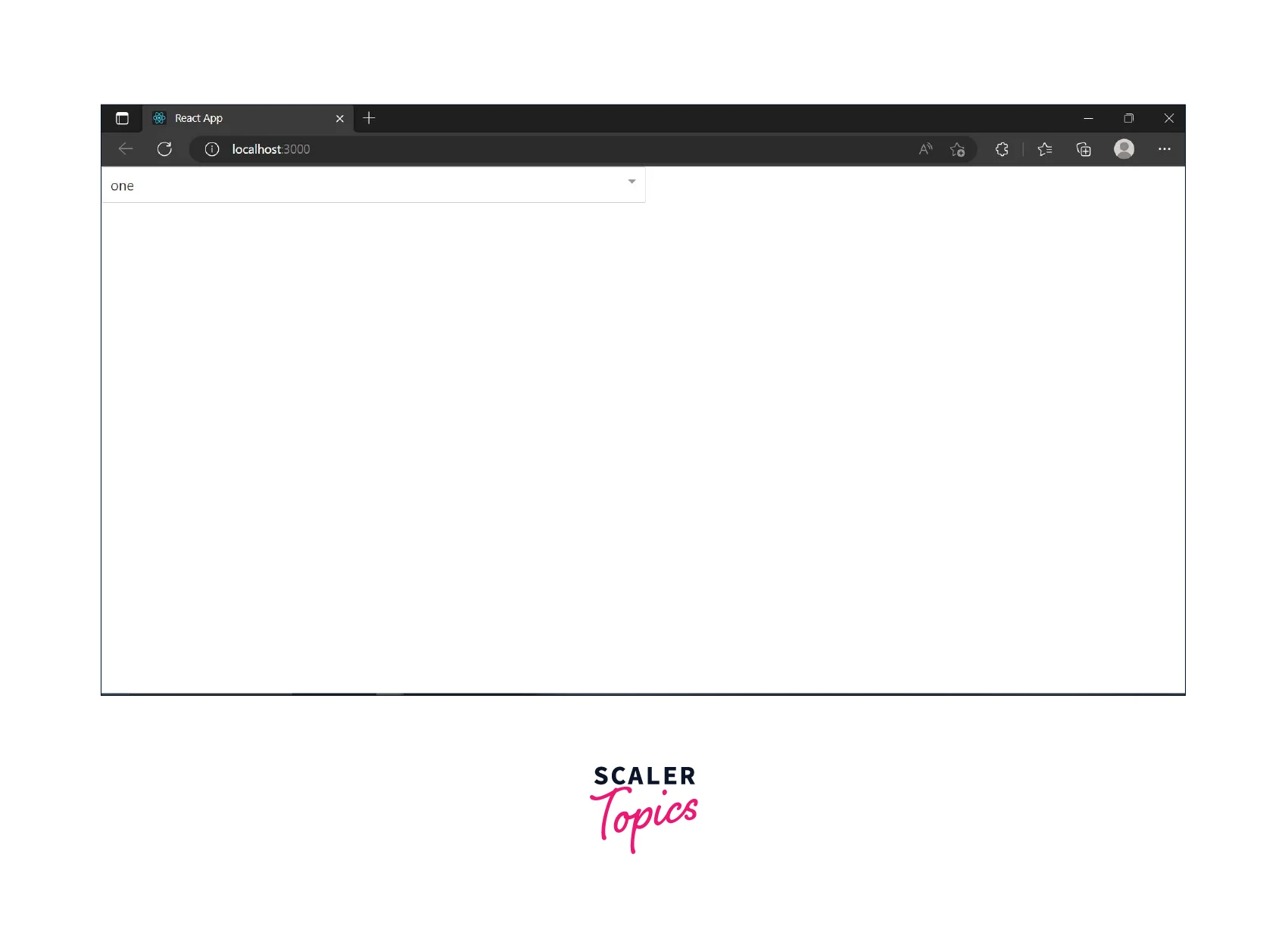
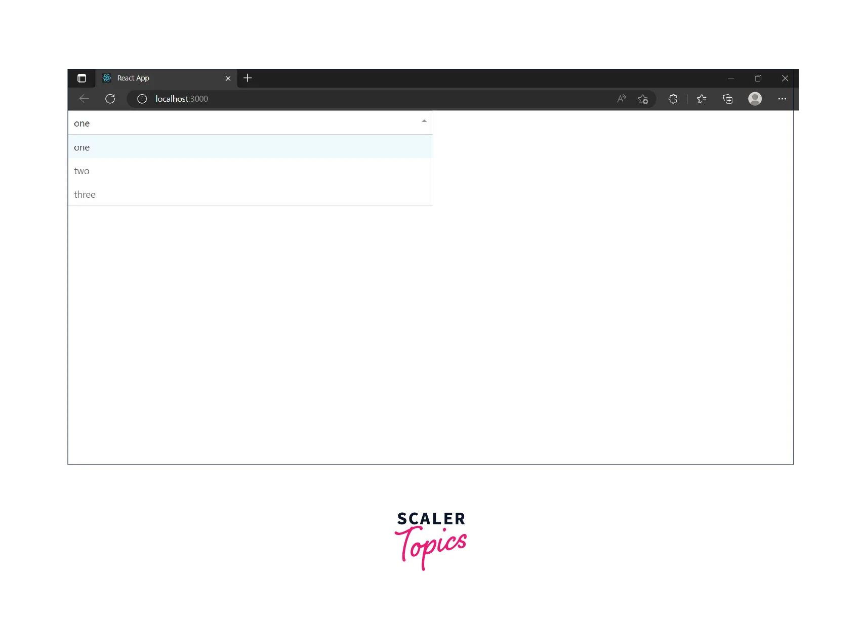
This is a simple way where we declare an array in the following way:
Object Array Options
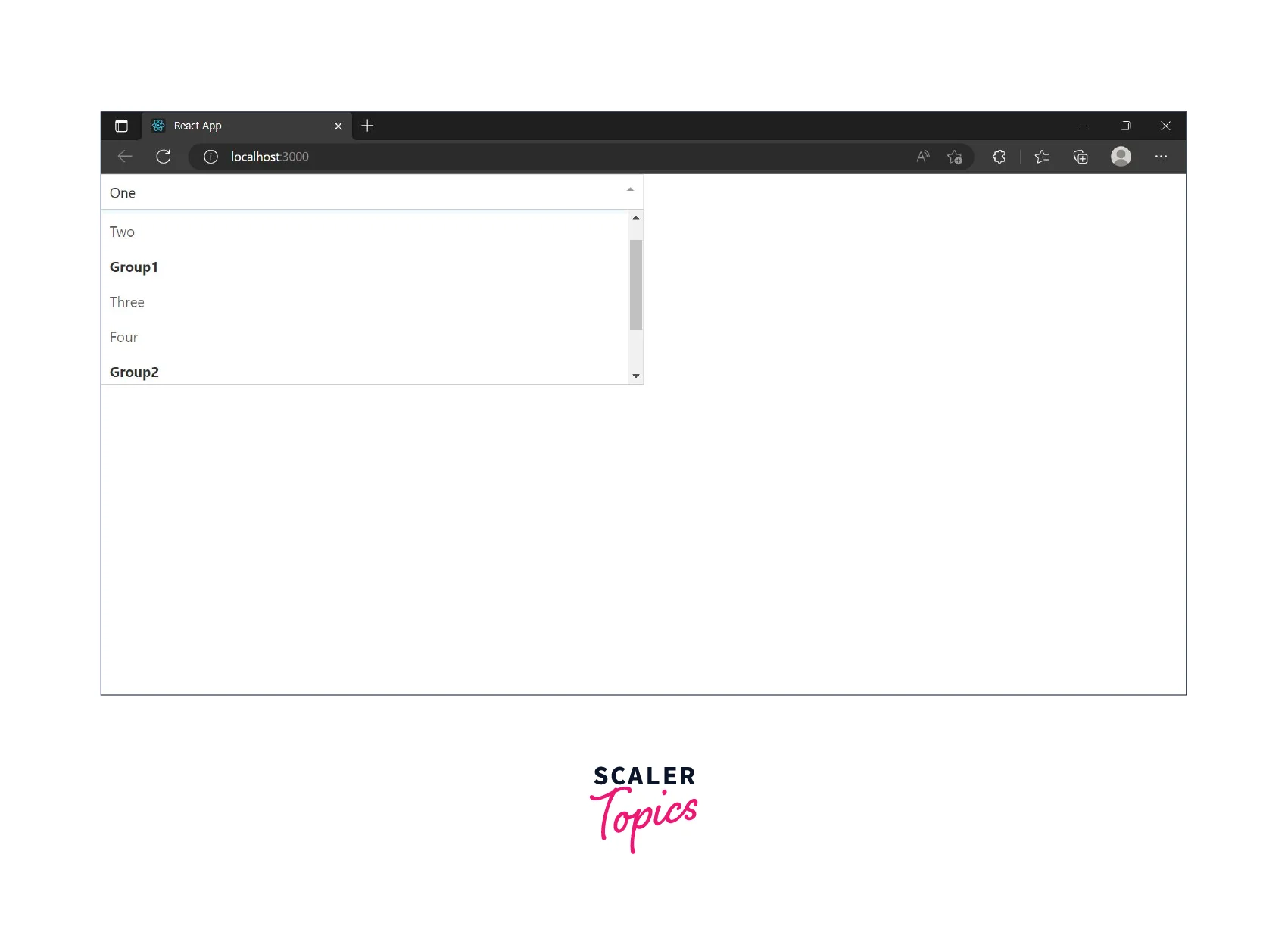
The other method is to declare an array of objects. This method is very helpful when you want to display elements in groups.
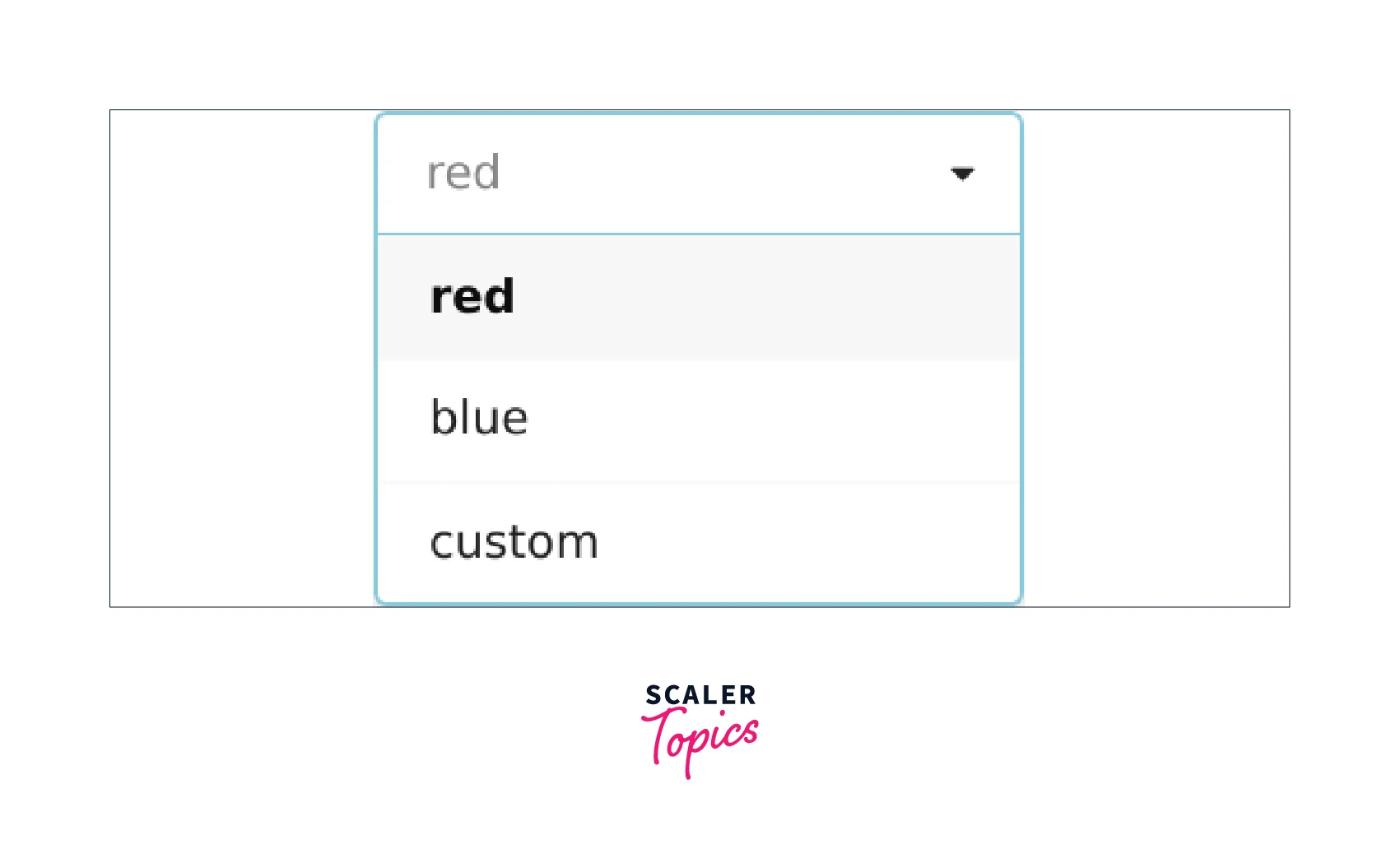
You can observe that className is used in the example above. You can use classes to further customise the options(change color, add icons etc.). This provides greater flexibility to the user to customise the dropdown.
Disabling the Dropdown
react-dropdown provides an easy way to disable the dropdown(you cannot use the dropdown to select a value). It can be done by passing the disabled boolean value to our Dropdown component. This functionality is useful when you want the dropdown to be active only when certain conditions are met, for eg. a checkbox is clicked.
Also, a class called .Dropdown-disabled is passed when you pass this disabled prop, so you can define the class and give whatever styling you want when your dropdown is disabled.
Turn Learning into Career Growth
Customizing the Dropdown
React-Dropdown provides several ways to customize the appearance and behavior of a dropdown menu. Here are some of the most common customization options:
Styling: The appearance of the dropdown menu can be customized using CSS styles. React-Dropdown provides several class names that can be used to style the different parts of the component, such as the menu, the menu items, and the selected item.
Options: The options that appear in the dropdown menu can be dynamically generated from data or hardcoded in the component. React-Dropdown allows developers to specify the options as an array of objects, each with a value property.
Callbacks: React-Dropdown supports event handlers and callbacks, such as onChange, which allow developers to respond to user interactions with the component and implement custom behavior.
Props: React-Dropdown provides a range of props that can be used to control the behavior and appearance of the component. For example, the placeholder prop can be used to specify the default text displayed in the dropdown before a selection is made, and the disabled prop can be used to disable the component.
By combining these customization options, developers can create a dropdown menu that fits their specific requirements and enhances the user experience of their application.
ClassName
className is a prop in React-Dropdown that allows you to specify a custom class name for the entire dropdown component. By using the className prop, you can apply custom styles to the dropdown component, such as changing the background color, font, etc. The custom class name will be used in conjunction with the default class names provided by React-Dropdown, so you can extend the default styles or override them completely.
Here is an example of how you can use className to customize the dropdown component:
In this example, a custom class name custom-dropdown is applied to the entire dropdown component, which can be used to style the dropdown in CSS.
ControlClassName
controlClassName is a prop in React-Dropdown that allows you to specify a custom class name for the control element of the dropdown. The control element is the button or link that opens and closes the dropdown menu and displays the selected option.
By using the controlClassName prop, you can apply custom styles to the control element, such as changing the background color, border radius, font size, etc. Similar to the className, the controlClassName will be used in conjunction with the default class names provided by React-Dropdown, so you can extend the default styles or override them completely.
Here is an example of how you can use controlClassName to customize the control element:
In this example, a custom class name custom-control is applied to the control element, which can be used to style the control in CSS.
PlaceholderClassName
placeholderClassName is a prop in React-Dropdown that allows you to specify a custom class name for the placeholder element of the dropdown. The placeholder element is the text that is displayed in the control element when no option is selected.
By using the placeholderClassName prop, you can apply custom styles to the placeholder element, such as changing the font size, color, etc. The placeholderClassName will be used in conjunction with the default class names provided by React-Dropdown, so you can extend the default styles or override them completely.
Here is an example of how you can use placeholderClassName to customize the placeholder element:
In this example, a custom class name custom-placeholder is applied to the placeholder element, which can be used to style the placeholder in CSS.
MenuClassName
menuClassName is a prop in React-Dropdown that allows you to specify a custom class name for the dropdown menu. This class name will be added to the HTML element that contains the options of the dropdown menu.
By using the menuClassName prop, you can apply custom styles to the dropdown menu, such as changing the background color, border radius, font size, etc. The menuClassName will be used in conjunction with the default class names provided by React-Dropdown, so you can extend the default styles or override them completely.
Here is an example of how you can use menuClassName to customize the dropdown menu:
In this example, a custom class name custom-menu is applied to the dropdown menu, which can be used to style the menu in CSS.
ArrowClassName
arrowClassName is a prop in React-Dropdown that allows you to specify a custom class name for the arrow element of the dropdown. The arrow element is the small triangle that is displayed in the control element and indicates whether the dropdown menu is open or closed.
By using the arrowClassName prop, you can apply custom styles to the arrow element, such as changing the color, size, etc. The arrowClassName will be used in conjunction with the default class names provided by React-Dropdown, so you can extend the default styles or override them completely.
Here is an example of how you can use arrowClassName to customize the arrow element:
In this example, a custom class name custom-arrow is applied to the arrow element, which can be used to style the arrow in CSS.
ArrowClosed, ArrowOpen
arrowClosed and arrowOpen are props in React-Dropdown that allow you to specify custom elements for the closed and open arrow, respectively. The arrow element is the small triangle that is displayed in the control element and indicates whether the dropdown menu is open or closed.
By using the arrowClosed and arrowOpen props, you can replace the default arrow with your own custom elements. For example, you could use an SVG icon or an HTML character.
Here is an example of how you can use arrowClosed and arrowOpen to customize the arrow:

In this example, the default arrow is replaced with HTML characters for the closed and open arrow.
Conclusion
In this tutorial, we have covered the following points:
- react-dropdown is a highly customizable and simple dropdown component for React. It allows developers to create a dropdown menu for their web application that can be triggered by a button or a link.
- react-dropdown leads to writing fewer lines of code, highly customisable UI, better accessibility, and greater reusability.
- There are two ways to define the options list for the dropdown:
- Flat Array
- Object Array
- To disable the dropdown you need to pass the disabled boolean value, which also passes a .Dropdown.disable class to the component.
- There are various props offered by react-dropdown to customise dropdown in react like: className, controlClassName, placeholderClassName, menuClassName, arrowClassName, arrowClosed, and arrowOpen.
 Google
 Amazon
 Microsoft
 Flipkart
 Adobe1200+ more