React Icons
Overview
Icons are small graphical elements that are used to help users understand the functionality of a user interface or application. They are often used in combination with text labels to provide a clear and concise representation of a particular function or feature. The use of icons can help to create a more intuitive and user-friendly interface. In react, we can use react icons to do so.
What are React Icons?
React icons are icons that can be used in a React application. They are typically implemented using libraries such as react-icons, which provides a collection of popular icon libraries (such as Font Awesome, Material Design, and Octicons) that can be easily used in a React application. These libraries include pre-built components that can be imported and used in your application to display the icons.
Transform Your Career
Choose from our industry-leading programs designed for career success
Modern Software and AI Engineering Program
Master full-stack development with AI integration

 +1000 more
Modern Data Science and ML with specialisation in AI
Advanced data science techniques with AI specialization
+1000 moreAdvanced AIML with Specialisation in Agentic AI
Deep dive into AIML with focus on Agentic systems
+1000 moreDevOps, Cloud & AI Platform Engineering
Build and manage AI-powered cloud infrastructure
+1000 moreAI Engineering Advanced Certification by IIT-Roorkee
Premier AI engineering certification from IIT-Roorkee
Installation
To install react-icons in your React application using npm, you can run the following command in your terminal:
npm install react-icons
This command will install the react-icons package in your project and make it available for use in your components.
You can also use the yarn package manager to install react-icons by running the command:
yarn add react-icons
Once the installation is complete, you can import and use the icons in your components. Please note that in addition to react-icons, you may also need to install the specific icon library you want to use, if it is not included in the react-icons package. For example, to use Font Awesome icons, you will also need to install the font-awesome package.
a) Usage
React icons can be used in a variety of ways within a React application, including:
- Navigation: Icons can be used to help users quickly and easily find the page or feature they are looking for.
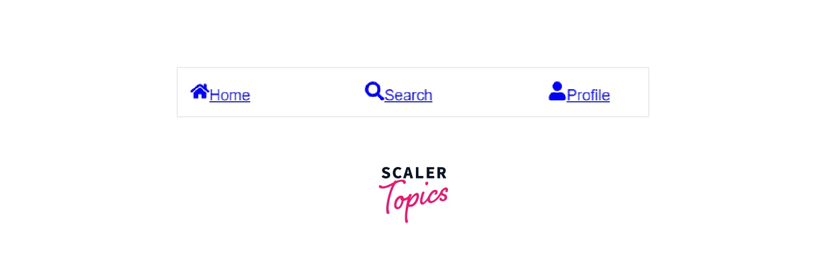
Explanation
Here we have created a navigation bar using react-icons (FaHome,FaSearch,FaUser).It will result in:
- Buttons: Icons can be used as the main visual element of a button, making it easy for users to understand the action that will be performed when the button is clicked.


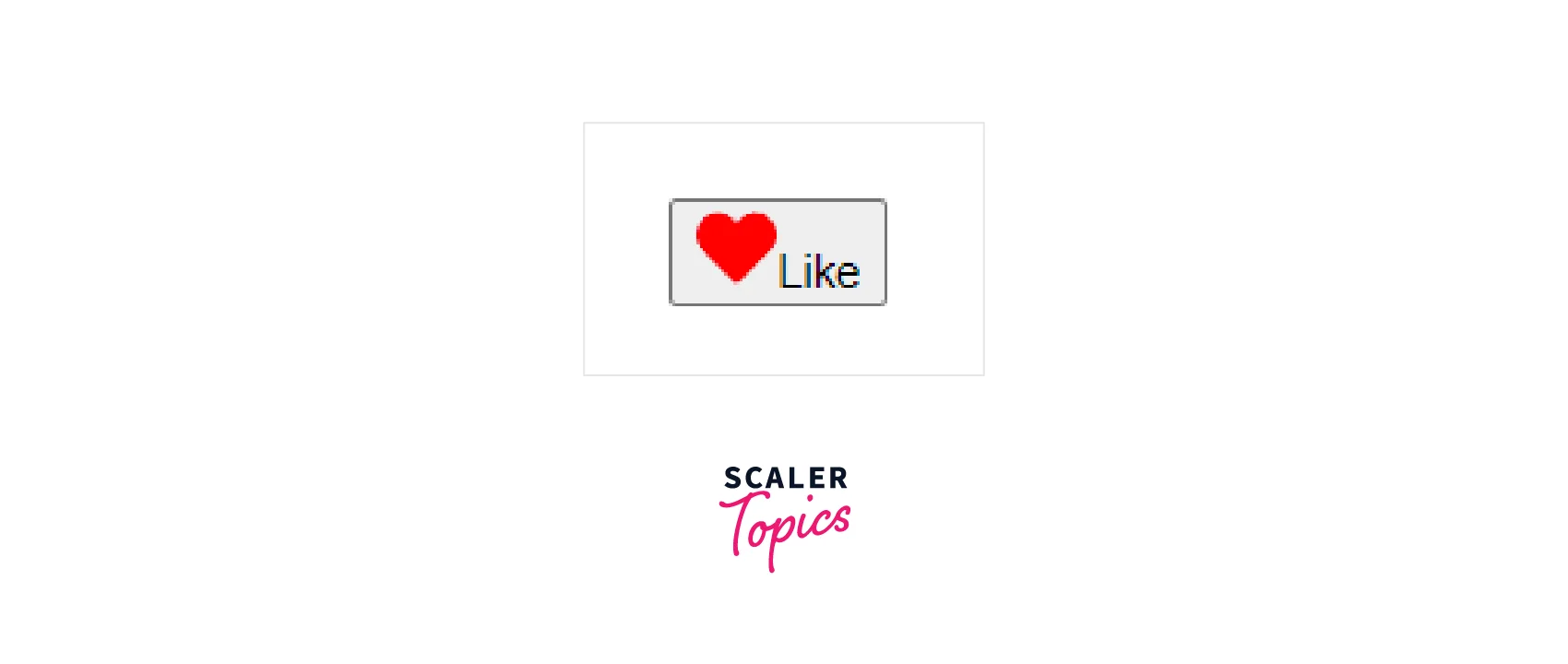
Explanation
Here we have created a like button using react-icons(FaHeart). It will result in :
- Indicators: Icons can be used to indicate the status of an element or feature, such as a checkmark to indicate that a task is complete.
Explanation
Here we have created a loading Indicator using react-icons(FaSpinner). It will result in :
- Direct manipulation: Icons can be used to represent actions that can be performed on an element, such as a trash can icon to indicate that an element can be deleted.
Scaler Placement Report and Statistics
Scaler learners achieved 2.5x salary growth with average post-Scaler CTC reaching ₹23L.
 Google
 Amazon
 Microsoft
 Flipkart
 Adobe1200+ more
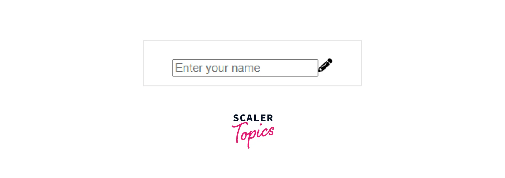
Explanation
Here we have created an Input manipulator component using react-icons(FaPencilAlt). It will result in :
- Informational: Icons can be used to provide additional information about an element or feature, such as a small information icon that reveals more details when clicked.
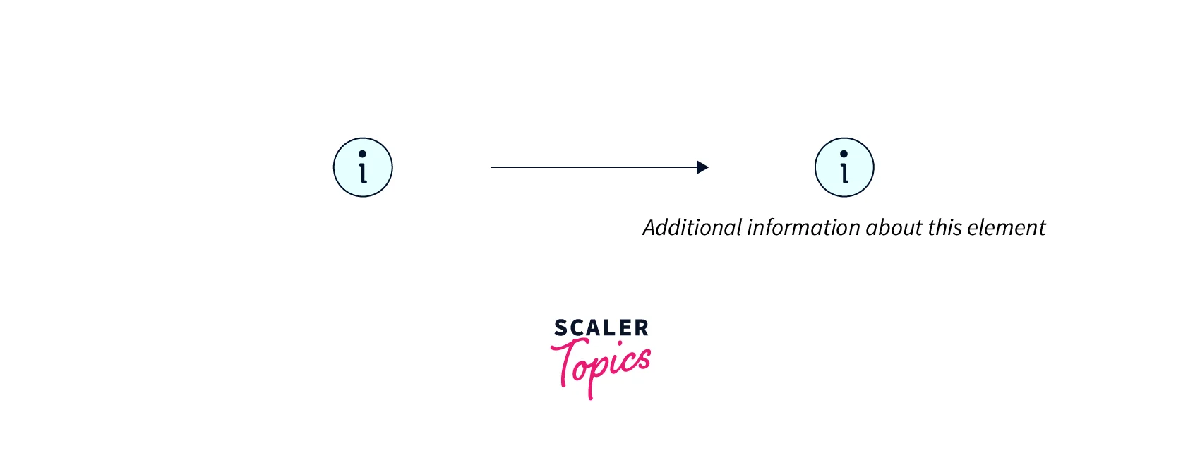
Explanation
Here we have created an Informational component using react-icons(FaInfoCircle). It will result in
The use of React icons can help to create a more intuitive and user-friendly interface by providing a visual representation of different functions and features. It also allows developers to utilize pre-built icons rather than creating custom icons every time.
Importing React Icons
There are different ways to import react-icons in your React application, depending on the icon library you are using and the way your project is set up. Here are a few examples of how to import different icon libraries from the react-icons package:
- Font Awesome: import { FaIconName } from 'react-icons/fa'
- Material Design: import { MdIconName } from 'react-icons/md'
- Ionicons: import { IoIconName } from 'react-icons/io'
- Octicons: import { GoIconName } from 'react-icons/go'
- Typicons: import { TiIconName } from 'react-icons/ti'
- Feather: import { FiIconName } from 'react-icons/fi'
You can also import all icons from a library by using the * wildcard import. import { Fa } from 'react-icons/fa'
Once you have imported all the icons, you can use them in your component by referencing the library name and the icon name like this: <Fa.IconName />
It is important to note that you may also need to configure your project to load the icons and styles correctly, depending on the icon library you are using. Some libraries may require you to include the CSS file in your project, while others may not. You may also need to install the specific library separately if it is not included in the react-icons package to use react icons.
Turn Learning into Career Growth
Available React Icons
React icons is a library that provides a wide range of popular icon libraries that can be easily used in a React application. Some of the most commonly used icon libraries that are available through react-icons include:
- Font Awesome: One of the most popular icon libraries, Font Awesome provides a wide range of scalable vector icons that can be customized using CSS.
- Material Design: Google's Material Design icons are designed to work well with the Material UI framework and are available in two different styles: filled and outlined.
- Ionicons: Ionicons is a library of open-source icons that were originally designed for use with the Ionic framework.
- Octicons: Octicons is a library of icons that were originally designed for use with GitHub.
- Typicons: Typicons is a library of scalable vector icons that are available in two different styles: filled and outlined.
- Feather: Feather is a collection of lightweight and customizable icons.
- EvilIcons: EvilIcons is a library of scalable vector icons that can be easily customized using CSS.
- LinearIcons: LinearIcons is a library of scalable vector icons that can be easily customized using CSS.
- SimpleLineIcons: SimpleLineIcons is a library of scalable vector icons that can be easily customized using CSS.
- Zocial: Zocial is a library of icons that were designed to be used as social media icons.
Please note that this list is not exhaustive and other icon libraries can also be used with the react-icons package.
Icon Styling
Icon styling in react-icons refers to the process of customizing the appearance of icons in a React application. This can include changing the size, color, and other properties of the icons to match the design of the application.
React icons allows you to style the icons in a variety of ways to match the design of your application. Here are a few ways that you can customize the appearance of your icons:
- Using Props: You can use props to change the size, color, and other properties of the icon. For example, you can change the color of an icon to red by passing a color prop like this: <FaIconName color='red'/>
- Using CSS: You can use CSS to style the icons. You can target the icon's class name and apply styles to it. For example, if you want to increase the size of all Font Awesome icons in your application, you can use the following CSS:
Explanation
This CSS will result in setting the font size of all fa react-icons equal to 32px.
- Using Styled-components: You can use the popular library styled-components to style your react-icons. This way, you can use the power of CSS-in-JS to style your icons. For example:
Explanation
This styled component will result in setting the font size and color of all fa react-icons equal to 32px and red respectively.
- Using CSS Modules: You can use CSS modules to scope your styles to the component level. This way, you can avoid class name conflicts and also style your icons.
- Using CSS-in-JS libraries: You can use CSS-in-JS libraries like emotion, JSS, or styled-jsx to style your icons.
It's important to note that some of the icon libraries may have their specific way to style the icons. For example, Material Design icons have different CSS classes for different variants of icons. So, it's important to check the library's documentation for more information.
Beyond JavaScript Basics: Our Full Stack Web Developer Course Guides You Through Advanced Techniques. Enroll Now & Transform Your Coding Expertise.
Conclusion
In this article, we have learned about react icons, which include:
- React-icons is a library for icons in React project.
- React icons can be installed by using the react-icons package.
- React icons can be used to add icons to buttons, navigation menus, forms, and other elements in a React application.
- They can be used to improve the visual design and user experience of the application.
- React-icons includes a wide variety of icons from popular icon sets such as Font Awesome, Material Design, and Octicons.
- React-icons icons can be styled using CSS, which allows for full control over the icon's appearance.