React Material UI
Overview
Creating a visually stunning website requires extensive designing of basic HTML elements and a lot of time, but we can easily achieve this using the react material UI library which provides designed HTML and other helper components that can be utilized to create a responsive and visually stunning website without writing code for the majority of components or using other class libraries.
Introduction
Material UI is an open-source react library that provides designed components that can be used as an alternative to basic HTML elements and also other advanced components that are useful to implement animations, alignment of components, and other features. All the components of material UI have been well documented with multiple examples that can be implemented directly in our application.
Transform Your Career
Choose from our industry-leading programs designed for career success
Modern Software and AI Engineering Program
Master full-stack development with AI integration

 +1000 more
Modern Data Science and ML with specialisation in AI
Advanced data science techniques with AI specialization
+1000 moreAdvanced AIML with Specialisation in Agentic AI
Deep dive into AIML with focus on Agentic systems
+1000 moreDevOps, Cloud & AI Platform Engineering
Build and manage AI-powered cloud infrastructure
+1000 moreAI Engineering Advanced Certification by IIT-Roorkee
Premier AI engineering certification from IIT-Roorkee
Prerequisite
The prerequisite for creating a react material UI application is,
- NodeJS installed in your machine. NodeJS is a JavaScript runtime that is used to run web applications.
- A code editor like VScode or any other alternatives.
- Basic knowledge about the basic concepts of react and how to create a react app.
- Fundamentals of designing with CSS.
- Basic knowledge of package managers like npm and yarn. You can learn more about the installation and usage of package manager in this article Npm and Yarn.
Installation
- The material UI library can be installed using either npm or yarn package manager. Material UI has a lot of react components and is separated into different packages. The material is the main package that has most of the components needed to design a website. We can install the library by using the following npm command,
We can use the following command to install the library using the yarn package manager,
The above command also installs another package called emotion that uses CSS in javascript for styling. Material UI is built based on the styling of components using the emotion library, but we can also change this to styled components by installing the styled components library, which is also another javascript-based CSS styling library.
When the above command is used instead of the previous command, material UI uses styled components as its styling engine to provide styled components.
- The @mui/lab package has all the experimental components that are ready to be used, but still accepts reviews and works towards improvements. We can download the library using the following commands,
- The @mui/x-data-grid package provides advanced components like data tables that help to display tables as a grid and modify them. This package also has a commercial version with many features and options. We will only look into the open-source or free version of this package,
- The @mui/icons-material package provides multiple icons with different formatting and colors to be used in our application.
Note : While searching for material UI, you can also see a package named @material-ui/, which is an older version. All packages of the current version are named with @mui/.
Features of Material UI
The material UI library provides user-friendly design and provides multiple options for customizations and designs,
- Material UI provides stunning UI which reduces the overall time spent in designing a website.
- Every design made into the component can be modified and customized according to our needs.
- Easy to learn and simple to use allows collaboration to be more effective.
- Executes fast in any environment and works with any theme on a website.
- Allows prop-based dynamic styling, theming, responsive styling with breakpoints, and much more.
- Material UI is the largest react UI library and provides the best community support.
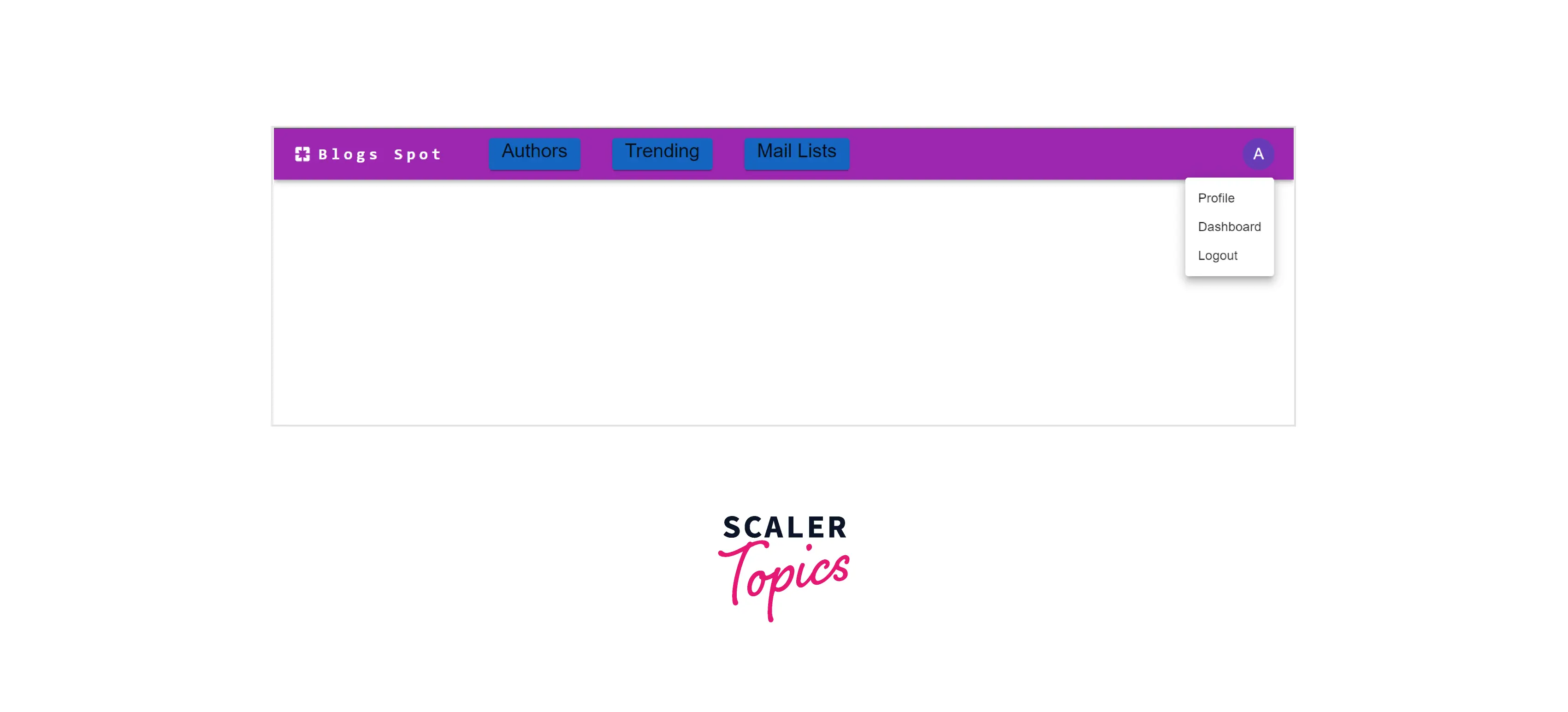
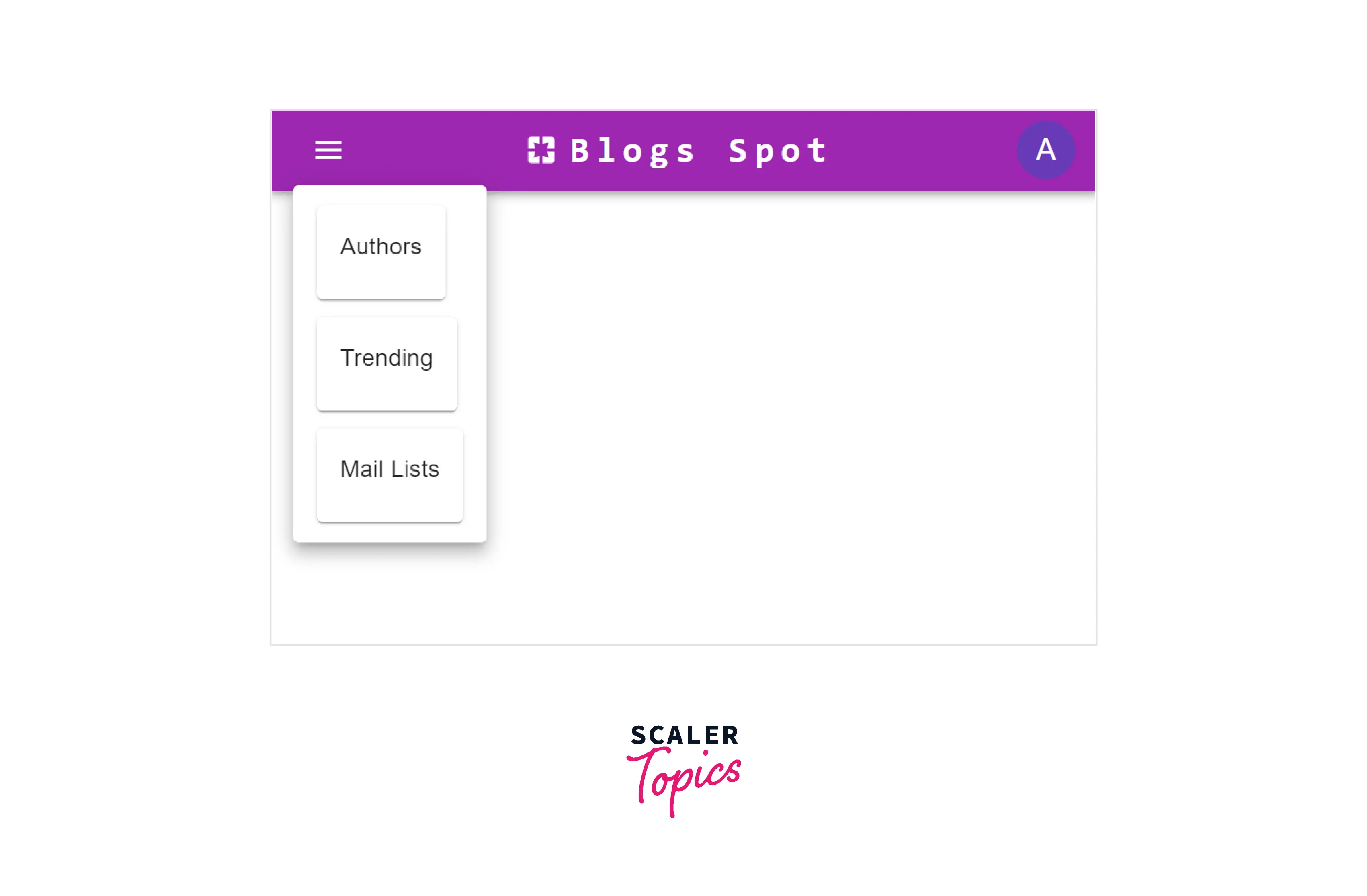
Working Example
The first step in designing a landing page or dashboard of a website is to create a user-friendly navbar with a responsive design for mobile users. The navbar component is easily accessible and usually has all the important links for the website. Let us build such a navbar using this example,
Code
Scaler Placement Report and Statistics
Scaler learners achieved 2.5x salary growth with average post-Scaler CTC reaching ₹23L.
Explanation
Let us look at each component of the navbar separately to understand this further.
- The AppBar is the component that is used to create a navbar in material UI.
- An Container is a component like div which is used to hold multiple children components. Material UI has predefined sizes like xl for extra large, md for medium, etc...
- An Toolbar is a flex container with row orientation that is used to set up icons and buttons in a navbar. The disableGutters prop is used to remove the left and right paddings from the container.
- A Box is another wrapper component used to contain multiple children elements.
- The Typography component is used to format text. The variant prop is used to specify the type of text such as headline, paragraph, or body. We can render a component as another component using the component prop.
- The IconButton can be used as a parent component for any icons to be rendered.
- The Menu component along with the MenuItems components is used to create a menu. The anchorEl prop is used to specify the element from which the menu should pop up and the anchorOrigin prop is used to specify the direction of the popup and the transformOrigin prop is used to change the direction of the popup.
- The Tooltip element is used to show information about a component when hovered over the component.
- The Card component is used to provide a block-shaped design with a box shadow to an element.
Let us understand the implementation of the navbar design using these components,
- We have declared two states, navbarAnchor and SettingsAnchor using the useState hook of react. An anchor is used to fix the position of the menu. An anchor can be attached to a component and the menu will pop up relative to the position of the component.
- The PagesIcon is the icon imported from material Icons. The sx is similar to the style prop and is used for styling.
- In material UI, we can specify display type for different types of dimensions using breakpoints such as md(medium), lg(large), sm(small), and xs(extra small).
- For mobile views, we should configure the xs prop as flex and md and none and vice versa.
- We can configure the margins with the m and padding with p whereas the first letter of each direction is used as a suffix. For example, ml means margin-left, and pd means padding down.
- Material UI provides three colors that can be specified in the bgColor or color prop. The color primary is red, secondary is purple, and info is blue, etc... We can also import other colors from @mui/material/styles.
- The function OpenMenu changes the value of the navbarAnchor with a reference to the menu icon and similar functions are performed by other functions.
Output
Conclusion
- Material UI is an open-source react library that provides user-friendly material-designed components.
- The material UI library can be installed using any package manager and has many components to provide both simple and advanced designs.
- The material ui reactjs is easy to learn, and implement and executes fast in any environment.
- React material UI provides high customization and flexibility to each component.
- React material UI provides layout components to create responsive layouts.
- The library is well-documented and provides the best community support.
 Google
 Amazon
 Microsoft
 Flipkart
 Adobe1200+ more