React Portals
Overview
A React portal helps us to render a react component outside the react tree to achieve freedom of alignment and positioning of the component. The methodology of react involves creating a root DOM node by using any container element in the HTML document and rendering all the code inside such an element. This means that all the code that is created in a react component is rendered under a single parent component which makes showing a component above the parent component harder and more time-consuming. Various design items like modals, popups, and tooltips are required to show above a component, and react portals help us to achieve such an effect easily.
Introduction
React portals are used to render the components or elements in your react application to a DOM node that exists outside of the primary root parent component. The portal component can access and use all the properties that are available from the parent component even though the portal component is not a direct child of its parent components. Portals can make it possible for us to implement a component that has to display over another component, but is a child of another component because portals raise the hierarchical level of a component so that it will not be affected by other components' properties.
Syntax The createPortal() method from ReactDOM is used to create a portal in react. The method has the following syntax,
- The child is a react component or fragment that can be rendered in the DOM.
- The container is the reference to the element that is present in the HTML page to which the child element will be rendered.
Transform Your Career
Choose from our industry-leading programs designed for career success
Modern Software and AI Engineering Program
Master full-stack development with AI integration

 +1000 more
Modern Data Science and ML with specialisation in AI
Advanced data science techniques with AI specialization
+1000 moreAdvanced AIML with Specialisation in Agentic AI
Deep dive into AIML with focus on Agentic systems
+1000 moreDevOps, Cloud & AI Platform Engineering
Build and manage AI-powered cloud infrastructure
+1000 moreAI Engineering Advanced Certification by IIT-Roorkee
Premier AI engineering certification from IIT-Roorkee
Features
React portals can be used to render a child component in a hierarchical level higher or equal to that of its direct parent or outside the react tree and has the following features,
- Portals can prevent the effect of properties in parent components like overflow: hidden and zIndex.
- We can access and modify the properties of the parent component even though the portal component is outside the React tree. This property is also called event bubbling.
- It can be used in pop-ups and tooltips that need to show over other components.
When to Use?
The portal can be used in situations when a component should show above its parent component ignoring the CSS properties of the parent component. In modern design, these requirements are needed in modals, tooltips, floating menus, and widgets.
Before we can start exploring the implementation of portals in an application, we need to understand the HTML structure and the elements to which the react component and our portal render. To understand this we can create a react application and navigate to the public/index.html page in the created application. You can find a part of the program in the file similar to that given below,
The div element in the above code with id as root is where the react application will render all the components. To do this, we need to find the element from the document object and create a root to which we can render our components.
- The element can be found using the document.getElementById("root") function of javascript
- We can use the createRoot() function of react to create the root and finally uses the render() function to render the elements in react to the HTML page.
The following code shows this,
The root is the div element present in the HTML page and the render() method is used to render the App component.
The concept of the portal allows us to render our react component to an HTML element other than the root element. To perform this, we can modify the index.html file by adding another div element with a different id to which we can render our element. The modified part of the code in the index.html file is,
The div element with the model-root id is introduced in the code.
Modals
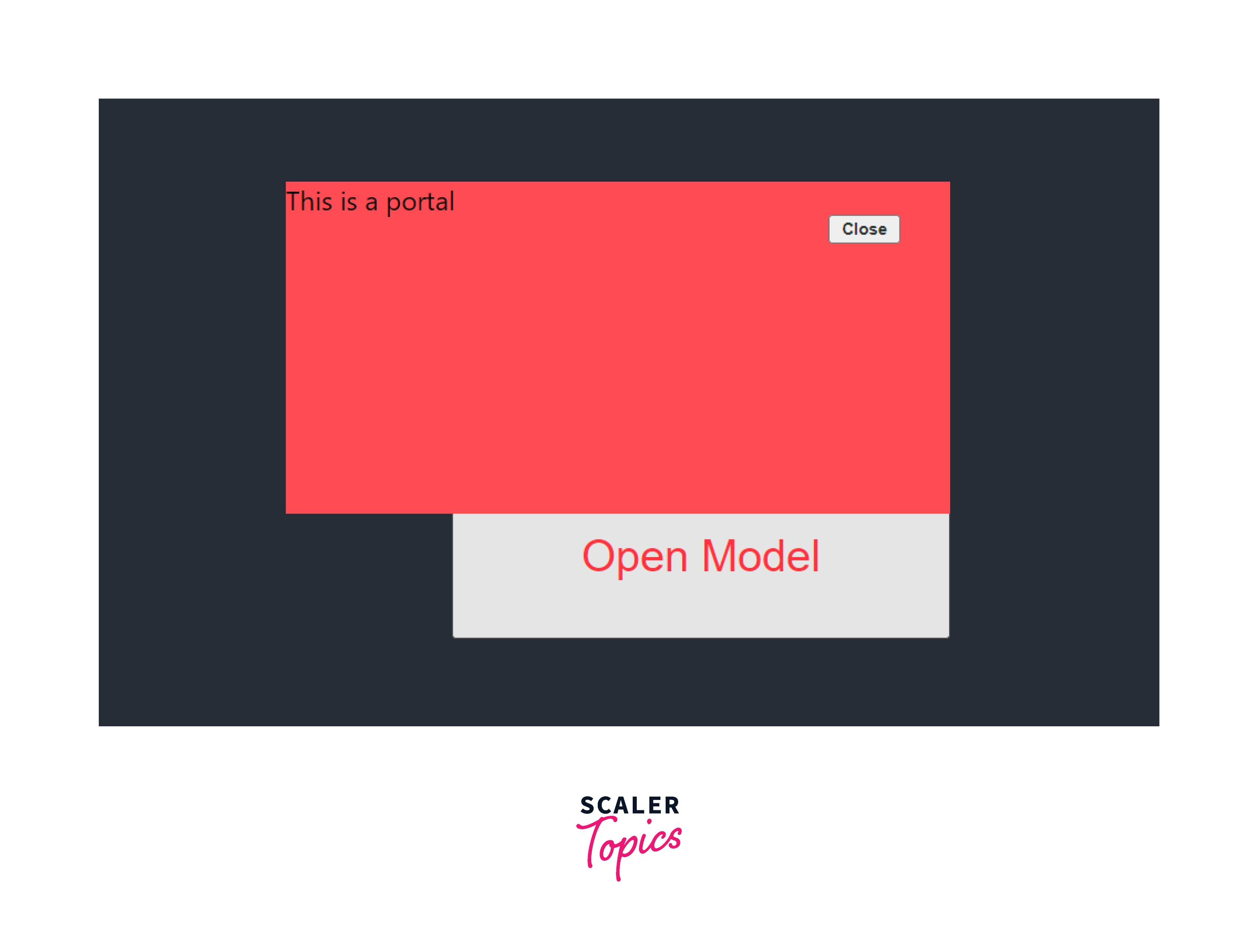
Modals are popup box that is used to show information that occurs after clicking a button or performing an action that triggers an event. We can use the ReactDOM.createPortal() function to create this model. The following code illustrates this,
Code
Explanation
- The ReactDOM.createPortal() is used to create the portal and the portal is rendered in the div element with id, modal-root.
- The portal shows when the user clicks the Open Model button.
- The useState hook is used to maintain the state of the model.
The following image shows the output of the above code,
We can understand the rendering of the portal using the following image,
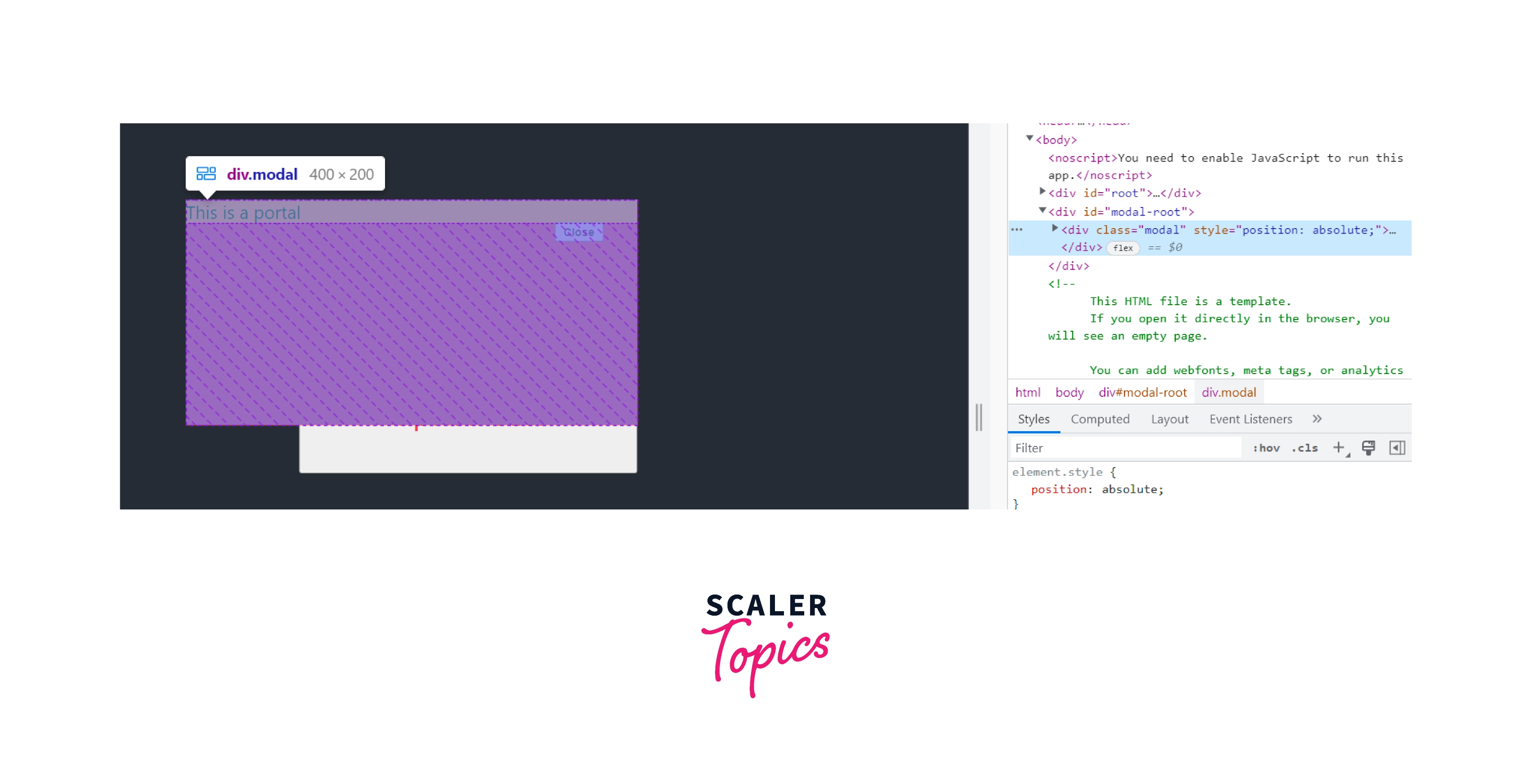
From the image, we can see that the portal is rendered in the div component with the id modal-root. The div with id, the root element represents all the react components other than the portal element.
Tooltips
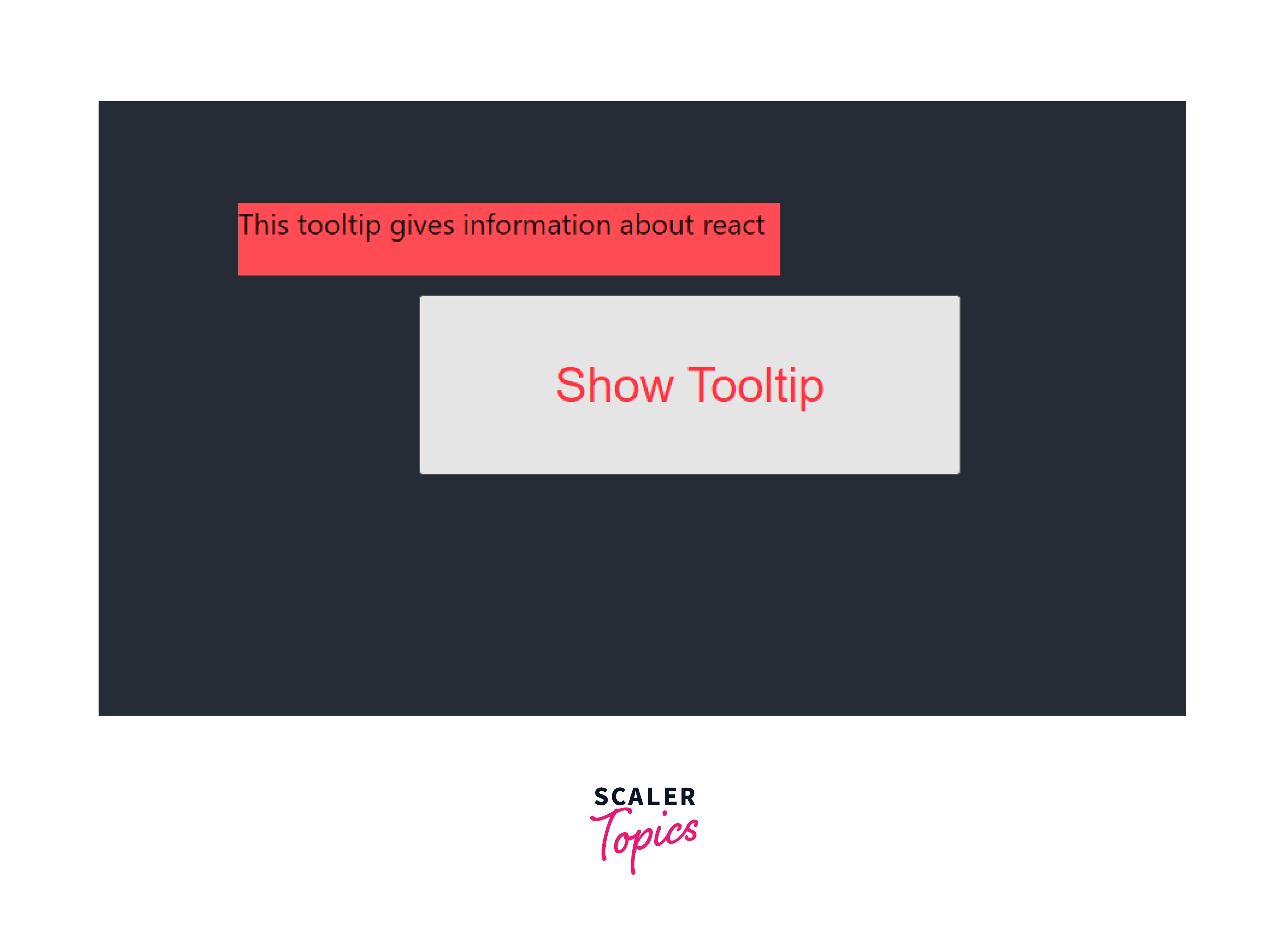
A tooltip is used to show information about a button or element when hovered over the element. A simple example of a tooltip will be to show the usage of a button when hovered over a button. Only simple changes from the previous code are required to create a tooltip using react portals. The changes are,
- We can remove the onClick event and use the onMouseEnter and onMouseLeave events to control the state of the tooltip. After modifying the button, the code will be,
- We can remove the close button from the portal component and also remove the onClose event from the pops passed to the component.
These changes can change a model to a tooltip component that can be used to show information when hovered over an element.
The image shows the output of the tooltip created using the react portal.
Turn Learning into Career Growth
Floating Menus
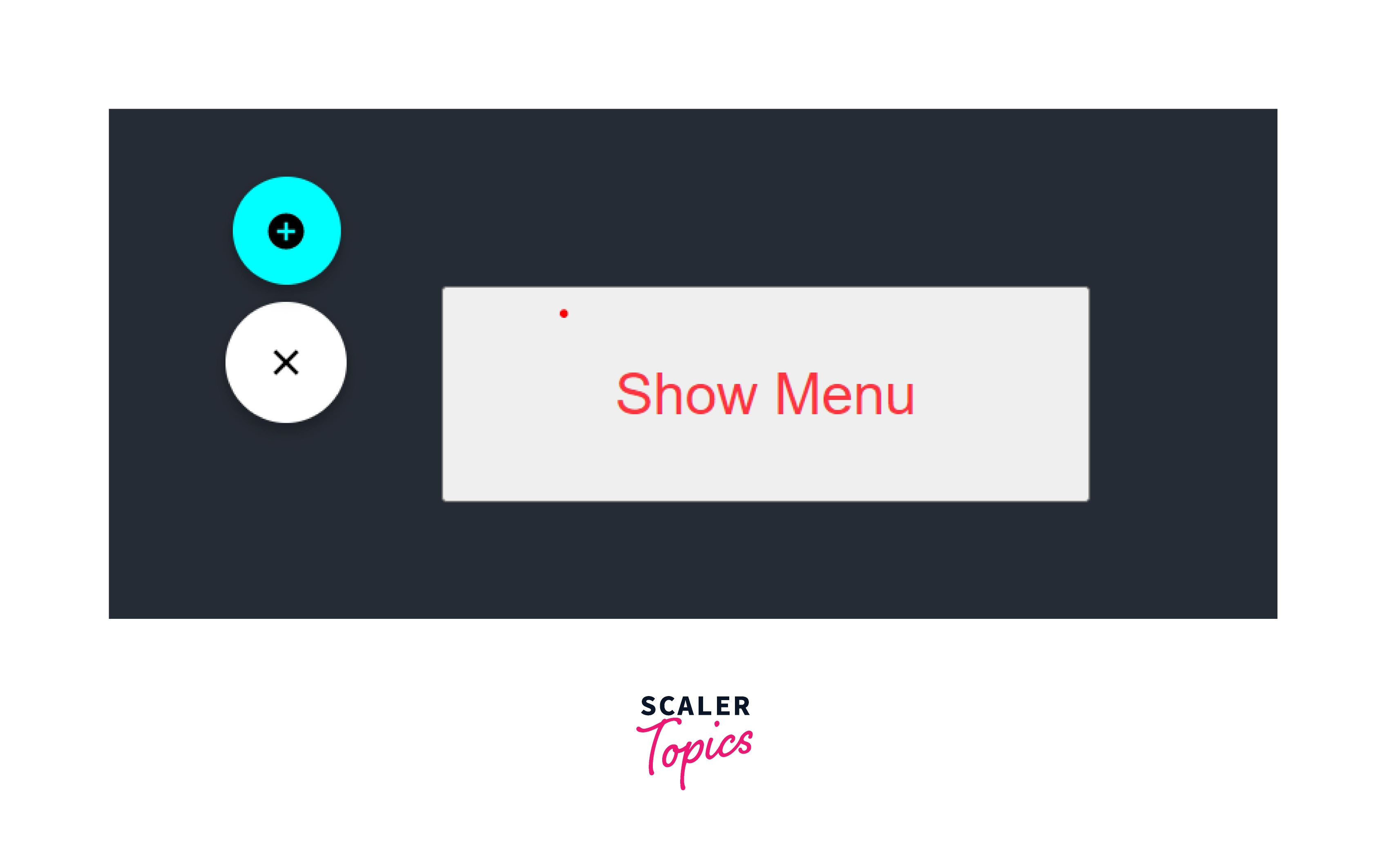
A floating menu is a menu that can float on the screen and has sub-menus that also float on the screen. These menus are shown by an action trigger and can be closed by the buttons in the menu. We can make these menu display over the parent components using react portals.
A floating menu can be easily implemented into our application using the react-floating-button-menu package. We can download the package and make changes as shown in the following code,
Code
Explanation
- The react floating items package provides three types of components.
- The FloatingMenu component is like a model that can be shown only if the isOpen state is made to true.
- The open and onclose events are passed into the react portal component to check if the menu is triggered and to close the menu respectfully.
- The MainButton is the large button displayed in the image and the ChildButton is the small button that is children of the larger button component.
Output
Widgets
A widget is a component that is used to show information about anything in an application. A widget is highly modular and reusable. The tooltips, floating menu, and models are all widgets that can be reused any number of times. React portals help us to create these kinds of popup widgets that display over a parent component and are easier to use than other components created without using react portals.
Let us create a simple widget with a button inside using the react portal, Code
Explanation The above code is a very simple illustration of a widget. After the creation of this widget, we can use it in multiple types by calling the widget component.
Installation
React portals can also be installed using the following command,
The above command installs the react-portal package from the npm repository to the local machine. After running the command, you can confirm the react-portal package installation by looking into the package.json file.
Event Bubbling Through Portals
Event bubbling is the action through which a compound that is present outside the react tree or rendered to another div component can access the state or functions of its parent components. Therefore, we can change the value of state in the parent component using the child component even though we are using react portals to render the child outside the tree.
The following code illustrates the process of event bubbling while using a react portal in react,
Code
Explanation
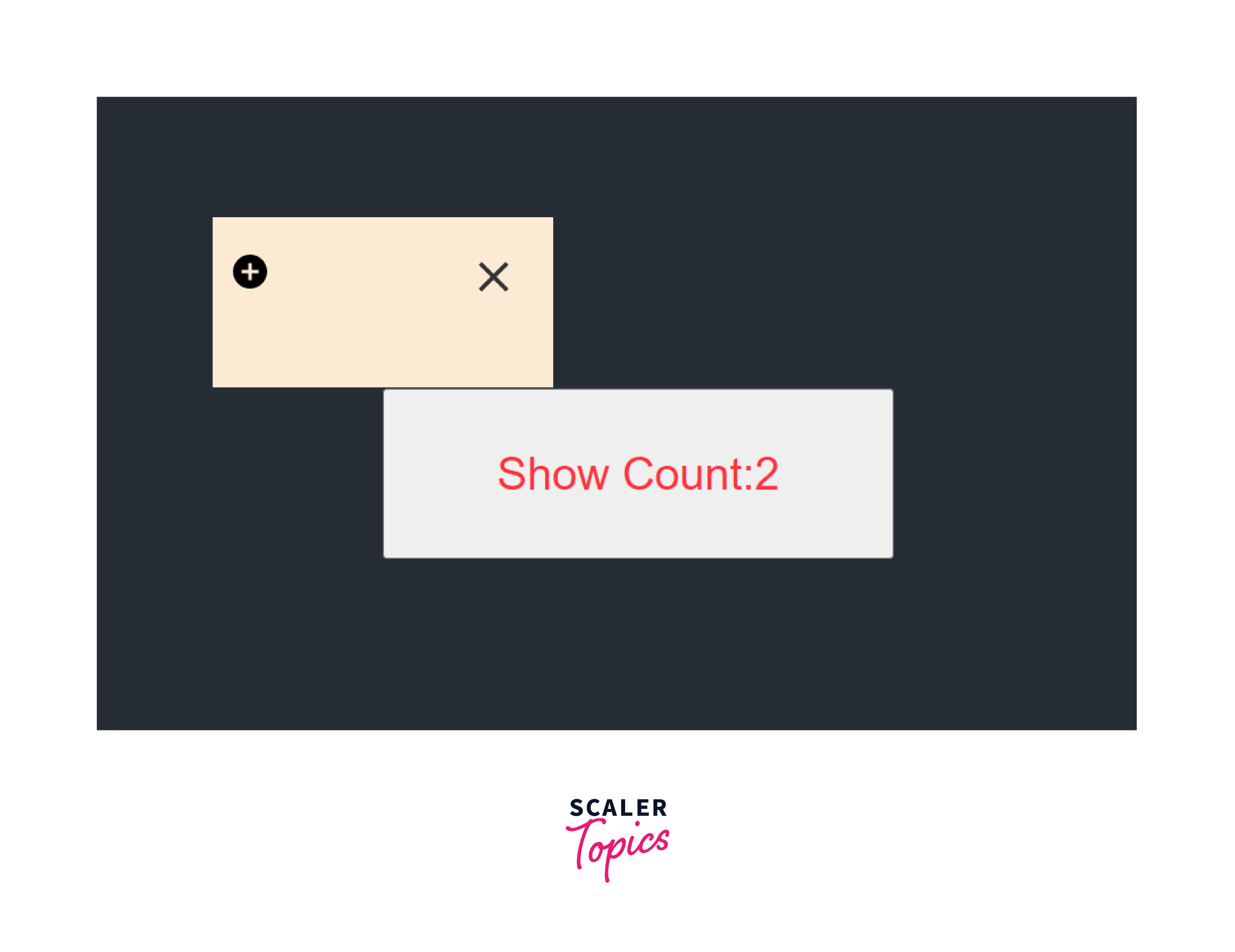
- In the above example, a counter is implemented using the useState() hook and react portal.
- The state of count is maintained in the parent component in which the children component Model is called.
- The Model component is a react portal and has functions to increment the count at the click of an icon.
- The child component Model is not present in the react tree, but the child component can change the count state present in the parent component.
- This is called an event bubbling through the parent component and is used to update values and render them in real time.
Output
Conclusion
- React portals provide an easier way to render elements into a DOM node that exists outside the parent component.
- Portals in react applications are used to display a component over a parent component ignoring the CSS properties of the parent component.
- The ReactDOM.createPortal(child, container) function is used to create a portal that is rendered at the container that exists outside the parent DOM.
- The child can be as simple as an HTML element or a react component.
- React portals can be used to create tooltips, models, and floating menus.
- Through the use of event bubbling, react portals can modify the state present in the parent components even though the portal component is present outside the react tree.
 Google
 Amazon
 Microsoft
 Flipkart
 Adobe1200+ more