React Select
Overview
Usually, whenever there is a need to get input from end users, we use elements like radio buttons, check boxes, or select elements. Radio buttons and checkboxes are good for smaller input and select elements are always used to select from multiple options. It is relatively simple to create a select element, but the default select element has a standard UI and is not very user attractive. Therefore, in react applications, we can use external libraries to create select elements and customize them to our use cases.
What is React-select?
React select is easily used in react component that is used to implement the select feature in react applications. React select elements react components that are developed on top of the select and option HTML tags with react states and features. A quality amount of design is already made in these select components, such that we can directly use them in our application without any need for CSS.
Multiple libraries provide a select element with customizable features. The react-select is a react library that provides quality select components with the following features,
- Highly customizable and flexible.
- Provides a modular structure and multiple props to control the select element.
- Features emotion styling API for modifying the design of elements.
- Features animation, data styling, and asynchronous options for the select component.
Some libraries provide multiple styled elements that can be used in react applications including the select element. Some of such libraries are core UI and material UI. The features of such libraries are,
- Core UI uses bootstrap and provides highly customizable and responsive react components.
- Similarly material UI is one of the highly used libraries and also provides responsive, customizable react components for native HTML elements.
Emotion is a styling library that can be used to write CSS styles in javascript without any additional configurations. We just have to install the @emotion/react library using any package manager and can use the CSS element in the package to create styles in react components.
Installation and Basic Usage
We can install the libraries using the npm or yarn package manager. A react project has to be set up before installing the packages. We can create a simple react application using the npx command.
The following command can be used to install the react select library through the npm package manager,
The react select library also supports typescript and all the types are also included in the package.
The material UI and core UI libraries have a lot of components and are separated into multiple packages. We can install the @coreui/react to use the select component with the core UI library,
We can install the @mui/material to use the select component with the material Ui library.
We can implement a simple select feature in our application with the Select component from the react-select library.
Explanation
- The Select component from the react select is used to create a select element.
- The options prop should be an array of objects with a value and a label. The value is passed as a parameter to the handleChange function and the label is displayed as an option in the dropdown of the select element.
- The handleChange function is used to update the selected state which is used by the value prop.
- The value prop is used to show an option on the select bar from the options. The react select default value is Select... and this can also be changed.
A simple react select using the material UI library,
A simple react select component using the core UI library,
Transform Your Career
Choose from our industry-leading programs designed for career success
Modern Software and AI Engineering Program
Master full-stack development with AI integration

 +1000 more
Modern Data Science and ML with specialisation in AI
Advanced data science techniques with AI specialization
+1000 moreAdvanced AIML with Specialisation in Agentic AI
Deep dive into AIML with focus on Agentic systems
+1000 moreDevOps, Cloud & AI Platform Engineering
Build and manage AI-powered cloud infrastructure
+1000 moreAI Engineering Advanced Certification by IIT-Roorkee
Premier AI engineering certification from IIT-Roorkee
Output
Common props
React select provides multiple common props that can be used to configure the select feature.
- The className prop can be used to specify a class name to the component for designing the component.
- The classNamePrefix prop is used to attach a class name with all inner components of the Select component which can then be styled using CSS.
- The isDisabled prop can with a true value can disable the select element.
- The isSearchable prop with a true value provides react select search feature that allows users to search for options.
- The isMulti prop allows users to select multiple options using the select component.
- The placeholder prop accepts a string which will be displayed when no options are selected. The default value is Select....
- The autoFocus boolean prop selects the component automatically when the screen is loaded. There are also props like onMenuScrollToBottom, onKeyDown, onFocus, etc.. that can be used for different events.
- The noOptionsMessage prop can be used to show a default message when there are no options to show.
- The Select component is made up of multiple react components. If we want to replace a component, then we can use the components prop with the new react component as input.
- The delimiter prop is very useful when the isMulti is enabled. This prop allows us to specify a delimiter that will concatenate all the options into a single HTML input value before sending it to the backend.
- The isClearable boolean prop enables the user to clear a selected option. When the prop is set to true, an X symbol is displayed at the end of the select text field and the prop has a default value of false.
- The required boolean prop can be used to constrain the user to select an option and is used as a part of form validation.
- The hideSelectedOptions prop is a boolean value that is used to hide the selected values in a multi-select component.
- The isLoading prop can be used in cases when there is an asynchronous function call to get the options for the component. When the prop is set to true, a loading animation is displayed.
- The menuPlacement prop can be any of the bottom, top, and auto values. This determines the position of the dropdown options menu.
- The pageSize prop takes a number as input and is used to specify the number of options to move when the PgUp or PgDn keys are used.
- The true value of the tabSelectsValue prop enables the feature to select the current option when the Tab key is pressed. The option is set to true by default.
- The backspaceRemovesValue is a boolean prop that can be enabled to clear the selected options using the Backspace key. The isClearable must be set to true to enable this prop.
- The escapeClearsValue prop takes a boolean value as input and is used to clear selected value and close the dropdown when the Esc key is pressed.
- The closeMenuOnSelect prop can be used to close the dropdown menu on selecting an option. The default value is true.
Controllable Props
Controllable props are used to control the actions of the select component. We can modify these props or the component can maintain them,
- The onChange function is invoked whenever an option is selected. This function should be used to set the value of the value prop.
- The menuIsOpen, onMenuOpen, and onMenuClose props can be used to specify functions that will be called when the dropdown menu opens or closes.
- The onInputChange prop is invoked when there is a change in the search value and is used to control the inputValue.
- The filterOption prop can be used to specify a function that filters the option to be displayed from the options prop.
We can also set the initial value of the control props. The defaultMenuIsOpen can be used to set the initial value to open the menu. The defaultInputValue prop is used to set the initial value of the search input. The defaultValue prop is used to set the value of the option.
Methods
The react select component has methods that are used to control the actions in the component. The focus() method is used to focus the select component on click or automatically and the blur() method is used to remove focus from the field. Both of these methods can be overwritten to focus or blur the selected component programmatically according to our use cases.
React Select Examples
Let us explore some react select examples with different configurations of the react select component.
Turn Learning into Career Growth
Basic Select
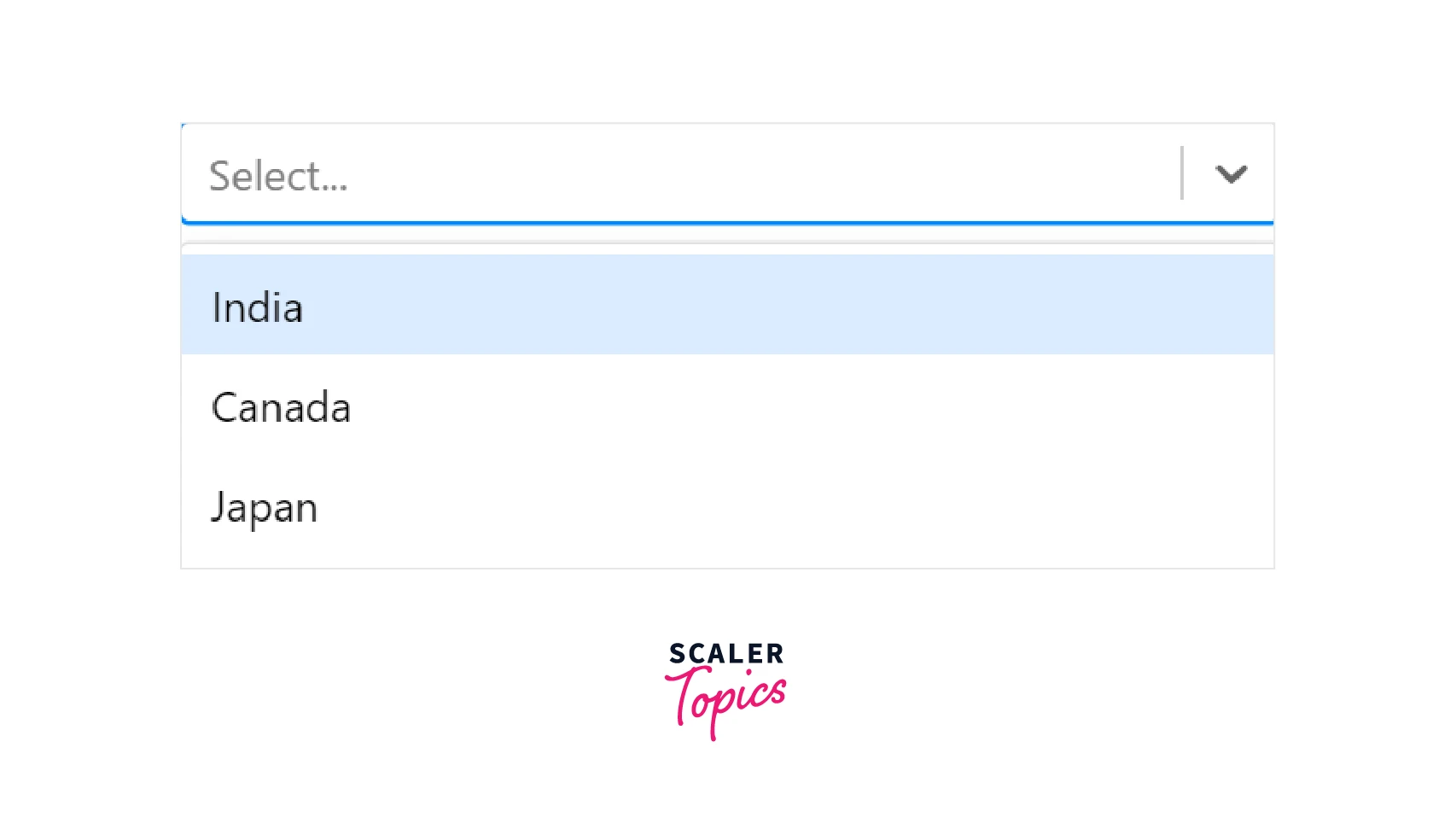
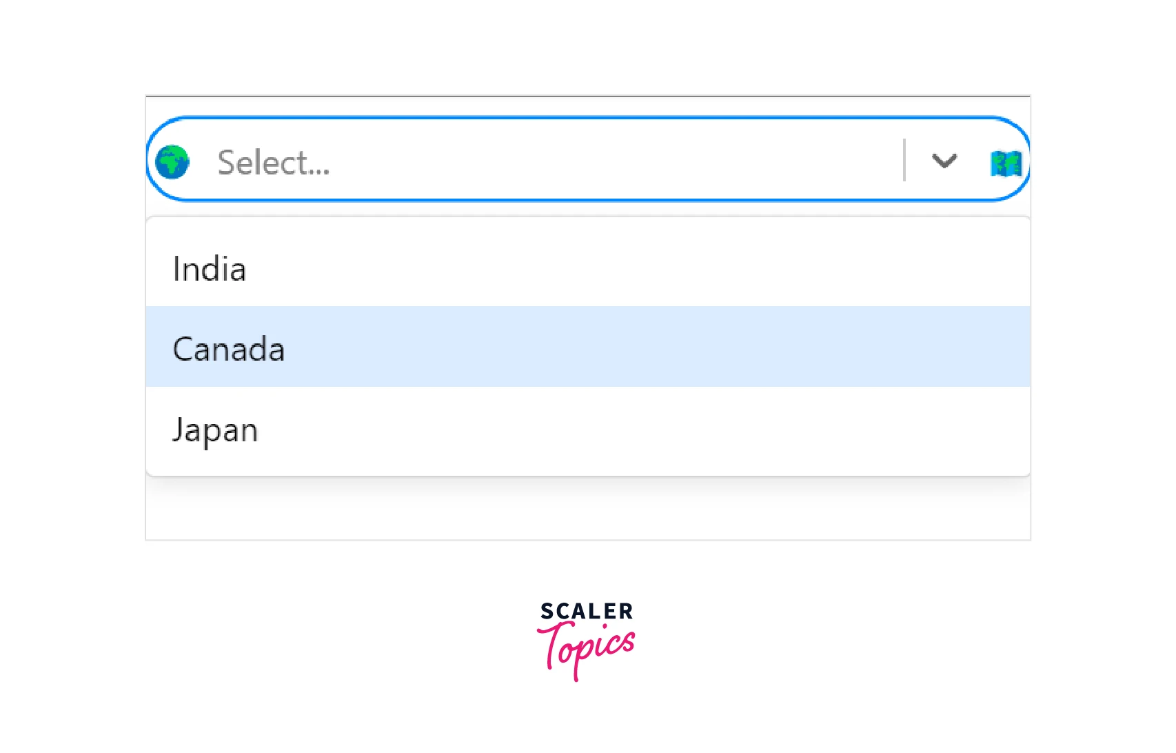
A basic select component can be created by declaring an options array and specifying the array in the options prop of the Select component.
The above example will render a select component similar to the image in the basic usage of the above section. The react select default value will be Select.... The other configurations like onChange and value will be handled by the component automatically.
Custom Styling Your Select Components
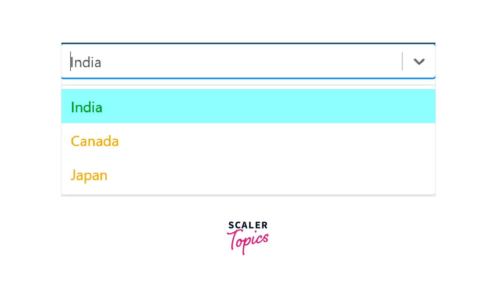
We can change the styles of the Select component using the custom styling feature of the component. The Select component is made of multiple components like option, control etc... Each of these components maintains some states and has default styling. The styles prop on the Select component is used for styling such components. The following code illustrates custom styling react select example,
Explanation
- The customStyles object is used to apply styles in the component. The styles of the control and option components are modified.
- The component has two parameters, the defaultStyles provides the applied styles to the component. The spread operator (...) is being used to apply those styles on the component and additional styles specified will be overwritten.
- The state gives access to the states used by the component. We can provide different styles based on the states in the component. The isFocused state is the option that is being hovered and the isSelected state is the currently selected option.
Output
Using on Change, Autofocus, and Options Props
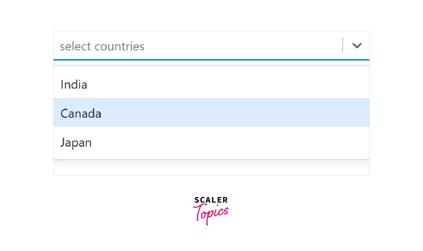
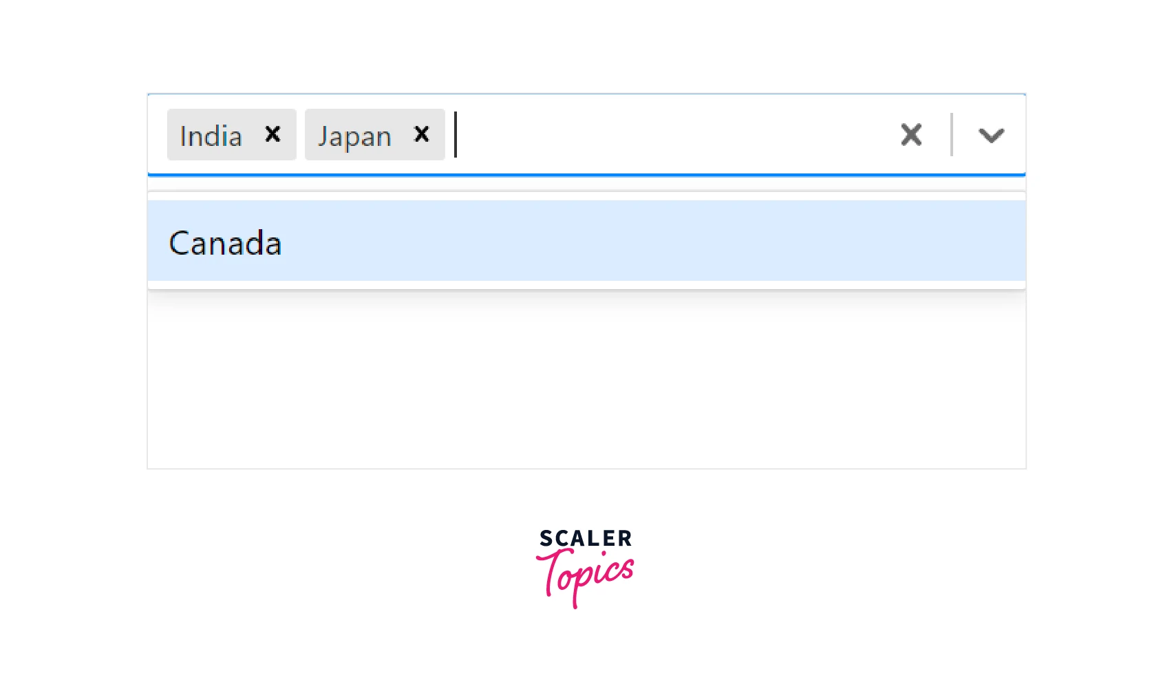
The autofocus prop can be used to focus the react select component on loading a page. The following code illustrates a multiple-option selectable react select example with autofocus, default options, and a placeholder,
Explanation
- The above example produces a multi-select component. The defaultvalue will be selected on loading the react select component.
- The placeholder will be displayed when no options are selected. It is important the specify the isMulti prop and the closeMenuOnSelect prop as false for the multiple option select component.
- The value and other props will be managed by the component.
Output
Scaler Placement Report and Statistics
Scaler learners achieved 2.5x salary growth with average post-Scaler CTC reaching ₹23L.
Custom Components
We can create a custom component based on the components of react select and replace the component. This feature provides more flexibility and we can also design our new component using the styles prop. The following react select example illustrates a custom component,
Explanation
- We need to import the components element from react select to create a custom component.
- In the above example, the Control component is created based on the default react select control component.
- To replace the control component, the new control component should be specified in the components prop.
- The styles is used to style to create the control component. The name of the component to be styled must be in lowercase.
Output
Built-In Animated Components
The react select library provides built-in animation components that can be used with the select component to enable animation effects. The makeAnimated component is used for animation effects and should be passed into the component prop of the react select component. A simple react select example is,
The above example renders a react select component that can be used to select multiple options with an animation that occurs when selecting or deselecting options from the dropdown menu.
Async Component
The react select library also provides select components to work with asynchronous inputs and outputs. The AsyncSelect component can be used to create an async select component. The following react select example can be used to understand this,
Explanation
Unlike the previous example, the react async select is used to load options from a remote source or an API. For example, the options are present and not fetched from an API. The loadData object is used to get the options from the CountryOptions array and load the options into the select component. The inputValue is used to specify the type of data to be loaded and the callback is a function that will be invoked after the loading of options. The defaultOptions prop determines the beginning of the remote request. If no value is provided for the defaultOptions prop, then the data will be loaded according to the loadOptions object immediately. We can also provide an options array to this prop and in such cases, the data will be fetched only on the first use of the select component.
Beyond JavaScript Basics: Our Full-Stack Certification Course Guides You Through Advanced Techniques. Enroll Now and Transform Your Coding Expertise.
Conclusion
- React Select is a library that provides styled and customizable select elements.
- React select can have multiple common props that help to customize the select component.
- We can change the react select default value, events, styles, react select search functions, etc.. using props.
- React select also provides form control and allows emotion API for styling components.
- React select provides options to utilize multiple keys like Backspace for clearing options, PgUp for navigation, Tab for selecting options, etc...
- There are also customizations to replace a component inside react select component.
- React select provides custom animations and styling of a component.
- We can use the AsyncSelect component to work with asynchronous options.
 Google
 Amazon
 Microsoft
 Flipkart
 Adobe1200+ more