React Toastify
Overview
The React-Toastify package enables developers to add toast notifications to their applications and also can set notifications and warnings. It also allows us to display toasts to users that contain messages and information for a set amount of time.
What is a Toast Notification?
In the actual world, a toast is a clinging of glasses among two or more people. However, you might be wondering how that relates to programming.
At a party, as guests make toasts, the clinging of the glasses creates a distinctive sound that attracts everyone's attention. In general, a toast sound draws the audience's attention.
Let's apply this to the world of software development. A toast is indeed a notification component that grabs the user's attention.
In every online app, we frequently need to let the user know whether an activity was successful or unsuccessful. This purpose is commonly accomplished by flashing the user warnings or notifications at the top of the screen for a brief time before they vanish. These notifications, referred to as "Toasts", automatically disappear after a timeout that developers choose.
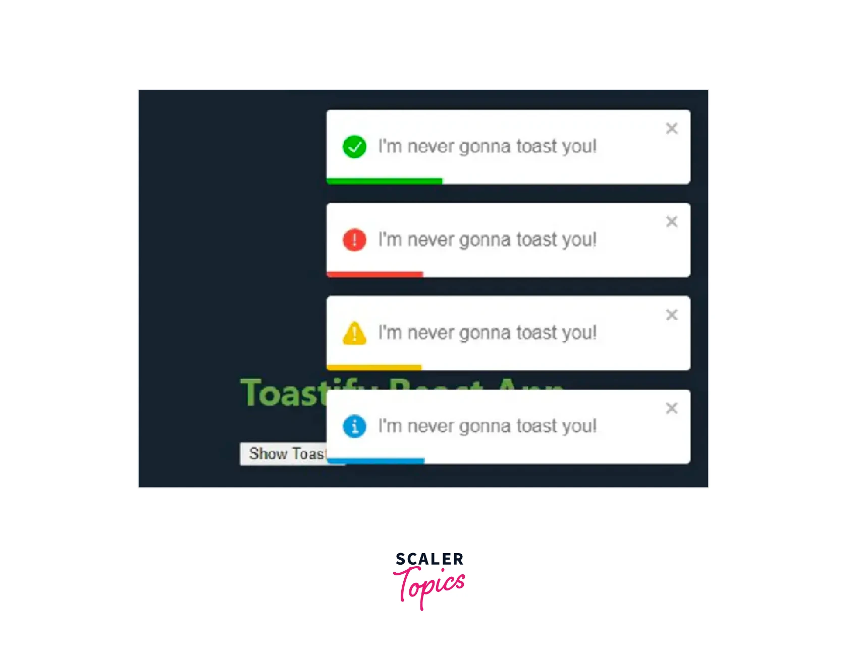
Types of Toast Notification
If you want even more customization, the react-toastify package includes four different toast notification types, which are mentioned below.
- Success
- Error
- Warning
- Info
Refer to the below image to see how they look.
What is React-Toastify?
One of the best React toast libraries is React-Toastify. With the help of this tool, you can easily add toast notifications to the apps and set alerts and notifications.
It notifies the user when a specific event has occurred. To notify the user of what happened and why it happened, a toast can include any type of information that would be relevant.
It first appeared in the Android developer community but has now expanded to other programming languages and frameworks, including ReactJS.
Notifications from Toast or Toastify are pop-up messages which show users' information. In the example below, the information might be a successful message, a warning, an error, etc.
Example Code :
Scaler Placement Report and Statistics
Scaler learners achieved 2.5x salary growth with average post-Scaler CTC reaching ₹23L.
Why Toastify?
If toast notifications are so important for notifying users of current events in their application, why do you advise toastify?
A React JS component called Toastify was independently created to be compatible with our React JS project.
We chose the React-toastify package for the following three strong reasonings :
Transform Your Career
Choose from our industry-leading programs designed for career success
Modern Software and AI Engineering Program
Master full-stack development with AI integration

 +1000 more
Modern Data Science and ML with specialisation in AI
Advanced data science techniques with AI specialization
+1000 moreAdvanced AIML with Specialisation in Agentic AI
Deep dive into AIML with focus on Agentic systems
+1000 moreDevOps, Cloud & AI Platform Engineering
Build and manage AI-powered cloud infrastructure
+1000 moreAI Engineering Advanced Certification by IIT-Roorkee
Premier AI engineering certification from IIT-Roorkee
The Ease of Use
The react toastify package meets our requirements for something easy to use yet still flexible in several ways.
It can be challenging to integrate certain toast notification packages into your project. By the time you fully implement them into your project, maintenance becomes difficult since they were not designed to be decoupled. But with the react toastify package, we didn't experience any of those problems.
Stability of Versions
Can you recall a time when a particular version of a library was functioning perfectly on your application, only to have a newer version of React JS installed and the package no longer worked?
We've experienced that, and it's typically caused by a combination of elements like poor design patterns, a bug in the most recent release, depreciation of package dependencies, and so forth.
However, this is usually due to incompatibility difficulties with the newer React JS library. We haven't seen any issues with the React toastify npm package since we started using it.
Adoption and Support by the Global Community
What makes a library strong and successful is the community's strength and support.
You require a toast notification package that allows you to rapidly solve any problems such as an error that arise within your application. That is one of the main reasons we prefer the react-toastify package.
Toast notification package has a global community, with more than a million downloads weekly, you will not be stuck when you use this package since there will be people, a solution, or an article somewhere on the internet to assist you in resolving it.
Now that we discussed the react-toastify package, it's time for you to test the react-toastify package.
Installation
You can install React-Toastify by running the following commands :
Once installation is complete, the package must be imported inside your component, as shown below. For React-Toastify to function, a CSS file must be imported that comes with React-Toastify.
Features
- Very easy to set up—you can get it working in about ten seconds!
- Simple to customize.
- Swipe to close
- Can select the direction of a swipe
- Utilizing your preferred animation is quite simple.
- Can show a react component within the toast!
- Has the onOpen and onClose hooks. Both can access the props provided to the react component that is rendered inside the toast.
- Can programmatically remove a toast
- Describe each toast's behavior
- When the focus of the window is lost, pause the toast.
- Fancy progress bar showing the amount of time left
- Possibility of updating a toast
- The number of toasts displayed simultaneously can be restricted.
- Dark mode, plus plenty more!
Examples
Styling your Toast Messages with React-Toastify
Let's launch our React application and examine how we can customize our toast messages using React-Toastify.
Remember that toast messages are alerts or notifications that we wish to display to the user at a specific time. These messages may appear when a user successfully logs in when a user logs in unsuccessfully when a faulty request is made when valuable information is viewed, and so forth.
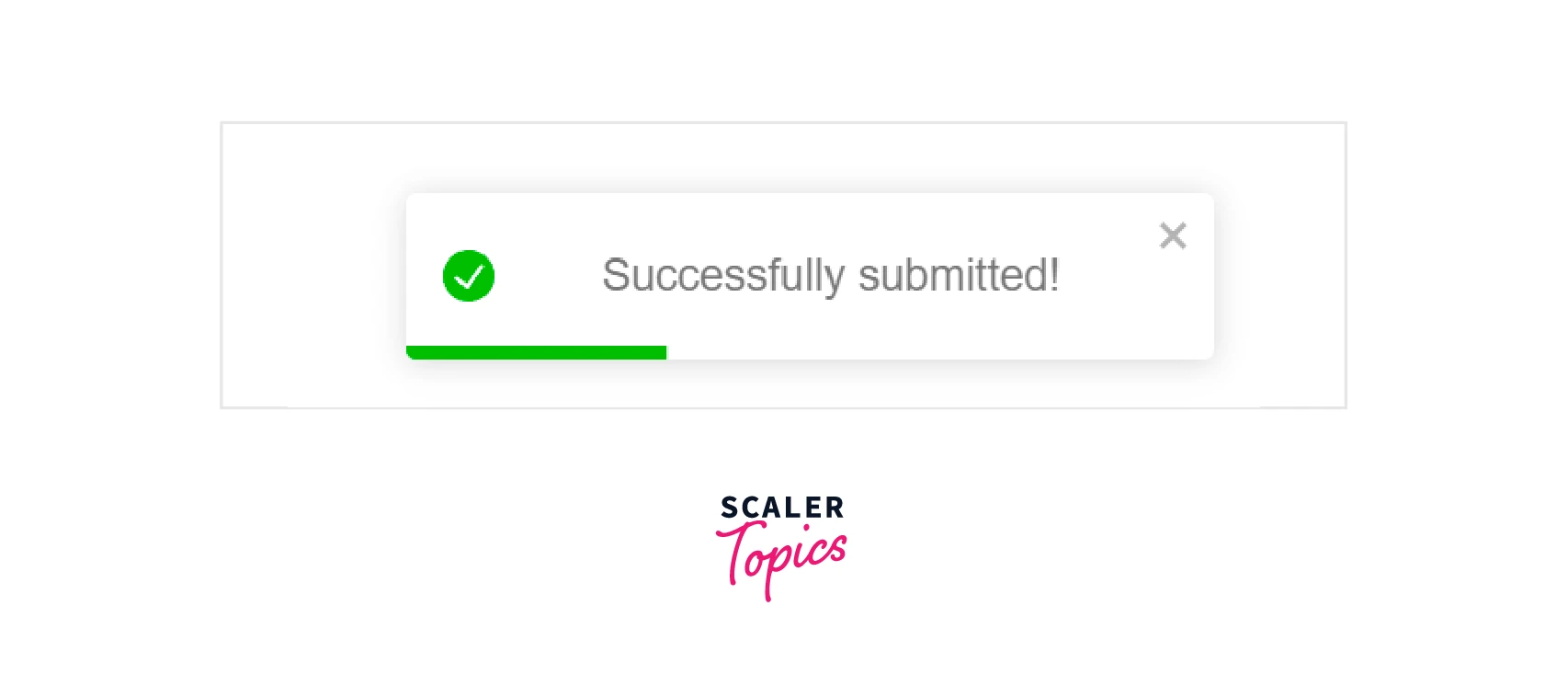
Import the react-toastify package and associated CSS file into your App.js file.
After importing the React-Toastify package, you can call the toast and insert your message :
If you execute the above code and click on the Submit button, a pop-up will be shown as such :
Turn Learning into Career Growth
Change your Toast Message’s Position
By default, all toasts appear in the upper right corner of your browser. By giving the toast a new position, the position can be modified. There are six positions that React-Toastify supports :
-
Top right
-
Top center
-
Top left
-
Bottom right
-
Bottom center
-
Bottom left You can position your toast message in your App.js file as follows, depending on where you would like it :
Example Code :
If you execute the above code and click on the Submit button, a pop-up will be shown as such :
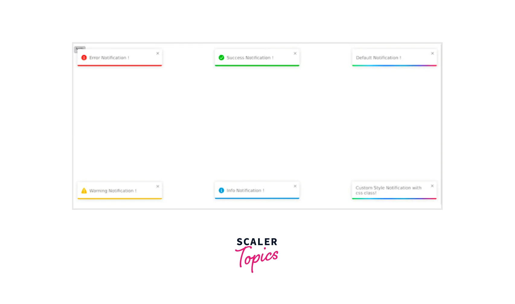
Differentiate between Toast Message Types
Similar to configuring the position of your toast message, you can define several toast message categories in your toast emitter to help consumers understand the data being displayed.
One useful strategy for enhancing the user experience of your React project is a specification. To help customers rapidly understand the data they see, this strategy uses various colors for each sort of toast message.
For instance, a red toast message usually indicates a warning or error message, whereas a green toast message usually indicates a successful response. You can specify a toast version for warnings, error messages, and general information.
In your App.js file, call toast using one of the following variants to indicate your toast emitter :
If you execute the above code and click on the Submit button, a pop-up will be shown as such :
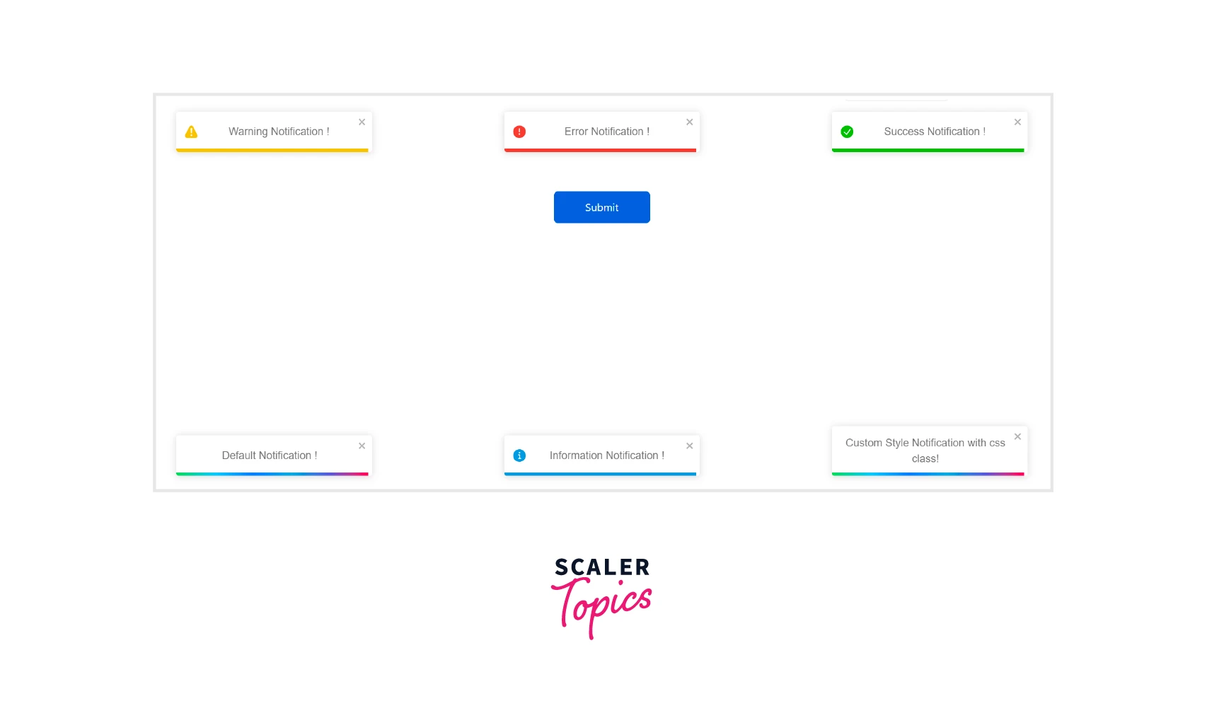
Pay attention to the most recent toast notice we made, which is displayed in the bottom right corner of the image. We can see that, in contrast to the others, have provided a className to it. That is a customized toast. Let's explore custom toasts with React-Toastify in more detail.
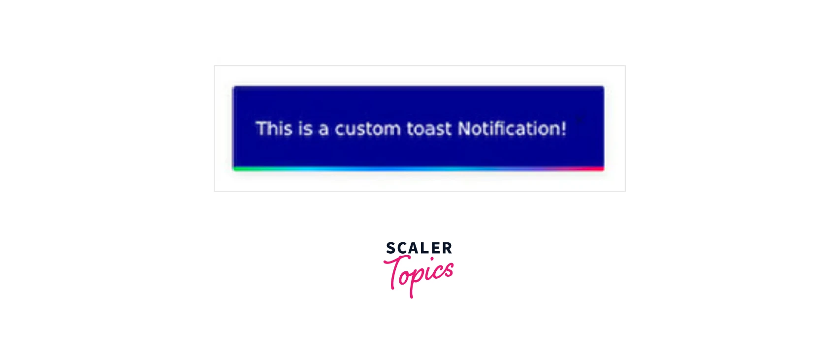
Style a Custom Toast Message
A notification that we can customize to fit our preferences is called a toast. Depending on the type of message we want to display, this enables us to offer the toast message your preferred width, formatting, font size, background, and much more.
For instance, we might want to provide a toast that matches the design of our website or application. We can achieve that with a personalized toast.
Give your toast message a className as follows in your App.js file before styling it.
Next, style it using className and your preferred methods in your CSS file :
If you execute the above codes and click on the Submit button, a customized notification will be shown as such :
Create Promise Toasts in React-Toastify
React-Toastify additionally enables us to construct and show Promise notifications in addition to these toast versions. After an API call is handled, these toast alerts appear, and when the call is finished, they either deliver a toast message of success or an error.
Add these lines to your App.js file to make promise toasts :
We specify pending, success, and error messages in toast.promise. While the fetch is running, the pending message will appear. Depending on the result, either a success message or an error message will appear next.
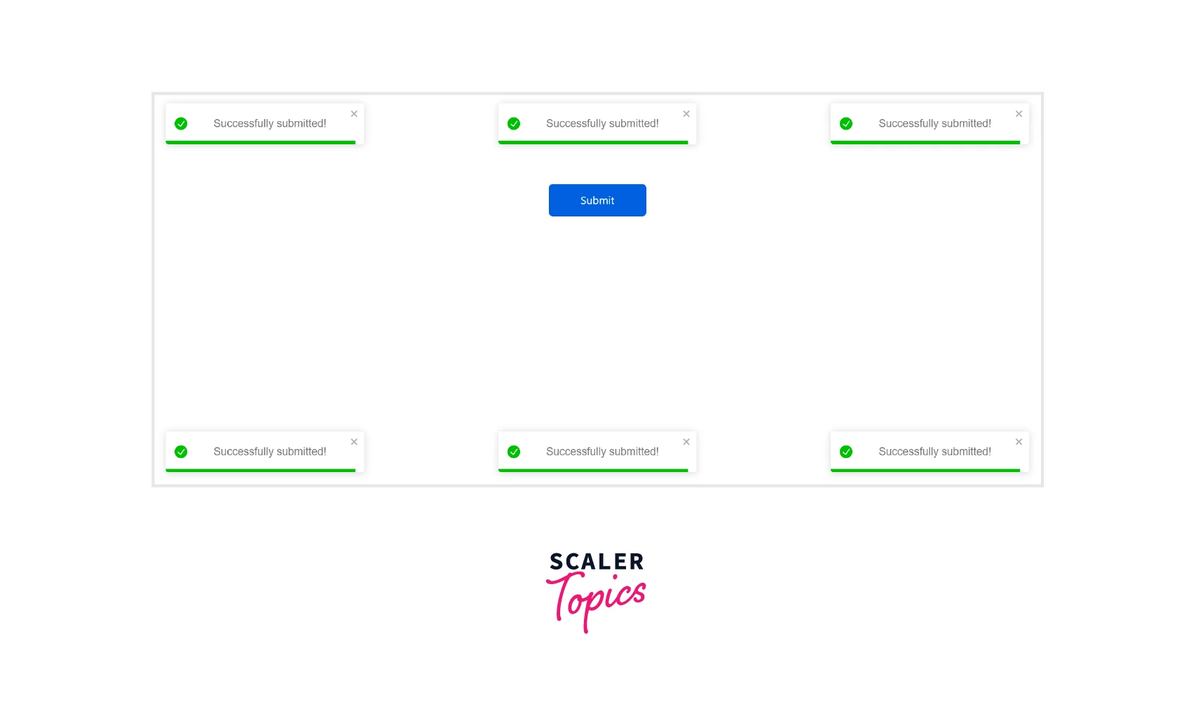
Clear Single and Multiple Toasts
So, how will you clear of a Toastify reaction ? You may use the solution below to clear off your toast notifications with a single button.
Example :
How to Limit the Number of Toasts Show Per Time ?
We can restrict the number of toasts that can be shown at once as opposed to only displaying one toast using an identifier. To achieve this, we modify <ToastContainer limit=4"> to include the 'limit' attribute.
When more toasts are available, they will be displayed after the preceding ones were already closed.
Use Transitions and Animation for Toasts
The toast transition animations in the package come in four different variations: bounce, slide, zoom, and flip.
Example :
Explanation :
Additionally, you can utilize it on the toast component itself as shown here: <ToastContainer transition={Slide}/>
Add a Swipe or Drag Dismiss Feature
You can leverage the Swipe or Drag feature included with this package to add further functionality, particularly to touch devices. By default, the draggable attribute is enabled; however, it can be turned off by defining it as false.
The draggablePercent attribute allows you to configure the percentage of the drag over the toast before it is dismissed.
JavaScript Maestro Seeking Full-Stack Mastery? Enroll in Our Full-Stack Developer Course and Uncover the Symphony of Front and Back-End Development.
Conclusion
- React-Toastify is a helpful React toast library since it offers a wide variety of toast options and is extremely customizable.
- We discussed how to use React-Toastify to style the toast messages. We also discovered that we could design and style our personalized toast notifications whichever we wanted.
- You can style your toast messages, change their position, and differentiate between toast messages as success, error, warning, and info.
- You can also style a custom toast message, create promise toasts, clear single and multiple toasts, limit the number of toasts shown per time, use transitions and animation for your toasts, or add a swipe or drag dismiss feature.
- There is much more information on the react toastify notification package, which you can obtain by visiting the official documentation page.
 Google
 Amazon
 Microsoft
 Flipkart
 Adobe1200+ more