Semantic UI React
Overview
Semantic UI is a framework that helps you build web applications. It provides a set of components for your application, tools to define responsive layouts, and flexible design support. Semantic UI uses Semantic UI React to provide integration with React. This library provides a React implementation of the component, so no additional JavaScript dependencies are required. Semantic UI uses Semantic UI themes, so you can reuse CSS style sheets to take advantage of Semantic UI themes.
What is Semantic-UI-react?
Semantic UI is one of many popular CSS frameworks that claim to speed up website building by providing pre-built CSS components. It prides itself on being semantic by using class names that are inherently thoughtful and meaningful.
Semantic UI is an open-source framework for creating intuitive UI using CSS, JQuery, and HTML. Semantic UI acts as an overlay for React components and exposes semantic themes as CSS style sheets.
Semantic UI React provides a way to create React components via as-prop. Component functionality and props can be assembled without adding nested components.
APIs in Semantic UI React
Augmentation
Control rendered HTML tags or render one component as another. Additional props are passed to the rendering component.
Augmentation is powerful. Component functionality and props can be assembled without adding nested components. This is essential for working with MenuLinks and React-Router.
Shorthand Props
Simplified props are generated and make use cases easier. All object props are distributed to child components
Child Object Arrays
Component with repeating children accepts arrays of simple objects. Facebook prefers this over using context to handle parent-child joins.
icon={...}
The icon prop is standard for many components. It can accept icon names, icon prop objects, or instances.
image={...}
The image prop is standard for many components. It can accept an image source, an image props object, or an instance.
Auto Controlled State
React has the concept of controlled and uncontrolled components.
Stateful components manage their state without wiring. The dropdown opens on click without connecting when you click on an open prop. Values are also stored internally without linking changes to the value.
Adding a value prop or an open prop causes the dropdown delegate to control its one prop to value. Other props remain automatically controlled. Combine any number of controlled and uncontrolled props. You can add or remove controls at any time by adding or removing props everything works.
Take a look at ModernAutoControlledComponent to see how this is done.
Transform Your Career
Choose from our industry-leading programs designed for career success
Modern Software and AI Engineering Program
Master full-stack development with AI integration

 +1000 more
Modern Data Science and ML with specialisation in AI
Advanced data science techniques with AI specialization
+1000 moreAdvanced AIML with Specialisation in Agentic AI
Deep dive into AIML with focus on Agentic systems
+1000 moreDevOps, Cloud & AI Platform Engineering
Build and manage AI-powered cloud infrastructure
+1000 moreAI Engineering Advanced Certification by IIT-Roorkee
Premier AI engineering certification from IIT-Roorkee
Why Use Semantic UI?
Semantic UI enables developers to quickly create a beautiful website using clean HTML, intuitive JavaScript, and simplified debugging, making front-end development a pleasant experience. Semantic UI is designed to be responsive, so your website can scale to multiple devices. Semantic is production-ready and works with frameworks such as React, Angular, Meteor, and Ember. This means you can integrate with any of these frameworks to organize her UI layer along with your application logic.
Install
To get started, you need to add Semantic UI React to your project.
NPM
YARN
Semantic UI React requires a common Semantic UI stylesheet to style properly. This can be done by installing the Semantic UI CSS package.
NPM
YARN
Once installed, the CSS files should be imported into the project with the default theme.
Now you can use Semantic UI React.
Components of React Semantic UI React
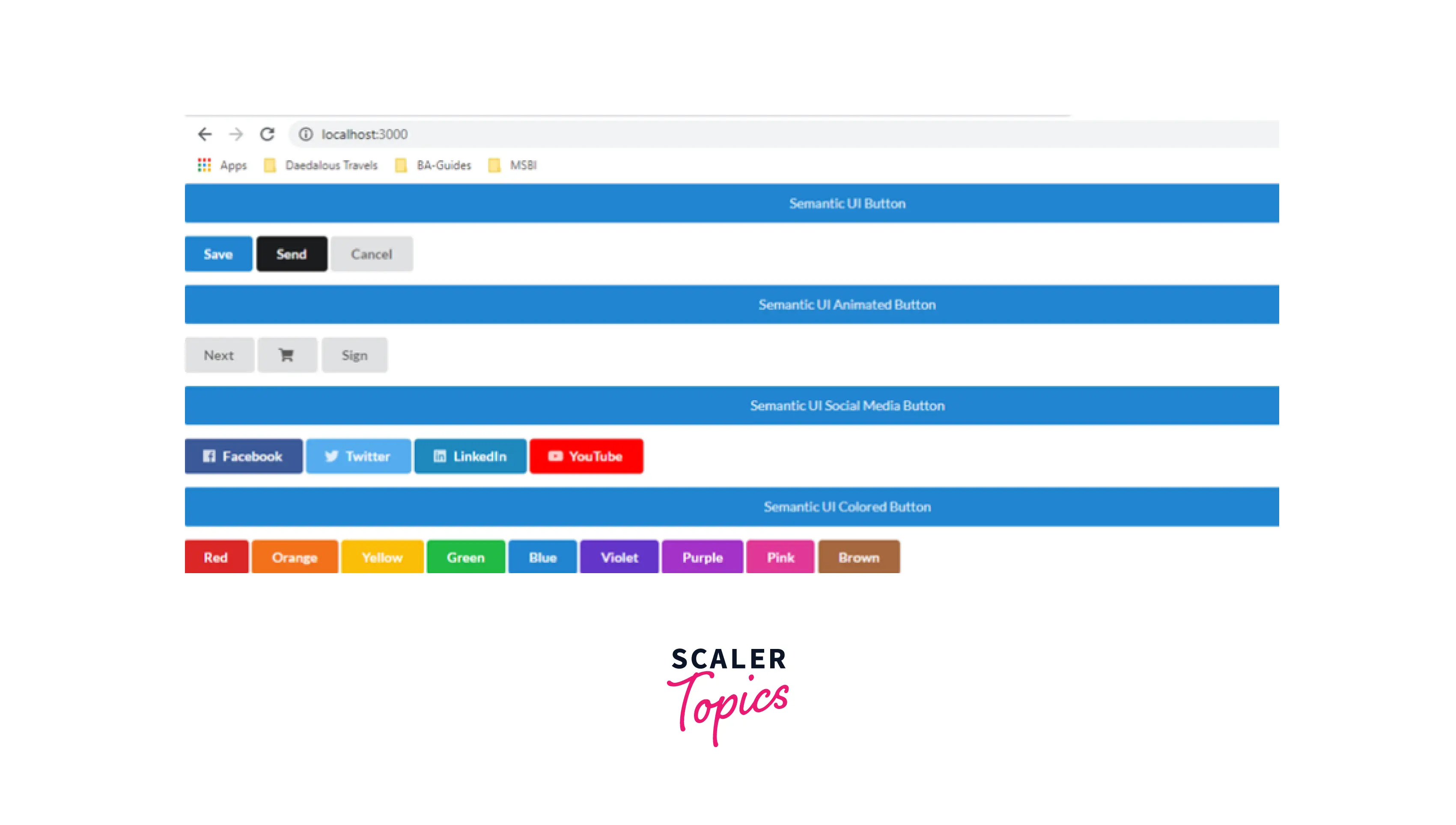
Learn the basic components of the semantic UI framework for React applications. Learn about Semantic UI Buttons, Containers, and Lists. Semantic UI components framework for creating beautiful user interfaces.
Go to the src folder and create a new component "Button.js". This component creates various buttons for the semantic user interfaces.
Button.js
App.js
Run the project with the command npm start and check the result.
Output:
Containers.js
App.js
Lists.js
App.js
Run the Project with the command npm start and check the result.
Output: Open your browser. It will by default open a tab with localhost running (localhost:3000)
Building Project Using Semantic UI React
Setup
To get Started:
- Rotate the React app
- Clean up the app to follow file structure
- Install Semantic UI React and Semantic UI CSS using NPM
- And install all React Responsive packages using NPM
- Add logo to the public folder
- Import Semantic.min.css into main.js
- Add the following lines of the code to the specified component
index.css
App.js
Main.js
NavbarLg Component
We use the Menu component for the navigation bars on the big presentation. For this, see Semantic UI React documentation and choose your own favorite menu component type. This demo uses the reverse menu type.
The documentation is written using React class components, but since the code is fairly simple, we'll convert it to a functional component.
Also, add registration and login links to the far right of the navigation bar.
Navbar.js
NavbarMb component
Moving on to the mobile navigation bar, it uses Semantic UI's React Sidebar, but with some major changes.
The question is how the Semantic UI overlay was added. They wrest all other content on the page to the sidebar.pusher component. This is ineffectual given that we don't want to nest all of our application's content inside this component. The sidebar control also needs an overhaul. This is because the hamburger icon is much preferred over the check mark. To fix all this, we'll add three custom components.
- Colored Overlay Components
- Hamburger Icon to Open Sidebar
- Close Icon to Close Sidebar
Use built-in Semantic UI symbols.
The hamburger icon toggles the icon to open or close based on the state of the sidebar.
NavbarMb.js
Navbar.js
Turn Learning into Career Growth
Making the Navbar Responsive with React-responsive
There is one navigation bar for large screens and one for mobile screens. Make your navbar responsive by using React-Responsive to switch from navbar-large to navbar-mobile and vice versa depending on screen size.
This is done in the Navbar component using Responsive React.
Import NavbarLg and NavbarMb into the Navbar component. According to the Responsive React documentation, use the useMediaQuery hook to declare multiple breakpoints as variables. create an object with a breakpoint screen size Whether size exceeds the breakpoint.
Navbar.js
It looks all done, but it's not perfect yet. If you look closely, you can see that the state is not preserved after switching from the large navbar to the mobile navbar. This is evident by observing highlighted navigation links. As soon as I switch from the large navbar to the mobile navbar or vice versa, I'm back home.
Imagine it was a multi-page React application. This can be confusing because if someone minimizes the screen on the login page, the navigation bar will go back to the home page even though the application stayed on the login page.
To fix this, let's promote the nav link state to the main navbar component and handle clicks from there. And pass nav links through props from NavbarLg or NavbarMb components. This maintains state because the nav link is part of the navbar component and the navbar component is always visible on both large and small screen UI.
Navbar.js
NavbarLg.js
Navbar.Mb
Shortand Props
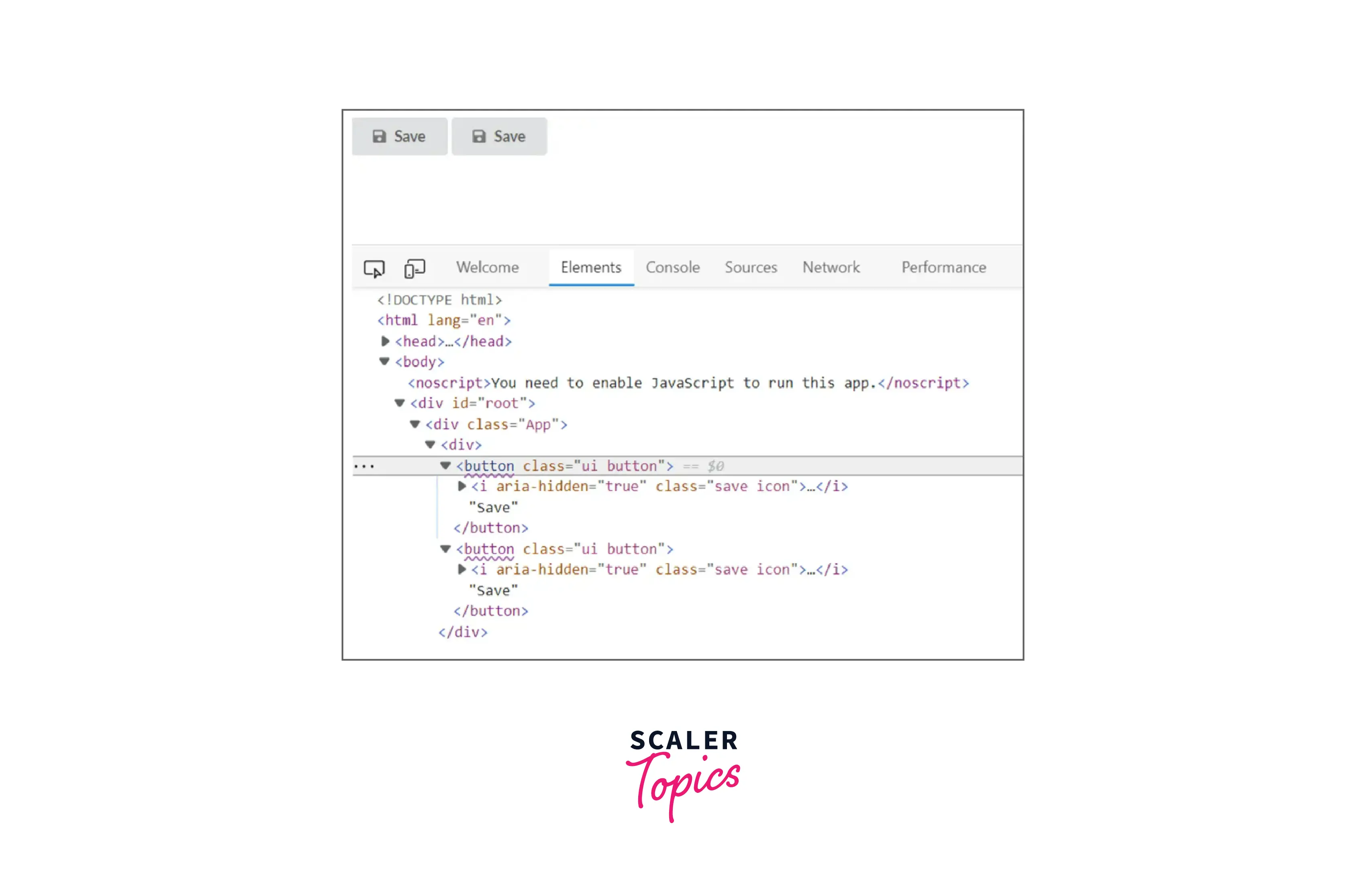
Some Semantic UI React components, such as buttons, allow abbreviations. Abbreviations allow you to configure your component's content using predefined props. This means that you can declare and customize your component's children only through props. This eliminates the need to write additional JSX code.
For example, a button has a special content shorthand for its main data. The HTML is different, but the buttons on the output screen are the same.
The buttonn also has an icon shorthand that can be used to add semantic UI reaction icons to its children.
Output:
You can use Semantic UI React's Header component to display HTML heading tags. For example: h1 to h6. With props you can specify which header tags to use.
Prop of Semantic UI React
- Extensible and many components but no transitions
- Documentation is also understandable
- very adaptable-good support for different screen sizes
- Good library, many enough to build big apps Component
- Great look and feel
- Easy customization
Alternatives and Comparisons
Alternatives to Semantic UI React.
Material-UI
Material UI is a Library of React UI components that implements Google's Material Design.
Semantic-UI
Semantic empowers designers and developers by creating a common user interface vocabulary.
Ant Design
Enterprise-class UI design language and React-based implementation. Out-of-the-box elegant UI components based on React Component.npm + webpack + babel + dora + dva development framework.
BootStrap
Bootstrap is the most popular HTML, CSS, and JS framework for developing responsive, mobile-first projects on the web.
Reactstrap
It provides pre-built Bootstrap components that allow a high level of flexibility and pre-built validation. It allows you to quickly create beautiful forms that are guaranteed to provide an impressive and intuitive user experience.
Comparisons to Semantic UI React.
- Material UI
- Bootstrap
- Reactstrap
- Nion
- Ant Design
- Chakra UI
Conclusion
- Semantic UI is a great framework to help build web applications. Create a React application using components provided by Semantic UI React. The theming support provided by Semantic UI makes it easy to change the style of your components.
- Semantic UI React, the React version of this framework. This will allow you to use the Semantic UI in your React application.
- Semantic UI React provides many pre-defined React components that you can use out-of-the-box to build your application very quickly.
- Semantic UI is easy to install, the documentation is very informal, and most importantly it looks great.
- Semantic UI is a UI component framework for the theming website. Semantic UI allows developers to build their websites using fast and concise HTML for a fully responsive mobile experience.
 Google
 Amazon
 Microsoft
 Flipkart
 Adobe1200+ more