How To Use React Styled Components?
Overview
A common way to design or create styles in a website is to use CSS in our application, but on creating large and complex applications normal CSS becomes harder to track and less flexible. Therefore, we can utilize modern libraries that allow the use of CSS inside java script components like styled-components to create modular, customizable, and flexible styles for our application.
Introduction
React styled components is a javascript library that can be used in react and react native to create CSS styled react components. Utilizing this library, we can create react native-styled components or react components by creating CSS-styled HTML components in javascript or typescript. This library makes styling through CSS modular, flexible, and easily trackable.
Transform Your Career
Choose from our industry-leading programs designed for career success
Modern Software and AI Engineering Program
Master full-stack development with AI integration

 +1000 more
Modern Data Science and ML with specialisation in AI
Advanced data science techniques with AI specialization
+1000 moreAdvanced AIML with Specialisation in Agentic AI
Deep dive into AIML with focus on Agentic systems
+1000 moreDevOps, Cloud & AI Platform Engineering
Build and manage AI-powered cloud infrastructure
+1000 moreAI Engineering Advanced Certification by IIT-Roorkee
Premier AI engineering certification from IIT-Roorkee
Installation
Any package manager can be utilized to install the styled components library into our project. The following command is used to install React styled-components library using the npm package manager,
We can also install the library using the yarn package manager,
We can also add the React styled components library as a dependency without a package manager with CDN by using the following script at the public/index.html page of our react application,
Note: Styled Components React also supports typescript, but the types have to be installed separately. The following command can be used to install the types for styled components as a development dependency,
Syntax
The styled components react are used to style normal HTML elements and make them a component to be used in react applications with all the features of the HTML element. For example, we can create a button component named Touch with all the properties of a button element and we can also create global styles with React styled components.
Create a file named styles.js in which the styles can be created. The syntax used to create styled components is,
In the App.js file, we can import the component and use it instead of a div tag.
Explanation:
- Any component can be styled, but the component to be styled should be used next to be styled keyword. For example, to style a button, we can use the styled.button syntax.
- All the styles for a component must be present inside the template literals(`).
- The created component can be replaced for the respective HTML element.
Basic Styled Components
A basic styled component can be created by adding styles to a component. The following code illustrates a styled button component created using react-styled components,
The styles are applied over an HTML button element which on rendering creates a styled button.

Main Features of React Styled Components
React styled components can also be used as react native-styled components and also has several features that make the styled components library a better fit than normal CSS.
- Easy to track, secure, and maintain.
- Styled components provide automatic vendor prefixing.
- Styles are highly customizable because of the ability to pass props, hieratical styling, and media query support.
- Styled components also support theming and also allow type-checking for props.
- Provides useTheme hook for advanced theming and also accepts ref inputs.
- This library also supports server side rendering.
Note : Vendor prefixing is a method used by multiple browsers to provide access to new CSS features before they were made usable with the browser. Some prefixes are -webkit that denotes Chrome, Safari, and IOS browsers, -ms- for Mozilla, etc...


Creating Global Styles
Global styles have global scope and will be applied all over the application. We can create global styles in Styled Components React by using the createGlobalStyle export. Let us create the global styles in the globals.js file,
The global style is the best place to initialize variables that can be accessed by other style components. We can declare a variable in the : root scope with a -- prefix and can get the value of the variable from any CSS in our application using the var() function.
After creating the GlobalStyle component, we must import this component into our application. The GlobalStyle component should be rendered in the base component of our application.
A base component is something that will be directly rendered into our application first and referenced in the index.js file. Routes to pages are usually provided in this component and therefore we can render the GlobalStyle in this component.
Themes Creation with React Styled Components
React styled components support theming using the context API. The theme can be made accessible to child components using the ThemeProvider component. The theme configuration should be passed to the theme prop inThemeProvider component. To add themes to our website, we must create the theme object. Let us create a file theme.js and add the theme object,
The theme that is passed to children from the ThemeProvider component can be accessed by styled components using the props.theme keyword. To access the secondary theme color, we can use the props.theme.secondary keyword. We can also add other props in styled-components and this will be discussed in later sections. If no theme is passed in the button then, the colour and background will be the default HTML button colours.
The theme object should be passed as a prop in the ThemeProvider component.
Explanation:
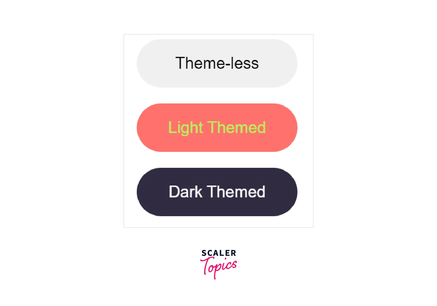
- The first button is not wrapped by the ThemeProvider and has no theme.
- The scope of the ThemeProvider is only for its children components.
- Different themes are passed to the consecutive ThemeProvider components and the colours of the button also differ respectively.
We can also make slight modifications to the above code to create a theme toggler that changes the theme.
The styled component also provides us with different components to access the theme outside the ThemeProvider component. For class-based react components, we can export the component with the withTheme higher-order wrapper to have access to themes. There is another component named ThemeConsumer which can be used in reacting class-based components to access the theme provided by the ThemeProvider component.
We can also use the useContext react hook that is used to manage state globally and pass the theThemeContext component provided by the react styled-components to get the current theme or the useTheme hook from styled-components.
Scaler Placement Report and Statistics
Scaler learners achieved 2.5x salary growth with average post-Scaler CTC reaching ₹23L.
 Google
 Amazon
 Microsoft
 Flipkart
 Adobe1200+ more
Styling Children's Elements
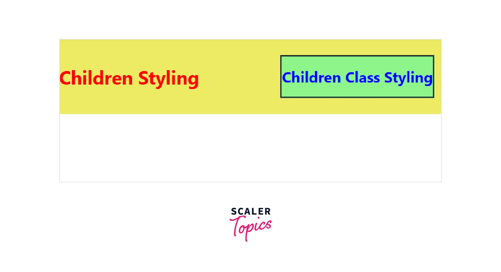
While styling classes with CSS, we can also style the HTML elements that are present as children in that class. Styled components react also has the same property to style the children's HTML elements. We can also style based on class and id using the normal CSS operators in styled-components.
The above styling illustrates that the styled-components follow a similar syntax to CSS for styling children elements. The h1 element is styled red and the h1 elements in the right class are styled differently and a border is also styled for the class. You can also see that we can also style pseudo selectors like hover, focus, after, and before inside the component using the & operator. The & operator represents the current element to be styled and we can add a hover pseudo selector using the : hover keyword.
We can use the created style in the App react component to render the styles,
The image below shows the difference in styling made by styling children's components using react-styled components.
Dynamic Styling with Props Using React Styled Components
React-styled components are very flexible and customizable due to the property to pass props into their components. These props can be used to add, remove or change the styles of the elements based on different conditions. The arrow functions introduced as part of the ES6 syntax are utilized to access the props passed into the styled-components.
We can utilize these props to dynamically change any styles. The following example provides a component that `dynamically changes the background image and colour of the page,
The wrapper component takes backdrop and bgColor as props to set a background image using the url() CSS function and set the colour of the text to be rendered inside the component. There are two ways to get the prop inside the styled component,
- We can use the {} brackets to access the prop directly.
- Access the prop using the props keyword.
If the backdrop prop is not passed, a black background is displayed in the Wrapper component.
Styled components can also be used to create components with default attribute values like password field or submit button. The attrs() function has access to all the attributes in an HTML element and can be used to give values to such attributes. The following example shows the usage of the attrs() function to create a password field,
Explanation:
- You can notice that there is an empty Input element without specifying the required attribute of type. This is possible because the default input type is defined as a password using the attrs() function.
- If a type is specified, then the default type password is replaced with the specified type. The || operator makes the function dynamic as it checks if a value for type is provided and if no type is specified then the type password is used.
While creating a project with typescript, we have to explicitly specify the type of prop that is to be passed in the component for dynamic styling in react-styled components.
The wrapper component can be modified as below for typescript,
In the above example, we can see the backdrop URL is not sanitized, which means there is a possibility for CSS injection. We can use the CSS.escape() static method to sanitize CSS from javascript for security purposes.
Note : Styled components also provide a transient prop that will not be passed down the reacting node in the DOM tree. Such components are prefixed with the $ sign.
The “As” Polymorphic Prop in React Styled Components
We can also create a multi-purpose component that can be rendered as a different HTML element using the as prop in react-styled components. With the as prop we can maintain a standard style while only changing the component to be rendered.
In the above example, the Container is a styled div component and we have rendered the element as a button using the as polymorphic prop.
There may be cases where we may need some additional styles to render the div element as a button and in such cases, instead of creating a new styled component, we can perform inheritance of the created style component. Let us add a box shadow property to the Container component and render the inherited component as a button.
The Button component is a div component with all styles of the Container element in addition to the box-shadow property.
Turn Learning into Career Growth
React Styled Components: Media Queries
Media queries are used to create a responsive design. We can use media queries within the styled-components in reacting to styled components for responsive design.
Let us create a responsive component whose content will be arranged based on the size of the device. For larger devices, the content will be arranged row-wise and for smaller devices, the content will be arranged column-wise.
We can just add the keywords @media screen and to the styled component and specify the width or height property to apply the styles.
The two buttons will be arranged row-wise on larger screens and column-wise on smaller screens.
Styled components also provide the css function that could be used to create custom CSS objects that could be applied to style the components. We can utilize this css function to create style variants based on size. The syntax of this css function is similar to the styled function, but the css function is general and is not specified for a specific element.
In the above example, we have created a CSS object with large and small size variants. A size prop is passed to the Responsive component which determines the CSS to be applied.
React Styled Components: Animations
Keyframes in CSS is used to control the steps of animation and create an animation effect. Styled components react provides its own keyframes component to create animations that can be utilized and reused by multiple components.
A simple animation in which text appears from the left of the screen.
We can also create an animation with a keyframe using normal CSS like the Normal component or use the keyframes function to create a custom animation and use it like in the Animation component. The ease-in-out animation will start slowly at the beginning and end slowly at the end.
React Styled Components: External File Structure
The file structure of styled components should be modular and easy to maintain. The best practice is to create the styles in the same folder where the components are present and name such styles files as component_name.styles.js to track them easily.
This also helps to separate all the styles respective to the components. Regarding file structures, styled components provide a StyleSheetManager component to customize the processing of styles and change the behaviour of CSS runtimes. One of the useful props of this component is isableVendorPrefixes which helps to disable all legacy CSS properties. The StyleSheetManager component is a high-level component and should be rendered at the top level.
Exporting Styles React Styled Components: Media Queries
As discussed in the file structure section, the styles present in a file can be exported with the export keyword. This export is called named export and can be imported by passing the name of the styled component inside the {}. We can export multiple components from a file.
Then the exported component can be imported into the home.js file,
The default keyword can be used for default exports which can be imported without the {}, but only one default export can be made per file.
FAQs
Q: Is styled-components CSS-in-JS?
A: Yes, CSS in js involves using CSS in JavaScript components to provide styling in a more customizable and flexible way. React-styled components are one of the most famous CSS in the JS library.
Q: Do I have to do any configuration before using styled-components?
A: No, styling components is a library that allows the usage of CSS in JavaScript components. We don't need to do a setup like SASS to compile the CSS as it uses the normal CSS runtime.
Conclusion
- Styled components in react and react native is a javascript library that can be used to create CSS-styled reusable javascript components.
- React-styled components are easy to use, customizable, and provide automatic vendor prefixing.
- The styled element in styled-components is used to create and combine styles with an HTML element.
- Global styles can be created using the create global style component and should be used at a higher level.
- Children elements inside a component can also be styled like normal CSS.
- Styled components provide theming which can be used to establish a theme in an application.
- Styled components accept props which makes a component dynamic and can be used to customize the styles of an element.
- Styled components also provide keyframes for animation and we can also use media queries to create responsive styles.