Sizedbox In Flutter
Overview
SizedBox Flutter is a box that can contain something inside it and you can decide how big or small that box should be. It's like having a frame where you can put a picture or any object, and you have control over the size of that frame.
Introduction
SizedBox Flutter acts as a container widget that enforces fixed width and height for its child widget. By specifying precise dimensions and constraints, you can override intrinsic sizes and ensure consistent visual presentation. Whether you need to allocate a specific space for text, images, or other complex elements, SizedBox allows you to define the exact measurements, delivering a polished and professional user interface.
Understanding Box Constraints
The importance of box constraints in SizedBox Flutter cannot be overstated. Box constraints play a crucial role in determining the behaviour and layout of widgets within the SizedBox.
First and foremost, box constraints ensure that the child widget of a SizedBox adheres to the specified dimensions. By defining the width and height through box constraints, developers can create a predictable and consistent user interface. This allows for precise control over the size of widgets, resulting in a polished and visually appealing layout.
Furthermore, box constraints enable the child widget to respond appropriately to the available space within the layout. If the SizedBox Flutter has constraints imposed by its parent widgets, such as maximum or minimum width and height, the child widget will adjust accordingly. This flexibility ensures that widgets can adapt and maintain their desired proportions, accommodating different screen sizes and orientations.
Basics of SizedBox
The basics of SizedBox Flutter are as follows:
- Size Control: SizedBox allows you to specify a fixed width and height for its child widget. You can define these dimensions using the width and height parameters of the SizedBox Flutter. By setting these values, you can ensure that the child widget occupies the desired space within the layout.
- Flexibility: In addition to fixed dimensions, you can also leave one or both dimensions unconstrained. For instance, you can set the width to double.infinity or the height to null. This allows the SizedBox and its child to expand or shrink dynamically based on the available space or the size of the content.
- Constraints: SizedBox respects the constraints set by its parent widget. If the parent widget imposes constraints on the SizedBox Flutter, such as maximum or minimum width and height, the SizedBox and its child widget will adjust accordingly. This helps maintain the integrity of the layout and ensures that the widgets behave within the specified limits.
- Shorthand: Flutter provides a shorthand syntax for creating an expanded SizedBox. Instead of explicitly setting width and height, you can use SizedBox.expand to automatically fill all available space within its parent widget. This is particularly useful when you want a widget to expand and occupy the remaining space in a container.
Properties of SizedBox Widget
The SizedBox Flutter has several properties that allow you to customize its behaviour and appearance.
Here are the main properties of the SizedBox Flutter widget:
- Child: This property is used to define the child widget that will be contained within the SizedBox. It can be any Flutter widget, such as a Container, Text, Image, or even another layout widget.
- Width: Specifies the desired width of the SizedBox. You can assign a double value to set the width in logical pixels. If not specified, the width will be unconstrained, allowing the child widget to occupy its intrinsic or available width.
- Height: Specifies the desired height of the SizedBox. Similar to the width property, you can assign a double value to set the height in logical pixels. If not specified, the height will be unconstrained, allowing the child widget to occupy its intrinsic or available height.
- Key: An optional property that allows you to assign a Key to the SizedBox. Keys are useful for identifying and differentiating widgets, particularly when working with widget trees and handling state changes.
Responsive Sizing with SizedBox
To achieve responsive sizing with SizedBox Flutter, you can use a combination of MediaQuery and LayoutBuilder widgets.
Here's an example of how you can accomplish this:
In this example, the LayoutBuilder widget provides a constraints object that represents the available space for the SizedBox. By accessing the constraints, you can dynamically adjust the size of the SizedBox based on the available space.
The width of the SizedBox is set to 80% of the screen's width using . This allows it to be responsive and adapt to different screen sizes.
The height of the SizedBox is set to 50% of the maximum height available within the constraints object using constraints.maxHeight * 0.5. This ensures that the height is responsive and adjusts proportionally based on the available vertical space.
Inside the SizedBox, you can place your desired widget or content that will be resized responsively based on the constraints provided by the LayoutBuilder.
By combining MediaQuery and LayoutBuilder with SizedBox, you can create responsive designs that adapt to different screen sizes and orientations, ensuring a consistent user experience across various devices.
SizedBox vs. Expanded and Flexible
SizedBox, Expanded, and Flexible are widgets in Flutter that serve different purposes when it comes to controlling the sizing and layout of widgets within a parent container.
Here's how they differ:
- SizedBox: SizedBox allows you to explicitly set fixed dimensions (width and height) for its child widget. It enforces a specific size constraint, regardless of the available space or content within the parent container. If the child widget exceeds the specified size, it may be clipped or overflow the parent container. SizedBox is useful when you need precise control over the size of a widget.
- Expanded: Expanded is typically used within a Row, Column, or Flex layout to distribute available space among multiple widgets. It expands to fill the remaining space within the parent container, allowing the child widget to take up as much space as possible. It's commonly used to create flexible layouts that adapt to different screen sizes and orientations. Expanded widgets can share the available space proportionally based on their flex factor.
- Flexible: Flexible is similar to Expanded in that it's also used within a flexible layout. However, Flexible provides more flexibility in how space is distributed among its children. It allows you to specify a flex factor that determines how the available space is divided. By assigning different flex values to Flexible widgets, you can control how much space each widget receives relative to others. Flexible is useful when you need more granular control over the distribution of available space among the children.
Advanced Techniques with SizedBox
Here are a few advanced techniques and use cases for SizedBox Flutter:
Utilizing SizedBox to control the aspect ratio of widgets
SizedBox can be used in combination with the AspectRatio widget to control the aspect ratio of widgets in Flutter. The AspectRatio widget maintains a specified aspect ratio by adjusting the dimensions of its child widget. Here's an example of how you can utilize SizedBox to control the aspect ratio of a widget:
In this example, the SizedBox sets the desired width for the widget to 200 logical pixels. Inside the SizedBox, the AspectRatio widget is used to maintain the aspect ratio of its child widget. By setting the aspectRatio property to 16/9 (commonly used for a widescreen aspect ratio), the child widget will adjust its height to maintain the specified ratio.
Creating Custom-Sized Widgets Using SizedBox
You can create custom-sized widgets by combining SizedBox with other widgets or customizing the child widget within the SizedBox.
Here are a few approaches to creating custom-sized widgets using SizedBox Flutter:
- Custom Container Size:
- Custom Widget with Aspect Ratio:
- Custom Widget Size with Media Queries:
Animating SizedBox for Dynamic Resizing Effects
Animating the size of a SizedBox can be achieved by combining it with animation widgets like AnimatedContainer or AnimatedSize.
Here's an example of how you can animate the resizing of a SizedBox:
In this example, we use an AnimatedContainer as the parent widget. The width and height properties of the AnimatedContainer are animated based on the _isExpanded boolean variable, which determines whether the widget is expanded or collapsed.
The _toggleSize() function is called when the GestureDetector is tapped, which triggers the size animation. Depending on the _isExpanded value, the animation controller forwards or reverses the animation.
You can adjust the _expandedWidth, _expandedHeight, _collapsedWidth, and _collapsedHeight variables to set your desired sizes for the expanded and collapsed states of the SizedBox.
Example App
Here's an example Flutter app that demonstrates the usage of SizedBox Flutter:
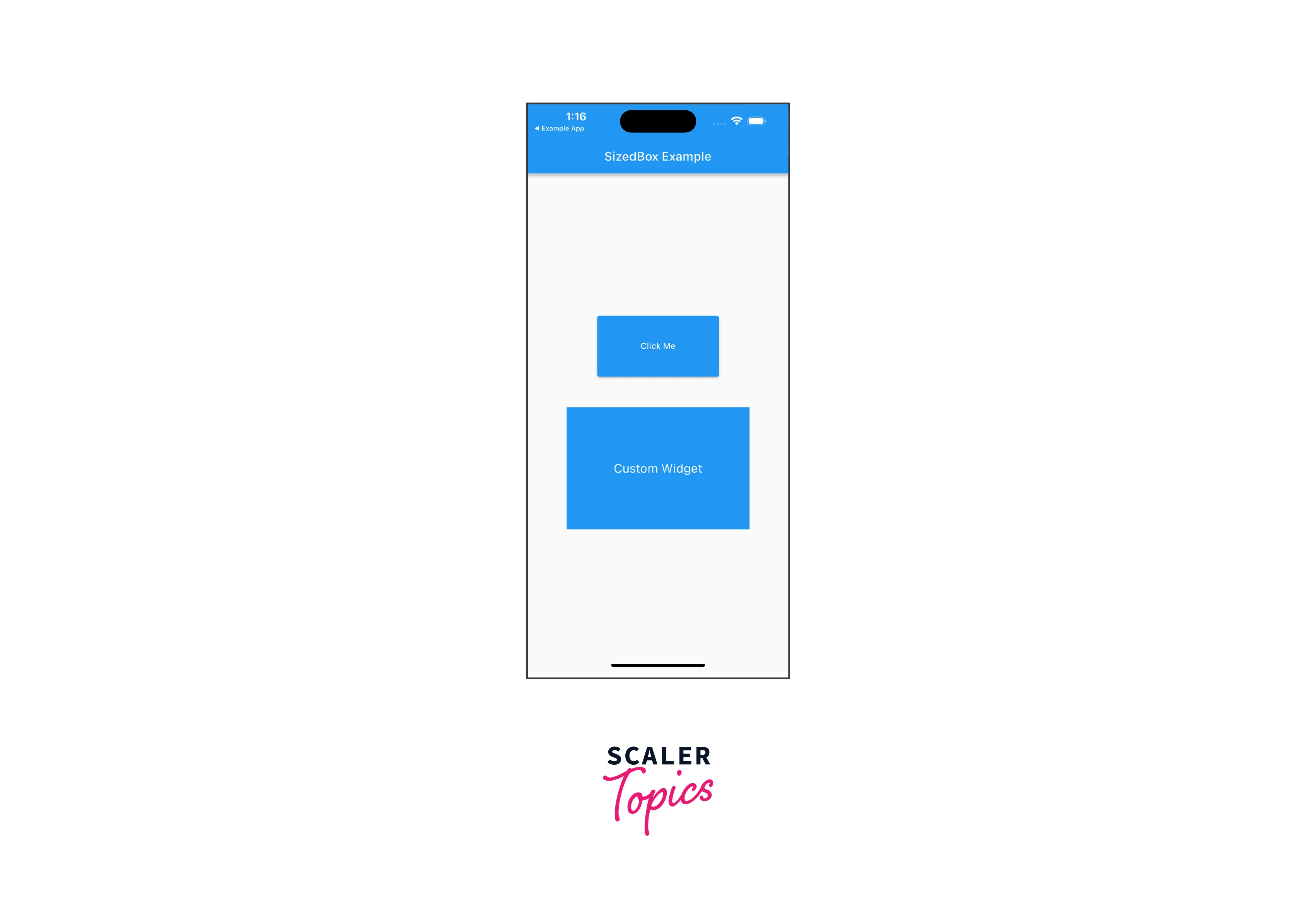
In this example app, we have a StatelessWidget, SizedBoxExampleApp, which serves as the root widget. It displays a Scaffold with an AppBar and a body containing a Column widget.
Inside the Column, we have two SizedBox widgets:
- The first SizedBox is used to create a fixed-sized button. It has a width of 200 and a height of 100. The child widget is an ElevatedButton with the text "Click Me". You can customize the onPressed callback to perform any desired action when the button is pressed.
- The second SizedBox is used to create a custom-sized container. It has a width of 300 and a height of 200. The child widget is a Container with a blue background color. Inside the Container, we have a Center widget with a Text widget displaying "Custom Widget" in white color and font size 20.
Conclusion
In conclusion, let's summarize the key points about SizedBox Flutter:
- SizedBox allows you to explicitly set the width and height of a widget, providing precise control over its dimensions.
- You can use SizedBox to enforce fixed-size constraints on a widget, ensuring it remains within specific width and height boundaries.
- By combining SizedBox with the AspectRatio widget, you can maintain the desired aspect ratio for widgets like images or video players.
- With MediaQuery, you can make your SizedBox responsive by setting its width and height based on a percentage or by adapting to the screen size of the device.
- Combining SizedBox with animation widgets like AnimatedContainer or AnimatedSize allows for smooth and visually appealing size transitions and dynamic resizing effects.
- SizedBox enables the creation of custom-sized widgets by specifying the desired width and height, either as fixed values or using responsive techniques.
- You can use SizedBox to apply minimum and maximum constraints on widget size, ensuring it remains within specified boundaries.