Snackbar
Overview
A snackbar is a small, unobtrusive notification that appears at the bottom or top of the screen. Its purpose is to provide concise information or feedback to the user without disrupting their current workflow. Snackbars are commonly used to confirm an action, display error messages, or convey other important information.
Build an AI-First Career, Master the Complete Skillset
Choose from our industry-leading programs designed for career success
Modern Software and AI Engineering Program
Master full-stack development with AI integration


 +1000 more
Modern Data Science and ML with specialisation in AI
Advanced data science techniques with AI specialization
+1000 moreAdvanced AIML with Specialisation in Agentic AI
Deep dive into AIML with focus on Agentic systems
+1000 moreDevOps, Cloud & AI Platform Engineering
Build and manage AI-powered cloud infrastructure
+1000 moreAI Engineering Advanced Certification by IIT-Roorkee
Premier AI engineering certification from IIT-Roorkee

AI Forward Deployed Engineer Program
Full-stack engineering, production AI and client-facing consulting
+1000 moreWhen to use
| Use Case | Snackbar Usage |
|---|---|
| Confirming an action | ✔️ |
| Displaying error messages | ✔️ |
| Notifying successful operations | ✔️ |
| Requesting user input | ✖️ (Use dialogs or modals instead) |
| Displaying lengthy content | ✖️ (Use modals or dedicated screens) |
| Long-term notifications | ✖️ (Use notifications or in-app messaging) |
Simple Snackbars
Simple snackbars are great for conveying quick, non-disruptive information.
Here are some key points to understand :
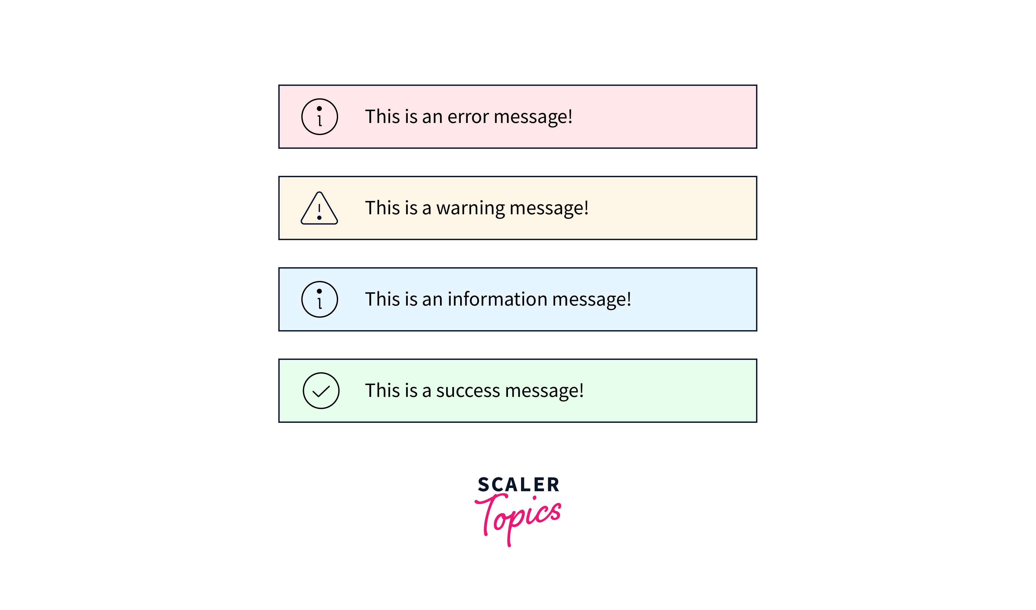
- Message Content : A simple snackbar typically contains a short and concise message. This message can inform the user about the success of an action, provide feedback, or display an error message.
- Duration : Simple snackbars usually appear for a brief duration and then automatically disappear.
- Action Button (Optional) : Depending on the use case, you can include an optional action button in a simple snackbar.
- Appearance : The appearance of a simple snackbar often includes a small rectangular container that appears at the bottom of the screen. It may have a background color, text color, and an icon or symbol to indicate the nature of the message.
Customization
Customization of snackbars allows you to tailor their appearance and behavior to match the design and branding of your application. Here are some aspects of customization :
- Styling : You can customize the visual style of a snackbar by changing its background color, text color, font size, and other CSS properties.
- Animation : You can add animation effects to the appearance and disappearance of snackbars. Animations can make the user experience smoother and more engaging. Common animations include fade-ins, slide-ins, or scale transitions.
- Content : While simple snackbars typically contain short text messages, customization can also extend to the content. You might want to include additional elements, such as icons, images, or dynamic content, depending on your application's needs.
- Position : Customization can also involve changing the default position of the snackbar. Instead of appearing at the bottom, you might want to position it at the top, in a corner, or at a specific location on the screen.
Positioned snackbars
Positioned snackbars refer to snackbars that appear at specific locations on the screen, rather than the default top or bottom position. This feature is valuable when you have a unique layout or need to draw the user's attention to a particular area. Here's how positioned snackbars work :
- Custom Location : Positioned snackbars allow you to specify the exact position where the snackbar should appear on the screen. This position is often defined in terms of coordinates or relative to a specific UI element.
- Use Cases : Positioned snackbars are useful when you want to provide context-specific feedback. For example, in a map application, you might show a snackbar with location details when the user marks a point of interest.
Positioned snackbars allow you to display messages at specific locations on the screen, making them valuable for context-specific feedback.
- Custom Location : Positioned snackbars can appear near relevant UI elements, enhancing their context and ensuring users associate the feedback with a specific action or area.
- Enhanced Relevance : They are useful in scenarios where feedback needs to be tied to a particular part of the application, such as providing location details on a map marker click.
- Focused Attention : Positioned snackbars draw the user's attention precisely where it matters, improving user understanding and engagement.
Examples :
In a photo-sharing app, you can position a snackbar near the "Like" button to confirm a user's action, or in a document editor, near a comment to acknowledge its submission.
Message Length
Message length is a critical consideration when working with snackbars. Snackbars are designed for short, concise messages, and their limited space should be used judiciously. Here's why message length is important :
- Conciseness : Snackbars are meant to deliver quick, to-the-point messages. Keeping messages short ensures that users can grasp the information at a glance without needing to spend much time reading.
- Readability : Long messages can be challenging to read in the limited space of a snackbar, especially on smaller screens. Users may miss critical information if messages are too lengthy.
Snackbars are not ideal for requesting user input or displaying lengthy content primarily because of their limited space and purpose.
- Space Constraint : Snackbars typically provide a small area for content, making them unsuitable for complex forms or user input.
- Readability : Lengthy content can be challenging to read in a small snackbar, potentially leading to user frustration and missed information.
- User Experience : Requesting input in a snackbar disrupts the flow of user interaction and can be confusing.
How Scaler Transformed Careers in Different Fields
Scaler learners achieved 2.5x salary growth with average post-Scaler CTC reaching ₹23L.
 Google
 Amazon
 Microsoft
 Flipkart
 Adobe1200+ more
Transitions
Smooth transitions are key to a polished user experience. Use animations to make your snackbars appear and disappear gracefully. A subtle slide or fade-in effect can make a significant difference.
Smooth transitions and animations in snackbars contribute to a polished and user-friendly interface.
- Enhanced User Experience : Animations make the appearance and disappearance of snackbars less jarring, creating a smoother user experience.
- Engagement : Well-designed animations capture the user's attention and guide their focus to the message, improving engagement.
- Professional Look : They add a professional and aesthetically pleasing touch to your application, reinforcing the quality of your product.
- Seamless Integration : Smooth animations ensure that snackbars seamlessly integrate into the overall flow of the application.
Consecutive Snackbars
When multiple snackbars need to appear in sequence, it's important to handle them gracefully. Ensure that one snackbar doesn't disrupt or overlap with another. Queueing or stacking snackbars is a common approach.
Snackbars and Floating Action Buttons (FABs)
Snackbars and floating action buttons (FABs) often go hand in hand. When a user takes an action through a FAB, a snackbar can provide feedback or confirmation, enhancing the user experience.
Turn Learning into Career Growth
Change Transition
Consider allowing users to change the direction or style of snackbar transitions in your app's settings. This small customization can enhance accessibility for users with specific preferences or needs.
Control Slide Direction
In some cases, you may want to control the slide direction of the snackbar (e.g., from the top or bottom). This can be particularly useful for apps with non-standard layouts or animations.
Complementary projects - notistack
Notistack is a popular open-source library that simplifies snackbar implementation in React applications. It provides advanced features and customization options, making it a valuable addition to your toolkit.
Accessibility
Accessibility should always be a priority. Ensure that your snackbars are screen reader-friendly and compatible with keyboard navigation. Provide ARIA roles and labels for improved accessibility.
Conclusion
- Snackbar in React provides unobtrusive, user-friendly notifications, enhancing the overall user experience.
- It offers real-time feedback for actions like form submissions or successful operations, improving user engagement.
- Integration with popular React libraries like Material-UI or Notistack simplifies implementation, saving development time.
- Snackbar components are designed with accessibility in mind, ensuring they are screen reader-friendly and navigable via keyboard controls.
- You can position snackbars at various locations on the screen, making them versatile for different use cases.
- Encourages short and concise messages, ensuring users quickly understand the information without disruption.
- Supports smooth animations for snackbar appearance and disappearance, creating a polished user interface.