15 Important Tableau Projects with Examples
Overview
Tableau, a powerful data visualization tool, has become instrumental in transforming raw data into actionable insights across various industries. In this overview, we'll delve into 15 important Tableau projects with examples that showcase its versatility and impact. First, consider sales analysis dashboards that help businesses track revenue trends, product performance, and market segmentation for informed decision-making. Healthcare organizations utilize Tableau to create patient outcome dashboards, improving patient care and resource allocation. Government agencies harness its capabilities for visualizing public data, ensuring transparency and engagement. Marketing teams rely on Tableau for campaign performance analysis, optimizing strategies for maximum ROI. Financial institutions use it to create risk management dashboards, ensuring financial stability.
Beginner Level Tableau Projects
In the dynamic realm of data analytics and business intelligence, Tableau has emerged as a game-changer, empowering individuals and organizations to transform raw data into actionable insights. For beginners embarking on their data journey, Beginner Level Tableau Projects offer an exciting entry point into the world of data visualization and analysis. These projects are designed to introduce novices to the fundamental concepts and tools of Tableau, making complex data more accessible and comprehensible.
At its core, Tableau is a powerful data visualization platform that allows users to create interactive and visually appealing dashboards, charts, and reports. Beginner Level Tableau Projects aim to demystify this software and guide newcomers through the essential steps of data exploration, preparation, and visualization. These projects typically start with the basics, teaching participants how to connect to data sources, import datasets, and manipulate data for analysis.
Now lets us read about few of them in details now:
Transform Your Career
Choose from our industry-leading programs designed for career success
Modern Software and AI Engineering Program
Master full-stack development with AI integration

Modern Data Science and ML with specialisation in AI
Advanced data science techniques with AI specialization
Advanced AIML with Specialisation in Agentic AI
Deep dive into AIML with focus on Agentic systems
DevOps, Cloud & AI Platform Engineering
Build and manage AI-powered cloud infrastructure
AI Engineering Advanced Certification by IIT-Roorkee
Premier AI engineering certification from IIT-Roorkee
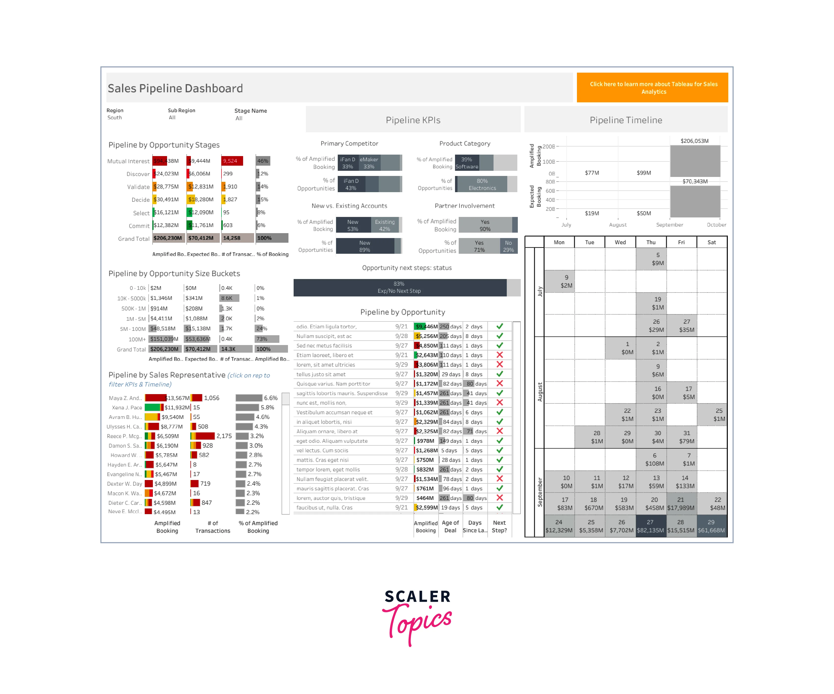
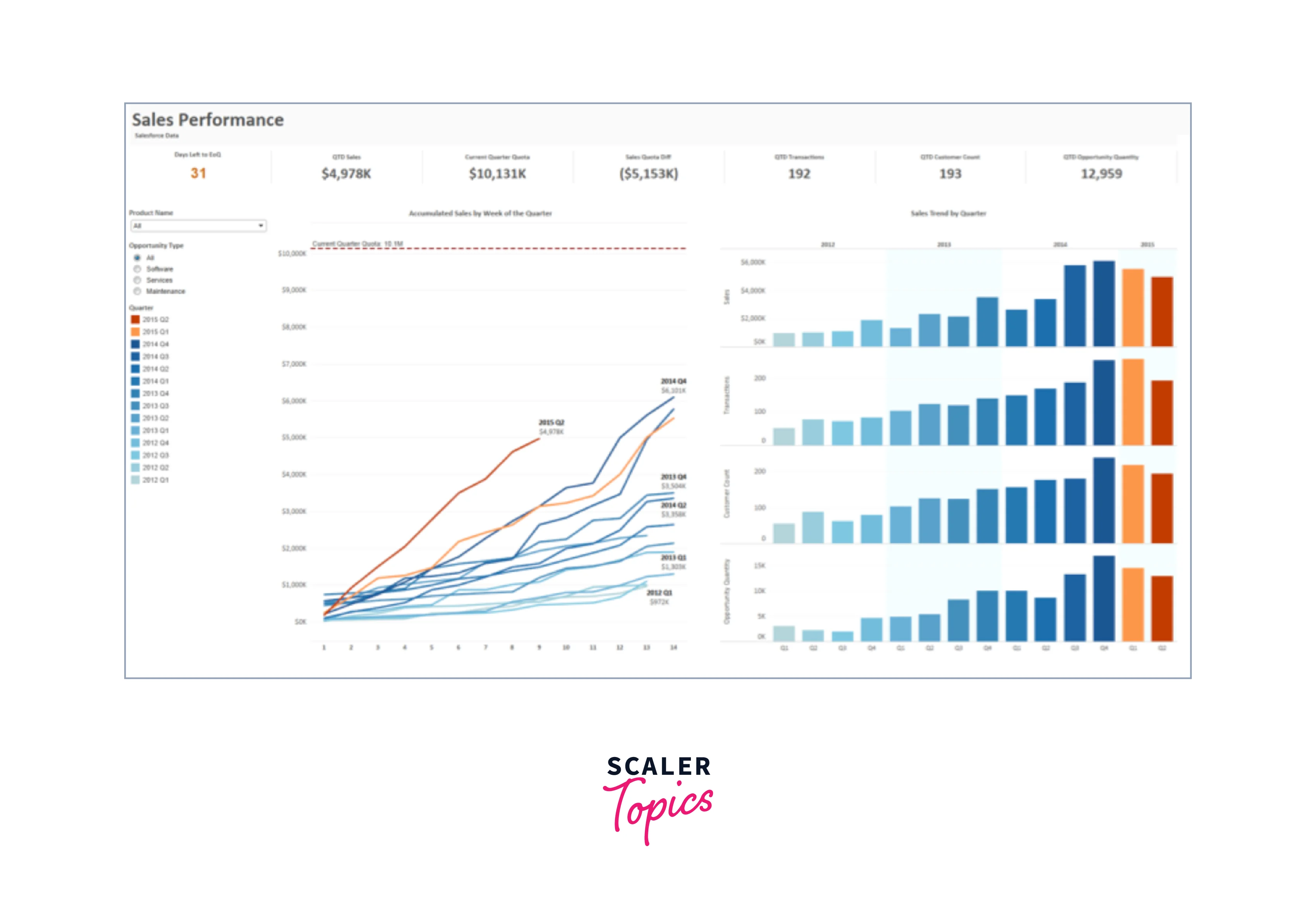
Project 1: Sales Performance Dashboard
Objective: Create a dashboard to visualize sales performance for a fictional company.
Steps:
- Data Preparation: Start by importing your sales data into Tableau. You can use a sample dataset or create one with fictional sales figures.
- Connecting Data: Open Tableau and connect to your data source. Choose the appropriate file format (e.g., Excel, CSV) and select your dataset.
- Data Exploration: Explore your data by dragging and dropping fields onto the canvas. You can start with basic elements like a bar chart to show monthly sales.
- Creating Charts: Create charts to represent different aspects of sales, such as line charts for sales trends over time, bar charts for product-wise sales, and pie charts for market share.
- Dashboard Creation: Assemble your charts on a dashboard by clicking on the "Dashboard" tab. Arrange them neatly to create an intuitive interface.
- Filters and Interactivity: Add filters to allow users to interact with the dashboard. For example, you can create a filter to select a specific year or region.
- Customization: Customize your dashboard by adding a title, captions, and tooltips to explain the data. You can also format the colors and fonts to make it visually appealing.
- Dashboard Actions: Create dashboard actions that enable dynamic interactions between different charts. For instance, clicking on a region in a map can filter the bar chart to show sales for that region only.
- Publishing: Once your dashboard is ready, you can publish it to Tableau Public or Tableau Server. This allows you to share your work with others.
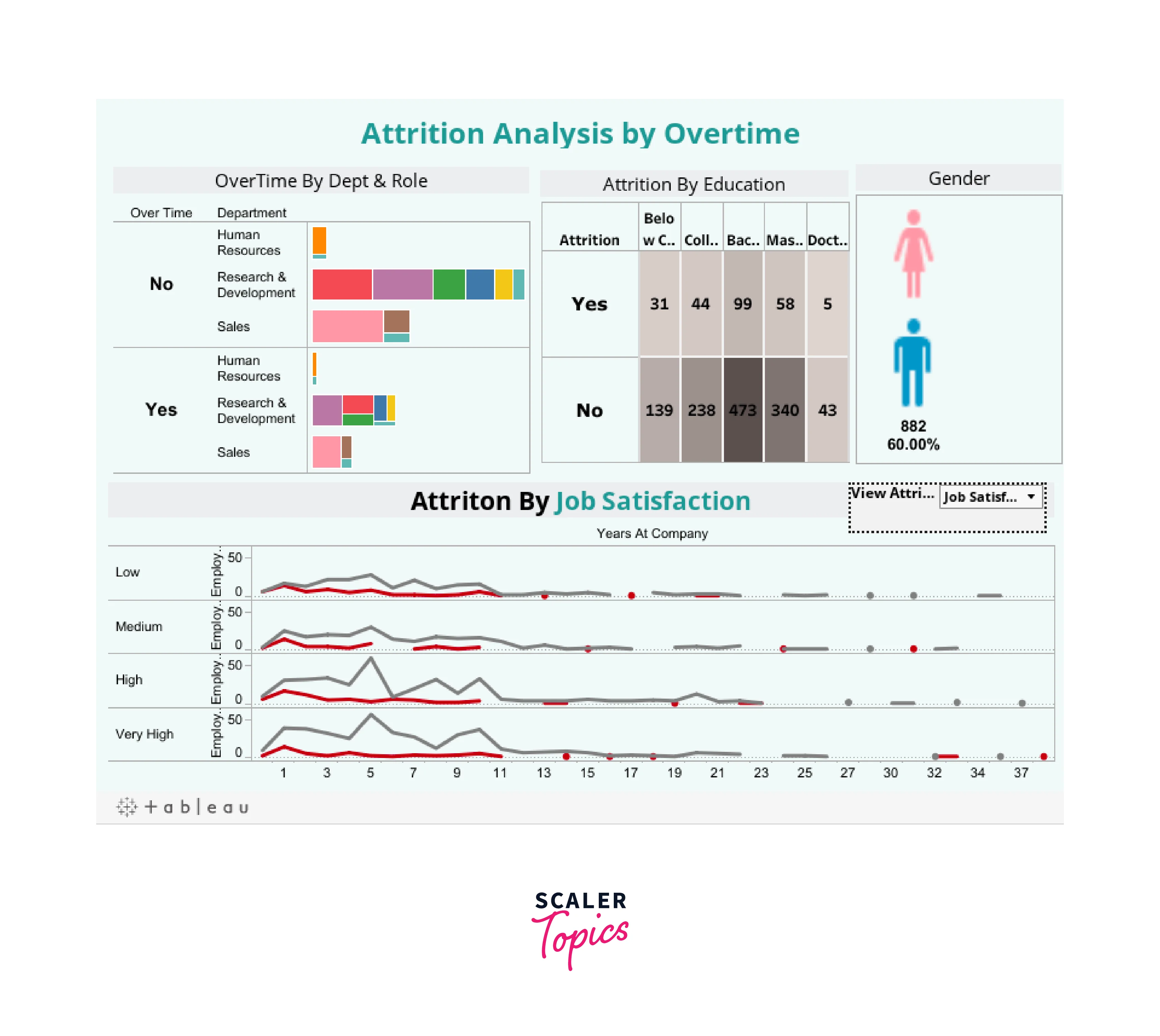
Project 2: Employee Attrition Analysis
Objective: Analyze employee attrition data to identify trends and factors contributing to attrition.
Steps:
- Data Import: Import your employee attrition dataset into Tableau. This dataset should include information about employees, their departments, and reasons for leaving.
- Data Exploration: Start by exploring the data. Create a simple table to view employee details like name, department, and hire date.
- Attrition Rate Visualization: Create a pie chart or bar chart to display the attrition rate in different departments. This can help identify departments with the highest attrition.
- Reasons for Attrition: Use a stacked bar chart to show the reasons for attrition. You can group them by department or any other relevant dimension.
- Employee Demographics: Create demographic insights by visualizing age distribution, gender diversity, and tenure within the organization.
- Interactive Filters: Add filters to allow users to select specific departments, job roles, or time frames for analysis.
- Dashboard: Assemble the individual charts into a dashboard. Add context by including a title, summary, and relevant filters.
- Highlight Actions: Implement highlight actions that allow users to click on a department or a specific reason for attrition to highlight related information across all charts.
- Insights: Interpret the visualizations and draw conclusions about the factors contributing to employee attrition. Share insights in the dashboard.
- Publish and Share: Publish the dashboard on Tableau Public or Tableau Server and share it with HR professionals or management.
Project 3: Product Sales and Profit Analysis
Objective: Analyze product sales and profit data to identify top-performing products and regions.
Steps:
- Data Import: Import your product sales and profit dataset into Tableau. Ensure that it includes product details, sales figures, and profit margins.
- Data Exploration: Begin by creating a scatter plot to visualize the relationship between sales and profit for all products.
- Top Products: Create a bar chart or table to display the top-selling products based on sales volume. You can also add filters to select a specific time period.
- Profit Margin Analysis: Build a scatter plot to show profit margins for different products. This helps identify products with high-profit margins.
- Regional Performance: Use a map chart to visualize sales across different regions or locations. Color code the regions based on sales performance.
- Dashboard: Combine the individual charts into a dashboard. Add titles, captions, and filters to enhance user experience.
- Interactive Filters: Allow users to filter data by product category, region, or time frame to get specific insights.
- Highlight Actions: Implement highlight actions that enable users to click on a product in one chart and see its performance across all charts.
- Trends and Insights: Analyze the visualizations to identify trends in product sales and profitability. Highlight key insights in the dashboard.
Project 4: Customer Segmentation Analysis
Objective: Segment customers based on their purchasing behavior and demographics.
Steps:
- Data Import: Import your customer data, which should include information like age, gender, purchase history, and location.
- Data Exploration: Start with a scatter plot to visualize customer age versus their total purchase amount.
- Customer Segmentation: Use clustering algorithms or simple rules to segment customers into groups. Create a bar chart to show the distribution of customers in each segment.
- Demographic Analysis: Visualize customer demographics using bar charts, pie charts, or maps, depending on the nature of the data.
- Dashboard Creation: Assemble the individual charts into a dashboard. Add a filter to allow users to select specific segments.
- Interactivity: Implement interactivity by allowing users to click on a segment to see detailed information about the customers in that segment.
- Insights: Analyze the segments to understand their characteristics and buying behavior. Provide recommendations for targeted marketing.
Turn Learning into Career Growth
Project 5: Website Traffic Analysis
Objective: Analyze website traffic data to understand user behavior and improve website performance.
Steps:
- Data Import: Import your website traffic data, including metrics like page views, bounce rate, and user demographics.
- Data Exploration: Create a line chart to visualize the trend in website traffic over time. You can also use tables to show top-performing pages.
- User Behavior Analysis: Create charts to analyze user behavior, such as a funnel chart to track the user journey through the website.
- Traffic Sources: Visualize the sources of website traffic (organic search, social media, direct, etc.) using a pie chart or bar chart.
- Dashboard Creation: Assemble the charts into a dashboard. Add filters to allow users to select specific time periods or segments of users.
- Interactivity: Implement interactivity by allowing users to click on a specific page or traffic source to see more details.
- Insights: Analyze the data to identify patterns in user behavior and traffic sources. Make recommendations for website improvements.
Intermediate Level Tableau Projects
In the ever-evolving landscape of data analysis and business intelligence, Tableau has emerged as a frontrunner, empowering professionals to transform raw data into meaningful insights. As individuals and organizations seek to harness the full potential of this powerful tool, intermediate-level Tableau projects represent a crucial stepping stone in the journey towards data-driven decision-making.
At this stage, practitioners have already mastered the fundamentals of Tableau, including data connection, basic visualizations, and simple calculations. Intermediate-level projects build upon this foundation, introducing more complex concepts and techniques. These projects often serve as a bridge between basic proficiency and advanced mastery, enabling users to explore and analyze data with greater depth and sophistication.
- Sales Performance Dashboard:
- Objective: Create a comprehensive dashboard to analyze sales performance.
- Data: Sales data with information on products, regions, and time periods.
- Techniques: Use bar charts, line charts, and heat maps to visualize sales trends by region and product category. Implement filters and parameters to allow users to drill down into specific data subsets. Calculate key performance indicators (KPIs) like sales growth, profit margins, and customer acquisition costs.
- Customer Segmentation Analysis:
- Objective: Segment customers based on their purchase behavior.
- Data: Customer transaction data with demographics.
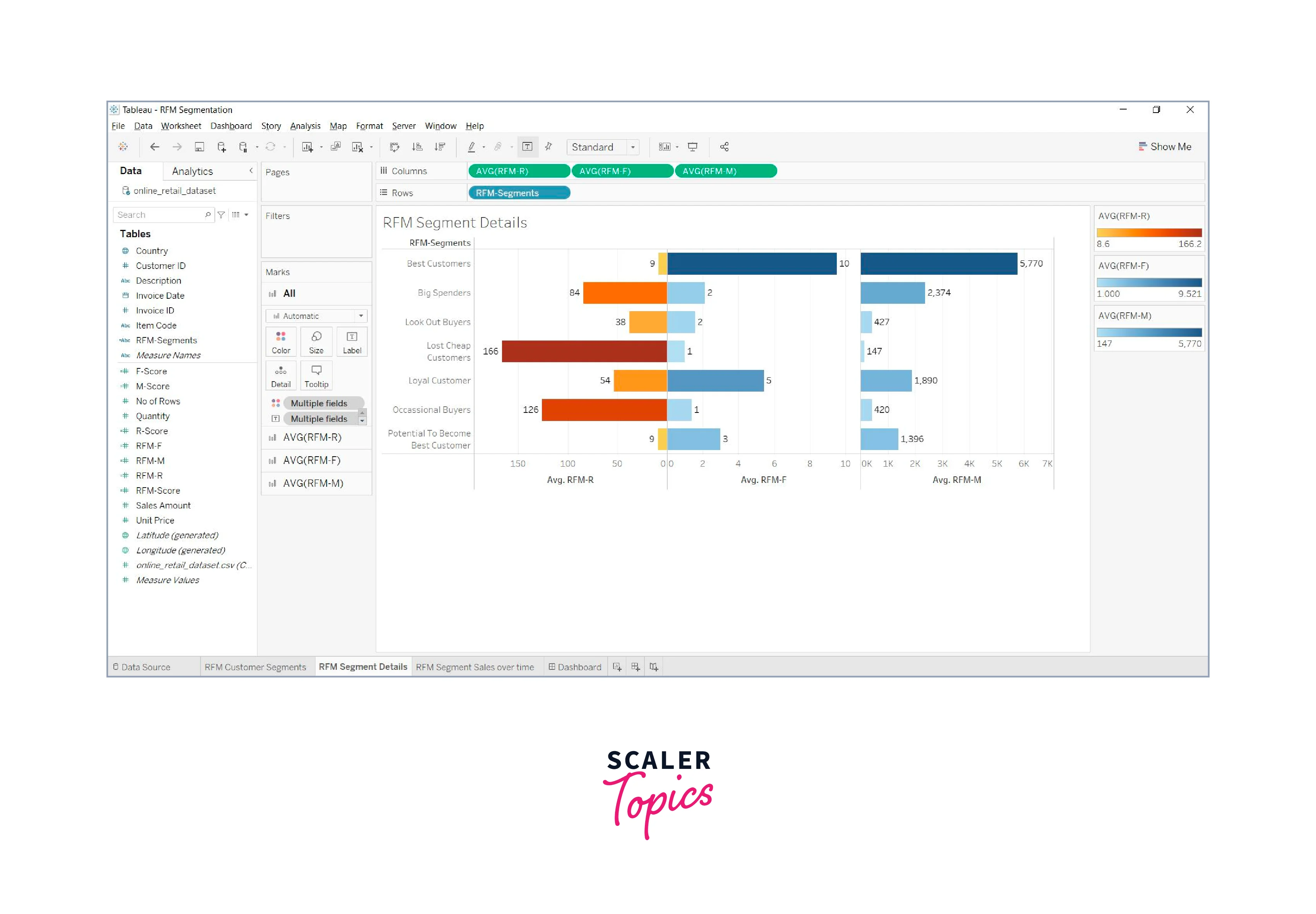
- Techniques: Utilize clustering algorithms (K-means, DBSCAN) to group customers with similar purchasing patterns. Create a scatter plot or bubble chart to visualize customer segments. Implement calculated fields to derive metrics like Customer Lifetime Value (CLV) and RFM (Recency, Frequency, Monetary) scores.
- Stock Market Analysis:
- Objective: Analyze stock market data to identify trends and opportunities.
- Data: Historical stock price data for multiple companies.
- Techniques: Develop candlestick charts, moving averages, and Bollinger Bands to visualize stock price movements. Use parameters to allow users to select specific stocks and date ranges. Create calculated fields for technical indicators like Relative Strength Index (RSI) and Moving Average Convergence Divergence (MACD).
- HR Analytics Dashboard:
- Objective: Provide HR insights on employee performance and attrition.
- Data: HR data with employee demographics, performance reviews, and exit records.
- Techniques: Design a dashboard with employee turnover rate, performance ratings, and diversity metrics. Utilize tree maps and sunburst charts to visualize the organization's hierarchy. Implement filters for department-wise analysis. Calculate attrition rates and identify factors contributing to employee turnover.
- Marketing Campaign Analysis:
- Objective: Evaluate the effectiveness of marketing campaigns.
- Data: Marketing campaign data, including channels, budgets, and conversion rates.
- Techniques: Create a funnel chart to visualize the customer journey from awareness to conversion. Use bar charts to compare the performance of different marketing channels. Implement a time series analysis to track campaign performance over time. Calculate Return on Investment (ROI) and Customer Acquisition Cost (CAC) metrics.
- Supply Chain Optimization:
- Objective: Optimize inventory and supply chain operations.
- Data: Supply chain data with information on suppliers, lead times, and demand.
- Techniques: Develop a supply chain dashboard with inventory levels, supplier performance, and lead time analysis. Utilize heat maps to identify bottlenecks in the supply chain. Implement forecasting models to predict demand and optimize inventory levels.
- Customer Churn Prediction:
- Objective: Build a predictive model to identify customers at risk of churning.
- Data: Customer data, including usage patterns and churn history.
- Techniques: Split the data into training and testing sets. Build a predictive model (e.g., logistic regression, decision tree) to predict customer churn. Visualize model performance using ROC curves and confusion matrices. Create a dashboard to monitor and segment at-risk customers.
- Social Media Sentiment Analysis:
- Objective: Analyze social media data to gauge public sentiment.
- Data: Social media posts and comments with sentiment labels.
- Techniques: Utilize natural language processing (NLP) techniques to analyze text data and extract sentiment scores. Create word clouds and sentiment heat maps to visualize sentiment trends. Implement filters for sentiment analysis by topic or time period.
- Website Analytics Dashboard:
- Objective: Monitor website performance and user behavior.
- Data: Web analytics data, including page views, bounce rates, and user demographics.
- Techniques: Build line charts and scatter plots to visualize website traffic and user engagement metrics. Implement filters for date range selection and user segmentation. Calculate conversion rates and user retention metrics.
- Real-Time Data Monitoring:
- Objective: Create a real-time dashboard to monitor data streams.
- Data: Live data feeds from sensors, IoT devices, or social media.
- Techniques: Use Tableau's real-time data connection capabilities to connect to live data sources. Develop visualizations that update in real-time as new data arrives. Implement alerts and thresholds for anomaly detection.
Advanced Level Tableau Projects
Advanced Level Tableau Projects take data visualization and analytics to the next level, offering an immersive and insightful experience for businesses and data enthusiasts alike. Tableau, a powerful data visualization tool, is leveraged in these projects to extract actionable insights from complex datasets. These projects typically build upon the fundamental skills of data visualization, exploring advanced techniques and functionalities that enable users to unlock the full potential of their data.
In these projects, practitioners delve into the world of data manipulation, where they transform raw data into meaningful and visually appealing dashboards. They often incorporate intricate calculations, advanced statistical analysis, and predictive modeling, allowing organizations to make data-driven decisions with confidence. Furthermore, advanced users harness the power of data blending and integration, connecting multiple data sources seamlessly to gain a comprehensive understanding of their business operations.
Now lets us read about few of them in details now:
- Predictive Sales Analytics Dashboard: Objective: Create a predictive sales analytics dashboard that not only shows historical sales data but also forecasts future sales trends. Details:
- Use advanced regression and time-series forecasting models in Tableau.
- Incorporate external data sources like economic indicators or seasonality factors.
- Utilize calculated fields and parameters to allow users to adjust forecast models.
- Customer Segmentation and Lifetime Value Analysis:
- Objective: Develop a customer segmentation dashboard that goes beyond basic demographics to identify high-value customer segments. Details:
- Utilize clustering algorithms like k-means within Tableau.
- Calculate Customer Lifetime Value (CLV) based on historical data.
- Create a dynamic dashboard that allows users to explore different customer segments.
- Network Analysis and Social Graph Visualization:
- Objective: Visualize complex networks and relationships within data. Details:
- Use graph databases or data reshaping techniques to prepare network data.
- Implement advanced graph analytics and algorithms in Tableau.
- Build interactive network visualizations to explore relationships, clusters, and influencers.
- Real-time Data Monitoring Dashboard:
- Objective: Create a real-time monitoring system that tracks key metrics and alerts users to anomalies. Details:
- Connect Tableau to real-time data sources (e.g., APIs or live databases).
- Utilize calculated fields and set actions to trigger alerts.
- Design a responsive dashboard that updates in real-time.
- Natural Language Processing (NLP) Text Analytics: Objective: Extract insights from unstructured text data using NLP techniques. Details:
- Utilize Tableau's integration with Python or R to perform NLP tasks.
- Analyze sentiment, topic modeling, and keyword extraction from textual data.
- Visualize text analytics results in a user-friendly dashboard.
- Advanced Geospatial Analysis:
- Objective: Take geographic analysis to the next level by incorporating advanced spatial analytics. Details:
- Use spatial calculations to create custom geospatial features.
- Implement spatial joins and overlays for complex geographical data.
- Visualize geographic data in 3D or utilize path analysis for route optimization.
- Financial Portfolio Management Dashboard:
- Objective: Build a comprehensive financial portfolio management tool for investors. Details:
- Connect to financial data sources or APIs to retrieve stock and asset data.
- Calculate portfolio metrics like risk, return, and diversification.
- Implement interactive filters and drill-down features for portfolio analysis.
- Machine Learning Model Integration: Objective: Integrate machine learning models into Tableau for predictive analytics. Details:
- Train machine learning models (e.g., regression, classification) in Python or R.
- Utilize the Tableau Python/R integration to deploy and visualize model results.
- Allow users to input parameters and see real-time model predictions.
- Healthcare Analytics Dashboard: Objective: Create an advanced healthcare analytics tool for hospitals or medical researchers. Details:
- Utilize healthcare datasets (e.g., Electronic Health Records) to analyze patient outcomes.
- Implement predictive models for disease prognosis.
- Visualize healthcare data securely and ensure compliance with privacy regulations.
- Supply Chain Optimization: Objective: Optimize supply chain operations using Tableau for inventory, demand, and logistics analysis. Details:
- Connect to ERP systems or supply chain databases.
- Visualize demand forecasting, inventory levels, and logistics routes.
- Implement "what-if" scenarios to test supply chain changes.
FAQ
Q. What is Tableau, and why is it used for these projects?
A. Tableau is a powerful data visualization and analytics tool used for these projects to transform raw data into meaningful insights and interactive dashboards.
Q. Can you provide examples of Tableau projects for sales analysis?
A. Sure, one example is a sales performance dashboard that tracks revenue, product sales, and regional performance over time.
Q. How can Tableau be applied in the healthcare industry for patient outcome analysis?
A. Tableau can be used to create dashboards that analyze patient data, track treatment outcomes, and monitor hospital performance, ultimately improving patient care.
Q. What kind of data sources are integrated into Tableau for financial risk management dashboards?
A. Financial institutions often integrate market data, historical financial data, and economic indicators to create comprehensive risk management dashboards.
Conclusion
- Data-Driven Decision-Making: Tableau empowers organizations to make data-driven decisions by transforming raw data into interactive visualizations and insightful dashboards.
- Cross-Industry Applicability: Tableau projects span various sectors, including sales, healthcare, finance, education, and more, highlighting its relevance across industries.
- Advanced Analytics: These projects showcase advanced analytics techniques such as predictive modeling, machine learning integration, and natural language processing (NLP) to extract deeper insights.