React Suite Tooltip Whisper Methods
Overview
React Suite is a comprehensive set of high-quality React components that can be used to build elegant and powerful web applications. One of the standout features of React Suite is its Tooltip and Whisper components, which provide an easy way to add tooltips, popovers, and other types of information-rich overlays to your React applications.
React Suite Tooltip Whisper Methods
Open
The open method is a part of React Suite's Tooltip and Whisper components, and it allows you to programmatically open these components. Tooltips and Whispers are often used to display additional information or context when a user hovers over or interacts with an element in a web application.
When you call the open method on a Tooltip or Whisper component, it triggers the display of the associated tooltip or whisper, making the information or content contained within it visible to the user. This can be particularly useful in scenarios where you want to show tooltips or popovers based on specific user actions or events, such as clicking a button or hovering over an element.
Close
Conversely, the close method allows you to programmatically close a Tooltip or Whisper component. This method is valuable when you want to dismiss or hide the tooltip or whisper based on user interactions, a specific event, or some other condition in your application.
When you call the close method on a Tooltip or Whisper component, it hides the tooltip or whisper, making the content it contains no longer visible to the user. This can help maintain a clean and uncluttered user interface by removing unnecessary information when it's no longer needed.
updatePosition
The updatePosition method is used to manually update the position of a Tooltip or Whisper component on the screen. This method is particularly useful when you need precise control over where the component should be displayed, especially when it's positioned relative to another element.
When you call the updatePosition method, you can provide new coordinates (usually x and y coordinates) to specify where the Tooltip or Whisper should appear on the screen. This allows you to dynamically adjust the position of the component based on changing conditions or user interactions.
Explaining Optional Parameters:
When discussing the React Suite Tooltip and Whisper methods, it's essential to explain any optional parameters they accept. For instance, in the case of the Tooltip component, there are parameters like placement and title.
- Placement: The "placement" parameter determines where the Tooltip should appear about the target element. It accepts values like top, bottom, left, or right. This parameter allows developers to control the Tooltip's positioning to ensure it doesn't obscure important content.
- Title: The "title" parameter defines the content displayed within the Tooltip. It's typically the text or information that you want to present to the user when they interact with the Tooltip-triggering element. Customizing the "title" parameter allows you to provide context or details relevant to the UI element.
Syntax
Here's the basic syntax for each of the Tooltip and Whisper methods:
Creating React Application and Installing Module (Step by Step)
Creating a React application and installing the necessary modules is a straightforward process that can be broken down into a few simple steps. To begin, you'll want to set up the project structure, typically within a directory for your application.
Once your project structure is in place, you can proceed to install the required modules. In this example, we've used the popular React Suite library, and you can install it using the command npm install rsuite.
With React Suite installed, you can then create React components that utilize its features, such as the Tooltip and Whisper components. These components can be customized and controlled using methods like open, close, and updatePosition as needed for your application's functionality. Finally, start your React application to see your components in action, making it easy to add interactive and informative elements to your web applications. Now follow these steps to get started :
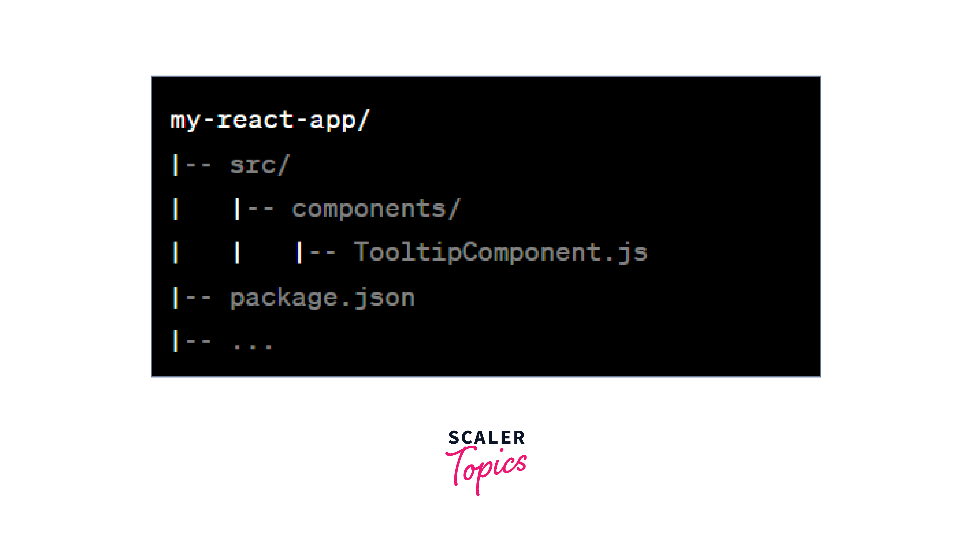
Project Structure
Your project structure should look something like this:
Examples and Steps to Run the Application
Install React Suite:
Create a simple React component that uses the Tooltip component:
Use the MyTooltip component in your main application:
Start your React application:
Now, when you click the "Show Tooltip" button, you'll programmatically open the Tooltip component.
To optimize the performance of Tooltip and Whisper components, especially in scenarios involving numerous tooltips or complex UIs, consider the following tips:
- Lazy Loading: Load tooltips and whispers only when they are needed to reduce the initial load time of your application. Use techniques like dynamic imports or lazy loading to accomplish this.
- Debouncing and Throttling: When dealing with frequent user interactions that trigger tooltips, apply debouncing or throttling mechanisms to avoid excessive updates and rendering.
- Virtualization: Implement virtualization techniques for large lists or complex UIs. This can help minimize the number of tooltips rendered simultaneously, enhancing performance.
- Memoization: Utilize memoization to cache tooltip content and prevent unnecessary re-renders. Libraries, like reselect or React's useMemo hook, can be valuable for this purpose.
React Suite Tooltip and Whisper components are designed to be responsive and adaptable to various screen sizes and orientations.
Here's how they typically adapt:
- Media Queries: CSS media queries can be used to define different styles and behaviours for tooltips and whispers based on screen size. For example, you can specify different placement options or adjust tooltip dimensions for smaller screens.
- Responsive Design: Design tooltips and whispers with responsive principles in mind, such as fluid layouts and flexible content. This ensures that they scale appropriately across different screen sizes and orientations.
- Orientation Changes: Handle orientation changes (e.g., portrait to landscape) by updating tooltip positioning and content as needed. Listen for orientation change events and adjust accordingly.
- Accessibility: Ensure that tooltips and whispers are accessible on all screen sizes and orientations. Test with screen readers and consider keyboard navigation for users with disabilities.
Conclusion
- React Suite Tooltip and Whisper Methods provide powerful ways to control and enhance user interactions in React applications.
- The open method allows you to programmatically open Tooltip and Whisper components, triggering their display when needed. It's useful for triggering tooltip visibility in response to specific user actions or events.
- The close method enables you to programmatically close Tooltip and Whisper components, dismissing them based on user interactions or logic. It's essential for hiding tooltip content when it's no longer relevant or needed.
- The updatePosition method gives you precise control over the positioning of Tooltip and Whisper components. It's valuable when you need to dynamically adjust the component's location based on changing conditions or user interactions.
- Proper project structure and module installation are essential steps in setting up a React application. By installing React Suite using npm install rsuite, you gain access to a wealth of high-quality components.
- Creating React components that utilize Tooltip and Whisper components allows you to create dynamic and informative user interfaces.
- Starting your React application helps you visualize how these components function in practice, enhancing your web application's interactivity and user experience.