How to Make a Background Blur in CSS?
 FREE
FREE

Overview
A website with a blurred background looks beautiful and appealing to users. But have you ever wondered how exactly this blur is created? Well, it's simple. Let's see how we can do it using the background blur css property.
This article discusses the filter and backdrop-filter CSS property, which was introduced in the Filter Effects Module Level 2 standard.
Translucence, blurring, and other effects can be used to add depth while maintaining the context of the backdrop material. This attribute is useful for a wide range of applications, including frosted glass, video overlays, translucent navigation headers, inappropriate graphic censorship, image loading, and so on.
We will go through the syntax of the backdrop-filter property, browser support, and actual implementations. We will also learn how to use CSS to generate blur background images.
Prerequisites
We'll be using different CSS properties to display the results and increase readability. It is recommended that readers have a basic understanding of CSS before reading this article on background blur CSS. Head over to CSS tutorial to learn more about such properties.
How to Make a Background Blur in CSS?
Before learning about backdrop-filter, let's explore how to make blurred backgrounds with CSS.
Website developers love blur backgrounds because they enhance the appearance of the web page. With a blurred background, the user can easily identify other elements on the page.
The CS filter property enables effects like blur or color shifting on an element, to create a blurring effect. You can apply visual effects to a component by using the filter attribute (like photoshop filters for the web). It is mostly applied to graphics, backgrounds, and borders.
The blur function of the filter property adds a Gaussian blur to the source image. The value of radius sets the value of the standard deviation to the Gaussian function, or how many pixels on the screen blend into each other so that a bigger value will create more blur. If no parameter is given, then a value of 0 is used. The parameter is specified as a CSS length however it does not allow percentage values.
Syntax:
Transform Your Career
Choose from our industry-leading programs designed for career success
Modern Software and AI Engineering Program
Master full-stack development with AI integration

 +1000 more
Modern Data Science and ML with specialisation in AI
Advanced data science techniques with AI specialization
+1000 moreAdvanced AIML with Specialisation in Agentic AI
Deep dive into AIML with focus on Agentic systems
+1000 moreDevOps, Cloud & AI Platform Engineering
Build and manage AI-powered cloud infrastructure
+1000 moreAI Engineering Advanced Certification by IIT-Roorkee
Premier AI engineering certification from IIT-Roorkee
Following is the Code to Create a Blurry Background Image with CSS:
HTML Code:
In this section, we will add the basic components to our webpage using HTML. We must create a <div> for the text box and provide some text.
CSS Code:
Additionally, we will add a background image to our webpage and create a blur background using the CSS code below:
Result:
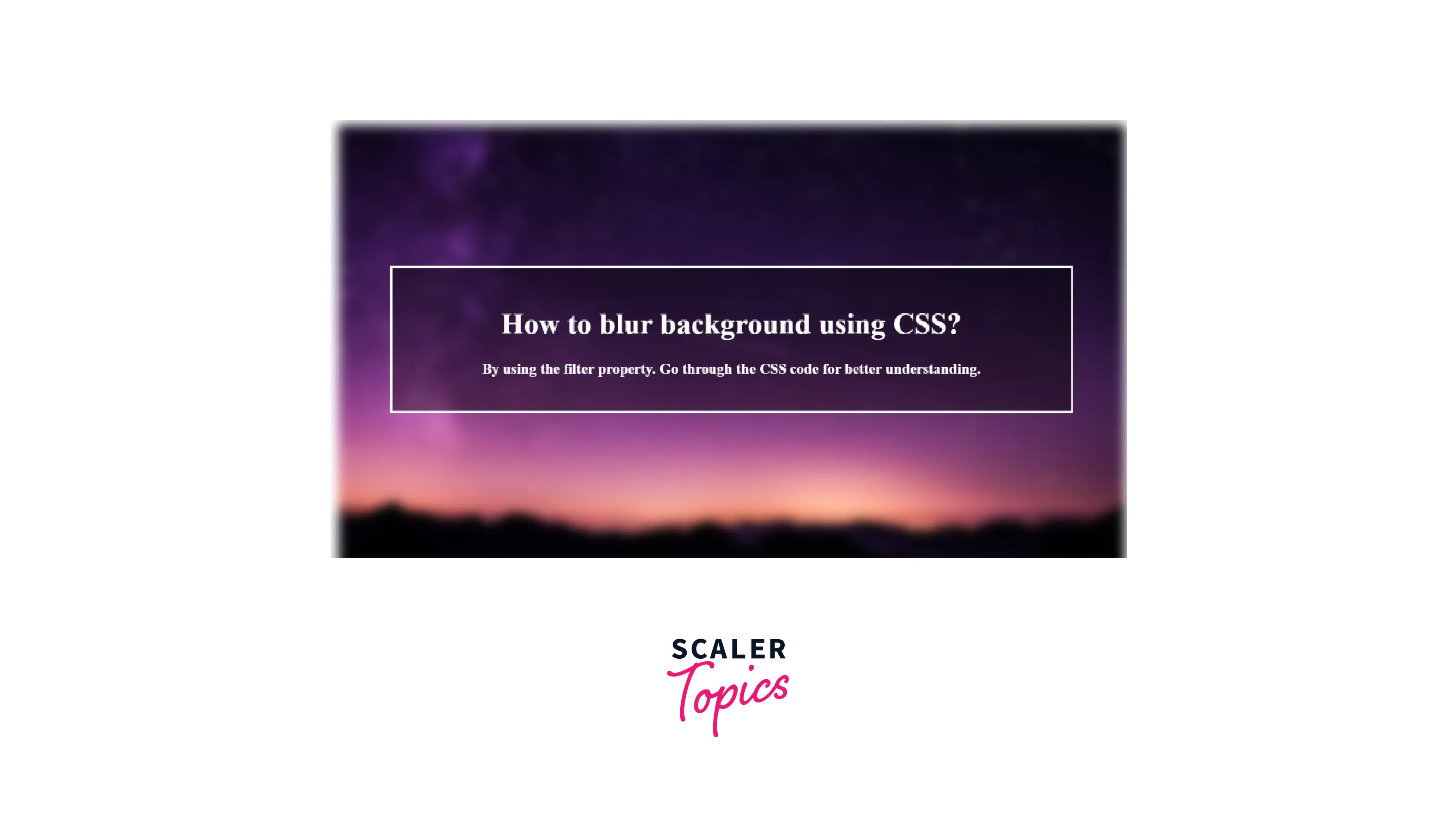
- Firstly, we add a background image by providing URL.
- To achieve the blur background effect, we apply a filter as blur and set its value to 6px.
- Position the background in the center of the page.
- Specify justify-content and align-item as the center to position the text box in the center of the frame.
- The text box to which we have applied blur is now positioned in the center of our page.
- To observe the blur effect more clearly, apply a transparent background color to the text using the rgba alpha property.
What is backdrop-filter?
Suppose you need to create an element with a slightly opaque, frosted glass look that sits on top of an image. The text must be live and not a picture. How will you implement this?
The backdrop-filter property in CSS applies filter effects (grayscale, contrast, blur, etc) exclusively to the background/backdrop of an element, not the whole background.
The backdrop-filter property provides graphical effects such as blurring or color shifting in the region behind an element, which can be seen through the element by altering its transparency/opacity.
Tip: When using backdrop-filter, the element's background should be made partially or semi-transparent. Otherwise, you’ll not be able to notice the effect.
In the sample provided below, I have applied various backdrop filters on parallel components. Only one background image was used in the body so that the backdrop-filter is clearly observed.
HTML Code:
CSS Code:
Result:
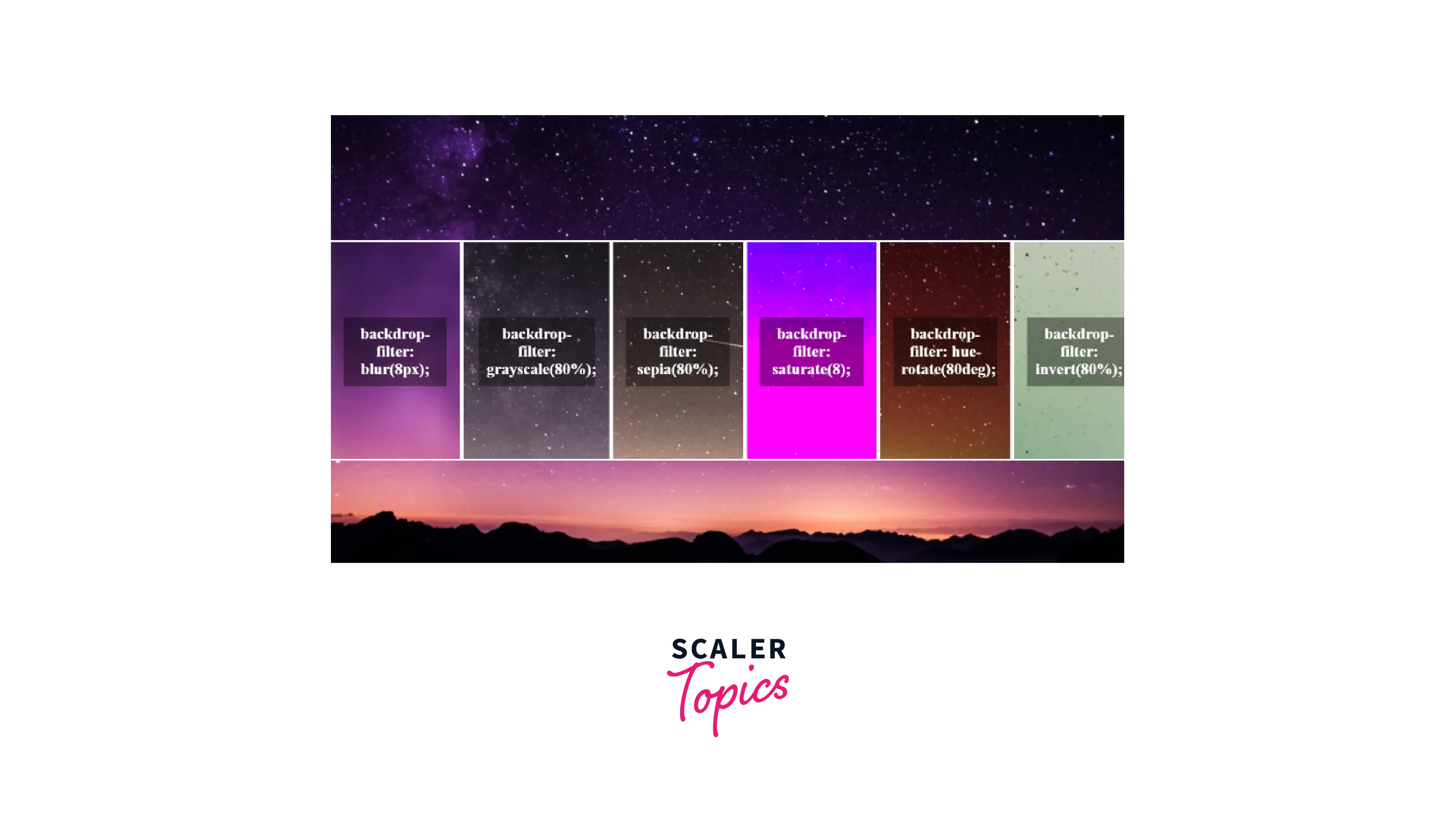
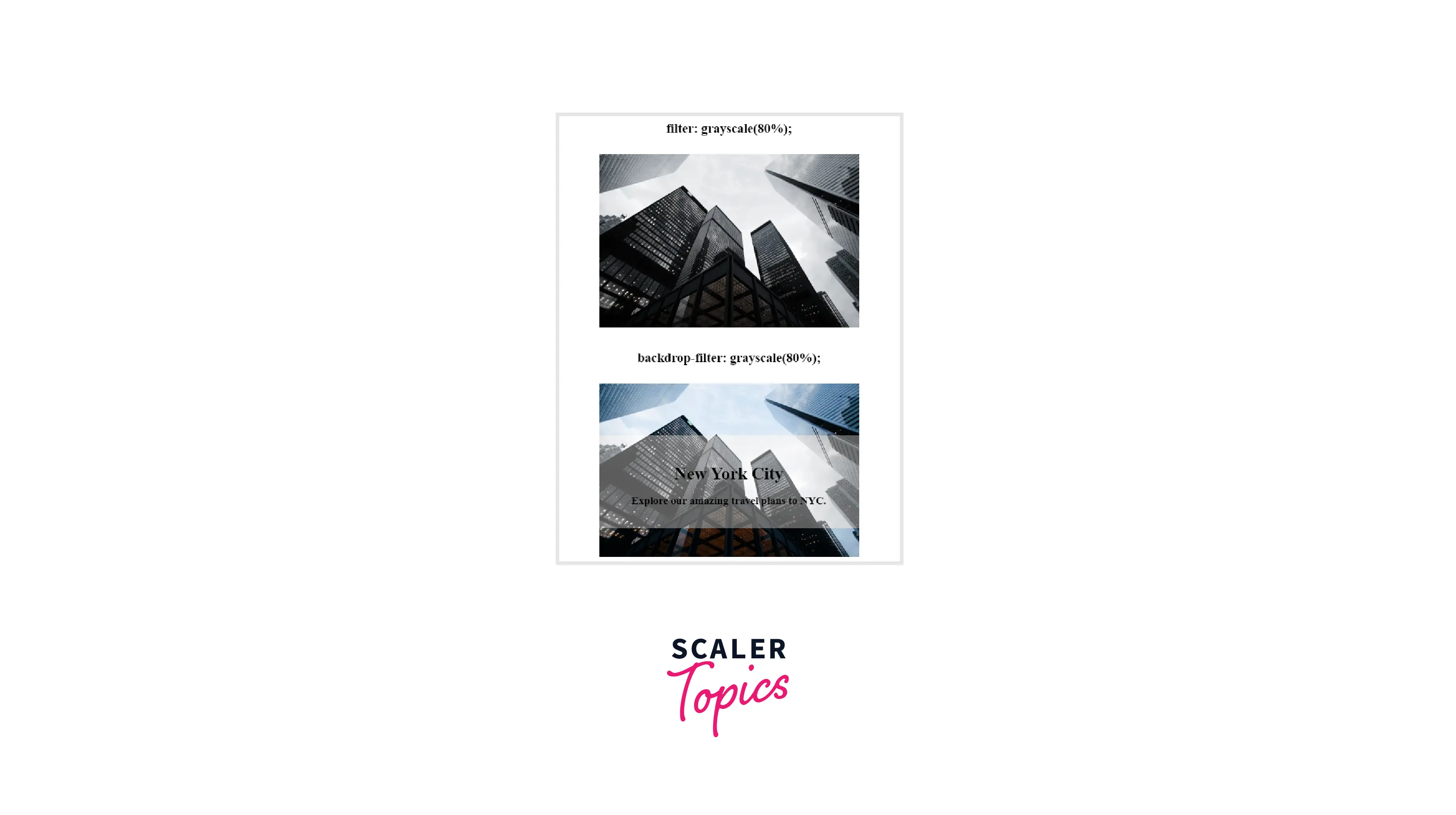
The filter was applied to the whole image in the first instance, but only to the area directly beneath our text content in this one. This example makes it clear that the effect is only applied to the area directly beneath the element and not to its background. The backdrop of the element must also be kept at least slightly transparent so that viewers can see the desired visual effects.
The backdrop-filter property is very similar to the filter property. The only difference is that the filter property affects the element itself, while the backdrop-filter will affect the elements beneath the element within the bounding box of the element.
While the filter property helps us in applying effects like blur and sepia on a given element, the backdrop-filter property will allow us to apply the same effects to the area behind the element.
Here is a demonstration to show the differences (be careful to use a suitable browser, such as Chrome with the Experimental Web Platform Features flag enabled — further information on browser support is provided at the end of the article):
HTML Code:
CSS Code:
Result:
LEARN MORE: WebKit first introduced this feature to the CSS Working Group last year, and it is now included in the Editor's Draft of the CSS Filters Level 2 specification. This property is currently being prefixed to conform with the W3C requirements for features that have not completed the standardization process. As a result, you will need to write -webkit-backdrop-filter when using this CSS property.
A Simple Example
The backdrop-filter property requires a target element and an additional element right underneath our target, to which the effects will be applied, in order to function properly.
The following markup was used to provide the backdrop effect in our demonstration below:
HTML Code:
In this section, we will create the basic structure of our webpage using HTML. We must create a <div> for the card. Add some text to make it distinguishable.
CSS Code:
Additionally, we added a background image to our webpage and created a background for the text using the CSS code below:
Result:
- Firstly, we add a background image by providing a URL and then give our content as display: flex.
- Specify justify-content and align-items as the center to position the blur effect in the center of the frame.
- The div to which we have applied blur is now positioned in the center of our page.
- To achieve the glass/blur effect overlay, we apply a backdrop-filter and give it a blur.
- To observe the effect, apply a transparent background color to the text using the rgba alpha property.

Filtered Backgrounds without backdrop-filter
The only way to create a filtered background before backdrop-filter was to add a separate "background" element, place it behind the foreground element(s), then apply the following filter:
By using the backdrop-filter property, you eliminate the unnecessary "background" component and directly apply filters to the backdrop:
Syntax
The backdrop-filter property shares several common properties with the filter property. You can apply it to any element using the syntax shown below:
The <filter-function> CSS data type represents a graphical effect that can modify the appearance of an input image. It is used in the CSS filter and backdrop-filter properties.
The <filter-function> data type is specified by one of the following filter functions. Each function requires a valid argument; otherwise, no filter will be applied.
Let's see how each backdrop filter operates when applied to an element whose content has some level of transparency.


a. blur()
To give a background blur effect on an overlay, the CSS’s backdrop-filter: blur() property is used. This property applies the blur effect to the box or any other element, and before is used to create the blurred background without adding additional markup.
Background blur css creates a gaussian blur to your content. The blur radius determines the amount of blurring; bigger values produce more blurring while lower values provide less blurring.
Syntax:
Examples:
Setting blur backdrops with pixels and with rem
HTML Code:
CSS Code:
Result:

b. brightness()
The brightness() CSS function applies a linear multiplier to the input image, making it appear more or less bright. You can adjust the intensity by changing the amount— values below 100% reduce brightness, and values over 100% increase brightness.
Syntax:
Examples:
Setting brightness using numbers and percentages
HTML Code:
CSS Code:
Result:

c. contrast()
The contrast() function adjusts the contrast of the input image. You can adjust the amount — values below 100% decrease contrast, and values over 100% increase contrast. Its default value is 1 or 100%.
Syntax:
Examples:
Setting contrast using numbers and percentages
HTML Code:
CSS Code:
Result:

Scaler Placement Report and Statistics
Scaler learners achieved 2.5x salary growth with average post-Scaler CTC reaching ₹23L.
 Google
 Amazon
 Microsoft
 Flipkart
 Adobe1200+ more
d. hue-rotate()
The hue-rotate() function modifies the hue of your content overall depending on the colors that surround a standard color circle.
You may choose the angle at which the hue will be rotated or shifted, as well as the number of degrees around the color circle.
Smaller angles (e.g., 10 degrees) display cold colored hues, whereas larger angles (e.g., 340 degrees) display warm colored hues. Manually entering degrees past 360 results in wrapping around the color circle again (e.g., 400 degrees displays the same result as 40 degrees).
Syntax:
Examples:
Examples of values for hue-rotate in degree or turns
HTML Code:
CSS Code:
Result:

e. saturate()
The saturate() CSS function increases or decreases the saturation of your content. You can adjust the amount — values below 100% desaturate the input image, and values over 100% increase its saturation.
Syntax:
Examples:
Setting correct values for saturated backdrops
HTML Code:
CSS Code:
Result:

f. grayscale()
The grayscale() CSS function turns your content to grayscale. You can adjust the amount — values below 100% will reduce the grayscale effect, and values at or over 100% display the complete grayscale of your content. Its initial value is 0.
Syntax:
Examples:
Setting correct values for grayscale()
HTML Code:
CSS Code:
Result:

g. invert()
The invert() CSS function reverses the colors of your content by inverting them. You can alter the amount — values below 100% reduce the inversion effect, and values at or over 100% display completely inverted content.
It appears like a page with a black body and an element with a backdrop-filter: invert(); would make that portion of the body white.
Syntax:
Examples:
Setting correct values for invert()
HTML Code:
CSS Code:
Result:

Turn Learning into Career Growth
h. sepia()
The sepia() CSS function converts the input image to sepia, which gives it a warmer, more yellow/brown appearance. You can adjust the amount — values below 100% reduce the sepia effect, and values at or over 100% display completely sepia-toned content. Its default value is 0.
Syntax:
Examples:
Setting correct values for sepia() backdrops
HTML Code:
CSS Code:
Result:

i. drop-shadow()
The drop-shadow() function applies a drop shadow effect to the given image. A drop shadow is a composited version of the alpha mask from the input image that has been particularly blurred and offset.
This function is comparable to the more well-known box-shadow property; however, with filters, certain browsers allow hardware acceleration for improved speed.
Syntax:
Examples:
Setting a drop shadow backdrop using blur radius and pixel offsets
Setting a drop shadow backdrop using blur radius and rem offsets
HTML Code:
CSS Code:
Result:

j. opacity()
The opacity() function provides transparency to the input image. The value of the amount defines the proportion of the conversion. A value of 0% is completely transparent. The input remains unaltered when the value is 100%.
Syntax:
Examples:
Setting correct values for opacity()
HTML Code:
CSS Code:
Result:

k. url() – (for applying SVG filters)
The url() function takes the address of an XML file that defines an SVG filter and may contain an anchor to a particular filter element.
Syntax:
HTML Code:
CSS Code:
Result:

Adding Multiple Filters
Another interesting use for the backdrop-filter property is to apply different filters to different parts of the image.
Like the filter property, multiple filters can be applied to the element's backdrop. All valid values for the filter property are also valid for the backdrop-filter property. Since these filter operations are performed in the browser engine, we can take advantage of hardware support, resulting in very efficient operations.
However, be warned! This backdrop effect requires additional rendering passes, which will have a negative impact on the performance. Ensure that you only use this function when absolutely required.
Developers should be able to utilize any type of filter in their designs, hence backdrop-filter supports all CSS Filters implementation effects. This implies we may utilize our backdrops in a variety of creative ways, for example:
backdrop-filter: blur(5px) hue-rotate(80deg); // .... and more
HTML Code:
CSS Code:
Result:

You may combine any number of functions but the sequence of the operations is still important for manipulating the rendering, for example, using grayscale() after sepia() will result in completely gray output.
Best of all, these effects are totally dynamic and can be applied to HTML5 media, CSS animations, WebGL, and other types of dynamic content.
This is an amazing advancement in the capabilities of the designs. Before this property, it was not possible to achieve this effect.
Browser Support
Despite its several similarities, the backdrop-filter property is not supported by as many browsers as the filter property.
Currently, only Safari 9 supports this attribute without a flag; even in this case, the -webkit- prefix is required.
According to MDN, every major browser except Internet Explorer, Firefox for Android, and Opera Mini support it; thus, you should write fallbacks for those browsers.
-
Google Chrome
Chrome versions 4 to 46 are incompatible with CSS Filter Effects. For Chrome, you can enable the Experimental Web Platform Features flag under chrome://flags.
-
Mozilla Firefox Firefox browsers 2 to 69 cannot employ this browser attribute. This web element is partially supported by Firefox versions 70 to 102.
To enable backdrop-filter on Mozilla go to about
(in the address bar) and set to true both layout.css.backdrop-filter.enabled and gfx.webrender.all. Firefox's most recent version supports this web element. -
Internet Explorer This element is not supported by the IE browser. Safari CSS Filter Effects were not supported by Safari version 3.1 to 5.1. Newer versions of Safari support this attribute with the prefix -webkit-.
-
Microsoft Edge The CSS Filter Effects element is partially supported by Microsoft Edge versions 13 to 17. This attribute is not supported by default for the Edge 12 browser, but it can be enabled.
-
Opera Versions 10 to 33 of Opera do not support this feature. CSS Filter Effects are partially compatible with prefix -webkit- for Opera versions 15 through 39. Opera versions 40 through 53 support this feature.
Conclusion
- This article demonstrated how to create a blurred background using the background blur CSS properties.
- We applied the filter function to blur the background image completely. Additionally, we can apply a backdrop filter to blur only the specified sections.
- Both filter and backdrop-filter have the same filter functions, and the same syntax (apart from the property name).
- In Filter Property, the filter effects are applied to both the element's background and its content totally.
- The CSS backdrop-filter property applies filter effects (grayscale, contrast, blur, etc.) to the background/backdrop of an element.
- The backdrop-filter has the same effect as the filter property, however, the effects are only applied only to the element's backdrop and not its content.
- To give a background blur effect on an overlay, the CSS’s backdrop-filter: blur() property is used.
In order to create an appealing image, you need to take into account both the image you choose and the filters you choose to apply. However, if used properly, this property can result in some cool results.
Play around with different filters to see what kind of effects you can create.