CSS Gap Property
 FREE
FREE

Overview
In this article, we shall learn the gap property of CSS. It is used to set the gutters between the HTML elements. The gutters can be between rows or columns. gap property of CSS can be used in case of multi-column layout, grid layout, and flex layout.
Build an AI-First Career, Master the Complete Skillset
Choose from our industry-leading programs designed for career success
Modern Software and AI Engineering Program
Master full-stack development with AI integration


 +1000 more
Modern Data Science and ML with specialisation in AI
Advanced data science techniques with AI specialization
+1000 moreAdvanced AIML with Specialisation in Agentic AI
Deep dive into AIML with focus on Agentic systems
+1000 moreDevOps, Cloud & AI Platform Engineering
Build and manage AI-powered cloud infrastructure
+1000 moreAI Engineering Advanced Certification by IIT-Roorkee
Premier AI engineering certification from IIT-Roorkee

AI Forward Deployed Engineer Program
Full-stack engineering, production AI and client-facing consulting
+1000 moreIntroduction to Gap in CSS
CSS gap is a property used to set gaps between rows and columns of a grid, flex, and multi-column layouts. It is also known as a grid-gap. It is shown in the figure below.

Syntax:
The syntax for the gap CSS property is defined by the keyword gap and its value is specified after this keyword, the value can be in pixels, em, cm or percentage.
It basically represents two types of gaps.
- row-gap
- column-gap
Let's understand them one by one.
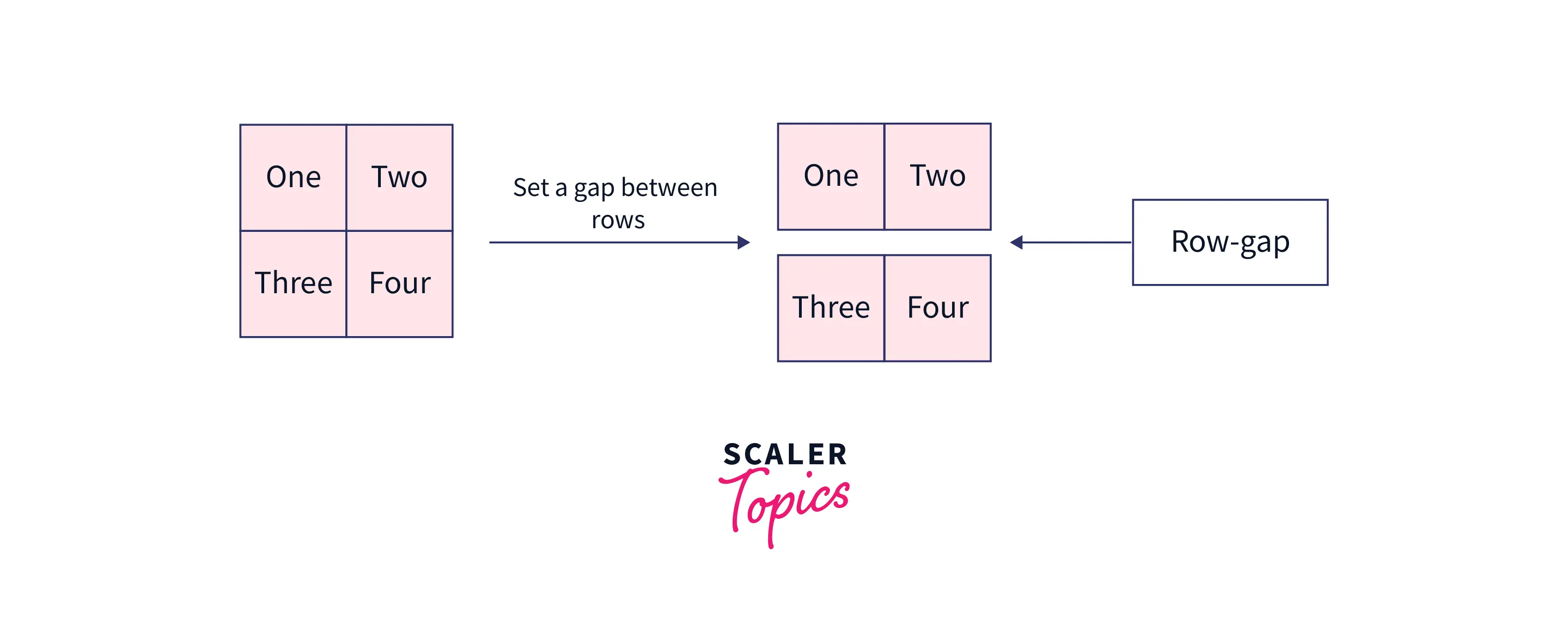
1) row-gap: row-gap is a CSS property that is used to set the gap between the rows.
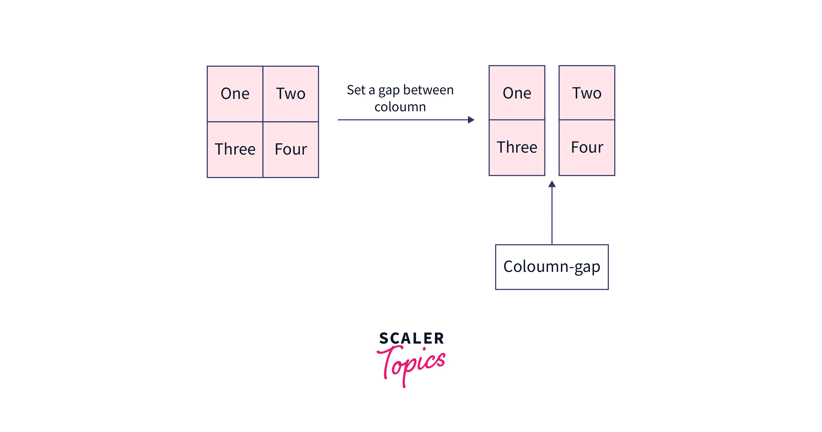
2) column-gap: column-gap is a CSS property that is used to set gap between the columns.
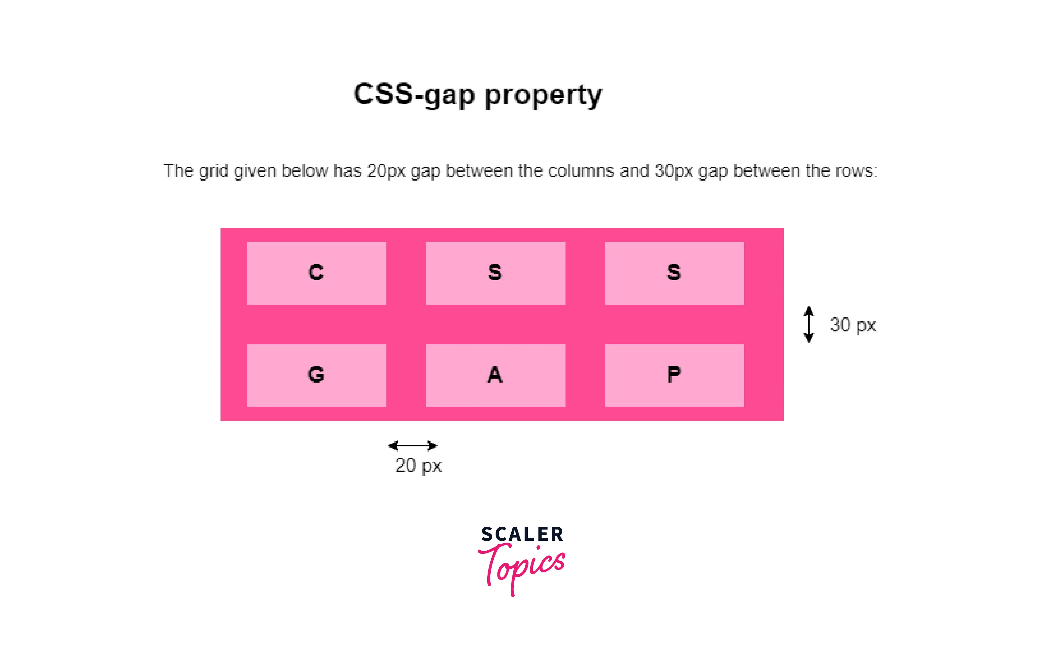
Let's understand the above explanation with an example
Output:
Values
The value represents the actual gutter that separates the grid lines. It can be in pixels(px), percentage(%), em etc.
The values of the gap property can be set using the following ways.
1) One length value: In this case, we use only a single value to represent the gutter. it can be written in pixels(px),em,centimeters(cm) and vmin, vmax.
The gutter between the rows and columns is set to the single value specified.
2) One percentage values: In this case, we use only a single value in the percentage units.
Here percentage(%) values are relative to the dimension of the element or the sum of the heights of the boxes inside the element.
3) Two length values: In this case, we use two length values to set the specific values of row-gap and column-gap.
Here first value represents the gutter between the rows while the second value represents the gutter between the columns.
4) One or Two percentage values: In this case, we put one of the values in percentage(%) unit.
5) calc() values: It is used to perform calculations for determining the values of the properties specified. Parameters allowed in this function are length, angle, frequency, time, percentage, number, etc. In the gap property, we use it to calculate the value of the gap to be added.
The example above calculates the value of the expression and uses it as a value for the gap property and sets that given gap between rows and columns.
The expression is evaluated using the operator precedence rules.
Let's understand the above discussion with different examples.
How Scaler Transformed Careers in Different Fields
Scaler learners achieved 2.5x salary growth with average post-Scaler CTC reaching ₹23L.
 Google
 Amazon
 Microsoft
 Flipkart
 Adobe1200+ more
Examples
At the beginning of the article, we discussed three types of layouts on which the grid-gap property can be used Here, we shall explore all of them one by one.
Grid layout:
Grid-layout is a two-dimensional layout used for creating responsive items on the webpage. The items are arranged in columns and rows. To specify the grid layout you need to set the property
display: grid;
Output:
Turn Learning into Career Growth
Flex layout:
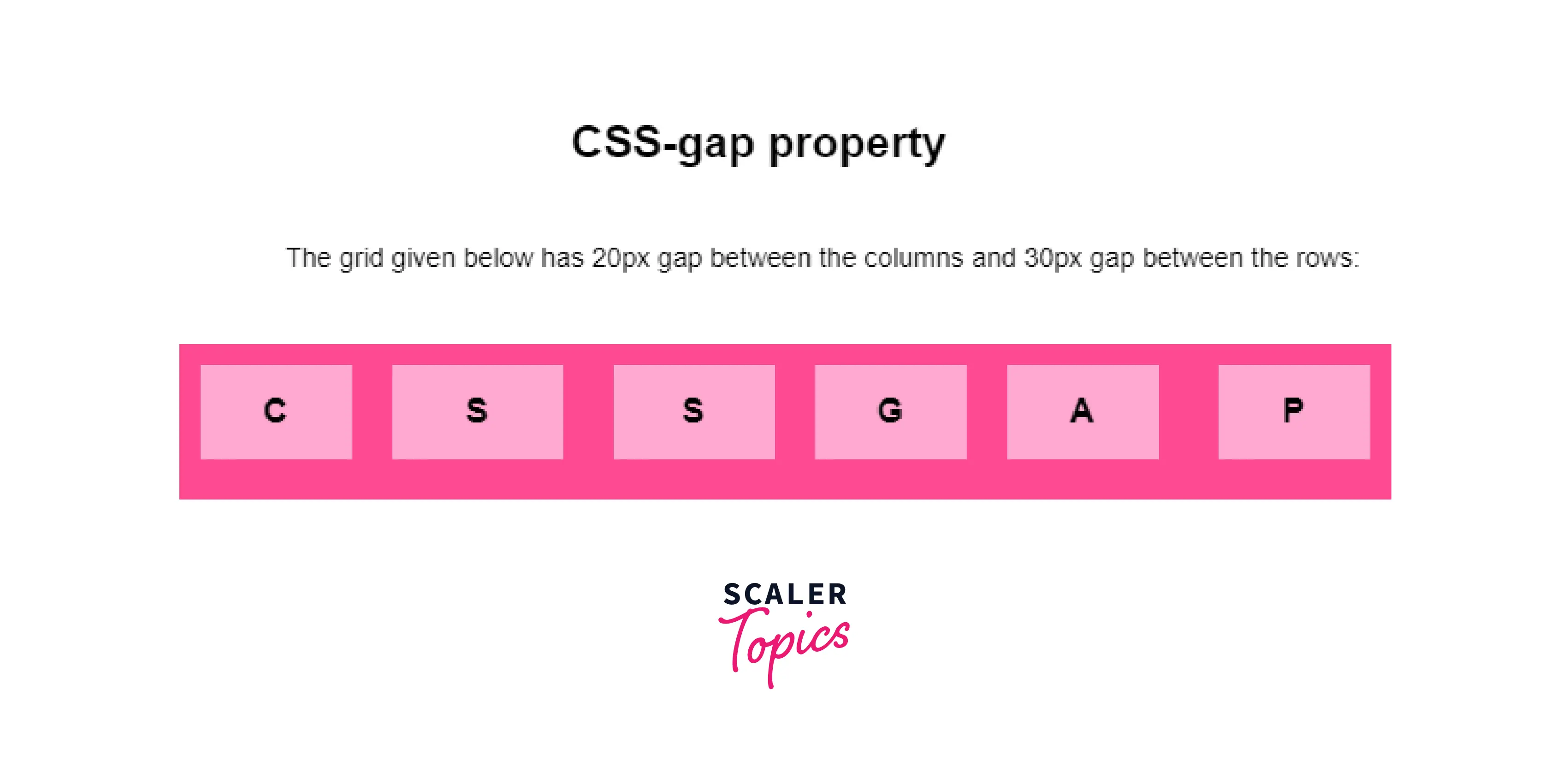
Flex layout is a one-dimensional layout model and offers space distribution among the items. It is used to align the items in a one-dimensional layout. To specify the Flex layout, we need to write display: flex;.
Output:
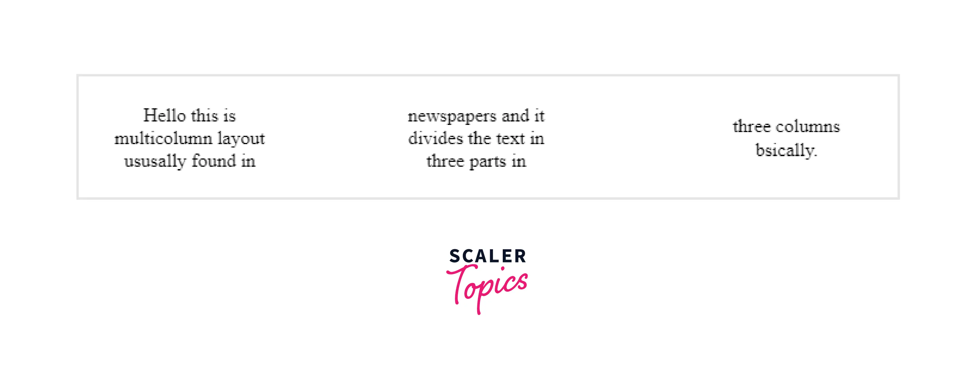
Multi-column layout:
The multicolumn layout is used to define multiple columns of text as defined in newspapers. To specify the multi-column layout we need to write the column-count, and column-gap, properties of CSS.
Output:
Browser Support
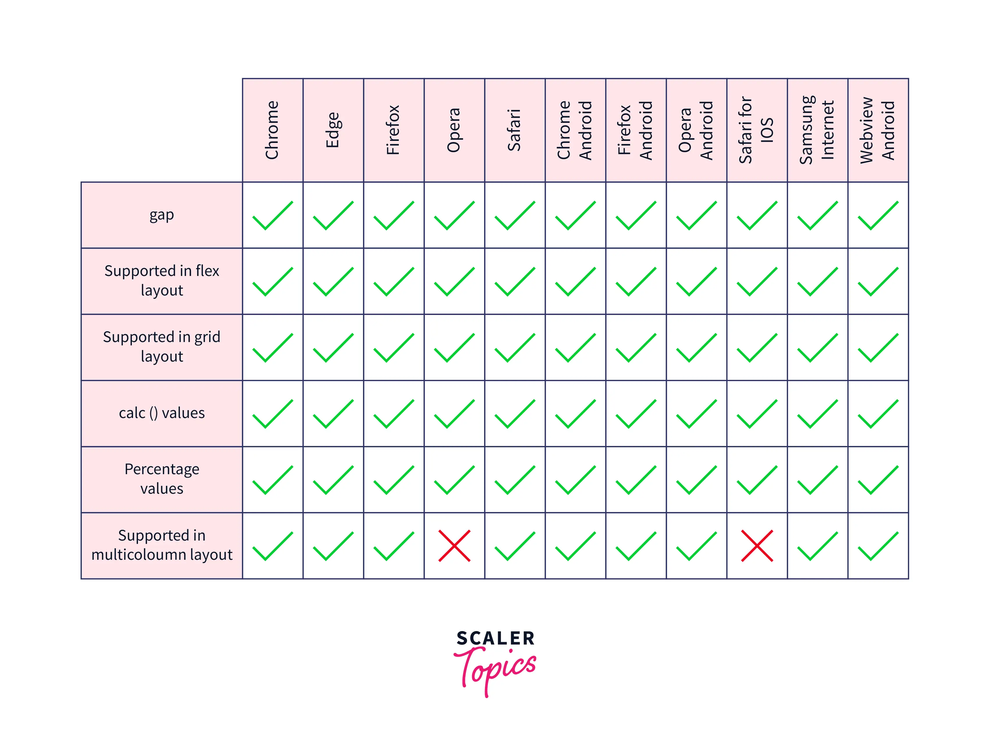
The browsers which support the gap property are as follows:
Conclusion
- We conclude that gap is a CSS property used to set gaps between elements.
- The gap can be a horizontal gap or a vertical gap depending upon the property specified.
- More specifically there can be row-gap and column-gap which are used to set values in the horizontal and vertical directions.
- gap property is used to set gaps between grid,multi-column, and flex layouts.
- The syntax for the properties is gap: values where the values are actually the numbers either in pixels, mmor other length scale.