2D Transformation in CSS
 FREE
FREE

Overview
Using CSS transform property, we can scale, skew, move, translate, and rotate HTML elements without affecting other surrounding elements. The transform property can be set to none or one or more transform methods. There are four primary two-dimensional transformation methods: ' rotate, scale, skew, and translate`. Each of these methods can be used to change the position of an HTML element in different ways. It provides an efficient way of making our website more attractive and trendy.
What is CSS 2D Transform?
The CSS3 2D transform property allows us to scale, skew, move, translate, and rotate HTML elements. It transforms the element without affecting other elements on the page; in other words, it does not cause other elements on the page to shift and instead gets overlapped over them.
The transformation is applied to the element's center (i.e., the point specified by the transform-origin property) by default. We can create animated elements that rotate, "bounce," and scale by combining 2D transform techniques with transition and animation properties.
Note: It is also to be noted that only elements whose layout is determined by the CSS box model and that aren't non-replaced inline boxes (i.e., element that is both a non−replaced element and an inline element) or table-column elements (i.e., the HTML element that defines a column within a table) can be changed using the transform property.
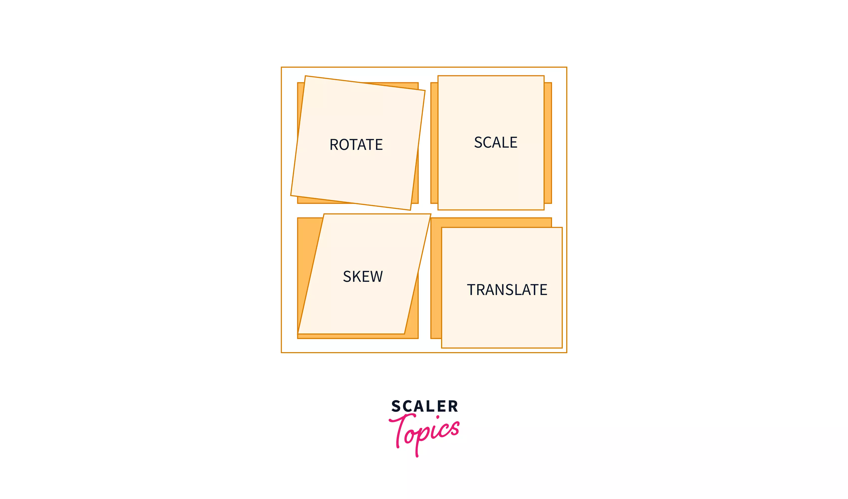 This picture gives a brief idea about the various transformation methods
Syntax of 2D Transformation in CSS
The transform property can be set to none or one or more <transform-function> or method values. The transform property can use the following 2D transformation methods, which are explained in detail in the next section.
translate()
It moves an element from its current position according to the given x and y-axis values.
Transform Your Career
Choose from our industry-leading programs designed for career success
Modern Software and AI Engineering Program
Master full-stack development with AI integration

 +1000 more
Modern Data Science and ML with specialisation in AI
Advanced data science techniques with AI specialization
+1000 moreAdvanced AIML with Specialisation in Agentic AI
Deep dive into AIML with focus on Agentic systems
+1000 moreDevOps, Cloud & AI Platform Engineering
Build and manage AI-powered cloud infrastructure
+1000 moreAI Engineering Advanced Certification by IIT-Roorkee
Premier AI engineering certification from IIT-Roorkee
rotate()
It rotates an element clockwise or counter-clockwise according to a given argument.
scale()
It increases or decreases the size of an element according to the given parameter.
skew()
It skews an element according to the given parameter.
matrix()
It combines all the 2D transform methods into one.
Browser Support and Prefixes
- IE(Internet Explorer) supports this property since IE9 with the -ms- prefix. Older versions and Edge don't need the prefix.
- Firefox supports it since version 3.5 and needs the -moz- prefix until version 15.
- Chrome since version 4 and until version 34 needs the -webkit- prefix.
- Safari needs the -webkit- prefix until version 8.
- Opera needs the -o- prefix for version 11.5 and the -webkit- prefix from version 15 to 22.
Turn Learning into Career Growth
2D Transformations Methods
The four primary two-dimensional transformation methods are scale, rotate, skew, and translate.
Translate
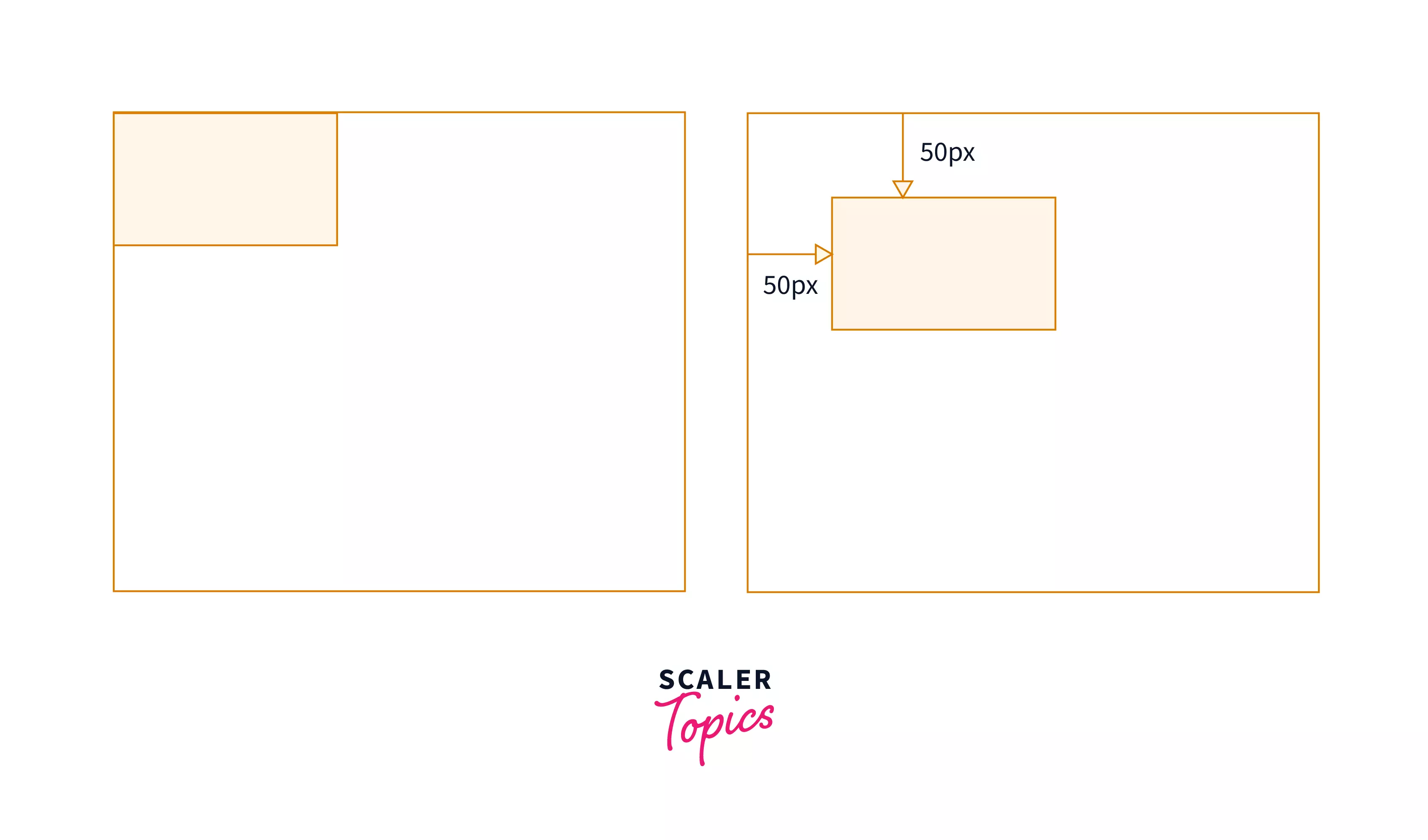
- The CSS translate() method is used to shift an element from its current location to a new location which is specified by the given X-axis and Y-axis arguments.
- The translate() method moves an element along both axes, whereas the translateX() and translateY() methods allow movement along the X-axis (right/left) or the Y-axis (up/down) respectively.
- A positive value for the translateX() parameter moves the element horizontally to the right from its original position, whereas a negative value shifts the element horizontally to the left from its original position. Similarly, translateY() shifts the element downward vertically for a positive value while it moves it up vertically for a negative value.
We can use px, em, rem, and viewport as units of length for the arguments. Furthermore, if we only specify one value in translate(x, y), that value will be used as the value of translateX(), while translateY() will be set to zero.
Example
- If the element is located with 0 pixels on the left and top, then using transform: translateX(50px) will move its 50 pixels to the right of its starting position, and transform: translateY(50px) will move the element vertically 50 pixels down. This can also be done using the code given below:
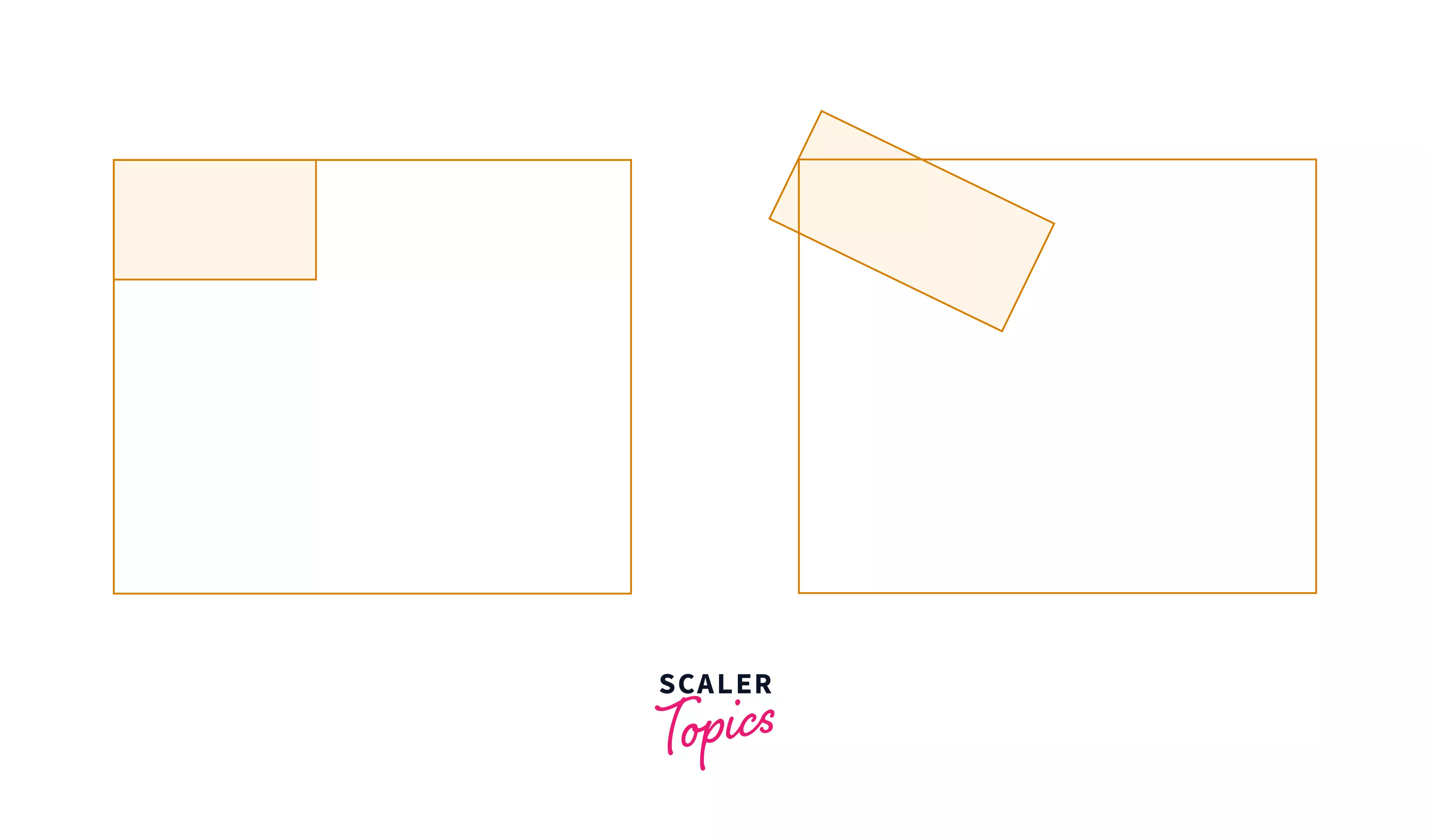
Rotate
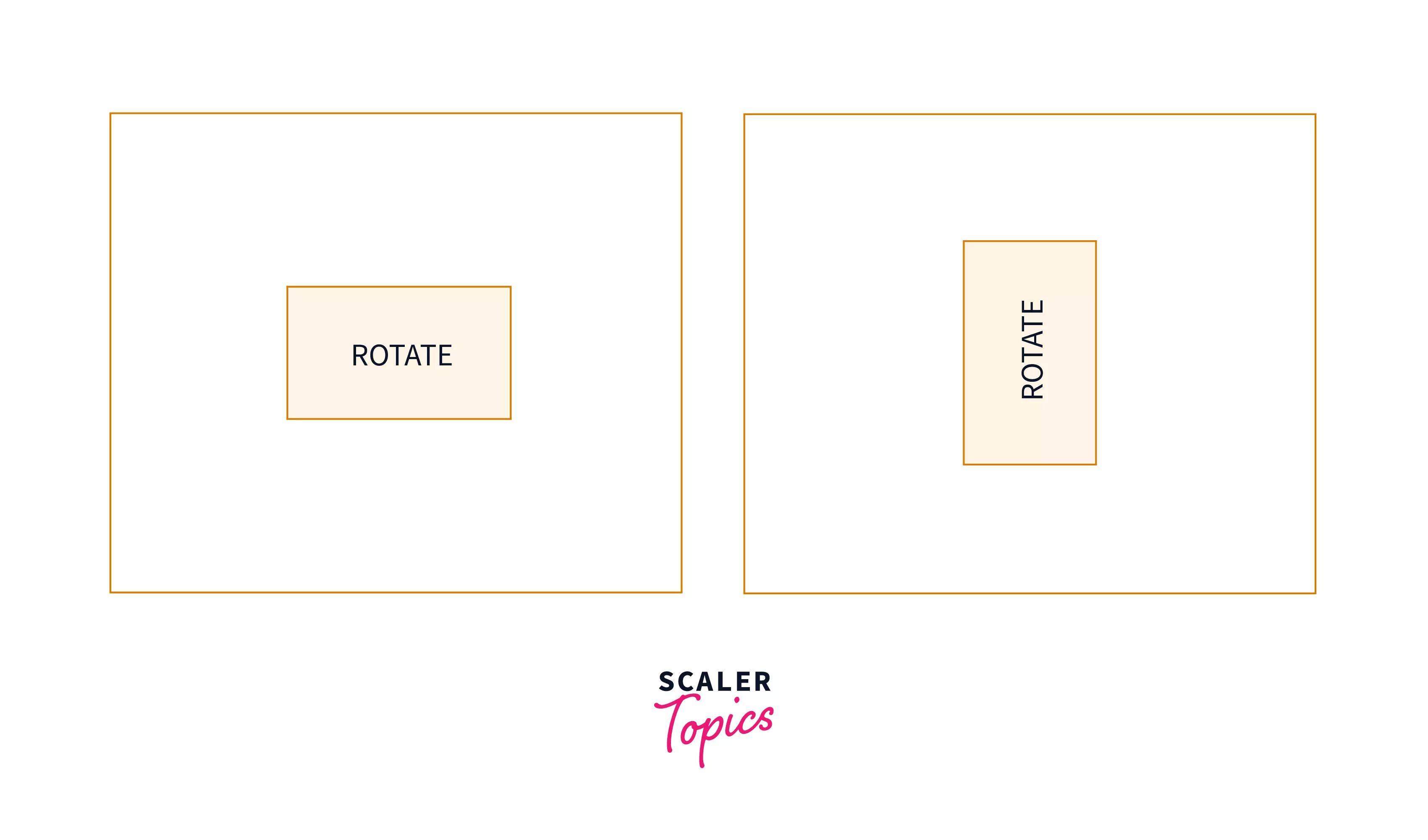
The rotate() function rotates an element in either a clockwise or counter-clockwise manner with its center as the origin. The transform:
- rotate() method accepts units such as deg (degrees), rad (radians), grad (gradians), or turn.
- if the value of the angle is positive, the item will turn clockwise, and with a negative value, it will rotate counter-clockwise.
Example
- The above code will rotate an element in 90 degrees in the clockwise direction.
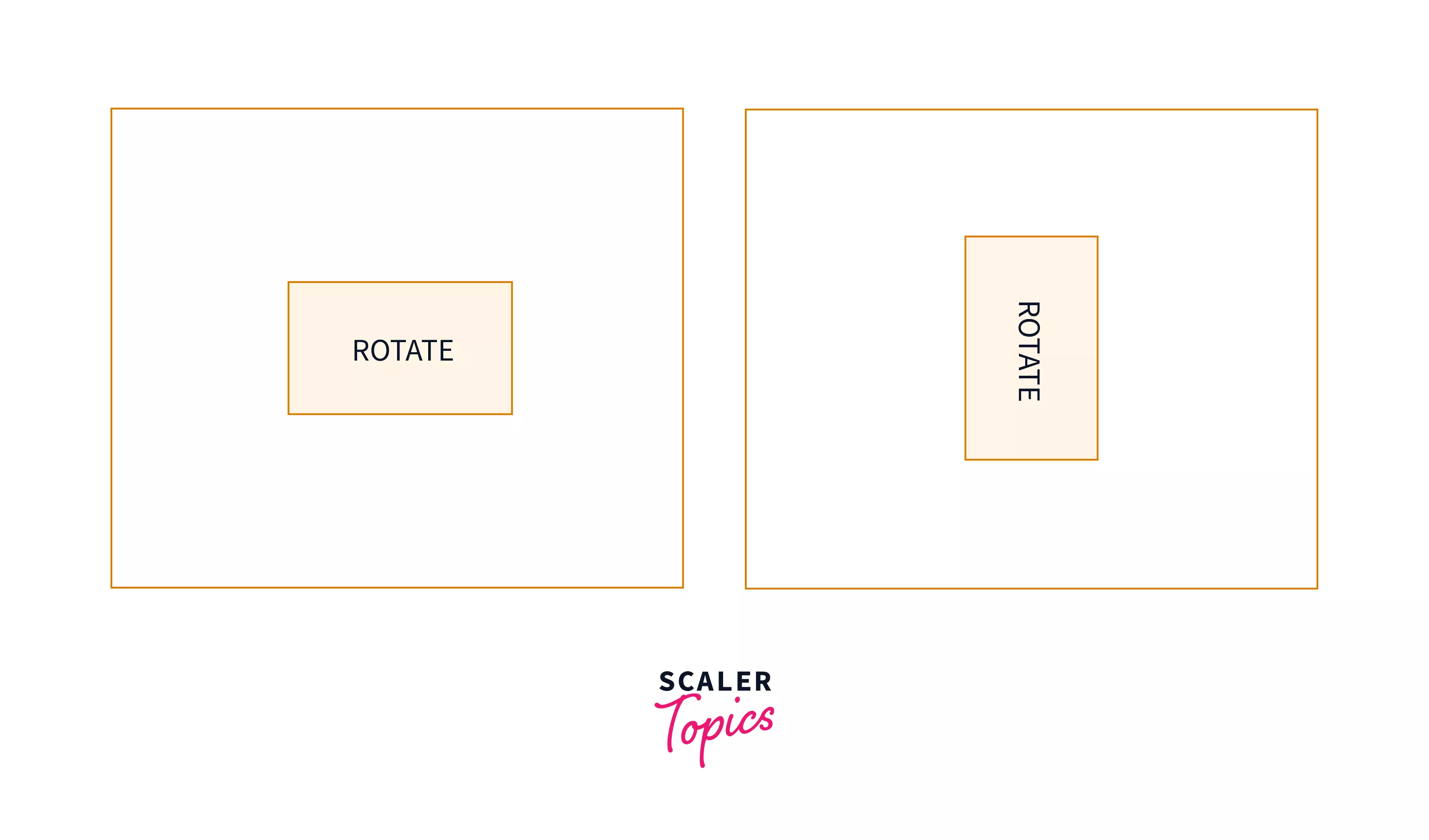
- The above code will rotate an element in 90 degrees in the anticlockwise direction.
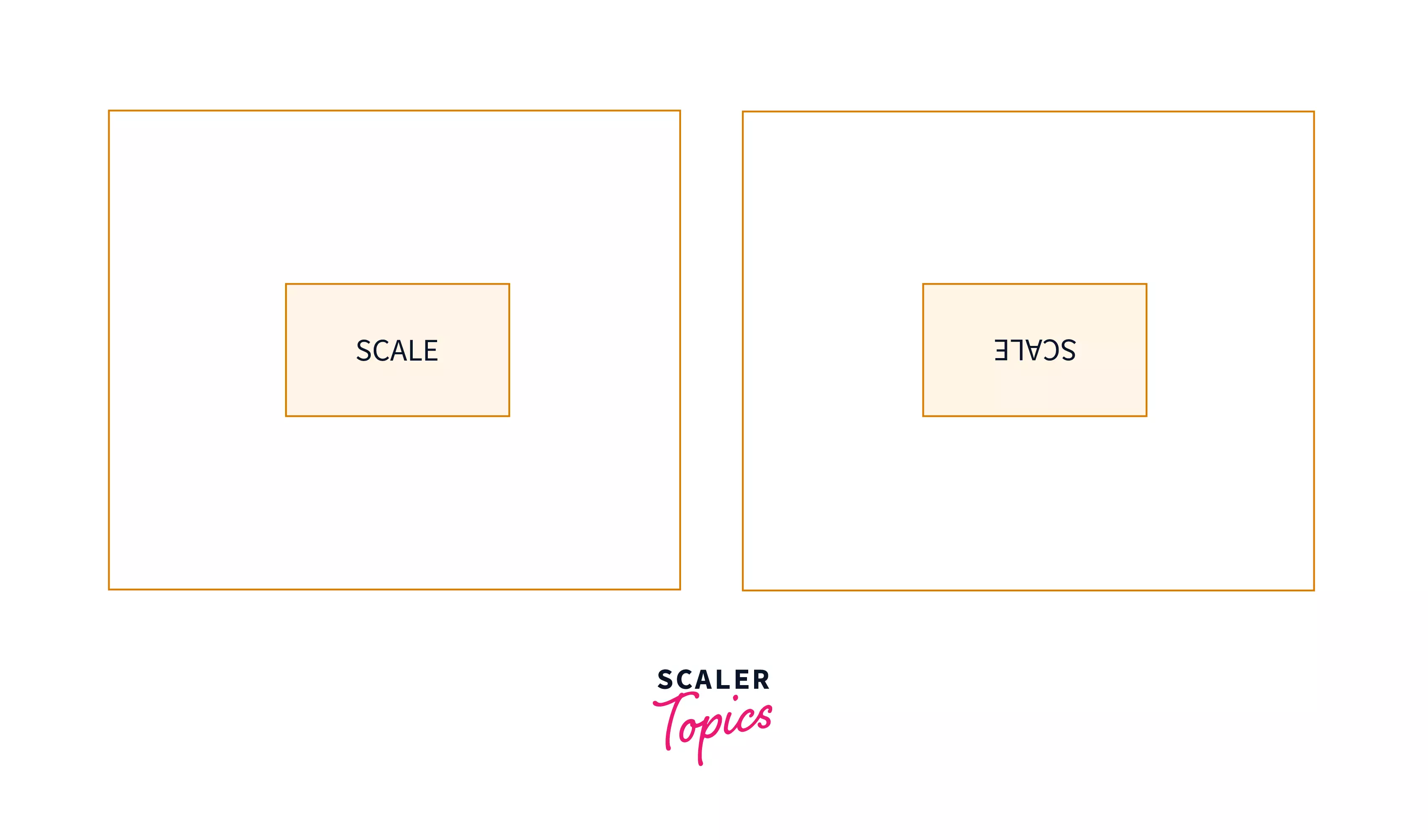
Scale
The scale() method is used to expand and reduce the element's size.
- scaleX() and scaleY() adjust the size in the X and Y directions, respectively, whereas scale() changes the size in both directions.
- The scale() function accepts any positive or negative number as an input.
- A positive value larger than 1 increases the element's size, whereas values between 0 and 1 decrease the element's size.
- The size of the element increases as we increase the value of the parameter.
- Values less than zero causes the element to increase or decrease in size and change the element to its original reflection.
- scale() takes two arguments, one for horizontal size change and the other for vertical size change. If scale() just has one value, it will modify the element in both directions equally depending on that value.
Note: A few other important points to note about the scale() method are:
- Percentage values are not accepted as a parameter by the scale() method.
- scale(0) makes the element disappear.
- scale(1) does not affect the element.
- scale(-1) creates a reflection of the element.
Example
- This code decreases the element's horizontal size by half while increasing its vertical size by two times.

- This code does not modify the element's size, but it does produce a mirror of the element along the x-axis.
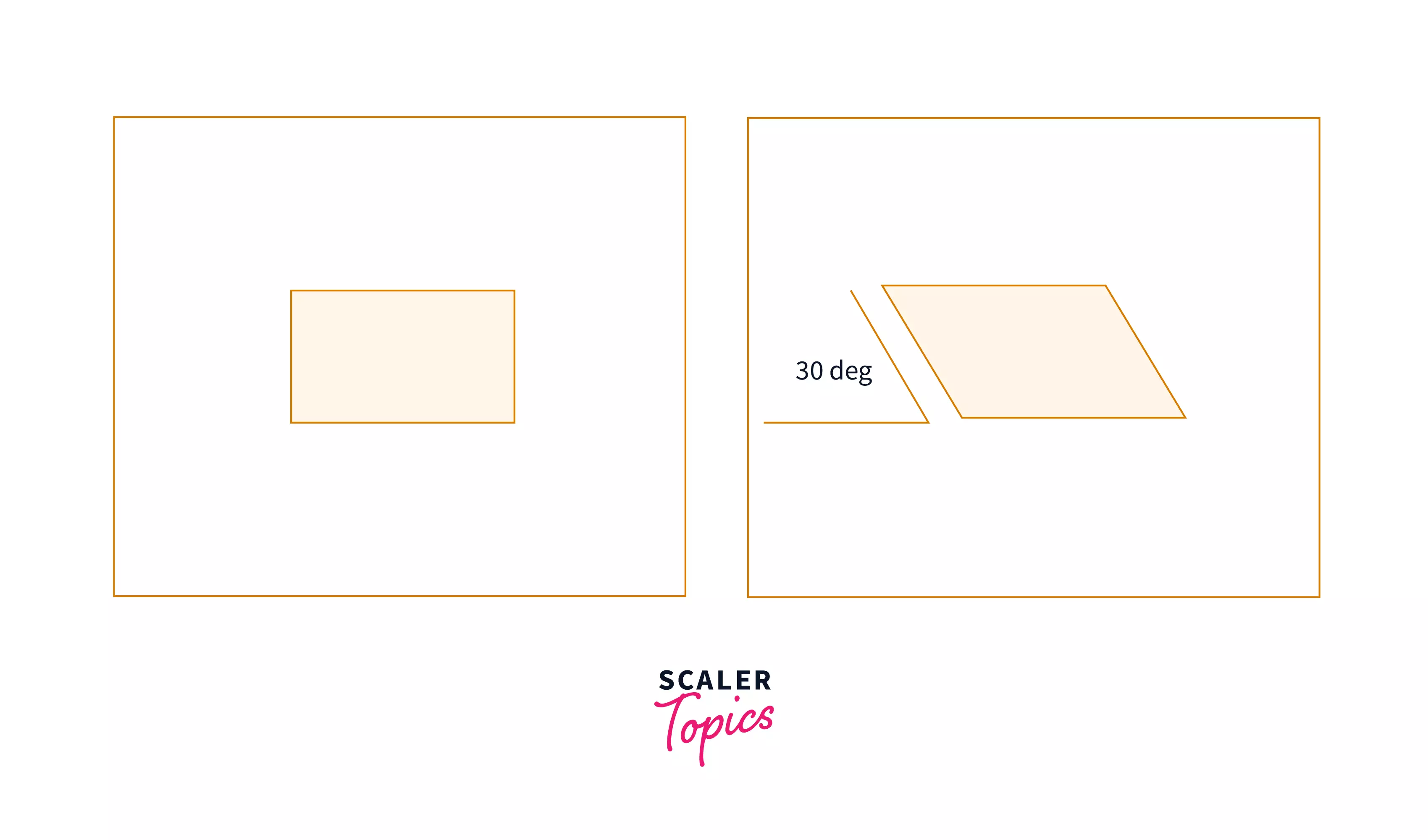
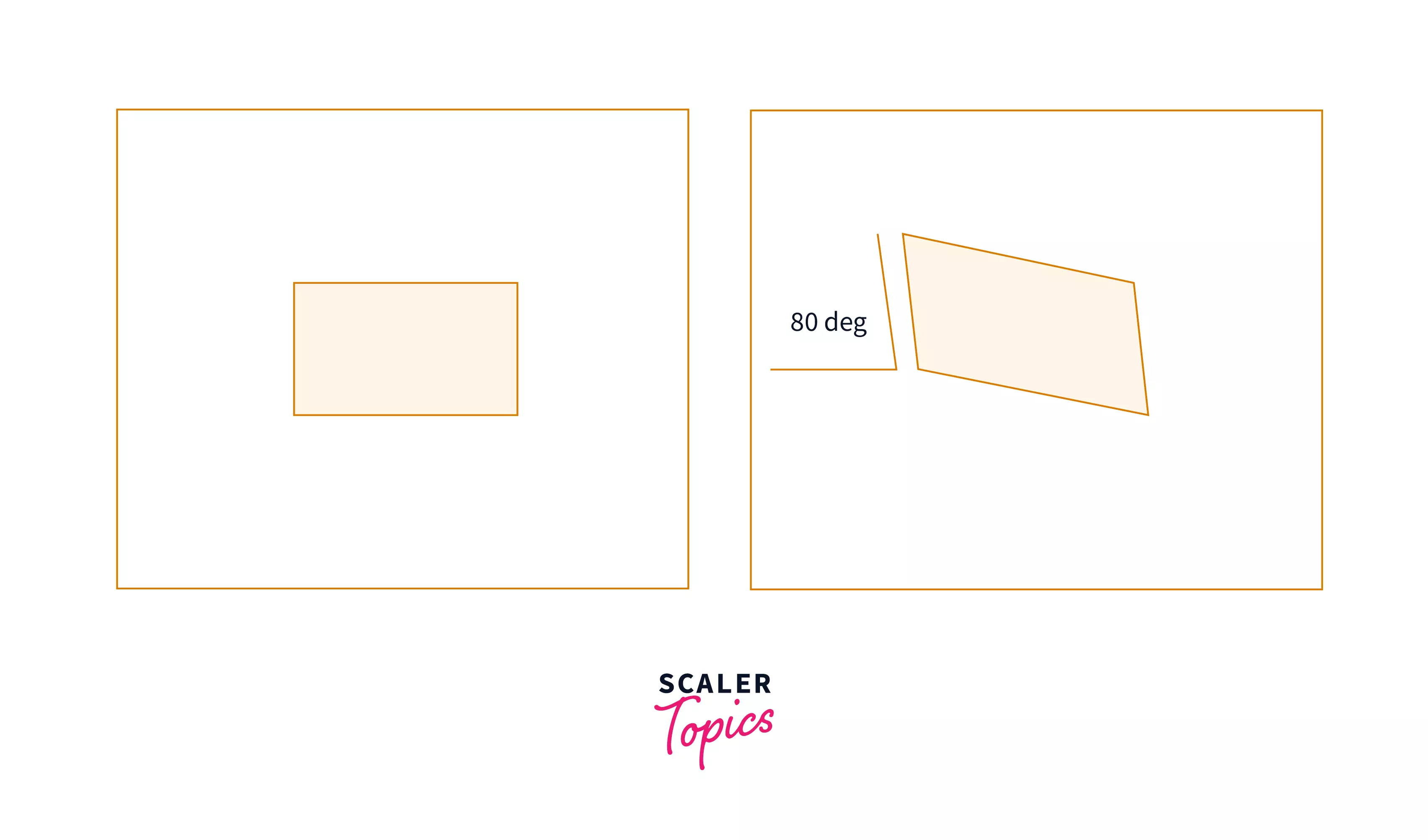
Skew
skew() specifies the slant or bevel of an element, which transforms it from a rectangle to a parallelogram. It distorts each point within an element by a certain angle in the horizontal and vertical directions. The result is as if we grabbed each element's corner and pulled it along a certain axis. The bevel is applied around the point specified by the transform-origin property (by default, it is the center of the element).
- The skewY() method skews an element along the Y-axis while the skewX() method skews an element along the X-axis.
- Angular values such as deg, grad, rad (valid), and turn are supported by the skew(), skewX(), and skewY() methods, just like rotate().
- skew() can take one or two parameters.
- The first parameter determines the horizontal bevel.
- The second parameter determines the vertical bevel.
- If only one parameter is passed, it works in the same way as skewX() and only adjusts the bevel horizontally.
Example:
- This code will shift down the points to the right of the default position.
- While this code will shift up the point.
Matrix
The matrix() method combines all the 2D transform methods into one. The matrix() method takes six parameters containing mathematic functions. The parameters are as follows:
Example:
- This code will double the size of the element along both the axis as the value of scaleX and scaleY are 2. It will also skew the element along the Y-axis only since the value of skewx is 0 and move the element 100px to the right horizontally.
Conclusion
- The transform attribute lets you skew, rotate, translate, or scale an element visually
- The CSS translate() property is used to move or translate an HTML element on an x and y coordinate scale.
- To rotate an HTML element clockwise or anticlockwise, use the CSS rotate() property.
- The CSS scale() property is used to change the size of an element based on a given parameter.
- The CSS skew() property is used to skew the element on the x and y-axis.
- The matrix() property combines multiple two-dimensional transform methods into a single method.
- Finally, the transform property can be used with the transition property to create animation.
 Google
 Amazon
 Microsoft
 Flipkart
 Adobe1200+ more