Bootstrap Classes
 FREE
FREE

Transform Your Career
Choose from our industry-leading programs designed for career success
Modern Software and AI Engineering Program
Master full-stack development with AI integration

 +1000 more
Modern Data Science and ML with specialisation in AI
Advanced data science techniques with AI specialization
+1000 moreAdvanced AIML with Specialisation in Agentic AI
Deep dive into AIML with focus on Agentic systems
+1000 moreDevOps, Cloud & AI Platform Engineering
Build and manage AI-powered cloud infrastructure
+1000 moreAI Engineering Advanced Certification by IIT-Roorkee
Premier AI engineering certification from IIT-Roorkee
Abstract
Bootstrap is the most popular CSS framework for developing mobile-first and responsive websites. The latest version of Bootstrap is Bootstrap 5, and it is supported by all modern browsers except IE 11. Bootstrap provides various classes to design and develop the UI based on the requirements. The classes available in Bootstrap are discussed in this article.
Bootstrap Classes
Bootstrap comes with the Bootstrap classes, which means you don't have to create and design the components from scratch; instead, you can use the classes provided by Bootstrap and build on top of those classes.
For each and every component and their different sizes, there are different classes available in Bootstrap. You just have to specify the class name, and the styling associated with that class name will be applied to the elements. Let's see an example of a page created using Bootstrap and observe how the classes are used to apply the styles that are available in Bootstrap.
The above code snippet also uses CSS files to add some extra styles other than Bootstrap. This example is provided for you to observe how the Bootstrap classes are used, and you can get the benefit from it by using it in your projects. The output of the above HTML code snippet is shown below.
There are many classes available in Bootstrap, and they are mentioned below with their description and usage.
Scaler Placement Report and Statistics
Scaler learners achieved 2.5x salary growth with average post-Scaler CTC reaching ₹23L.
Complete List of Bootstrap Classes
-
Navbar
Navbar is a responsive navigation bar with the support of branding, links, forms, etc., and it comes with responsiveness. The classes available in the Navbar section in the Bootstrap framework are mentioned below.
-
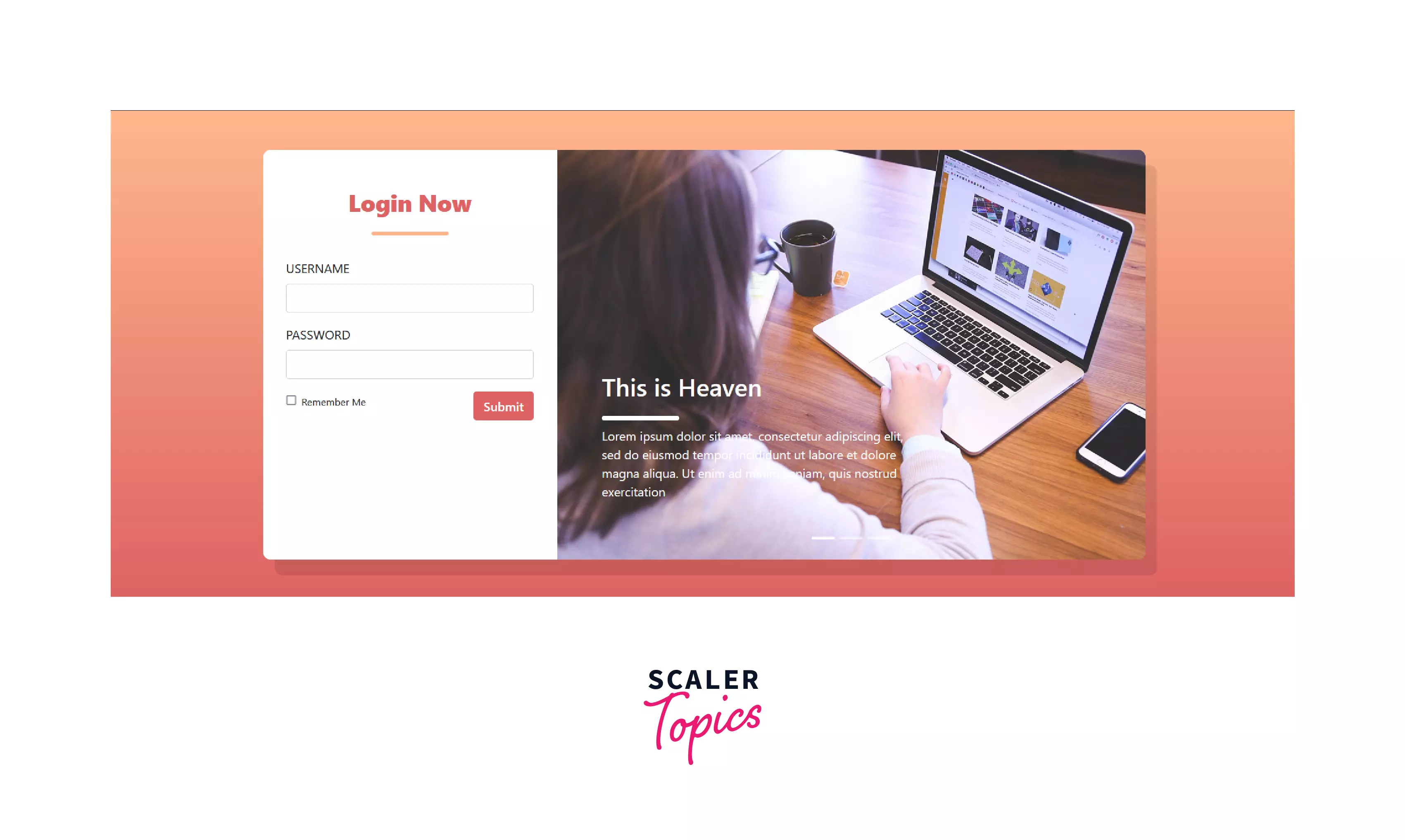
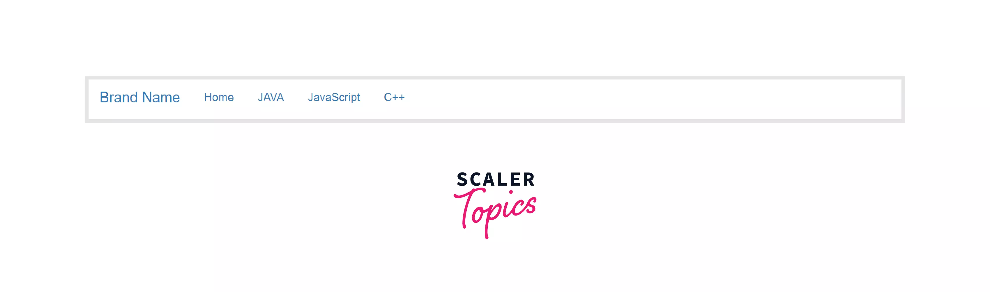
navbar - Basic navigation bar at the top of the page. The below image shows the example of the default navbar.
-
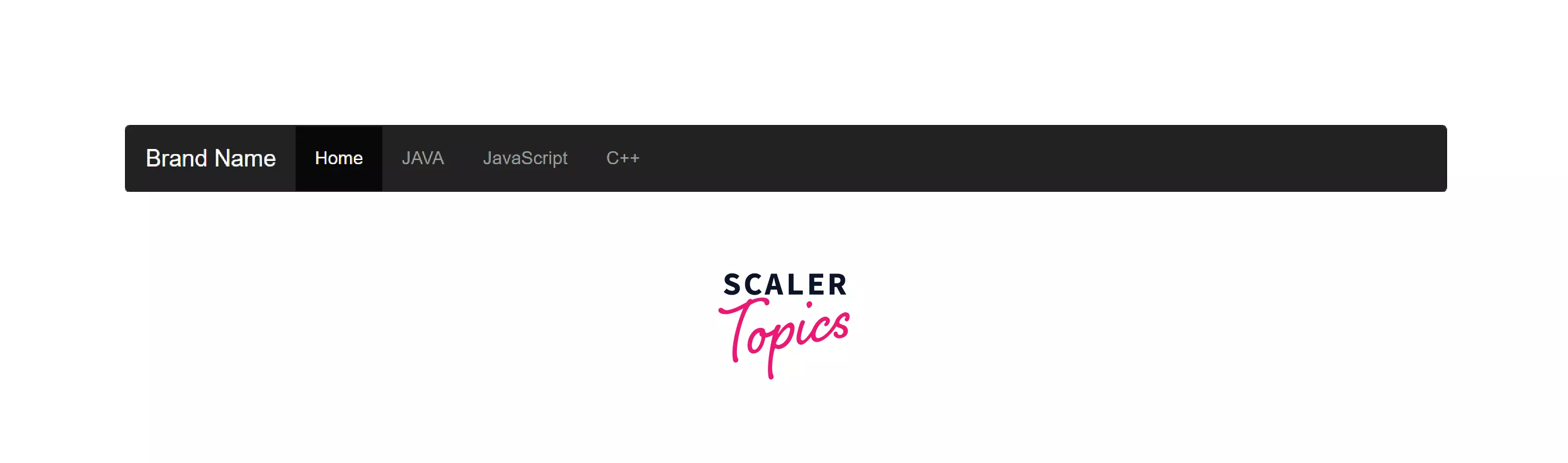
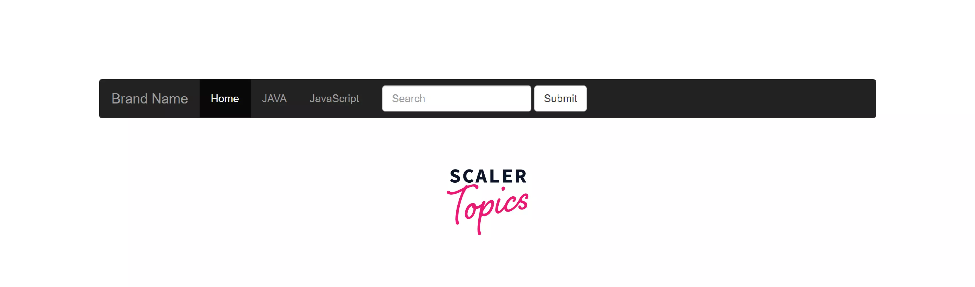
navbar-inverse - Bootstrap provides an alternative black navbar if you don't like the default greyish white colored navbar. The below image shows the example of the black navbar.
-
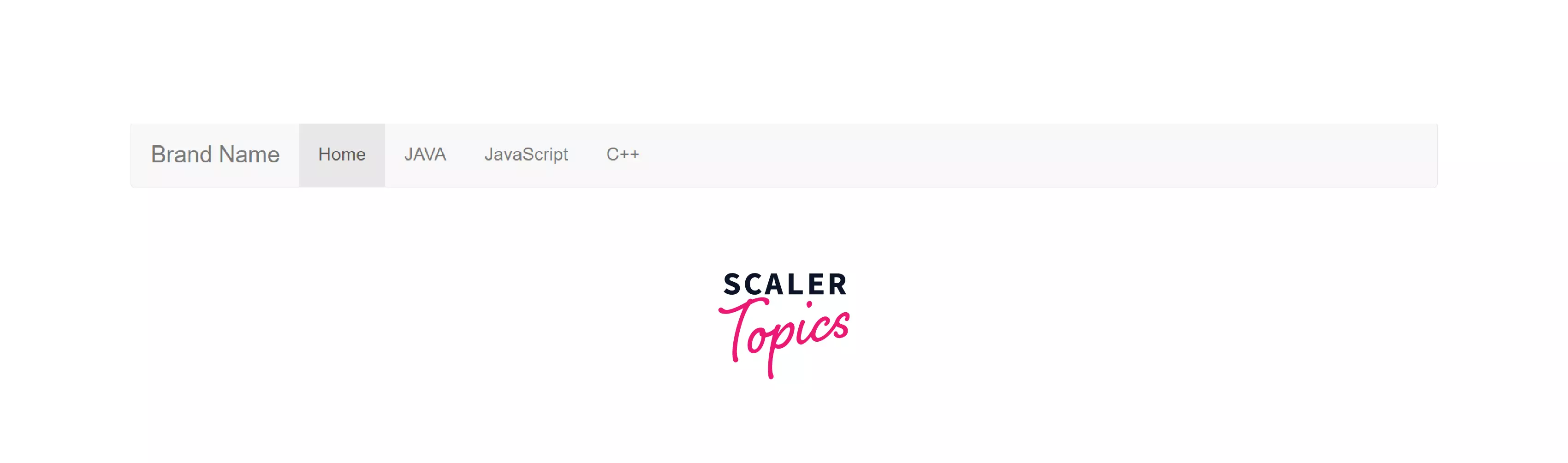
navbar-brand - A component inside the Navbar component for brand names or product names to make the brand/product names stand out from the rest. The above image shows the navbar-brand example, which has the branding of "Scaler Topics".
-
navbar-text - This class is used to add the vertically and horizontally centered text inside the navbar that is not the links.
-
navbar-expand-* (-sml, -mdl, -lgl, -xl) - Used to add collapsible feature in the navbar. It can vary according to the sizes specified in the class.
-
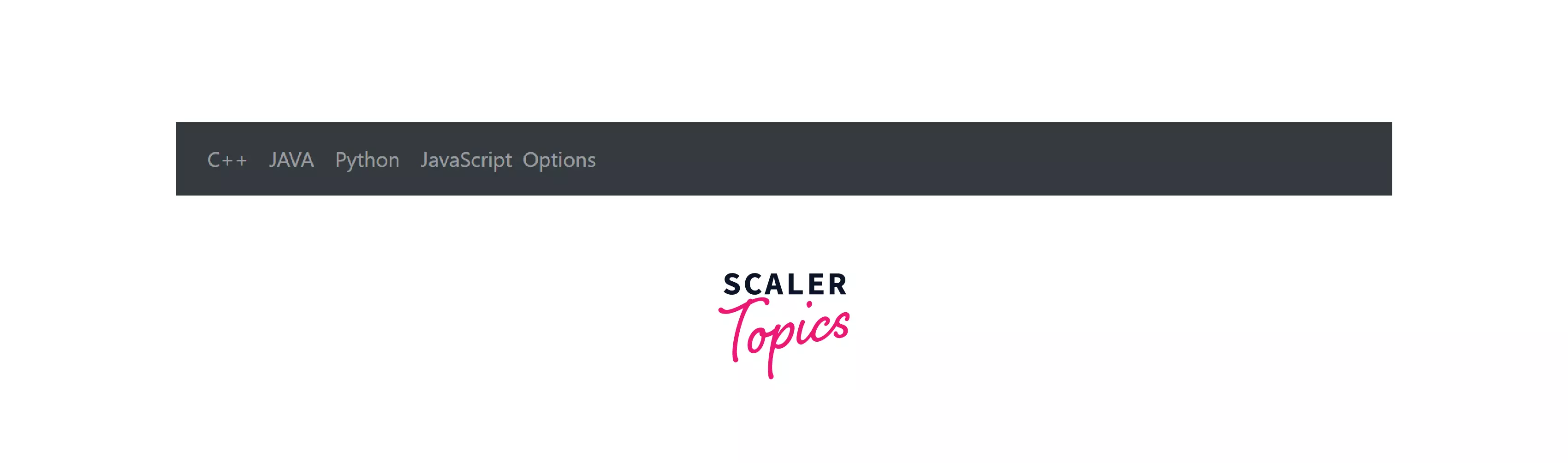
navbar-light - Used to create light-colored navbar. The below image shows the exmaple of light-colored navbar.
-
navbar-toggler - Navbar togglers are left-aligned by default.
-
collapse navbar-collapse - This class groups and collapse navbar contents by a parent breakpoint.
-
navbar fixed-top - Set a fixed navbar at the top and in dark color.
-
navbar fixed-bottom - Set a fixed navbar at the bottom as primary and in
-
navbar sticky-top - Set a sticky navbar at the top while scrolling also.
-
form-inline - Places a form (e.g. a search bar) in the Navbar.
-
navbar-form - Used to add the various form elements in the navbar. The below image shows the example of forms (here, a search bar) used inside the navbar.
-
-
Alerts
Bootstrap provides the classes to include the Alert messages that are responsive too. Alerts are created with the .alert class. The classes available in the Alerts section in the Bootstrap framework are mentioned below.
-
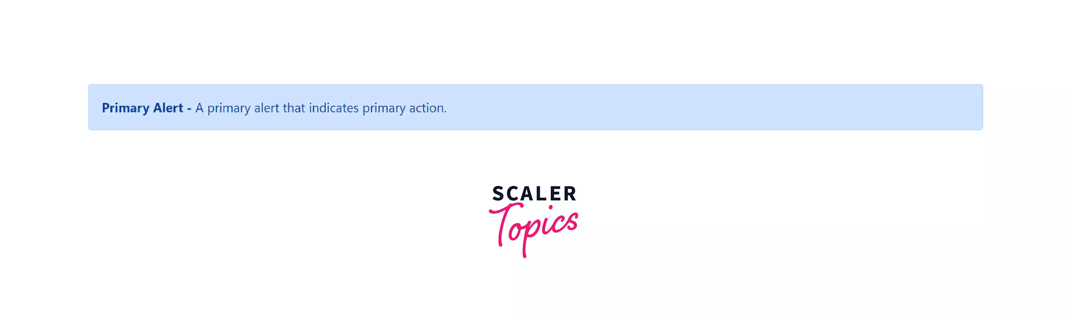
alert-primary - Creates primary and colorful alerts for any texts in light blue color.
-
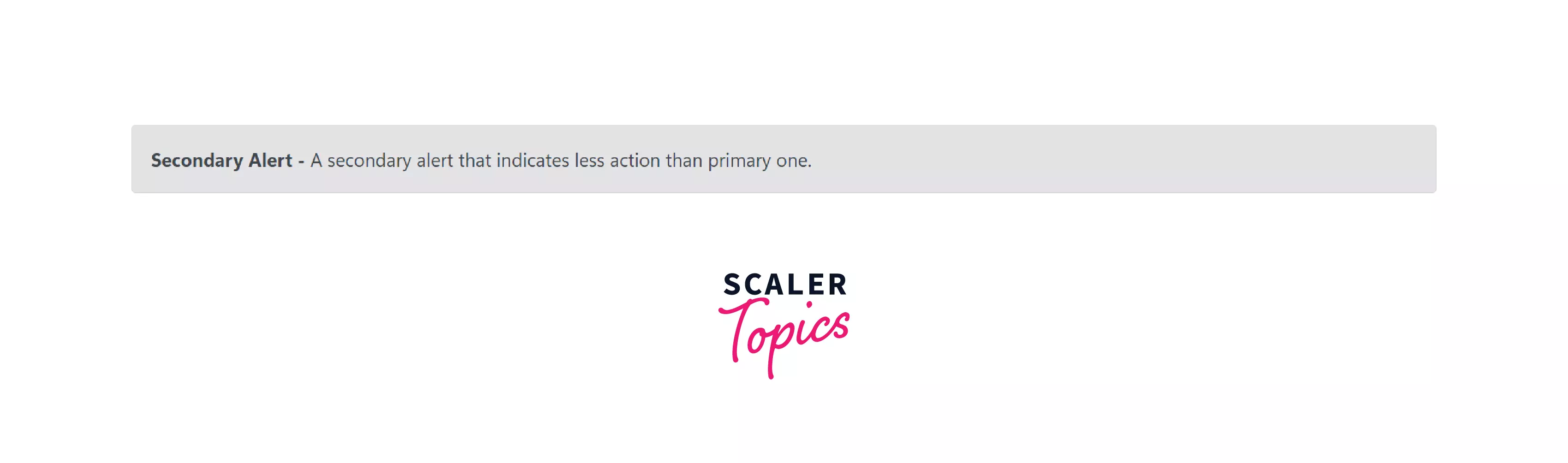
alert-secondary - Creates a secondary alert in light gray color.
-
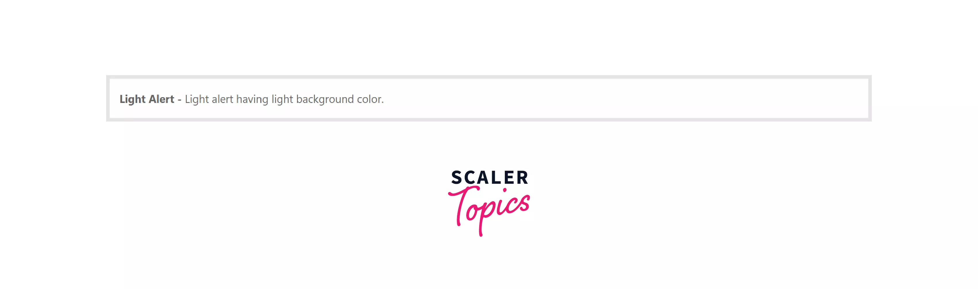
alert-light - Creates an alert with a very light background color.
-
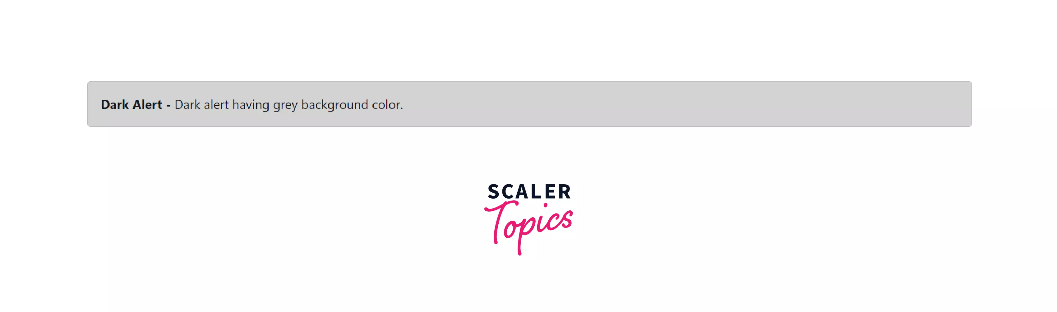
alert-dark - Creates an alert with a slighlty dark background color.
-
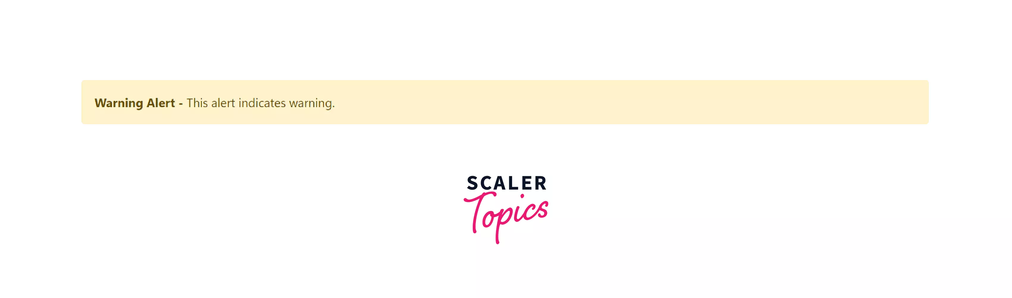
alert-warning - Creates an alert containing a message of upcoming action.
-
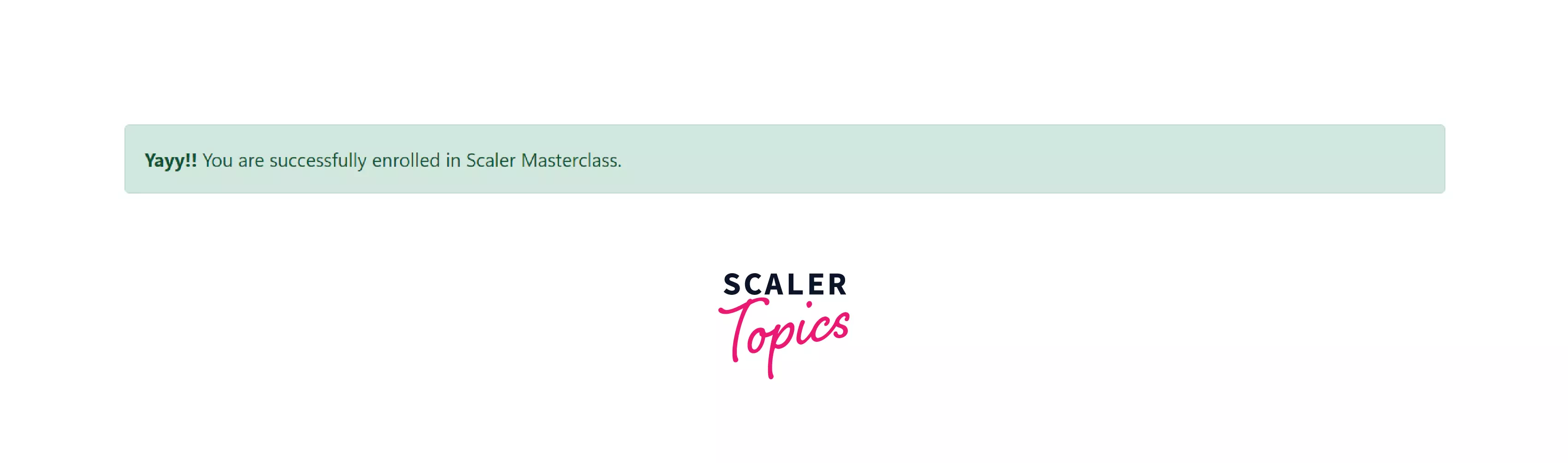
alert-success - Creates an alert that displays that the action has been confirmed. The below image shows an example of a success alert.
-
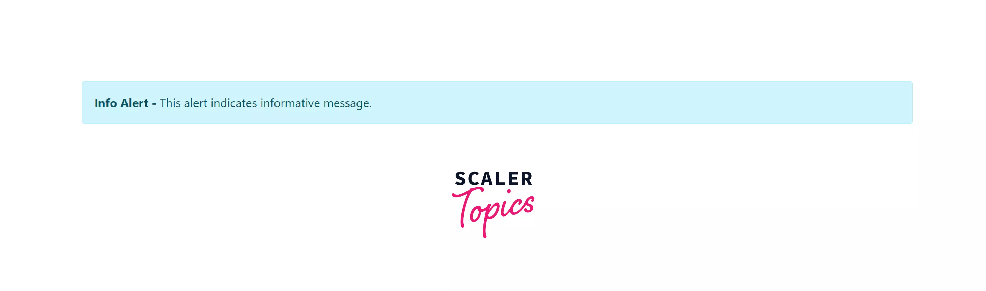
alert-info - This alert contains some important information for the user.
-
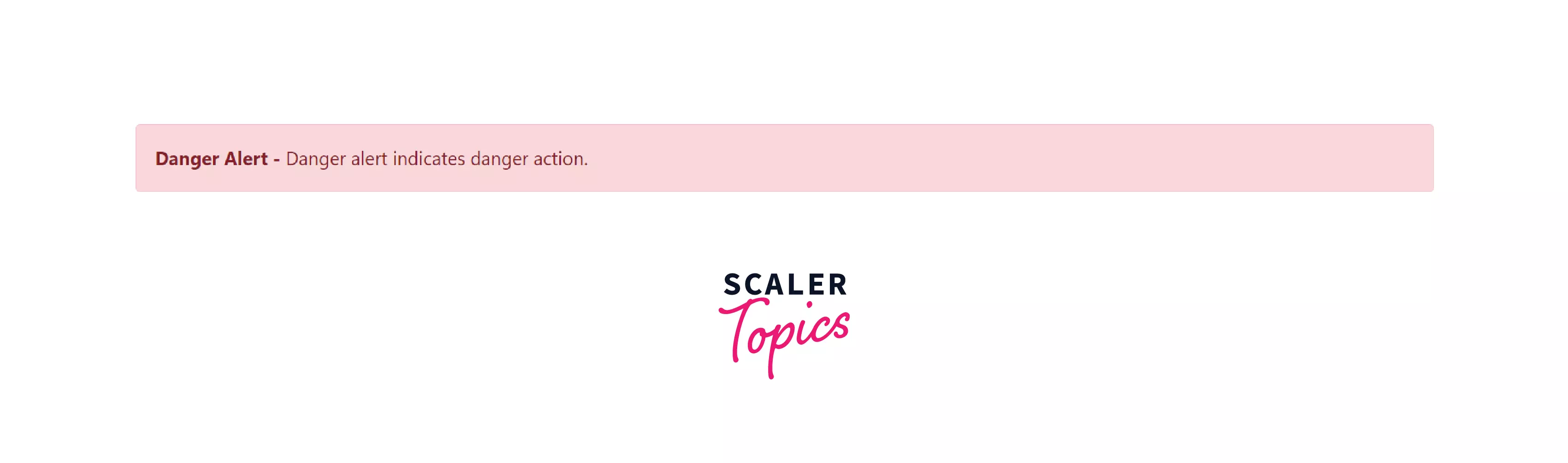
alert-danger - Similar to a warning alert but for more negative actions.
-
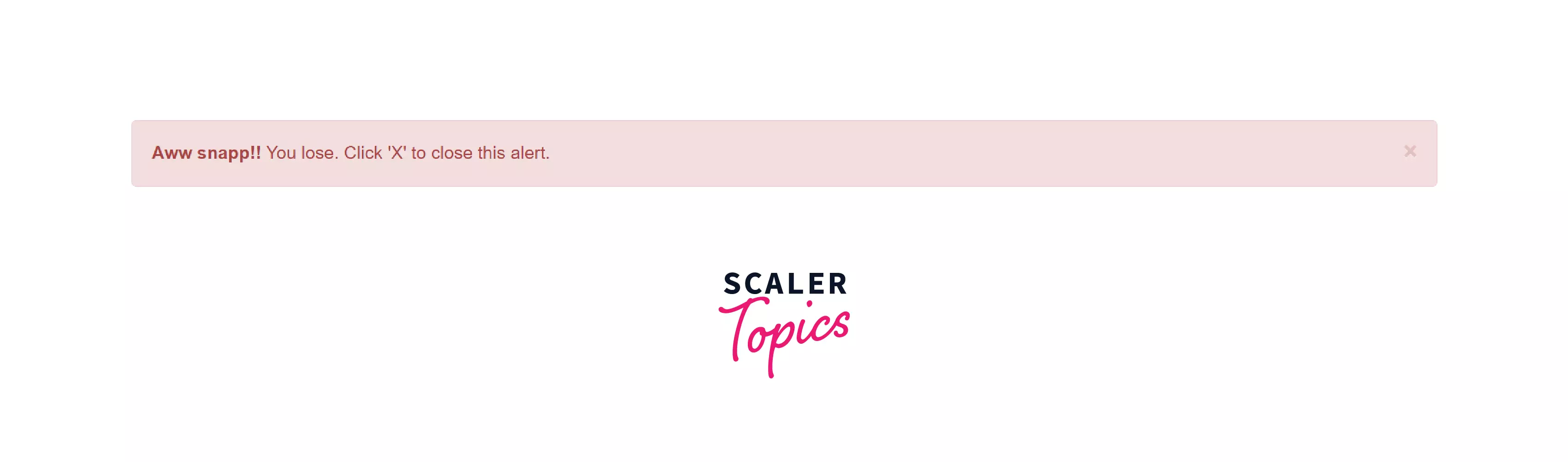
alert-dismissible - This type of alert provides an option to close after reading it. The below image shows the example of a dismissible alert box.
-
alert-heading - This class is used to add a header to your alert (e.g., billing address).
-
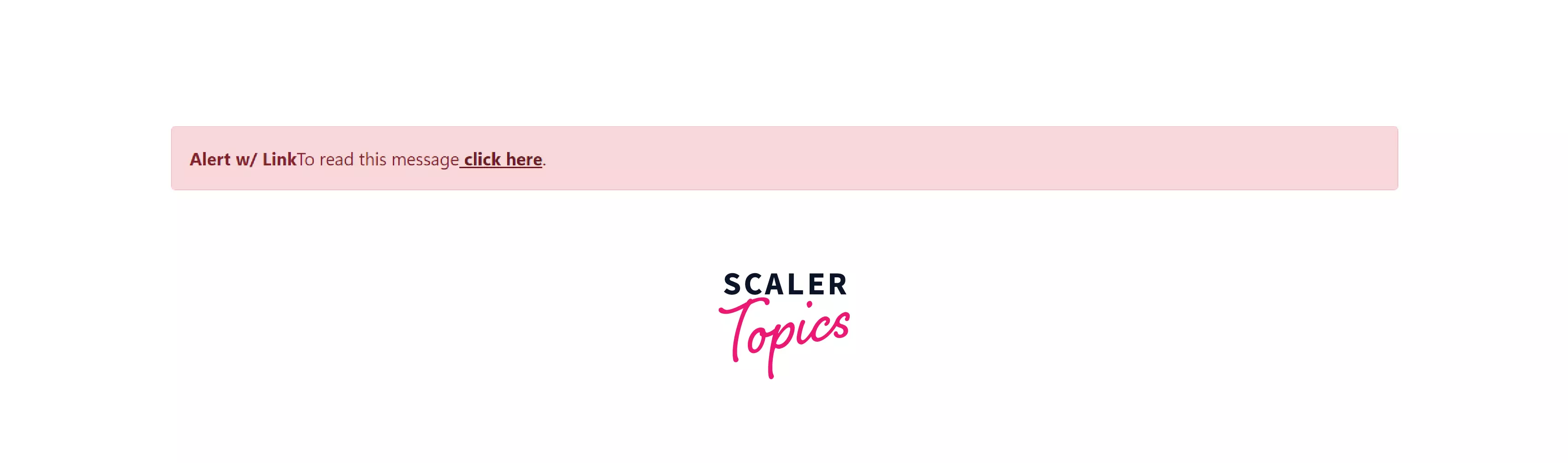
alert-link - This class is used to add a link inside the alert.
-
-
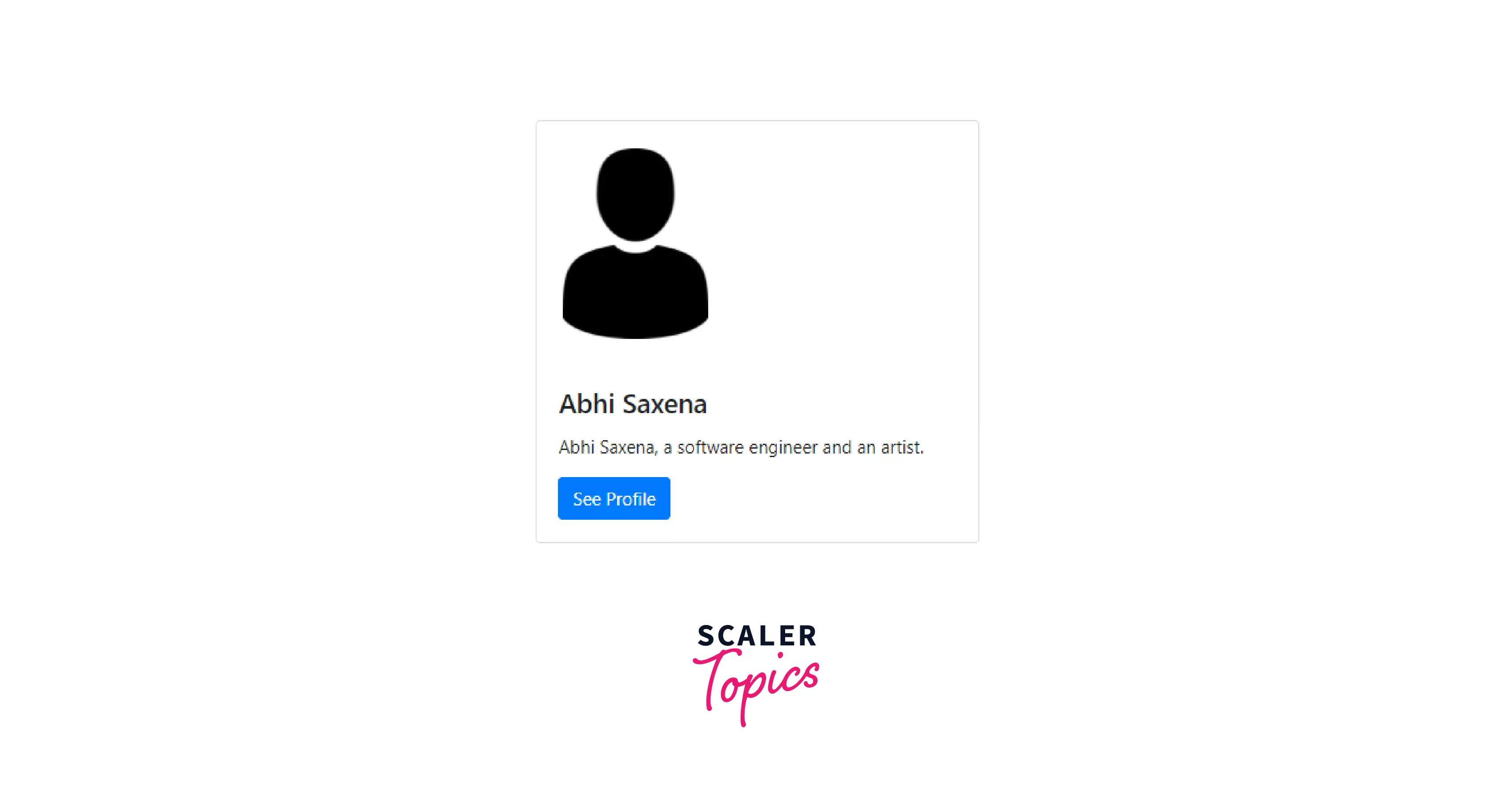
Cards
A card is a container that includes headers, footers, background, colorful options, and a lot more. It is filled with lots of content with multiple variants and options. The classes available in the Cards section in the Bootstrap framework are mentioned below.
-
card-body - This class contains the main element of the card.
-
card-title - Add a title to your card using this class.
-
card-subtitle - This class is used to add subtitles to your card.
-
card-header - To place a custom header inside your card, this class is used. This header is placed above all titles and subtitles.
-
card-footer - If you want to add some extra information to your card at the last, then use this class, it will go right after card-body.
The below image shows an example of a card created using Bootstrap.
-
card-link - You can embed a link inside the card using this class. Add this class to an <a> tag.
-
card-text - Used to add some words to your card.
-
card-img-top - Used to enclose an image to your card.
-
card-img-bottom - Used to place the image at the bottom of the card.
-
card-img-overlay - Use an image as the background, and all the texts inside the card are overlayed.
-
card-columns - Cards can be organized in columns, too, using this class.
-
card-deck - Used to assemble the cards with the same height and width.
-
card-group - Used to group the cards. A group means a single element with the different cards having the same height and width.
-
-
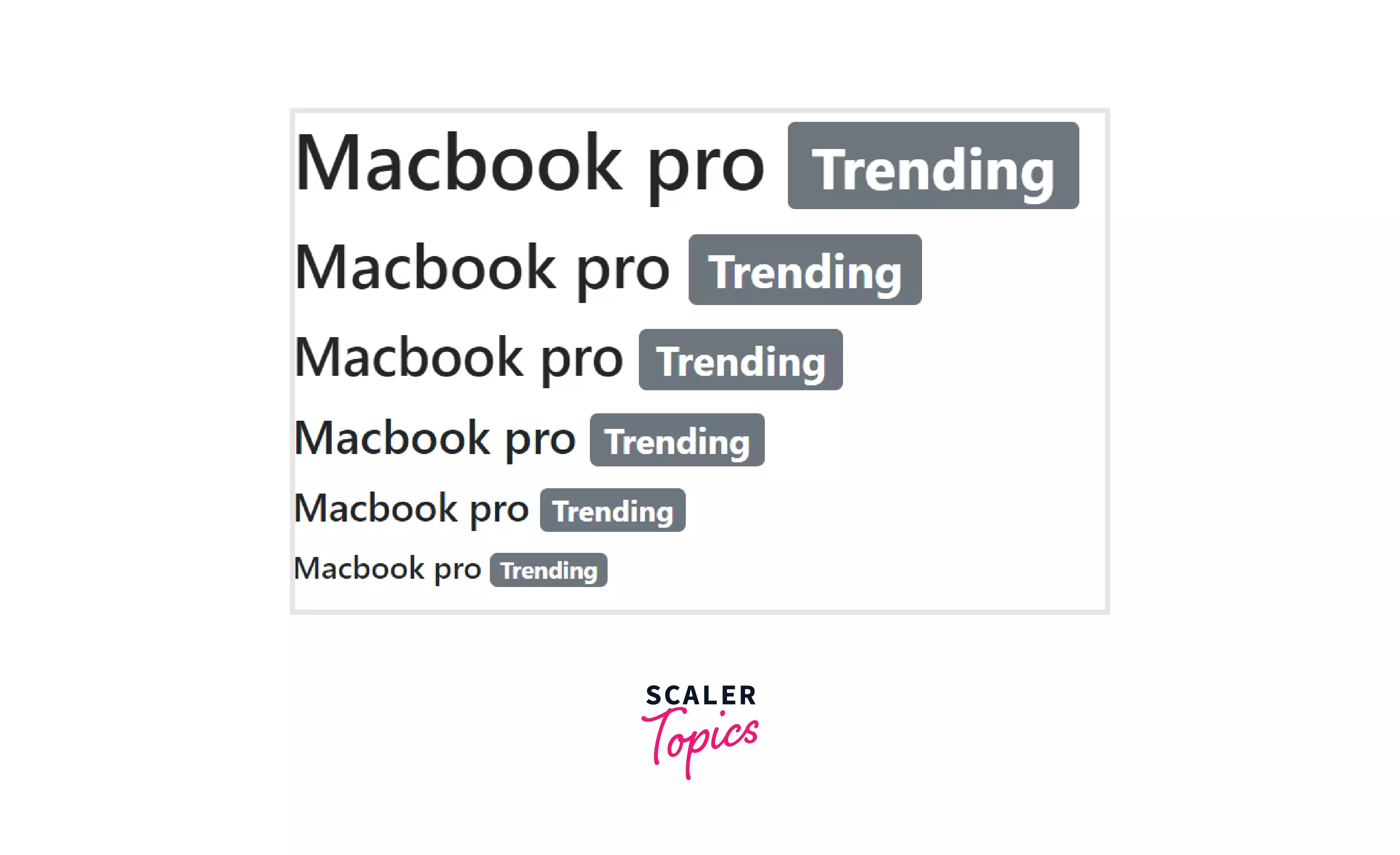
Badges
Badges are used to display extra information next to some text, button, or other elements. You can also style the badges according to your needs. The classes available in the Badges section in the Bootstrap framework are mentioned below.
-
badge - This class is used to denote that a badge is created, and it is used with some text or links or badges that are also part of buttons.
-
badge-pill - Used to modify the shape of the badges. The badges are more rounded when this class is used.
-
badge-primary - Used to add a badge to the primary message.
-
badge-secondary - Used to add a badge to the secondary or less important message.
-
badge bg-* - Used to add a background color to the badge.
-
badge-danger - Used to add a badge that has a red background color.
-
badge-success - Used to add a badge that has a green background color and denotes success or completion.
-
badge-warning - Used to add a yellow-colored badge that represents a danger sign.
-
badge-light - This class is used to add a light badge.
-
badge-dark - This class is used to add a dark badge.
The below image shows the example of the badges created using Bootstrap.
-
-
Navs
Nav classes are used to create a simple, horizontal menu bar that can be further styled according to the classes provided by the Bootstrap. The classes available in the Nav section in the Bootstrap framework are mentioned below.
- nav - This class is added to the ul element if you want to create a simple and horizontal menus.
- nav-item, nav-link - This class is added in each li item and add nav-link class to their links.
- justify-content-center - This class is added to the ul element to center the nav.
- justify-content-end - This class is added to the ul element to right-align the nav.
- flex-column - This class is added to ul to create a vertical nav.
- nav-tabs - This class is added to ul element to turn the nav menu into navigation tabs.
- nav-pills - By adding this class to ul element, the nav menu is turned into navigation pills.
- nav-justified - The tabs/pills are justified using this class.
-
Forms
Forms are the most important aspect of any website. With Bootstrap, you can build attractive forms and layouts with additional elements. The classes available in the Forms section in the Bootstrap framework are mentioned below.
- form-group - This class is used to wrap the labels and form controls of the created form.
- form-control - Used to style the controls like <input>, <select>, <textarea>.
- form-inline - This class is added to create an inline form in which all the elements are inline, left-aligned.
- form-horizontal - Used to create a horizontal form. On smaller screens, it will transform to a vertical form.
- control-label - Used this class on labels inside the form.
- form-control-lg - Used to set the form size to large.
- form-control-sm - Used to set the form size too small.
- form-control-file - If any file is to be uploaded by the user, then all the styling related to it can be added by this class.
-
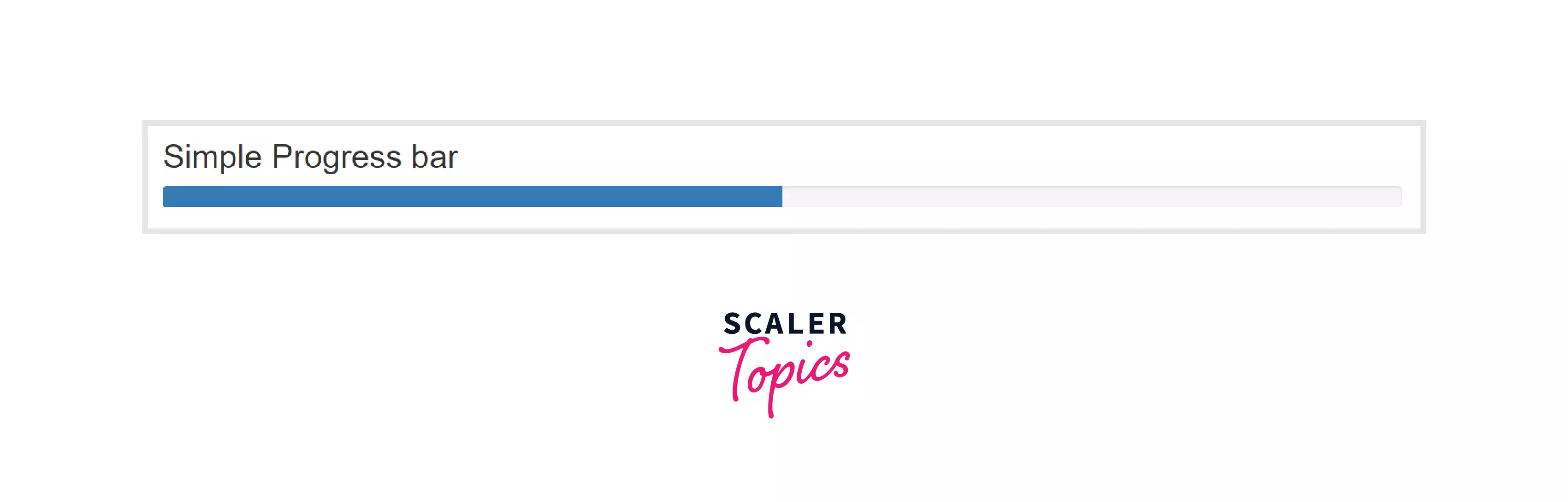
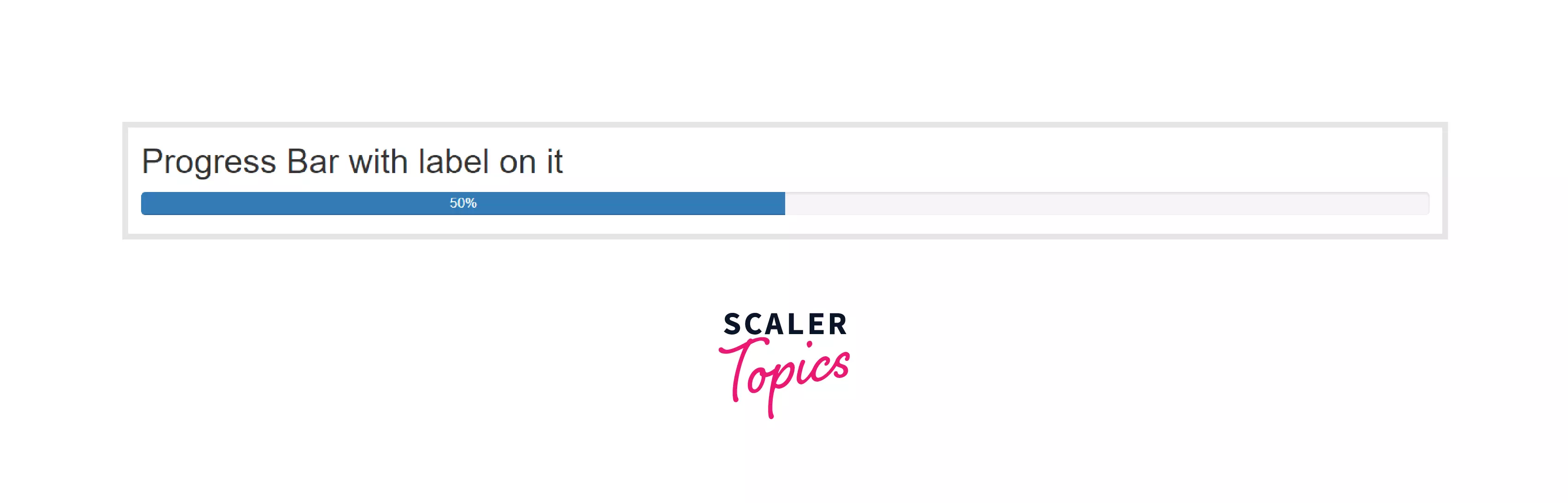
Progress
Progress bars in Bootstrap do not use the progress element to ensure that you can animate them, stack them and place text labels over them. The classes available in the Progress section in the Bootstrap framework are mentioned below.
-
progress - Used as a wrapper to indicate the maximum value of the progress bar.
-
progress-bar - Used to indicate the progress so far.
-
progress-bar bg-* - These background utilities are added with the progress bar to change the appearance of the individual progress bars.
-
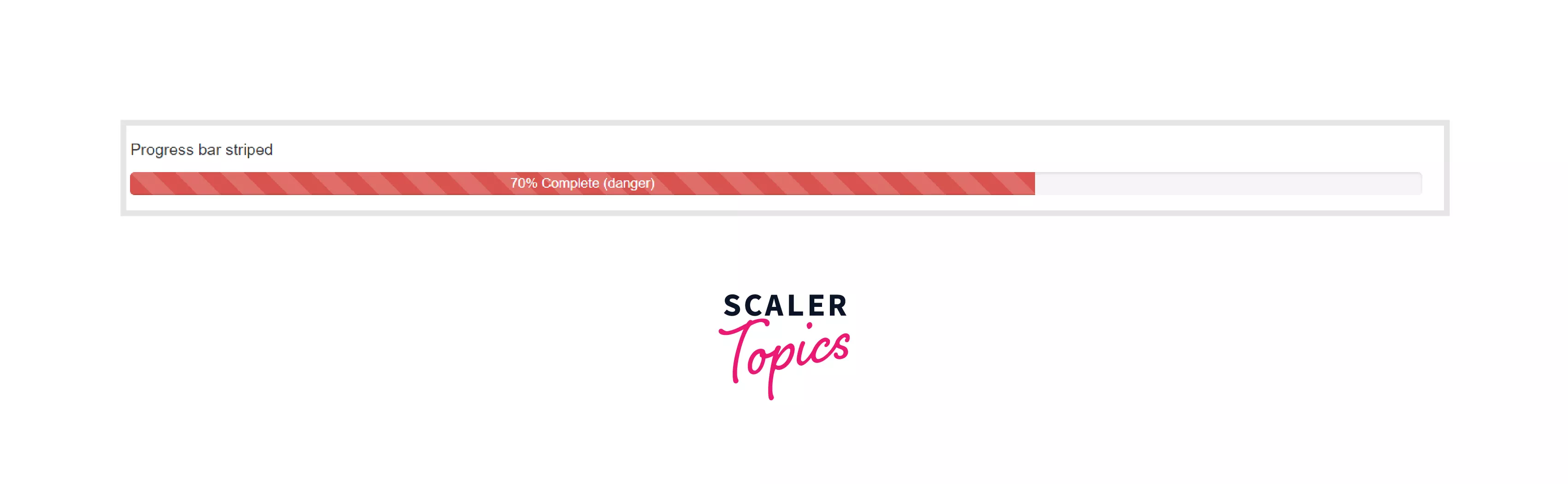
progress-bar-striped - Used to apply stripes to a progress bar that is applied via a CSS gradient.
-
progress-bar-animated - This class can be used to animate the stripes right to left via CSS animations.
-
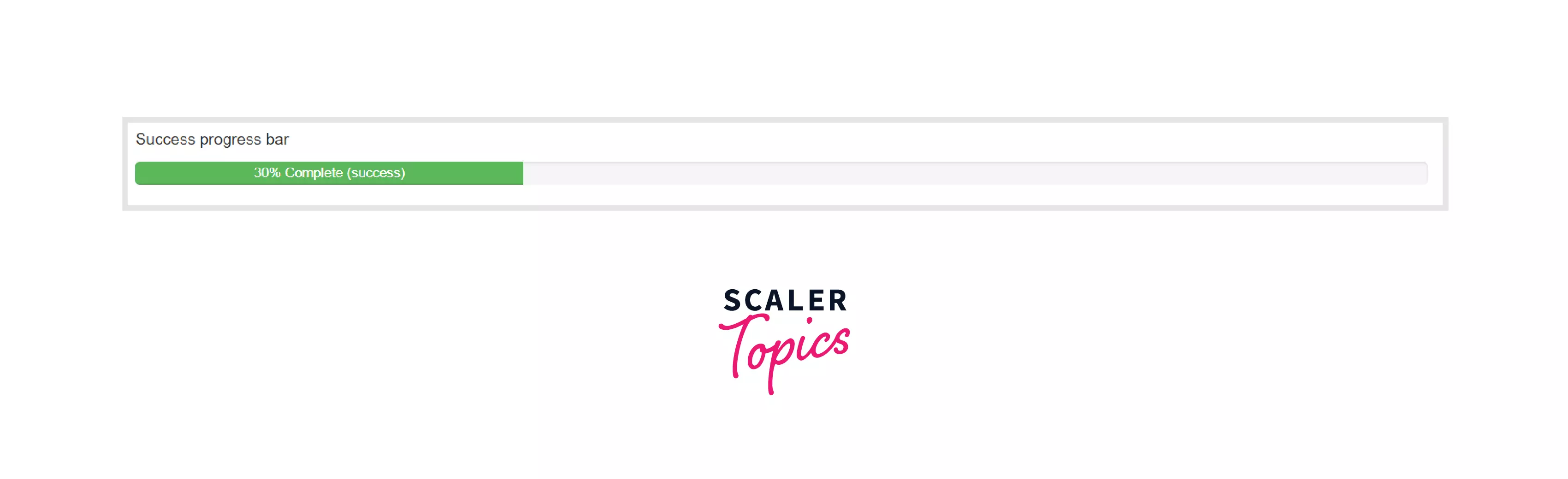
progress-bar-success - Green-colored progress bar denoting the success or the completion.
-
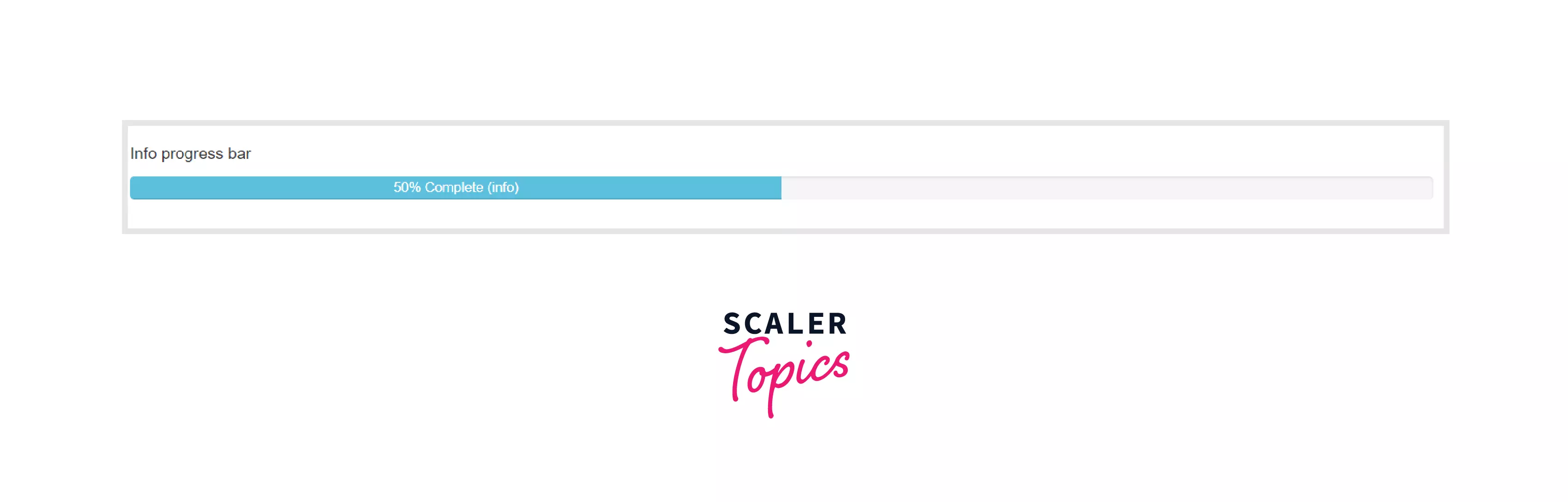
progress-bar-info - This class is used to denote some info with the progress bars, and its background color is light blue.
-
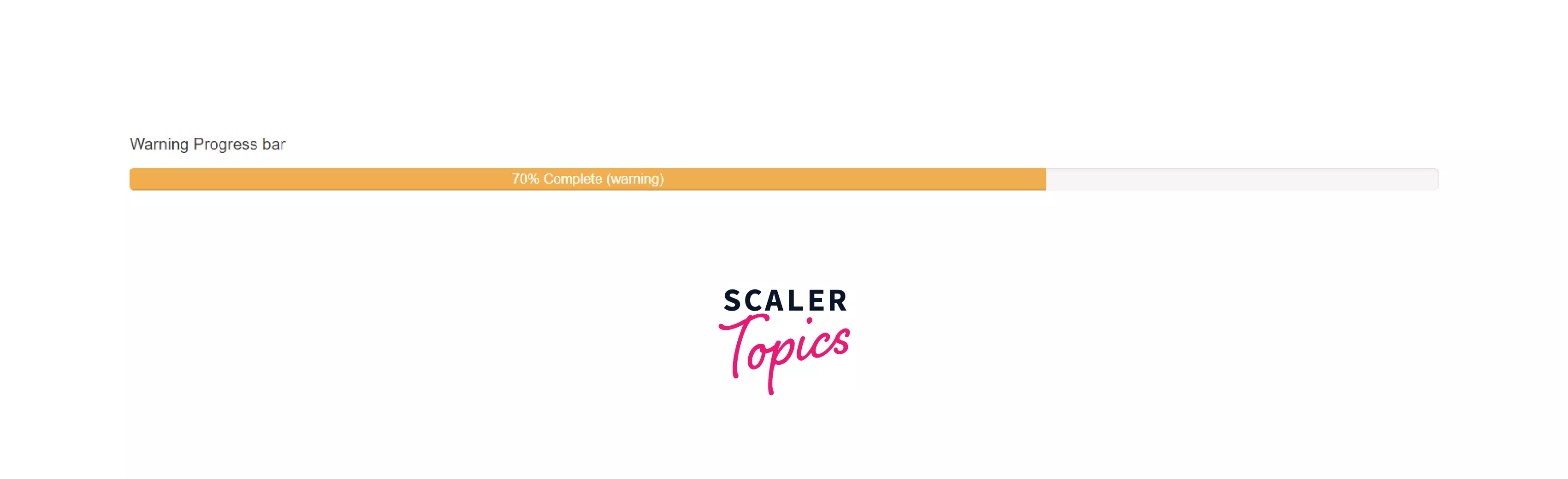
progress-bar-warning - Orange-colored progress bar that denotes warning levels.
-
progress-bar-danger - Red-colored progress bar that signifies danger.
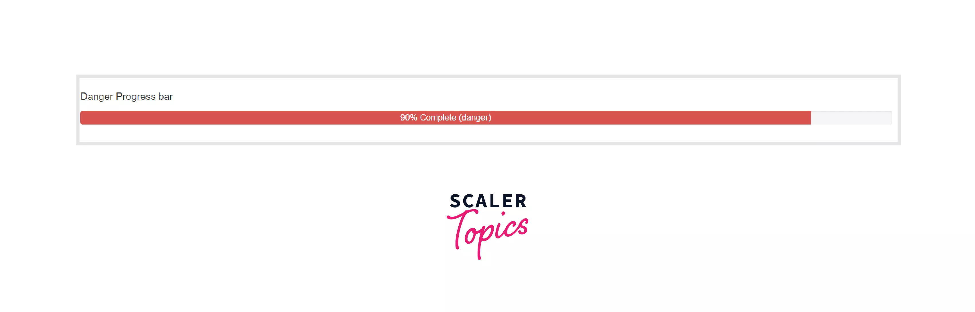
-
-
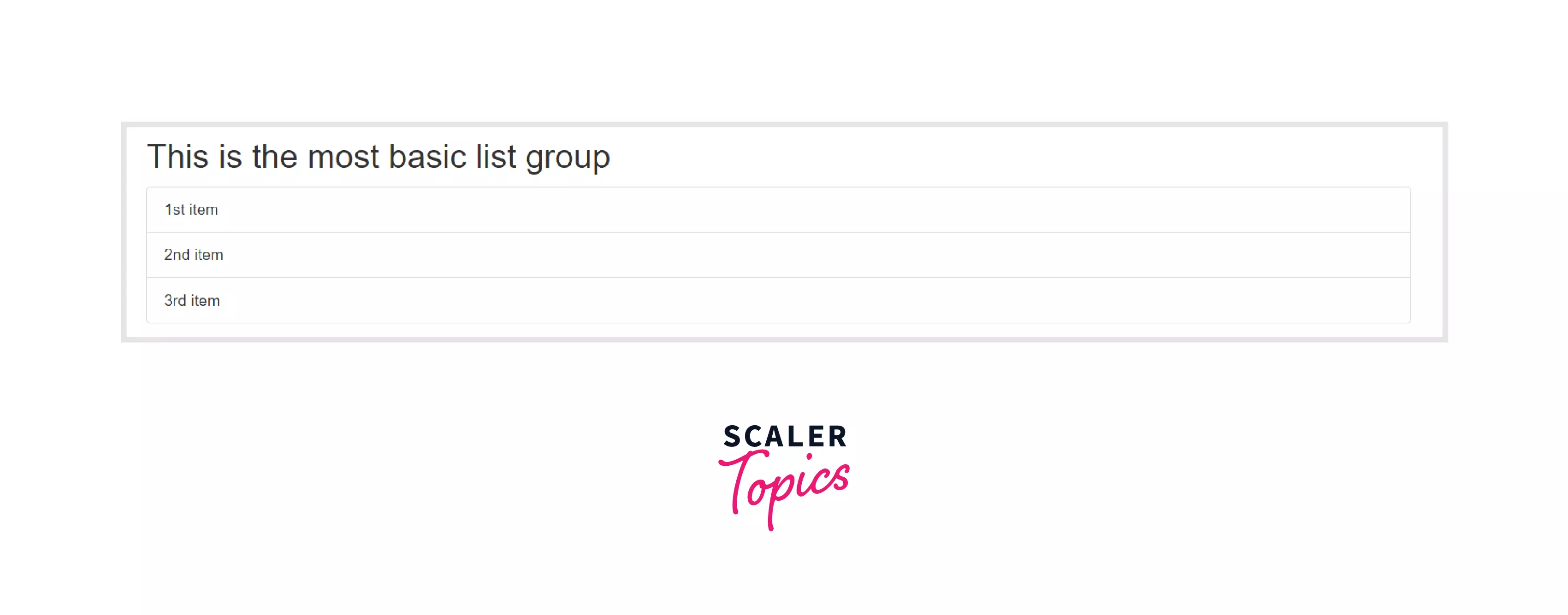
List Group
To display the series of components, list group classes are available in Bootstrap. These are flexible and powerful components to display this type of content in the Bootstrap. The classes available in the List Group section in the Bootstrap framework are mentioned below.
-
list-group - It is a container class that contains an unordered list with the list items.
-
list-group-item - Items inside the list group is created with this class.
-
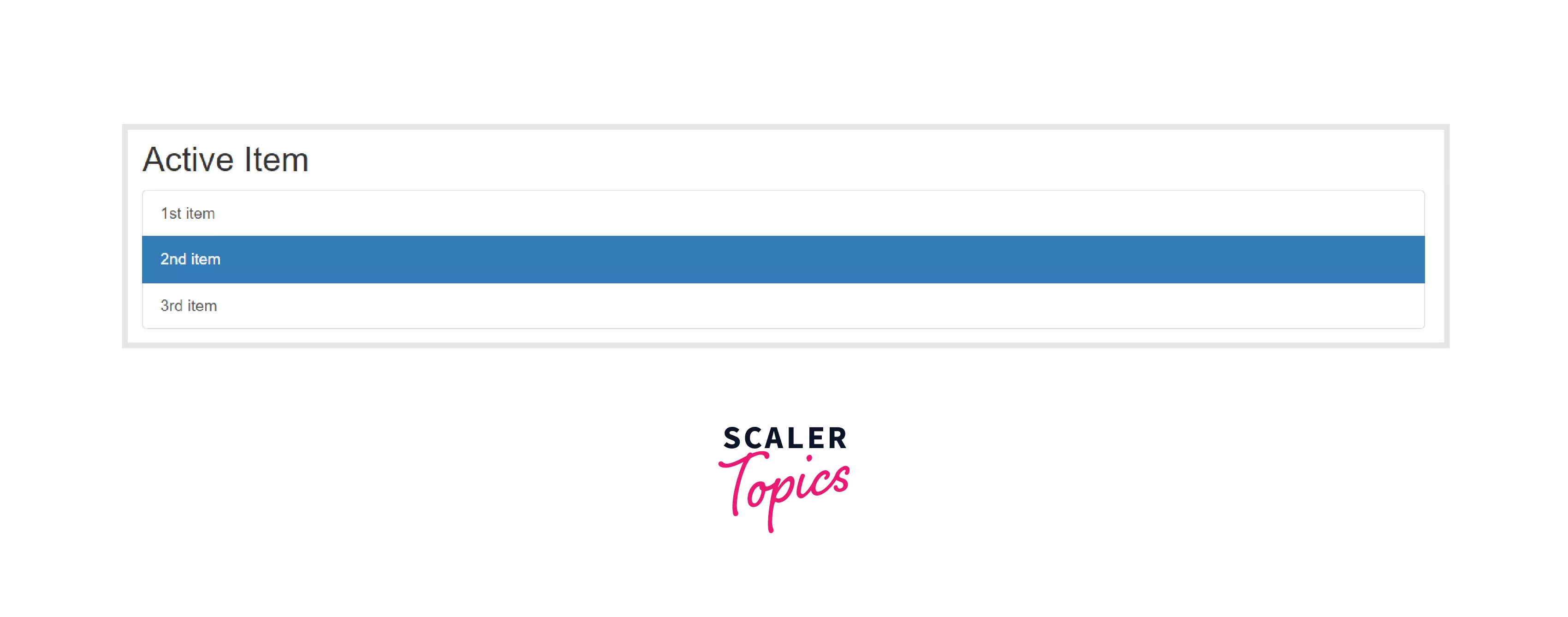
list-group-item active - Used to indicate the current active selection.
-
list-group-item disabled - Used to make it appear as disabled.
-
list-group-item-success, list-group-item-info, list-group-item-warning, list-group-item-danger - These classes are used to color the list items.
-
list-group-flush - Used to remove some borders and rounded corners from the list items.
-
list-group-numbered - Used to indicate the lists as numbered list group items.
-
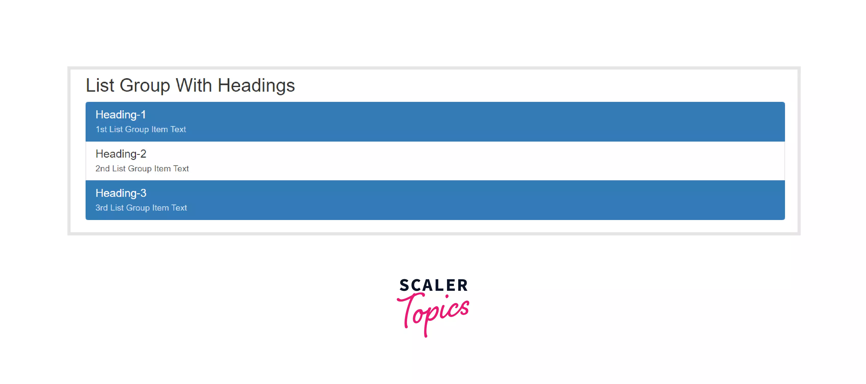
list-group-item-heading - Used to add a heading inside a list group item.
-
list-group-item-text - This class is added to the text inside the heading of the list group item.
-
-
Typography
Everything you need for text, headings, sub-headings are included in the Typography. The classes available in the Typography section in the Bootstrap framework are mentioned below.
-
h1 - h6 - All HTML headings are available in Bootstrap.
-
lead - This class is used to make a paragraph stand out from the rest.
-
text-lowercase, text-uppercase, text-capitalize, text-truncate - These classes are used to set the text to lowercase, uppercase, capitalize the letters, and truncate the letters, respectively.
-
-
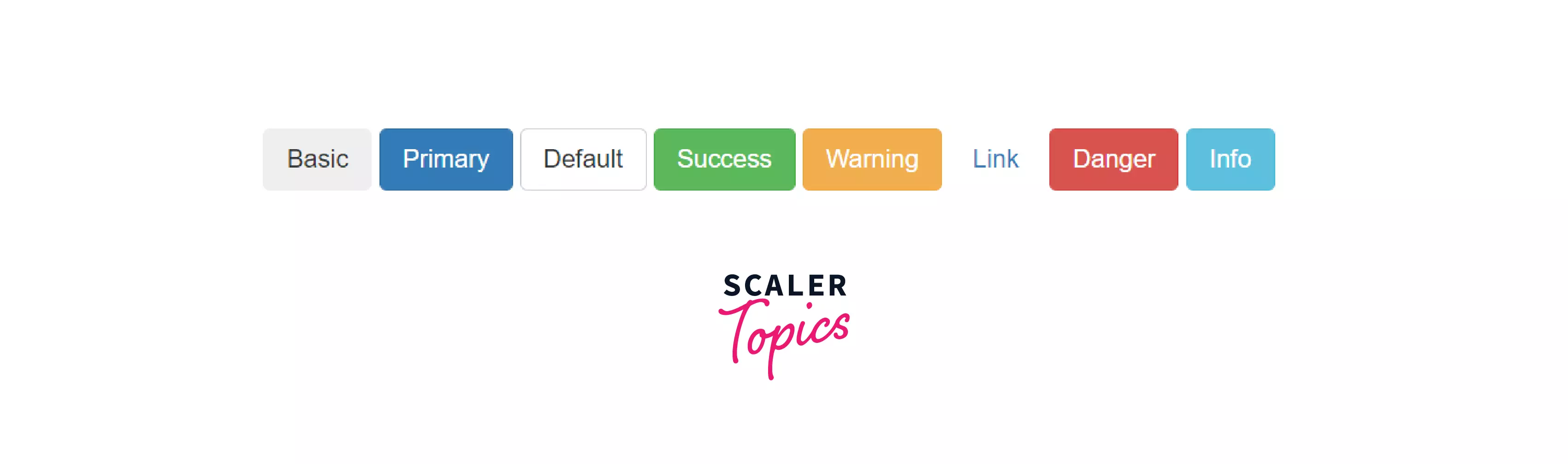
Buttons
Bootstrap includes various styles of buttons that can be directly included in your website. Buttons also support custom styles, multiple sizes, and more. The classes available in the Buttons section in the Bootstrap framework are mentioned below.
-
btn - This class is to be used with the button element.
-
btn-outline-* - Used to remove the background images or colors on any button, and an outline is created with the specified color in the class.
-
btn-lg, btn-sm, btn-xs - Used to set the sizes of the button.
-
btn-primary - This class is used to add a primary button having blue background color.
-
btn-secondary - A secondary button is having grey background color.
-
btn-default - A default button provided by Bootstrap with a white background.
-
btn-success - Green-colored button that signifies success.
-
btn-info - This class is used to add a button that contains some information and its background color is light blue.
-
btn-warning - Orange-colored button that signifies warning via a button.
-
btn-danger - As the class name denotes, the background of the color will be red.
-
btn-light - Light colored button.
-
btn-dark - Dark colored button.
-
btn-link - This class is used to embed a link within the button.
-
btn-block - Used to create a block-level button.
The below image shows examples of buttons that are created using Bootstrap.
-
-
Button Groups
Button Groups in Bootstrap means the buttons are wrapped on a single line or stacked in a vertical column. The classes available in the Button Groups section in the Bootstrap framework are mentioned below.
- btn-group - Wrap a series of buttons with this class.
- btn-group-lg - Large sized button group.
- btn-group-sm - Small-sized button group.
- btn-group-xs - Extra small sized button group.
- btn-group-vertical - This class is used to create a vertical button group.
- btn-group-justified - Used to span the entire width of the screen.
-
Tables
Tables are used across various places, widgets, data-pickers, etc. Bootstrap provides classes for creating tables too. The tables can be customized, too, with the modifier classes available in Bootstrap. The classes available in the Tables section in the Bootstrap framework are mentioned below.
- table-primary - Creates a table with a light blue background color. This class can be used on tables, rows, as well as on cells.
- table-secondary - This class adds a grey background color.
- table-success, table-danger, table-warning - Adds a light green, light red, or light yellow background color on tables, rows, or individual cells.
- table-info, table-light, table-dark - Adds blue, white, black background color to the cells.
- thead-light - Used to add a light-colored background in the heading of the tables.
- thead-dark - Used to add a dark-colored background in the heading of the tables.
- table-striped - This class is used to add zebra stripes to the table.
- table-condensed - If you want to make a table compact by cutting cell padding in half, use this class.
- table-bordered - Used to add borders on all the sides of the table.
- table-hover - This class is used to add a hover effect, i.e., the grey background color on table rows.
- table-*-responsive - Used to create a responsive table, where "*" denotes sm, md, lg, xl.
-
Images
You can add responsive images by adding classes of images available in Bootstrap. The classes available in the Images section in the Bootstrap framework are mentioned below.
- img-fluid - This class is used to add responsive images.
- img-thumbnail - Used to give an image a rounded 1 px border appearance.
- img-rounded - Adds rounded corners to the image.
- img-circle - This class is used to shape the image into a circle.
-
Dropdowns
Dropdown menus are very much useful for displaying the list to the user, and the user can choose any of the items from that list. Bootstrap provides various classes that are used to create the dropdown menus within no time.
-
dropdown - This class indicates a dropdown menu.
-
caret - This class creates a caret arrow icon that indicates a dropdown menu.
-
divider - To separate the links inside the dropdown menu with a horizontal border, this class is used.
-
dropdown-header - Used to add the headers inside the dropdown menus.
-
dropdown-menu-right - Add this class to right-align the drop-down menu.
-
dropup - By using this class, the drop-down menu extends upwards.
-
disabled - This class disables the item in the dropdown menu.
Below image shows the example of the dropdown created using Bootstrap.
-
-
Spinner
Spinners or Loaders are widely used across almost all websites, and Bootstrap provides built-in spinners which you can use in your projects. Classes available for the Spinner are mentioned below.
- spinner-border - Used to create a spinner/loader of black color.
- spinner-grow - If you want your spinner to grow instead of spin, use this class.
- spinner-border-sm - This class is used to create a small-sized spinner having a spinning effect.
- spinner-grow-sm - This class is used to create a small-sized spinner having a grow effect instead of spinning.
You can use color utilities with the spinner that are mentioned here: spinner-border text-primary, spinner-border text-success, spinner-border text-info, spinner-border text-secondary, spinner-border text-dark, spinner-border text-light, spinner-border text-danger, spinner-border text-warning, spinner-border text-muted.
-
Utility: Display
The classes available in the Display section in the Bootstrap framework are mentioned below, through which you can quickly toggle the display value for any of the elements in your webpage.
- d-{value} for xs breakpoint - The display value for the xs breakpoint can be set or changed using this class.
- d-{breakpoint}-{value} for sm, md, lg, xl, and xxl breakpoints - For given breakpoints, this class is to be added to include the display properties in the elements.
The value can be any of these: none, inline, inline-block, block, grid, table, table-cell, table-row, flex, inline-flex.
-
Utility: Flexbox
Alignment of the items and managing the layout can be easily done by the classes available in the Flex section in the Bootstrap framework mentioned below.
- d-flex - Creates a flexbox container, and the direct children will be transformed into the flex items.
- d-inline-flex - Creates an inline flexbox container.
- flex-column - Used to display the flex items vertically, i.e., in columns or on top of each other.
- flex-column-reverse - This class is used to reverse the vertical direction.
- flex-row - Used to display the flex items horizontally, i.e., side by side or in rows.
- flex-row-reverse - This class is used to right-align the flex-items.
- justify-content-* - This class is used to change the alignment of the flex items. Here "*" means start, center, end, between, around.
- flex-fill - To have an equal width of the flex items, this class is used.
- ms-auto - This class is used to add the margins to the flex items, and it pushes the items to the right.
- me-auto - This class is used to add the margins to the flex items, and it pushes the items to the left.
- align-content-*-start - Aligns the items from the start on different screens.
- align-content-*-end - Aligns the items at the end on different screens.
- align-content-*-center - Aligns the items in the center on different screens.
- align-content-*-stretch - Stretch the gathered items on different screens.
- align-content-*-around - Align the gathered items "around" on different screens.
The below-mentioned classes are responsive variations for d-flex and d-inline-flex classes.
- d-sm-flex, d-sm-inline-flex, d-md-flex, d-md-inline-flex, d-lg-flex, d-lg-inline-flex, d-xl-flex, d-xl-inline-flex, d-xxl-flex, d-xxl-inline-flex.
-
Utility: Sizing
With the use of Sizing utilities, you can easily alter the height and width of the element. Bootstrap includes support for 25%, 50%, 75%, 100% and auto by default. The classes are like: w-25, w-50, w-75, w-100, h-25, h-75 etc.
-
Utility: Text
The classes available in the Text section in the Bootstrap framework are mentioned below.
- text-start - Aligns the text to the start on all viewport sizes.
- text-center - Aligns the text to the center on all viewport sizes.
- text-end - Aligns the text to the end on all viewport sizes.
- text-sm-start - Start aligned the text on viewport sized small or wider.
- text-md-start - Start aligned the text on viewport sized medium or wider.
- text-lg-start - Start aligned the text on viewport sized large or wider.
- text-xl-start - Start aligned the text on viewport sized extra-large or wider.
- text-wrap - Wraps the text.
- text-nowrap - Prevent the text from wrapping.
- font-weight-bold - This class is used to add boldness to the text.
- font-weight-bolder - This class is used to add more boldness than the font-weight-bold.
- font-weight-lighter - Used to lighten the text.
- font-weight-normal - This class is used to display the text as it is, and if any boldness is present, then it is removed, and the text will display the normal weight.
- text-decoration-none - If you want to remove the stylings from the text, then use this class.
- font-italic - This class is used to italicize the font.
- text-monospace - This class is added to the font in which you want the letters to be monospaced.
- text-muted - This class is used to display the text as the muted one.
- text-white-50 - To add the 50% opacity white to the text, this class is used.
- text-black-50 - To add the 50% opacity black to the text, this class is used.
-
Utility: Colors
Bootstrap provides some classes through which one can manipulate the colors of the text as well as the background with ease.
- bg-primary - This class is used to add a primary background color that is blue in color.
- bg-secondary - This class is used to add a secondary background color that is grey in color.
- bg-success - To add a green background color and to show some success or completion, this class is used.
- bg-info - Used to add a teal background color, and texts represent some information.
- bg-warning - If you want to add a warning text with the orangish-yellow background color, use this class.
- bg-danger - This class is used to add a red background color to the text.
- bg-light - Used to add a light background color behind the text.
- bg-dark - Used to add a dark background color behind the text.
- text-primary - This class adds a primary color to the text that is blue in color.
- text-secondary - This class adds a secondary color to the text that is greyish in color.
- text-success - If you want to show completion or success via texts, then this class is used that supports green text color.
- text-warning - Used to add orange color to the text.
- text-danger - Used to add red color to the text.
- text-light - This class is used when there is dark background available, and the text color is light.
- text-dark - This class is used when the background of the text is light and the text color is dark.
- text-white - The text color is white in this class, and it is used when there is dark background present in the text.
Note: You don't have to learn all the classes available in Bootstrap, and you can't learn all of these. Practice by doing projects, and at the time of building the projects, you'll get to know what you need. After that, come here for the reference, and you can always refer to the official documentation of Bootstrap.
Conclusion
- You learned about how the Bootstrap classes are used to include the built-in components in your website.
- There are various classes available to include the CSS styling directly from the Bootstrap.
- Alerts component provides various colored alerts for different purposes.
- There are card components that are widely used on almost all websites, and bootstrap provides a wide variety of cards with different and colorful styling.
- You also saw how the badges could be created within minutes using Bootstrap.
- This article covered the classes available in the utility classes of Bootstrap, and with the use of these classes, one can develop the UI with ease.
- There are a lot more components available in Bootstrap, you can always refer to the official documentation for reference.
 Google
 Amazon
 Microsoft
 Flipkart
 Adobe1200+ more