Bootstrap Spacing
 FREE
FREE

Abstract
Spacing in Bootstrap can be added between elements by adding custom margin or padding to them. Bootstrap provides several short-hand utility classes to add response-friendly margin and padding to modify an element's appearance. They include support for all properties,i.e., individual properties and horizontal and vertical properties. Spacing classes are built from a default SASS(Syntactically Awesome Style Sheets) map and can be used to add spaces with sizes ranging from .25rem to 3rem.
Bootstrap Spacing
Spacing in Bootstrap is implemented by using Bootstrap utility classes to set margin and padding.Bootstrap spacing utilities are short-hand bootstrap classes that help apply response-friendly spaces in between elements in a webpage. They provide ease of use and simplicity and are a must-have tool for designing beautiful websites. Bootstrap spacing is implemented by adding margin and padding between elements.
Syntax
The general syntax to set margin or padding is
With the size having values ranging from 0.25rem to 3rem.
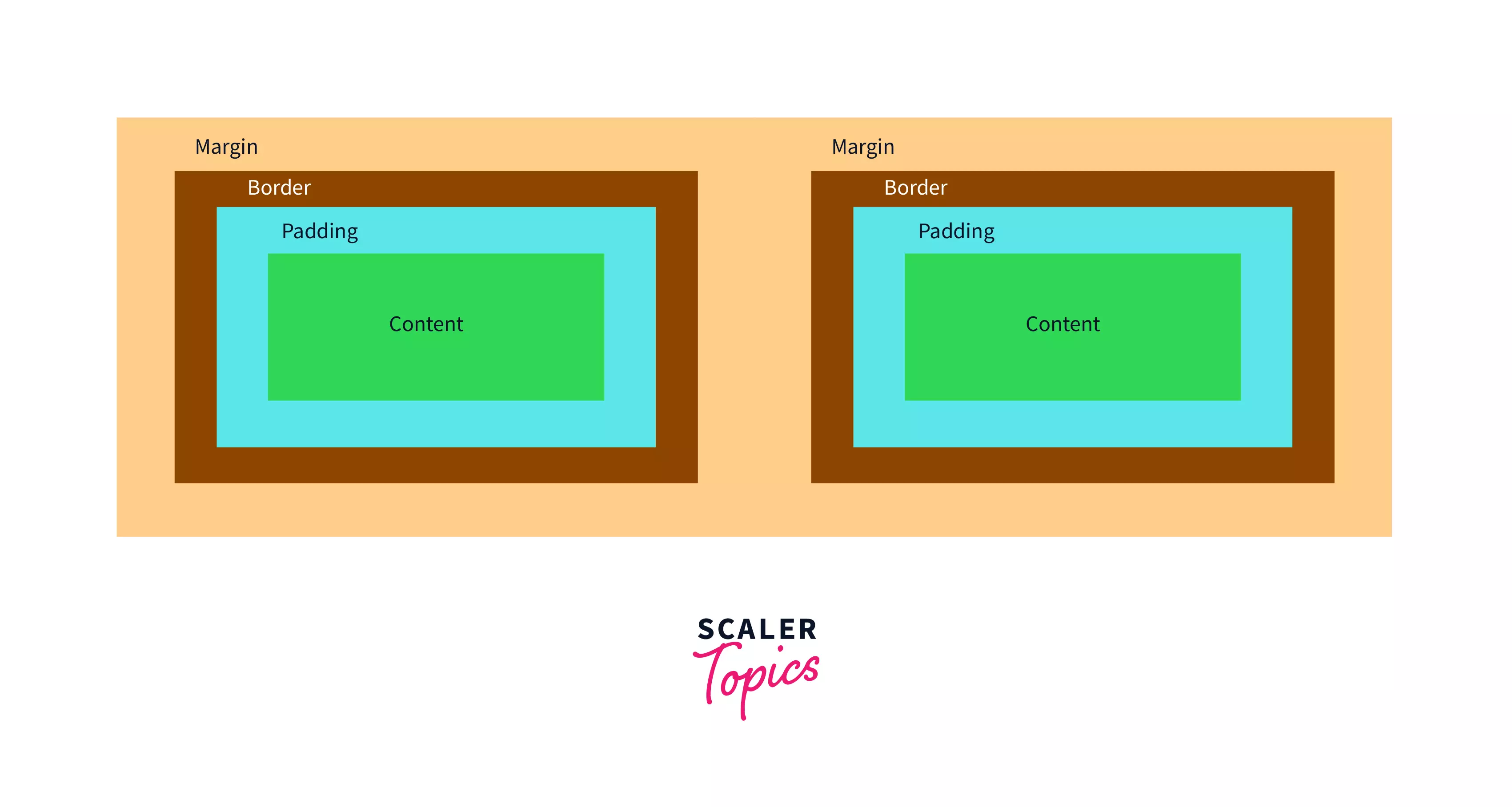
Box Model in CSS
CSS follows the box model to arrange and lay out elements in the webpage. Accordingly, each element is modeled as a box with four specific components, the margin, the border, the padding, and the content, which can be modified using CSS styles.
The image below is a general representation of how elements are arranged within the CSS box model. Both of the elements have space within the four boxes, i.e., the margin, the border, the padding, and the content.
Transform Your Career
Choose from our industry-leading programs designed for career success
Modern Software and AI Engineering Program
Master full-stack development with AI integration

 +1000 more
Modern Data Science and ML with specialisation in AI
Advanced data science techniques with AI specialization
+1000 moreAdvanced AIML with Specialisation in Agentic AI
Deep dive into AIML with focus on Agentic systems
+1000 moreDevOps, Cloud & AI Platform Engineering
Build and manage AI-powered cloud infrastructure
+1000 moreAI Engineering Advanced Certification by IIT-Roorkee
Premier AI engineering certification from IIT-Roorkee
Margin
The margin(colored yellow) refers to the space surrounding an element, and it lies outside the border(colored brown) of the element. As such, the margin property can be manipulated to add white space outside an element's border.
Padding
On the other hand, padding(colored blue) refers to the space between the border of an element and the content(colored green) of the box, and as such, changing the padding can also add space around an element.
Utility classes
Bootstrap provides predefined utility classes and subclasses, which can be used within markup text as class names to easily add predefined spaces to elements. These utility classes manipulate either of the margin and padding properties and provide shorthand class names to specify their sizes.
These predefined classes are built on a default SASS map with sizes ranging from .25rem to 3rem. These bootstrap spacing utility classes can be used within any element and include support for individual properties and all properties, including vertical and horizontal properties.
These classes follow a general syntax of {property}{sides}-{size} where {property} can be either of margin or padding, {sides} is used to determine which side of the element to add the space to and {size} is used to specify the size to be added to the element, and it ranges from 0 to 5.
We shall discuss the syntax in depth in the following sections.
Notations
Syntax:
The bootstrap spacing utility classes are named using the following general syntax:
And they take the following values:
- Property: It can be either of m or p to specify margin or padding.
- Sides: It is used to specify the side in which the margin or padding is to be modified. It takes the following values:
- t - for classes that set margin-top/padding-top
- b - for classes that set margin-bottom/padding-bottom
- l - for classes that set margin-left/padding-left
- r - for classes that set margin-right/padding-right
- y - for classes that set both margin-top and margin-bottom or both padding-top and padding-bottom. In other words, it adds space on the y-axis.
- x - for classes that set both margin-left and margin-right or both padding-left and padding-right. In other words, it adds space on the x-axis.
- blank - for classes that set margin and padding to all four sides.
- Breakpoint: Is any of the four breakpoints(excluding xs):
- sm : viewport ≥576px
- md : viewport ≥768px
- lg : viewport ≥992px
- xl : viewport ≥1200px
In Bootstrap, breakpoints are adjustable widths that control how your responsive layout reacts to different device or viewport sizes.
- Size: It is used to specify the size of the margin or padding that is to be modified. It takes the following values:
- 0 - to set the margin or padding to 0
- 1 - (by default) sets the margin or padding to $spacer* .25 i.e. .25 rem or 4px
- 2 - (by default) sets the margin or padding to $spacer* .5 i.e. .5 rem or 8px
- 3 - (by default) sets the margin or padding to $spacer i.e. 1rem or 16px
- 4 - (by default) sets the margin or padding to $spacer* 1.5 i.e. 1.5 rem or 24px
- 5 - (by default) sets the margin or padding to $spacer* 3 i.e. 3rem or 48px
- auto - for classes that set the margin to auto.
Note: Bootstrap spacing sizes are defined within the SASS sheets using the $spacer variable, whose value is defined as 1rem or 16pxby default. We can add custom values of the spacing by adding entries to the $spacers SASS variable.
Usage
Let us look at a few use cases for the Bootstrap spacing classes, which will help visualize how Bootstrap spacing can be used while styling elements.
Turn Learning into Career Growth
Example 1:
We wish to add custom padding to a few paragraphs in the first example. We have specified a primary background with white text for each paragraph using bootstrap utility classes 'bg-primary' and 'text-white 'to properly visualize the output.
Markup:
Output:
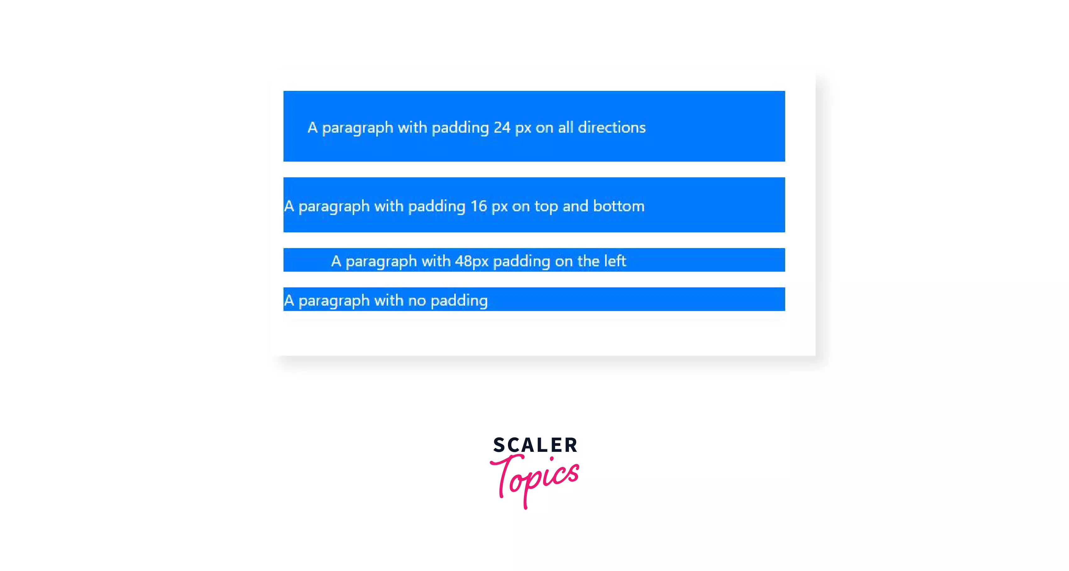
For the above example, let's go through the various elements used in code and observe their effect on the output:
- The first paragraph uses the class 'p-4', which adds a padding of 1.5rem on all sides.
- The second paragraph uses the class 'py-3', which adds a padding of 1rem on the top and bottom of the element. Similarly, we can use the class 'px-{size}' to add padding of the required size on the left and right of the element.
- The third paragraph uses the class pl-5' to add a padding of 3rem to the left of the element. Similarly we can use any of 'pt-{size}','pb-{size}'or'pr-{size}' to add padding at the top, bottom or right of the element respectively.
- The fourth paragraph uses the class 'p-0', which removes padding from the paragraph.
Example 2:
In the second use case, we add some margins to a few elements within a div as specified in the following markup. We specify the use of a primary background color for the paragraph elements and secondary background color for the span elements as well as white text with the help of bootstrap utility classes 'bg-primary', 'bg-secondary' and 'text-white' respectively. We also use 'p-2' to specify standard padding of 8px, which will help us visualize the output.
Markup:
Output
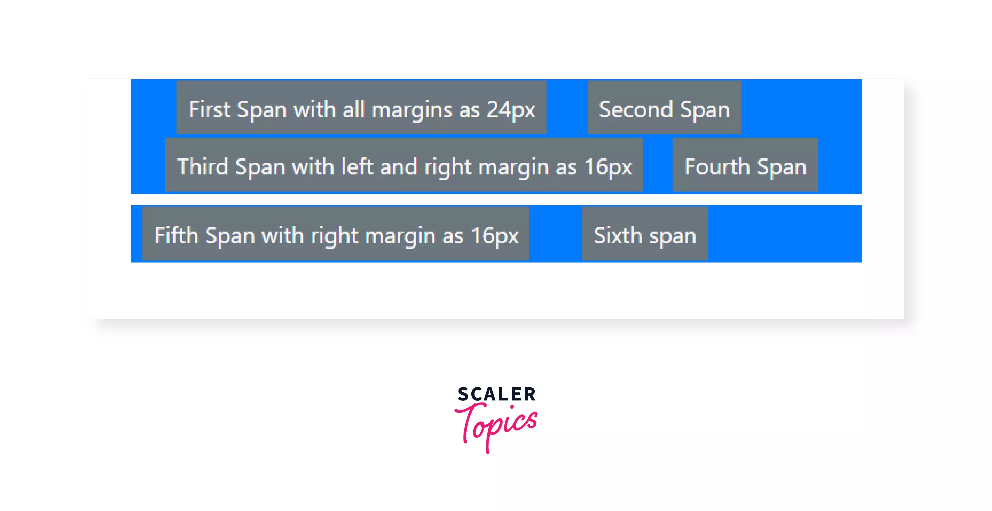
For the above example, let's go through the various elements used in code and observe their effect on the output:
- The first two paragraph uses the class 'm-0', which removes all margin between them.
- The third paragraph uses the class 'mt-2' which adds a margin of .5rem above it.
- The first span uses the class 'm-4 ', which adds a margin of 1.5rem on all sides of the element.
- The second and the fourth span use the class 'm-0 ', which removes all margins around them.
- The third span uses the class 'mx-3', which adds a margin of 1rem to the left and right of the elements, respectively.
- The fifth span uses the class 'mr-3', and the sixth span uses the class 'ml-3' to set a margin of 1rem to the left and right of the elements, respectively. Note that the total space between the fifth and sixth span is 2rem, which is the sum of the margins of the two elements.
- Similarly, to add margin to an element, we can use the following margin classes: 'm-{size}' for all sides, 'mt-{size}' for top, 'mb-{size}' for bottom, 'ml-{size}' for left, 'mr-{size}' for right, 'mx-{size}' for horizontal and 'my-{size}' for vertical margins.
In the last example, in the first span, we have used the class m-4 to set all the margins around the element to 1.5rem. However, you may be wondering why we can only see the left and right margins and not the top or bottom. This is due to margin collapse.
Margin collapse occurs when the adjoining margins of two or more boxes (which might or might not be siblings) combine to form a single margin. This occurs only for vertical margins and not for horizontal margins.
Margin collapse can be avoided in several ways, and it is important to account for margin collapse to avoid messy layouts. However, we shall keep its discussion to a minimum as it is beyond the scope of this article.
How do the Classes Work?
Bootstrap spacing classes are defined within the bootstrap stylesheets. These classes specify sizes for the margin and padding properties of a CSS box. The sizes for these classes are defined within the following Sass map:
We can add entries into the $spacers map to add more size options if necessary.
Accordingly, some representative declarations of the Bootstrap spacing classes are as follows:
Responsive Spacing
Responsive spacing can be added by using the syntax -
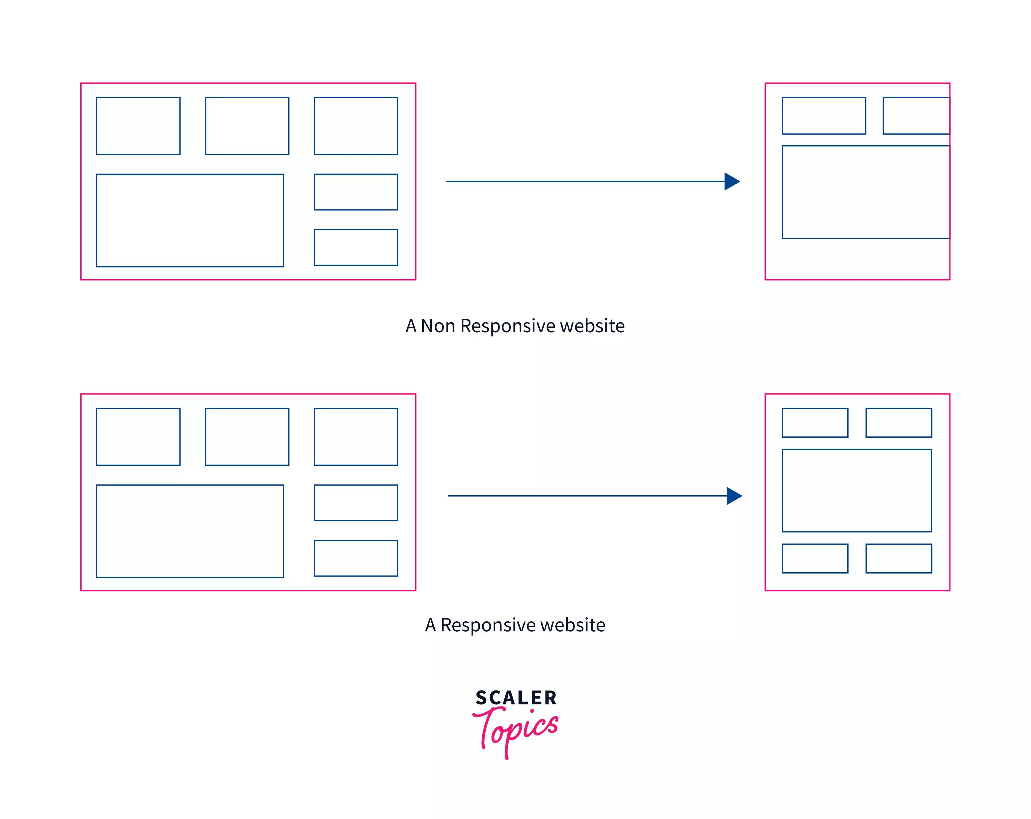
Responsiveness is an important aspect of building any webpage. A webpage on a computer browser cannot look the same as a webpage on a smartphone, and spaces on a computer browser may not look the same on a smartphone.
In the two use cases discussed above, we have used the general syntax {property}{side}-{size}, which sets a fixed size for the property for all viewports from xs to xl.
To add custom responsive spacing for multiple breakpoints, we can use the class names with the following syntax:
Within this syntax, we can include the breakpoint abbreviations to specify custom space sizes for specific-sized viewports.
The breakpoint abbreviations are as follows:
- sm : viewport ≥576px
- md : viewport ≥768px
- lg : viewport ≥992px
- xl : viewport ≥1200px
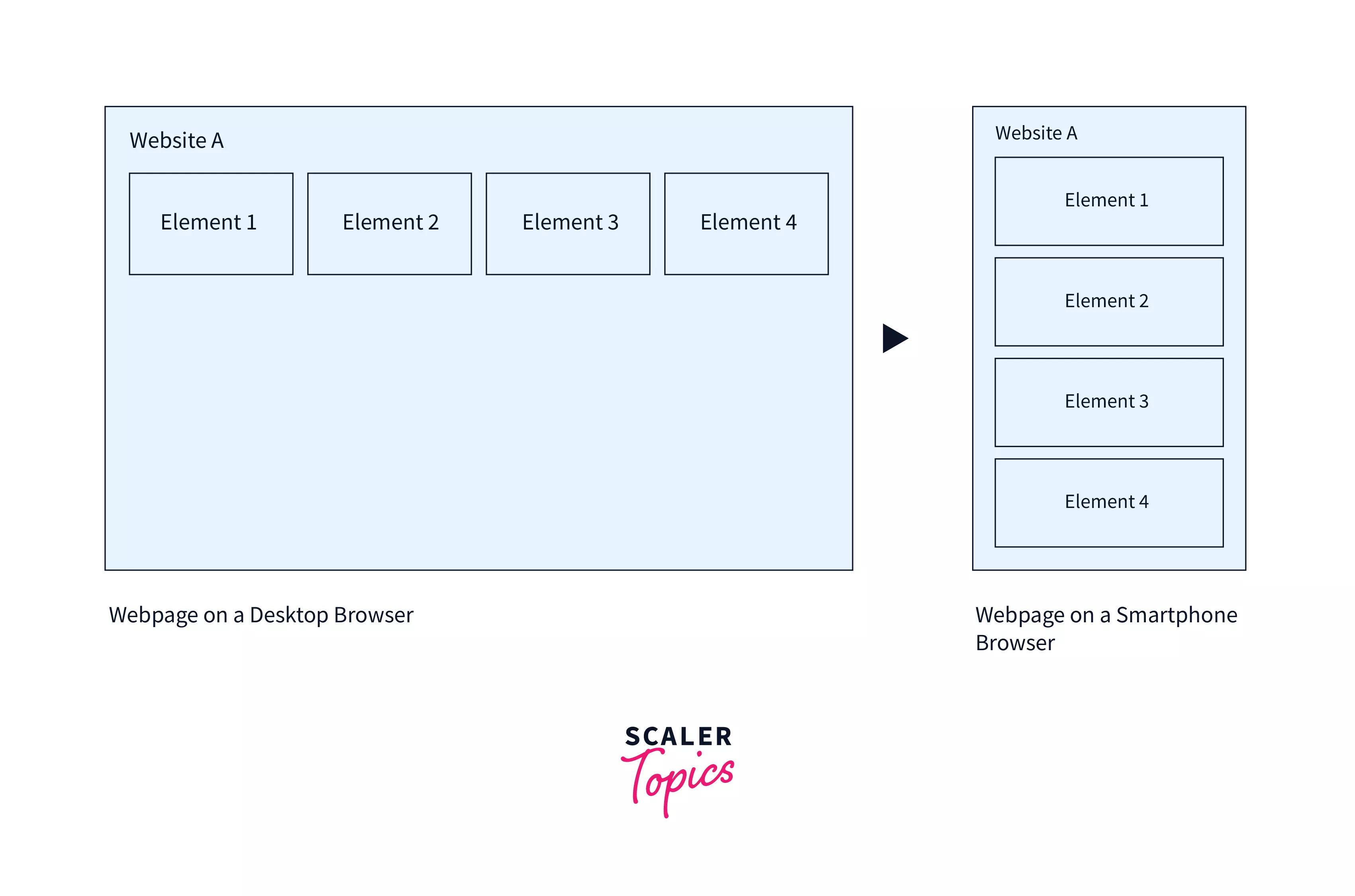
Let us say you have a row of 4 items on larger viewports, and you have added spaces using ml-2, for example. On smaller viewports, however(less than md), the four items instead align vertically, which makes the ml-2 spaces obsolete and causes the layout to become messy. Instead, you are now required to add vertical spaces to the elements. The simple solution to this is adding responsive classes to the elements, which cause spaces to only appear or disappear at breakpoints.
Consider the following table that defines classes to set the margin for each breakpoint:
| Classes | Description |
|---|---|
| .ml-# | Set the size for all viewports |
| .ml-# .ml-sm-0 | Set the size for viewports less than sm (576px) |
| .ml-sm-# .ml-md-0 | Set the size for viewports between sm (576px) and md (768px) |
| .ml-md-# .ml-lg-0 | Set the size for viewports between md (768px) and lg (992px) |
| .ml-lg-# .ml-xl-0 | Set the size for viewports between lg (992px) and xl (1200)px |
For the above example, using the classes "ml-md-3 mb-2 mb-md-0" sets the left margin to 3(1rem) only for viewports greater than md(768px) and sets the bottom margin to 2(.5rem). for smaller viewports and 0 for viewports greater than md.
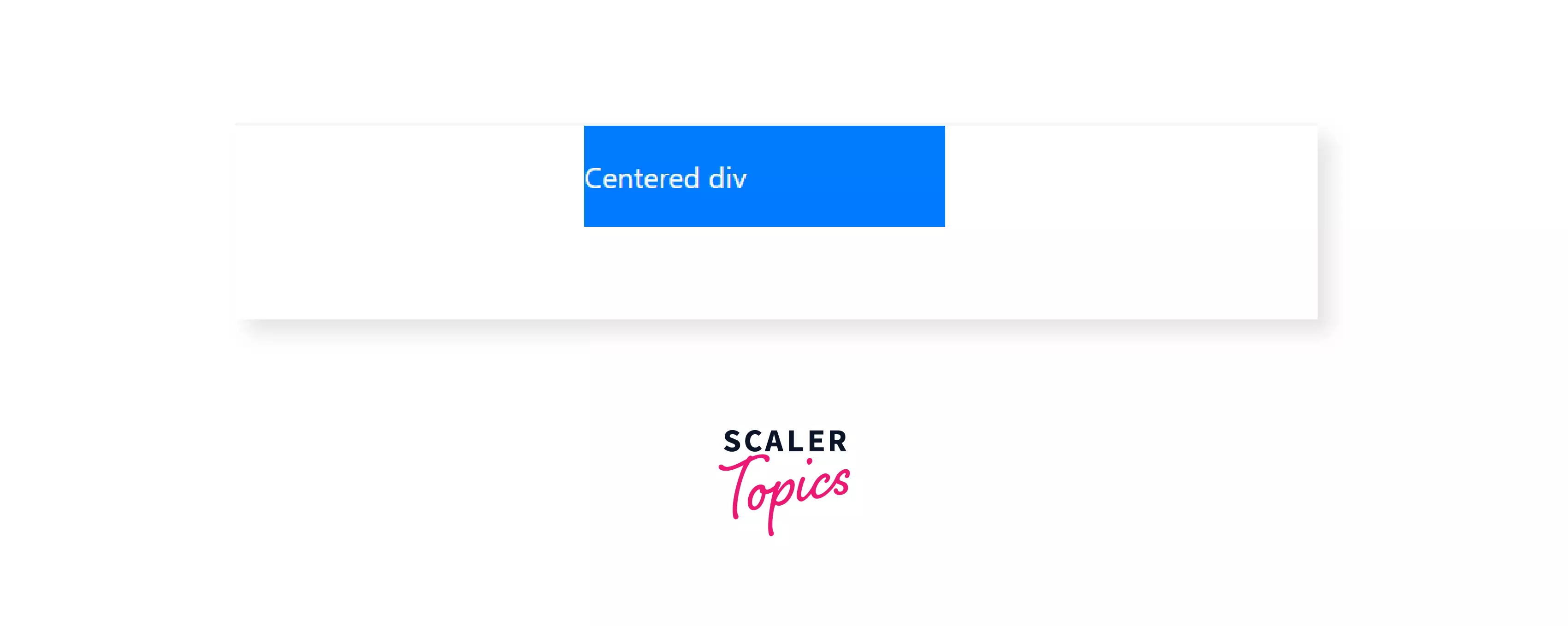
Horizontal Centering
Bootstrap mx-auto class can be used to center block elements with fixed width.
The auto keyword can be used to set the margin of an element to auto. It tells the browser to automatically determine the left and right margins themselves, which it does by setting them equally.
Thus, for a block-level element with a fixed width, we can easily center its content by setting its margins to auto.
Using Bootstrap spacing utilities, we can use the mx-auto class to set the horizontal margins of a box to auto and thereby center any content, given that the content has display:block and width set.
For example, we try to center a div with a fixed width of 200px in the following markup.
Output
Negative Margin
- Boostrap spacing classes can also add a negative margin to elements.
- Negative margin classes have a similar syntax to general spacing classes but with an n just before the size.
In CSS, margin properties can utilize negative values(padding cannot), and negative margin utilities for every non-zero integer size(e.g.,1, 2, 3, 4, 5) have been implemented in Bootstrap.
These negative margins are disabled by default but can be enabled in SASS by setting $enable-negative-margins: true. The following line is added to the SASS map handling spacers for negative margins.
Negative margins follow a similar syntax to the normal margins except for the addition of an n before the size:
The implementation of negative margin is also similar to general margins; a representation of it is as follows-
Negative margins are usually used to stretch elements to fill or overflow their containers.
Let us discuss a use case for negative margins. Take the following markdown that has three div that is centered and of width 300px.
Each of these div has a padding of 1rem and has a child div inside them.
Output
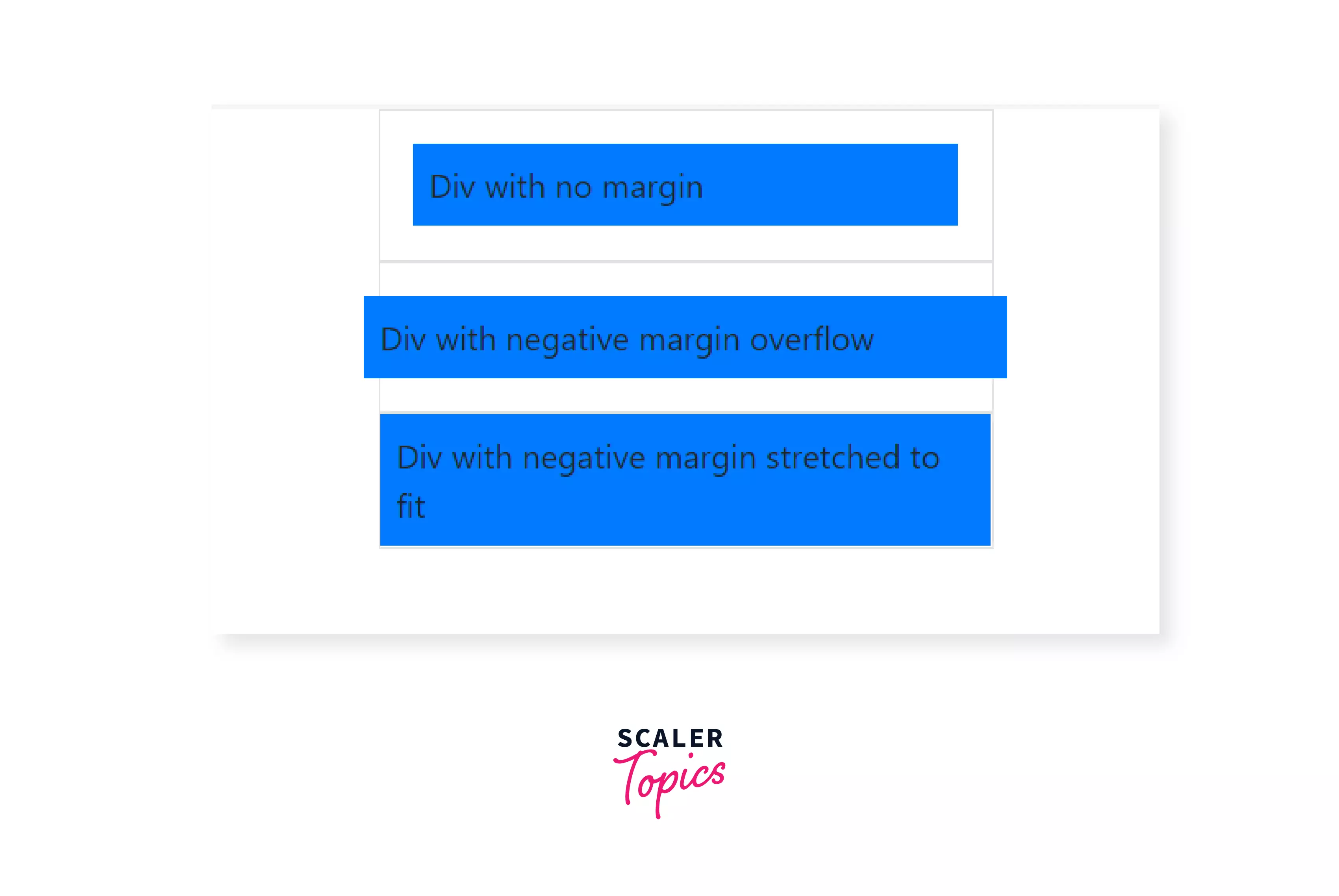
For the above example, let's go through the various elements used in code and observe their effect on the output:
-
The first child div had no margin and hence had a space of 1rem around it from the padding of its parent.
-
The second child div used the class mx-n4, which applied a margin of -1.5rem to its left and right, and hence it overflowed by .5rem on both sides.
-
The third child div used the class m-n3, which applied a margin of -1rem to all its sides and, when added to its parent's padding of 1rem, caused it to stretch and fill the parent div.
Thus, we can use any of the classes m-n#, mx-n#, my-n#, ml-n#, mr-n#, mt-n# and mb-n# where # can be any size from 1 to 5 to set negative margins to elements.
Scaler Placement Report and Statistics
Scaler learners achieved 2.5x salary growth with average post-Scaler CTC reaching ₹23L.
Summary
- Bootstrap provides several short-hand utility classes to add spacing to elements by changing their margin and padding.
- These classes follow the syntax {property}{side}-{breakpoint}-{size} where {property} can be either of m for margin or p for padding.
- {side} refers to the direction of setting the margin or padding, and it supports individual properties, directional properties, as well as all properties.
- {size} sets the size of the space to be added and takes the value of 0 to 5. These sizes are defined in a Sass map and range from 0rem to 3rem(0-48px) in fixed increments which can be modified.
- {breakpoint} abbreviations add support for responsive spacing declarations. This can be omitted to add spacing for all breakpoints(xs to xl).
- mx-auto class can be used to horizontally center a block element with a fixed size.
- Bootstrap spacing utilities also support negative margin classes, which can be used by adding an n before the size.
See Also:
 Google
 Amazon
 Microsoft
 Flipkart
 Adobe1200+ more