CSS Flexbox
 FREE
FREE

Overview
CSS flexbox allows users to arrange and organise their webpage horizontally or vertically, which makes the webpage easy to understand and beautiful. Well, Flexbox is not just a property, but it is a CSS layout module (Block - for the section in the web page, Inline - to highlight particular text, Table, Positioned). In this article, we'll be looking at CSS Flexbox in detail.
What is CSS Flexbox?
- CSS Flexbox is a CSS layout module that is used to arrange and organize items on web pages in one direction, i.e., horizontally and vertically.
- CSS Flexbox helps in creating flexible and responsive layouts where we can adjust the flex items within the flex container.
- It is used to fill the extra space available or shrink the size of the content if it is overflowing.
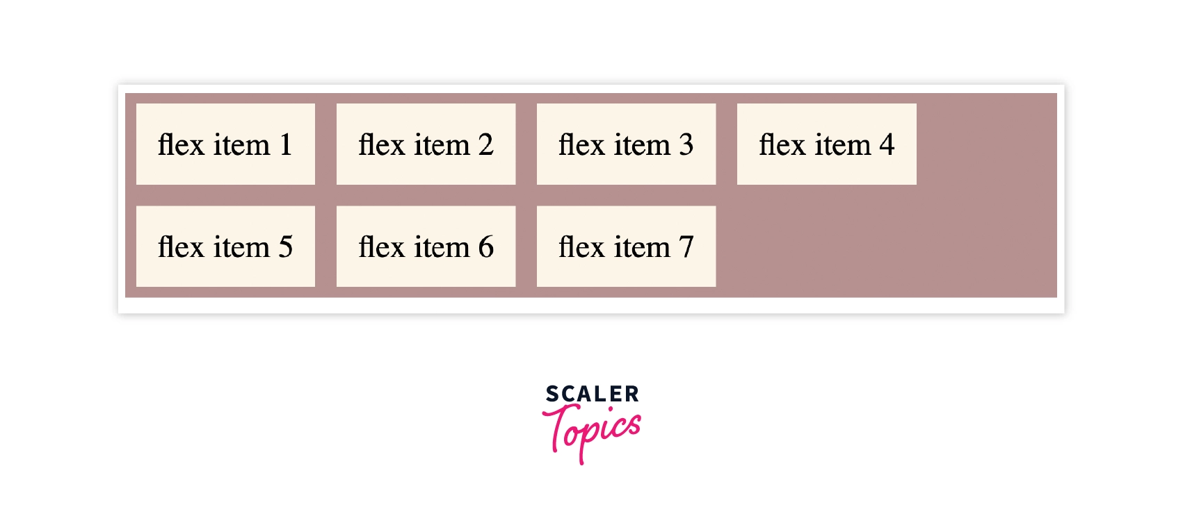
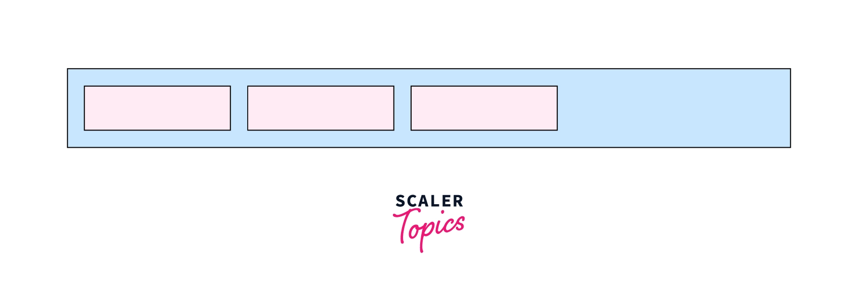 As we can see in the image above, we can arrange flex items using the display property as flex as shown in the syntax.
Syntax:
Here, in the syntax flex container, the class of the div element and display property as flex will distribute the items from left to right by default.
Basics and Terminology of CSS Flexbox
Flexbox is not a property. It is a CSS layout module that has lots of its properties, for example, flex-direction, which helps in aligning the items in a particular direction that we want.
Let's understand some basic terminologies of CSS flexbox of how CSS flexbox works.
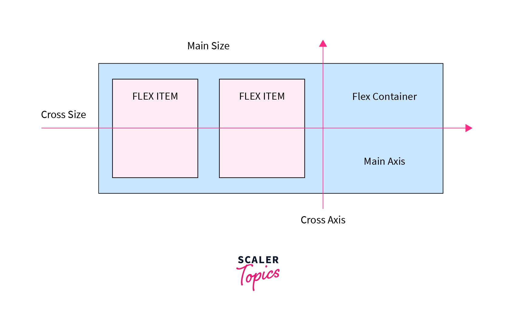
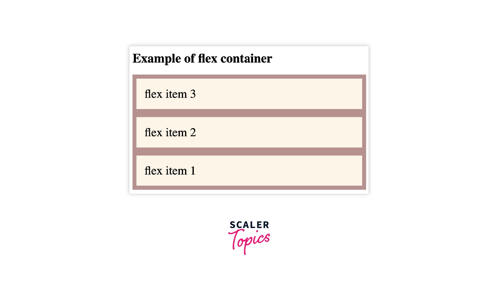
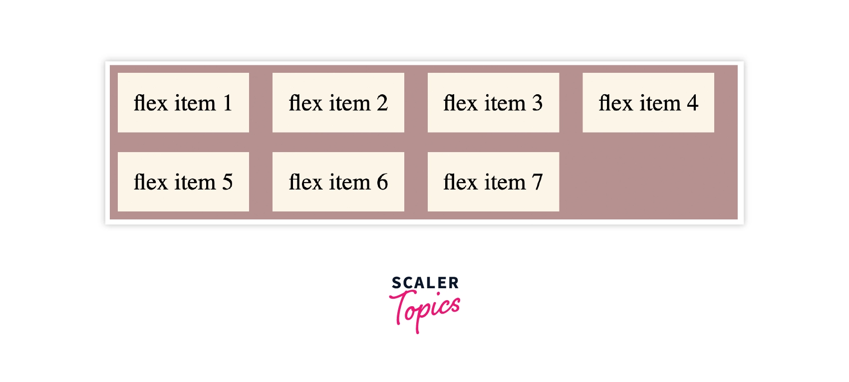
- Flex Container - Flex container is used as a container for the flex-items. To make the container flexible, we set the display property as flex.
The white area, as shown in the image, is known as a flex container that contains two flex items.
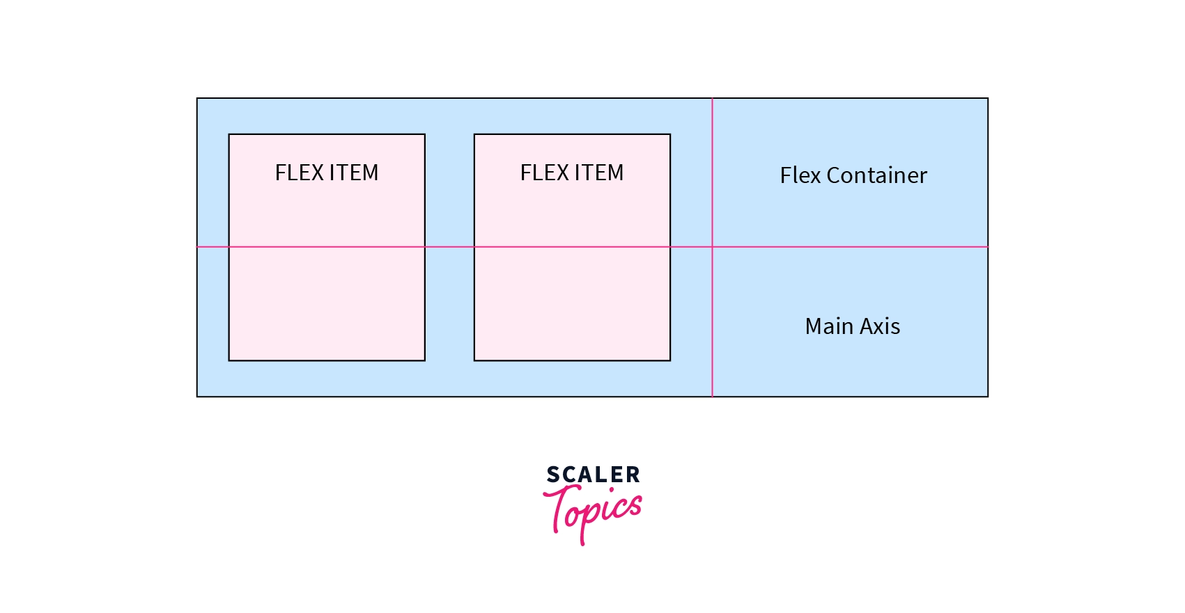
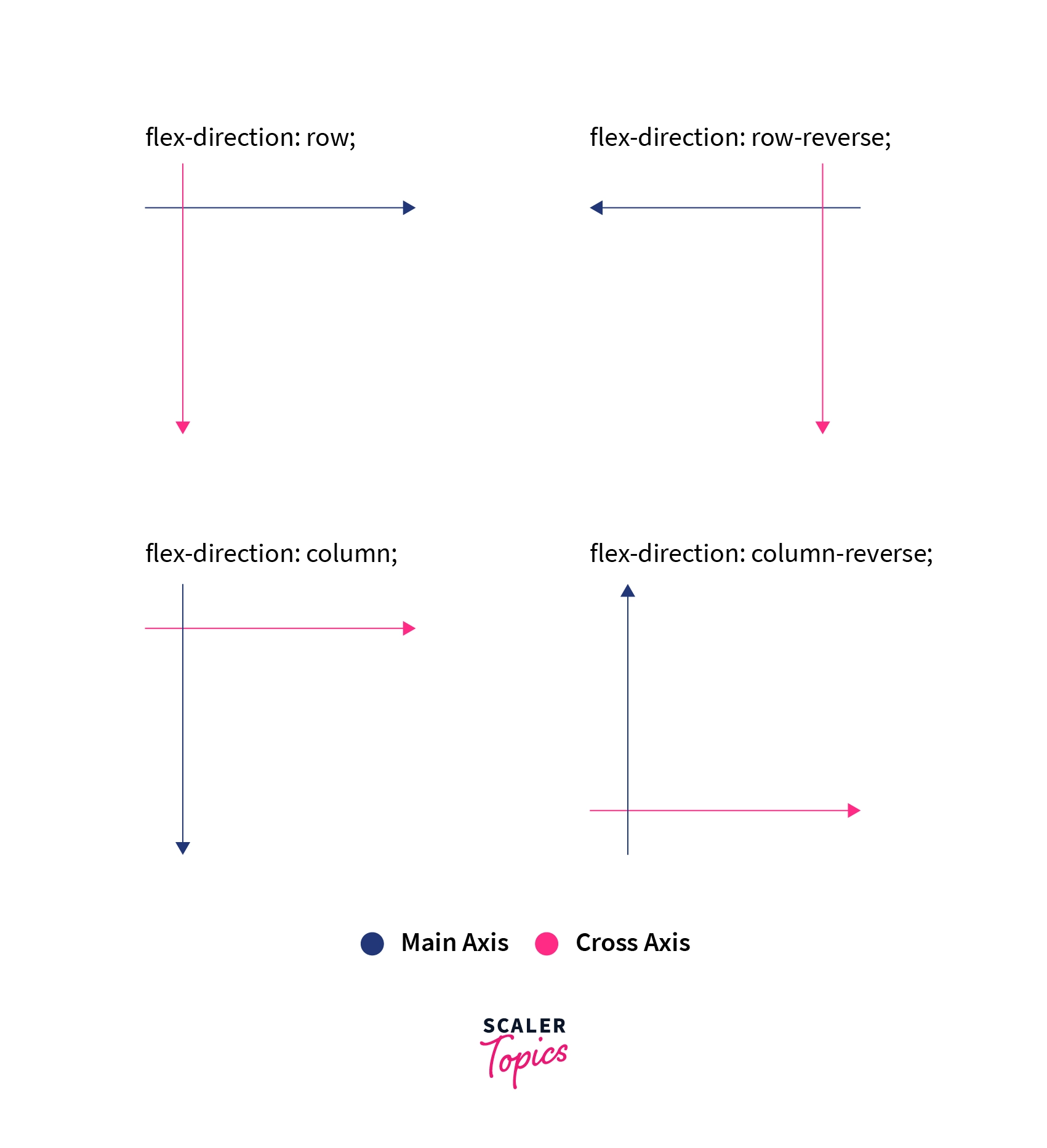
- Main Axis - The main axis is used as a primary axis for the flex-container to align the flex-items. It is set using the flex-direction property.
As shown in this image, the flex-items are arranged from left to right.
 It can go in the following directions: -
-
Left to Right
flex-direction: row -
Right to Left
flex-direction: row-reverse -
Top to Bottom
flex-direction: column -
Bottom to Top flex-direction: column-reverse
-
Main Size - It denotes the width and height of the flex container that depends on the main axis.
-
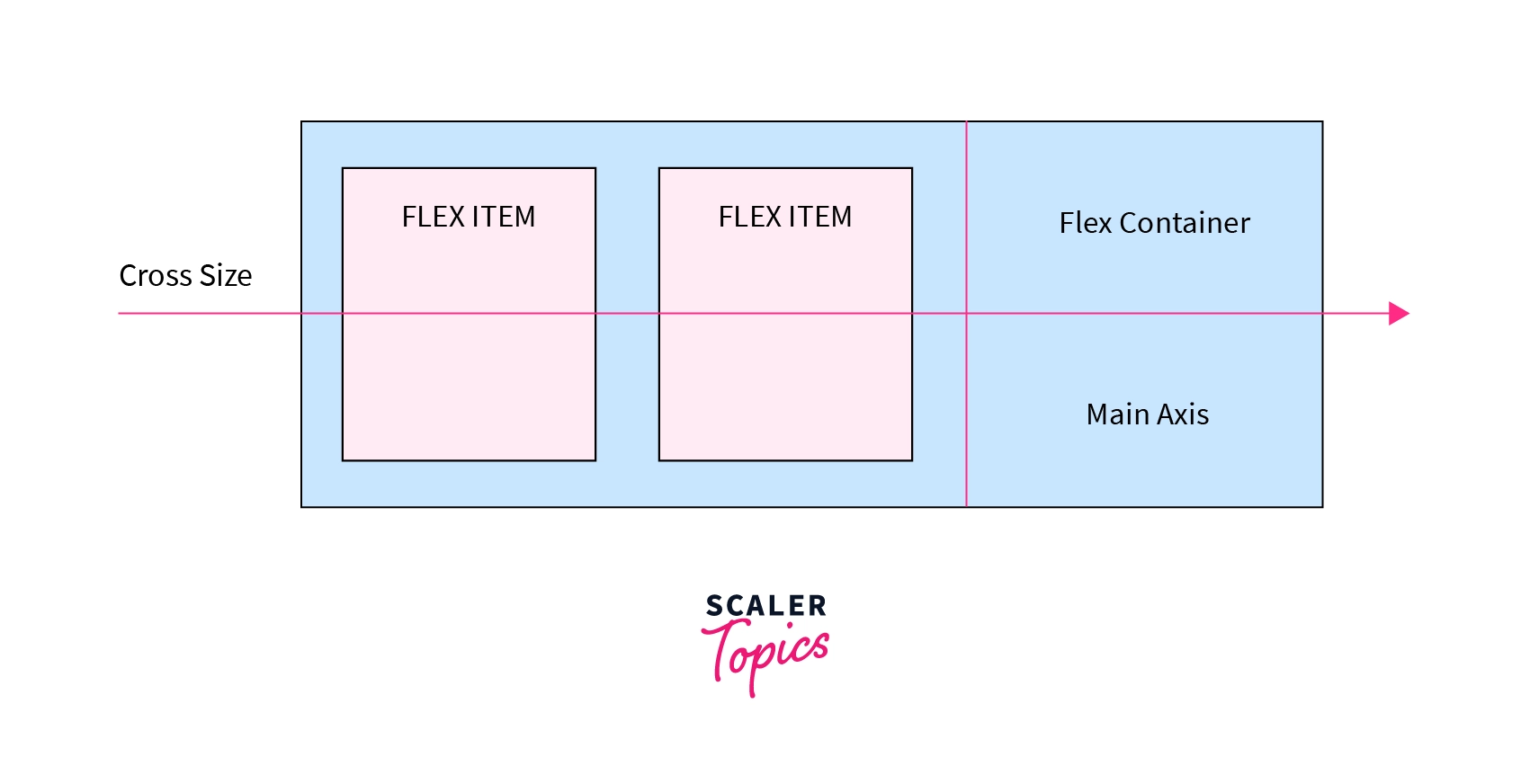
Cross Axis - It is always perpendicular to the main axis. It arranges itself as per the main-axis direction, as shown in the image.
- Cross Size - It denotes the width and height of the flex items that are in the cross dimension.
Transform Your Career
Choose from our industry-leading programs designed for career success
Modern Software and AI Engineering Program
Master full-stack development with AI integration

 +1000 more
Modern Data Science and ML with specialisation in AI
Advanced data science techniques with AI specialization
+1000 moreAdvanced AIML with Specialisation in Agentic AI
Deep dive into AIML with focus on Agentic systems
+1000 moreDevOps, Cloud & AI Platform Engineering
Build and manage AI-powered cloud infrastructure
+1000 moreAI Engineering Advanced Certification by IIT-Roorkee
Premier AI engineering certification from IIT-Roorkee
How Does CSS Flexbox Work?
- Flexbox works on an axis grid as shown in the image above.
- Using flexbox, we can change the order of the items without altering the source code.
- Flexbox helps in controlling the unused space. If there is space left, then flex items grow to fill that available space. If there is no space left, then flex items shrink to prevent overflow.
- Flex items can be laid out in any direction, such as top to bottom, left to right, right to left, or bottom to top.
When to Use CSS Flexbox?
You should work with CSS Flexbox while working with small-scale layouts such as: -
- Navigation bar
- Media items such as images, videos, etc.
- Card Layouts
- WebForms
If you are working with large-scale layouts (entire web pages), then you must work with CSS Grid because CSS flex is limited to one-direction layouts only.
CSS Flexbox Architecture and Chart
Flexbox Architecture
So what is Flexbox Architecture? Well, as we have already discussed the main-axis, cross-axis, etc., it'll become easy for us to understand. The flex items are distributed along the axis, i.e., the main axis and cross axis. And the position of the layout can be changed in one direction, i.e., rows and columns.
Turn Learning into Career Growth
Flexbox Chart
This image shows CSS flexbox properties with their values. You can use it as a reference while working on projects.
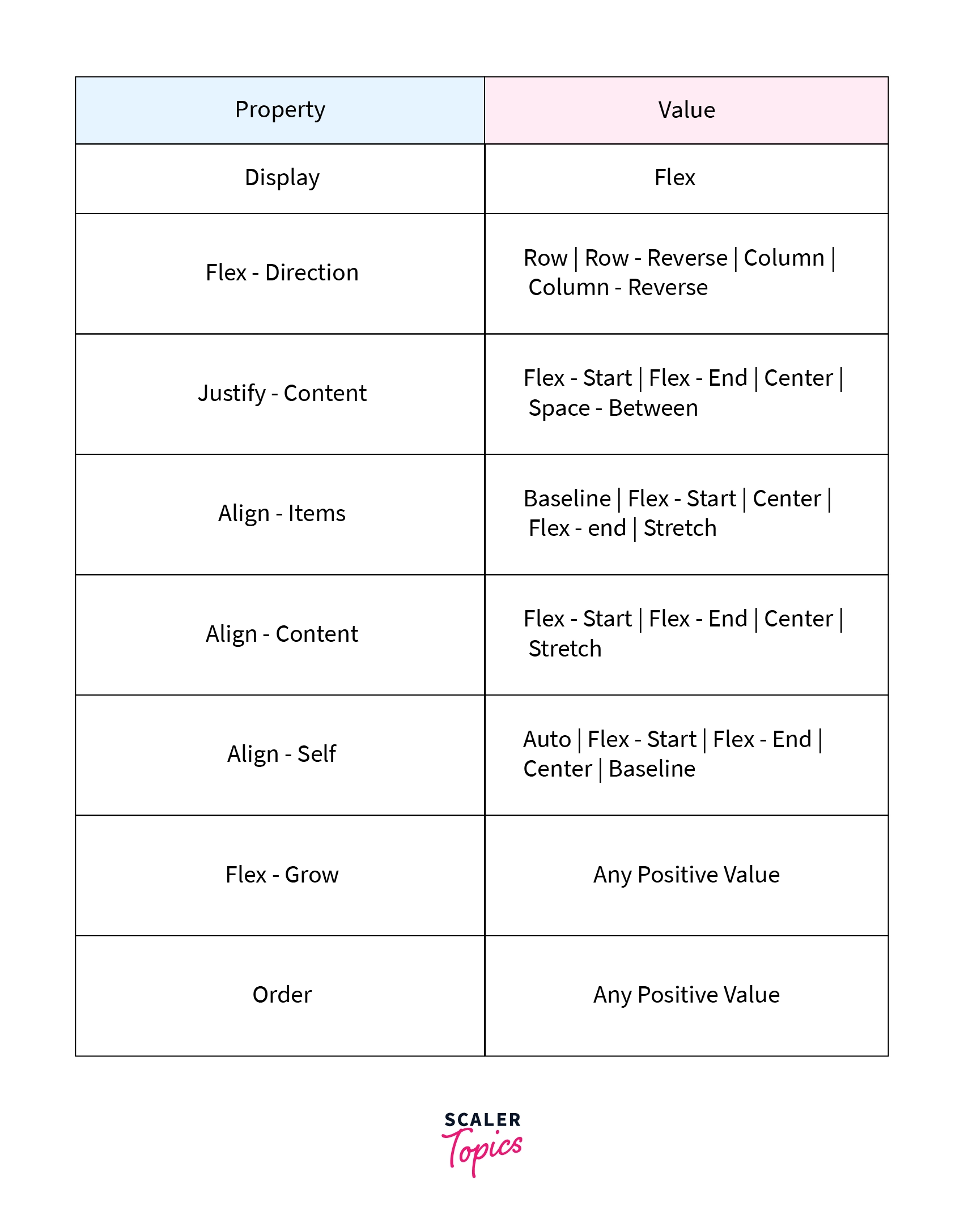
We will understand every property in detail in the coming sections of the article.
CSS Flexbox Properties
CSS Flexbox is a CSS module that possesses various properties where some properties are applied to the parent container while some are applied to the flex items.
Let's discuss them in detail.
Properties for the Parent (flex container)
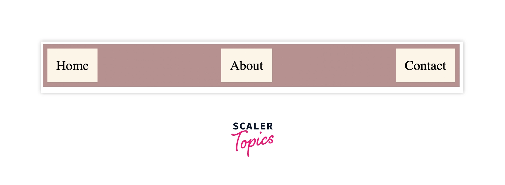
CSS display
CSS display property defines the container for the HTML element. It helps in making the container flexible.
Syntax:
To make the container display property is set to flex.
Example:
Let's understand it with a simple navigation bar example. We will be applying flex properties to the complete flex container.
Output:
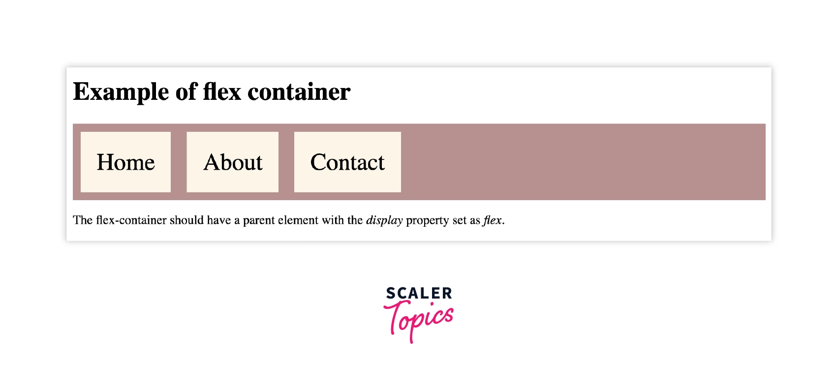
As already discussed, the display property as flex arranges the flex-items from left to right as shown in the image.
CSS flex-direction
CSS flex-direction is used to set the orientation and direction of the flex items. Flex direction property can have four value: - row (left to right), row-reverse (right to left), column (top to bottom), column-reverse (bottom to top).
Syntax:
We can set the values of flex-direction to row, column, row-reverse and column-reverse.
Example:
CSS Flex-direction
HTML code:
Output:
In this example, the flex items are arranged from bottom to top, the last item goes to the top, and vice-versa.
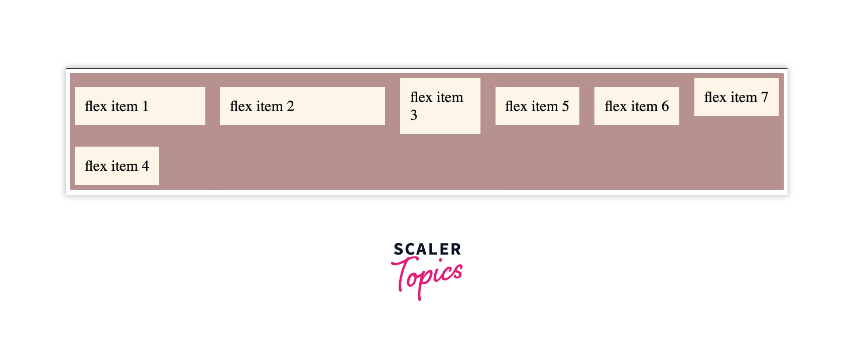
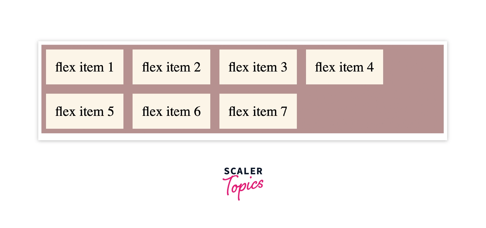
CSS flex-wrap
Flex-wrap defines the arrangement of flex items in a row that should wrap or not. It takes the following values: -
- wrap - The flex items will wrap if it is necessary.
- nowrap - This is the default value that means the items will not wrap.
- wrap-reverse - The flex-items will wrap in reverse order if necessary.
Syntax:
We use flex-wrap to arrange the flex items according to the size of the windows.
Example:
Output:
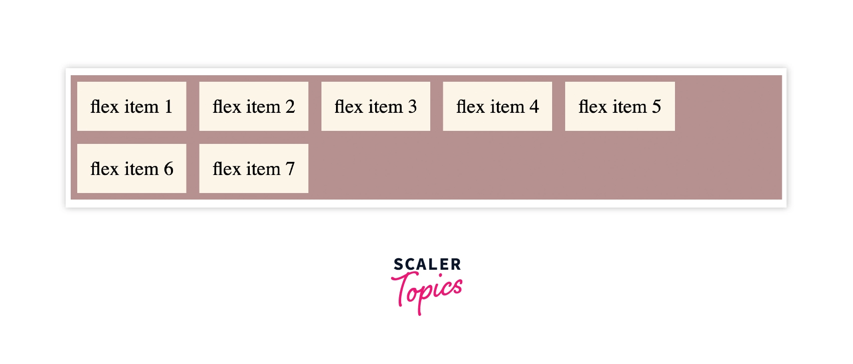
From the above example, flex items wrap on resizing the window.
CSS justify-content
Justify-content allows you to align flex-items along the main axis. It defines the distribution of space around the flex items along the main-axis of the flex container.
It takes the following values: - start, center, space-between, space-around, space-evenly.
Syntax:
The justify-content property is set to start where the items pack from the start.
Example:
Output:
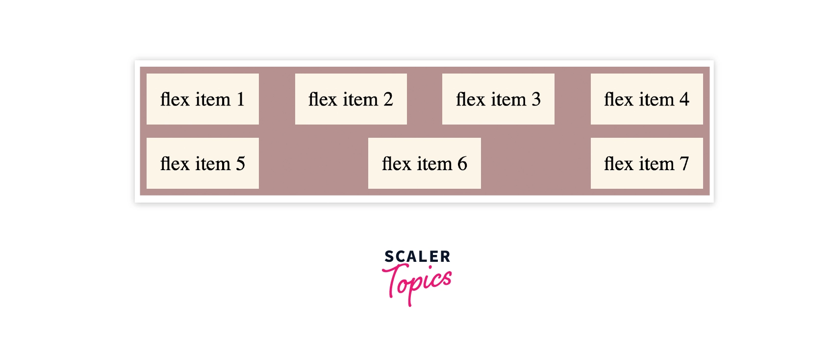
The flex items arrange with space between the lines along the main-axis.
CSS align-items
Align items are used to align flex-items along the cross-axis. It takes the following values: - start, end, stretch, center.
Syntax:
The value of align-items is set to center, which means the items are packed around the center. The basic keywords used for align-items are: normal and stretch.
Example:
Output:
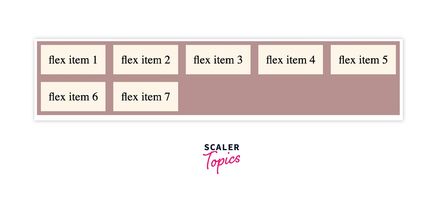
In the above example, the value of align-items is set as flex-start where the items pack from the start.
Stretch is the default value that stretches the flex-items to fill the container.
CSS align-content
Align-content is used to align flex-lines along Cross Axis. It works similarly to justify-content. The values it takes are: - start, end, center, space-around, space-between, space-evenly.
Syntax:
align-content does not take a left and right values.
Example
Output:
In the above example, the value of align-content is set as space-evenly where the items are distributed evenly, having equal space around them.
CSS gap - row-gap and column-gap
The gap is a shorthand for row-gap and column-gap that is used to set the gap between row and column.
Syntax:
gap takes row value first, then column value.
Example:
In the following example, the value of row gap is set as 5px, and the column gap is set as 10px.
Output:
From the output, the flex items have a row gap of 5px while the column gap is 10px.
Properties for the Children (flex items)
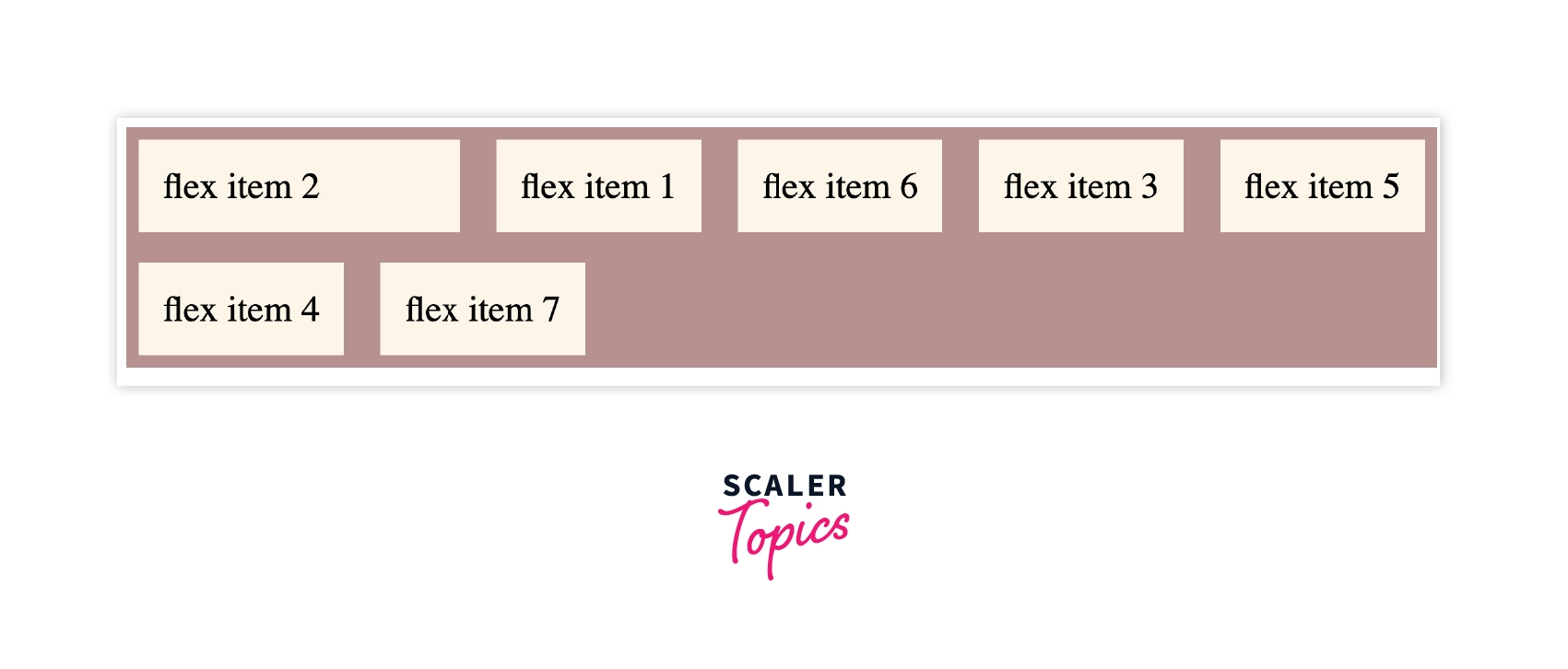
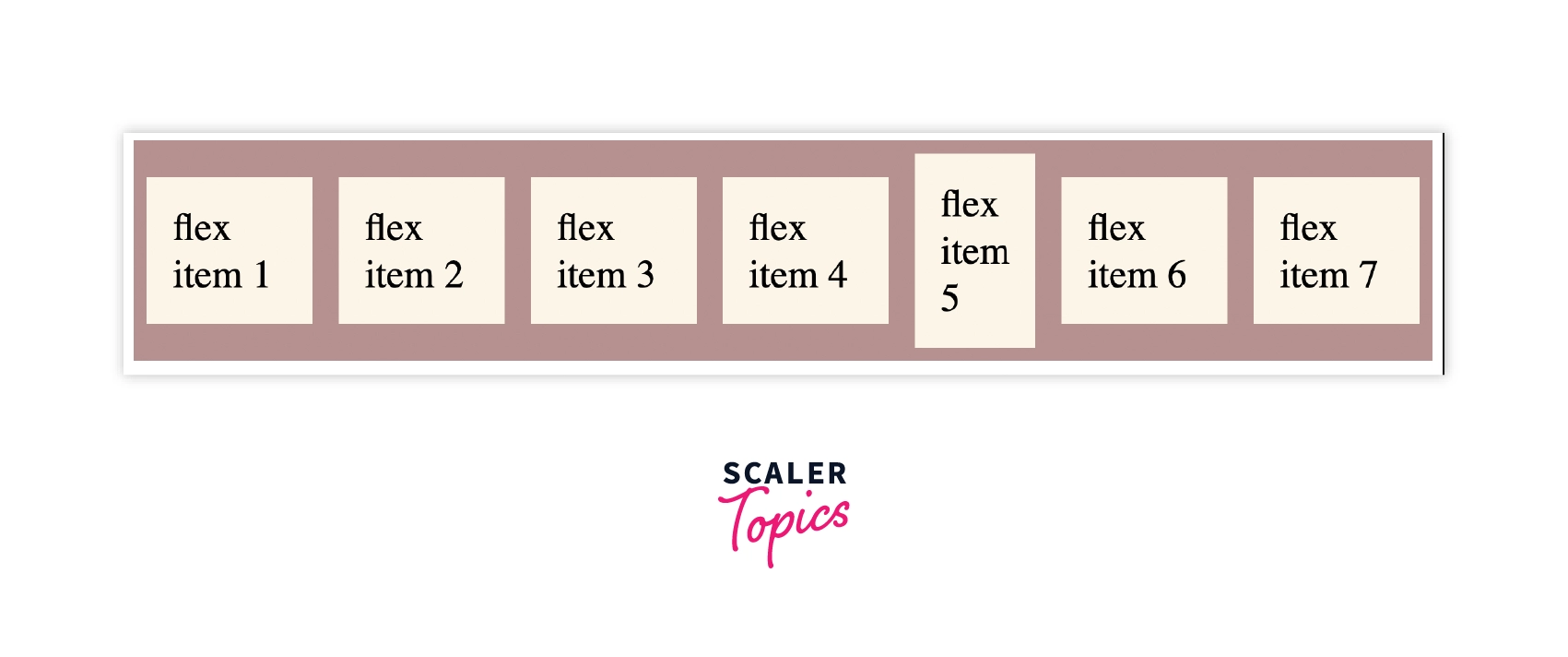
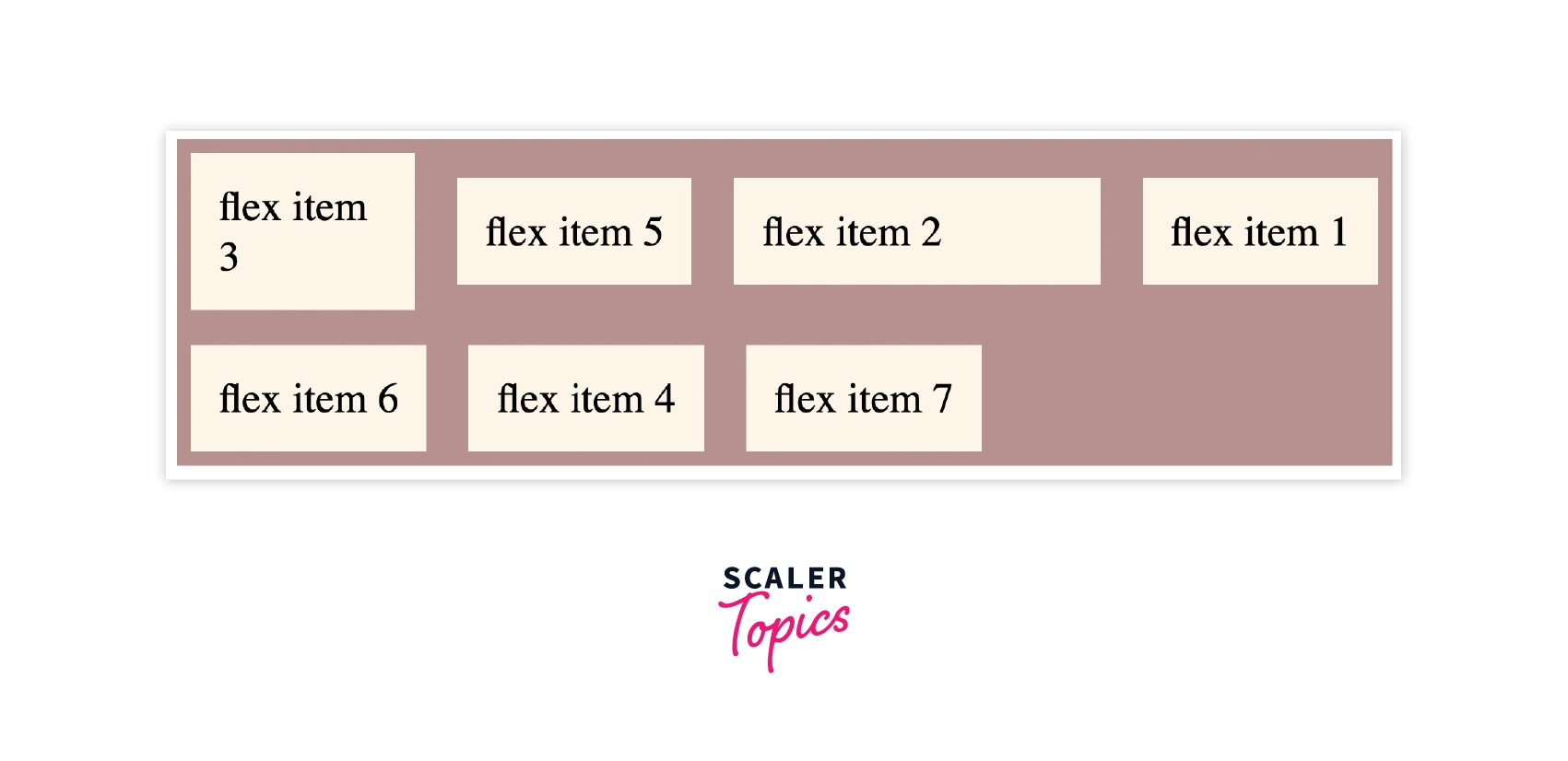
CSS order
CSS order affects the order of the elements. It is only applied to the flex items, not the flex container. We can assign the order for the flex-item by the number as shown in the syntax.
Syntax:
Example:
Output:
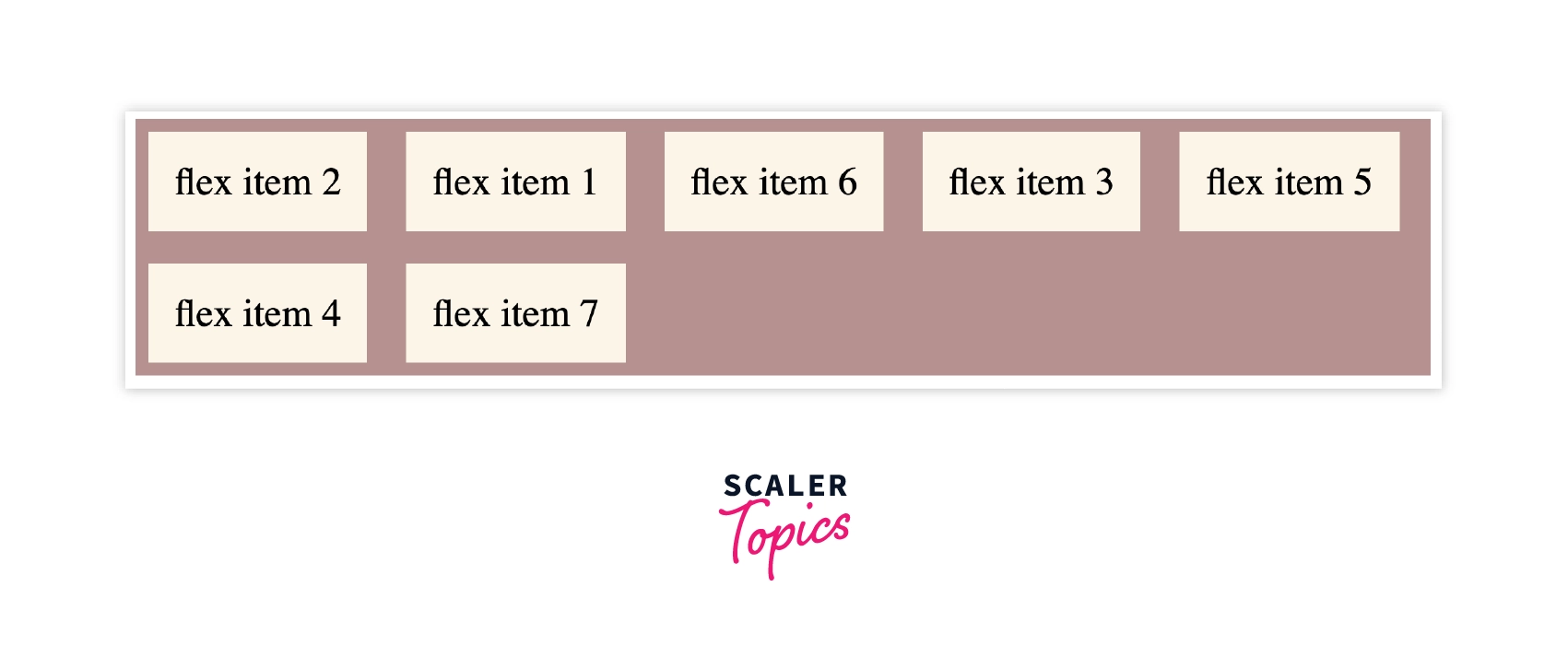
From the output, the order of the flex-items is changed without changing the order of the source code, as shown in the source code.
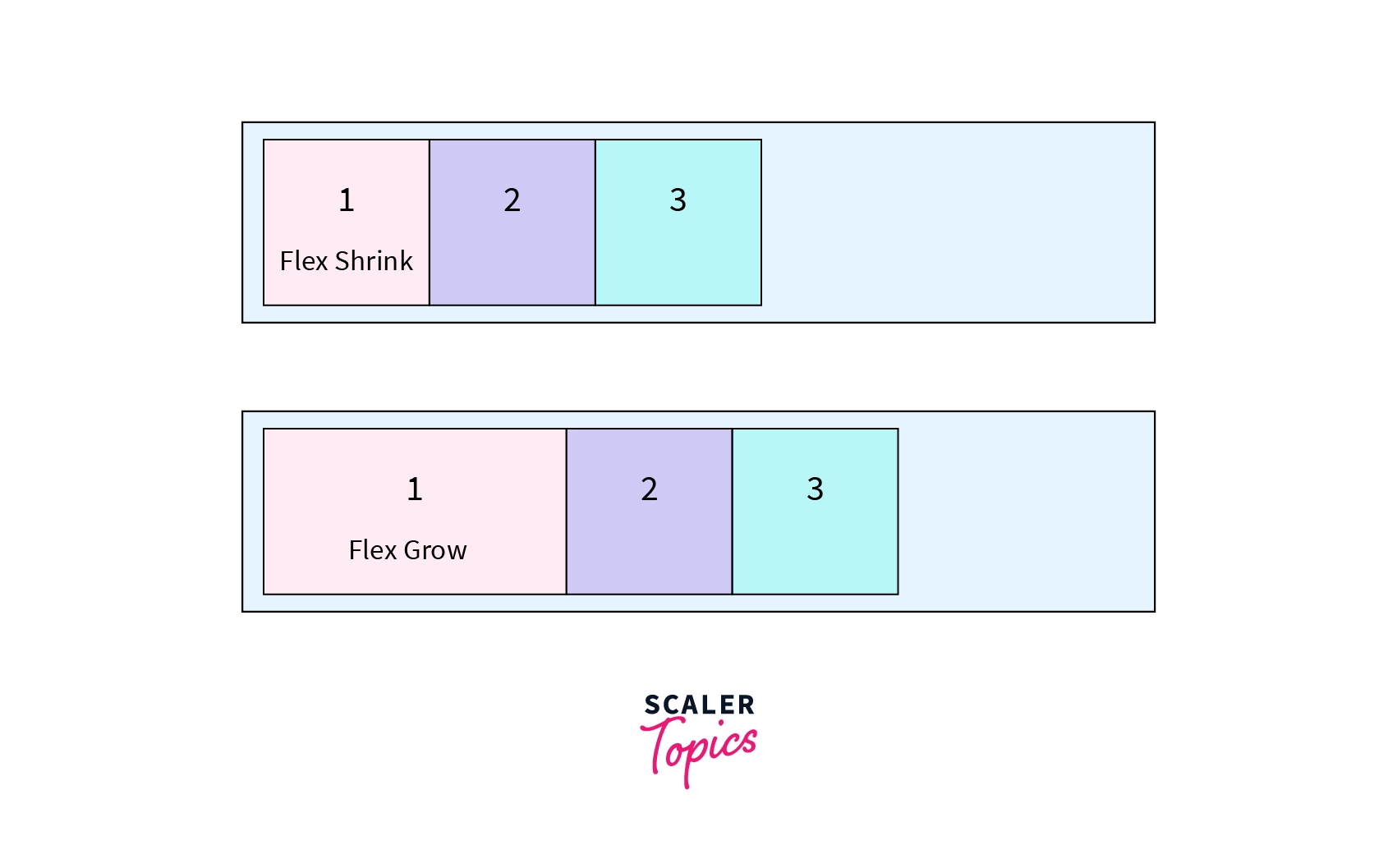
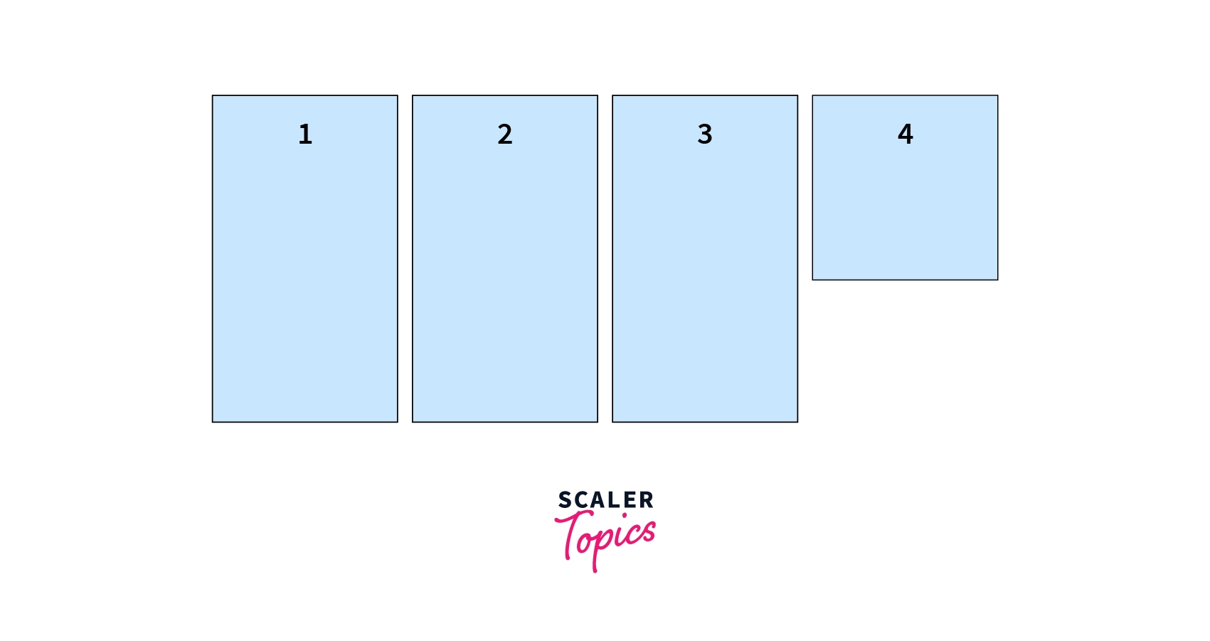
CSS flex-grow
Flex-grow helps in increasing the size of the flex item. It grows its size according to the width of the flex-container.
Syntax:
The value of flex-grow is set as 2, which means the size of the flex item will increase by 2 based on the width of the flex-container.
Example:
Output:
From the above example, we can conclude that the size of item 2 is increased by 7, as shown in the code.
CSS flex-shrink
Flex-shrink property helps in shrinking the size if the size of the flex-item is greater than the flex-container. It works opposite to the flex-grow. The default value of CSS flex-shrink is 1.
Syntax:
Example:
We should remove the flex wrap property to make flex-shrink work.
Output:
The value of flex-shrink is added to the flex-item 5 where the flex item's size shrinks.
CSS flex-basis
Flex-basis is used to define the initial size of the flex-item.
Syntax:
We can set the size of flex-item using flex-basis property.
Example:
In this example, the initial size of flex item 3 is set as 120px.
Output:
From the output, we can see that the size of flex item 3 has changed.
CSS flex
To use flex-grow, flex-shrink, and flex-basis, we use CSS flex property which is a shorthand property. The order will be flex-grow, flex-shrink, and flex-basis, as we can see in the syntax.
Syntax:
The first value that flex takes is flex-grow, the second is flex-shrink, and then third is flex-basis.
Example:
In this example we will set all the three values using flex to the flex item 1.
Output:
As we can see in the output, the flex property is applied to flex item 1 with the values: - flex-grow as 0, flex-shrink as 0, and flex-basis as 220px.
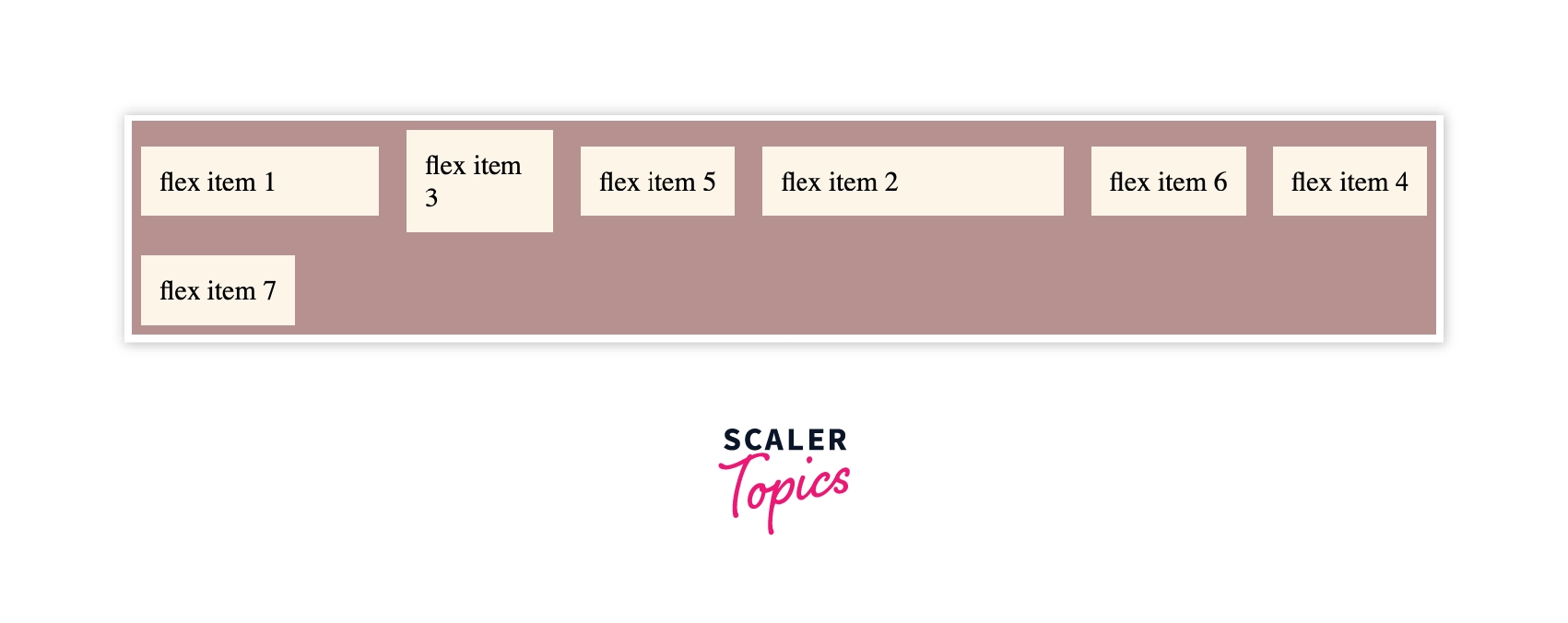
CSS align-self
To align the flex-item in the flex-container we use CSS align-self. The values are the same as the align-items property in a parent class. We can override the alignment of the individual item.
Syntax:
To align a particular flex item, align-self is used. In the following syntax, the value of align-self is set as the center.
Example:
CSS Code
HTML Code
Output:
From the output, we can see that the alignment of the flex-item 7 has been set to start.
CSS ShortHand Flexbox Properties
We have already seen the CSS Flex property, which is a shorthand property. Now, let's see a few other shorthand properties.
CSS flex-flow
CSS flex-flow is a shorthand property. In place of flex-direction and flex-wrap, we can use flex-flow, which defines both the properties.
Syntax:
It takes flex-direction value first, then flex-wrap property.
Example:
Output:
From the above example, we see that the flex items are arranged in the row direction, and while resizing the window, the flex items wrap.
CSS place-content
Place-content is the shorthand property for justify-content and align-content property.
Syntax:
Example:
Output:
From the above example, we can conclude that by using place-content, we can apply justify-content as well as align-content properties using place-content.
Conclusion
- CSS Flexbox helps the user in creating flexible and responsive layouts which are compatible with all the devices.
- CSS flexible box is used to arrange items horizontally as well as vertically. It is a CSS module that has its child properties.
- Flexbox property is used when working with small layouts, for example, navigation bar.
- To apply the flexbox properties to the complete container, we have parent flexbox properties such as CSS flex display, align-items, etc.
- To apply the flexbox properties individually to the flex-item or child item we have child flexbox properties such as CSS flex, CSS flex-basis, etc.
 Google
 Amazon
 Microsoft
 Flipkart
 Adobe1200+ more