CSS Grid Property
 FREE
FREE

Overview
Back in the early days of web development, developers had to rely on all kinds of tricks and hacks to position elements on the screen in a way that gave consistent results across multiple browsers. But today, nearly everyone relies on the most widely used layout tools of CSS, i.e., FlexBox and the Grid. Reebok is one of the top grid-based websites.

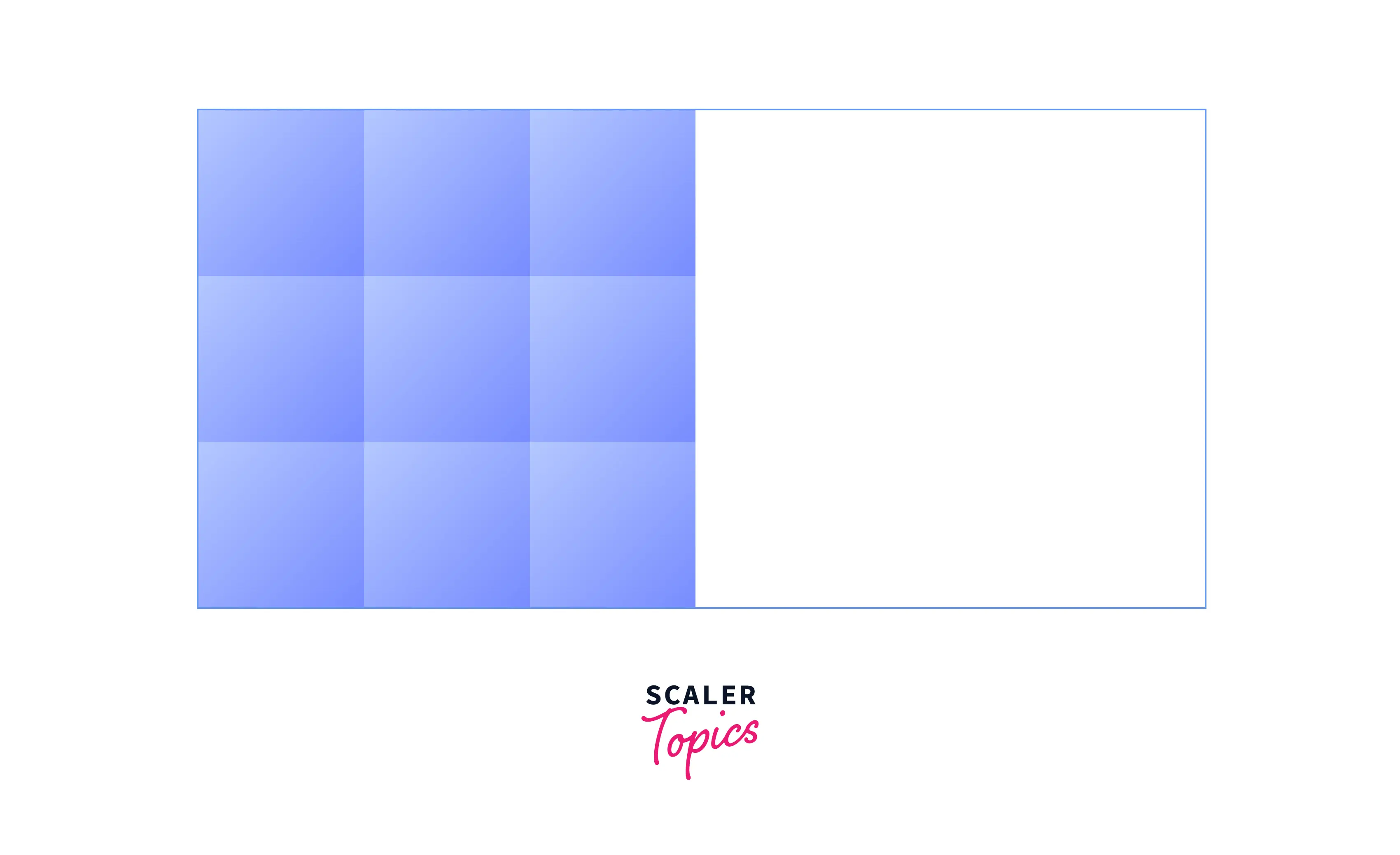
Unlike FlexBox Layout, which is single-axis oriented, Grid Layout is optimized for 2-dimensional layouts, which means it allows you to align any number of items across any number of rows and columns. Grids can be used to lay out major areas of the webpage or small user interface elements.
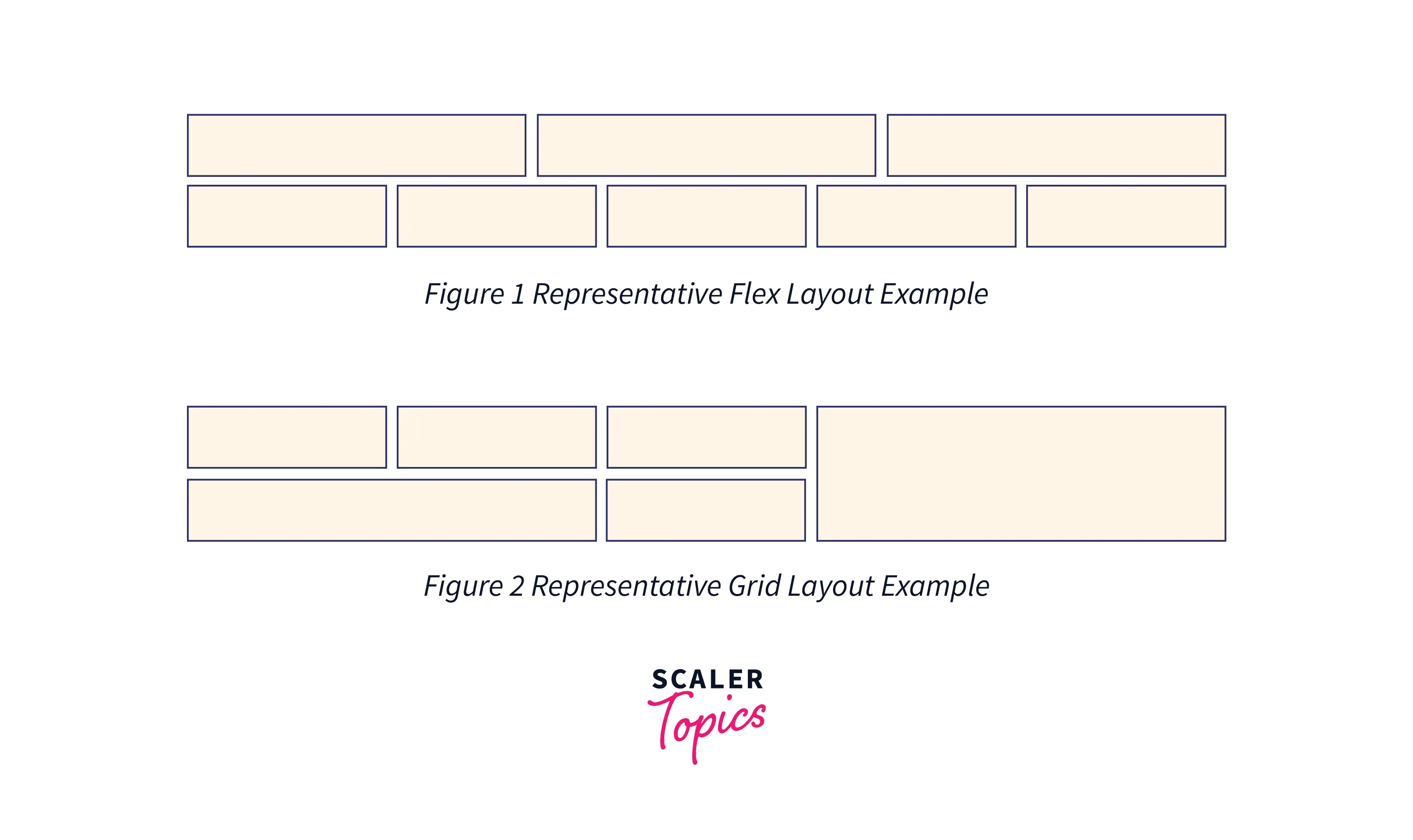
In the above graphic, figure 1 represents the Flex layout where items are aligned in only one direction, and figure 2 represents the Grid layout where items are aligned in two directions.
What is the CSS Grid Property?
CSS Grid Layout is a two-dimensional layout system that lets you lay content out in rows and columns. It follows a top-down approach to layout, allows explicit overlapping of items, and provides values to automatically resize the elements on the web page. It is one of the most powerful CSS tools available, allowing you to create complex design layouts with ease. It also provides several features which easily let you build responsive websites.
The CSS code for the above layout:
Scaler Placement Report and Statistics
Scaler learners achieved 2.5x salary growth with average post-Scaler CTC reaching ₹23L.
CSS Grid Properties
Before defining the grid layout on the webpage, we need to understand some terminologies:
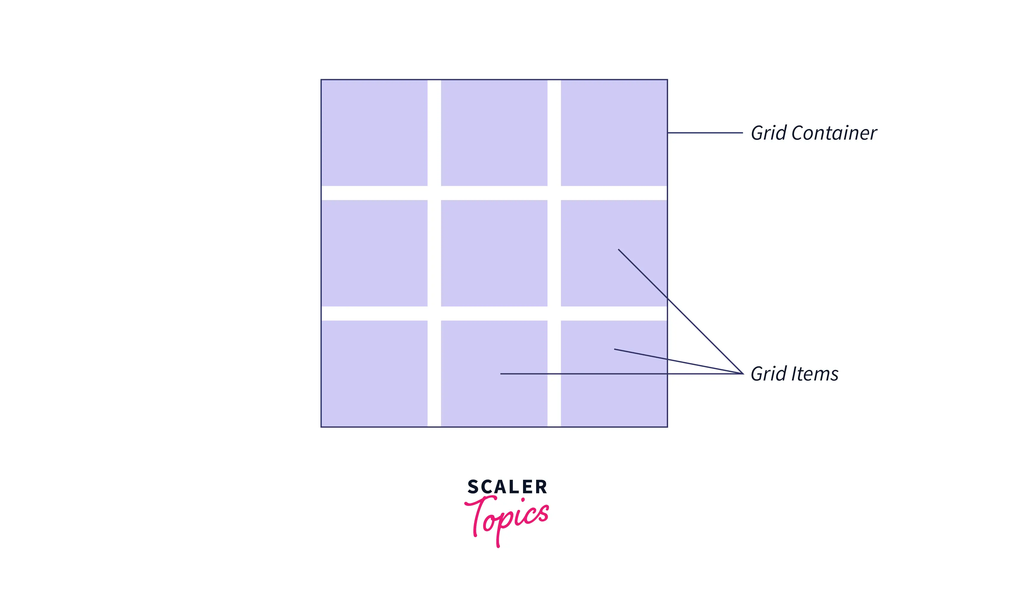
- Grid Container: The element on which display value is set to grid becomes the grid container. Here, the box is the grid container.
- Grid Items: The direct child elements of the grid container become the grid items. Here, box-items are the grid items and not sub-box-item.
When you will execute the following code, the element box will become the grid container, and all direct children of the box i.e. box-items will become the grid items and not sub-box-item.
HTML
CSS
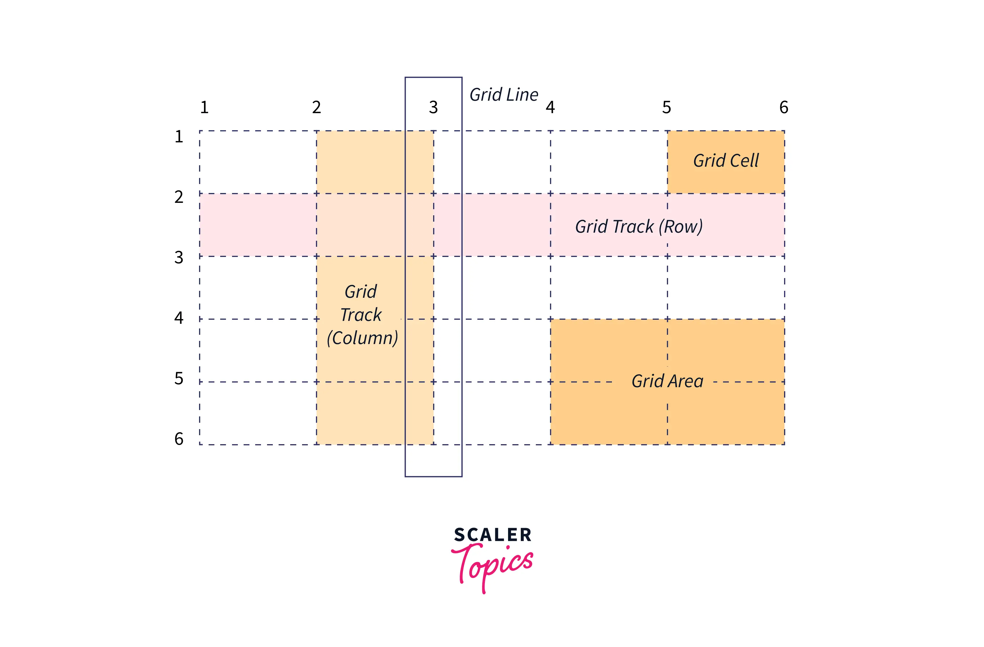
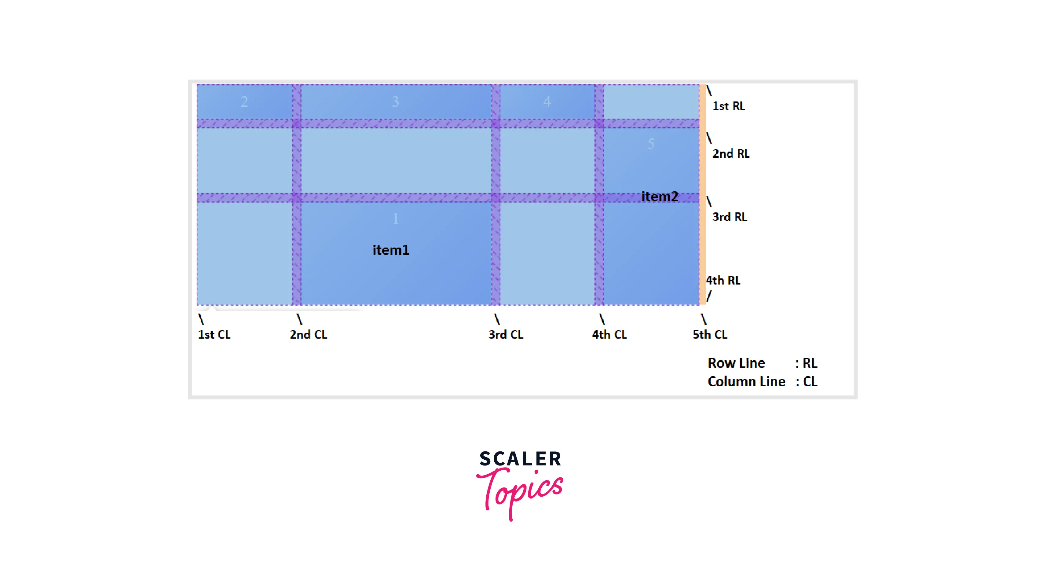
- Grid Lines: The lines between columns and rows in the grid are the grid lines. The vertical lines between the columns are column lines and the horizontal lines between the rows are row lines.
- Grid Tracks: The space between two adjacent grid lines is the grid tracks. Tracks can be horizontal or vertical (i.e. the rows and columns defined in the grid).
- Grid Cell: The grid cell is the space between two adjacent row lines and two adjacent column lines. You can also define the grid cell as the intersection part of a row and a column.
- Grid Area: The grid area is made up of one or more neighboring grid cells that form a rectangle.
CSS Grid Properties for the Parent (Grid Container)
CSS Display
The display property of CSS specifies how the element is displayed on the webpage. To define a grid, we use the grid or inline-grid value of the display property. As soon as we do this, the element becomes the grid container and all direct children of that element become grid items.
CSS
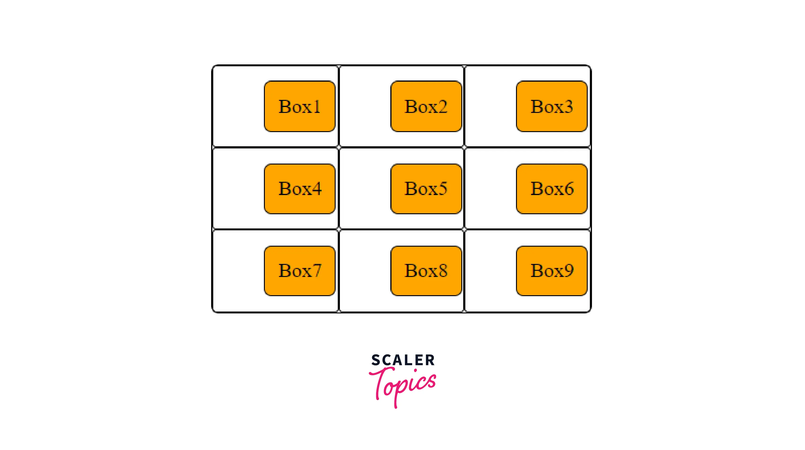
In the following example, we have created a div element with a class of grid-container, and, inside are six child elements. By using the display property, we define .grid-container as a grid.
HTML
After the execution of the above code, the output will look like this:
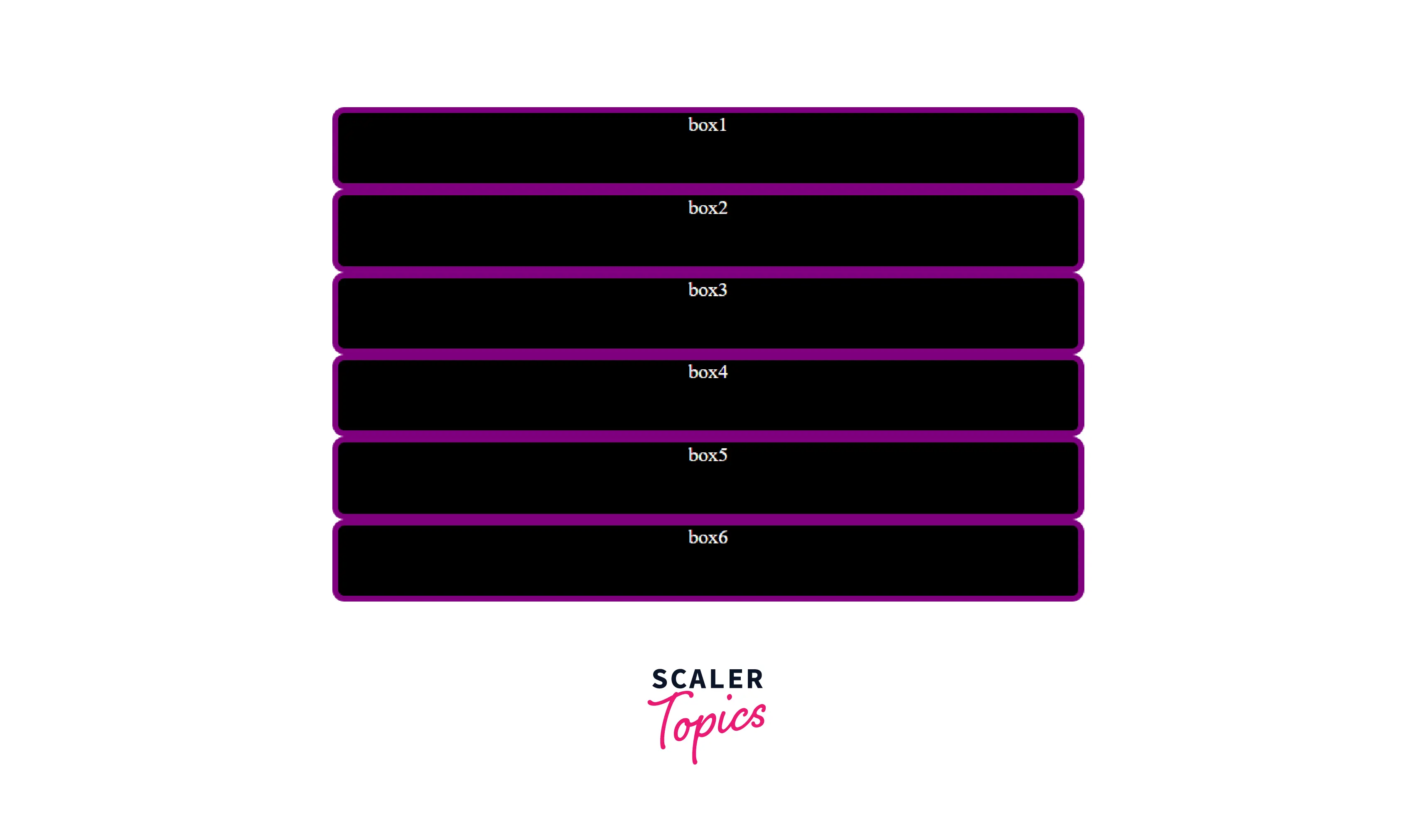
Note: Unlike Flexbox, the items will not immediately look different. Declaring display: grid gives you a one-column grid, so the items will continue to display one below the other as they do in normal flow.
Takeaway:
- Grid items are placed in rows by default and span the entire width of the grid container.
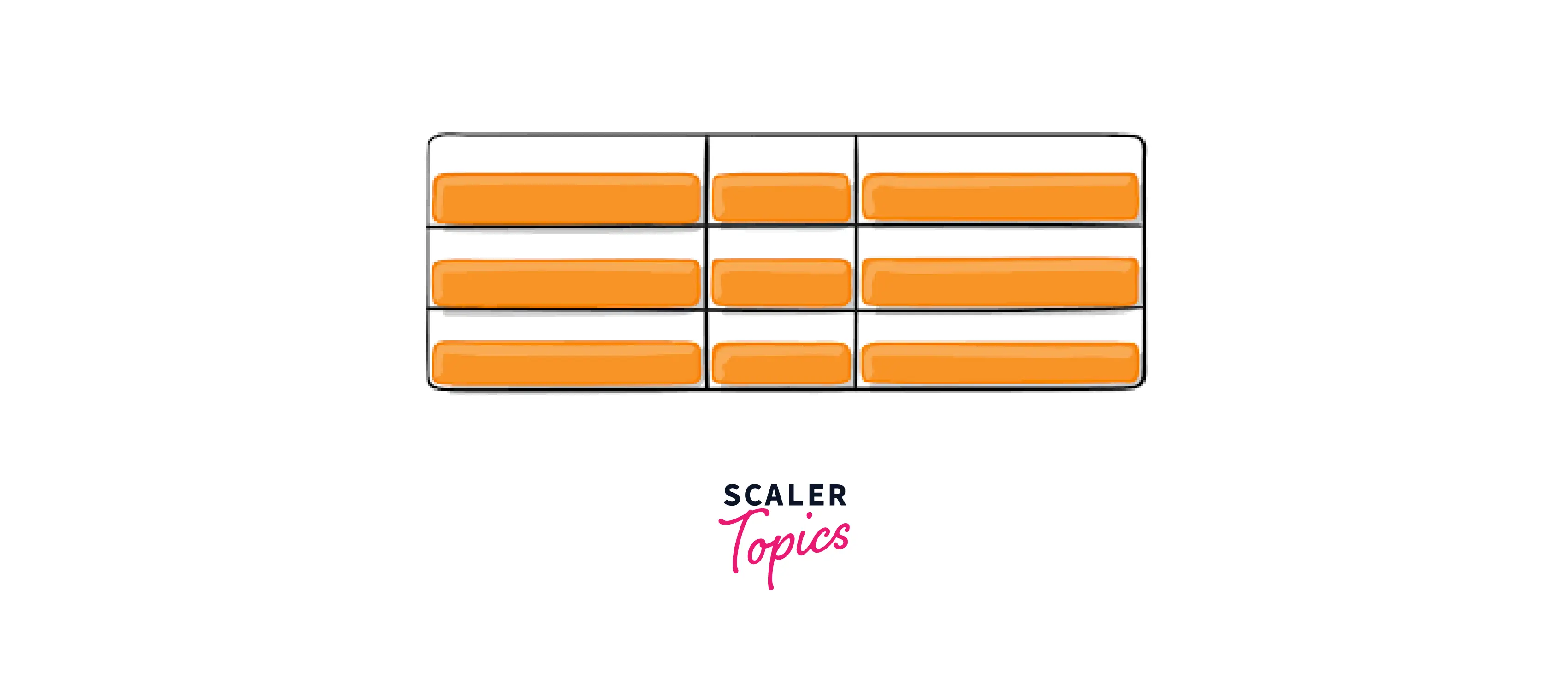
CSS grid-template-columns
The grid-template-columns property of CSS specifies the number and width of the columns in the grid layout. The space-separated list of values specifies the number of columns for each row whereas each value specifies the width of the respective column. The values can be a length, a percentage, or a fraction of the free space in the grid (using the fr unit).
CSS
After adding the above code, the output will look like this:
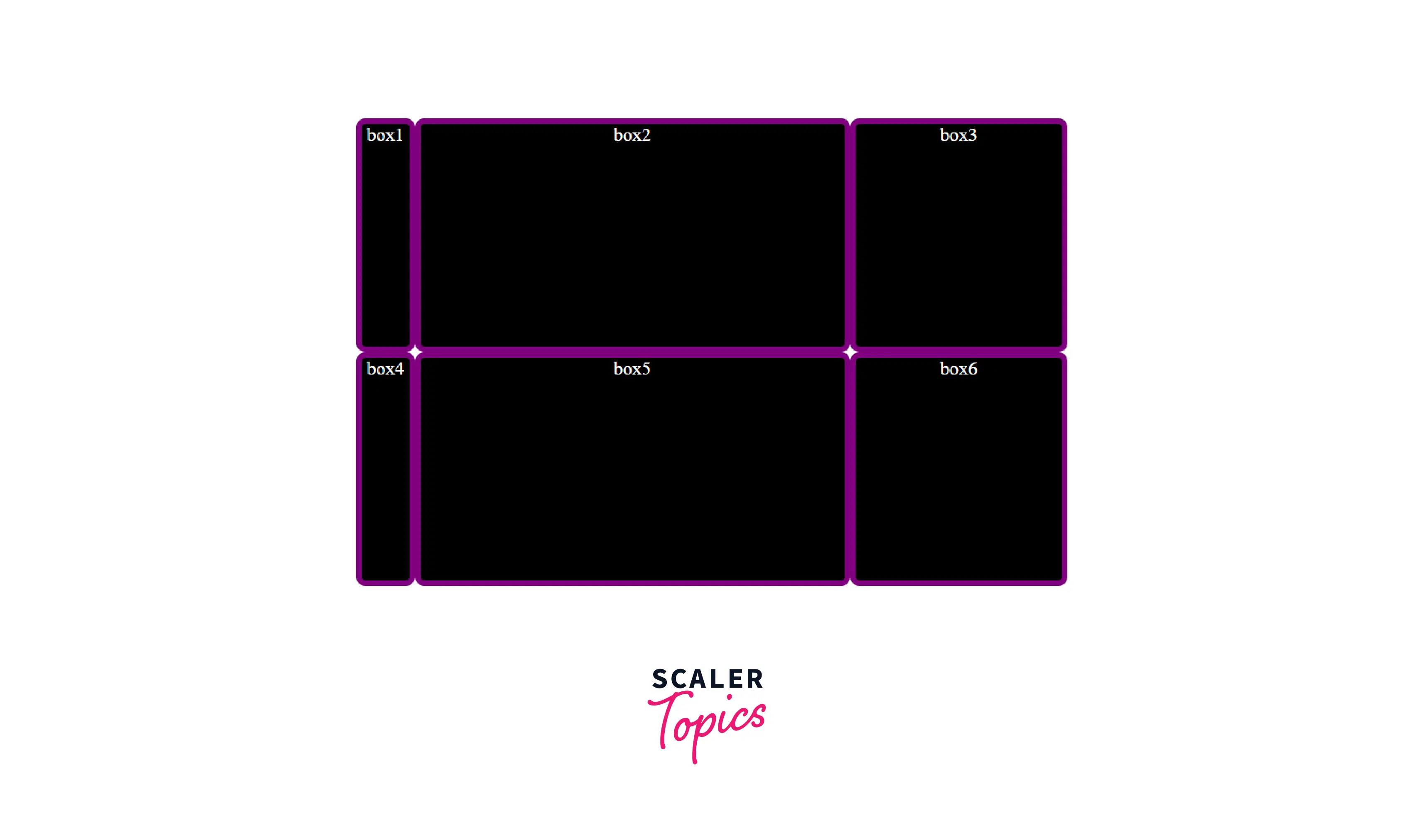
In the above example, the size of the column tracks is defined by the grid-template-columns property. The first column track is 50 px, so the fixed width is taken away from the available space. The remaining space is then divided into three parts and then assigned in proportion to the two flexible tracks.
Note: The fr unit distributes available space, not all space. You can mix fr units with fixed-length units — in such a case the space needed for the fixed tracks is used up first; the remaining space is then distributed to the other tracks.
Takeaway:
- Grid introduces an fr unit to help us create flexible grid tracks.
- The fr unit represents a fraction of the available space in the grid container.
CSS grid-template-rows
The grid-template-rows property of CSS specifies the number and height of the rows in the grid layout. The space-separated list of values specifies the number of rows in the grid whereas each value specifies the height of the respective row. The values can be a length, a percentage, or a fraction of the free space in the grid (using the fr unit).
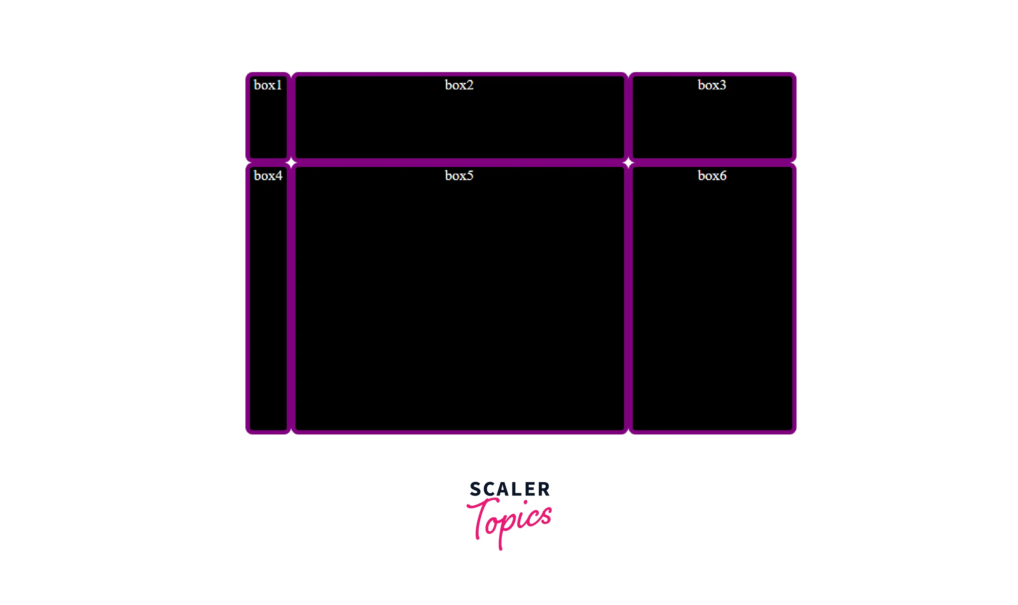
We can also use a repeat() function, the first value passed to repeat() is the number of repetitions and the second value is the grid tracks to repeat. In the following code, it will create two rows, the height of the first row is fixed, i.e., 100px. So, the fixed height will be taken away from the available space and the remaining space will be assigned to the second row.
After the execution of the above code, the output will look like this:
Takeaway:
- If you only define the size of column tracks with the grid-template-columns property, it will not only create columns of specified size but also row tracks on its own. These row tracks are part of the implicit grid.
- The rows and columns of an explicit grid are defined using grid-template-columns or grid-template-rows properties.
CSS grid-template-areas
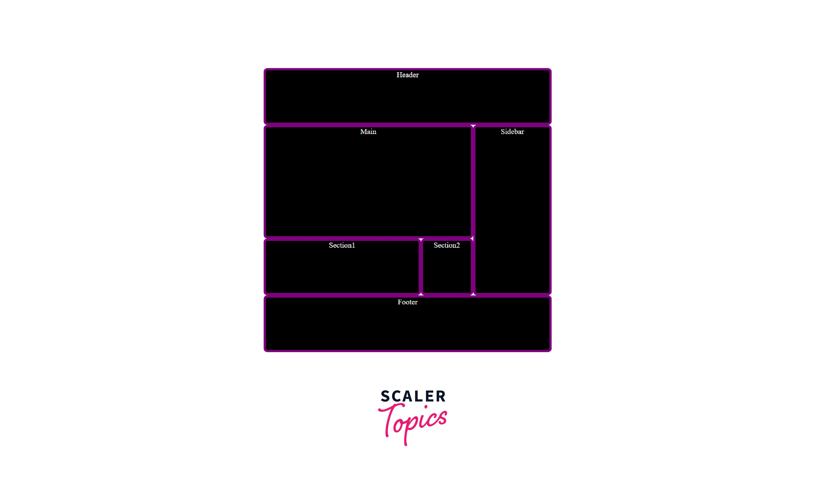
The grid-template-areas property of CSS defines the grid by assigning names to the grid items with the help of the grid-area property and then specifying the location of that item in the value of the grid-template-areas property. The syntax itself in the grid-template-areas property serves as a visual representation of the grid's structure.
The grid-template-areas property accepts one or more strings as a value. Each string (enclosed in quotes) represents a row of the grid and each cell in the string represents a column. When the names of the grid areas are repeated within and between rows, they create a single-named grid area that spans the corresponding grid cells. The declaration is invalid unless those cells form a rectangle.
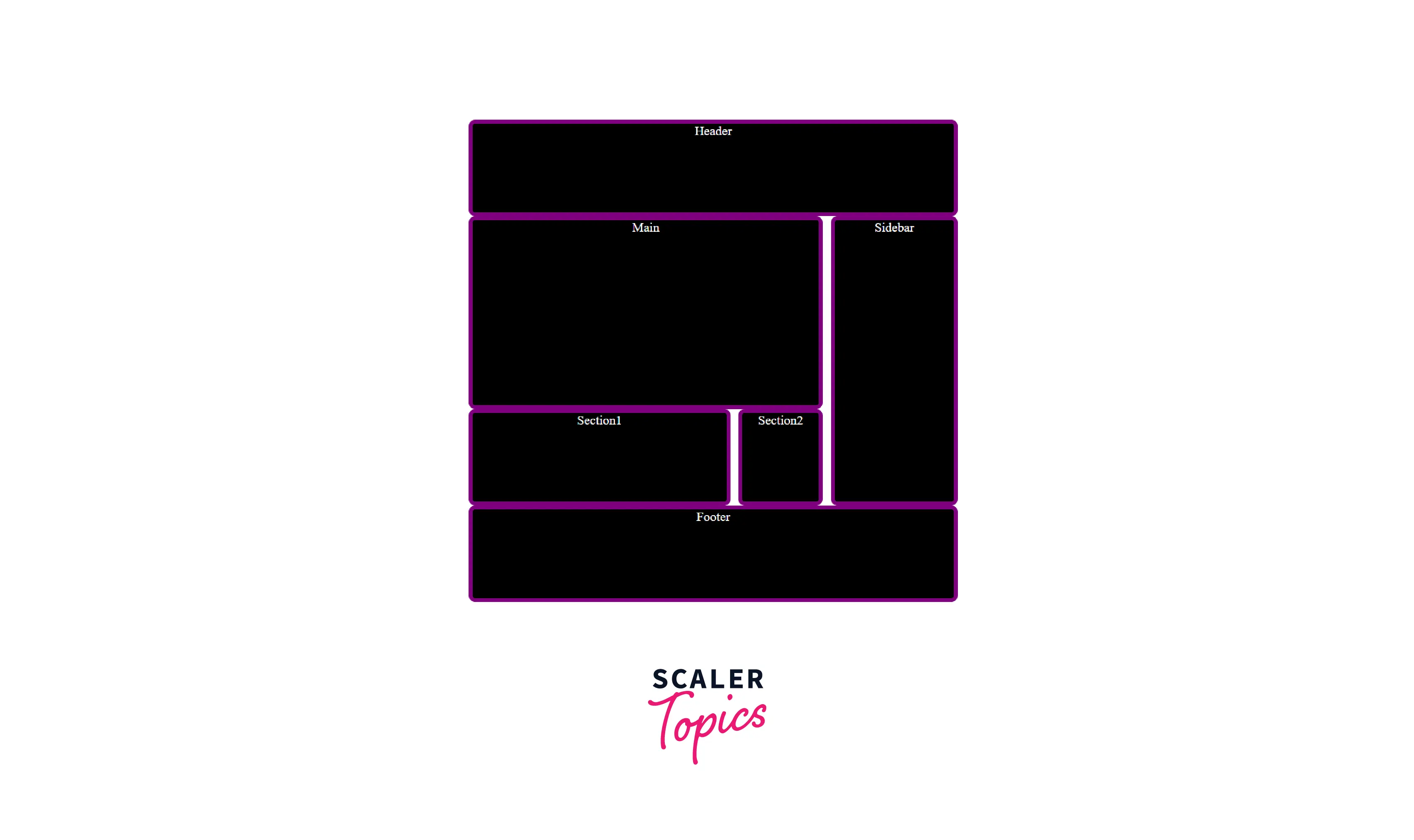
In the following example, we have created a layout using the grid-area property and grid-template-areas property. Here, there are four rows and four columns. The first row merges four cells as the Header area. The second row merges three cells as the Main area. The third row merges the first two cells as the Section1 area, the third cell as the Section2 area, and the last cell of the second and third rows as the Sidebar area. The last row merges four cells as the Footer area.
HTML code
After the execution of the above code, the output will look like this:
Takeaway:
- The declaration in the grid-template-areas property is invalid if the grid cells don't form a rectangle.
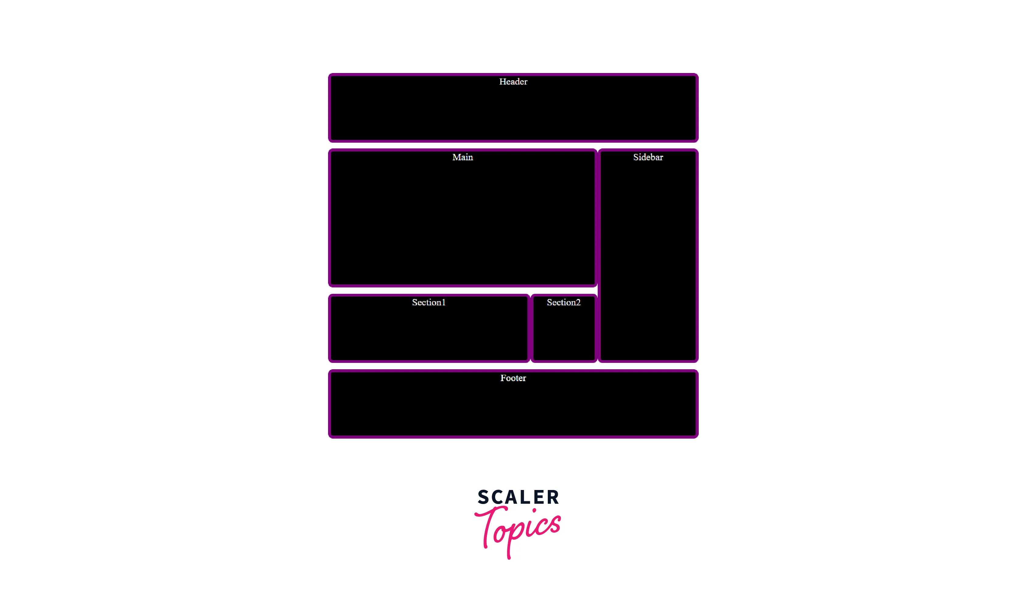
CSS grid-template
The grid-template CSS property is a shorthand property for setting grid-template-rows, grid-template-columns, and grid-template-areas in a single declaration. The grid-template property can have the following values:
- none: sets all three properties to their default values.
- <grid-template-rows> / <grid-template-columns> : sets grid-template-rows and grid-template-columns to the specified values, respectively, and sets grid-template-areas to none.
- [ <line-names>? <string> <track-size>? <line-names>? ]+ [ / <explicit-track-list> ]? : Sets grid-template-areas to the strings listed, grid-template-rows to the track sizes following each string, and grid-template-columns to the track listing specified after the slash (or none, if not specified).
The following CSS code will also help you to build the layout used in the previous example.
Transform Your Career
Choose from our industry-leading programs designed for career success
Modern Software and AI Engineering Program
Master full-stack development with AI integration

 +1000 more
Modern Data Science and ML with specialisation in AI
Advanced data science techniques with AI specialization
+1000 moreAdvanced AIML with Specialisation in Agentic AI
Deep dive into AIML with focus on Agentic systems
+1000 moreDevOps, Cloud & AI Platform Engineering
Build and manage AI-powered cloud infrastructure
+1000 moreAI Engineering Advanced Certification by IIT-Roorkee
Premier AI engineering certification from IIT-Roorkee
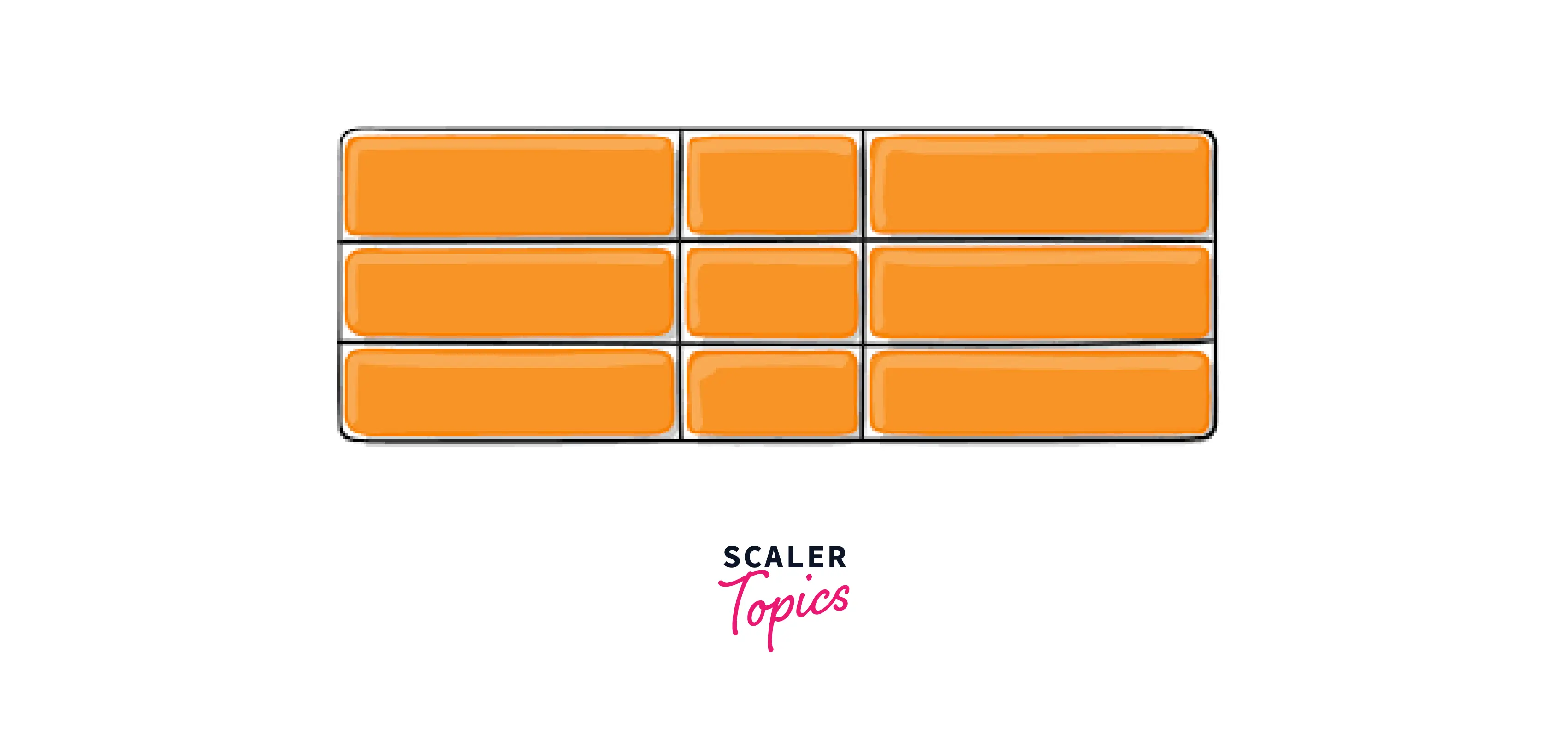
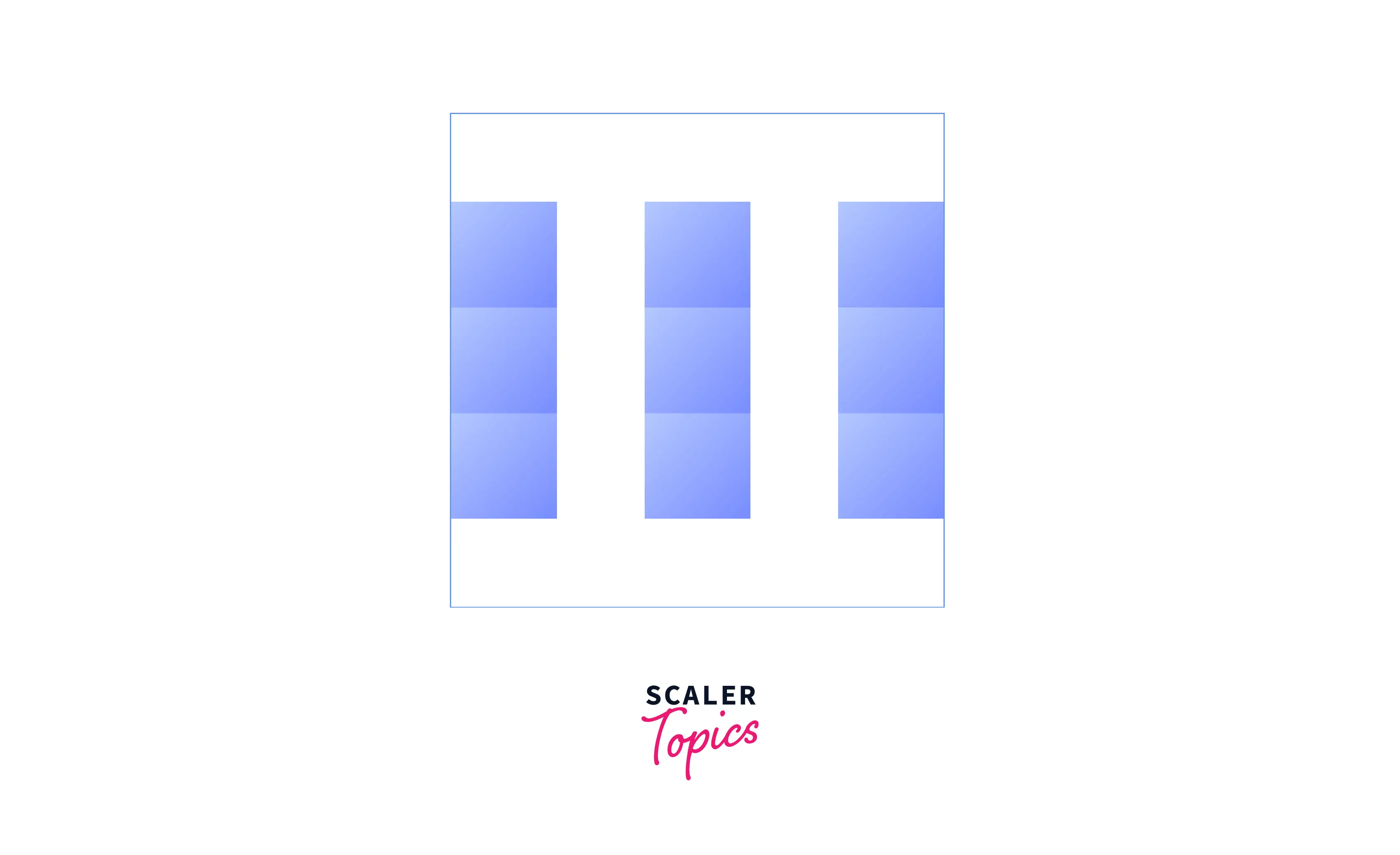
CSS grid-column-gap
The column-gap (grid-column-gap) property of CSS specifies the size of the gap between the columns in a grid layout. The values used can be a length, a percentage (i.e. relative to the dimension of the element), or a normal keyword (browser's default spacing is used between the columns).
Add the code below in your CSS to create gaps between columns.
After the execution of the above code, the output will look like this:
Takeaway:
- The grid-column-gap property was renamed to column-gap to make it usable in multiple layout methods.
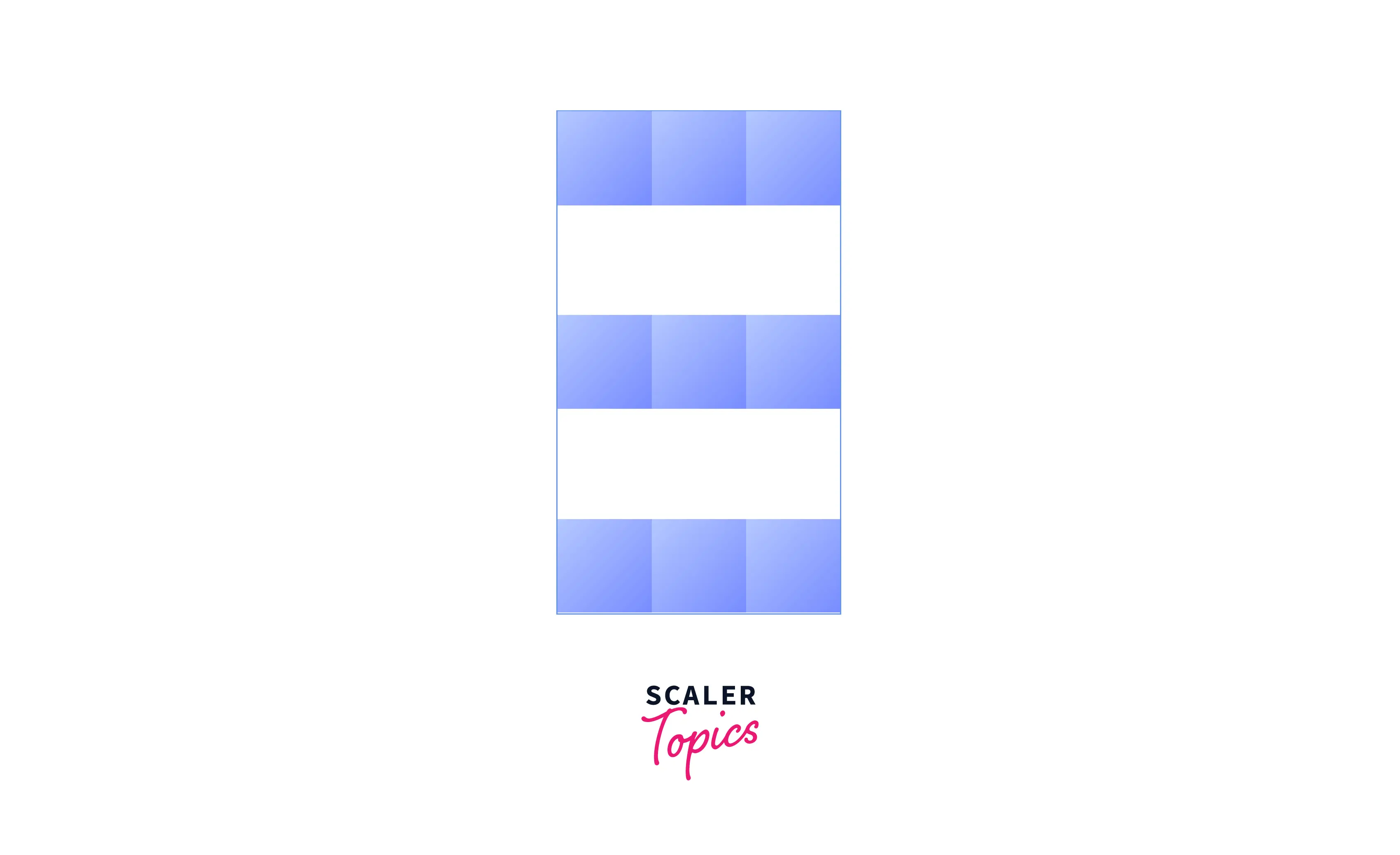
CSS grid-row-gap
The row-gap (grid-row-gap) property of CSS specifies the size of the gap between the rows in a grid layout. The values used can be a length or a percentage (i.e. relative to the dimension of the element).
Add the code below in your CSS to create gaps between rows.
After the execution of the above code, the output will look like this:
Takeaway:
- The grid-row-gap property was renamed to row-gap to make it usable in multiple layout methods.
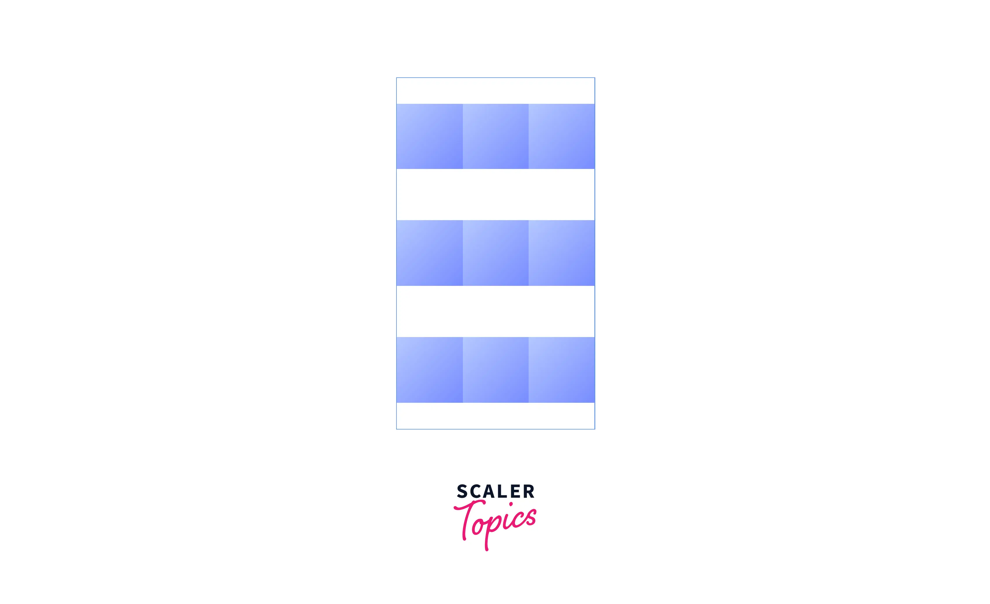
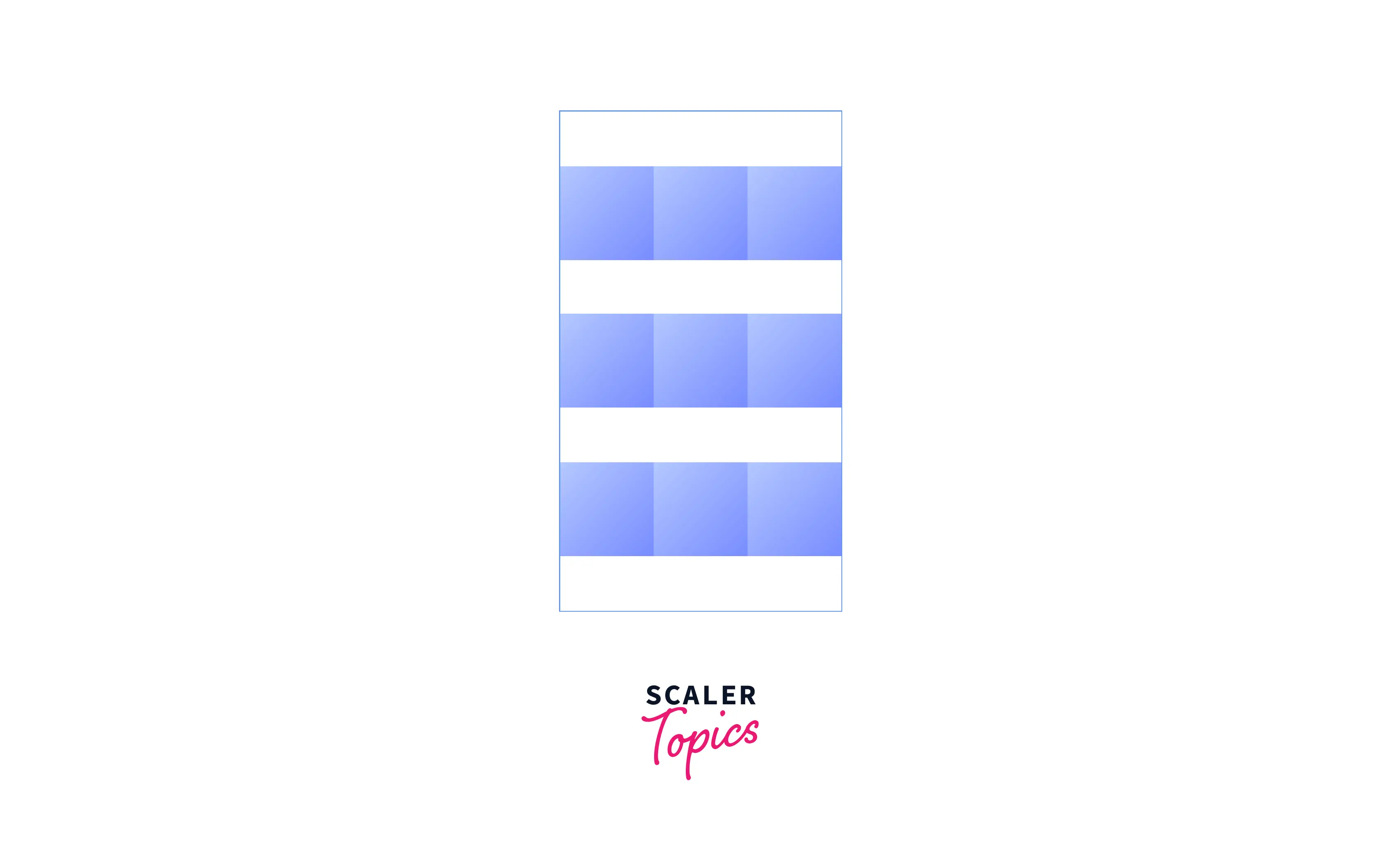
CSS grid-gap
The gap (grid-gap) property of CSS specifies the size of the gaps between rows and columns in a grid layout. It is a shorthand property for setting row-gap and column-gap in a single declaration. The values used can be a length, a percentage, or a set using the calc() function.
If a single value is specified, that value is set for both row-gap and column-gap properties. If two values are specified, the first value is set for the row-gap property and the second value is set for the column-gap property.
Add the code below in your CSS to create gaps between rows and columns.
After the execution of the above code, the output will look like this:
Takeaway:
- The grid-gap property was renamed to gap to make it usable in multiple layout methods.
- Grid gaps are only created in between columns and rows, and not along the edge of the grid container.
- The values used in the gap or other related properties can be any non-negative length unit or percentage, but not an fr unit.
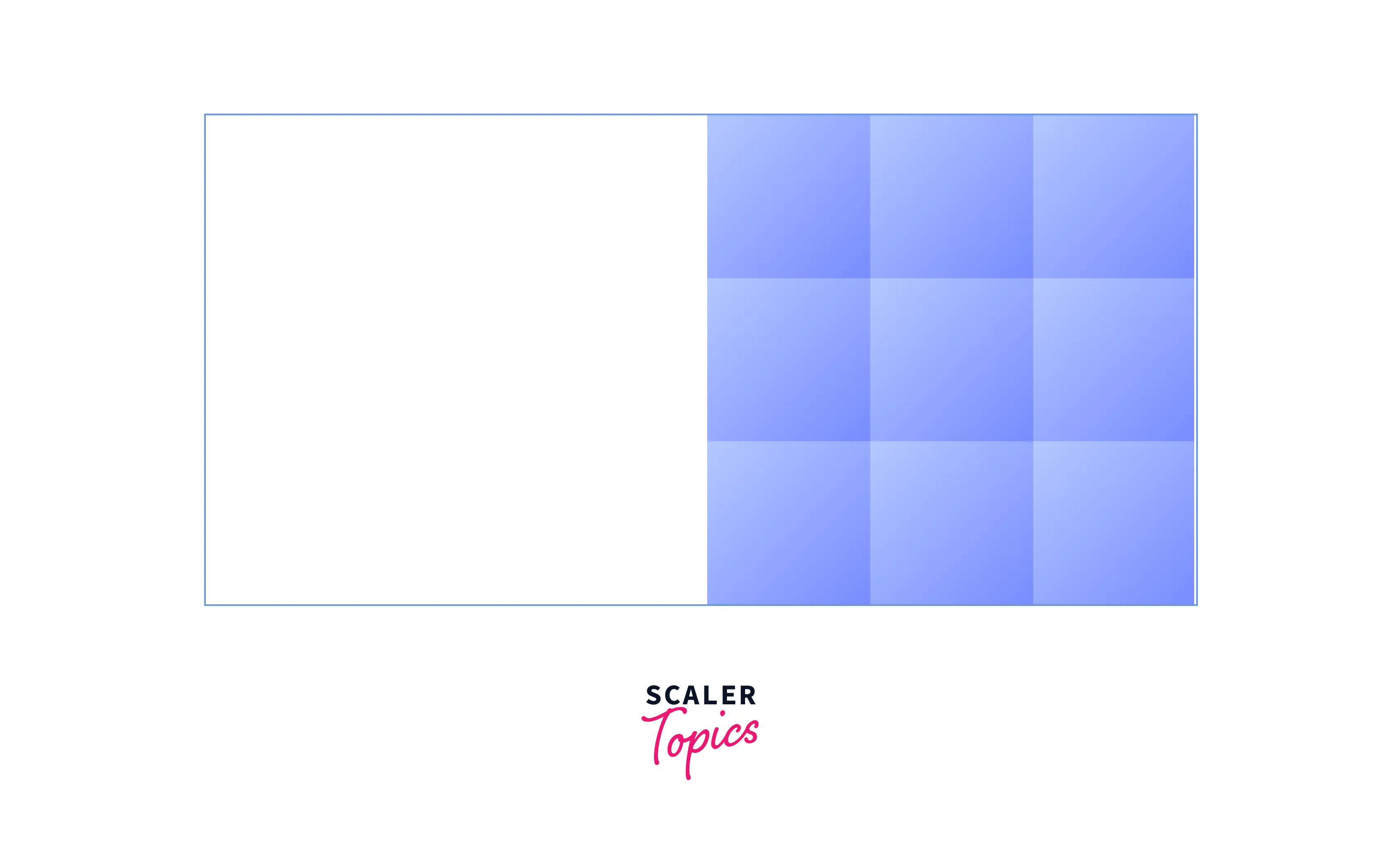
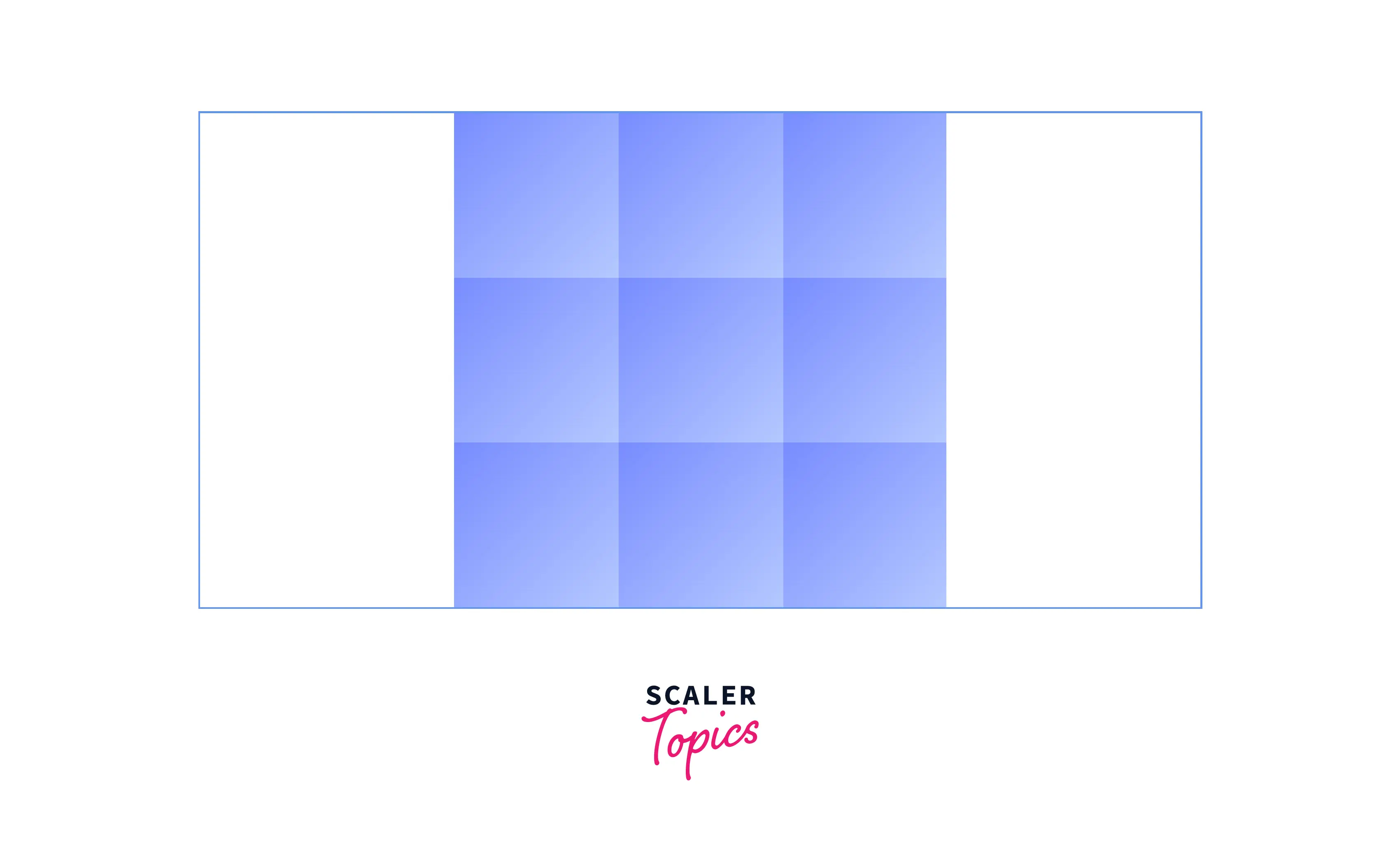
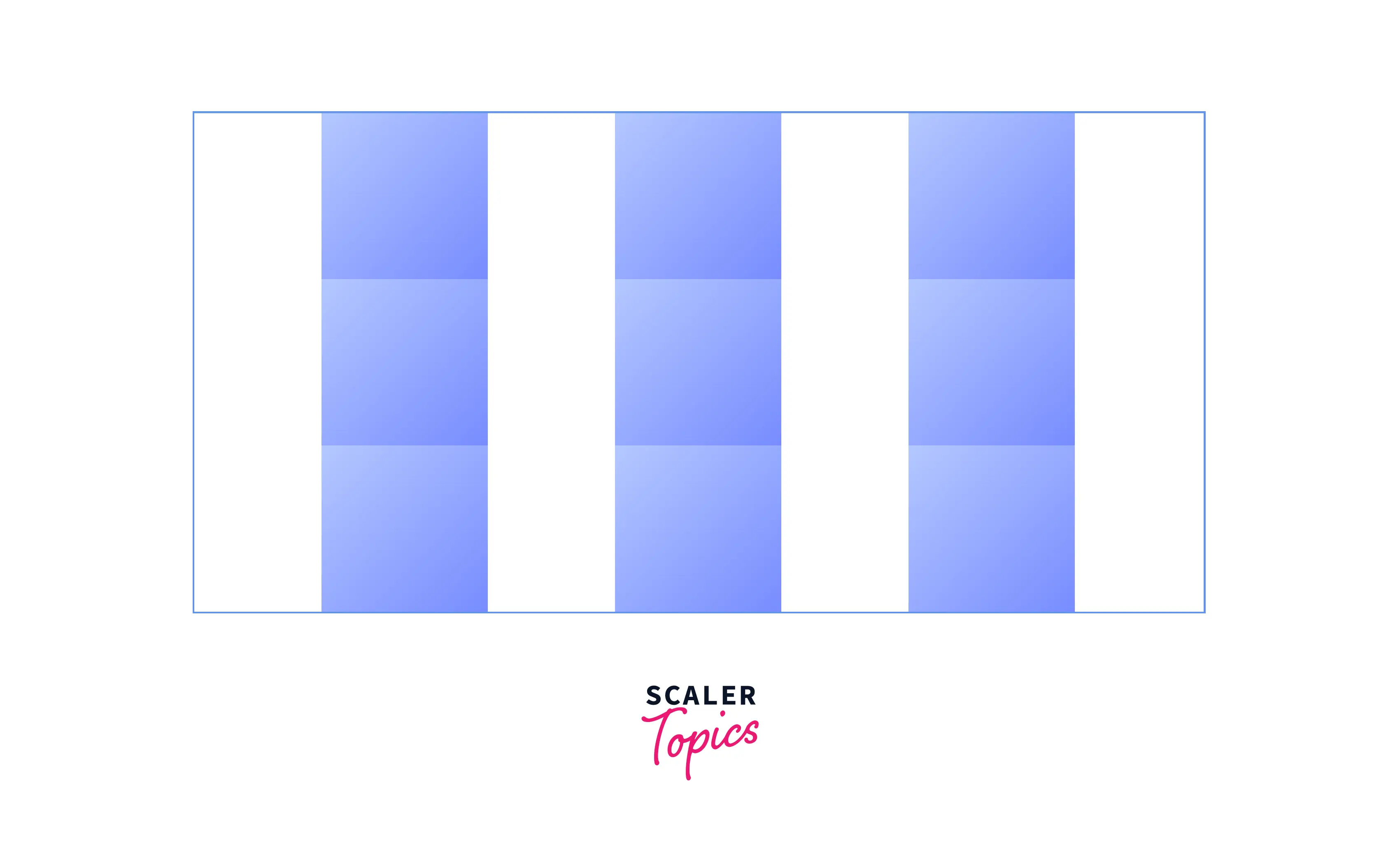
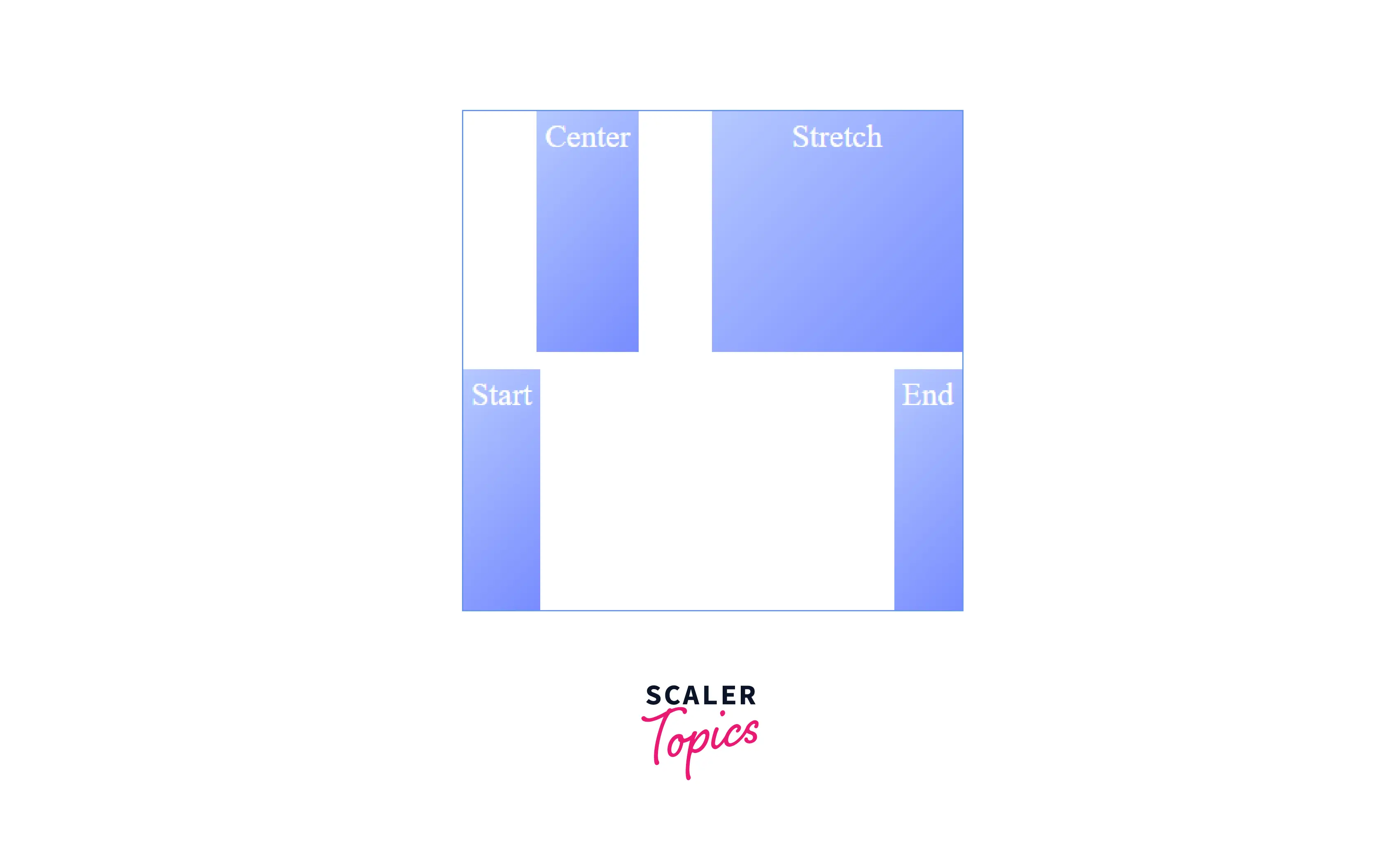
CSS justify-items
The justify-items property of CSS specifies the horizontal alignment of grid items in the grid cell. It basically aligns the grid items along the row (inline) axis. The possible values are
- start: The grid items are aligned horizontally towards the starting (left) edge of the alignment container, i.e., their cell.
- end: The grid items are aligned horizontally towards the ending (right) edge of the alignment container, i.e., their cell.
- center: The grid items are aligned horizontally in the center of the alignment container, i.e., their cell.
- stretch: The grid items are horizontally aligned, causing them to fill the whole width of the alignment container, i.e., their cell.
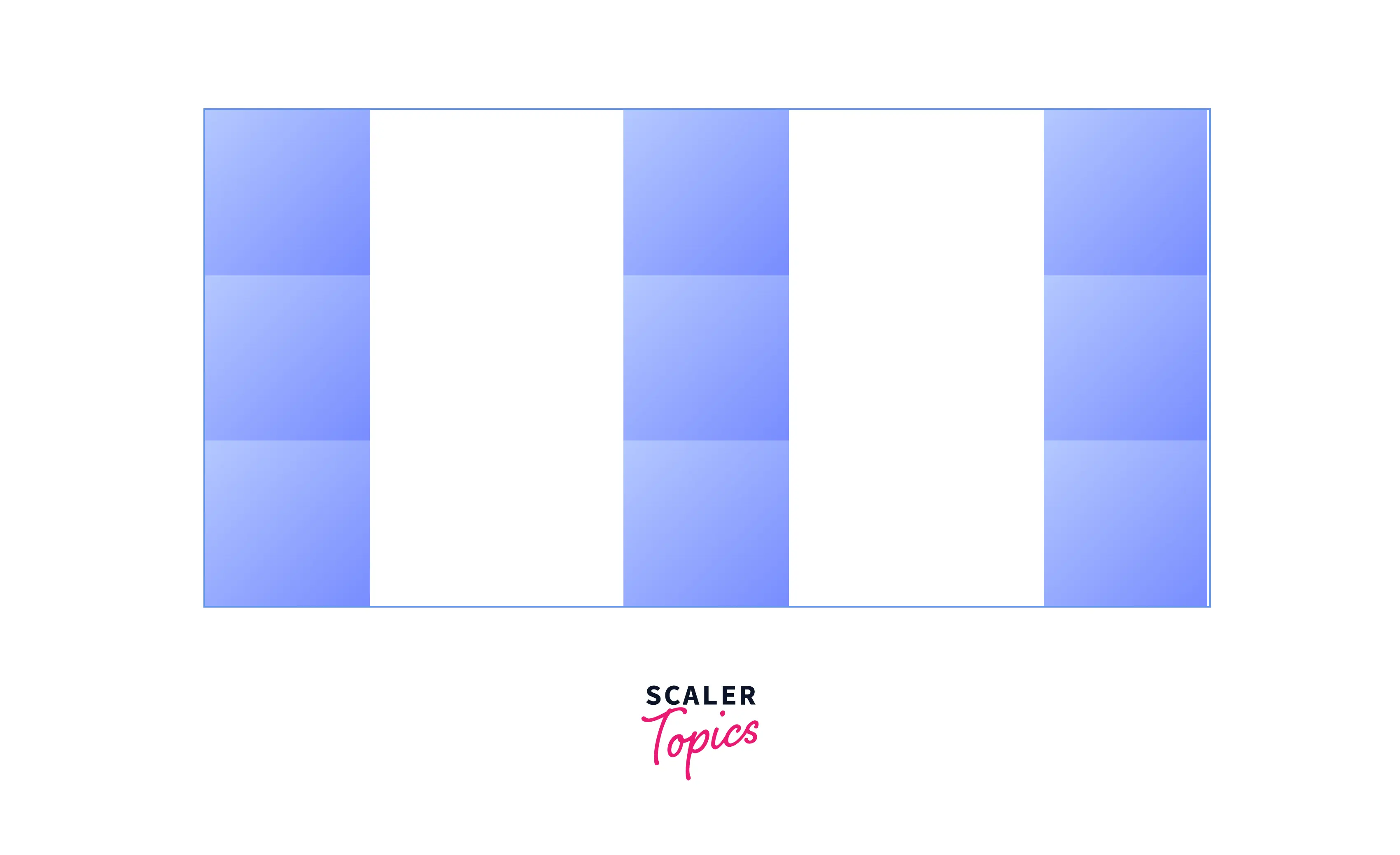
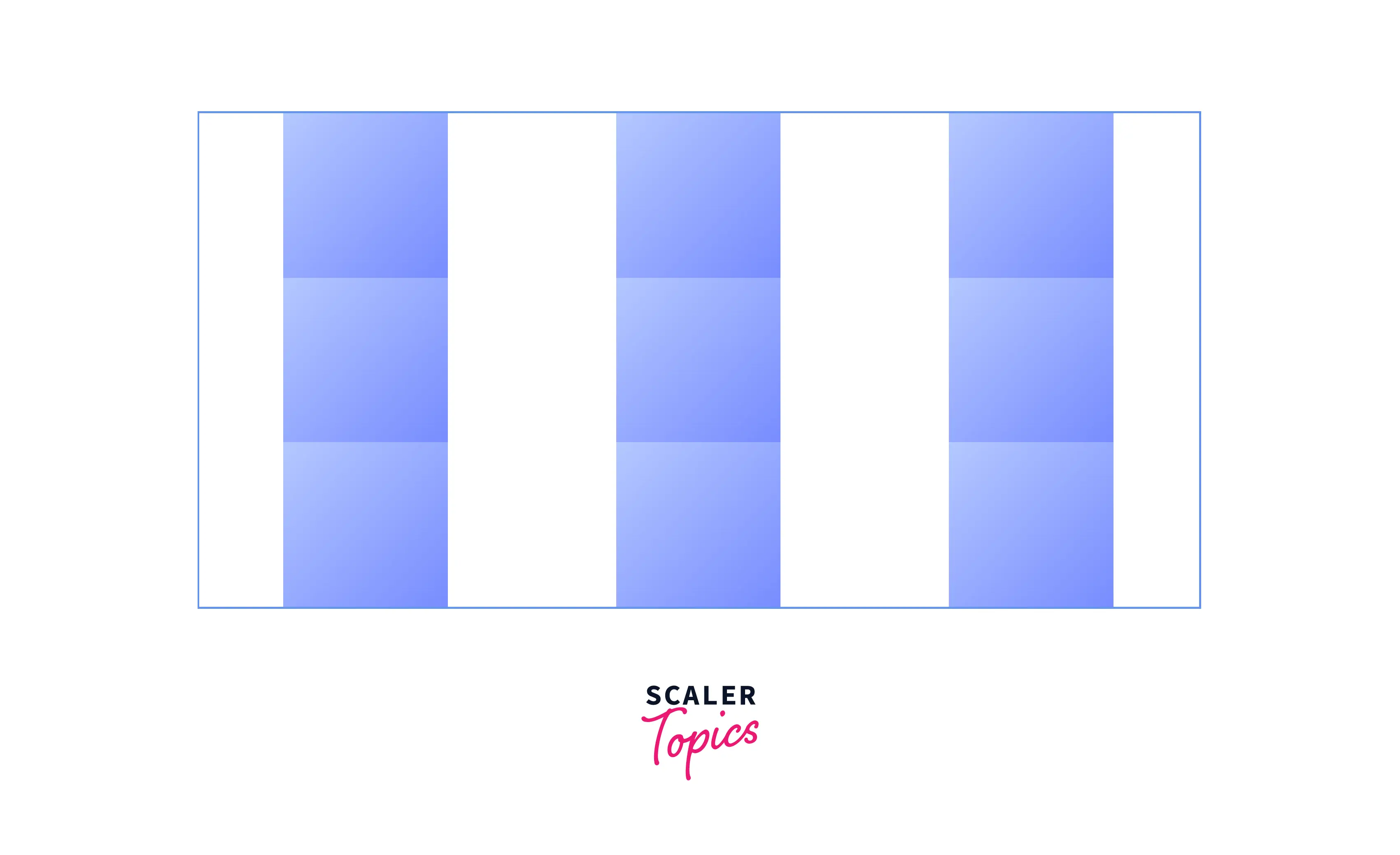
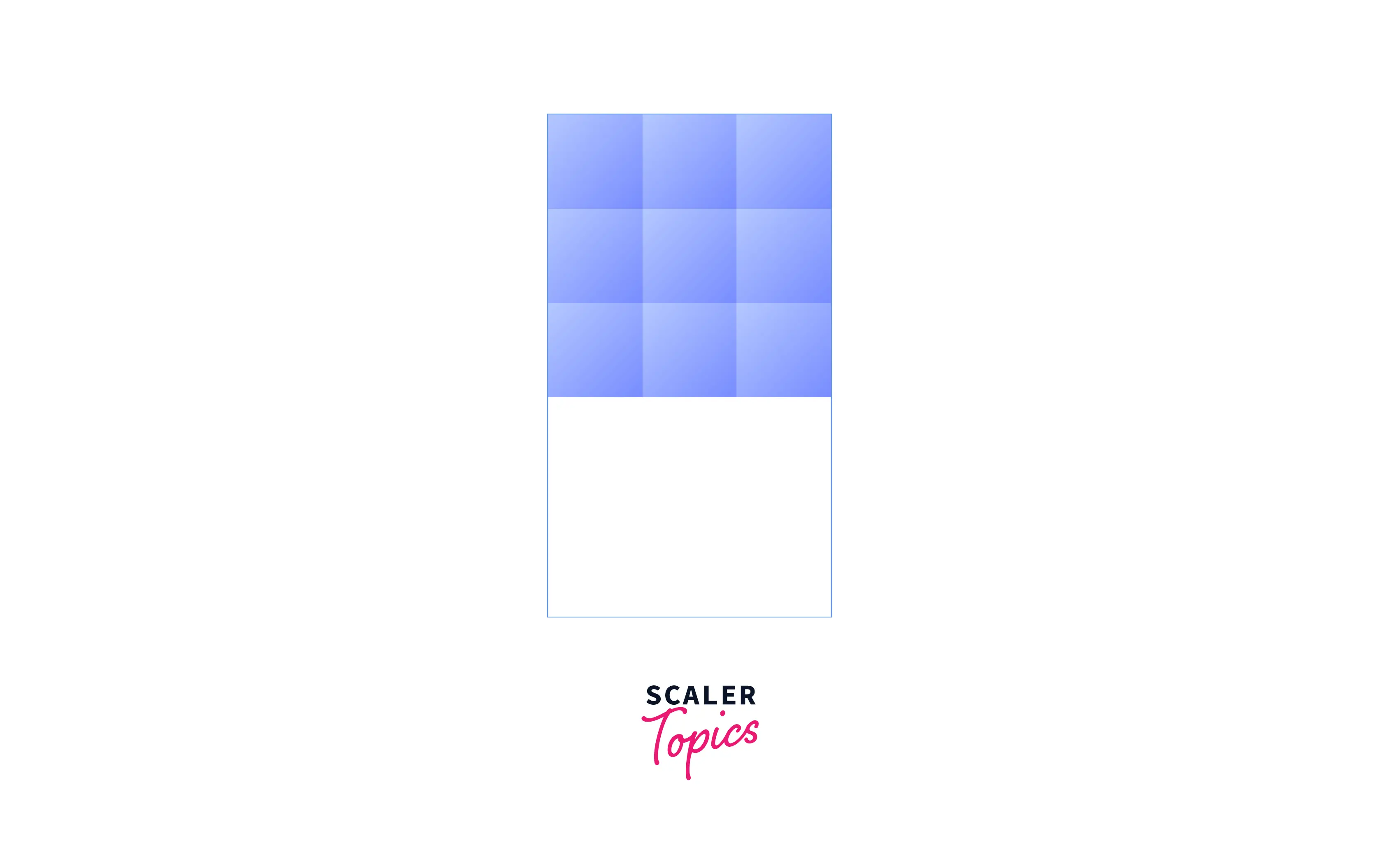
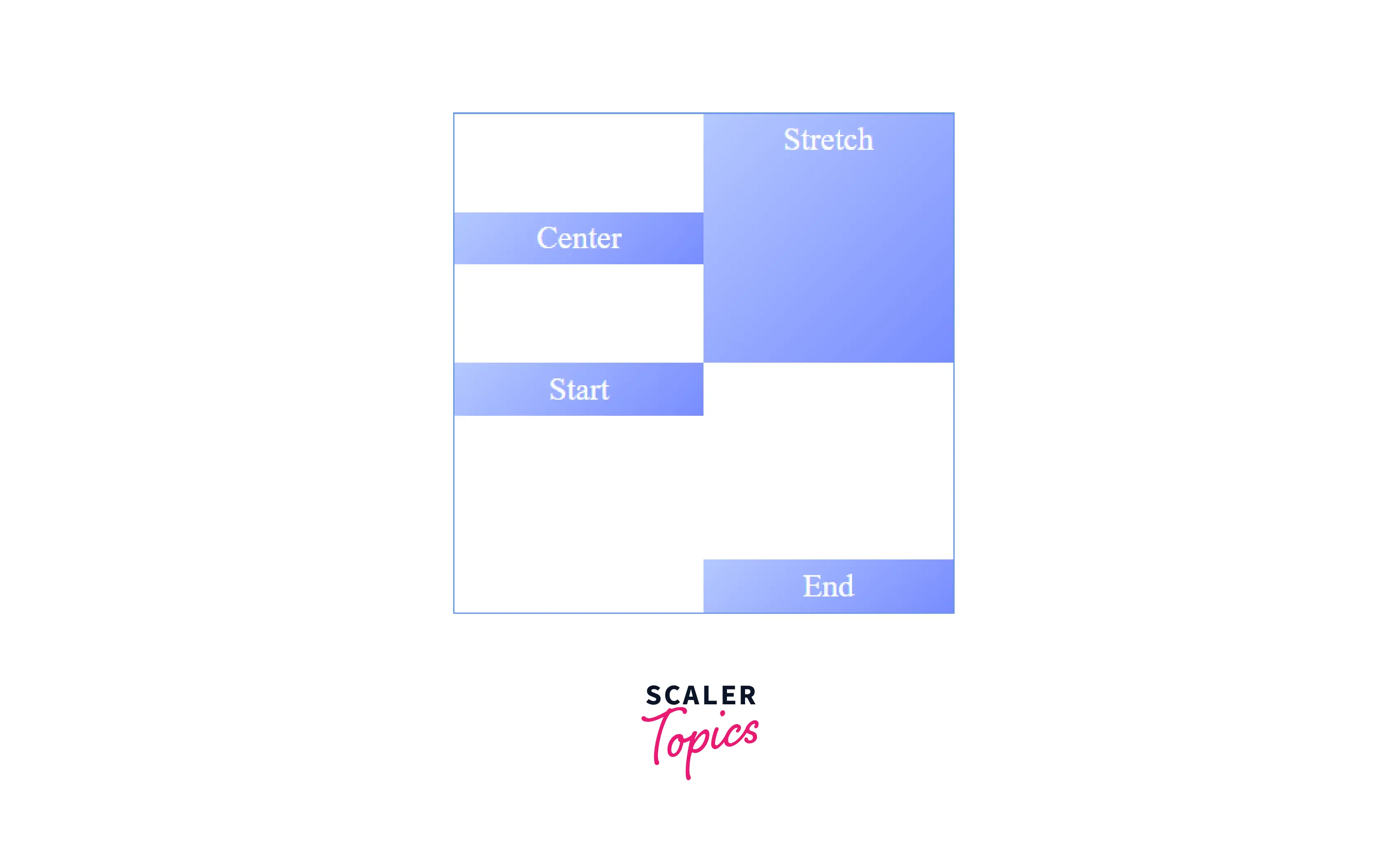
CSS align-items
The align-items property of CSS specifies the vertical alignment of grid items in the grid cell. It basically aligns the grid items along the column (block) axis. The possible values are
- start: The grid items are aligned vertically towards the top edge of the alignment container, i.e., their cell.
- end: The grid items are aligned vertically towards the bottom edge of the alignment container, i.e., their cell.
- center : The grid items are aligned vertically in the center of the alignment container, i.e., their cell.

- stretch: The grid items are vertically aligned, causing them to fill the whole height of the alignment container, i.e., their cell.
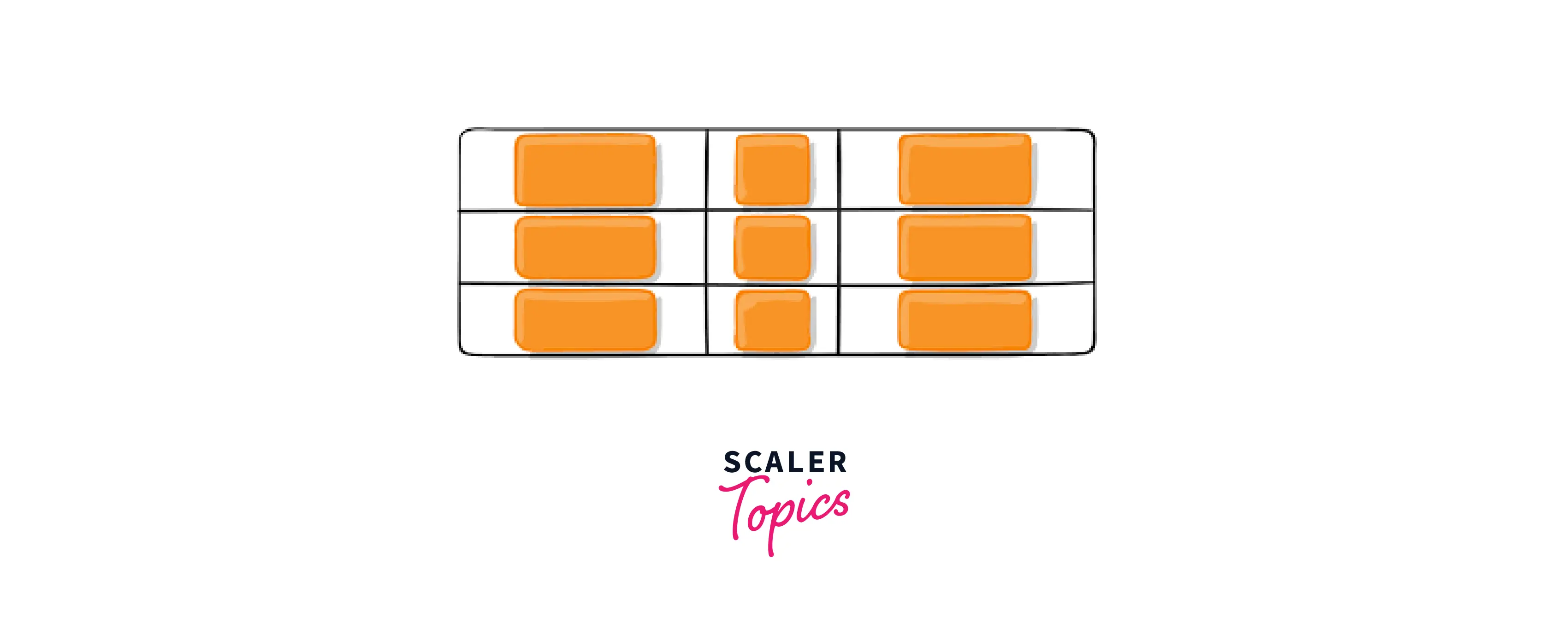
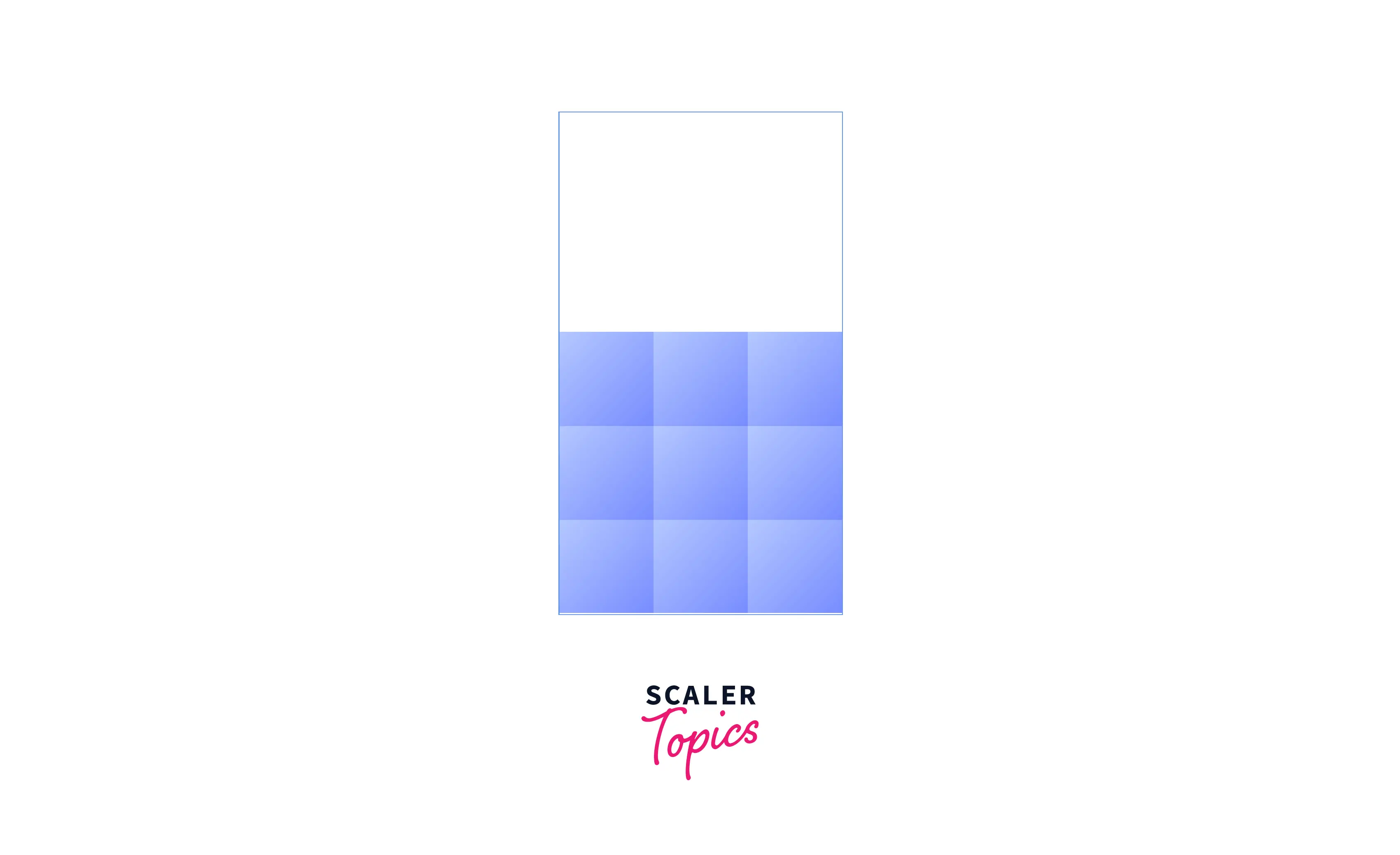
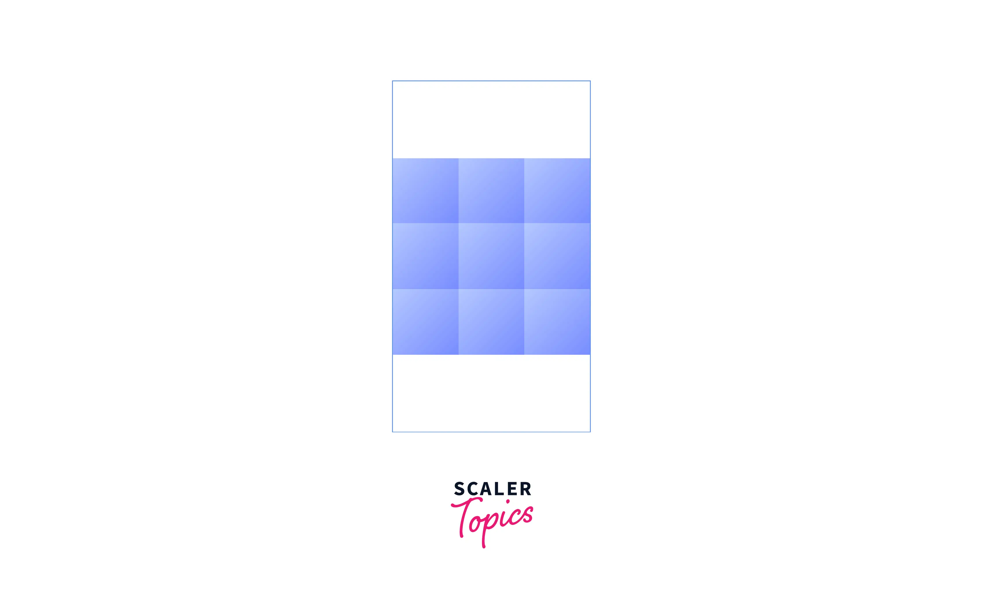
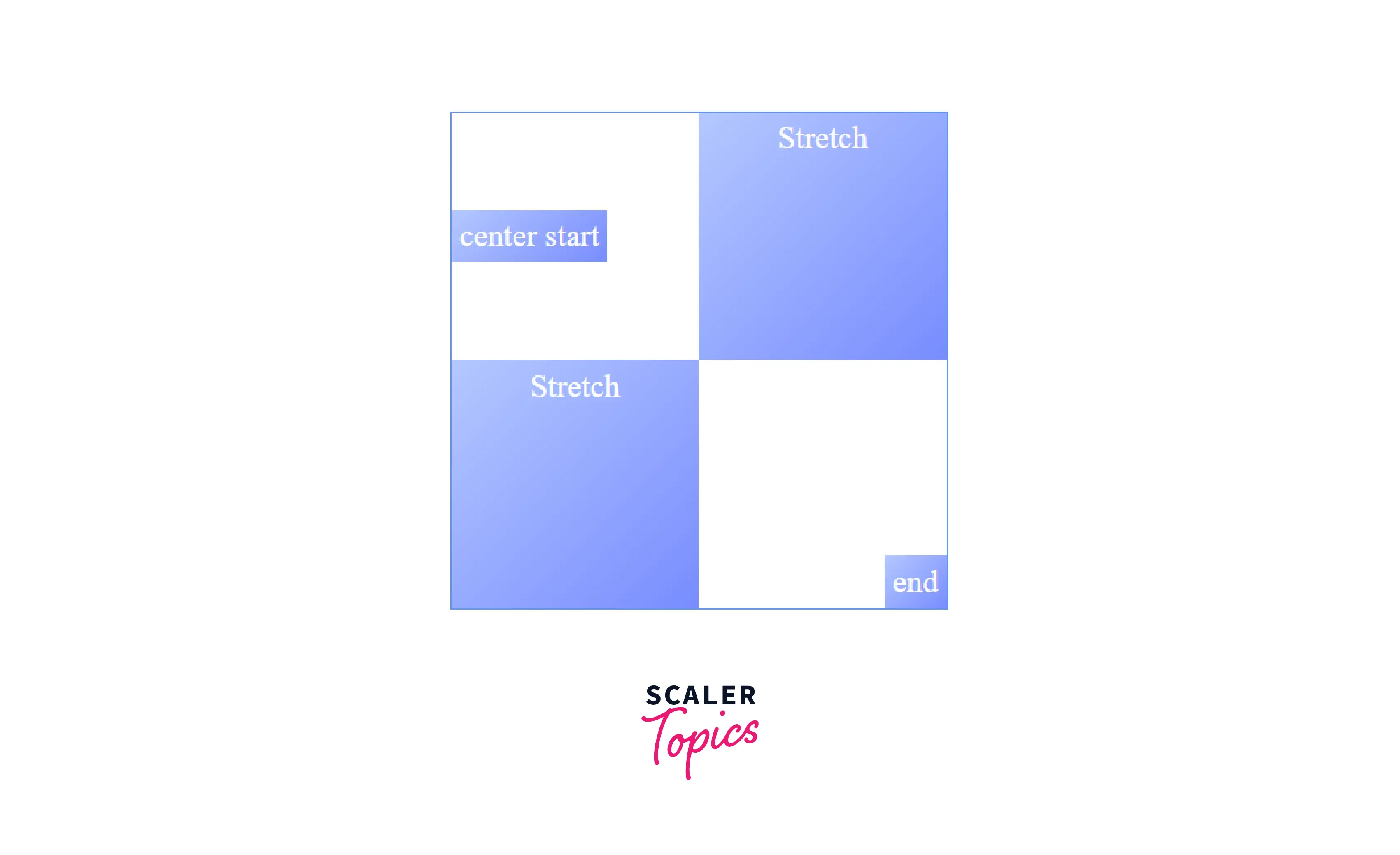
CSS place-items
The place-items property of CSS specifies the vertical and horizontal alignment of grid items in the grid cell. It is a shorthand property for setting align-items and justify-items properties in a single declaration.
If a single value is specified, that value is set for both align-items and justify-items properties. If two values are specified, the first value is set for the align-items property and the second value is set for the justify-items property.
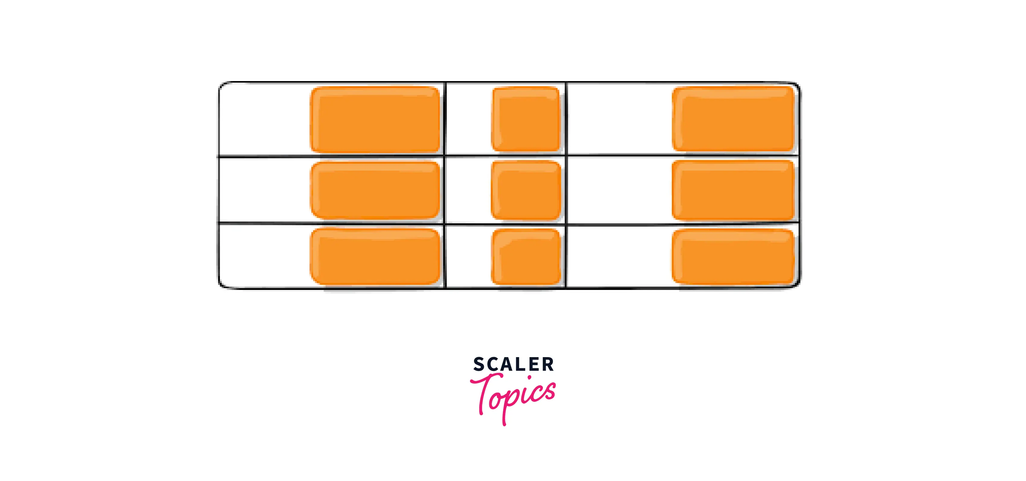
The grid items are placed vertically at the center and horizontally towards the end edge of their cells.
CSS justify-content
The justify-content property of CSS aligns the entire grid along the row (inline) axis. This happens only when the total size of the grid might be less than the size of its grid container. The possible values are
- start: The entire grid is aligned horizontally towards the starting (left) edge of the grid container.
- end: The entire grid is aligned horizontally towards the ending (right) edge of the grid container.
- center: The entire grid is aligned horizontally in the center of the grid container.
- space-between: The entire grid is distributed in such a way that the column tracks will have space between them. The first and last columns will be pinned toward the left and right edges of the grid container.
- space-around: The entire grid is distributed in such a way that the column tracks will have space before, between, and after them. The empty space before the first and after the last column equals half of the space between each pair of adjacent columns.
- space-evenly: The entire grid is distributed in such a way that the column tracks will have equal space around them. The space between each pair of adjacent columns, as well as the space before the first column and after the last column, are all exactly the same.
CSS align-content
The align-content property of CSS aligns the entire grid along the column (block) axis. This happens only when the total size of the grid might be less than the size of its grid container. The possible values are:
- start: The entire grid is aligned vertically towards the top edge of the grid container.
- end: The entire grid is aligned vertically towards the bottom edge of the grid container.
- center: The entire grid is aligned vertically in the center of the grid container.
- space-between: The entire grid is distributed in such a way that the row tracks will have space between them. The first and last rows will be pinned toward the top and bottom edges of the grid.
- space-around: The entire grid is distributed in such a way that the row tracks will have space before, between, and after them. The empty space before the first and after the last row equals half of the space between each pair of adjacent rows.
space-evenly: The entire grid is distributed in such a way that the row tracks will have equal space around them. The space between each pair of adjacent rows, as well as the space before the first row and after the last row, are all exactly the same.
CSS place-content
The place-content property of CSS specifies the vertical and horizontal alignment of the entire grid. It is a shorthand property for setting align-content and justify-content properties in a single declaration.
If a single value is specified, that value is set for both align-content and justify-content properties. If two values are specified, the first value is set for the align-content property and the second value is set for the justify-content property.
The entire grid is placed vertically at the center and horizontally spaced out such that the column tracks will have space between them.
CSS grid-auto-columns
The grid-auto-columns property of CSS specifies the width of the column tracks of an implicitly-created grid. When there are more grid items than cells in the grid, or when a grid item is placed outside the explicit grid, implicit grid tracks get created. The values can be a length, a percentage, or a fraction of the free space in the grid (using the fr unit).
Turn Learning into Career Growth
CSS grid-auto-rows
The grid-auto-rows property of CSS specifies the height of the row tracks of an implicitly-created grid. The values can be a length, a percentage, or a fraction of the free space in the grid (using the fr unit).
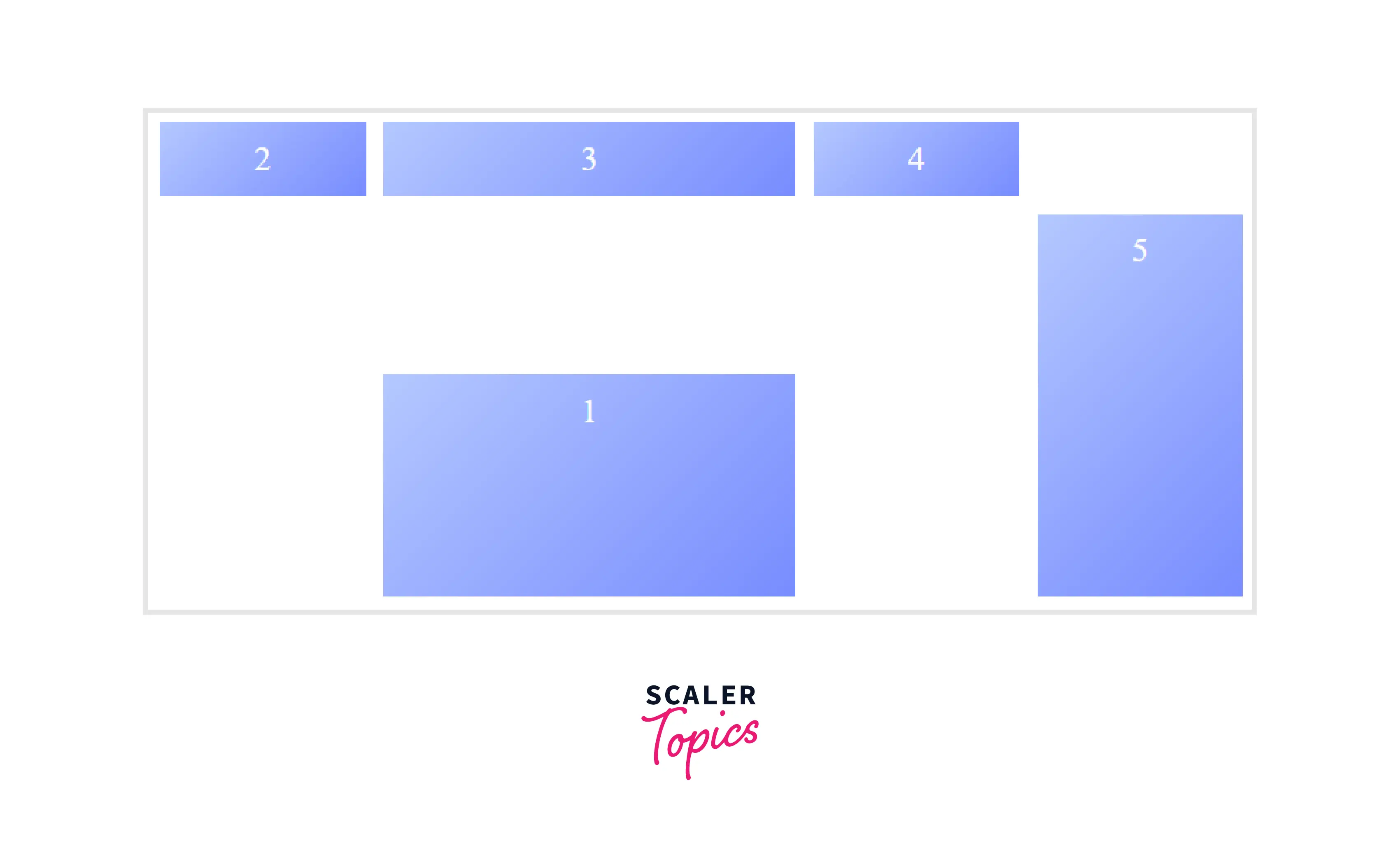
In the following example, we have created six boxes and placed box 3 and box 6 out of the explicit grid i.e. 2x2 grid, this results in the creation of implicit grid tracks. With the help of grid-auto-rows and grid-auto-columns properties, we will specify the size of implicit grid tracks.
HTML
After the execution of the above code, the output will look like this:
Takeaway:
- The rows and columns of an implicit grid are defined using grid-auto-columns or grid-auto-rows properties.
CSS grid-auto-flow
If you have grid items that you don’t explicitly place on the grid, the auto-placement algorithm takes over and places the items for you. The grid-auto-flow property of CSS controls how the auto-placement algorithm works, specifying exactly how auto-placed items flow into the grid. The possible values are:
- row: Items are placed by filling each row.
- column: Items are placed by filling each column.
- dense: Items are placed by filling holes in the grid.
- row dense: Items are placed by filling each row and holes in the grid.
- column dense: Items are placed by filling each column and holes in the grid.
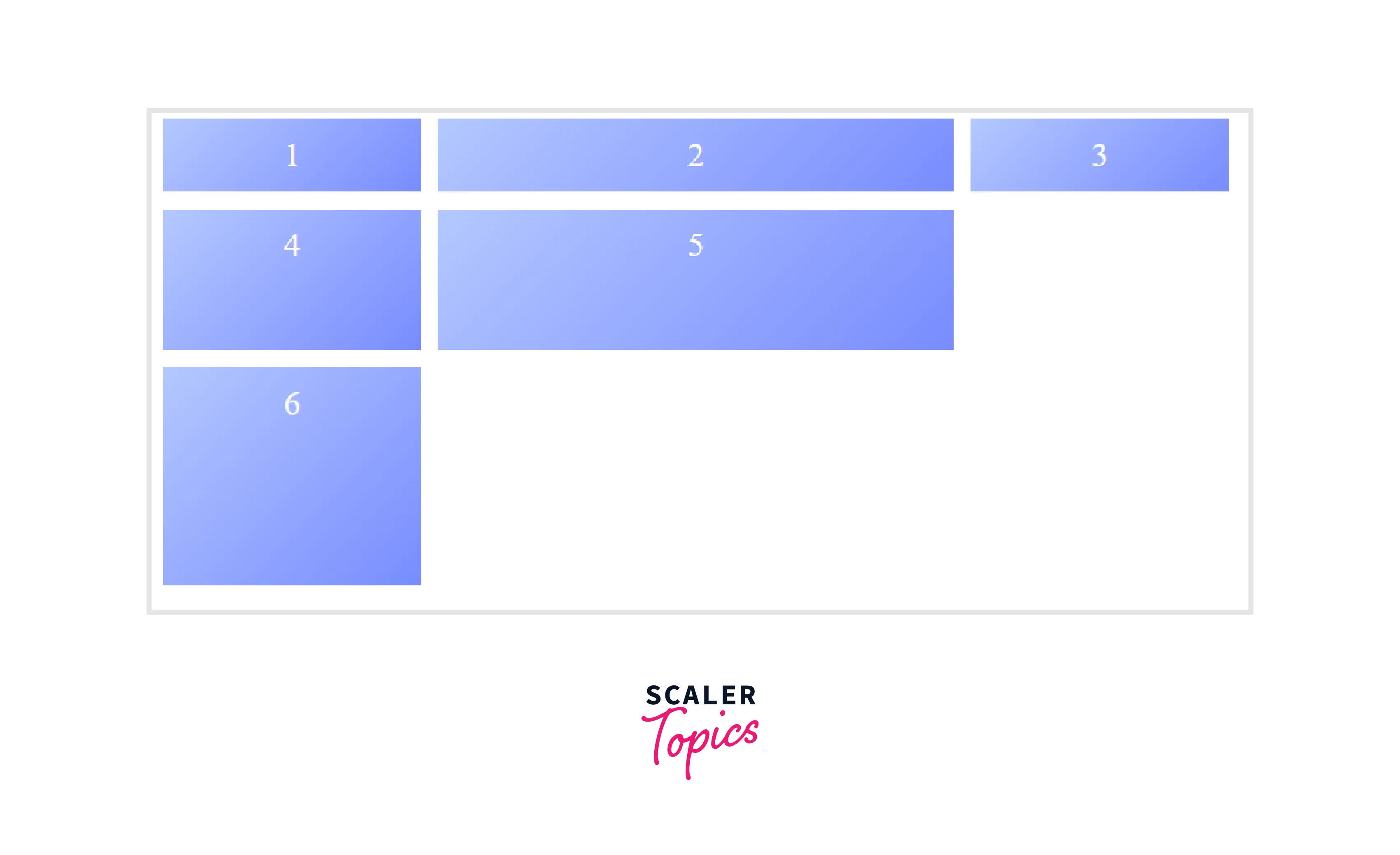
In the following example, we have created five boxes and assigned positions to only two boxes. The remaining three boxes will be placed using the auto-placement algorithm.
Here, set the grid-auto flow to row, and the remaining boxes will be placed by filling each row.
HTML
After the execution of the above code, the output will look like this:
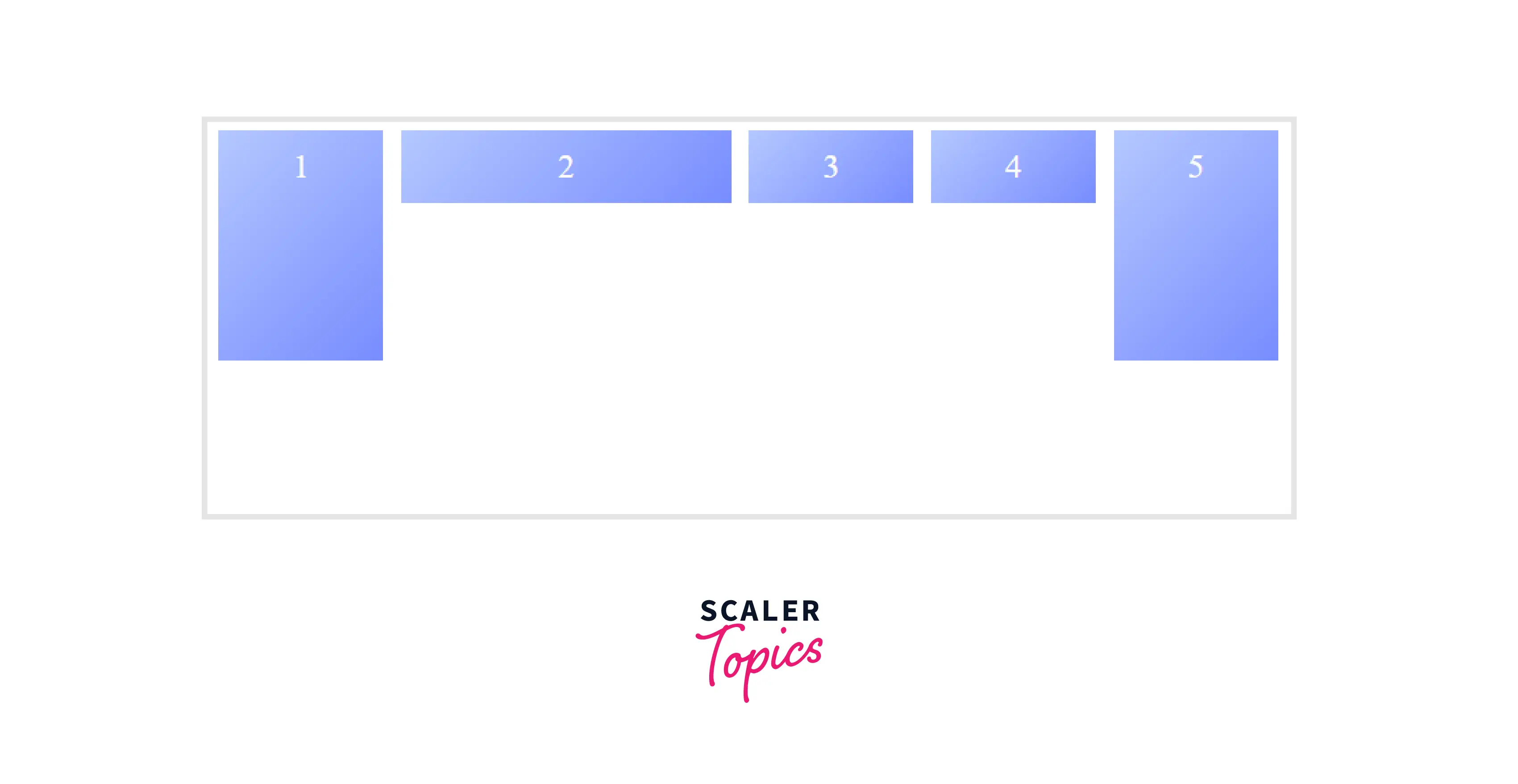
Change the value of grid-auto-flow to column, you’ll see the items are placed by filling each column, as shown in the graphic below.

Takeaway:
- The default value of the grid-auto-flow property is row. In other words, the flow (direction) for the grid items to be filled in is a row.
CSS grid
The grid property of CSS is a shorthand property for setting grid-auto-columns, grid-auto-flow, grid-auto-rows, grid-template-areas, grid-template-columns, and grid-template-rows in a single declaration. The possible values are:
- <'grid-template'> : Defines the grid-template including grid-template-columns, grid-template-rows and grid-template-areas.
- <'grid-template-rows'> / [ auto-flow && dense? ] <'grid-auto-columns'>? : Sets grid-template-rows and grid-template-columns to the specified values, respectively, and grid-auto-flow to column. All other grid sub-properties are reset to their initial values.
- [ auto-flow && dense? ] <'grid-auto-rows'>? / <'grid-template-columns'> : Sets grid-template-rows and grid-template-columns to the specified values, respectively, and grid-auto-flow to row. All other grid sub-properties are reset to their initial values.
CSS Grid Properties for the Children (Grid Items)
CSS grid-column-start
The grid-column-start property of CSS specifies which column line the grid item will start.
Syntax:
grid-column-start: auto | span n | column-line;
The values can be:
- auto: It has no effect on the position of the grid item, indicating auto-placement, an automatic span, or a default span of 1.
- span n: The item will span n number of columns. If the <integer> n is omitted, it defaults to 1. Negative integers and 0 are invalid.
- column-line: The item will start from that column line. If a negative integer is given, it instead counts in reverse, starting from the end edge of the explicit grid.
Example:
CSS grid-column-end
The grid-column-end property of CSS specifies which column line the grid item will end, or the number of columns the item will span. The values can be a column-line, span <integer>, or an auto keyword.
Syntax:
Example:
CSS grid-row-start
The grid-row-start property of CSS specifies which row line the grid item will start.
Syntax:
The values can be:
- auto: It has no effect on the position of the grid item, indicating auto-placement, an automatic span, or a default span of 1.
- span n: The item will span n number of rows. If the <integer> n is omitted, it defaults to 1. Negative integers and 0 are invalid.
- row-line : The item will start from that row line. If a negative integer is given, it instead counts in reverse, starting from the end edge of the explicit grid.
Example:
CSS grid-row-end
The grid-row-end property of CSS specifies which row line the grid item will end, or the number of rows the item will span. The values can be a row-line, span <integer>, or an auto keyword.
Syntax:
Example:
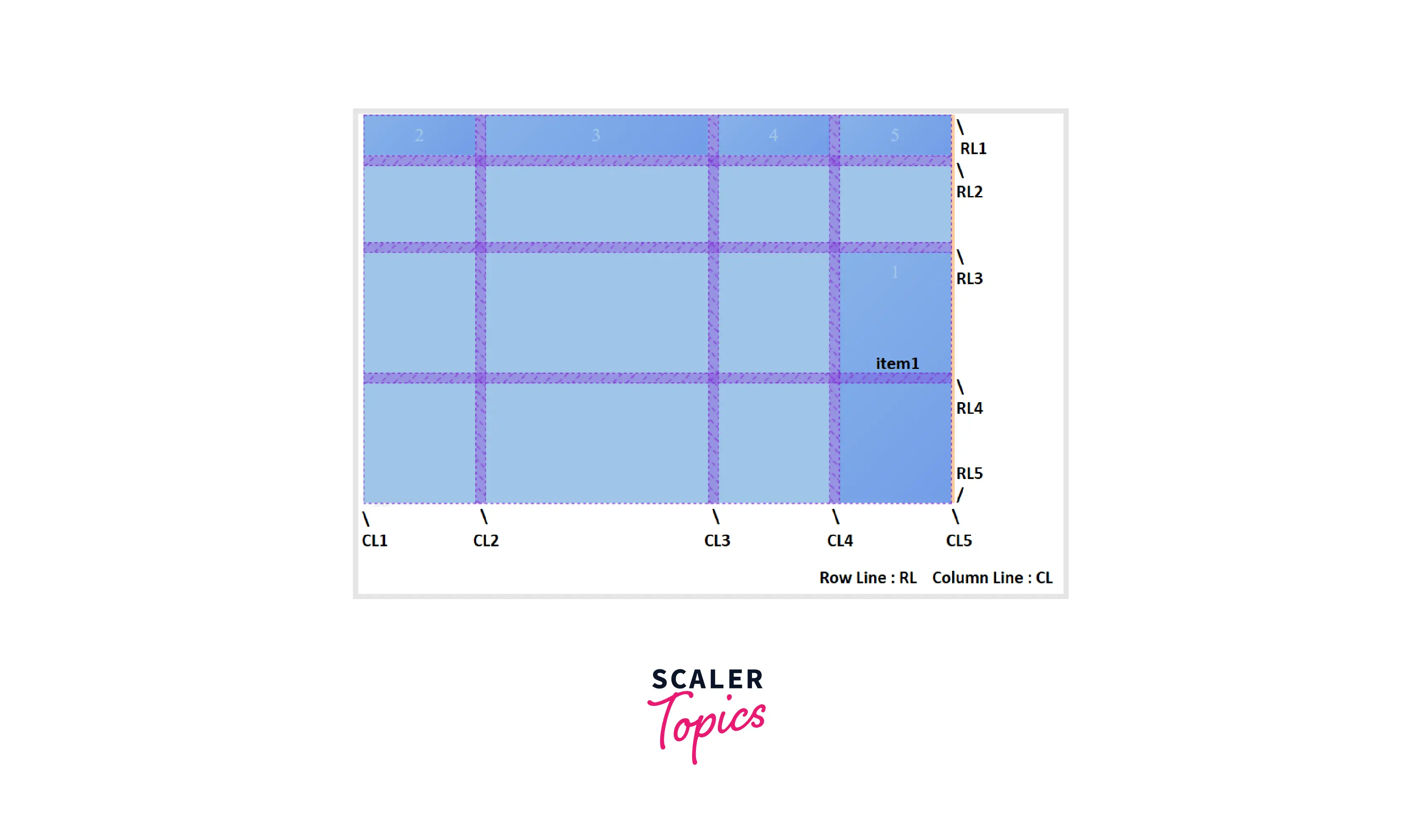
As shown in the following example, one can place items using the above properties.
CSS
To build the above grid, use the HTML code below:
After the execution of the above code, the output will look like this:
CSS grid-column
The grid-column property of CSS is a shorthand property for setting grid-column-start and grid-column-end properties in a single declaration. It specifies on which column line the grid item will start and end.
Syntax:
grid-column: grid-column-start / grid-column-end;
CSS grid-row
The grid-row property of CSS is a shorthand property for setting *grid-row-start *and grid-row-end properties in a single declaration. It specifies on which row line the grid item will start and end.
Syntax:
grid-row: grid-row-start / grid-row-end;
CSS grid-area
The grid-area property of CSS is a shorthand property for setting grid-row-start, grid-column-start, grid-row-end, and grid-column-end properties in a single declaration. It is also used to specify the names of the grid items.
Syntax:
grid-area: grid-row-start / grid-column-start / grid-row-end / grid-column-end;
CSS
CSS justify-self
The justify-self property of CSS aligns a grid item inside a cell along the row (inline) axis. This property applies to a grid item inside a single cell and can also be used to override any container-level alignment.
CSS
CSS align-self
The align-self property of CSS aligns a grid item inside a cell along the column (block) axis. This property applies to a grid item inside a single cell and can also be used to override any container-level alignment.
CSS
CSS place-self
The place-self property of CSS allows you to align a grid item inside the cell, both vertically and horizontally. It is a shorthand property for setting align-self and justify-self properties in a single declaration.
If a single value is specified, that value is set for both align-self and justify-self properties. If two values are specified, the first value is set for the align-self property and the second value is set for the justify-self property.
CSS
Conclusion
- The CSS Grid Layout introduces a two-dimensional layout system to CSS.
- The grid layout contains an auto-placement algorithm to place those items whose position is not explicitly defined on the grid.
- Grid contains alignment features that allow us to control how the items align once they've been placed in a grid area (such as justify-items and align-items), as well as how the entire grid is aligned (such as justify-content and align-content).
- In the grid layout, more than one grid item can be placed on the same cell, and they can partially overlap each other. It can be done using the z-index property or grid-column and grid-row properties.
 Google
 Amazon
 Microsoft
 Flipkart
 Adobe1200+ more