CSS Grid vs Flexbox
 FREE
FREE

Overview
CSS Flexbox and CSS Grids are the two current mainstream tools for layout elements on the web pages. These allow us to create complex and responsive layouts that were previously only possible with some CSS hacks like position, float, etc, or JavaScript. CSS Flexbox has become extremely popular for front-end developers as it has made it a lot easier to create dynamic layouts and align the content on the webpages.
However, there are newer ways to create the layouts like CSS Grids, which also have the capability to layout the elements and align the content on the webpage and in some cases, it is better to use CSS Grids than to use Flexbox but still, flexbox is also widely used.
Now you must be thinking about when to use Flexbox and when to use Grids as both shares multiple similarities and many layouts can be solved using both tools. Also, there have been many debates on using a particular method for a specific use case but there is not a straight answer of when to use what. So in this article, you'll get to learn and understand why and where to use CSS grids and flexbox according to the project and design requirements.
Transform Your Career
Choose from our industry-leading programs designed for career success
Modern Software and AI Engineering Program
Master full-stack development with AI integration

 +1000 more
Modern Data Science and ML with specialisation in AI
Advanced data science techniques with AI specialization
+1000 moreAdvanced AIML with Specialisation in Agentic AI
Deep dive into AIML with focus on Agentic systems
+1000 moreDevOps, Cloud & AI Platform Engineering
Build and manage AI-powered cloud infrastructure
+1000 moreAI Engineering Advanced Certification by IIT-Roorkee
Premier AI engineering certification from IIT-Roorkee
How Does the CSS Flexbox Layout Work?
CSS Flexbox, a new layout system introduced in 2009 which helps to build responsive web pages and layouts easily. Since its release, it is considered to be the main layout system for modern web pages.
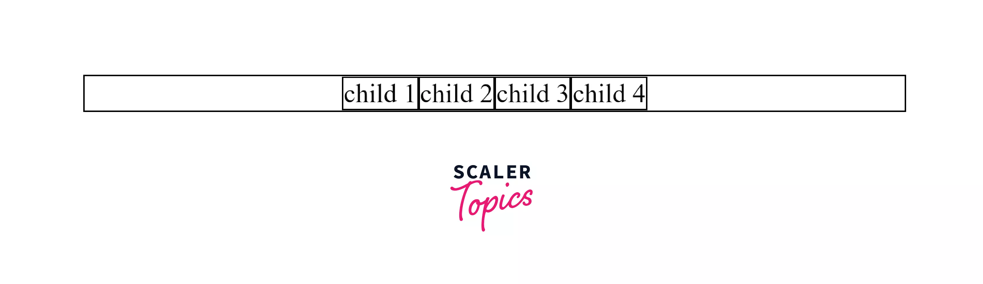
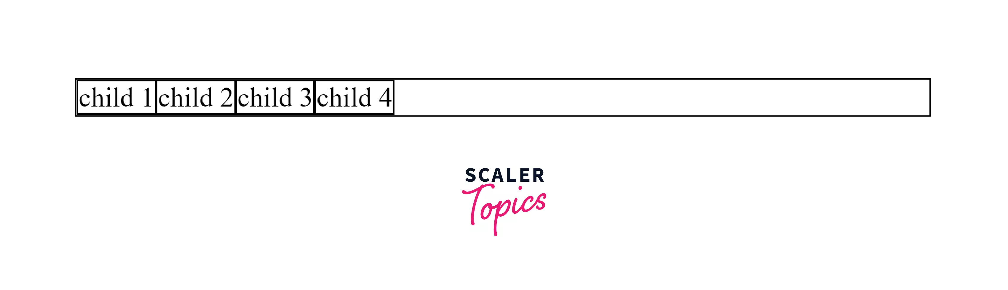
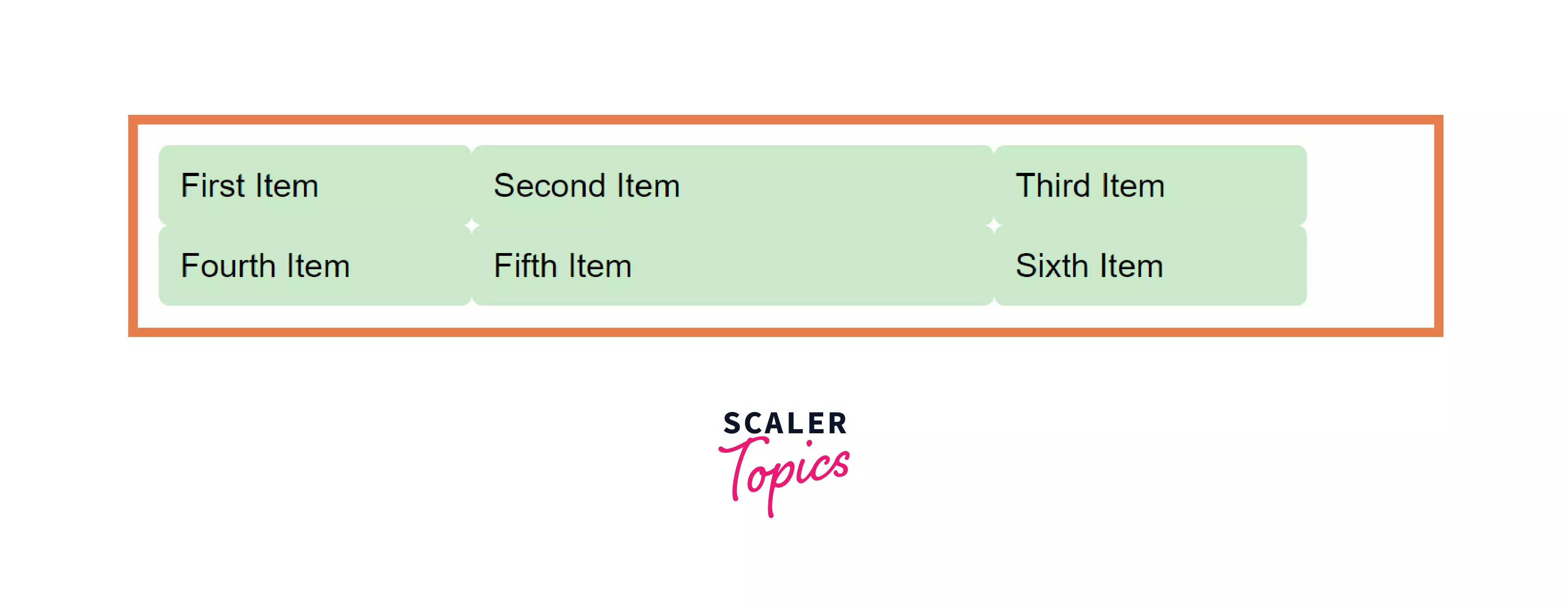
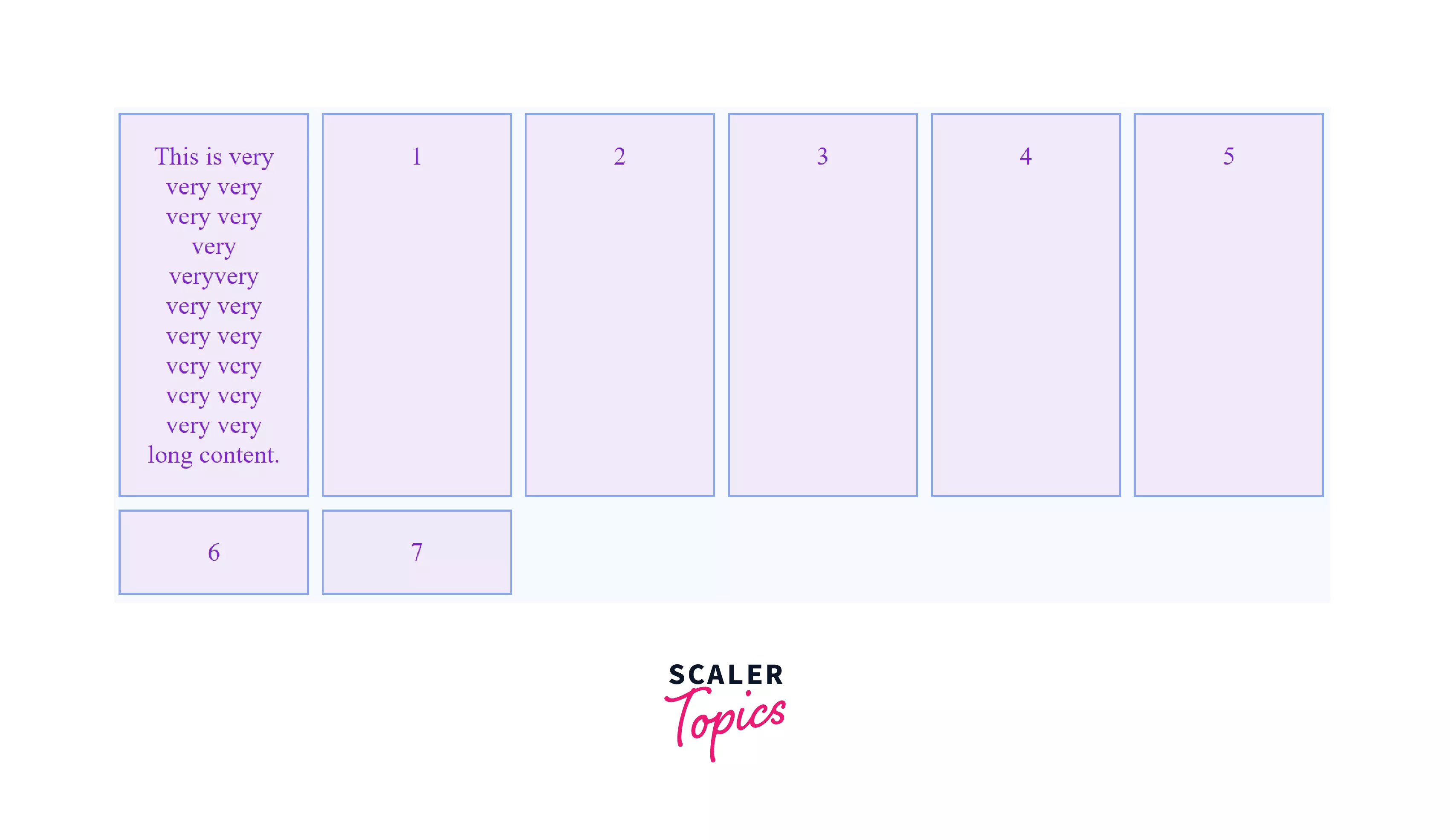
Flexbox has a one-dimensional layout which means when you want to stack the elements in one direction only i.e. either in rows or in columns then you should use Flexbox to easily layout the content on the webpages. Flexbox is not designed to support both the rows and columns alignment at the same time. The image shown below represents how the elements can be arranged inside a container using flexbox and also note how the elements are stacked in rows only.
To use Flexbox, you need to create a parent container and this container will be your flex container. To define a flex container you can use the below CSS in your parent container.
Here, according to CSS display module by w3.org, each value of the display property is described as a combination of two things i.e. an outer display model and an inner display model.
As shown above, when you add display: flex; it really means that display: block flex;. The outer display type of the parent container/flex container is block and hence it acts as a block-level element in normal flow whereas the display type of inner elements is flex i.e. the items inside the parent container or child elements have the display type of flex. Hence, if you have any element, or let's say a paragraph followed by a flex container then it'll flow to the next line as both(flex container and paragraph element) are block-level elements.
As shown in the example below, display: flex is applied to the parent div having class parent-container. Here, the display: flex means the parent container will act as a block-level element whereas the children of this parent container are flex items and not the block-level items.
The flexbox display property can either be set to inline-flex or flex.
Example:
HTML
CSS
The output of the above code is:
You can also define the parent container with the value of display: inline flex; i.e. this is a flex container that acts like an inline-level element and the child elements are the flex items. The children of the inline-flex container behave in the same way as that the child elements of the flex container.
Note: display: inline-flex just makes the parent container inline, not the items inside the container.
Example:
HTML
CSS
The output of the above code is:
After defining the flex container some initial values come into play. The flex items inside the flex container display as rows by default. This is because the initial value of CSS property flex-direction is row. This CSS property sets the direction of the main axis, and we call the direction opposite to the main axis as cross axis. Other values of the flex-direction are: column, row-reverse, column-reverse.
The row and column values are self-explanatory i.e. they put the items either in the rows or columns.
How Does the CSS Grid Layout Work?
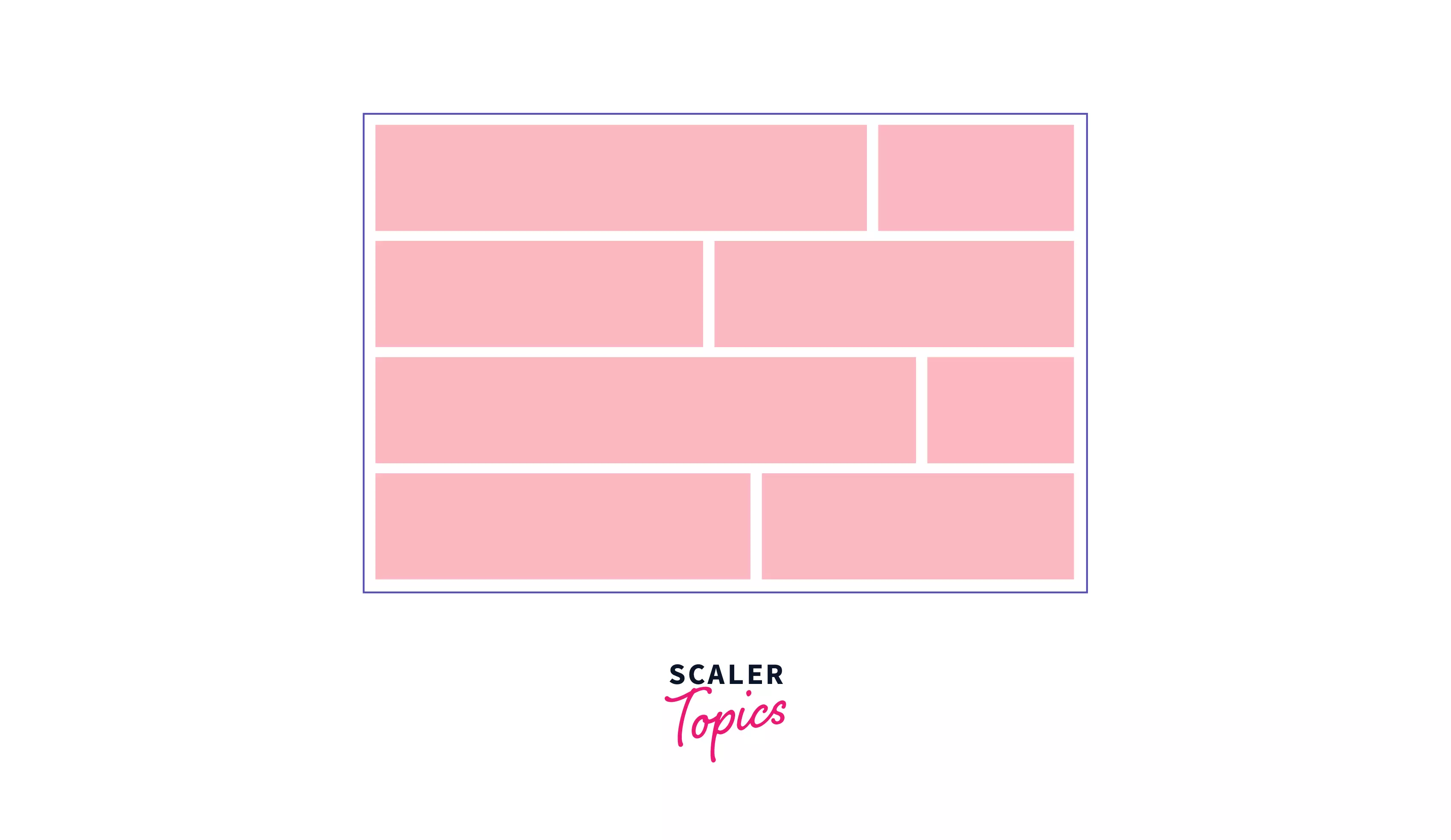
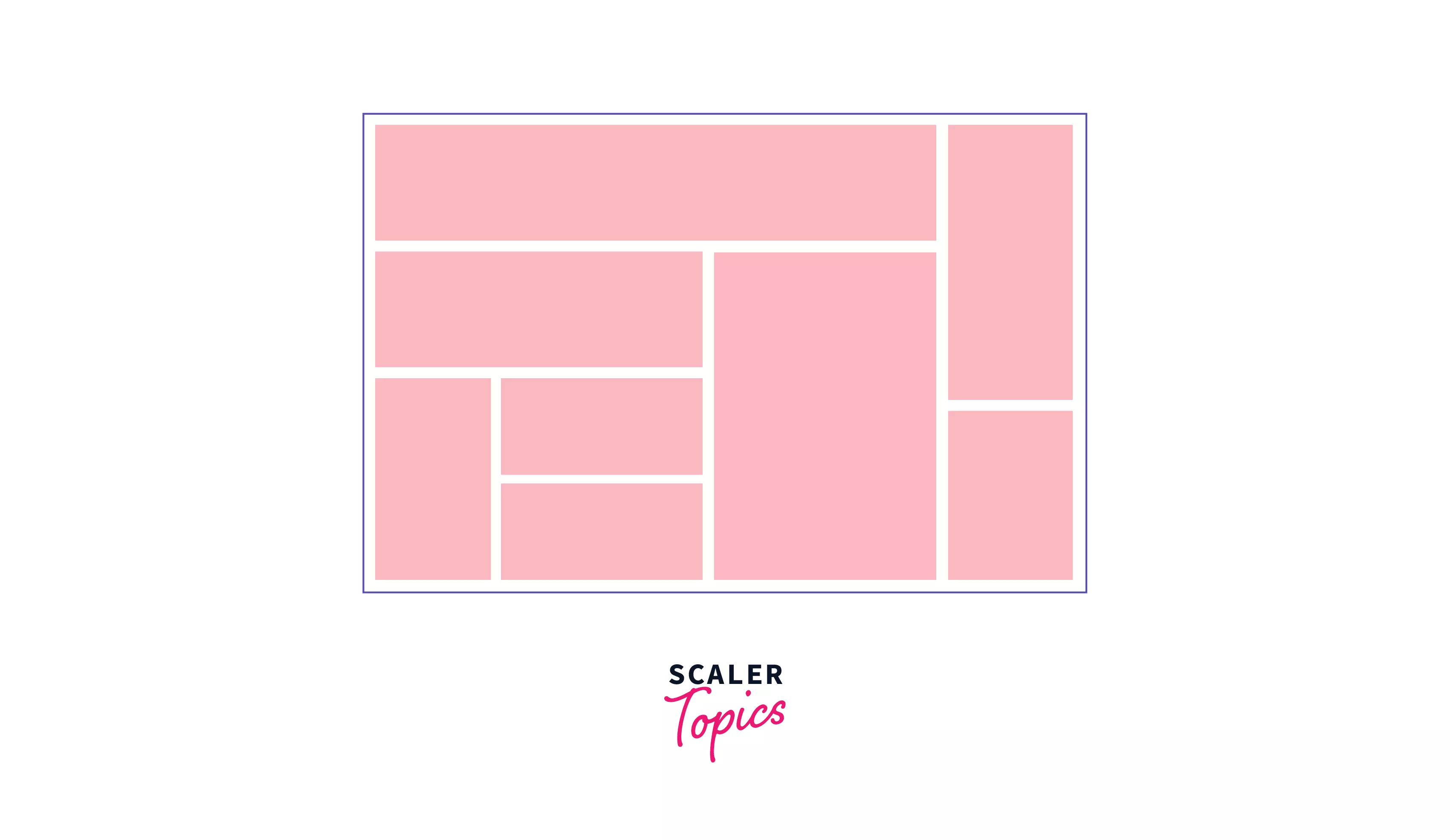
CSS Grids are used to create two-dimensional layouts on the webpage. If you want to use the grid layout in your web pages, you have to specify to the browser by setting the value of the display property to grid i.e. display: grid. Like Flexbox, the browser will create a block-level container that has the property display: grid and the children of that container will take part in grid formatting. That means all the child elements behave like grid items rather than block or inline-level elements. Also, the grids are used for the two-dimensional layout of the elements i.e. the elements or components can be arranged in rows and columns.
The below image shows how the elements can be arranged in a grid layout.
Consider an example that contains 3 div items i.e. 3 block-level elements, a string with a span(an inline element), and again a string outside the div container as shown below.
Example:
HTML:
CSS:
The output of the above code snippet is shown below:
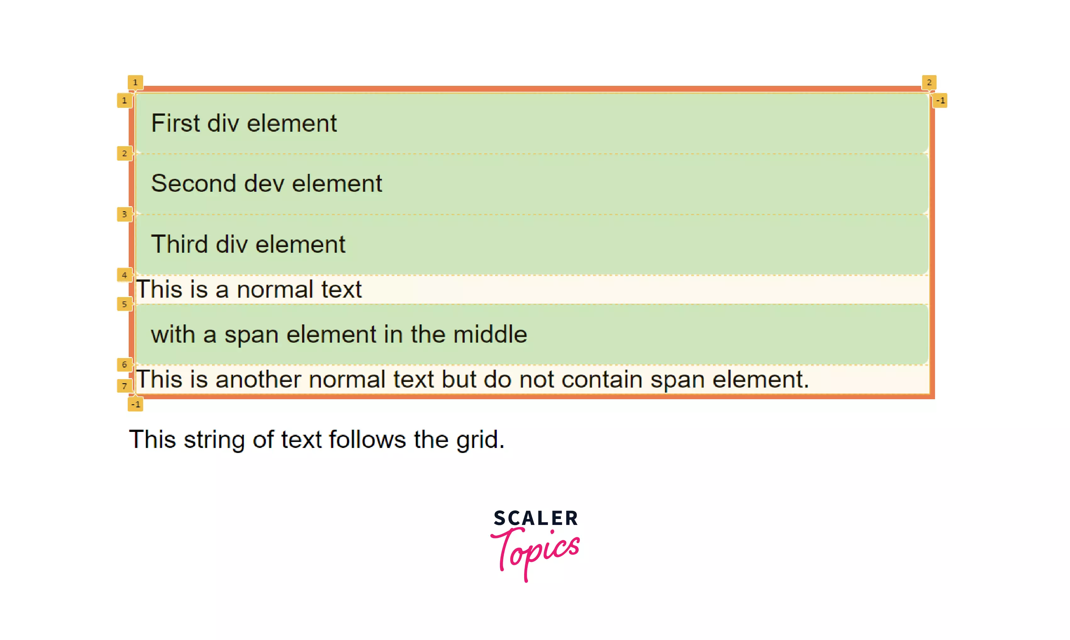
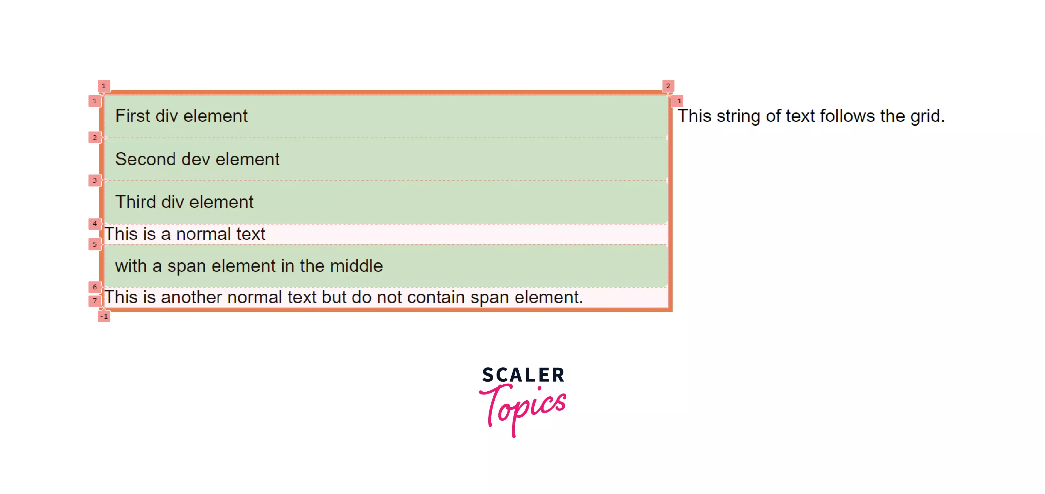
If you inspect the grid using Grid Inspector in any of the browsers, you can see the numbers have been created and these are rows that have been created for the items that belong to the grid container. You can also create an inline-grid by using display: inline-grid;. In this case, the grid container acts as an inline-level box. However, the children inside the grid container anyways behave the same way as grid items inside the block-level container.
Consider an example that demonstrates how you can create the inline-grid container with the child elements.
Example:
HTML:
CSS:
The output of the above code snippet is shown below:
Although the above outputs are a grid-like structure but these do not look like one. So, to create a grid-like structure, we'll need to add columns and rows. To create columns and rows, grid-template-columns and grid-template-rows properties are used.
HTML:
CSS:
The output of the above code snippet is shown below:
Uniqueness in Grid and Flexbox:
The CSS Grid vs Flexbox is a unique layout method in their places and there are some important points that you should consider while applying any of these methods in your project.
The most important thing you should know about Flexbox is that it is one-dimensional. When the Flexbox was released, the developers thought that this was the best possible solution to create and layout the elements on the web pages, but that's not the case. Because the main idea of a one-dimensional system does not make sense when you want to build large and complex layout designs.
-
One vs Two-dimension
The most important point to consider is that Flexbox is one-dimensional i.e. we can only control how elements are placed on the single axis (main axis or cross-axis). Although you can expand the layout by setting the wrap property still we have no control over how the elements are placed along the second axis.
On the other hand, a grid is a two-dimensional layout system i.e. CSS Grids let you work along two axes: vertically and horizontally. And in a grid system, you can precisely place grid elements into cells i.e. rows and columns.
-
Content-First vs Layout-First
Flexbox allows content to control layout on a column by column or row basis. This makes it ideal for flexbox for small layouts and components. Consider an example of a header where you may require some items to be left-aligned and some items to be right-aligned, this can be easily done by flexbox. Also, if there is any free space you can easily shrink or expand the element sizes.
As shown in the above example, flexbox focuses more on content flow rather than content placement.
On the other hand, CSS Grids are used to lay out the whole component on the webpage. With the CSS grid, the elements are placed in the cells defined by the grid. Let's take the above example of the header again. If you want to place the items inside the header you would need to define specific grid areas for the header items. This sounds similar to using flexbox.
But what if you wanted to add another item to the header?
You would definitely need to add a new grid area. So this is where the flexbox is more powerful while creating dynamic content.
As you can see in the example above, the content inside the grid items does not stretch out, hence grids are more focussed on content placement.
Hence, CSS Grids are best suited for creating overall components and are best suitable for precise content placement whereas CSS Flexbox is best suited to layout the elements inside the bigger components and with the flexbox, it's hard to predict the behavior at certain viewports and you can get surprising results.
Turn Learning into Career Growth
Difference Between Grid and Flexbox:
The difference between CSS Grids vs CSS Flexbox is mentioned below:
-
Dimensionality and Flexibility
One of the most common differences between CSS Grid vs Flexbox is that CSS Flexbox is one-dimensional whereas CSS Grids is a two-dimensional model. The CSS Grids have been designed to do many things that Flexbox can't do and Flexbox is one of the best tools to do some layout things that Grids can't do.
For example, a flexbox can layout the elements either in a row or column i.e. horizontally or vertically but not both at the same time whereas grids can layout the components horizontally and vertically i.e. grid allows to place the elements on rows and columns simultaneously.
-
Alignment
CSS Flexbox allows you to organize elements horizontally in one direction or vertically in one direction. CSS Grids uses fractional measure for units for creating grid fluidity and also auto keyword functionality to adjust rows and columns according to your need.
There are things that can be achieved by the CSS Grids as well as Flexbox too. Though you need some practice to achieve the same result by using any of these methods. There is still one thing that Grids can do but the Flexbox cannot do. Flexbox cannot create overlapping items whereas this is possible with the CSS Grids.
-
Item Management
While applying CSS Flexbox, you set the parent container as the flex container while flex items represent the children. By doing this the flex container can ensure a balanced representation of its elements. This will allow developers to design for multiple screen sizes too. Whereas Grids support both implicit and explicit placement of the elements. The grids allow you to automatically extend line items and copy values into new creations from the preceding item.
For example, you may have seen in the news website or magazines that there are items that are intentionally overlapped to create some asymmetrical layout. This can only be achieved by CSS Grids and not with the Flexbox. Hence, Grids can help you to create asymmetrical layouts or overlapping layouts but Flexbox can't.
Advantages of Grid and Flexbox
- Less dependency on third-party libraries leads to reduced bloating of code and better readability.
- No need to depend on large libraries like bootstrap, hence smaller file size.
- Flex items can be laid out in any direction i.e. rightwards, leftwards, downwards, upwards.
- Rather than creating extra HTML elements to contain the grid, columns, and rows, the grids are created in a stylesheet that becomes easy and maintainable.
- Once you learn the basic syntax and know the in and outs of the CSS Grid vs flexbox, prototyping with these is fast and efficient.
Disadvantages of Grid and Flexbox
- Most major browsers support these, but they are still relatively new compared to the traditional box model.
- Flexbox is only limited in one direction, which can also be disadvantageous in some situations
- Flexbox may be simple, but more complex flexbox layouts can get complicated real quick. Complicated layouts are also quite messy to debug.
- Implementing complex grids can become quite confusing to learn, especially for beginners.
Conclusion
- The CSS Grids have been designed to do the things that Flexbox couldn't do and Flexbox is also one of the best tools to do some stuff that Grids couldn't do.
- The CSS Flexbox is a one-dimensional layout model whereas Grids is a two-dimensional model. To choose from CSS Grid vs flexbox becomes an important step in a project.
- A flexbox container can either facilitate laying out items in a row or in a column whereas a grid container can facilitate laying out items across and down at once.
- Flexbox is content-based and it adjusts according to the content whereas Grids works on layout level and it is container-based.
- Flexbox cannot intentionally overlap elements or items in a layout while grids help you create layouts with overlapping elements.
 Google
 Amazon
 Microsoft
 Flipkart
 Adobe1200+ more