CSS Grid
 FREE
FREE

Overview
CSS Grid is a layout system that makes designing web pages easier with the help of rows and columns. It uses rows and columns to lay out elements on the web page. It can be used to create a variety of different layout that ranges from simple like a table to complex like a layout of some magazine. It is one of the most powerful tools CSS has to offer.
What is CSS Grid?
CSS Grid is a two-dimensional layout system that completely changes designing web pages and makes them far easier compared to the previous systems like floats.
Elements are arranged in columns and rows much like a table and it also has a lot of customization options for every design. It also minimizes if not eliminates the use of floats which can be tedious to work with.
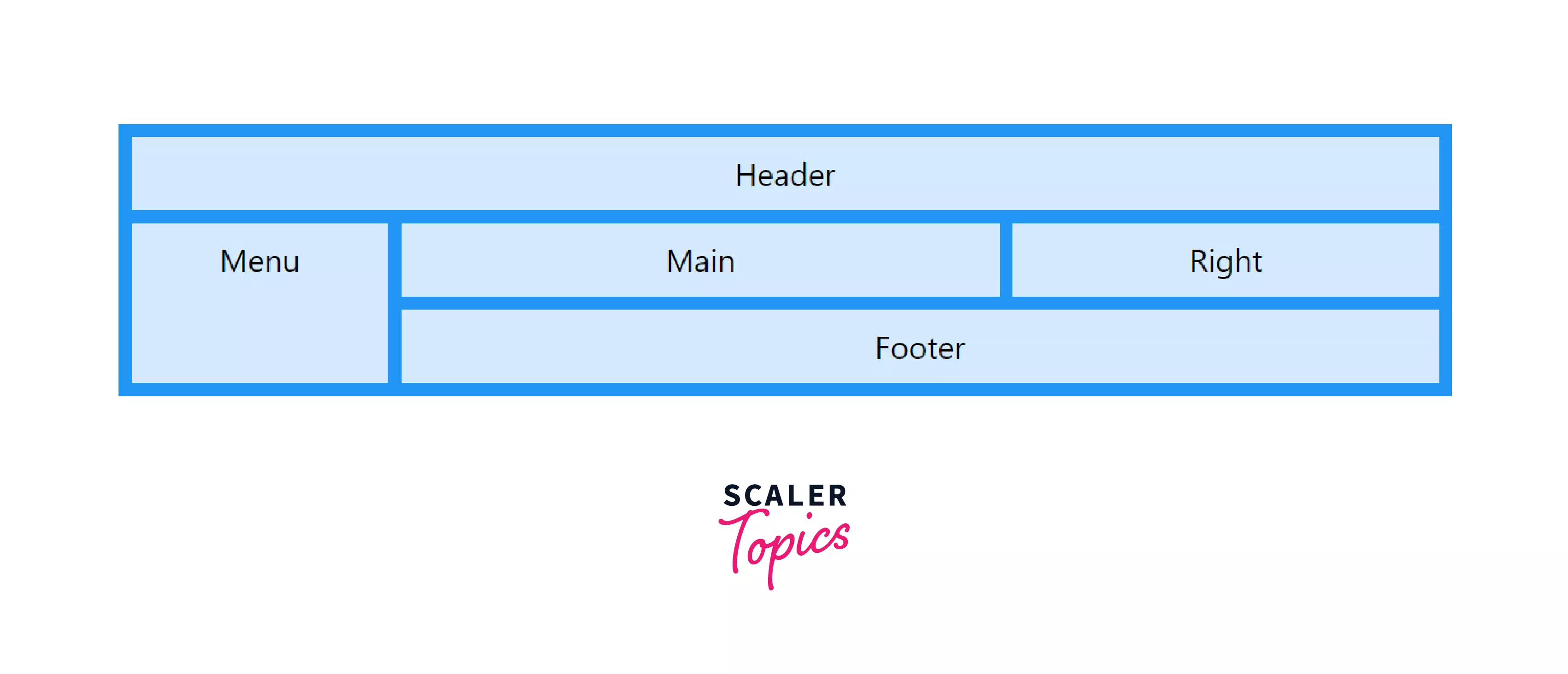
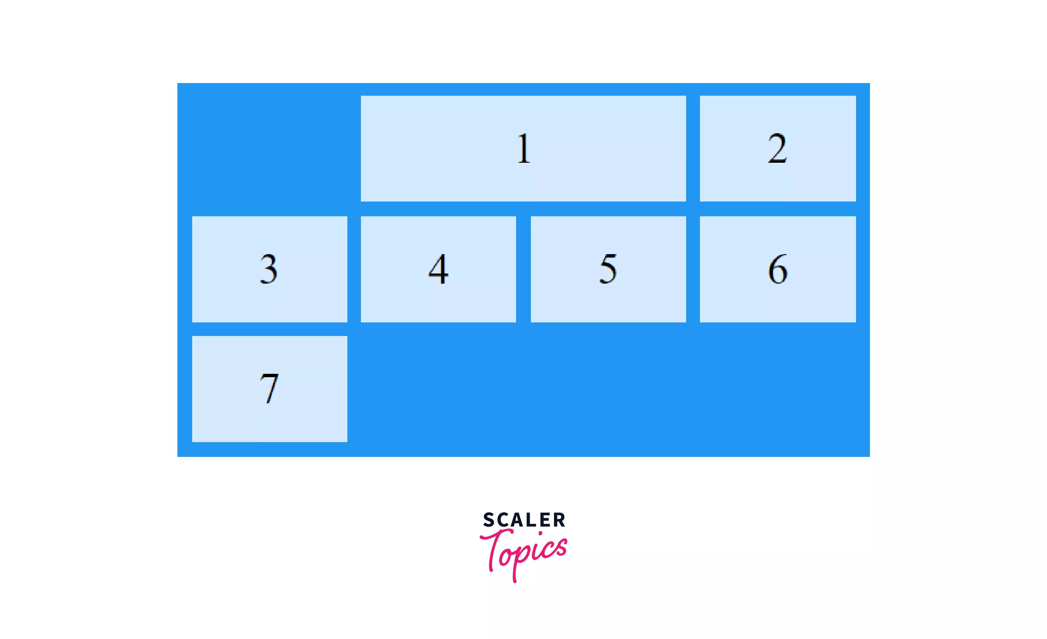
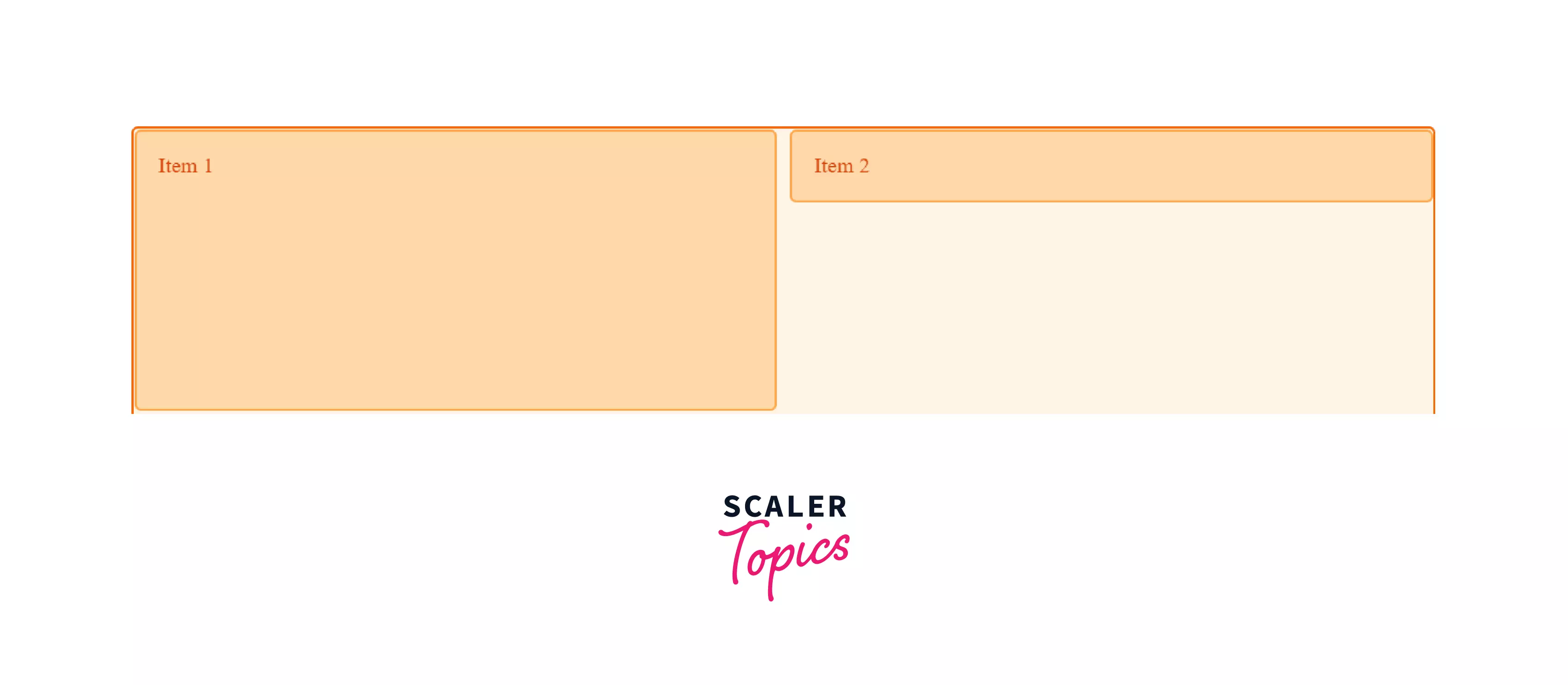
A CSS grid contains a parent usually referred to as a grid container and one or more child elements called grid items.
Here the outer box with dark blue color is the parent and all the elements like Menu, Header, Main, etc. are the children.
To create a CSS Grid all we have to do is set the display property of an element that we want to act as a parent to grid.
In doing this the .parent element becomes a grid container and every element which is a direct child of the grid container(here .parent) becomes an item in that grid or a grid item(here Header, Footer, Main, etc).
EXAMPLE:
HTML
CSS
This code will make the <div>, a grid container and <p> & <img> grid elements.
You might not see any effect of the grid property right now and that's okay.
In this article, we will learn everything about CSS Grids that will allow us to customize designs easily and effectively.
CSS Grid Concepts and Terminology.
Now that we know what a grid is, let’s start with some of the concepts that’ll help us understand CSS grids in a better way.
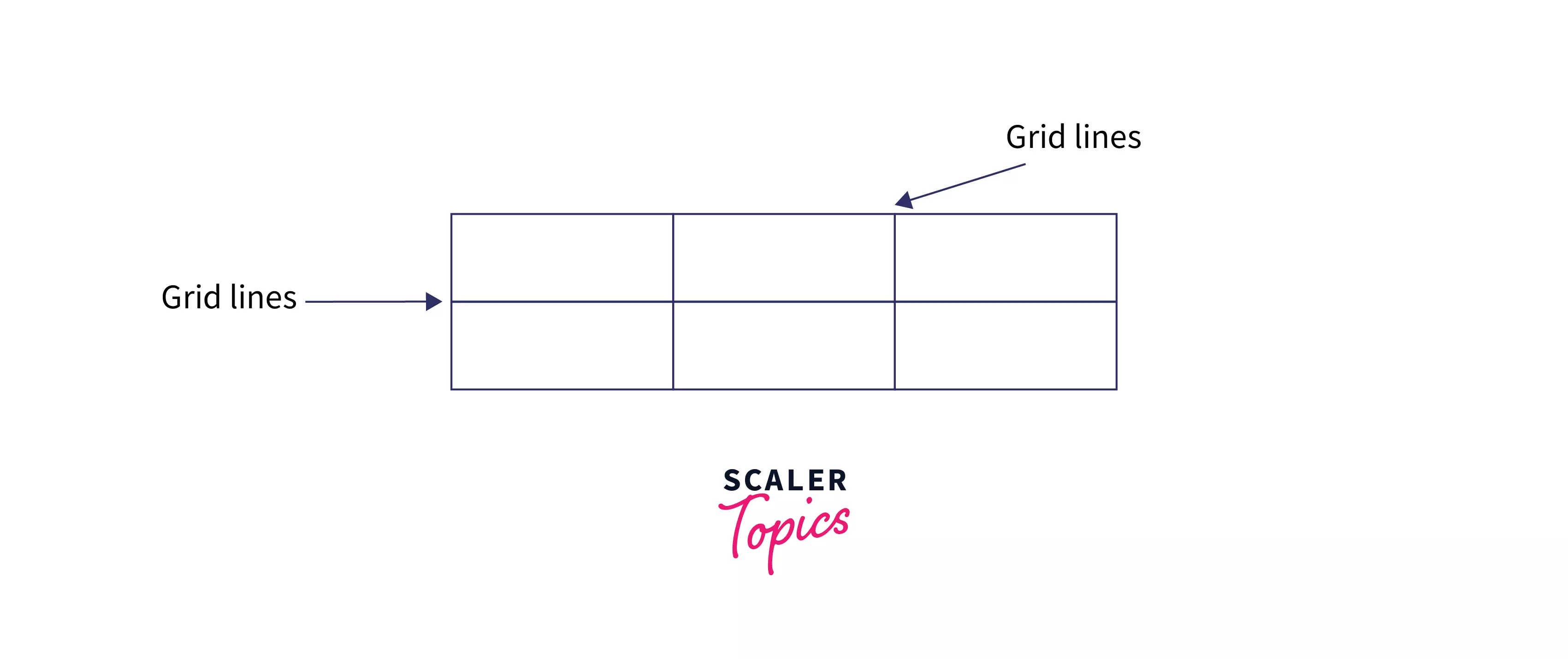
Grid Lines
Grid lines are horizontal and vertical lines that run through the entire CSS grid. These lines separate elements from one another. Imagine a table, then the lines that separate every row and column can be thought of as grid lines.
In the given image the lines that the arrows are pointing at are grid lines.
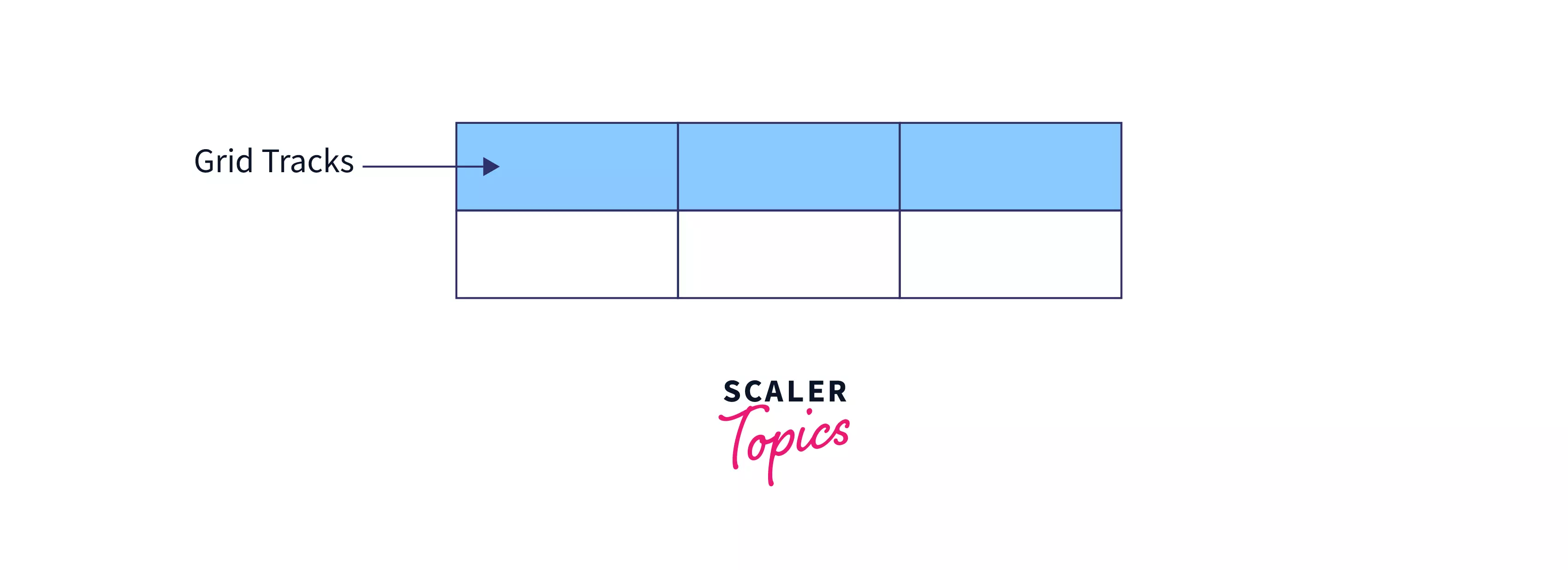
Grid Tracks
The space between any two consecutive grid lines is called a grid track. The lines could be both vertical or horizontal.
It is basically the space or the area between the lines.
In the image given below, the blue signifies a grid track.
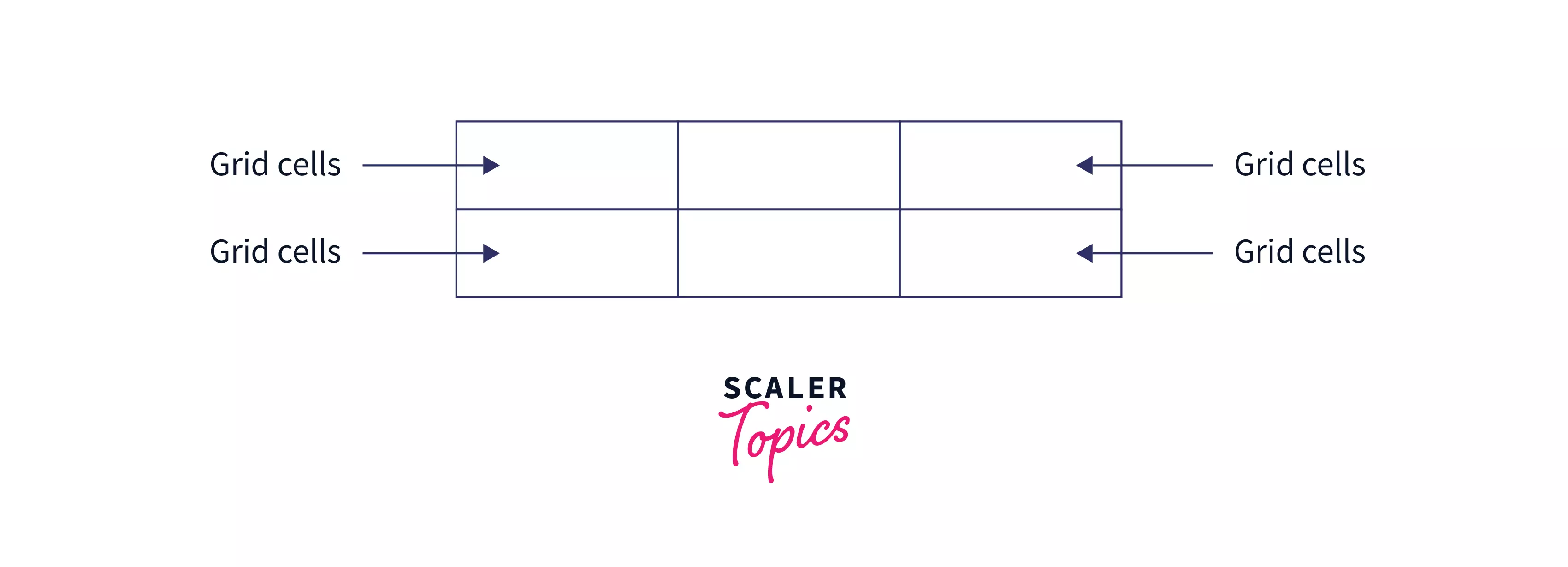
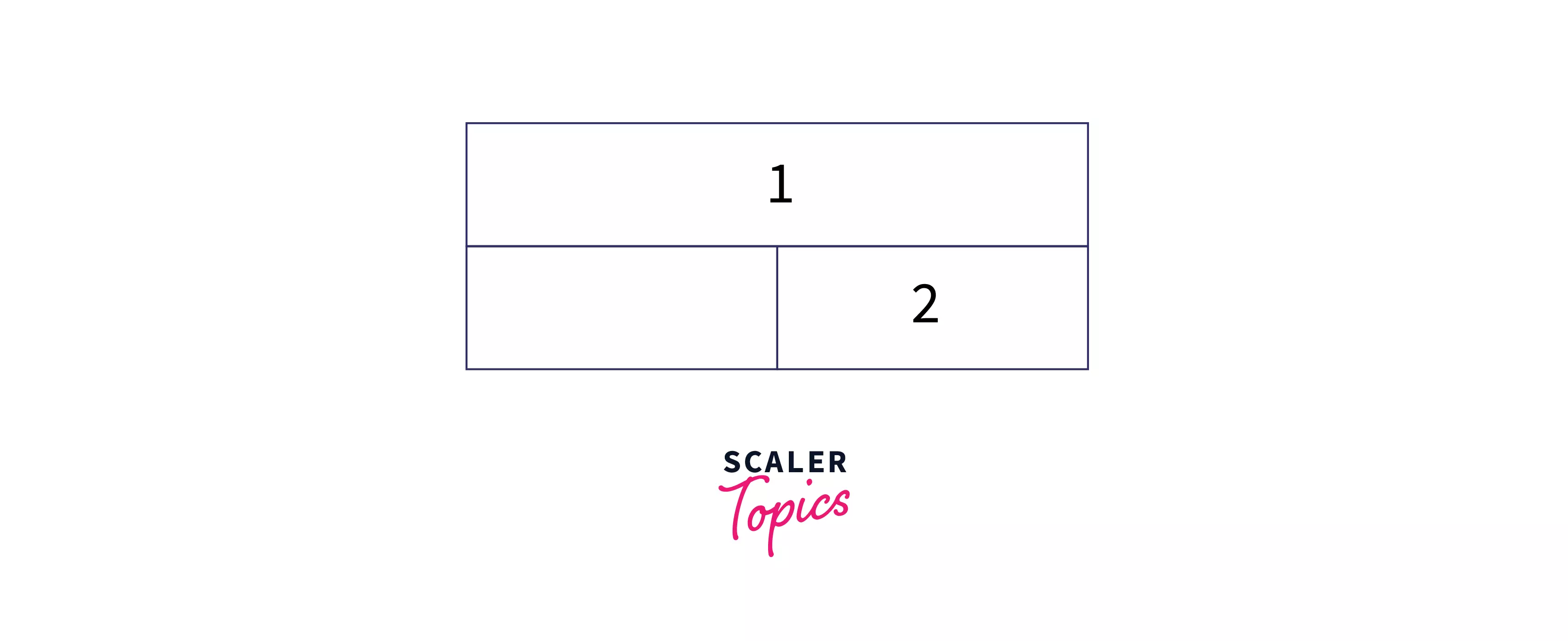
Grid Cells
Grid Cells are the space present between any four intersecting grid lines. From the table analogy, every table cell can be thought of as a grid cell too.
It is the smallest unit in the CSS grid.
Scaler Placement Report and Statistics
Scaler learners achieved 2.5x salary growth with average post-Scaler CTC reaching ₹23L.
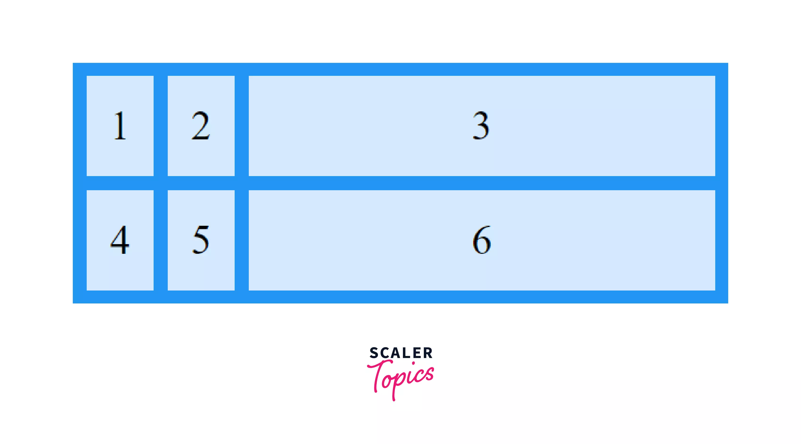
Grid Areas
Grid areas are nothing but a collection of grid cells that form a rectangular area on the grid.
Grid areas can be of 1 cell or multiple cells.
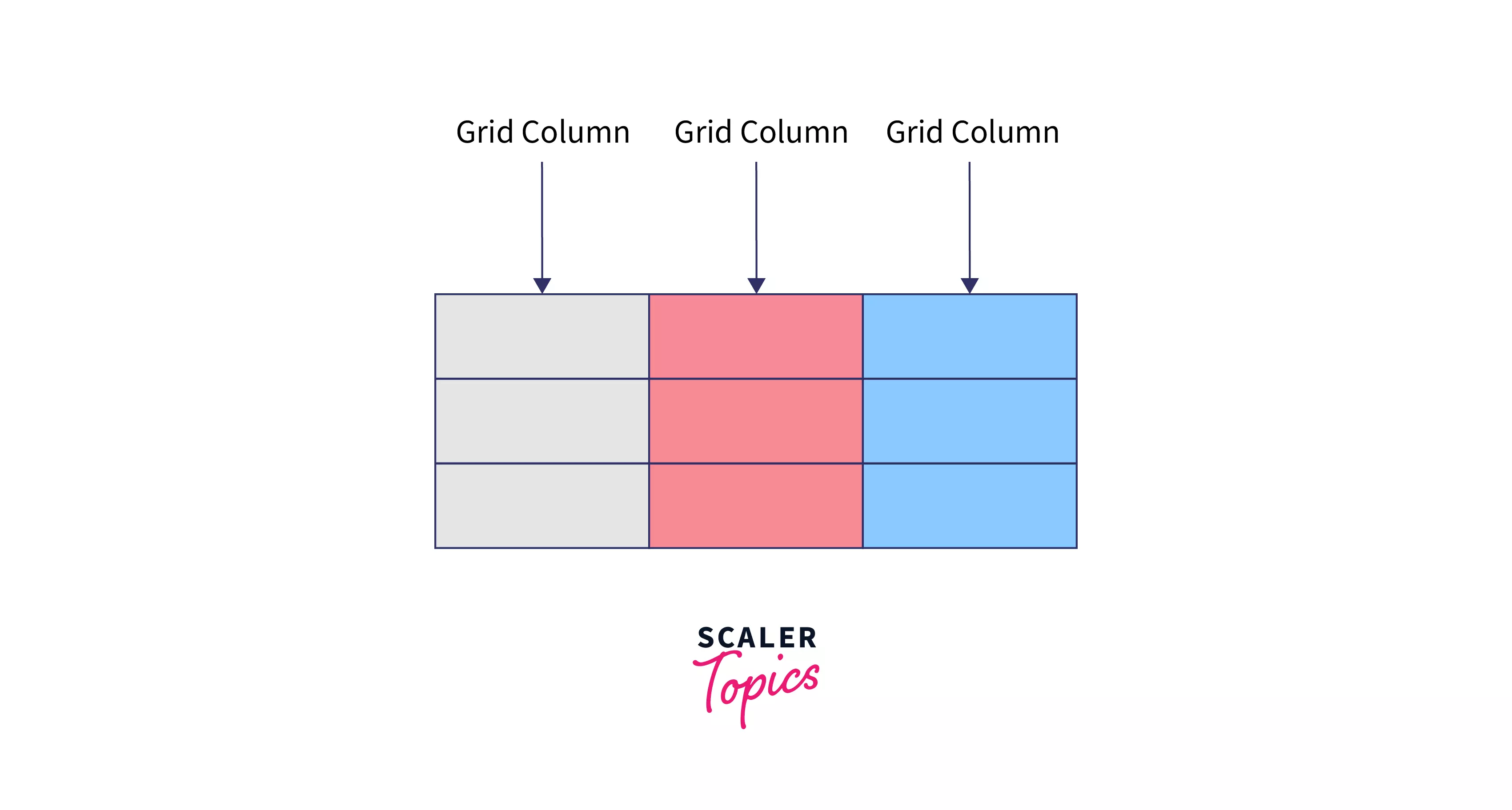
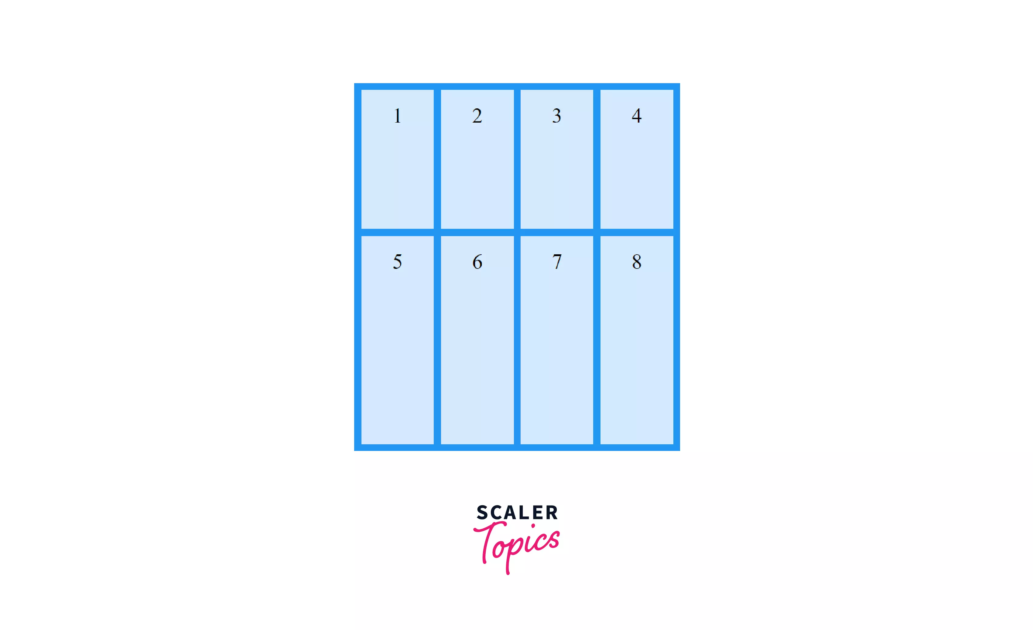
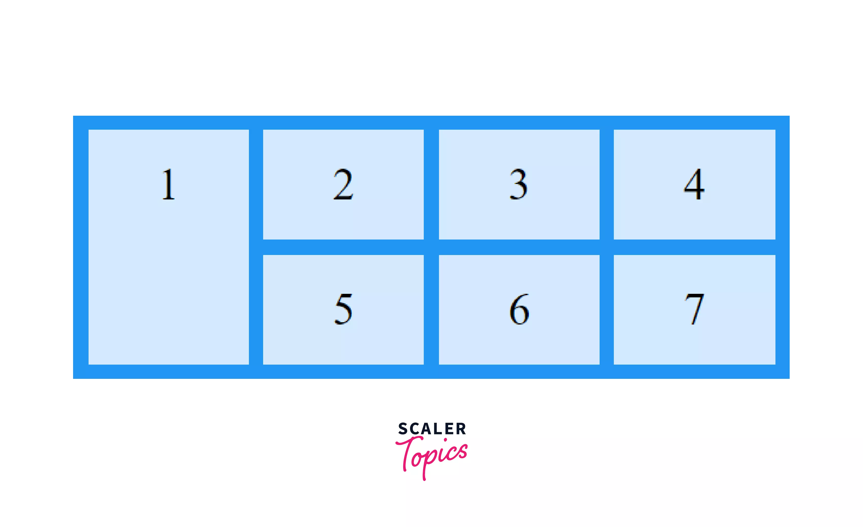
Grid Columns
The space between any two adjacent vertical grid lines is known as a grid column. You might find it similar to grid track, cause it is. Grid track is a general term we use for both grid rows and columns.
The columns in a table can be considered grid columns.
In the image below the Grey, Red, and blue blocks are all grid columns.
Transform Your Career
Choose from our industry-leading programs designed for career success
Modern Software and AI Engineering Program
Master full-stack development with AI integration

 +1000 more
Modern Data Science and ML with specialisation in AI
Advanced data science techniques with AI specialization
+1000 moreAdvanced AIML with Specialisation in Agentic AI
Deep dive into AIML with focus on Agentic systems
+1000 moreDevOps, Cloud & AI Platform Engineering
Build and manage AI-powered cloud infrastructure
+1000 moreAI Engineering Advanced Certification by IIT-Roorkee
Premier AI engineering certification from IIT-Roorkee
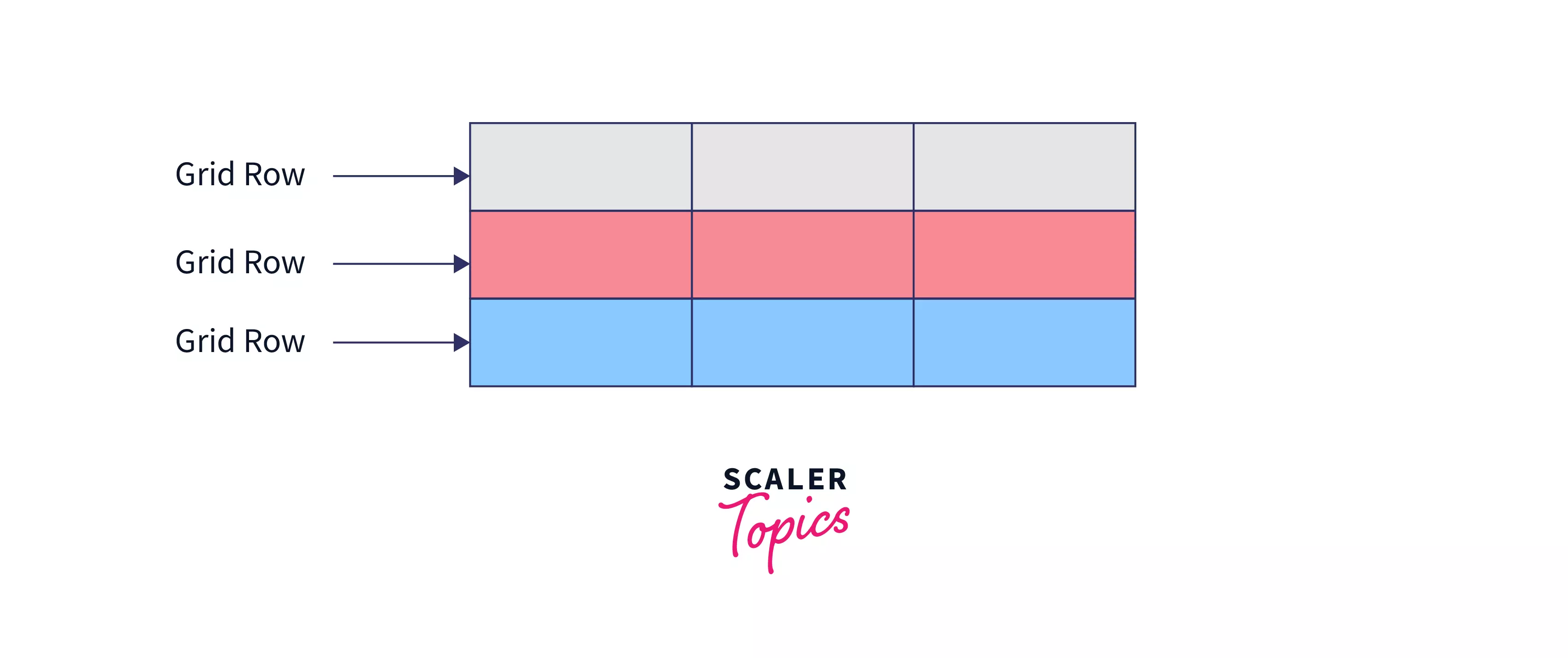
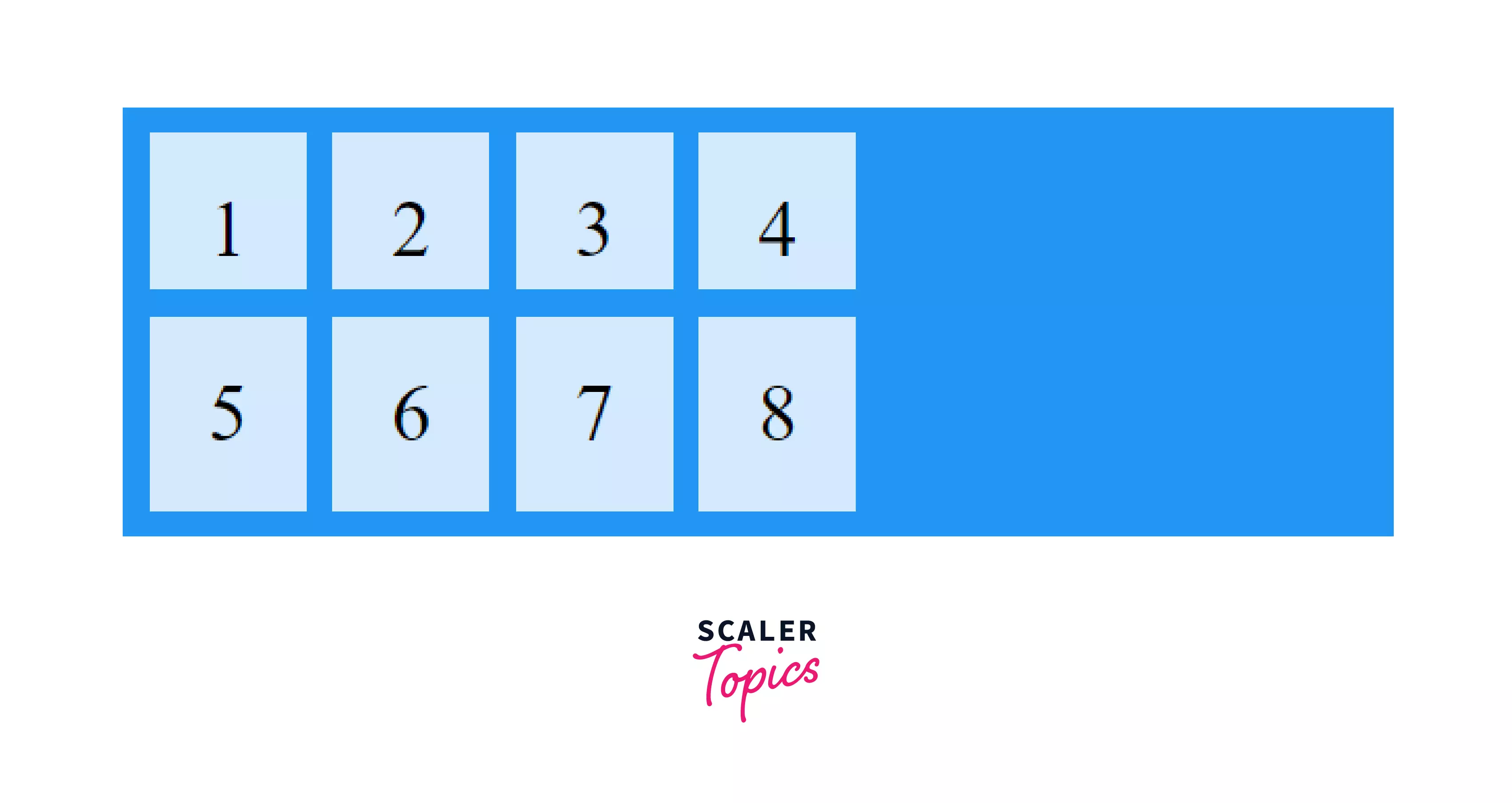
Grid Rows
The space between any two adjacent horizontal grid lines is known as a grid row.
The rows in a table can be considered as grid rows.
In the image below the Grey, Red, and blue blocks are all grid rows
Scaler Placement Report and Statistics
Scaler learners achieved 2.5x salary growth with average post-Scaler CTC reaching ₹23L.
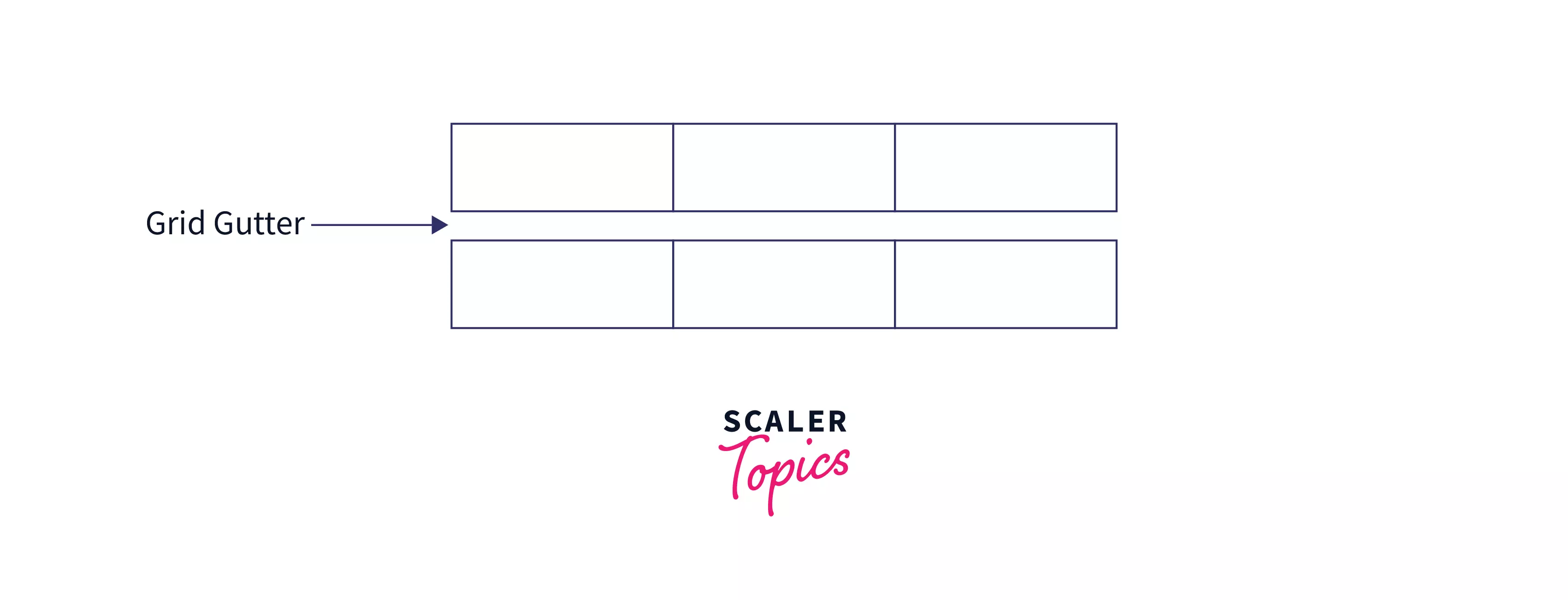
Gutters
When you want a gap between two adjacent rows or columns a gutter is created. This can be done to style the webpage and/or provide some space between the elements.
In short, gutter is the space between any two adjacent rows or columns.
CSS Grid Container
As mentioned earlier the element that we apply the display: grid; property is basically the grid container. But just adding the property doesn’t change anything, so let’s dive into some interesting things that will help show us the real power of grids.
Creating Columns
Firstly, let's discuss how can we create some columns in our grid. For this, we use a CSS property known as grid-template-columns.
Using this property we can specify the number of columns we want along with their widths.
It can be used as -
Example:
The above code will create a grid with three columns two of size 50px and one with a size set automatically.
We can put any number of columns and also use any size units like rem,em,% etc.
Creating rows
To create rows in grids we use a CSS property known as grid-template-rows.
Just like columns, we can use this property to specify the number of rows we want along with their heights.
It can be used as -
Example:
The above code will create a grid with two rows of height 200px and 300px.
Just like columns, here also we can use any unit to specify the size.
Creating Grids using names
grid-template-areas, allows us to create a named grid, meaning we can choose a different name for every area in the grid, and any element that has the same grid-area name, will be placed there.
It can be used as -
To understand it better, let's look at its implementation.
Firstly, grid elements are named using the property grid-area.
Example:
Then, by using 'grid-template-areas' we create a named grid.
We provide this property with a string containing the item names and the order in which they are to be placed in the grid.
So we can just specify the element names in the order in which we want to be placed.
It can be used as -
Example:
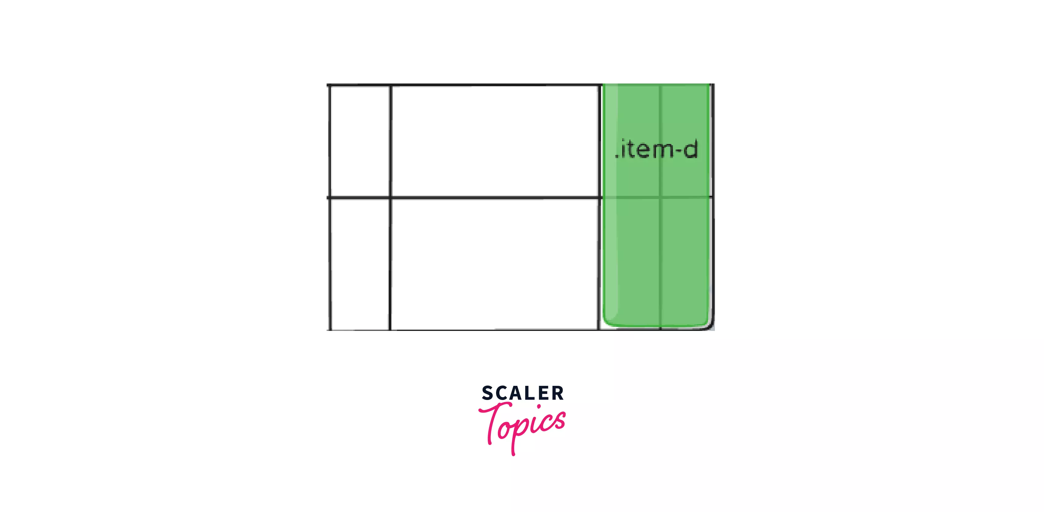
Here . signifies, that area is to be left empty.
The above code will generate an output like this image.
The repeat function
As you probably would have observed specifying every column along with their size is a tiring process, especially if you have a large number of rows/columns of the same size.
To resolve this we can use a function called repeat, which takes two parameters, the number of times you want to repeat a row/column and its size. This can help in creating any number of rows/columns with just a single line of code.
It can be used as -
Example:
This will generate the same output as writing 60px, four times.
This way of creating CSS Grid is great and we are able to create some simple layouts using just this. But the real power of CSS Grid starts when we work with grid items too so now let's see some properties on grid items.
CSS Grid Items
As discussed all of the elements that are direct child of the grid container are known as grid items. There are some interesting properties we can apply to grid items that we will be discussing below.
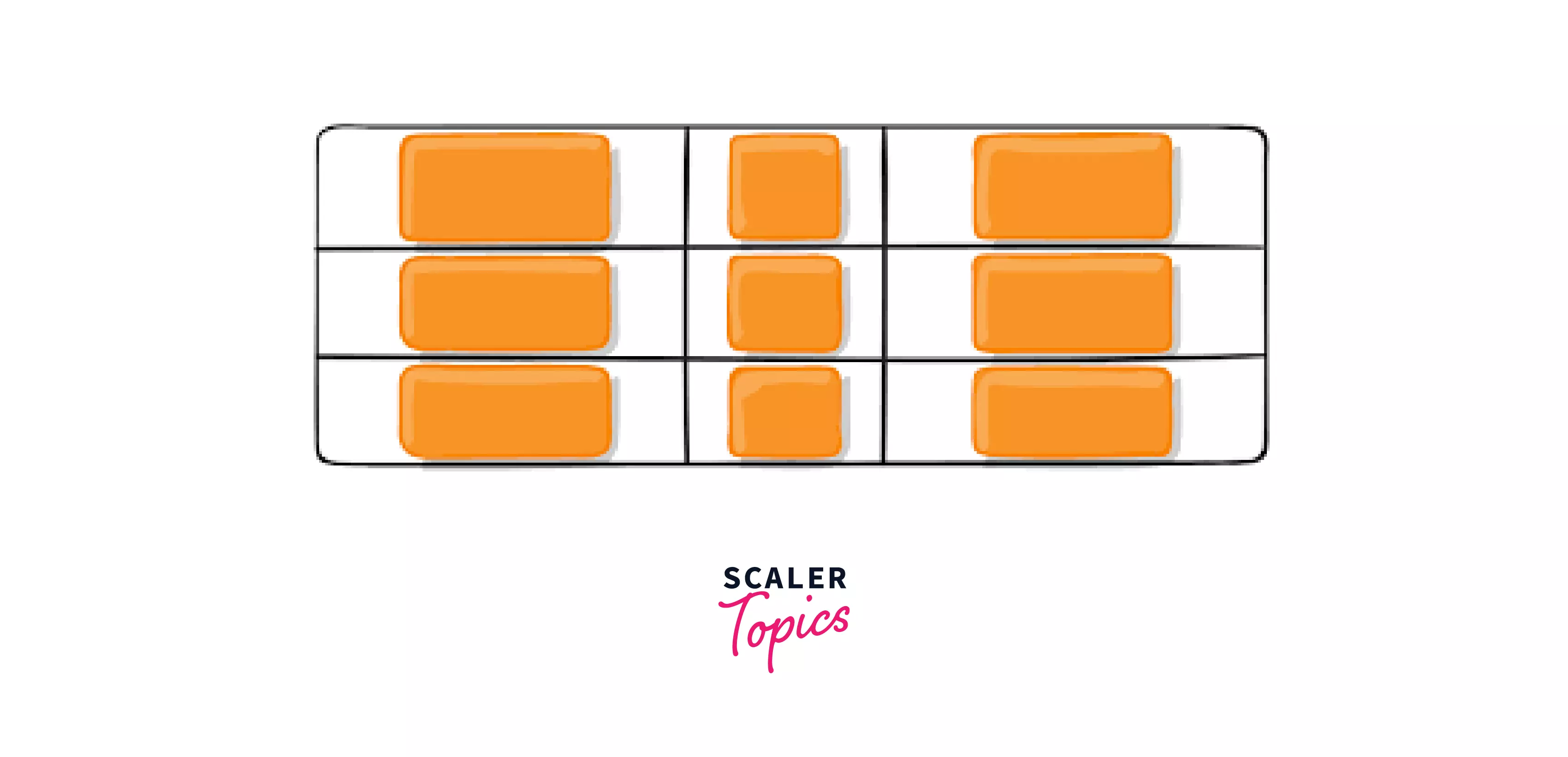
Here the orange elements are grid items.
Turn Learning into Career Growth
Ordering items
CSS grids allow us to order elements irrerspective of the way they are written in HTML. We can write the HTML for an element earlier and make it appear afterward, this is done by using the order property on the grid item.
It can be used as -
Example:
HTML
CSS
This would generate the following output.
| a |
| c |
| d |
| b |
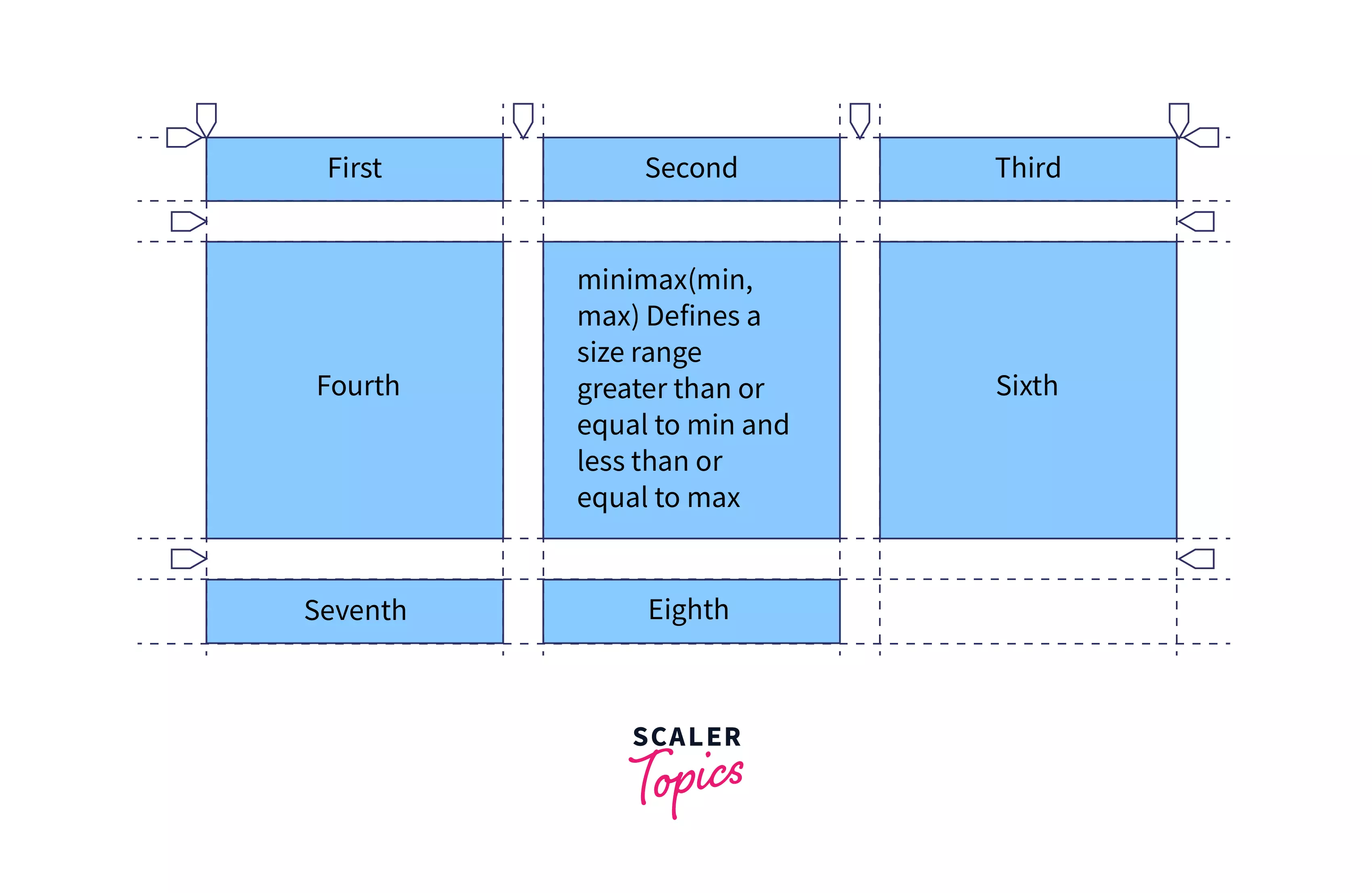
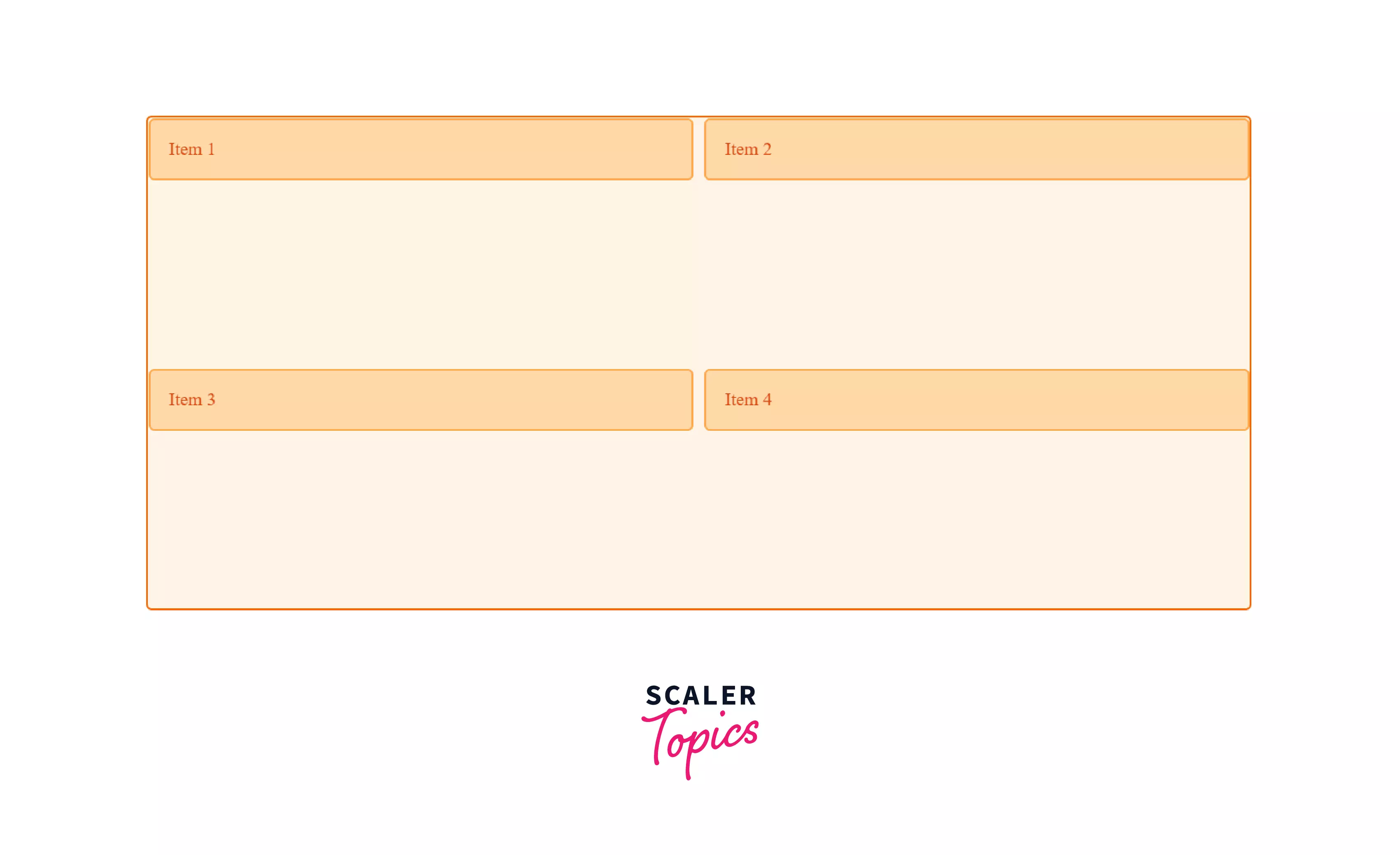
Overlapping Grid Items
When specifying the size in grid-template-rows or grid-template-columns, some elements containing a large amount of text can overflow.
To prevent this we can use min-max function and specify the size on the parent element. It takes two arguments, the minimum size and the max size.
It can be used as
Example:
This will create three rows with a minimum size of and will increase itself according to the content, like in the image.
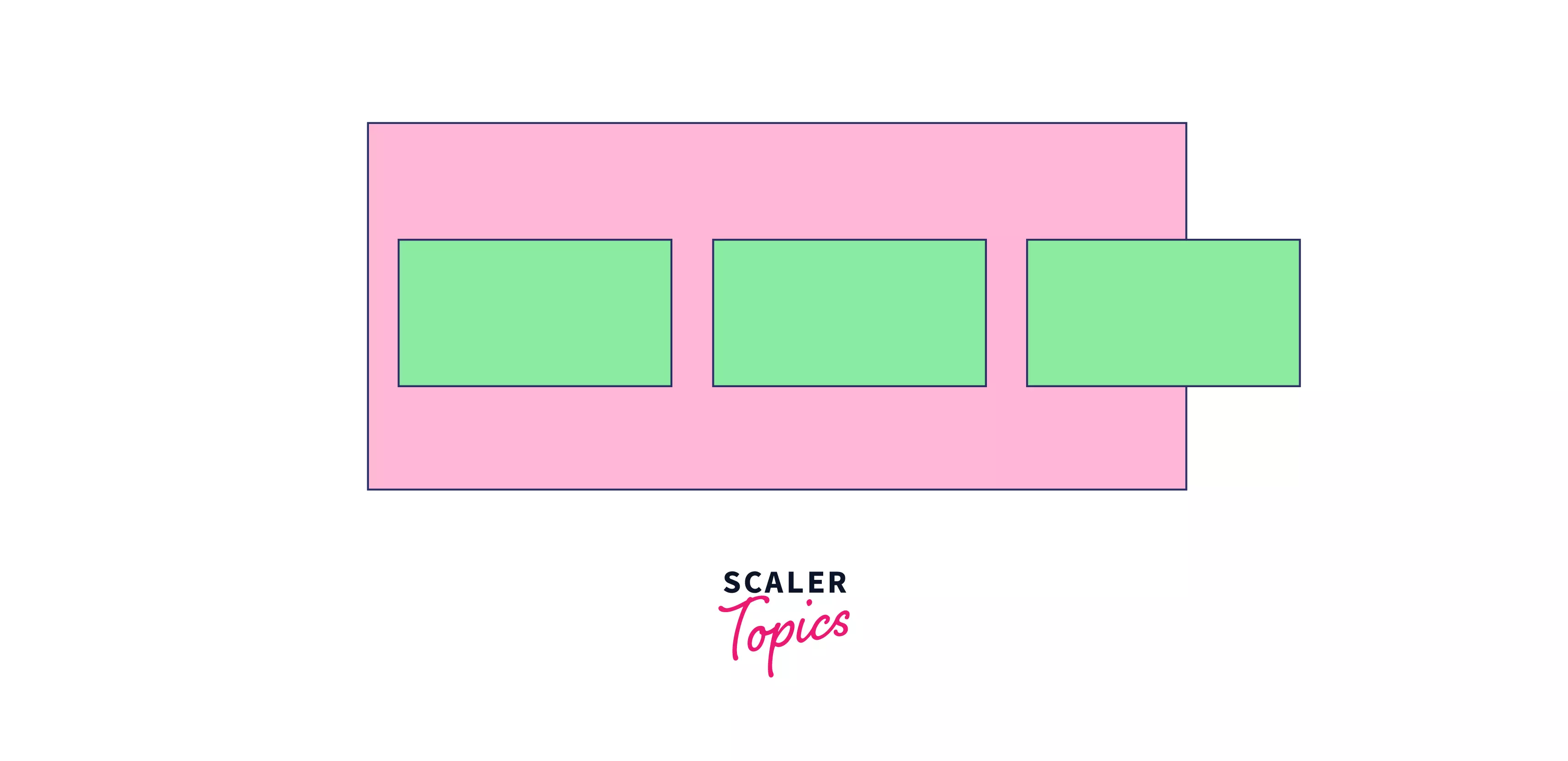
Absolutely positioned CSS Grid
Absolutely positioning an element doesn’t have any effect on the grid alignment, and the grid will act as if that element is still present.
It is used when you want to place an element in the grid at a fixed position irrespective of the other elements in the grid.
Example:
A diagram depicting this is given below
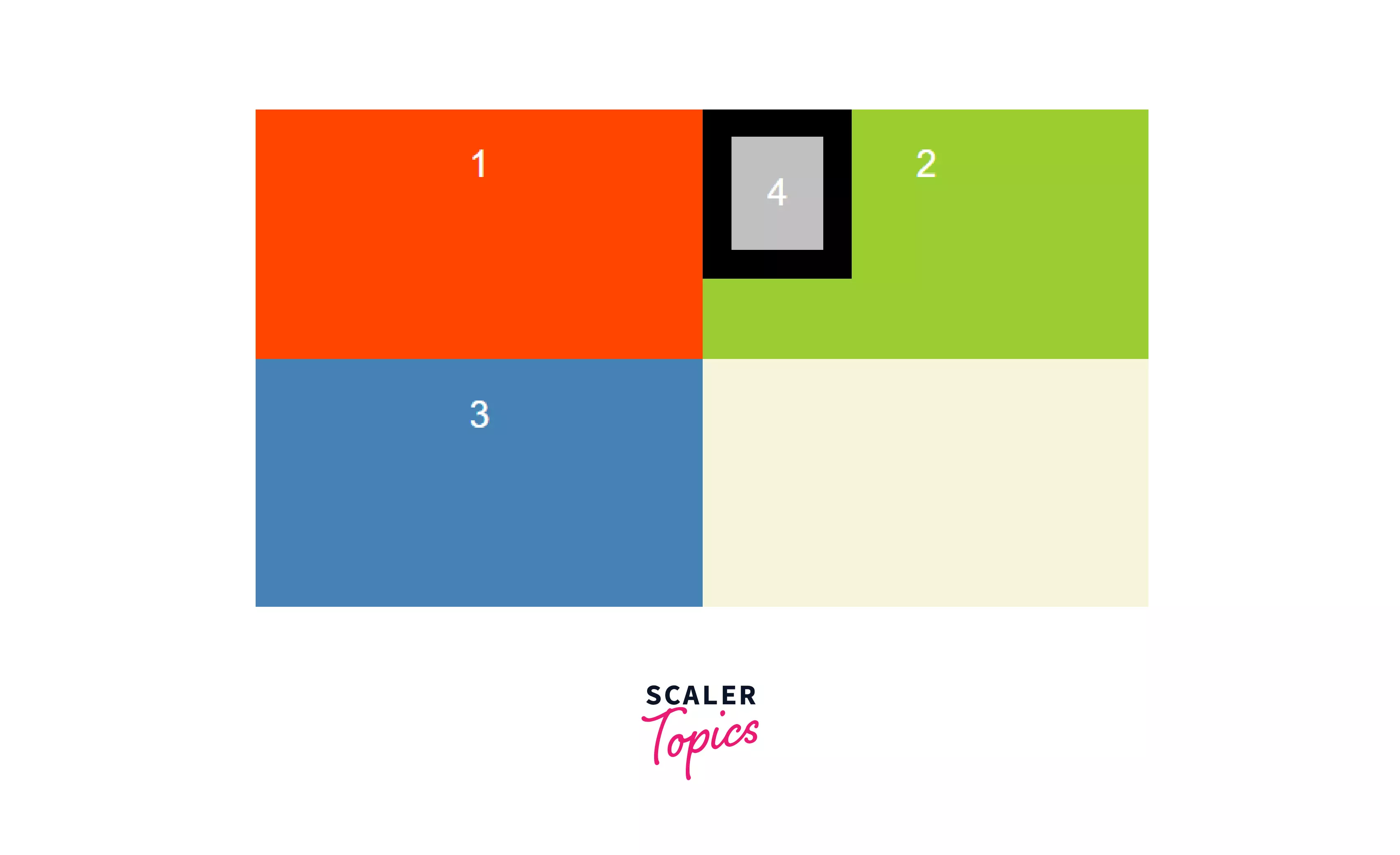
grid-column property
This property is used to specify on which column element is to be placed. We can specify on which column the element will start and on which column it will end.
It can be used as
If you don’t wanna specify the end column we can use the span keyword to specify how many columns the element should cover or for how many columns the element should stretch.
The other elements that are adjacent to the changed elements will adjust themselves accordingly. Here, they will move to the right.
Example:
This will make the .item1 start from column 2 and continue for two columns or end at column 4.
grid-row property
This property is used to specify on which row element is to be placed. Just like grid-col we can specify on which row the element will start and on which row it will end.
Here, the elements below the changed element will move to lower rows.
It can be used as
Example:
This wil make the .item1 start from row 1 and continue for two columns.
grid-area property
grid-area property is applied on a grid item and used to specify the item’s size and location.
This property can be used as a shorthand for four properties making the code concise and more readable.
The four properties are -
- Grid row start
- Grid column start
- Grid row end
- Grid column end
It is a shorthand for grid-column and grid-row.
Example:
CSS Grid Alignment
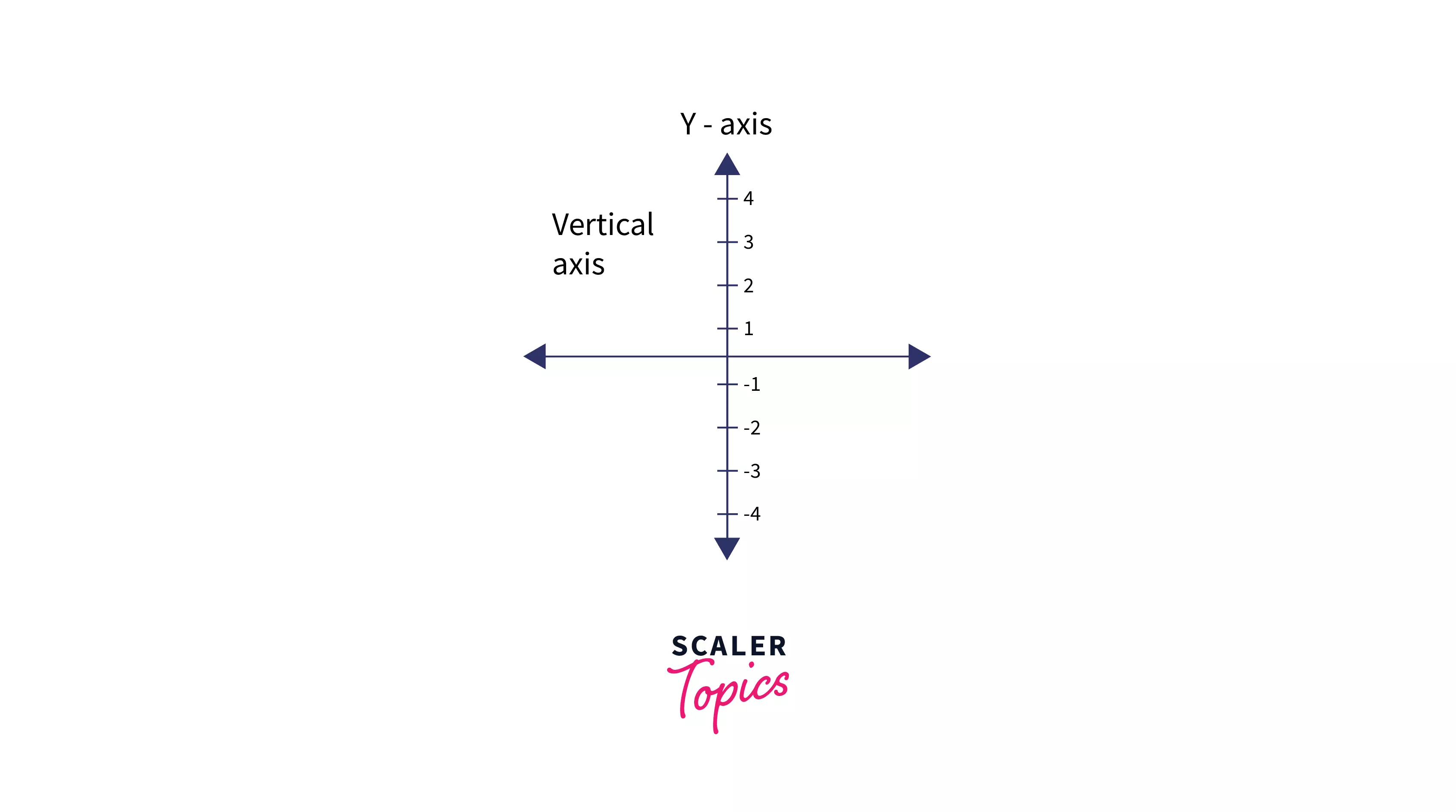
There are two axes in a CSS grid, horizontal and vertical axis and we can align items on both or either of these axes.
Firstly we’ll look into aligning items on the vertical axis.
Aligning all items on the vertical axis
align-items is used to align all items in the grid on the vertical axis using the property align-items, which is applied to the grid container. This is used to specify the vertical alignment of the grid items.
There are many values that can be used with align-items for aligning items in the vertical axis -
- auto
- normal
- start
- end
- center
- stretch
- baseline
- first baseline
- last baseline
Example:
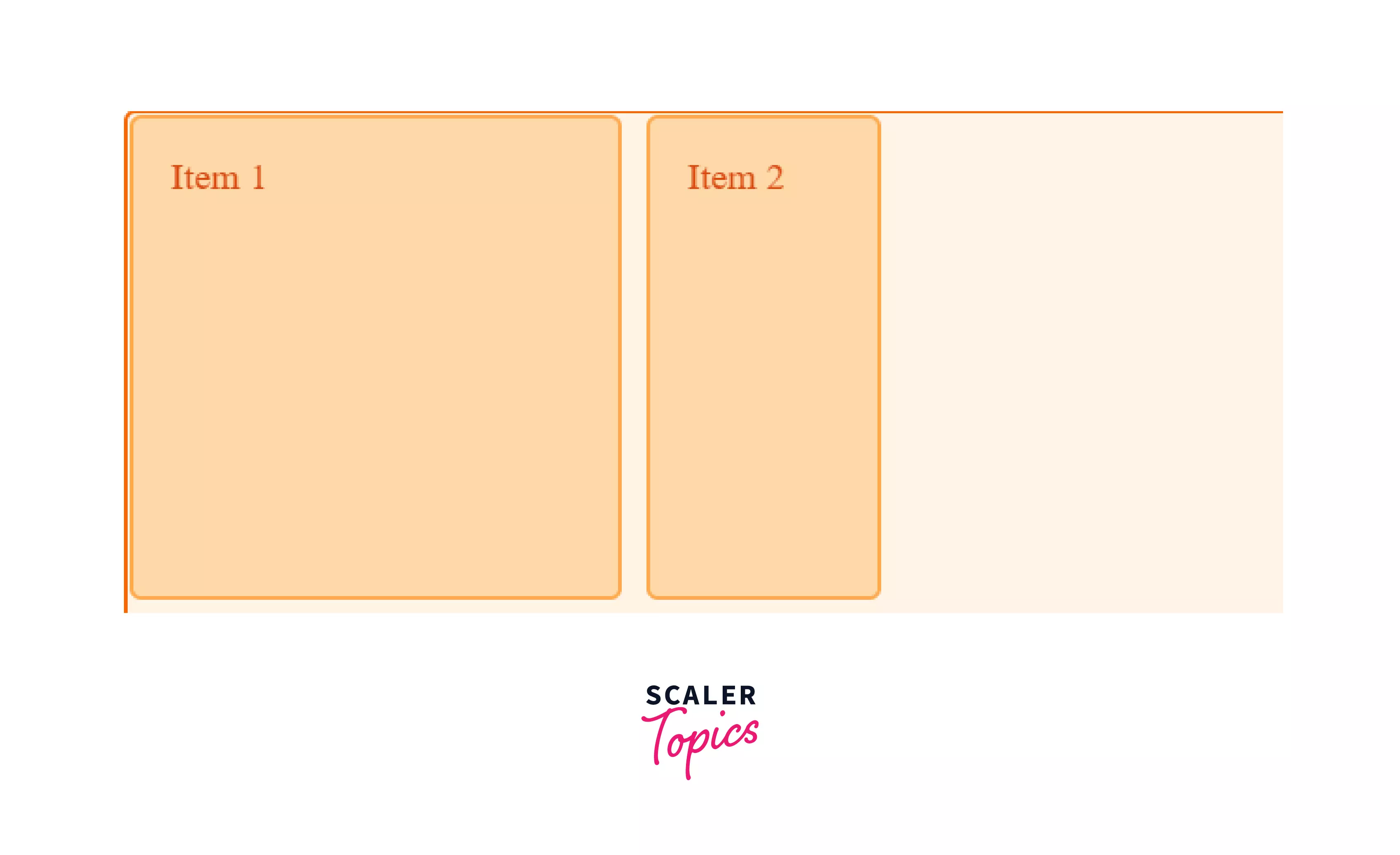
Here the .container element contains 4 items. The start property for align-items forces the elements to start from the start of their particular grid row.
Aligning a particular item on the vertical axis,
align-self is applied to a particular item and is used to align it with respect to the grid on the vertical axis.
It also uses the same values used in align-items for aligning the items.
Example:
Here the .item1 has the property stretch applied to it which stretches the element in the y-axis to take the full space available. The .item2 has the property start applied which makes it start from the top of the current grid row.
Aligning all items on the horizontal axis
To align all items in the grid on the horizontal axis at once we can use the property justify-items, which is applied to the grid container. This is used to specify the grid alignment of the items.
There are many values that can be used-
- auto
- normal
- start
- end
- center
- stretch
- baseline
- first baseline
- last baseline
Example:
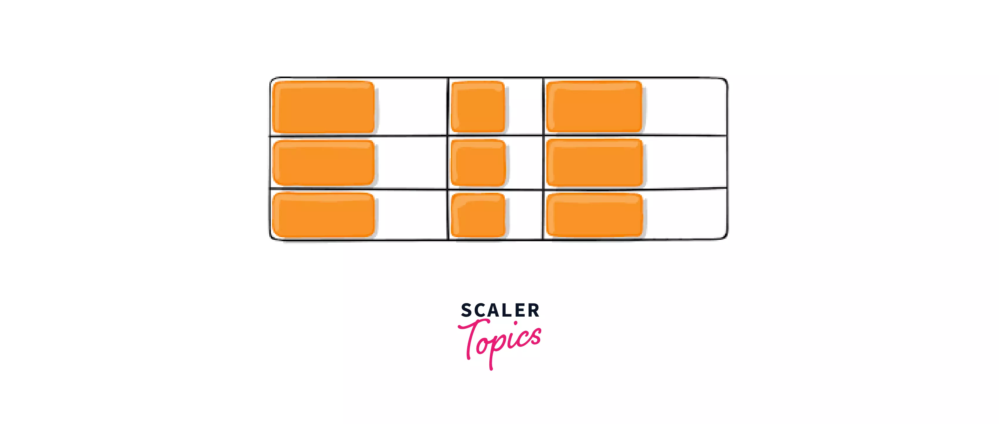
Here the .container element contains 9 items of different sizes. The start property for justify-self forces the elements to start from the start of the grid line preceding them.
Aligning a particular item on the horizontal axis
This property is applied to a single item that needs a different horizontal alignment with respect to the grid. It also uses the same values used in align-self in the horizontal axis.
Example:
Here the .item1 has the property stretch applied to it which stretches the element in the x-axis to take the full space available.
The .item2 has the property start applied which makes it start from the start of the current grid column.
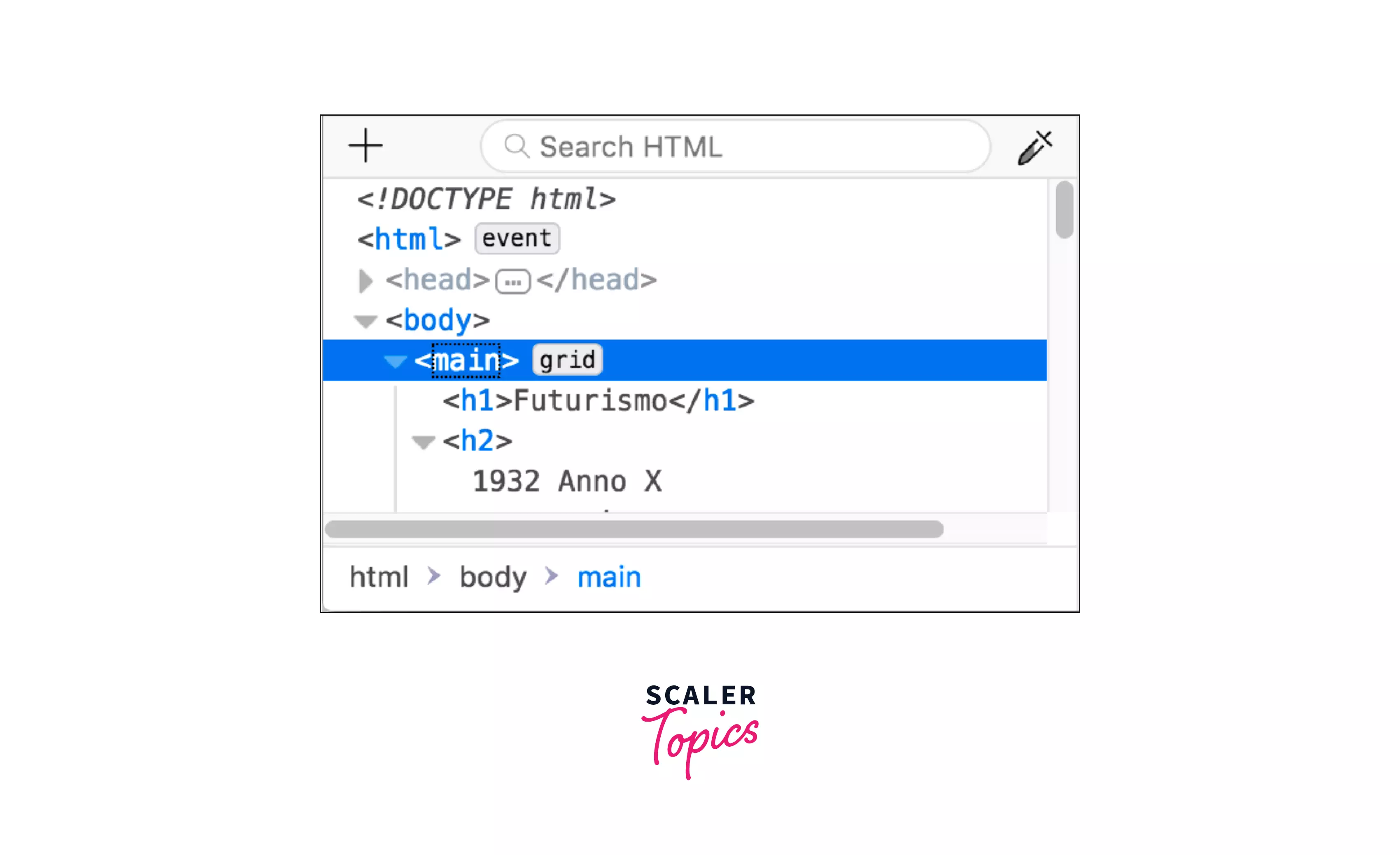
CSS Inspector tool
CSS inspector tool is an excellent tool integrated in chrome and other browsers that allow you to see and change CSS grid-related properties visually or through code, without the need to change the actual CSS file.
To access it all you have to do is -
-
Select the menu icon and the top right of the browser.
-
Then select the More tools option.
-
Then click on Developer tools.
-
You can also use the shortcut Ctrl+Shift+I.
-
Then go to the Elements tab at the top and you will see all the elements on the web page.
-
Here you can navigate to the parent grid element by expanding the body element and then selecting the container with the grid applied to it.
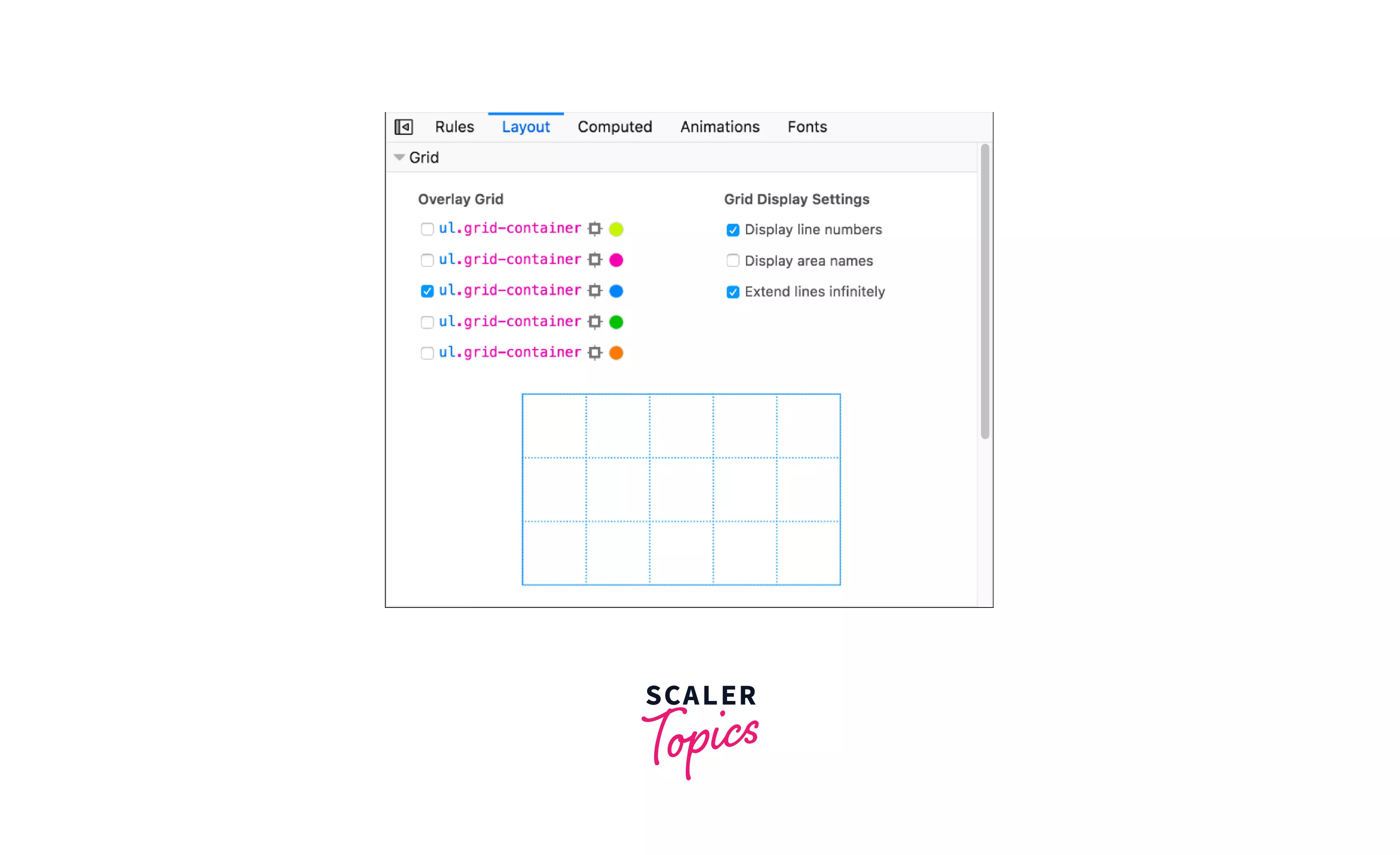
- When the grid is available on a page the Layout option will be visible in the CSS pane which can be used to see and change things in the CSS grid.
Conclusion
- CSS Grid are two-dimensional layouts used to arrange items in the webpage.
- CSS Grid contains two types of entities namely, Grid Containers and Grid Items.
- There are various properties like grid-template-rows, grid-template-colums,grid-column, etc, that can be used on both the grid containers and items for designing the grid.
- Grid lines are horizontal and vertical lines that run through the entire CSS grid.
- A grid container is a HTML element which contains all the elements inside the grid as its direct child.
- CSS Grid Inspector tool gives the ability to see and change Grid related properties right from the browser
 Google
 Amazon
 Microsoft
 Flipkart
 Adobe1200+ more