CSS Size
 FREE
FREE

Overview
In designing, size matters. The size of the elements plays a major role in capturing the attention of the user. For a web developer, it is important to understand how the different elements can be sized on the webpage. When it comes to styling the webpage, you have to get your hands dirty with CSS. CSS is a wonderful technology that enables developers to create their websites according to their needs. In this article, we will cover the topic of how to size elements using CSS.
Transform Your Career
Choose from our industry-leading programs designed for career success
Modern Software and AI Engineering Program
Master full-stack development with AI integration

 +1000 more
Modern Data Science and ML with specialisation in AI
Advanced data science techniques with AI specialization
+1000 moreAdvanced AIML with Specialisation in Agentic AI
Deep dive into AIML with focus on Agentic systems
+1000 moreDevOps, Cloud & AI Platform Engineering
Build and manage AI-powered cloud infrastructure
+1000 moreAI Engineering Advanced Certification by IIT-Roorkee
Premier AI engineering certification from IIT-Roorkee
What is CSS size?
Size in CSS refers to how big or small different elements on the webpage will be displayed to the user. There are different ways by which the elements on the webpage can be sized. Before learning about how to style, we will first take a look at what are the two types of sizes that CSS has:
- Intrinsic Size - It is the original size of the elements that are set before any CSS is applied to them.
- Extrinsic Size - In this, the elements are given some specific size by the user.
Sizing Items in CSS
There are many different ways in which we can set the size of elements.
-
Height and Width As the name suggests, these properties are used to set the Width and Height of the elements.
- Values this support:
- length - absolute value
- percentage - sets the size relative to the parent
- auto - browser calculates the Height/Width
- max-content - Intrinsic preferred height
- min-content - Intrinsic minimum height
- fit-content - Will use available space but never more than max-content
Code Samples
Output
- Values this support:
-
Max Width CSS max-width is used to set the maximum width of an element. The max-width property also improves how the web browser handles small windows. The browser knows the maximum allowed width, and if it encounters smaller width, then it automatically adjusts the element.
- Values max-width support
- length - absolute values
- percentage
- none
- max-content
- min-content
- fit-content
Code Sample
Output
Here, you can see that there is some space on the right after the text because the maximum width for the element was reached.
- Values max-width support
-
Natural or Intrinsic Size Intrinsic or the natural size is set before any CSS is applied. , e.g., If you have placed an image on the webpage and you haven't changed its height or width, then it will be displayed in its intrinsic size. Another example is that an empty div has no size of its own; it takes the size of the content that we put inside it or the Height and Width that we set extrinsically.
Code Sample
Output
Here, we get only a div with a border of 1px (the first one), but if we give this div some height, then only we will be able to view the sky blue color (the second one) because, by default, the div is empty.
-
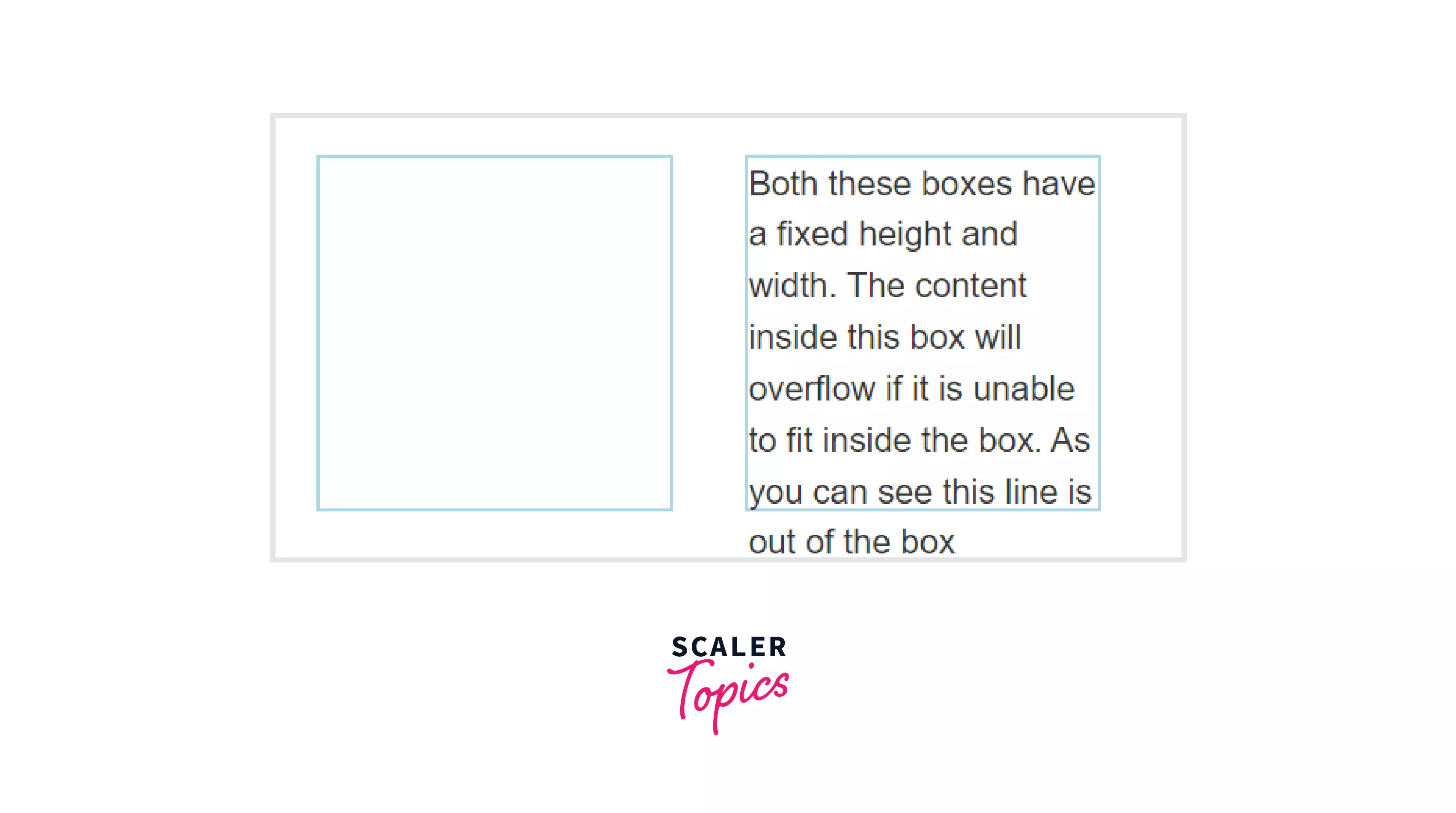
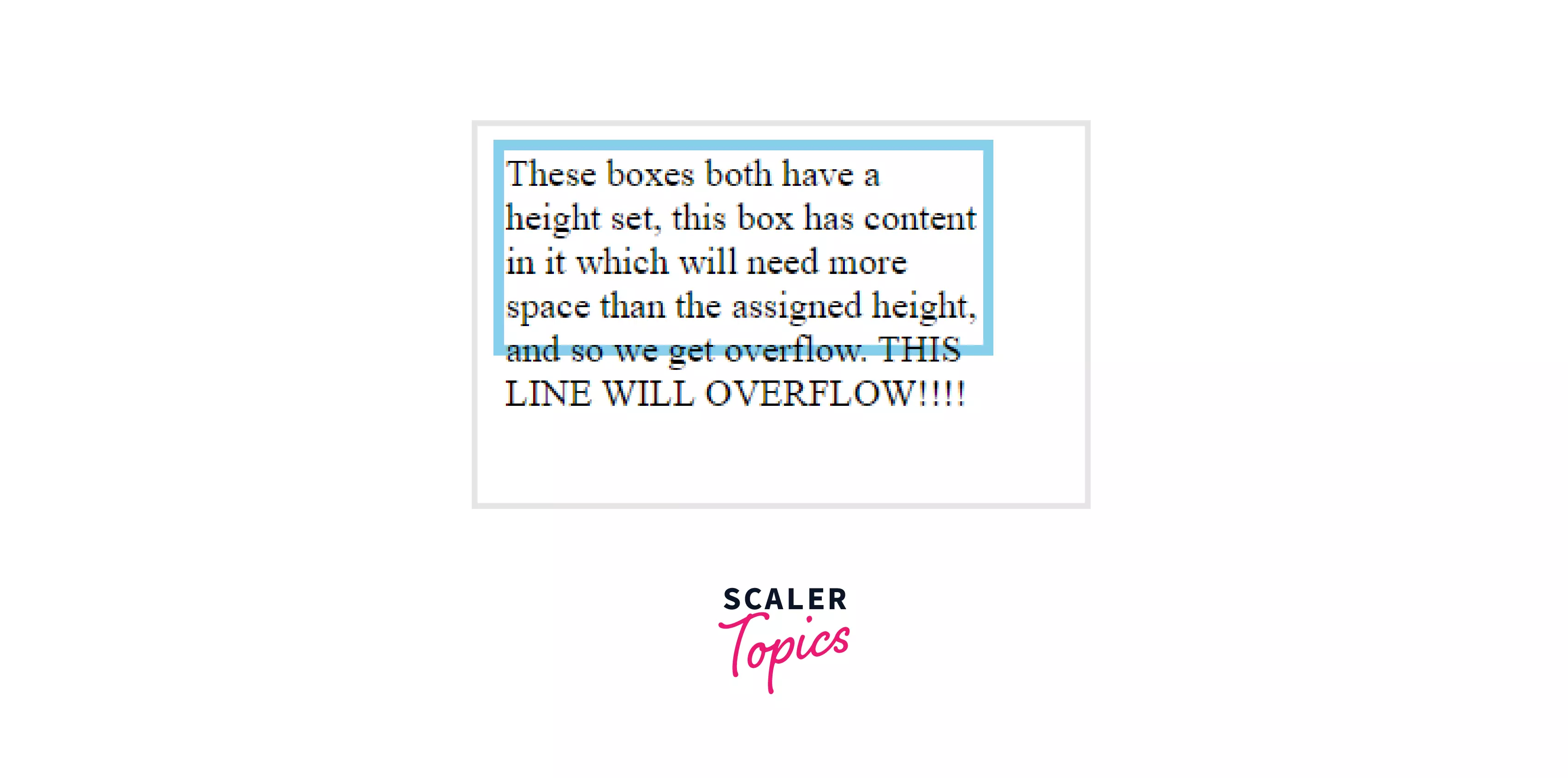
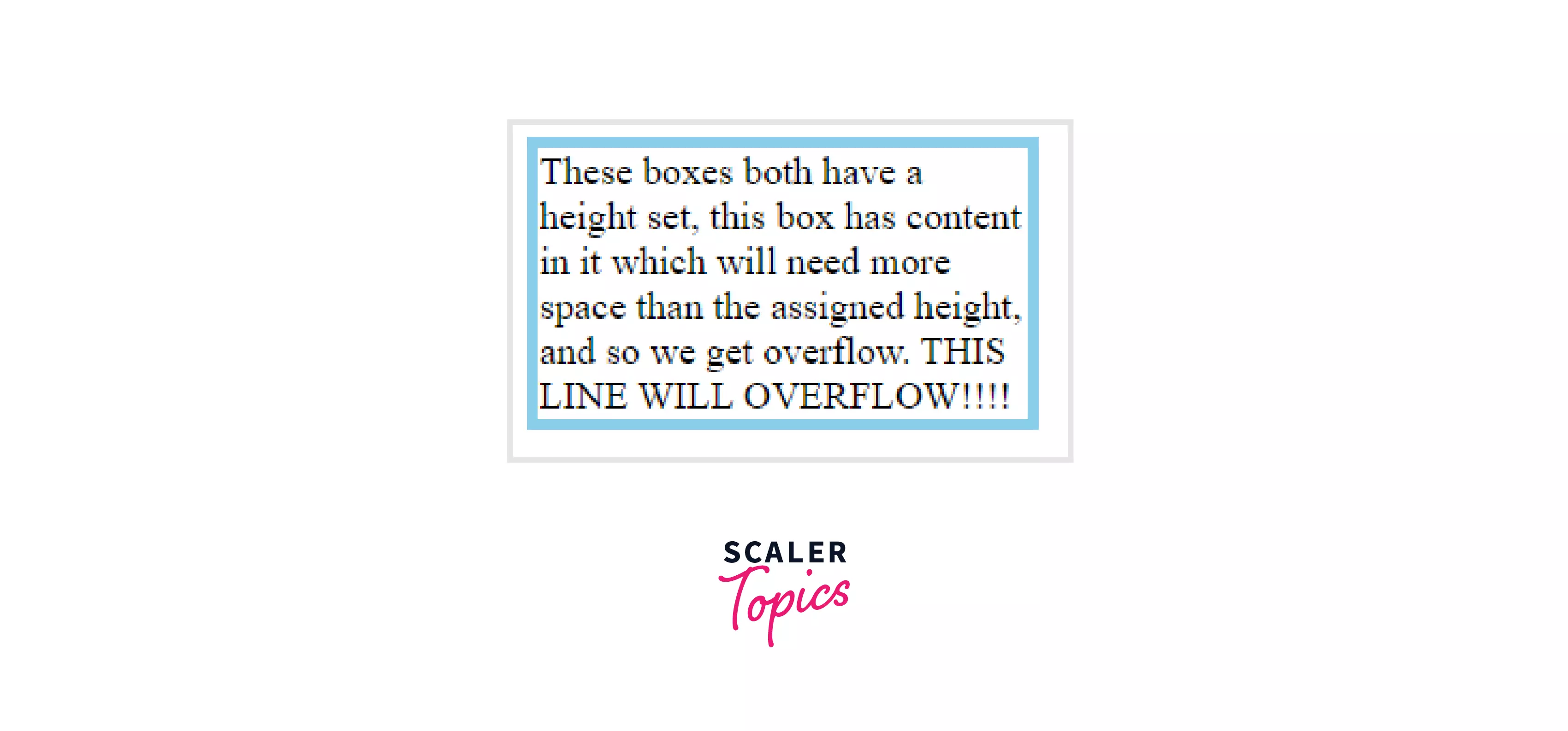
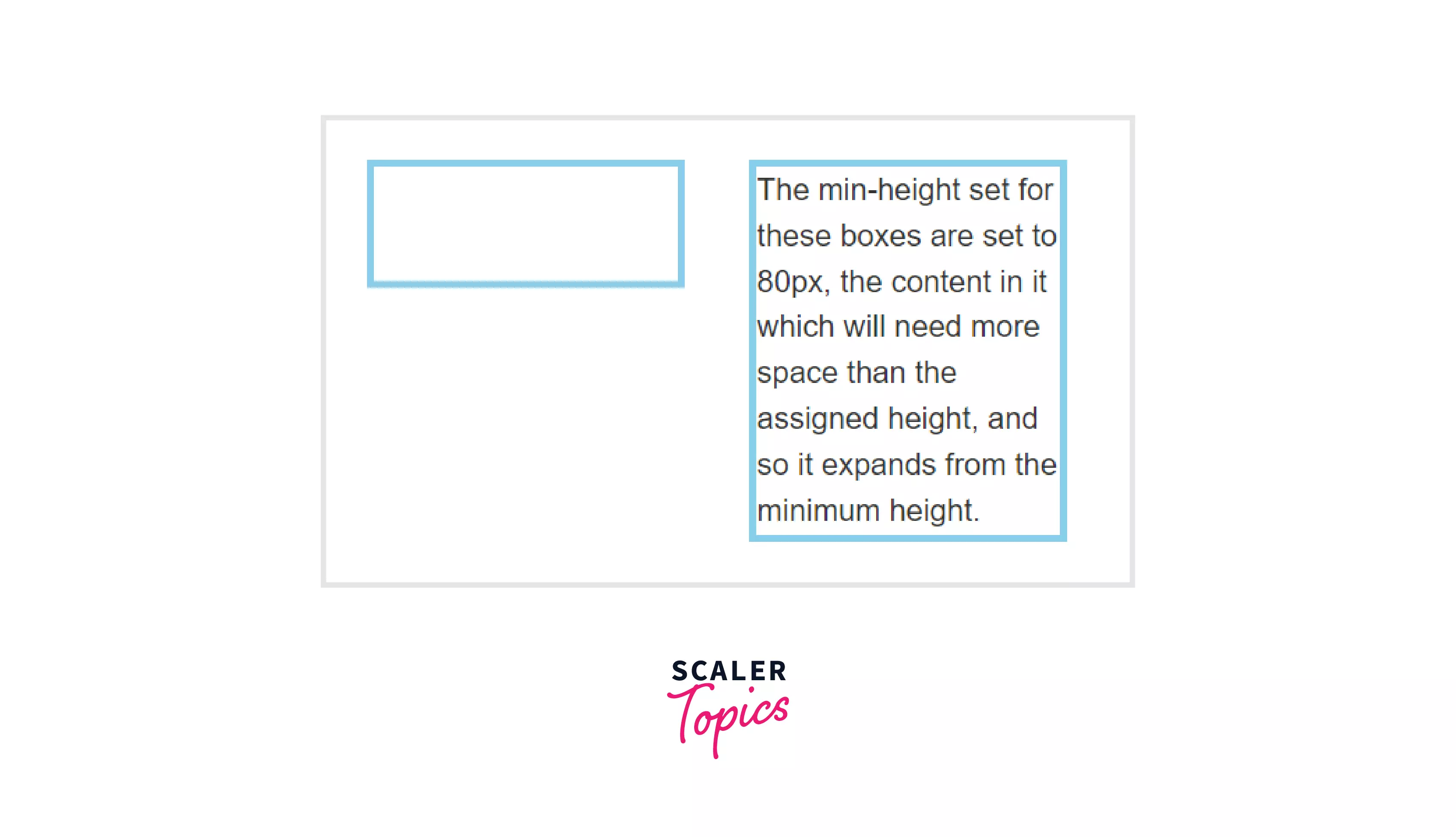
CSS min- and max- sizes Mostly when placing elements on a website, we are not sure how much space they will occupy, especially with the text boxes. So, in that case, we can use the CSS min- and max- properties to set a boundary that this specific element will take the minimum of this space and the maximum of this space. Here is how the overflow in a textbox looks:
Code for the above text element
, e.g., You can make a text box with a min-height of 200px. If you put more content inside the text box, then it will stretch to fit that content inside it. On the flip side, if you use the Height property, then the text will overflow from the container because the container will not stretch to fit the text.
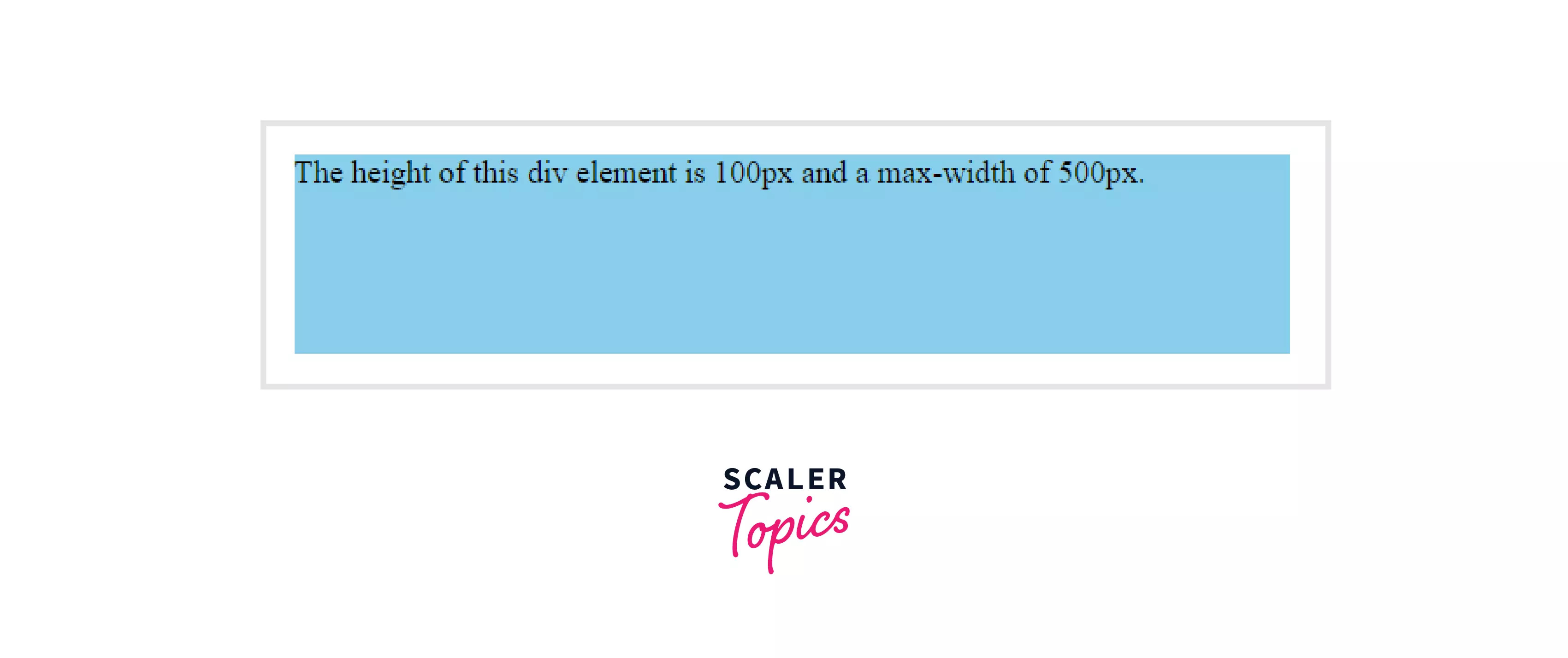
Let's understand this better with an example. This is the same container but with min-height instead of height.
 Code for above example
-
Values * length - absolute values * percentage - changes are relative to the parent element * none(only with width) - it means no limit on the size of the box * auto - the browser will calculate * max-content * min-content * fit-content
Code Sample
Output
-
-
Setting a specific size Setting a specific size to elements is referred to as extrinsic size. We have seen various methods showing how we can set the size of elements. We can use the following methods to set the specific size of elements:
- Using Height and Width properties
- Using max-width and max-height
Turn Learning into Career Growth
How to Set Image Height and Width in CSS?
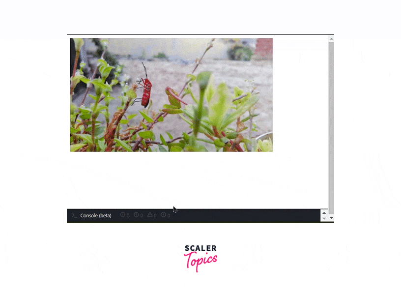
The <img> tag in HTML allows us to set the height and width of the image so that the space required by the image is reserved when the page is loaded.
Here is an example,
Here the height and width of 500px are reserved for the image. But you can set the size of the image using CSS, and CSS allows us to create responsive images too. These are the preferred ways:
-
Height and Width properties Height and width can be specified for an image, but to make the image responsive, we specify the width and set the height to auto. In this way, the image scales up and down depending on the size of the browser window.
Code Sample
Output

But there is one drawback here when the window is large, but the image is small, then the image is scaled up larger than its original size. To solve this issue, we use the second method.
-
Using max-width property Here we set the max-width property to 100% so that the image is never scaled up larger than its original size.
Code Sample
Output
Now the image will scale down, but it will not scale up above its maximum size.
How to Fit Elements with Respect to Screen Size in CSS?
Responsive design is a concept in web design that aims at creating a design that renders well on different types of devices with various screen sizes.
Here is an example of how the Scaler Website looks on different screen sizes.
Desktop
 Tablet
 Mobile

To achieve this, we can use media queries provided by CSS, which specify a boundary condition between which we can place our styles. CSS also has one other way which can help in creating a responsive design; these are called Viewport Units
The viewport is the visible area of the page in the browser. We have units:
- vw - Viewport Width
- vh - Viewport Height
We can use these units and can size elements relative to the viewport of the user. e.g. height : 1vh is equal to 1% height. Similarly, height: 1vw is equal to 1% width. Viewport units can be used with Text also!
If we use viewport units, then the size of our elements changes with the change in the size of the viewport.
Conclusion
- Intrinsic size refers to the original size of the elements before applying any CSS
- Extrinsic sizing means that the elements are given some specific size
- Different ways to set the size of elements:
- Height and Width
- max-width
- intrinsiz size
- min- and max- sizes
- Images can be made responsive by using Height, Width and max-width properties.
- max-width allows the image to scale with the browser, but not more than its original size.
- Viewport units vh and vw can be used to set the size according to the size of the viewport.
 Google
 Amazon
 Microsoft
 Flipkart
 Adobe1200+ more