CSS Units
 FREE
FREE

Abstract:
Every property like margin, padding, height, width, font-size, etc in CSS that has some dimensions or length needs a unit. CSS provides us with lots of units, some of whose values are fixed and are called absolute units while there are others whose values are relative to other values like that of the parent element’s or to the default value for that particular HTML element, these are called relative units. Among the absolute units in CSS, we have centimeter, millimeter, pixel, etc; While among the relative units in CSS, we have percentage, em, vh, rem, etc.
What is a CSS unit?
When you talk about the distance between two places like your house and your friend’s house, you talk in kilometers or meters. Whereas talking about the height of a person we, usually, talk in centimeters or feet. And similarly often you might talk in relative terms like your new books are double in thickness compared to your earlier books. (Sounds quite a bit heavy :sweat_smile: .)
Very similar to real-world units, we have units in CSS for expressing the dimensions of several properties like margin, padding, length, width, etc of an HTML element, like we can set the margin of an HTML element to a specific value. That value consists of some numeric figures followed by a unit. Let's look at the image below to get it more clearly:
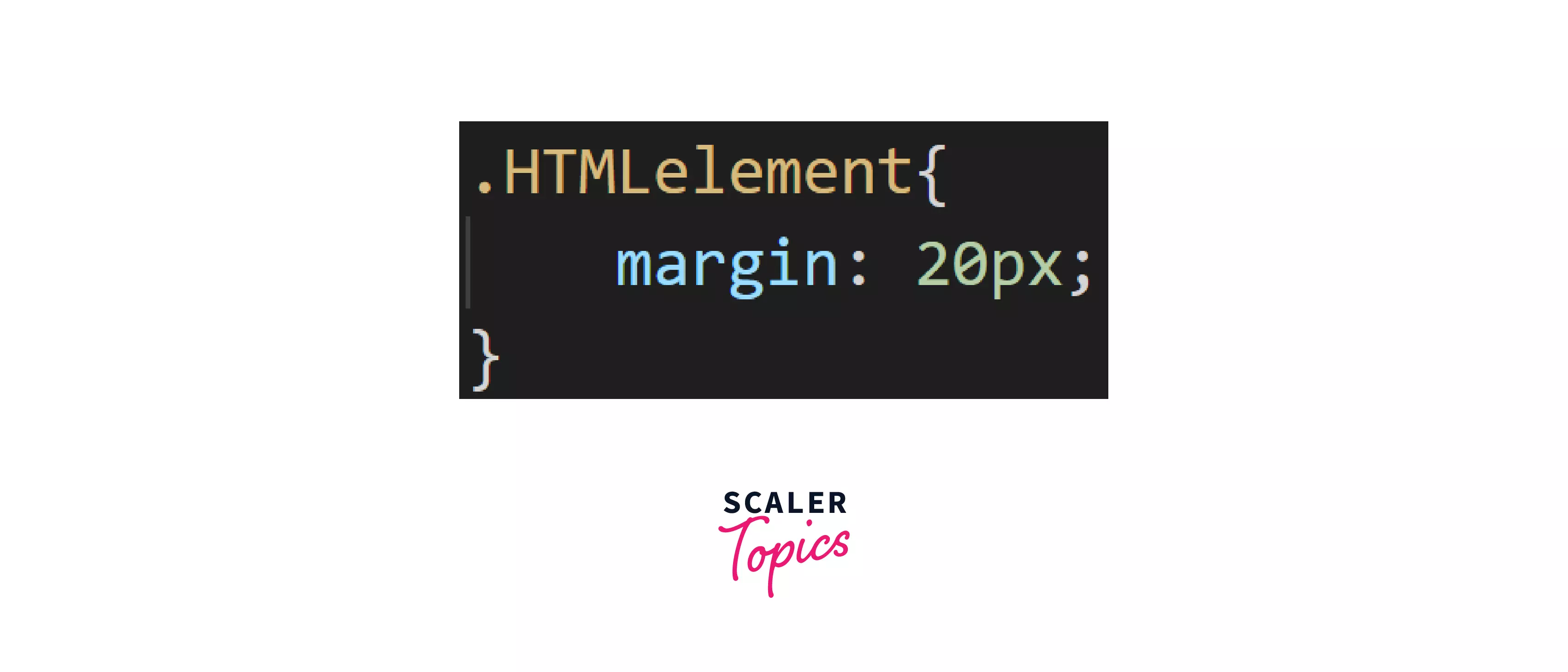
That 20 is the numeric figure and that px(pixel) is a CSS unit. This is the most common CSS Unit we shall be using.
In case, we want our elements to be responsive we shall use CSS units like percentage, em, or rem. We shall be studying each of these units in detail.
NOTE: Responsive means making the same web element fit to different screen sizes automatically without creating a completely separate design for each screen size.
The Two Major Types of Units in CSS:
CSS units can be classified into two major categories:
- Absolute
- Relative
Let us study each of them in detail.
Absolute Units:
These units are the ones whose values are fixed irrespective of any other factors like parent element or viewing window i.e the screen size won't affect the size of the element.
Let's look at where these absolute units are used.
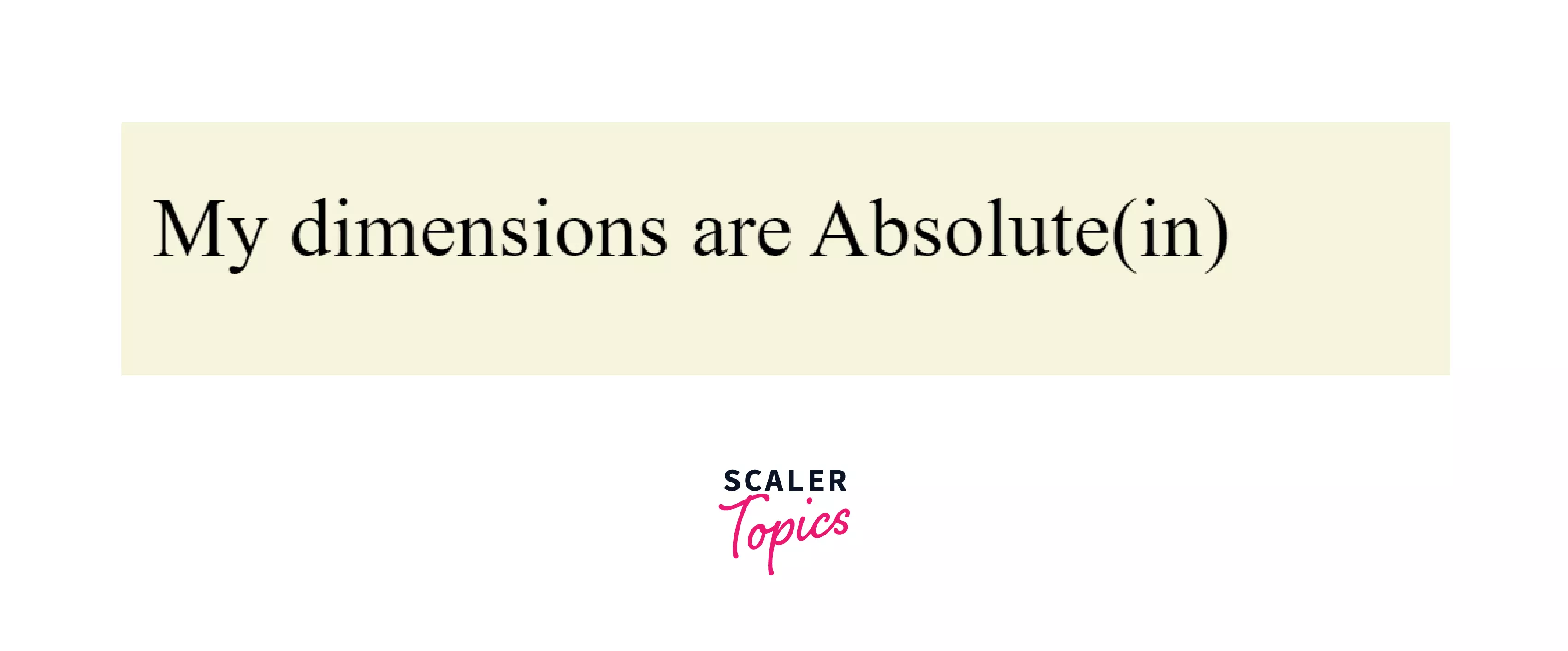
That Google logo at the left corner is provided with an absolute height and width of 30px and 92px respectively which means if we change screen size, other elements like the search bar will change their height & width but the logo will remain in the exact dimensions of 92x30.
In the web, usually absolute units are used in logos.
Most of these units are used for prints, the only unit widely used for websites is pixel (px).
Let us have a look at an example and let us understand what exactly absolute mean. We will take a div and put absolute units as its dimensions then we shall see how the change in the viewing window does not affect the dimensions of the div:
HTML:
CSS:
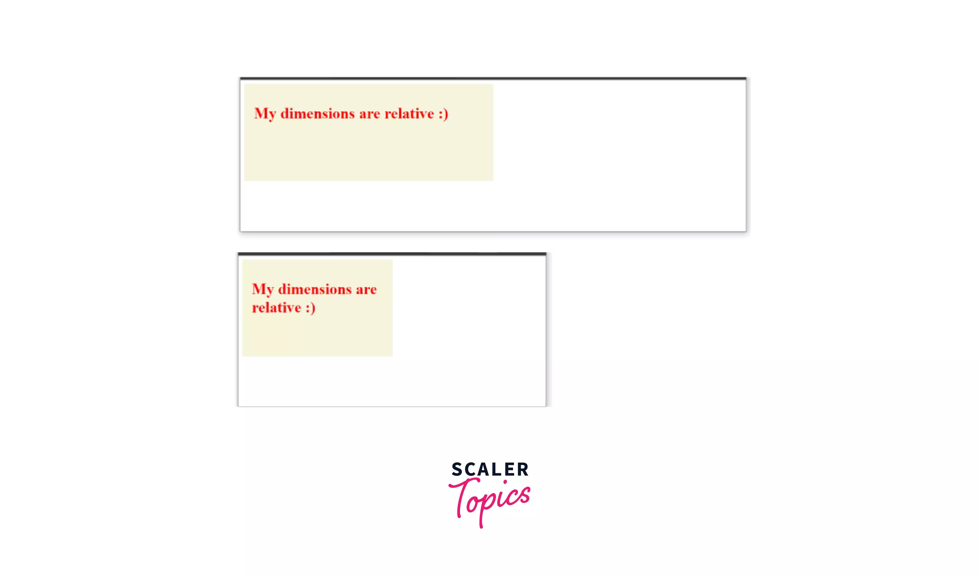
The above CSS code sets the height and width of the div as 200px and 300px respectively along with an uniform padding of 20px. Now, all the three values mentioned above are "absolute", you will understand better from the outputs what it exactly means.
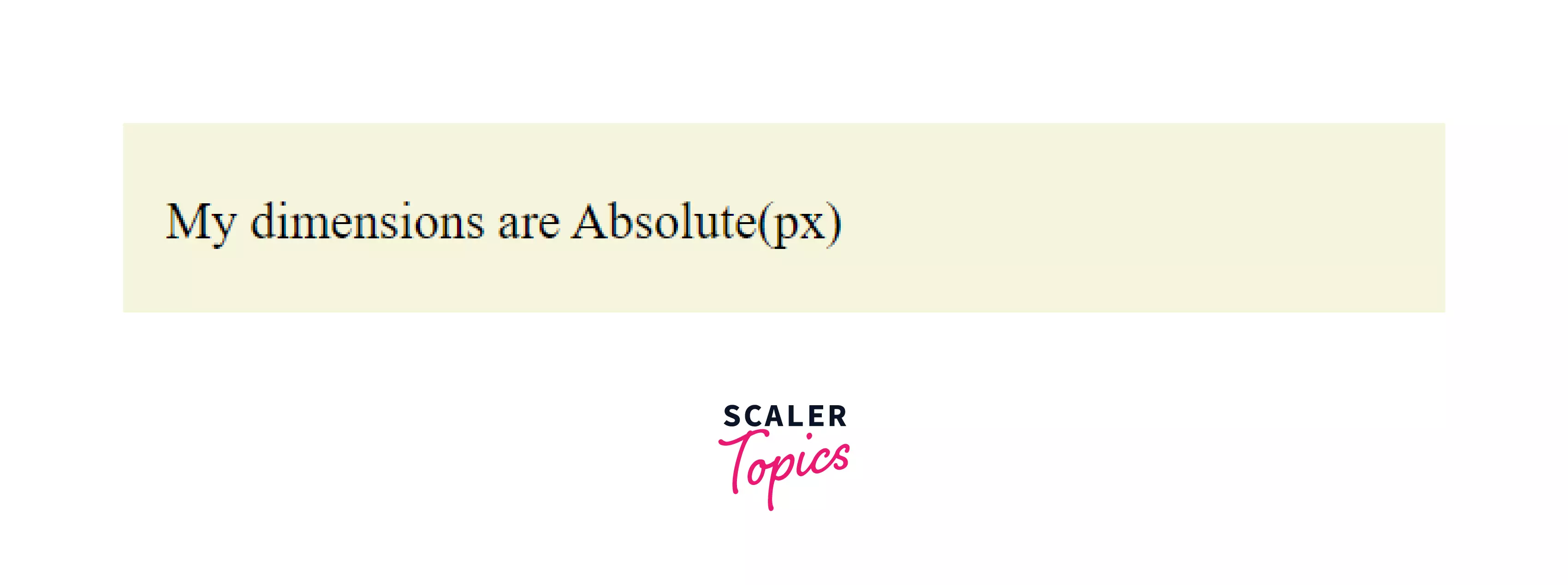
Output as we can see in the browser:
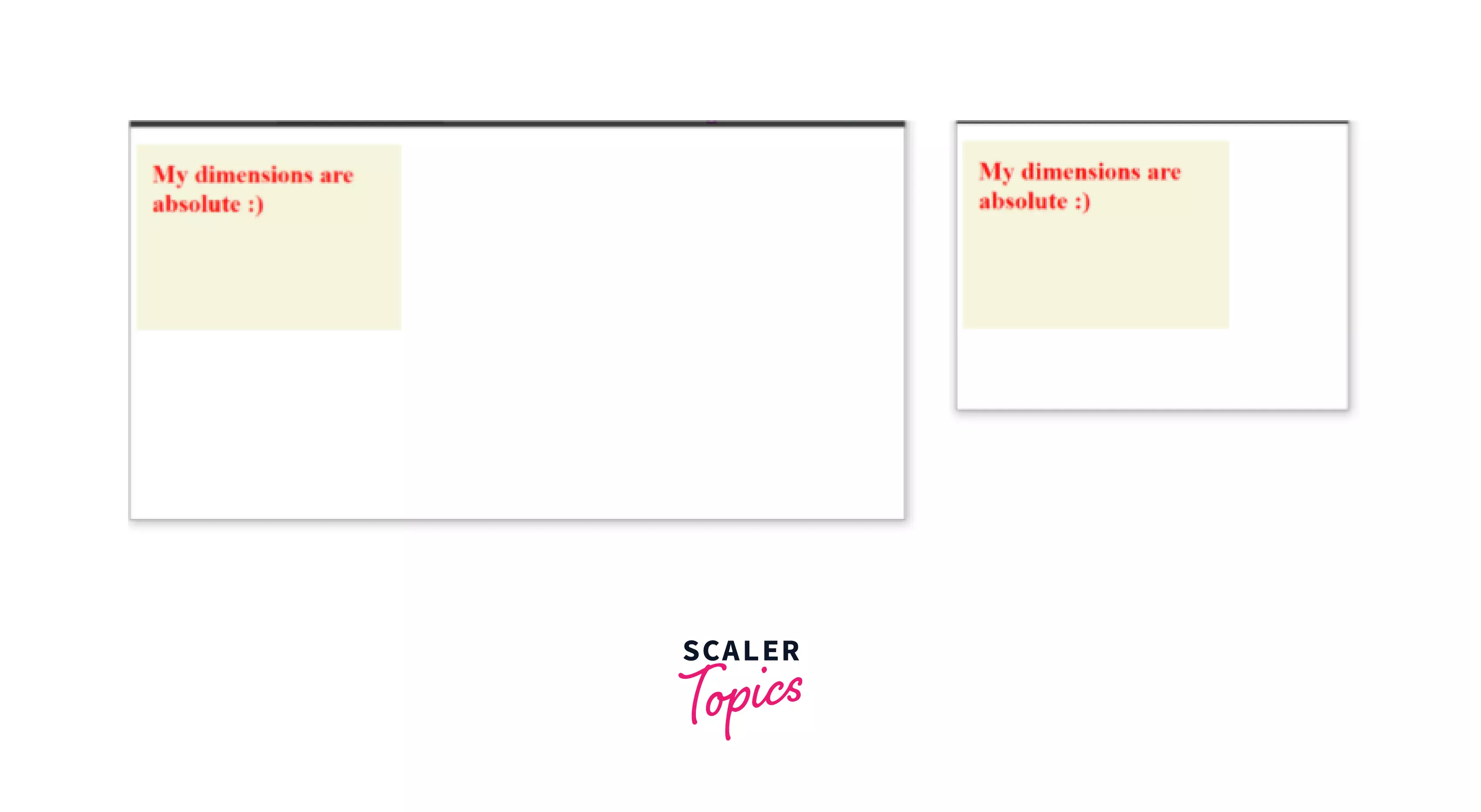
We can see, irrespective of the viewing window size, there is no change in the dimensions of the div inside. This is what absolute units mean. They remain the same in any size of the screen.
Let us have a close look at each of the different absolute units:
We shall be applying the different absolute unit on the same text to understand the difference better. The HTML containing the text goes as follows:
HTML:
CSS px:
px stands for Pixel. Pixels can be defined as 1/96th part of an inch.
Syntax:
NOTE:
- In most syntaxes, we have used the font-size property but any HTML element that has some length like width, height, margin, padding, etc will follow the same syntax for the CSS unit.
- All 'K' used in syntax is any numeric value (non-negative Integer or decimal).
Use case: Pixels are widely used in websites to make elements of fixed sizes (ex: in a logo) i.e we don’t want them to change size with screen size variation.
Example: HTML:
CSS:
The above CSS code changes the font size to 20px.
Output as in browser:
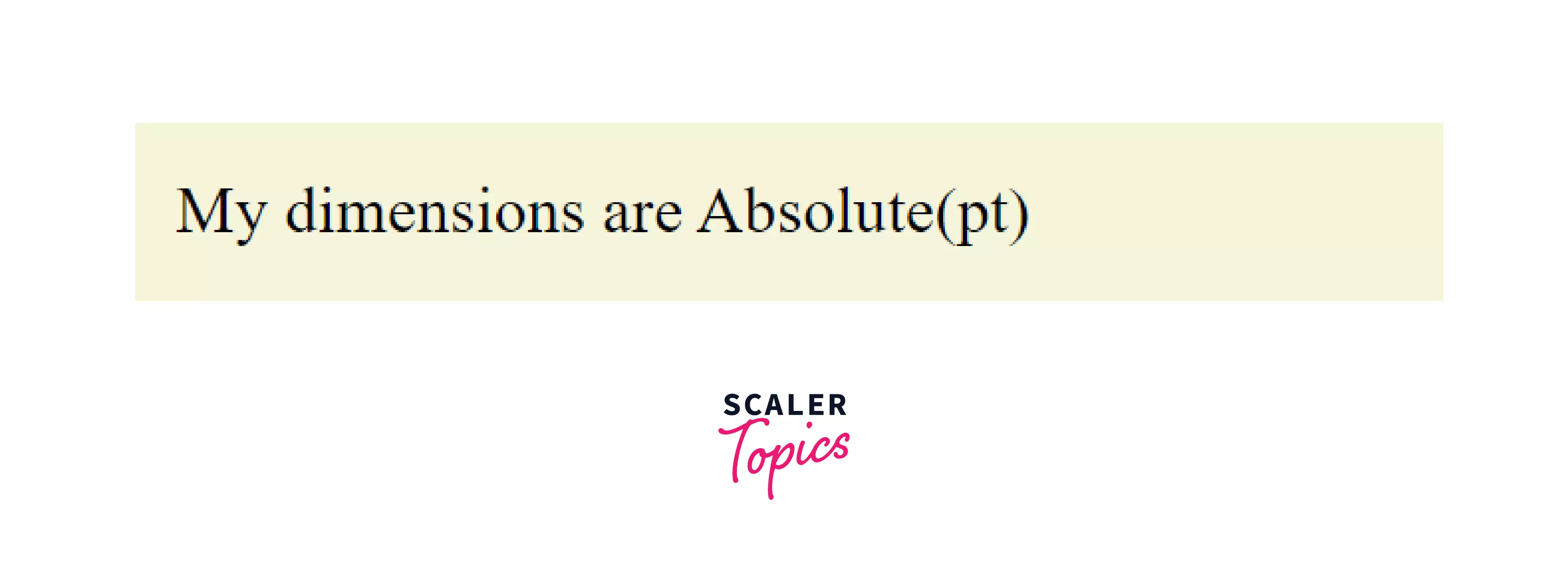
CSS pt:
pt stands for point. 1 CSS pt is defined as 1/72th of an inch.
Syntax:
Use case: This unit is mainly used in printers for printing the output on paper and not so widely used for on-screen outputs.
Example: HTML:
CSS:
The above CSS code changes the font size to 20pt.
Output as in browser:
Transform Your Career
Choose from our industry-leading programs designed for career success
Modern Software and AI Engineering Program
Master full-stack development with AI integration

 +1000 more
Modern Data Science and ML with specialisation in AI
Advanced data science techniques with AI specialization
+1000 moreAdvanced AIML with Specialisation in Agentic AI
Deep dive into AIML with focus on Agentic systems
+1000 moreDevOps, Cloud & AI Platform Engineering
Build and manage AI-powered cloud infrastructure
+1000 moreAI Engineering Advanced Certification by IIT-Roorkee
Premier AI engineering certification from IIT-Roorkee
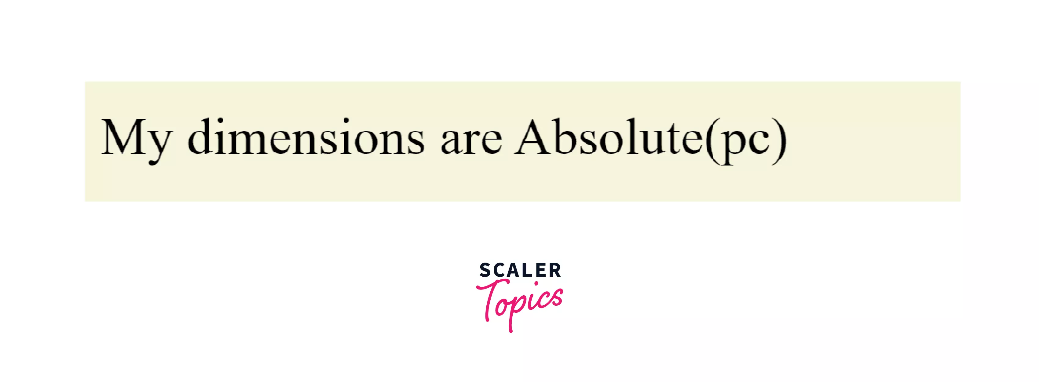
CSS pc:
pc stands for pica or picas. 1 CSS pt is defined as 1/6th of an inch.
Syntax:
Use case: This unit is mainly used in printers for printing the output on paper and not so widely used for on-screen outputs.
Example: HTML:
CSS:
The above CSS code changes the font size to 3pc.
Output as in browser:
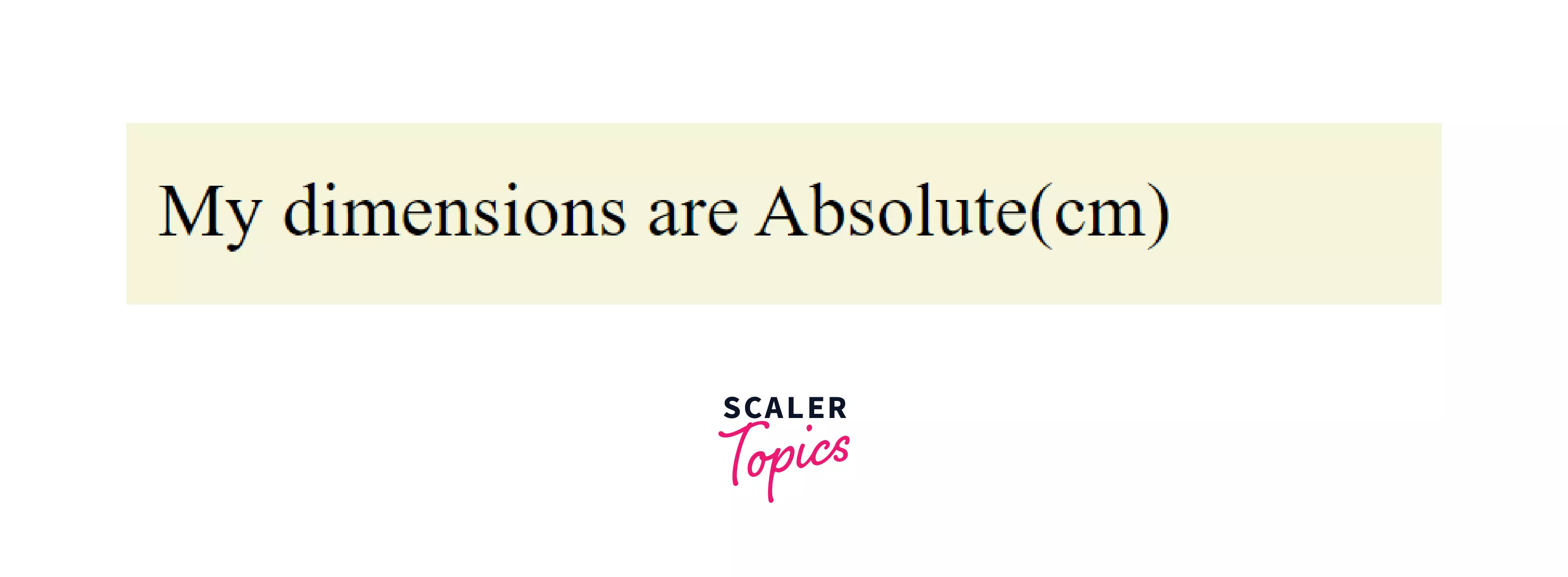
CSS cm:
This is our good ‘ol centimeter that we all know :).
Syntax:
Use case: This unit is mainly used in printers for printing the output on paper and not so widely used for on-screen outputs.
Example: HTML:
CSS:
The above CSS code changes the font size to 1cm.
Output as in browser:
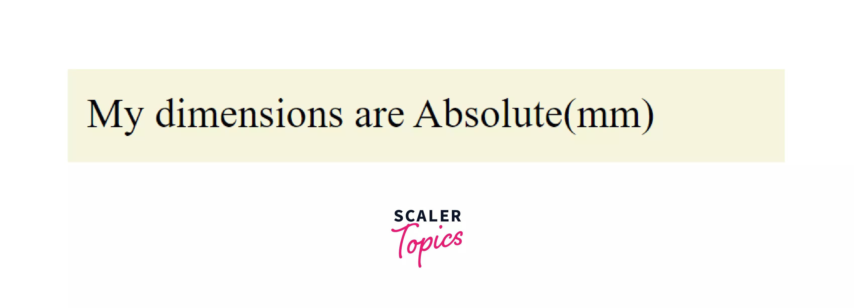
CSS mm:
mm stands for millimeter.
Syntax:
Where K is any numeric value.
Use case: This unit is mainly used in printers for printing the output on paper and not so widely used for on-screen outputs.
Example: HTML:
CSS:
The above CSS code changes the font size to 10mm.
Output as in browser:
CSS in:
in stands for inch.
Syntax:
Use case: This unit is mainly used in printers for printing the output on paper and not so widely used for on-screen outputs.
Example: HTML:
CSS:
The above CSS code changes the font size to 0.5 inches.
Output as in browser:
Relation between the Absolute Units in CSS:
| Unit | equivalence |
|---|---|
| pixel | 1px = 1/96th of an inch |
| point | 1pt = 1/72th of an inch |
| pica | 1pc = 1/6th of an inch |
| centimeter | 2.54 cm = 1 inch |
| milimeter | 10mm = 1cm |
That was all for the Absolute CSS units. Now let us have a look at the Relative units in CSS.
Scaler Placement Report and Statistics
Scaler learners achieved 2.5x salary growth with average post-Scaler CTC reaching ₹23L.
Relative Units
These units are relative to some other length property like the parent element's font size or the size of the viewport.
In relative units, we talk in terms of the same property, like, if we are talking about width of an element in relative units then it is relative to the WIDTH of the parent element/viewport. We shall be seeing this in the example section in a while.
Relative units, if used correctly, are suitable for making elements scale properly with respect to other things on the same page i.e to make the element responsive. We shall see this in the example below.
Let us take an example where we would set the width of a div to be exactly 50% of the width of the body element, and it should adjust itself automatically relative to the width of the body element.
HTML:
CSS:
The above CSS code sets the width to be 50% relative to the parent, which in this case, is the body, and sets the height to static 200px. Alongside we have set the padding to be 20px all around. The box-sizing is set to border-box for better understanding. (Read more about box-sizing <here (link Scaler Box sizing article)>
Output as in browser:
You can see from the above two pictures that at any point in time the width of the div is exactly 50% of the width of the parent(here, the body of the HTML). This is what makes the web pages “responsive”.
Now let us look into each of the Relative units available in CSS.
Turn Learning into Career Growth
CSS %:
This is the percentage unit. The measurement of the element is relative to the dimensions of the parent. Like if we set the width of an HTML element to be K% then its width is calculated as follows:
Syntax:
Use case: % is widely used for making responsive sites. This allows us to size HTML elements dynamically relative to the size of the viewing window.
Example: HTML:
CSS:
The above CSS code changes the size of the font inside a div is exactly 32px which is twice relative to the parent (i.e body). The default font size of plain text is 16px.
Output as in browser:
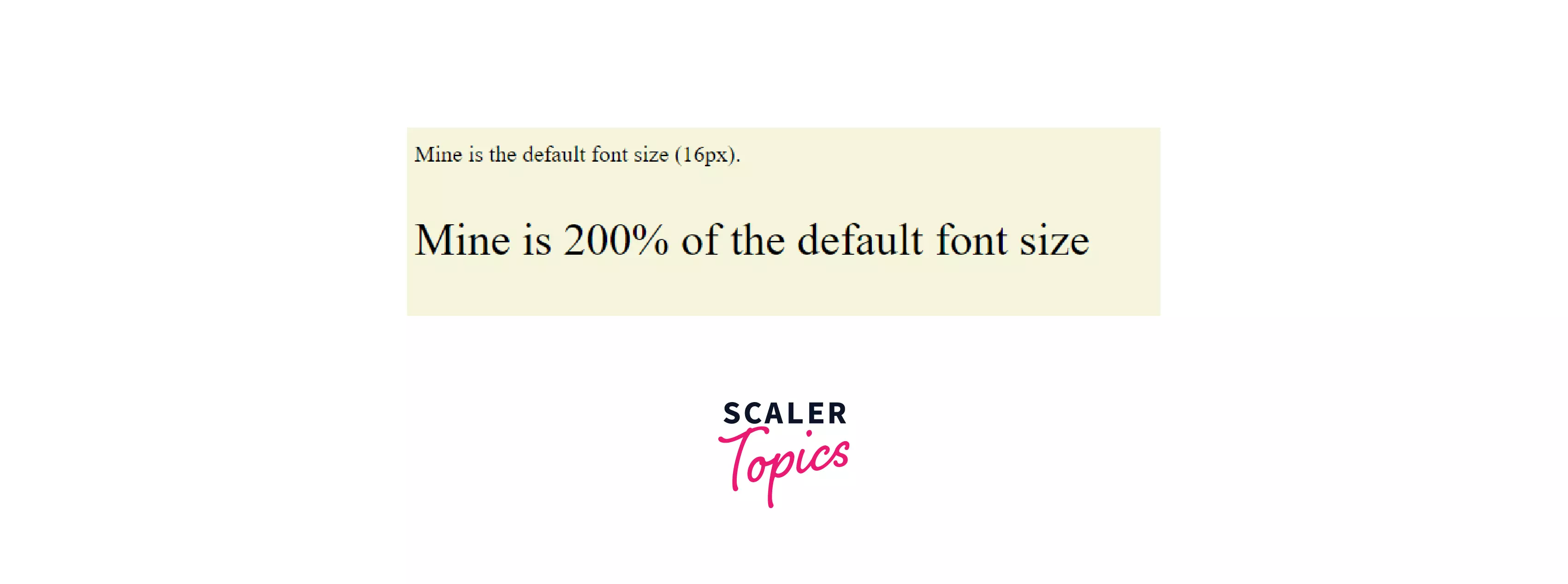
The size of the font inside a div is exactly 32px which is twice relative to the parent (i.e body). The default font size of plain text is 16px.
CSS em:
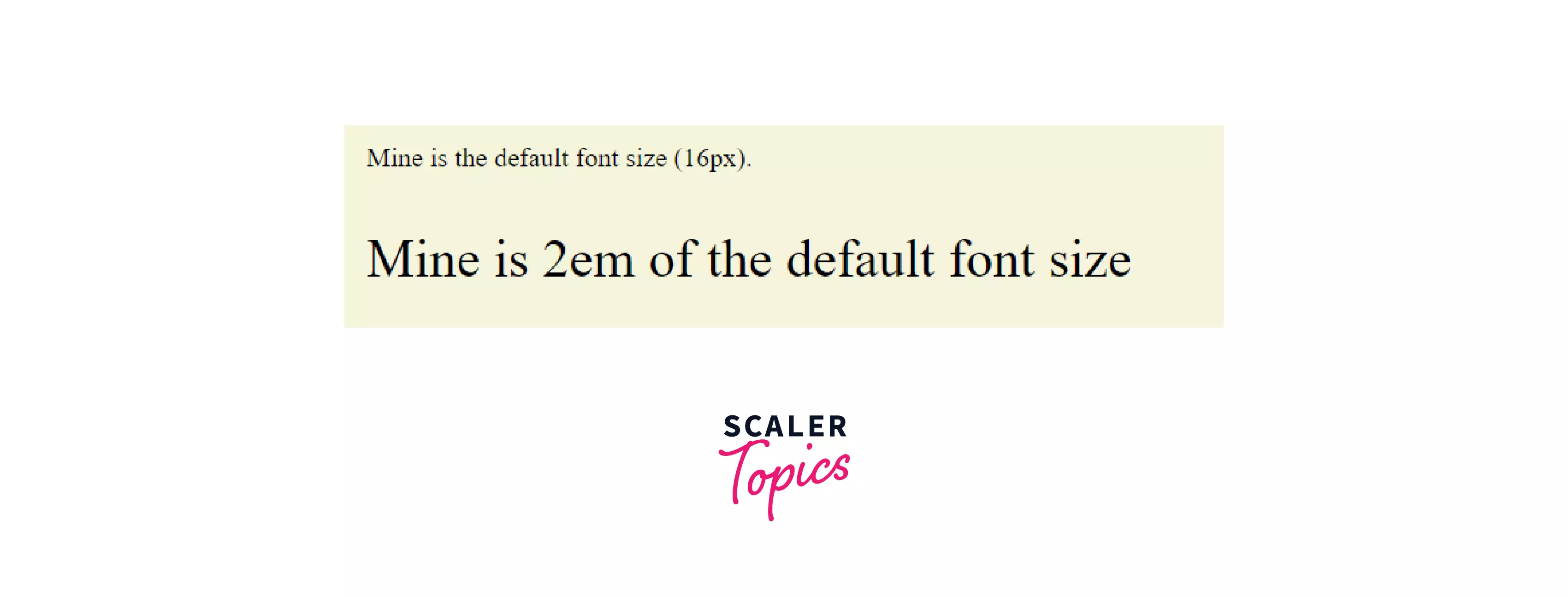
1em refers to the default size of the property. So precisely, 1em is equivalent to 100%. (i.e 1em in case of plain text would be 16px if the root value is unaltered)
Interesting fact about em: em in CSS is another widely used relative unit. It has got the phonetic pronunciation of the English alphabet ‘M’. This is because as per the olden days’ golden rules of typesetting 1em were used to signify the width of the capital letter ‘M’. 2em would mean twice the width of the capital ‘M’. But this is no longer the case in the modern era.
Syntax:
Use case: This is mostly used to achieve the same values dynamically as is the case with % but applicable specifically to font size.
Example: HTML:
CSS:
The output will be exactly the same as it was with 200%.
Output as in browser:
NOTE: Both % and em are inherited as they are RELATIVE TO THEIR PARENT! So, if we put parent font size as 2em then again we put child font size as 2em it would be added up to 4em (i.e 400% of the default value)! This might cause issues in the case of large CSS codes.
Example to show the add up effect of the em unit: HTML:
CSS:
The above code sets the font-size of body to be 2em, then further in the <p> tag we set the font-size as 2em. The resulting font will be thus 4em relative to the default font size due to the adding-up effect.
Output:
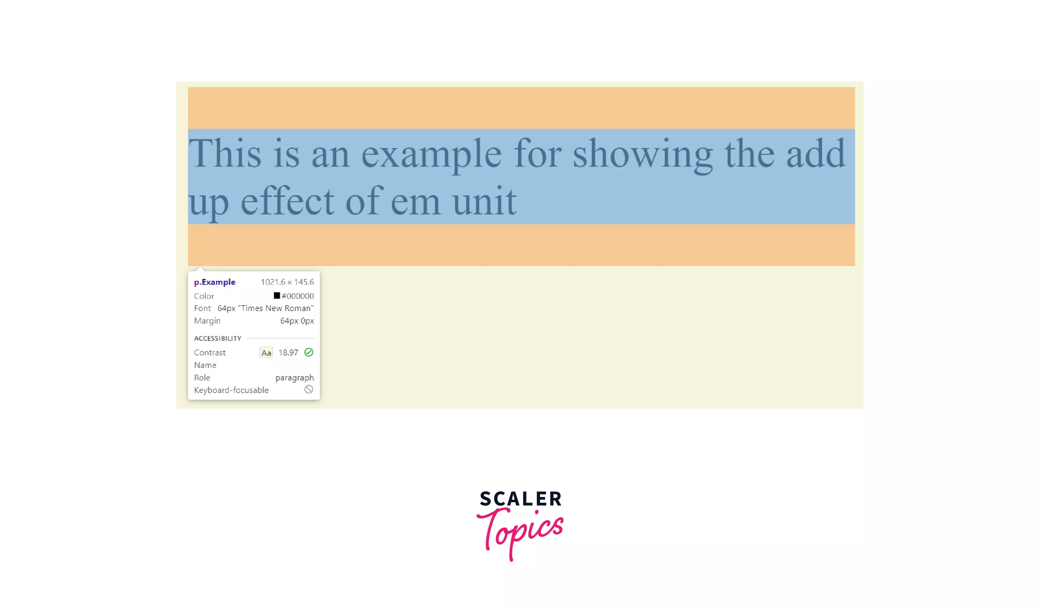
As you can see the font size is 64px which is 4 times the default font size of 16px.
CSS rem:
This unit counters the adding-up effect of units like % and em. rem rather stands for Root em.
This means the browser will ignore all the adjustments made to the parent elements and will scale the HTML element, to which the property is applied, based on the root/default value for that particular element.
Syntax:
Use case: This is used to achieve the values relative to the root/default value of the HTML elements. This is usually used for font-size property.
Example:
HTML:
CSS:
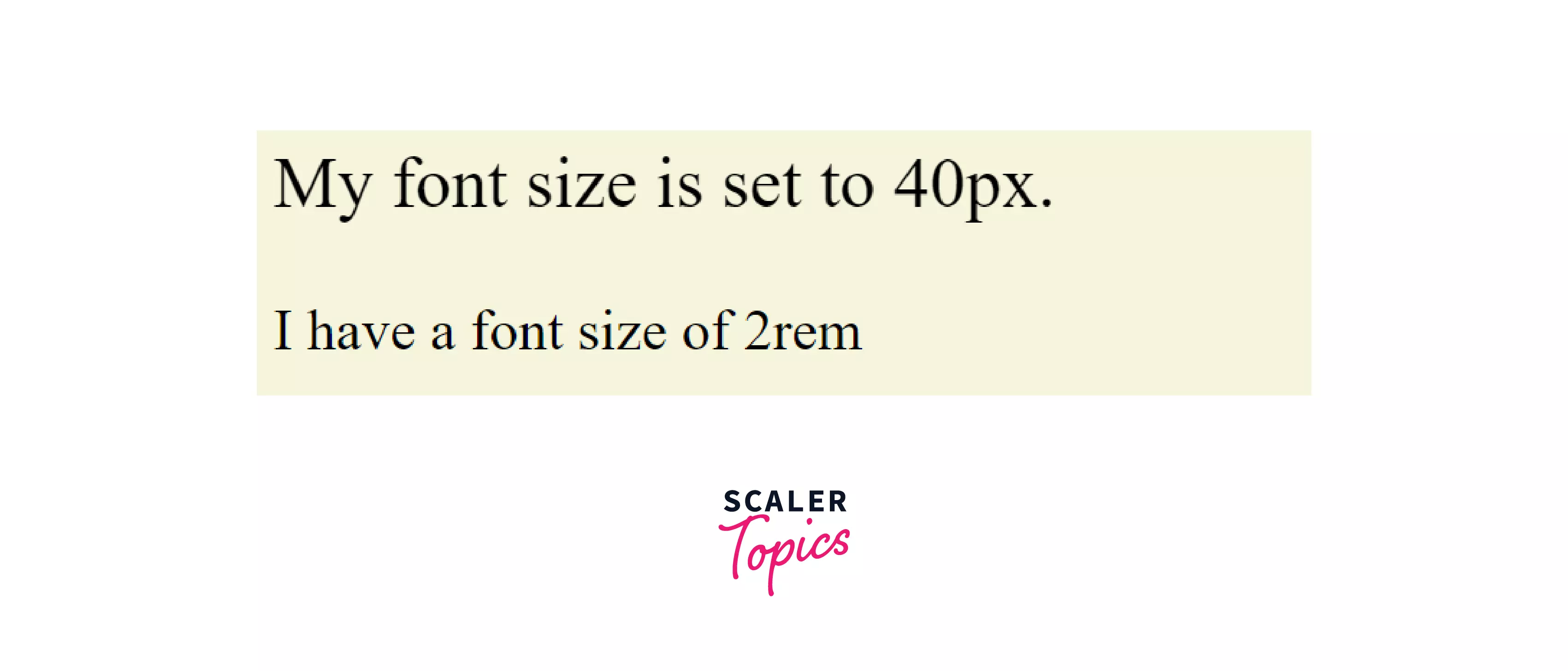
In this CSS code, the font-size of the div is set to 2rem (i.e twice the base font size ignoring all changes) and thus is (2 x 16px=) 32px. It ignores the change in font size of 40px made to its parent (here, the body).
Output as in browser:
CSS ch:
This unit sizes relative to the width of the digit ‘0’ as in parent. For plain text 1ch=8px (this is only true if the font-size of the parent element is unchanged from the default value of 16px.);
Syntax:
Use case: This is used to achieve the values relative to the width of the digit ‘0’. This is not very commonly used.
Example:
HTML:
CSS:
The output is similar to plain text i.e 16px.
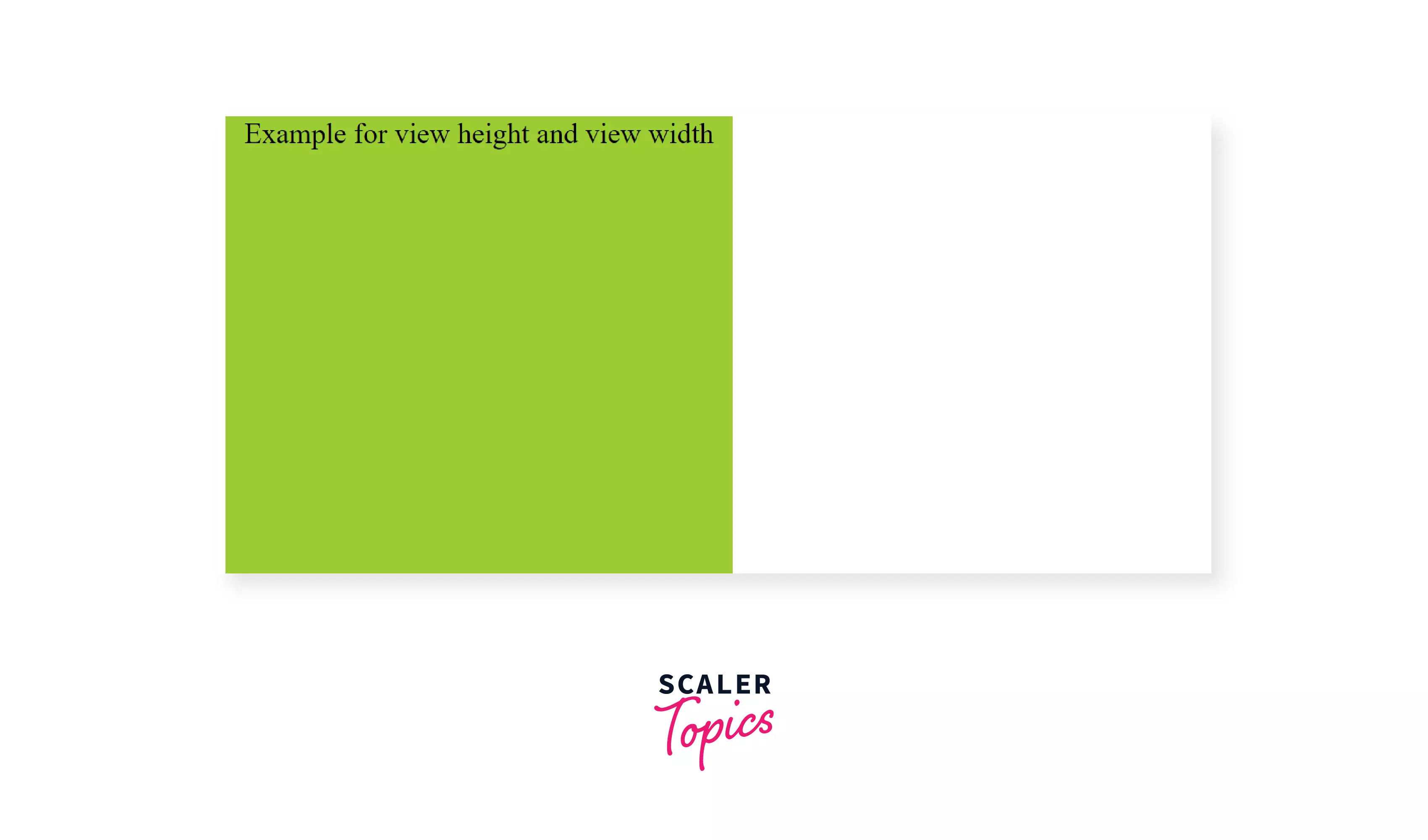
CSS vh:
This stands for view height. If we want our element to have exactly the same height as your viewport/ view window then use 100vh to denote that.
Syntax:
Use case: Mainly used for pages that occupy the entire height of the viewport.
CSS vw:
vw stands for View Width. 100vw means 100% the width of the viewport/view window.
Syntax:
Use case: Mainly used when the element width needs to be framed w.r.t the width of the viewport.
Example of using vh and vw units:
HTML:
CSS:
The above CSS code sets the height to 100vh, the width to 50vh, and font-size as 2 rem.
Output as viewed in the browser:
CSS vmin:
100vmin means the element changes are relative to 100% of the smaller dimension of the viewport (i.e 100% of the minimum of view height and view width).
Syntax:
Use case: Used for responsive views. If we want to fit an element within the viewport we would prioritize the minimum of the two vh and vw.
Scaler Placement Report and Statistics
Scaler learners achieved 2.5x salary growth with average post-Scaler CTC reaching ₹23L.
CSS vmax:
100vmax means the element changes are relative to 100% of the larger dimension of the viewport (i.e 100% of maximum of the view height and the view width).
Syntax: font-size: Kvmax;
Use case: Used for responsive views. If we want to fit an element to scale relative to larger of vh and vw.
Example of vmin and vmax:
HTML:
CSS:
The above CSS code sets the height to 70vmax and the width to 50vmin, alongside a font-size of 2rem.
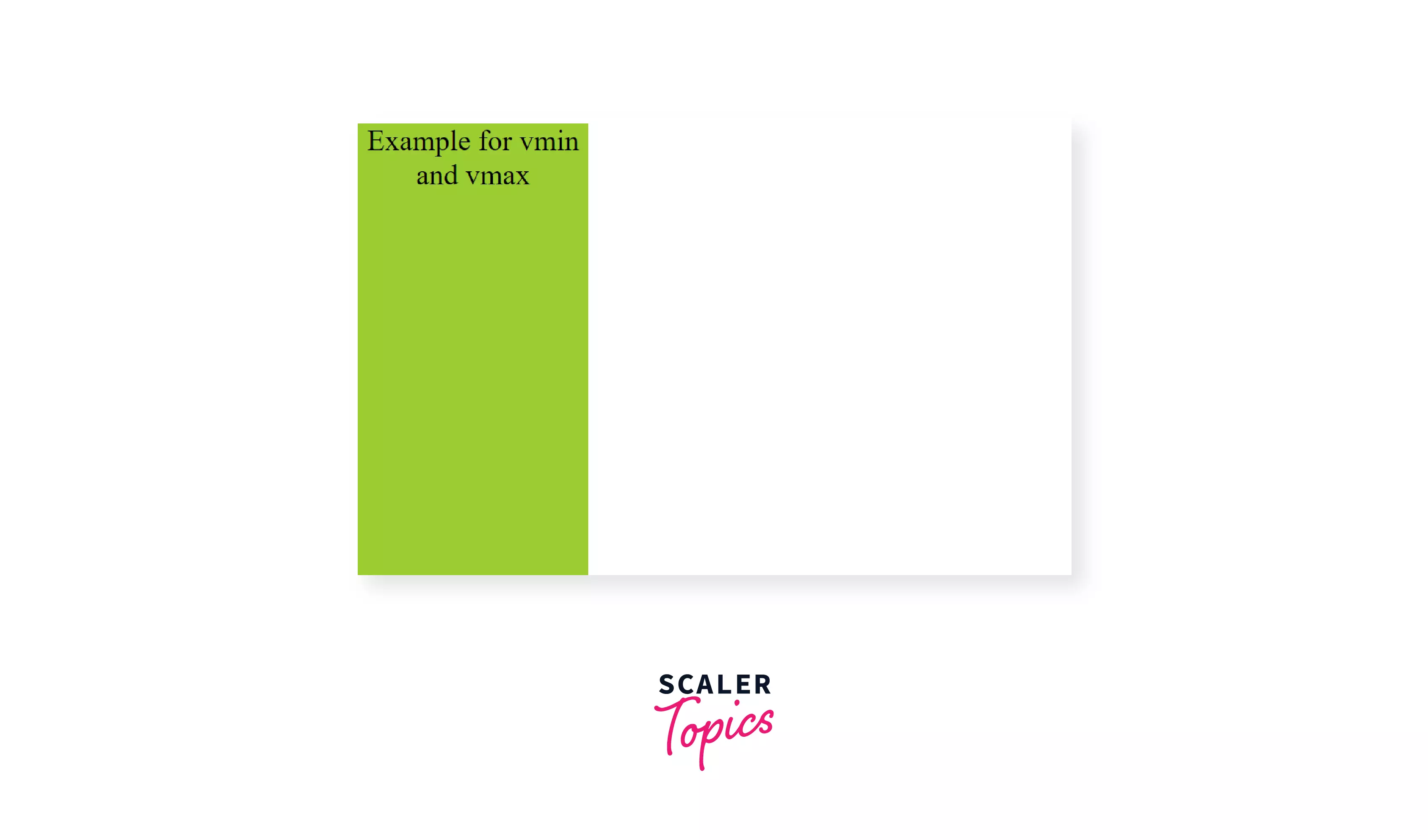
The width of the element is 50% of the minimum of vh and vw (here the smaller one is vh). The height of the element is 70% of the maximum of vh and vh (here the maximum is vw).
CSS ex:
Relative to the height of the letter ‘x’, 1ex would be equal to the length from the base of the letter ‘x’ to the intersection point.
Syntax:
Use case: very rarely used.
Absolute Unit Vs Relative Unit:
- The values for absolute units do not depend on any other factor and remain the same irrespective of any change. Whereas in relative units the values depend on some factor and changing that factor will cause the value to change.
- Relative units are preferred over absolute units for making responsive sites because when HTML elements are set to relative unit they scale with respect to the size of the viewing window thus the size of elements will change automatically to fit the size of the screen i.e. become responsive.
Summary:
-
All the dimensions mentioned in CSS need some unit just like other real-world measurements. These units are known as CSS units.
-
CSS units are mainly of two types:
- Absolute
- Relative
-
Absolute units: values are fixed irrespective of any other factors like parent element or viewing window.
- Pixel is the most commonly used absolute unit.
-
Relative units: values are relative to some other value on the web page and make the website responsive.
- The most commonly used relative units are %, em, rem.
-
Unitless dimensions: If the numeric value is zero then the unit can be skipped.
 Google
 Amazon
 Microsoft
 Flipkart
 Adobe1200+ more