linear-gradient() - CSS
 FREE
FREE

In CSS, gradients elevate styling beyond solid colors and images. They are color transitions where an area shifts from one color to another. In CSS, Gradients are of two types:
- linear gradients
- radial gradients.
Let's explore each of them in detail.
CSS linear-gradient() Function
The linear-gradient() function is an inbuilt function in CSS to set the linear gradient CSS as the background image.
The linear-gradient() function creates an image that displays a transition in the form of two or more colors along a straight line.
Basically, CSS gradients are represented by the <gradient> data type, which is a special kind of image. Therefore, the linear-gradient() function results in an object of <gradient> type.
This function can be used anywhere you would use an image, such as the background, since gradients are generated dynamically, so they can be used instead of traditional raster images that give similar effects.
Moreover, the gradient is generated by the browser itself, so they look better than raster images when zoomed in.
Definition and Usage of linear-gradient() Function in CSS
The linear-gradient() function sets a linear gradient, a transition between colors along a straight line as the background image. We can specify two or more colors to display the transition among them.
To create a linear gradient, you should specify at least two colors. These are the colors among which you want a transition. You can also state a direction in which the change of colors should happen. However, the default direction is 180 degrees or from top to bottom.
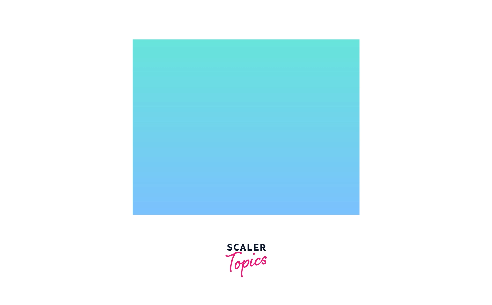 This will be the default direction as depicted in the above image and is equivalent to the top to the bottom, which means the colors are distributed from top to bottom.
Transform Your Career
Choose from our industry-leading programs designed for career success
Modern Software and AI Engineering Program
Master full-stack development with AI integration

 +1000 more
Modern Data Science and ML with specialisation in AI
Advanced data science techniques with AI specialization
+1000 moreAdvanced AIML with Specialisation in Agentic AI
Deep dive into AIML with focus on Agentic systems
+1000 moreDevOps, Cloud & AI Platform Engineering
Build and manage AI-powered cloud infrastructure
+1000 moreAI Engineering Advanced Certification by IIT-Roorkee
Premier AI engineering certification from IIT-Roorkee
Composition of linear-gradient
The linear gradient is composed of-
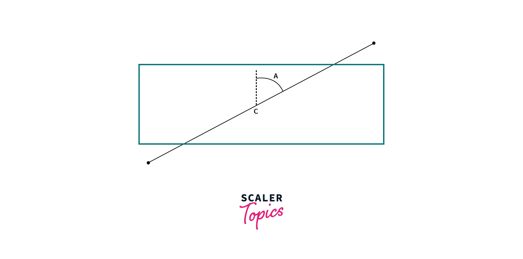
1. Gradient Box - A gradient image has infinite dimensions, unlike other background images. What gives a visible dimension to the gradient is the gradient box which is the area where it is displayed, i.e., around any HTML element.
When we apply a linear gradient to any Html element, that area is the border-box for that element which is the same area that would have been taken by any background image unless you change the size using other CSS properties.
However, we can set the size of the gradient box using the background-size property of CSS then the gradient box will be resized and will be placed in the top left corner of the DOM element by default.
2. Gradient line - A linear-gradient is defined by an axis called the gradient line. The colors that make the gradient are placed on this gradient line. This line can be vertical, horizontal, diagonal, or at any angle, as you will specify in the linear-gradient function.
The colors of the gradient are defined by two or more points, the starting point, the ending point, and other optional points. The colors you specify will start at the starting point and end at the ending point. The other optional points are spread on the gradient line between the starting and the ending point.
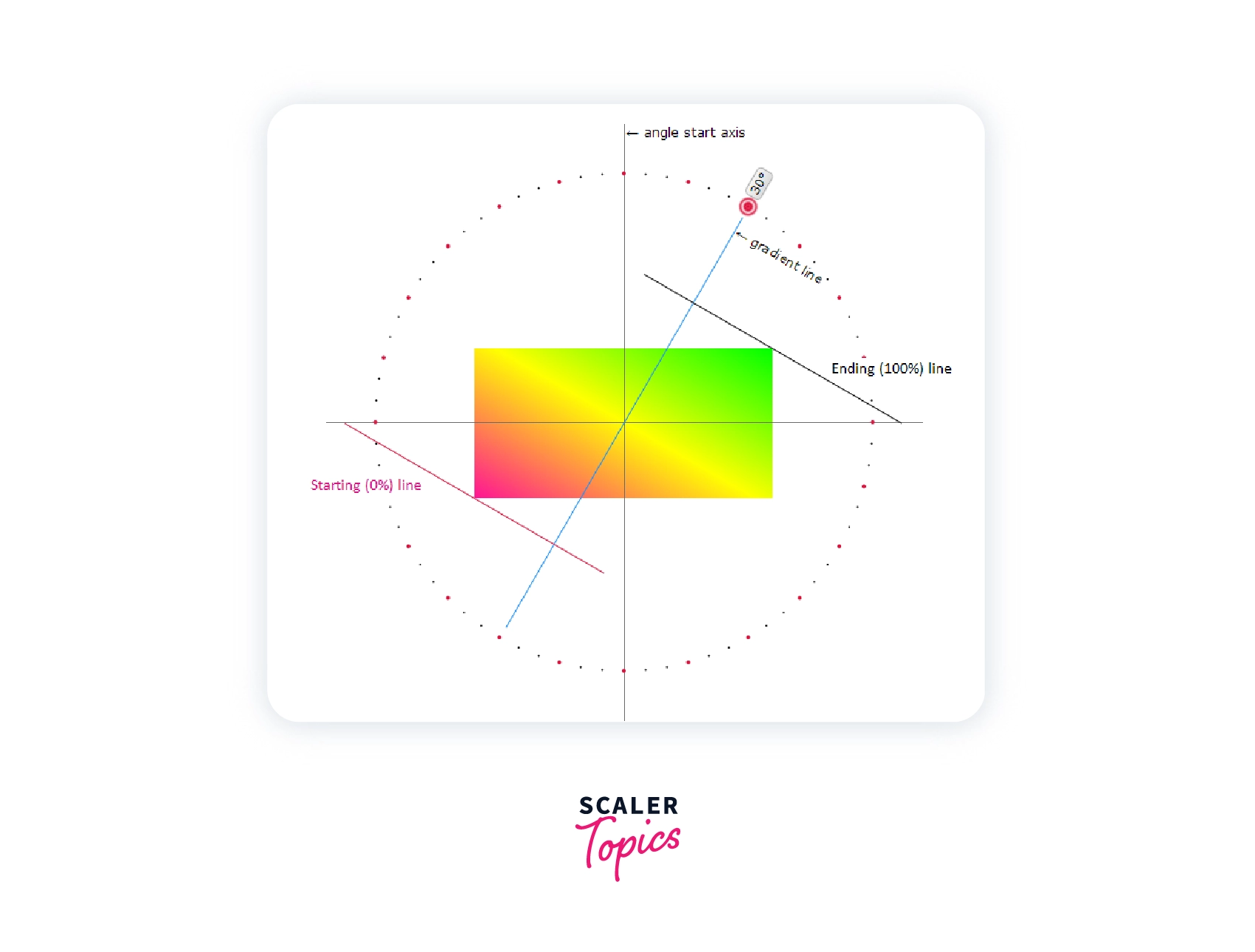
3. Gradient angle - The gradient angle is used to determine the direction of the gradient with respect to the gradient line. The gradient angle is the angle between the gradient line and a vertical line that passes through the center of the gradient box.
This angle can be defined either by specifying an angle with a unit or using one of the keywords like to top, to bottom, to the right, to the left, to top right, etc. However, if no angle is specified, by default, it takes to the bottom (180deg or 0.5turn)
Syntax
The linear-gradient() function can be used either with the background property or the background-image property of CSS.
Values
-
-It is the gradient line's angle of direction with respect to a vertical line that passes through the center of the gradient box. The value of 0deg corresponds to 'to top'; other increasing values rotate in a clockwise direction from there. However, it is an optional field. By default, its value is 180 degrees. -
- This tells the position of the gradient line's starting point. It consists of the word 'to' followed by two keywords- one to depict the vertical side (up or bottom) and the other to indicate the horizontal side (left or right). However, the order of the keywords does not matter. If the value of any one of the <angle> or the <side-or-corner> is present in the linear-gradient(), then the gradient is specified according to that. Otherwise, the default value to the bottom is used; therefore, it is also an optional field.
-
- It specifies different color stops inside the gradient box. These color stops are ordered in a comma-separated list where each color can be defined as- <color> [<percentage> | <length>]?
<percentage> or <length> are used to specify the position of the color stops explicitly. However, it is not necessary to specify the percentage or length; mentioning the color would be enough.
Scaler Placement Report and Statistics
Scaler learners achieved 2.5x salary growth with average post-Scaler CTC reaching ₹23L.
Examples
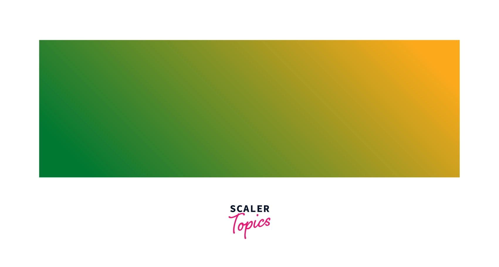
background-image: linear-gradient(pink, green, yellow);
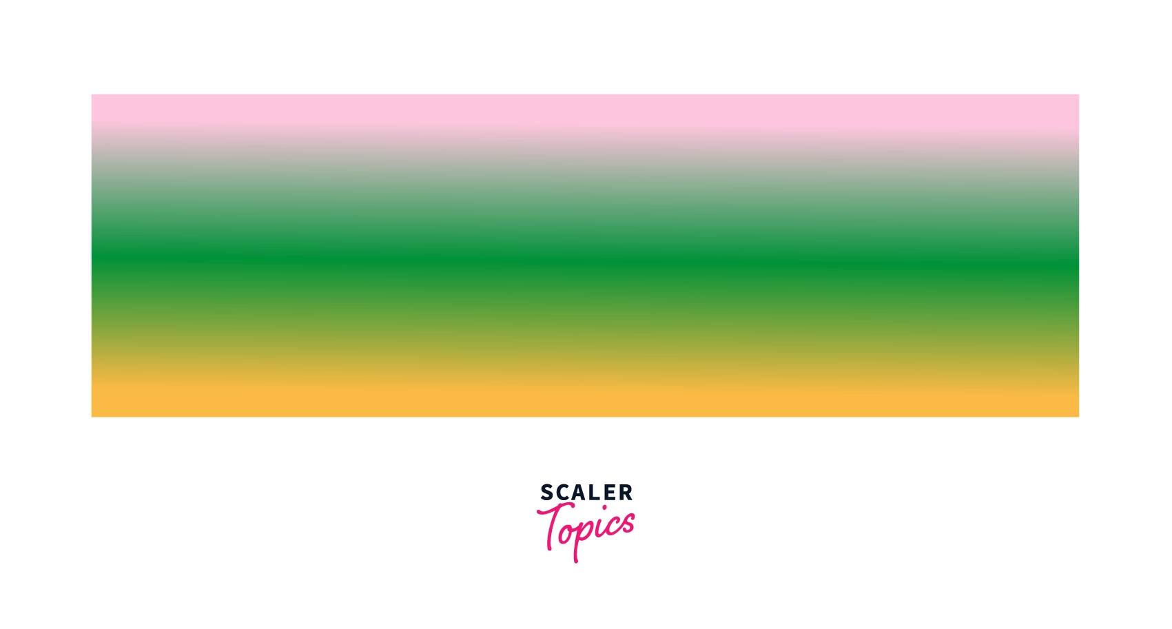
The transitions among the three colors are rendered at an angle of 180deg(default value). The three values of the colors pink, green, and yellow specified in the linear-gradient function are the three color stops among which the transitions are made.
One important thing to keep in mind is that the various colors are displayed as "lines" and are always perpendicular to the gradient line.
background-image: linear-gradient(45deg, green, yellow);
The first value in the linear-gradient() function specifies the transition being rendered at an angle of 45 degrees, followed by two color stops.
background-image: linear-gradient(red 0%,orange 25%, yellow 50%, green 75%, blue 100%);
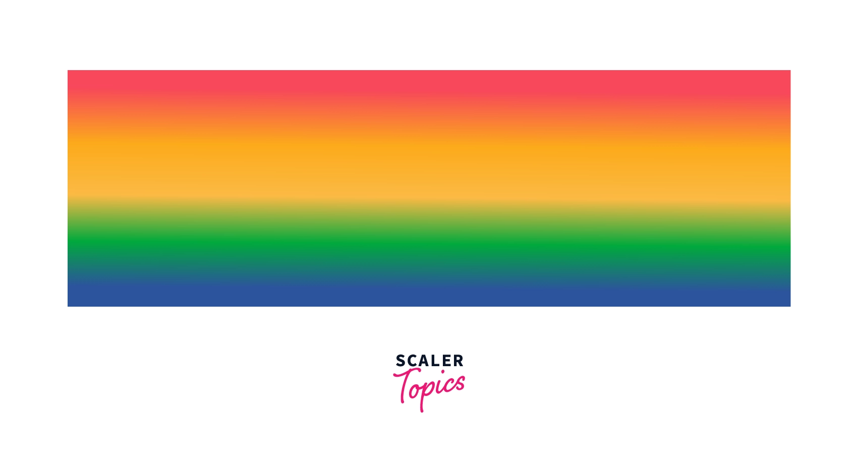
In the above example, we are defining the positions of each color stop. The red color starts at 0% of the area occupied by the gradient box, followed by the orange color, which starts at 25%, then yellow at 50%, followed by green and blue at 75% and 100%, respectively.
Though color stops should be listed in ascending order. Yet, if you don't order them properly, the browser will do it for you.
background-image: linear-gradient(to right, red 30px, yellow 60px, red 90px, yellow 120px,red 150px);
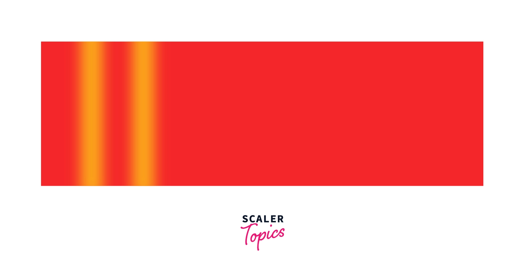
In this example, the position of the color stops is defined using length in pixels. These positions are calculated from the start of the gradient line. The direction of the gradient line to the left.
background-image: linear-gradient(red 20%, yellow, blue 80%);
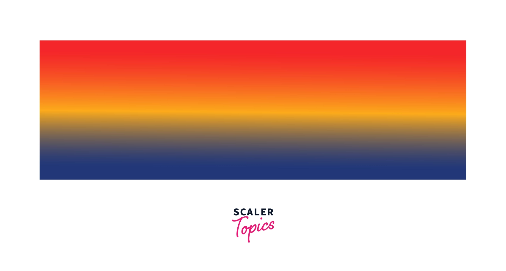
If you mix both positioned and un-positioned color stops, then the browser will find the right place for the un-positioned color like it did in the above example for yellow.
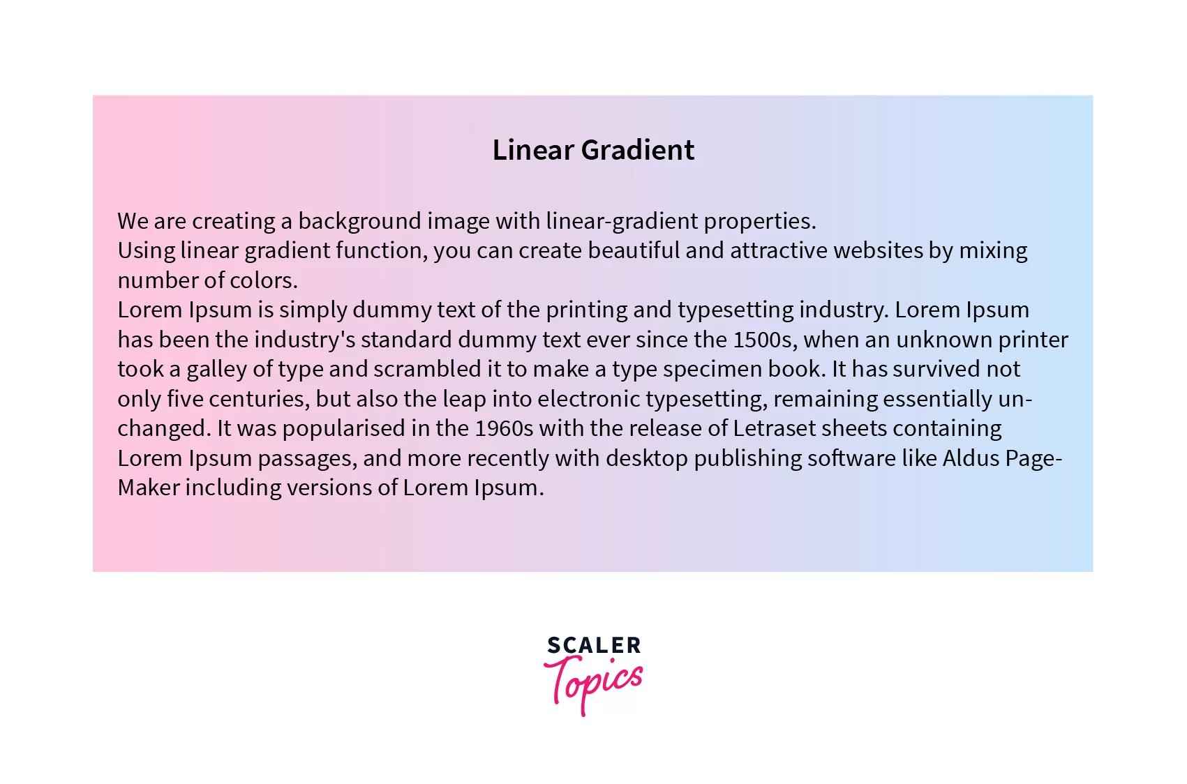
How to create a linear gradient background using CSS?
The below code will create a transition of the two colors specified at an angle of 90deg with some random text on the screen.
Output:
Conclusion
- A linear gradient CSS is used to display a smooth transition between two or more colors along a straight line.
- To create a transition, we use a linear-gradient() function, which takes the list of colors as a parameter; the direction of the transition and the positions of the color stops can also be given as a parameter, but they are optional.
- The linear gradient is defined by an axis which is the gradient line on which color stops are distributed.
- The gradient line makes an angle with a vertical line that passes through the center of the gradient box, known as the gradient angle, which tells us the direction in which the gradient is going.
- Therefore, by defining the gradient function, we can make different backgrounds that we can use on our websites.
See Also:
- Use CSS Formatter to format your code
 Google
 Amazon
 Microsoft
 Flipkart
 Adobe1200+ more