Media Query CSS
 FREE
FREE

Abstract
Media queries in CSS are CSS features that display content that adapts to different features such as screen resolution. It applies different custom styles to a browser or device and targets specific characteristics and features to make the web page more responsive. CSS Breakpoints are customizable widths to control and change the behavior of our layout on various devices and screen sizes. They are used to change font size, background color, hide elements, and many more.
What are CSS Media Queries?
Media Queries is a feature of CSS allowing content rendering to adapt to different features such as screen resolution. CSS Media Queries apply different custom styles to a browser or device to suit user preferences. It targets specific characteristics and features to make the system more responsive.
As we all know, the most commonly used media query is viewport ranges, but it is not the only one. There are a lot of others like orientation, resolution, aspect-ratio, and many more that are yet unexplored.
Media Query CSS Syntax
A media query in CSS consists of a media type(optional) and can contain multiple media feature expressions that can be either true or false. They are combined using not, and, and only logical operators.
Let's get a closer look to uncover its meaning.
Scaler Placement Report and Statistics
Scaler learners achieved 2.5x salary growth with average post-Scaler CTC reaching ₹23L.
Media Types
Media types are the media that we are trying to style. In many cases, we use the screen as the media type. Let's explore each of them.
- all -To match all devices like devices with print previews or screen.
- print -Used for devices with print previews or intended to print like printers.
- screen -Used for devices with a screen like tablets, laptops, mobile phones, and computers.
- speech-Used for devices with a screen reader. It applies the style when the screen reader reads the page out loud like Adobe Reader.
Logical Operators
- and - It combines media features or a media type and feature. It is true if all the expressions are true. It also represents a range of various features.
It shows the color of the text as blue when the screen has a min-width of 600px and a landscape orientation. If either of the condition is false, the code results in its default black color.
As the conditions are joined by the and operator, the code works only when all the conditions are true. In the example, the element styles when the screen width is between 320px to 768px.
- or (Comma-separated) - If either of the queries is true, we comma-separate them.
Unlike the and operator, the or operator works well when either of the conditions are true. In this example, the code applies if either the screen is in landscape mode or it has a min-width of 600px.
- not - not operator is used to negate the entire query and reverse its meaning.
It is evaluated as not (all and (orientation: landscape)) which works when the screen is not on landscape mode.
Media Query in CSS Examples
As you design a website, make sure you check its responsiveness on real devices. Do Right Click and Inspect. You can choose from various devices and their orientation in which you want to view your webpage.
- Using max-width feature as media query in CSS
In this example, we are going to know about the max-width feature. It allows us to style the elements until the screen reaches the maximum width.
Output:
- Using orientation feature as a media query in CSS In this example, we are styling elements using the orientation feature of media query. Let's have a look to get a deeper understanding of it.
Output:
CSS Media Query Features
Width
It specifies the width of the viewport. It can be a specific number or a range of values using min-width and max-width.
Transform Your Career
Choose from our industry-leading programs designed for career success
Modern Software and AI Engineering Program
Master full-stack development with AI integration

 +1000 more
Modern Data Science and ML with specialisation in AI
Advanced data science techniques with AI specialization
+1000 moreAdvanced AIML with Specialisation in Agentic AI
Deep dive into AIML with focus on Agentic systems
+1000 moreDevOps, Cloud & AI Platform Engineering
Build and manage AI-powered cloud infrastructure
+1000 moreAI Engineering Advanced Certification by IIT-Roorkee
Premier AI engineering certification from IIT-Roorkee
Height
It specifies the height of the viewport. It can be a specific number or a range of values using min-height and max-height.
Device-Width
It specifies the width of the screen that displays rendered elements.
Device-Height
It specifies the height of the screen that displays rendered elements.
Scaler Placement Report and Statistics
Scaler learners achieved 2.5x salary growth with average post-Scaler CTC reaching ₹23L.
Orientation
It is the mode of the orientation of the viewport. It can be portrait(vertical) or landscape(horizontal) based on screen rotation.
Aspect-Ratio
It specifies the ratio between the width and height of the viewport.
Device-Aspect-Ratio
It specifies the ratio of the values device-width and device-height of the rendering surface.
Color
It specifies the number of bits of the color of a device.
Color-Index
It specifies the number of colors the device supports. It can be an exact number or a range of values with min-color-index and max-color-index.
Monochrome
It specifies the number of bits of the color of a monochrome or greyscale device.
Turn Learning into Career Growth
Resolution
It specifies the resolution of the device in terms of pixel density.
Scan
It specifies the scanning process of the output device to display how a device paints an image on the screen. It has two values interlace and progressive. Interlace draws odd and even lines alternatively, whereas progressive draws them all in a sequence.
Grid
It uses a 0 and 1 to determine if a device has a grid(1) or bitmap(0) screen.
Writing Media Queries in CSS for Responsive Design
Nowadays, Responsive is the key feature of a website. The website must adapt to all browsers and devices for optimal user experience. Media queries are a salient feature of responsive web design as it allows to create different layouts depending on the viewport size and know more about the website in depth. It is with the help of breakpoints. Breakpoints are customizable widths to control and change the behavior of our layout on various devices and screen sizes.
We use the @media rule to style elements with a set of CSS properties only if they satisfy certain conditions. If the conditions are false, the default value takes its charge. In case of comma seperated media query, the other condition checks for its validity. Thus, responsive design is a perfect combination of media features joined using logical operators to work on the suitable media types.
How to Set CSS Breakpoints?
CSS Breakpoints are set based on two things:
- Based on device With the rapidly changing technology, there are too many devices coming out with different screen sizes. It is not feasible for designers to target every screen size. So to cover all the sizes, we set breakpoints on the most popular device sizes. Moreover, We should first design on mobile before designing for any other devices. Instead of changing styles for smaller devices, we should change them for larger ones.
These media query are applied depending on the devices where we want to change the layout of the the elements.
- Based on content It is better to change the designs where the content starts to break. That's the point where we use a media query. These are the points where breakpoints get added. We add a breakpoint when we want a webpage to behave differently on either side of the breakpoint. Thus the webpage becomes more readable and attractive. For example, we see a collapsed menu on small screens and an expanded form on screen size more than that.
These media queries help us create a layout as per our convenience and definition of breakpoints. The breakpoints can be in between the ranges of the specified devices and can start and end based on the content.
Using Min-Width and Max-Width for CSS Breakpoints
We use min and max screen width media queries to make our website responsive on all screen sizes.
Min-width media queries are used to set breakpoints for mobile devices, whereas max-width media queries are for larger ones.
These are the media query ranges or breakpoints we use in our CSS for all types of devices.
Min-Width
The min-width media queries apply styles on mobile devices. It takes the assigned value as the initial values and applies the styles until the maximum limit. For example, @media (min-width: 576px) { ... } applies the styles on screen with width more than 576px. The style would apply to devices between the minimum specified width and above.
Max-Width
The max-width media queries apply styles on larger devices. It takes zero as the initial value if no minimum value has been set yet. Styles within that media query apply on devices whose screen width lies in the range of zero and the given max-width. For example, @media (max-width: 576px) { ... } applies the styles on screen with width between 0 and 576px.
Note: We subtract 0.02 from the max values to avoid conflict between the ranges.
The Media Query CSS Breakpoints to be Used
There are six default breakpoints in CSS which fit in most websites.
| BreakpointClass | infix | Dimensions |
|---|---|---|
| X-Small | None | <576px |
| Small | sm | ≥576px |
| Medium | md | ≥768px |
| Large | lg | ≥992px |
| Extra large | xl | ≥1200px |
| Extra extra large | xxl | ≥1400px |
Note : The media query infixes are used when we write our CSS code in sass and are available as sass mixins. Sass mixins define styles through CSS codes that are reused throughout the stylesheet.
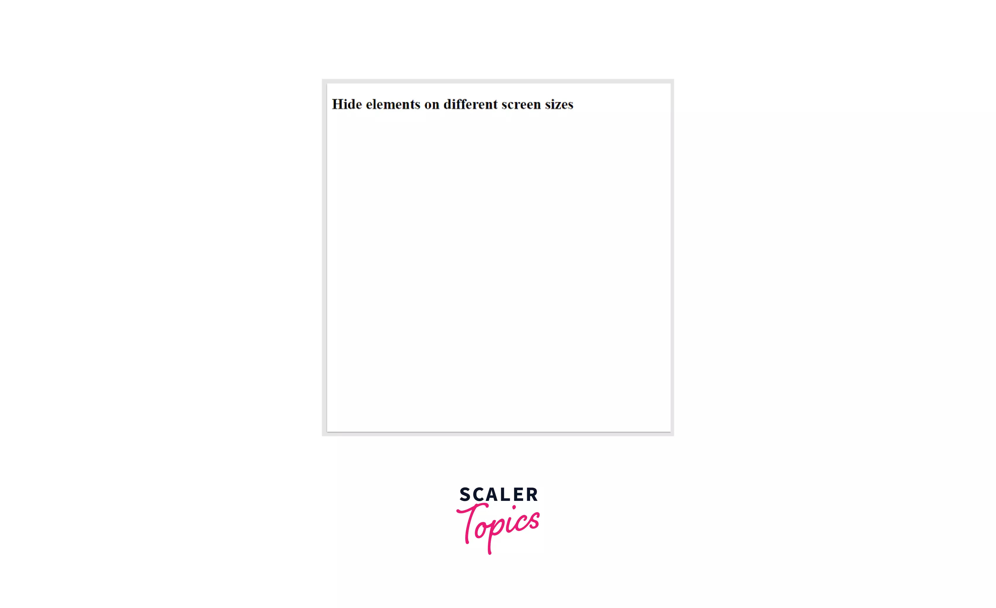
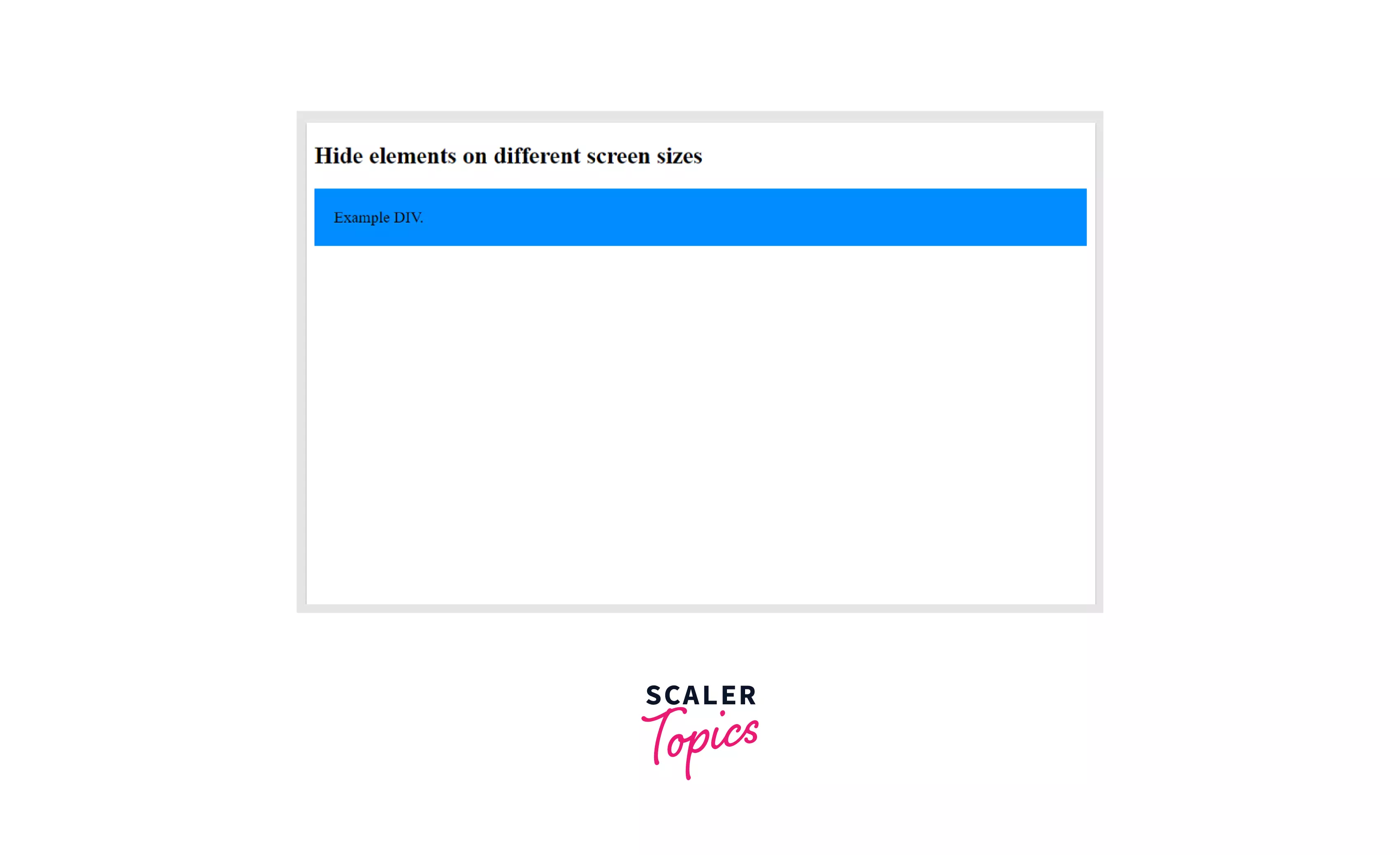
Hide Elements With CSS Media Queries
Hiding elements using media queries is of utmost importance when working on different screen sizes. Sometimes we need to display elements on larger devices that are a mess in mobile devices. To avoid such situations, we use the display property to hide elements in CSS. Display property applied with the appropriate range, and media query help us decide when to hide the elements.
Output
When the browser's width is 600px wide or less, hide the div element. Resize the browser window to see the effect.
For screen width less than 600px
Screen width greater than 600px
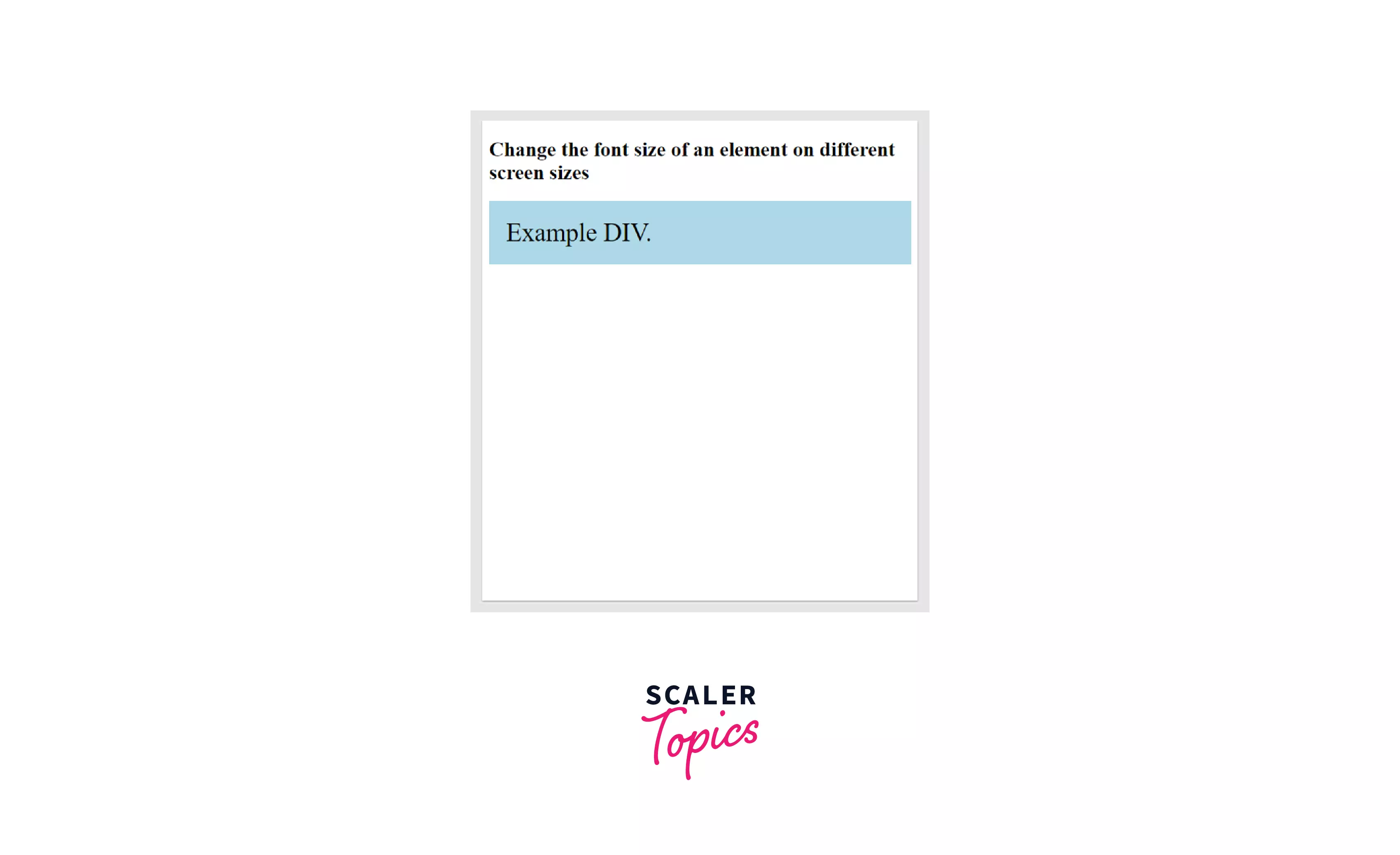
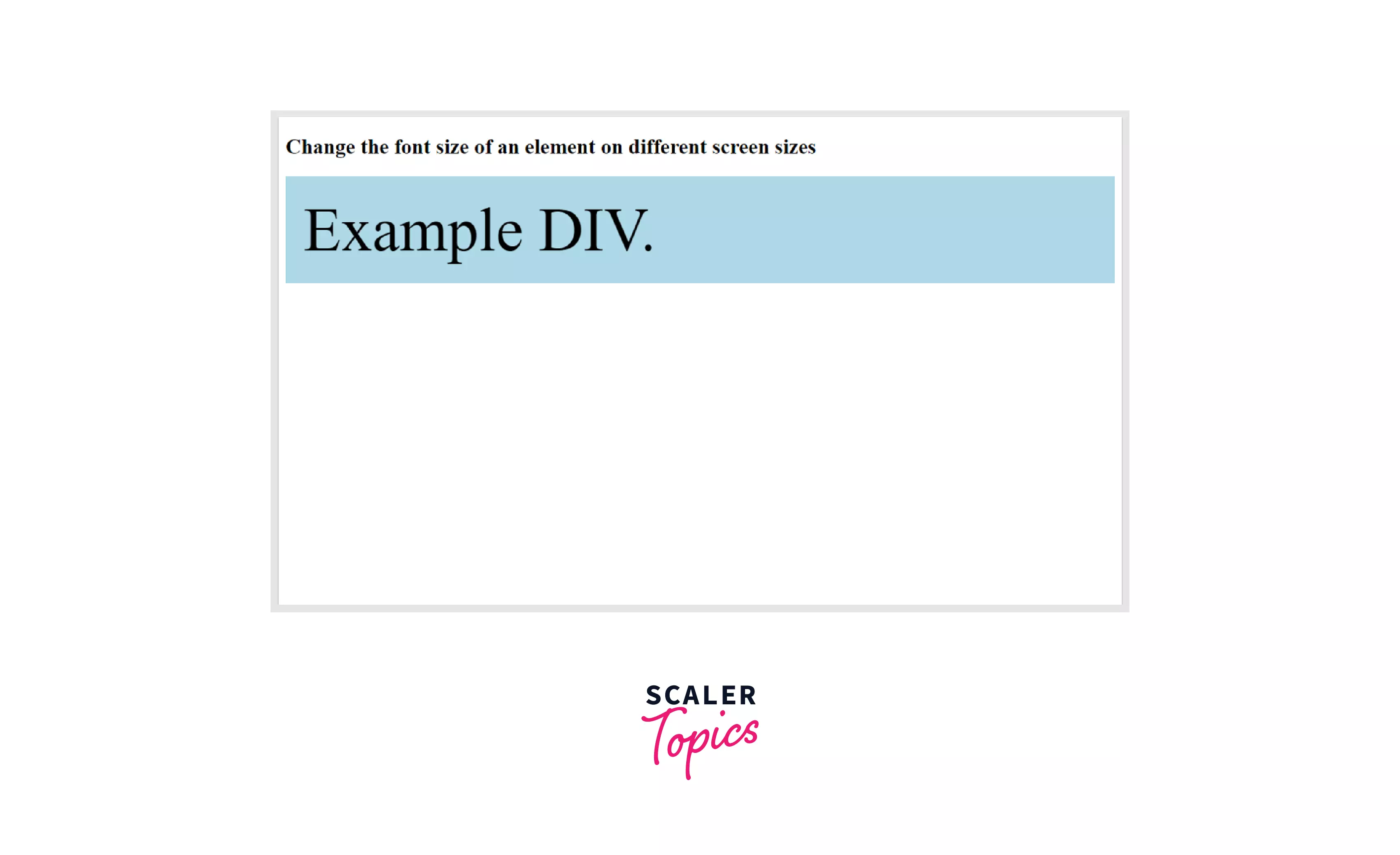
Change Font Size With Media Queries in CSS
We use media queries in CSS with font-size property to change the font size on different screen sizes. In this example, we will see how the font size reduces on smaller screen sizes and increases on the larger screen sizes.
Output When the browser's width is 600px wide or less, set the font-size of DIV to 30px. When it is 601px or wider, set the font-size to 80px. Resize the browser window to see the effect.
Output on small screen
Output on wider screen
Conclusion
- Media queries are adaptable to different screen sizes and device types like printers and screen readers.
- They can be applied to various media query features like min-width, max-width, orientation, height, resolution, etc.
- They can also be used to hide and display elements where required.
- These are used to design websites and applications which can work on various screen sizes by changing layouts at certain breakpoints.
- Breakpoints are created based on content and devices.
See Also:
 Google
 Amazon
 Microsoft
 Flipkart
 Adobe1200+ more