Data Visualisation in Python

Overview
To understand what your data conveys, and the stories it contains, and for being able to clean it properly for models as well, it must be first visualized and represented in a pictorial format. This representation of your data, in pictorial formats such as graphs is known as data visualization. Python provides a plethora of libraries for data visualization. Some of the prominent libraries are - Matplotlib, Seaborn, Bokeh, and Plotly.
Scope
- This article discusses the basics of data visualization in python.
- It contains a short description of libraries and their usage of them to create scatter, line, bar, and histogram graphs along with code.
- The article does not go into the details of every function and library used for data visualization in Python.
Introduction to Data Visualization in Python
Every day, data is generated in zettabytes, where 1 zettabyte is bytes. With such large amounts of data being generated every day, it is obvious that you would never be able to understand it, or summarize it (if asked) if it is given to you in a tabular format or in any raw format.
To understand what your data conveys, and the stories it contains, and for being able to clean it properly for models as well, it must be first visualized and represented in a pictorial format. That way, you would be able to expose patterns, correlations, and trends from the data that you would not have been able to do if it was presented to you in a tabular format.
So, with the help of data visualization, you will be able to get the summary of your data visually. You'll have pictures, maps, and graphs that help the human brain in processing and understanding any given data easily. The process of data visualization plays a very significant role when it comes to representing small or large data sets, however, it is especially useful for large data sets since it is practically impossible to look at all the data at once, let alone process it, or understand it manually. This process of data visualization is made simple by Python. Python comes with multiple libraries that aid us in representing our data pictorially. Before we get to how python can aid us with data visualization, let's take a look at the data that we would use for the examples in this article.
Transform Your Career
Choose from our industry-leading programs designed for career success
Modern Software and AI Engineering Program
Master full-stack development with AI integration

Modern Data Science and ML with specialisation in AI
Advanced data science techniques with AI specialization
Advanced AIML with Specialisation in Agentic AI
Deep dive into AIML with focus on Agentic systems
DevOps, Cloud & AI Platform Engineering
Build and manage AI-powered cloud infrastructure
AI Engineering Advanced Certification by IIT-Roorkee
Premier AI engineering certification from IIT-Roorkee
Database Used
For this article, we will make use of a data set on which we will perform the data visualization in Python. This data set is called the Tips database.
Tips Database
The tips data set is a collection of details about the tips given by customers in a restaurant in the early 1990s. The data contains the tips collected for a time period of 2 and a half months.
It has 244 rows, with the columns as - total_bill (total bill of the customer), tip (the tip given by the customer), sex (gender of the customer), smoker (yes or no if customer smokes), day (day of the week), time (lunch or dinner) and size (number of people).
This data set can be downloaded from here.
Let's take a look at the data. So to read the data we will make use of a library provided by python called - Pandas. We will first import it with an alias - pd. Next, we will use the read_csv() method by pandas which helps in reading files of the csv (comma separated value) format. We will then make use of the head() method which by default prints the first 5 rows of a dataset. In the paranthesis, you can also add 10 like this - head(10) to read the first 10 rows of the dataset.
Output:
| index | total_bill | tip | sex | smoker | day | time | size |
|---|---|---|---|---|---|---|---|
| 0 | 16.99 | 1.01 | Female | No | Sun | Dinner | 2 |
| 1 | 10.34 | 1.66 | Male | No | Sun | Dinner | 3 |
| 2 | 21.01 | 3.5 | Male | No | Sun | Dinner | 3 |
| 3 | 23.68 | 3.31 | Male | No | Sun | Dinner | 2 |
| 4 | 24.59 | 3.61 | Female | No | Sun | Dinner | 4 |
Here's what it looks like. Now we have our data, and we can move to understand how to visualize this data in Python.
Scaler Placement Report and Statistics
Scaler learners achieved 2.5x salary growth with average post-Scaler CTC reaching ₹23L.
Packages for data visualization in python
Python comes with multiple libraries or modules that help with the data visualization in Python. The most commonly used libraries that we will discuss in this article are - Matplotlib, seaborn, bokeh, and plotly.
Let's look at each one of them.
Matplotlib
This library is a low-level, easy-to-use library for data visualization in Python and it is built on NumPy arrays. It allows you to build plots like - scatter plots, bar graphs, stem charts, step graphs, histograms, box plots, pie charts, violin plots, etc. To see all types of plots, refer to Matplotlib.
To install Matplotlib you can use the following command to install using the package manager pip:
If you are using conda:
Now that you have matplotlib installed, we can move further with creating wonderful visualizations using this library. Let's discuss some very common plots. In this article, we're going to use the matplotlib.pyplot library where pyplot is a submodule.
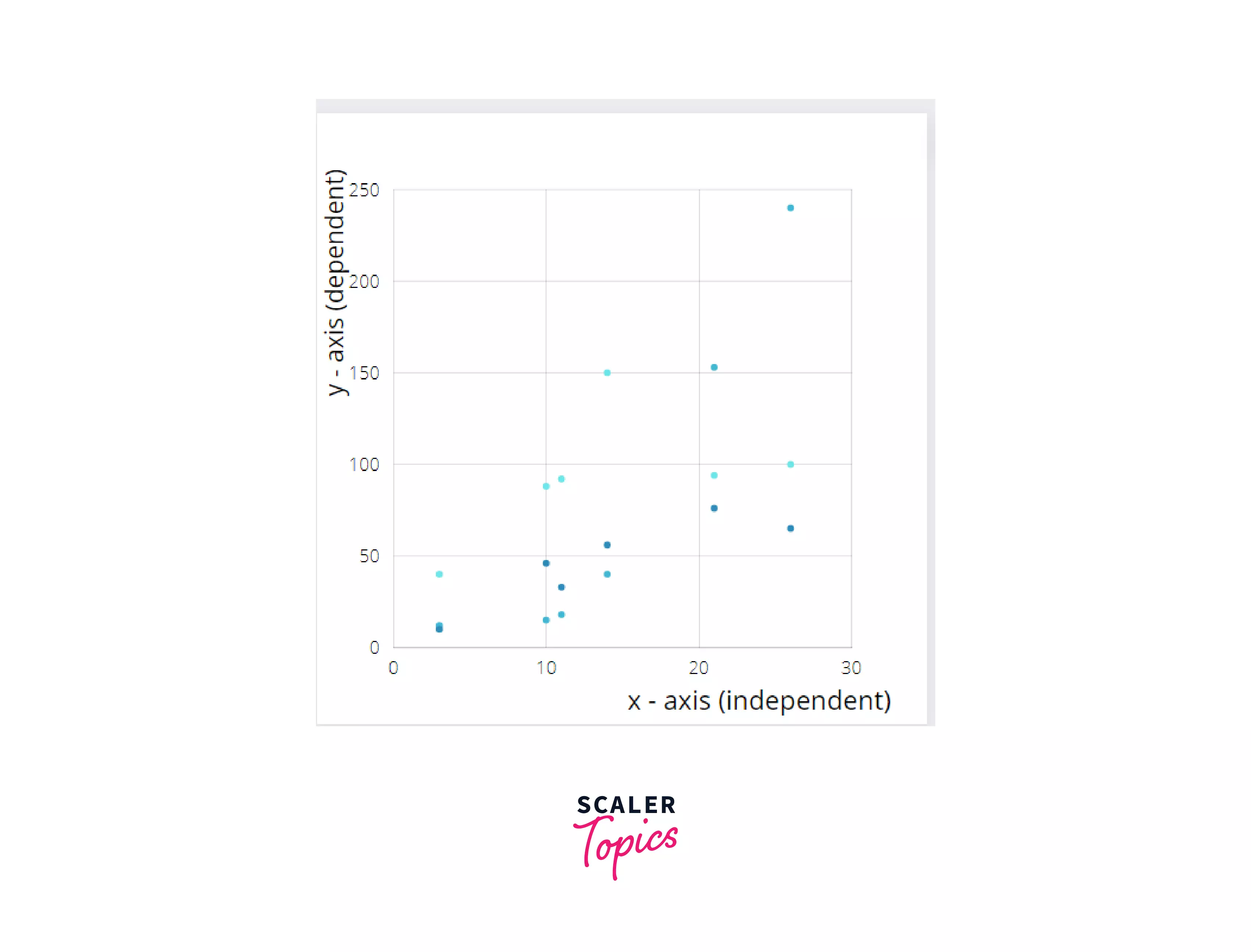
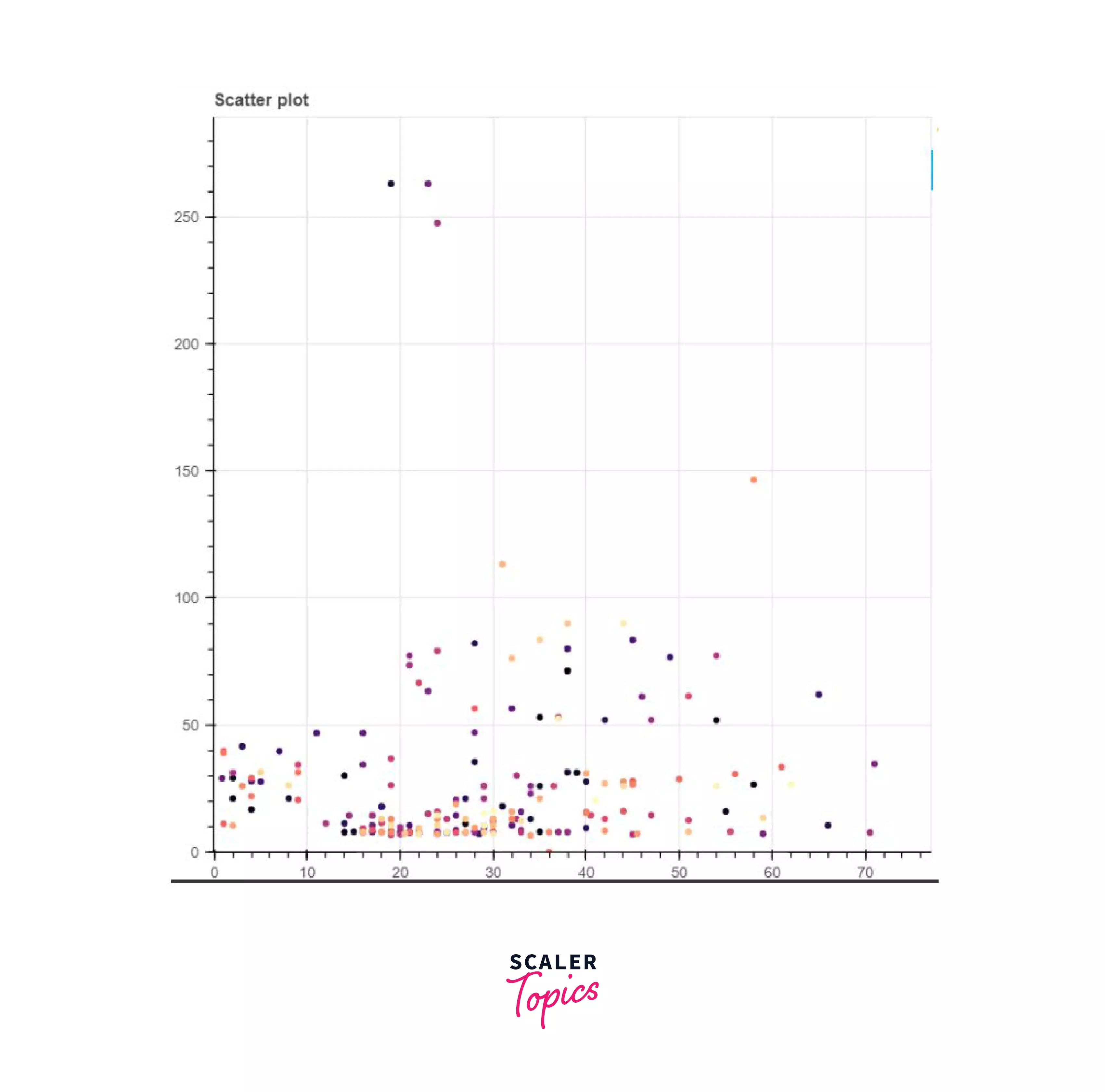
Scatter Plot: A scatter plot is a 2-dimensional plot that represents the relationship between any two variables. In this plot, the independent variable is plotted on the X-axis and the dependent variable on the Y-axis.
Here's an example of a scatter plot:
A scatter plot is used when:
- Your data contains paired numerical data
- For any unique value of the independent variable (plotted on the X-axis) there exist multiple values of the dependant variable (Y-axis)
- It is also used when you want to determine the relationship that exists between variables. An example could be identifying the potential root cause of a problem or even checking if two products appear to be related to each other with the particular cause etc.
So, in our example database, it would make sense if we found out the relationship between 2 variables - the day, and the tip. We'd like to know on which days our restaurant gets more tips, and on which day we receive fewer tips.
For this purpose, we will make use of matplotlib's scatter() function which takes in as its parameters - X and Y, i.e. the independent and dependent variables which must be of the float or array-like data type. Some of the optional parameters are:
- s: size of the marker in points (usually an array from data)
- c: list of colors of the plot
- marker: shape of the points plotted
- alpha : blending value - 0 (transparent) and 1 (opaque)
and so on.
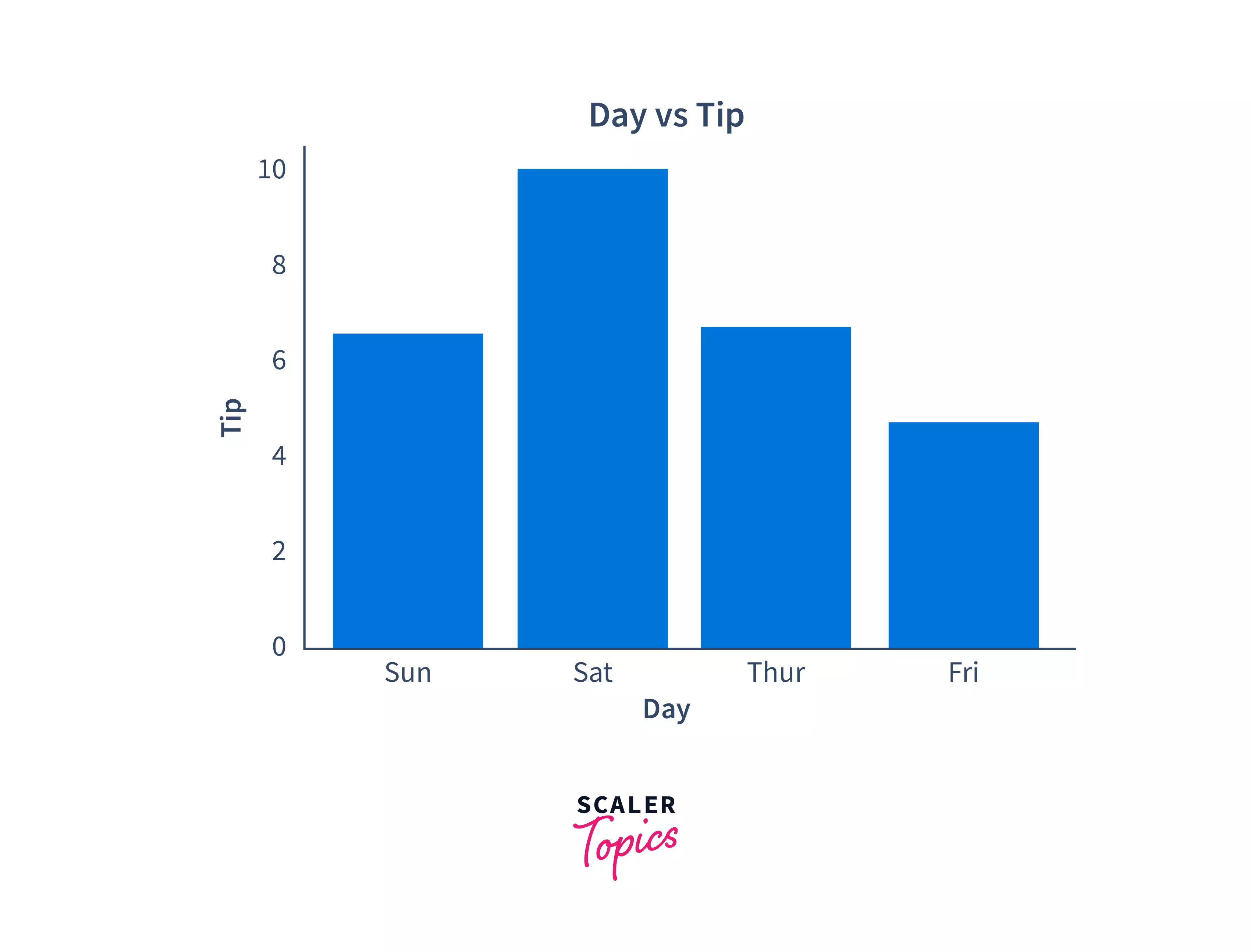
Let's plot the days vs tips plot from the tips data set:
Output:
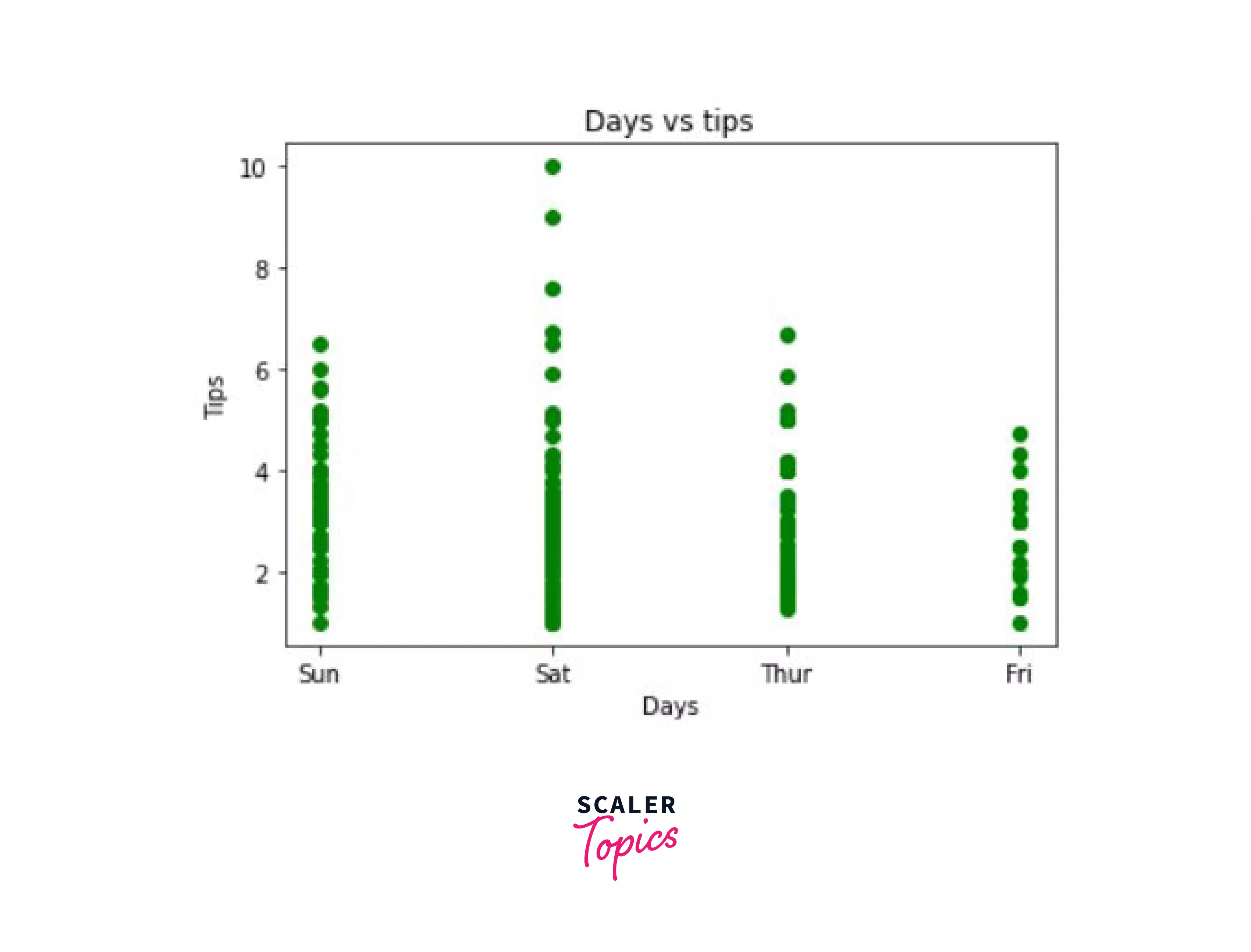
In the output we can see that for the 4 days - Sunday, Saturday, Thursday, and Friday, our tips are distributed in the following manner. On Saturday, we also got the highest tip.
Now, if we would like to know the price of the total bill at which these tips were given differentiated by color, and change the size of marker according to the size of the tip amount, we could do so using the c and the s parameter discussed above.
Here's how we would do it:
Output:
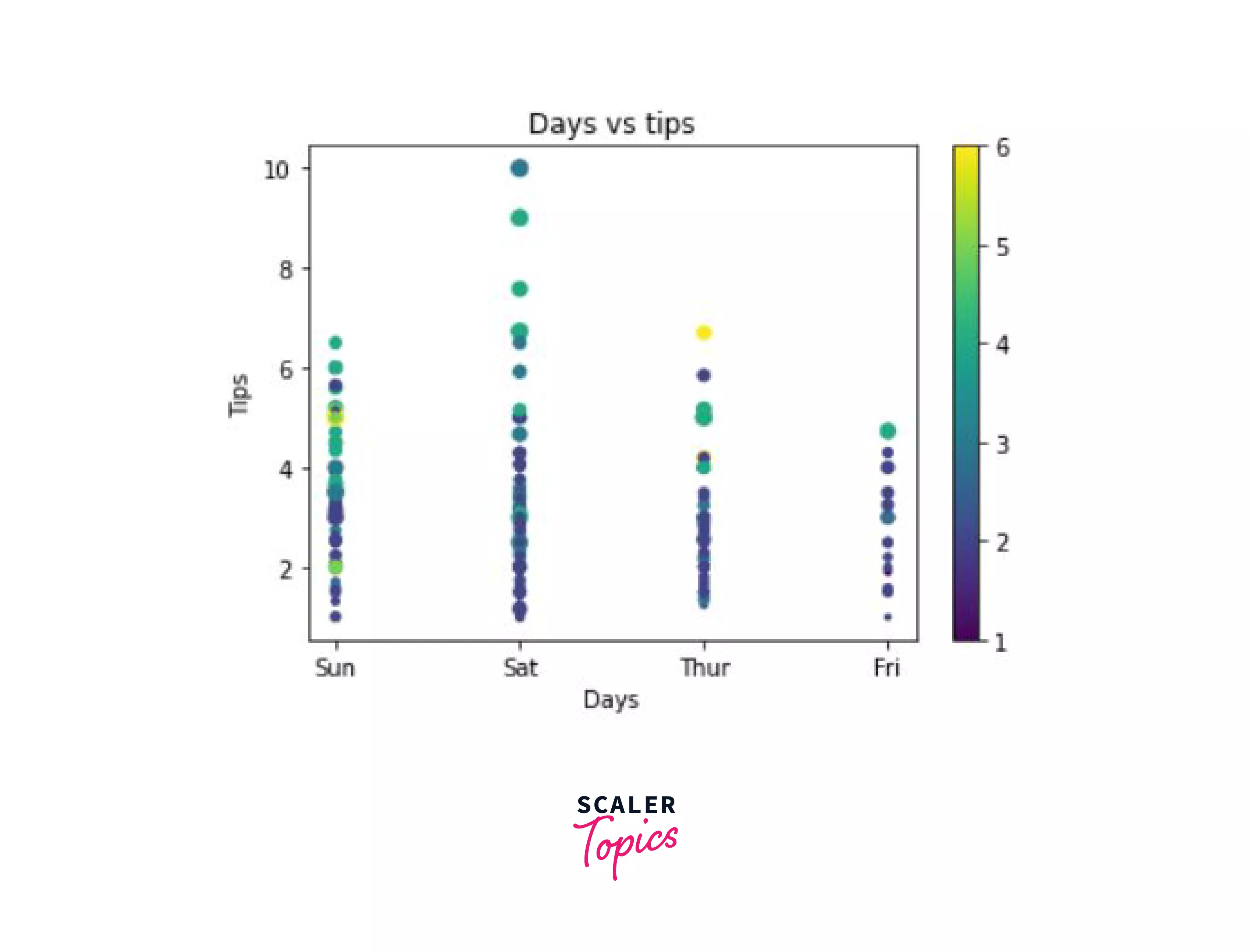
As we can see in the chart above, the size of the marker is small when the tip is small (as can be seen in the lower section of the graph) and the size of the marker is larger when the tip is larger. The color of the marker depends on the size of the bill, so a 1 dollar bill is black and a 6 dollar bill here is marked as yellow.
Let's now look at another type of plot.
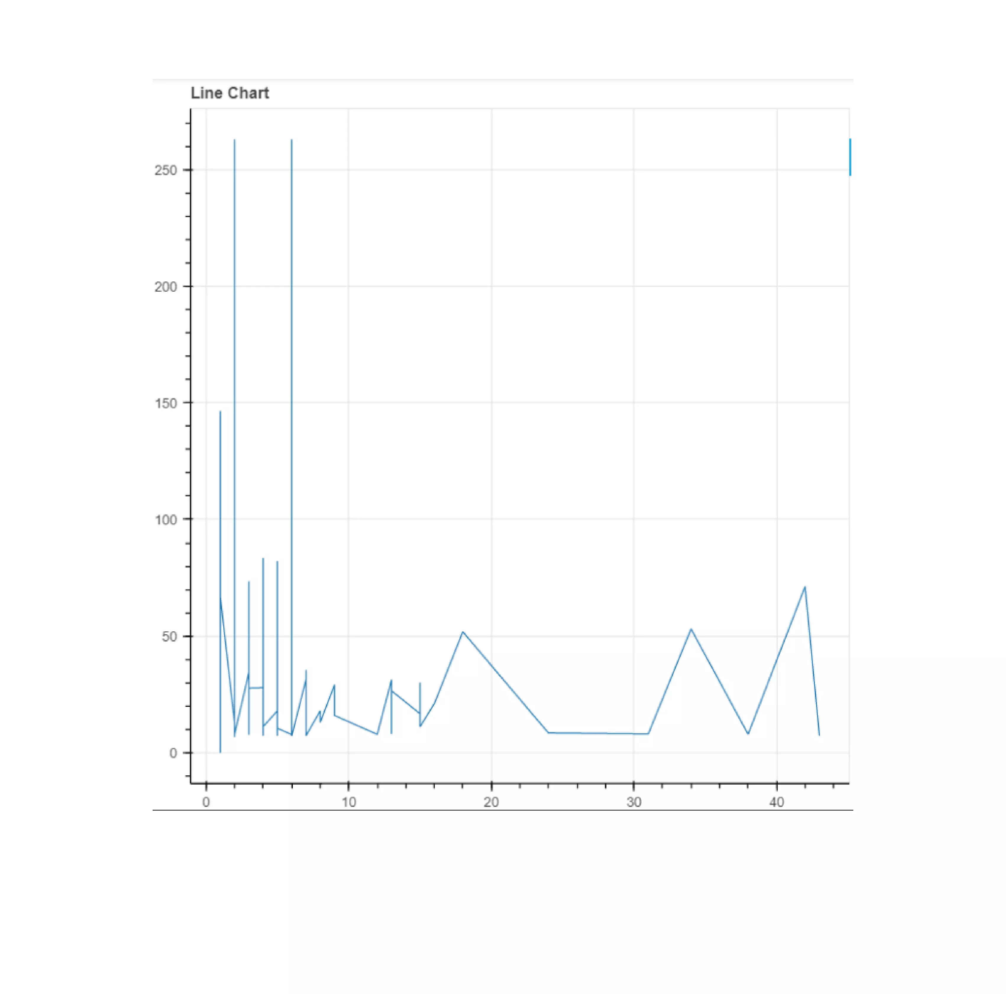
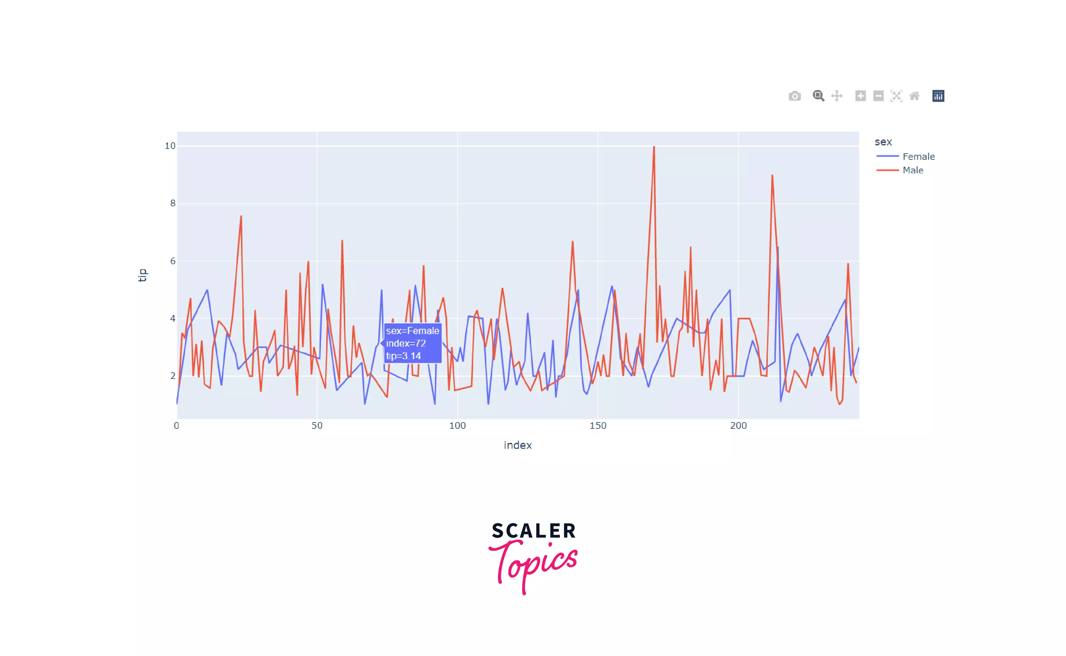
Line Graph:
Line graphs are the simplest graphs that you have probably already studied. We use line graphs to represent information that changes over time. You can plot a line graph by plotting multiple data points that represent values of x and y variables. You can then join them together to form the line.
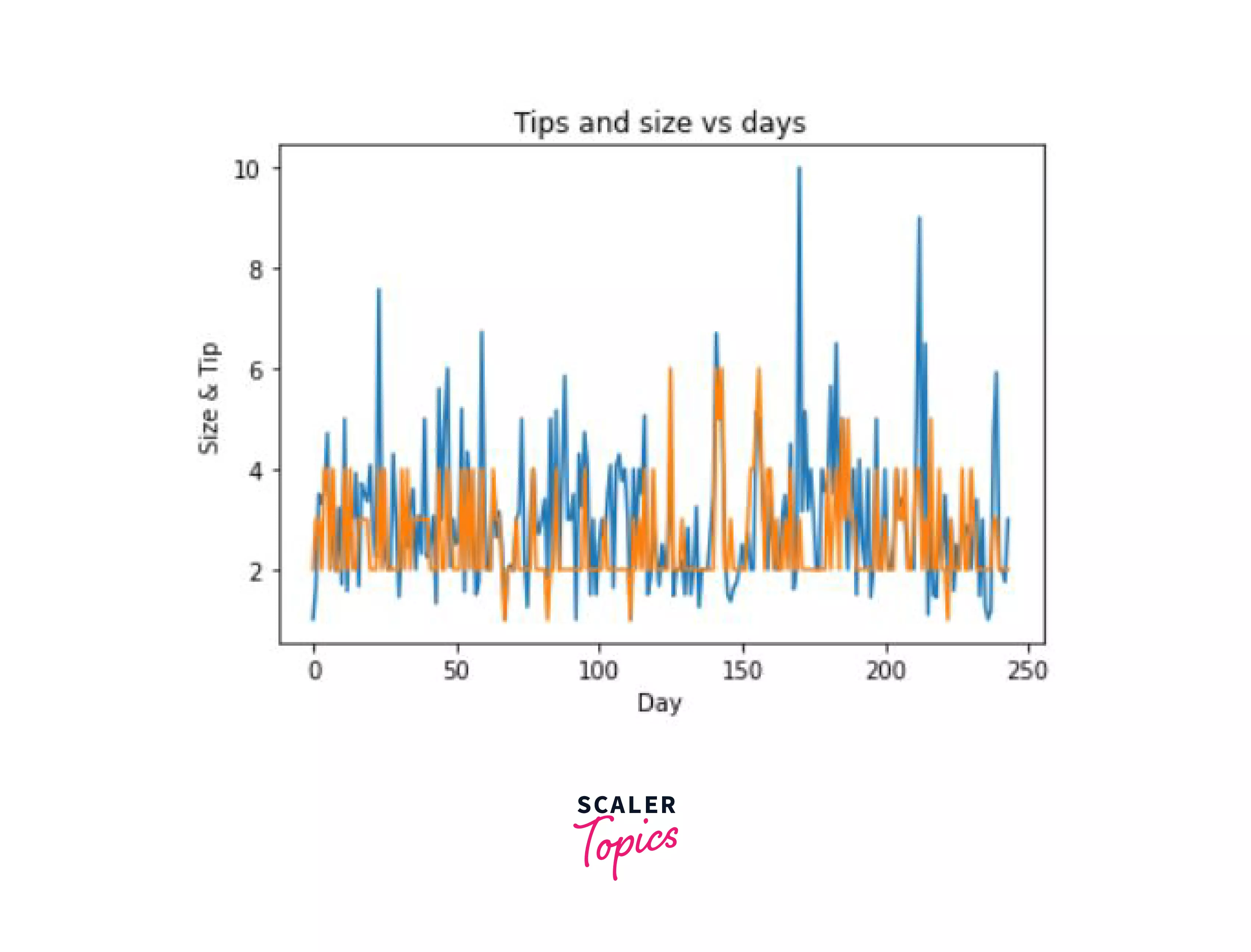
In our data, it might be useful to see how the tip and size of customers at a table change according to the days of the week.
For this purpose, we will make use of the simple plot() function which takes X and Y as input.
Let's see how we'd plot these.
Output:
Bar Graph:
Another very common plot is the bar chart. This graph represents the relationship between two variables using rectangular bars that have lengths and heights proportional to the values that they represent.
Here's how a bar chart generally looks like:
For plotting this graph, we will make use of the bar() function, which also takes X and Y as input.
For this example, we're going to create a graph between the day and the tip. The height of the bar on each day will represent the maximum tip value.
Output:
Histogram:
Another plot that is useful for the visualization of data is the histogram. This plot is useful if you'd like to represent the data in a grouped format. It is also used or summarizing whether that is discrete or continuous. In this graph, the data points will be represented according to the specific range of values that they fall in. These ranges are called bins. You can also think of it as a vertical bar graph. However, the main difference between a bar chart and a histogram is that the histograms represent the distribution of the non-discrete variables (continuous variables) and on the other hand, bar graphs compare discrete variables (variables that have a value that is determined by counting).
Here's how a histogram generally looks like:
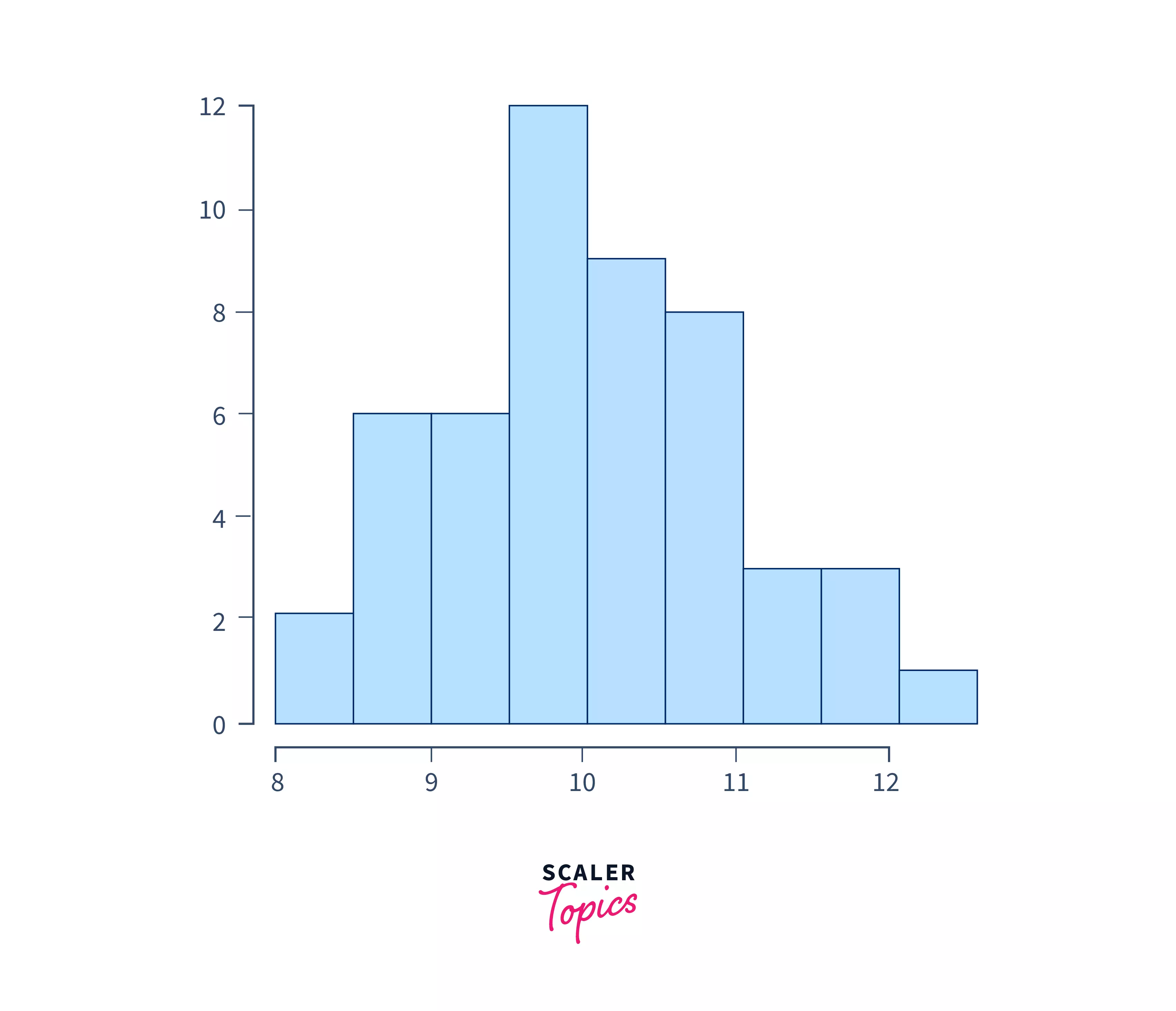
Let's visualize it for better understanding. Here, the X-axis will have all the value ranges (bins) and the Y-axis will give us frequency information of the data. We'll make use of the hist() function to plot this graph. If categorical data is passed to this hist() function, it automatically computes the frequency of values.
This code will give you the following output:
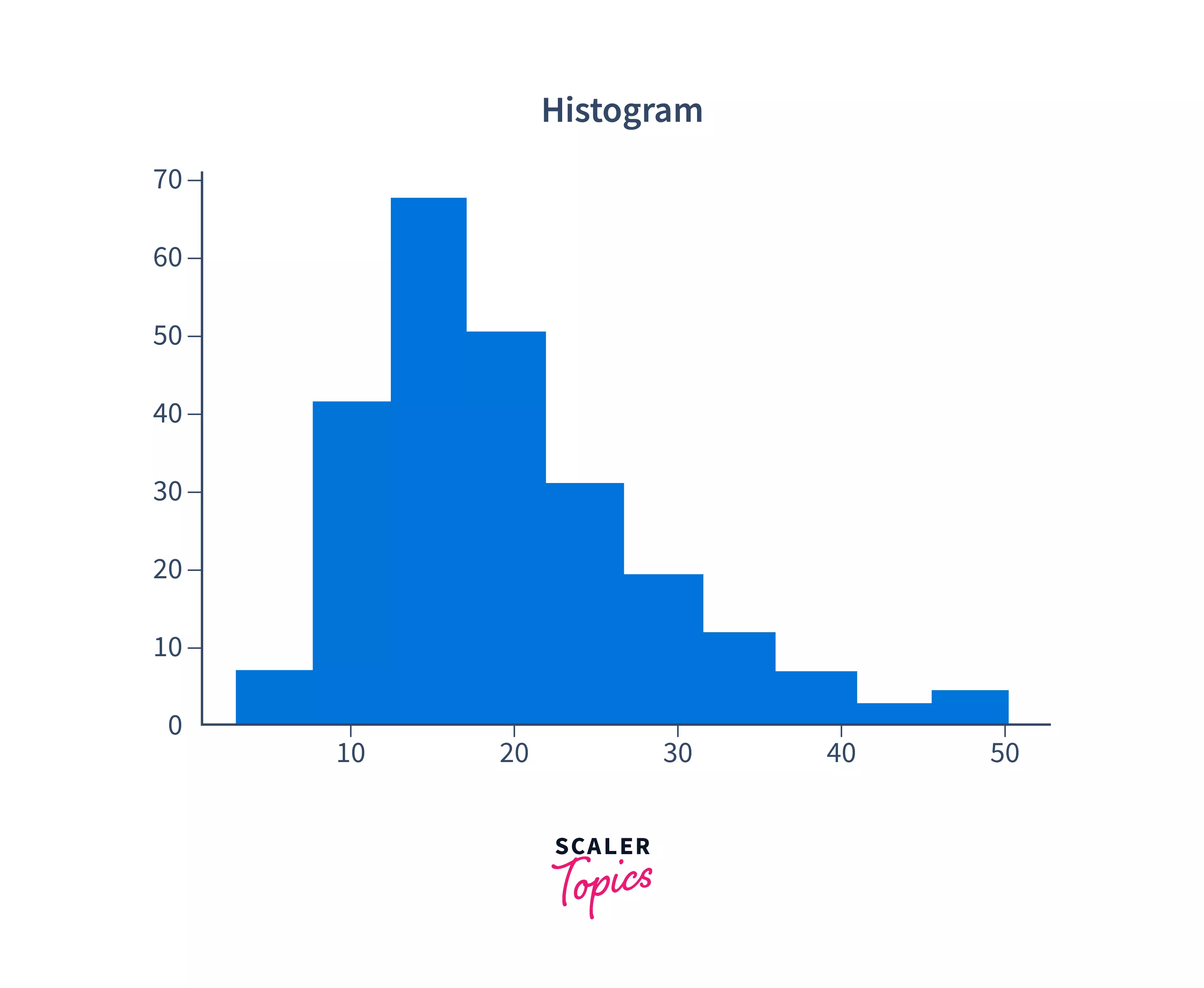
As you can see, you can now visualize where the maximum frequency of the total amount lies. The most common total bill amount was between 10 and 20. Play around with the bins parameter to set the number of value ranges in the histogram to get more accurate results.
You now know the basic charts in the matplotlib module. To explore more charts, take a look at the documentation.
Turn Learning into Career Growth
Seaborn
While matplotlib is one of the most common data visualization libraries, we have another common library called - Seaborn. It is a library that has a high-level interface, and it is built on top of matplotlib, which means that it has added functionalities. The main advantage is that it provides more beautiful plots, with various color palettes making your data look pretty and pleasing to the eyes.
The seaborn library is generally used for statistical and multivariate (multiple variables) data visualization, and for plotting time series data. You can also fit and visualize linear regression models easily.
To install seaborn, just like matplotlib, you can use the pip or conda package manager of python. You can:
or
depending on the package manager that you use.
Since this library is built on top of matplotlib, you can use this library along with matplotlib. To use them together, you simply have to use seaborn as you would use, and incorporate the matplotlib functions as we did earlier. Let's look at a simple example.
Again, usin the tips dataset, we'll try to plot the total bill (total_bill) with the number of the customers at a table (size) using a simple line graph. To do this, we will use the lineplot() function that is provided by seaborn which takes the name of the x column, y column, and the dataset as input. To look at the complete tutorial of this library, refer to this.
Let's look at the output of this graph:
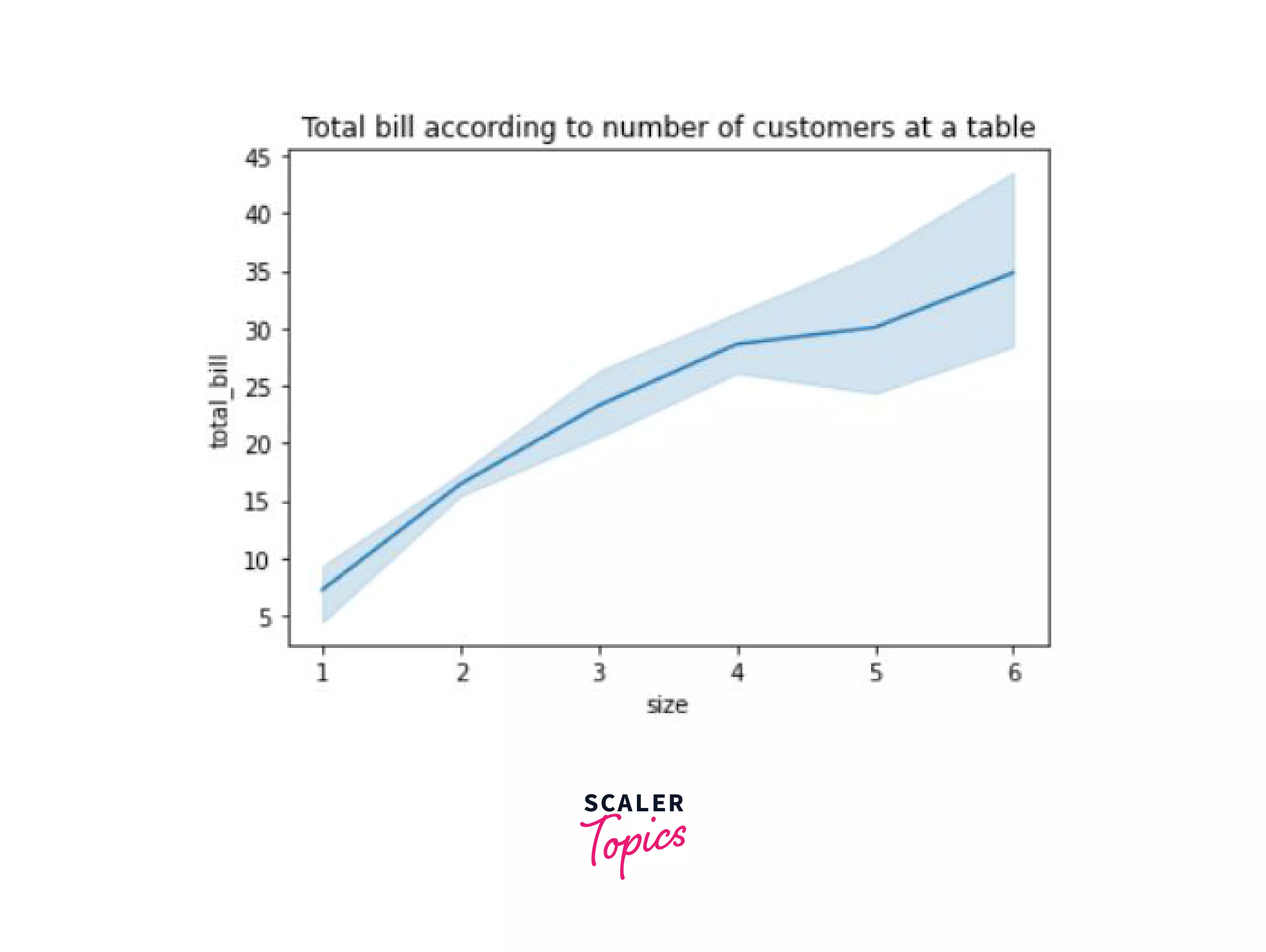
Well, this graph is certainly better looking than our line graph plotted using just matplotlib. Let's look at multiple other plots using seaborn as well.
Scatter plot:
We've already discussed the scatter plot in matplotlib, you can try creating one on your own using the sns.scatterplot() function that takes the same inputs as the line plot.
Now, say we wanted to plot the tips given by different genders of customers on different days, with the help of a scatterplot, here's how we would do it. We can easily achieve this by making use of the hue argument in the scatterplot() function.
Output:
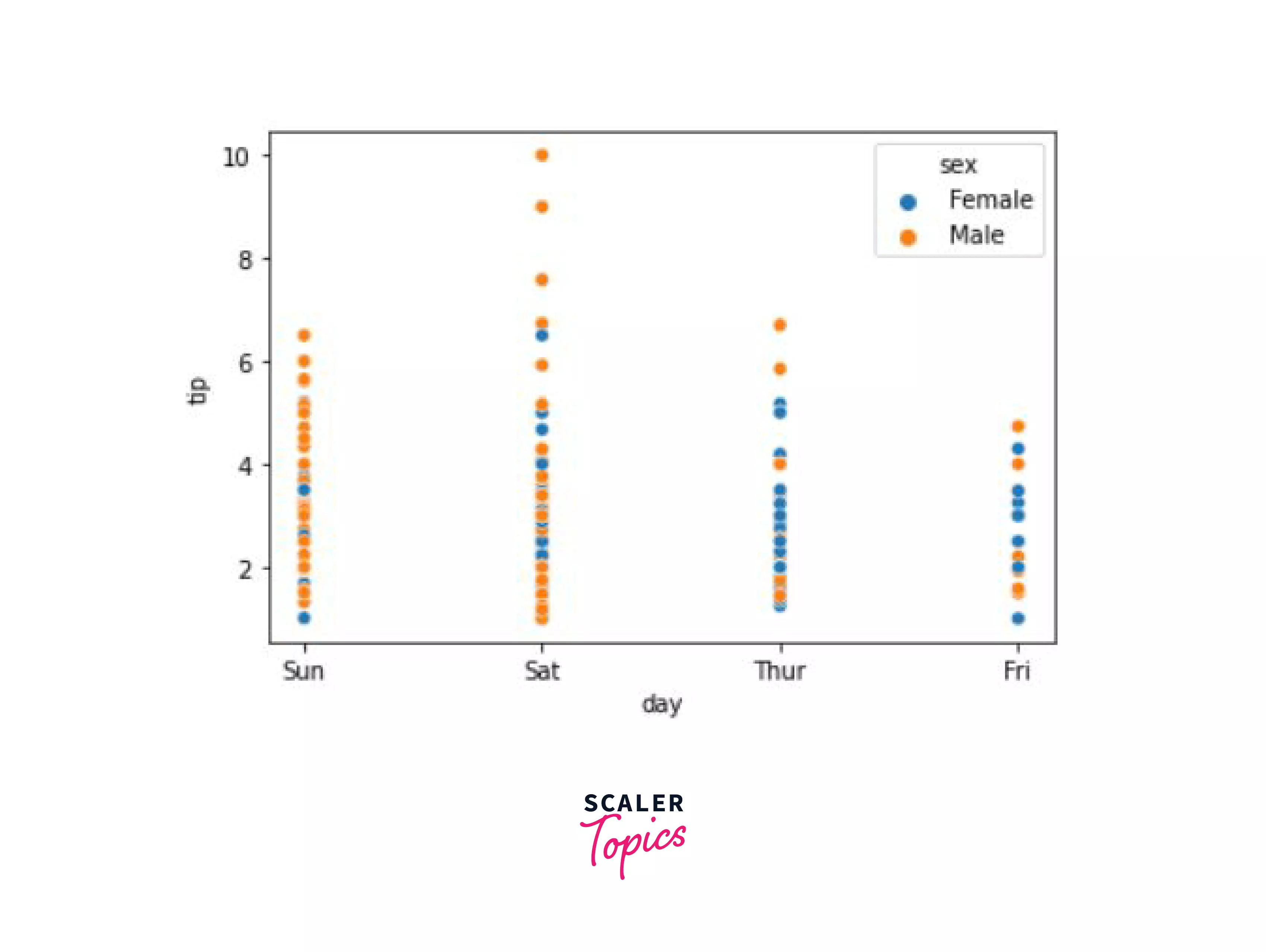
Now you can better visualize the distribution of the gender and the tips that they gave on certain days. Males gave more tips on Saturday, and Females gave more tips on Thursday.
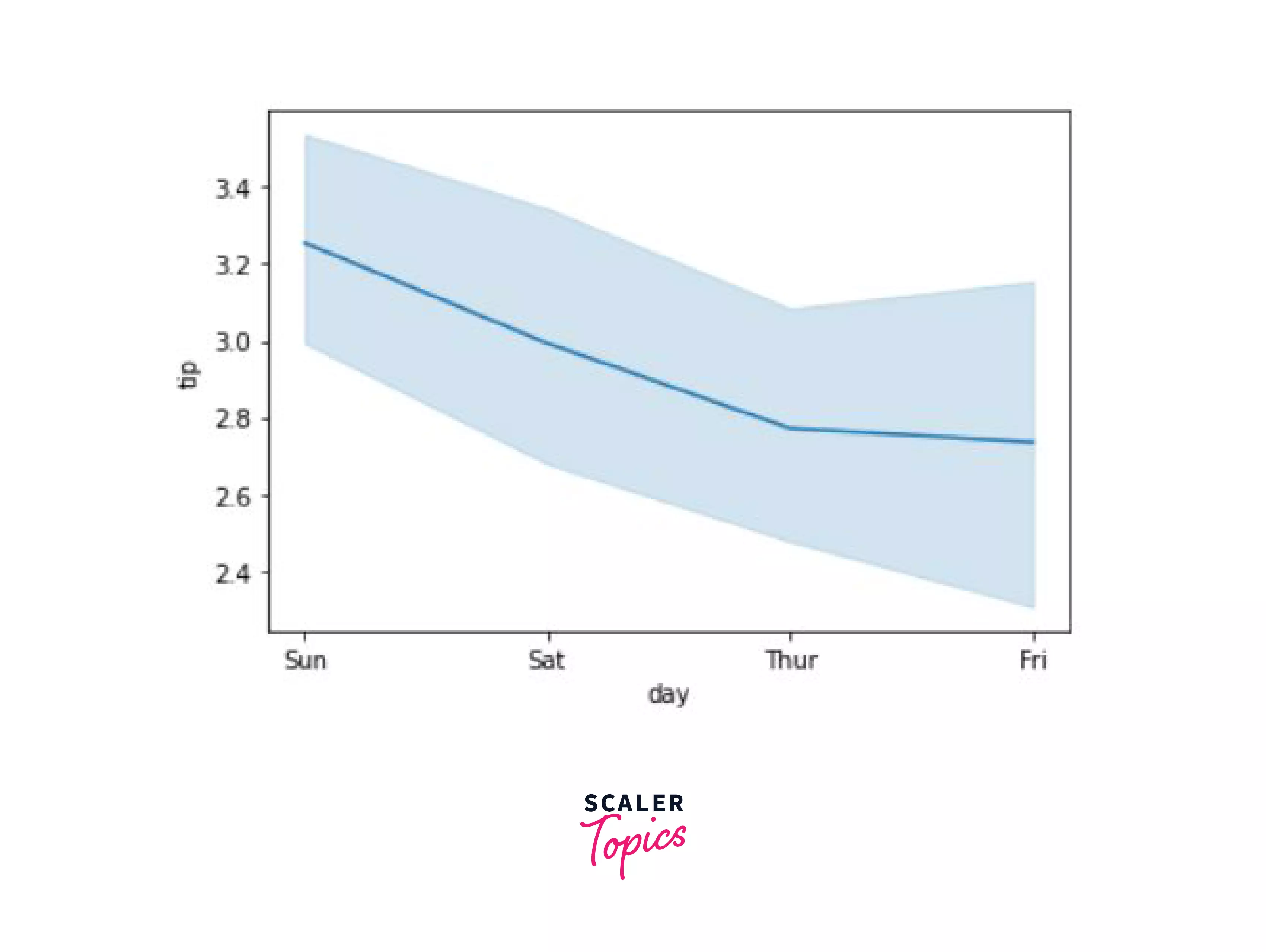
Line Plot:
We already read about the line plot, let's look at another example that compares the days with the tips.
Output:
Bar Plot:
Just like our bar plot in matplotlib, we have a similar function - barplot() that can be used to create a bar graph.
In this example, we'll create a bar graph that compares the tips given based on the gender on different days.
Output:
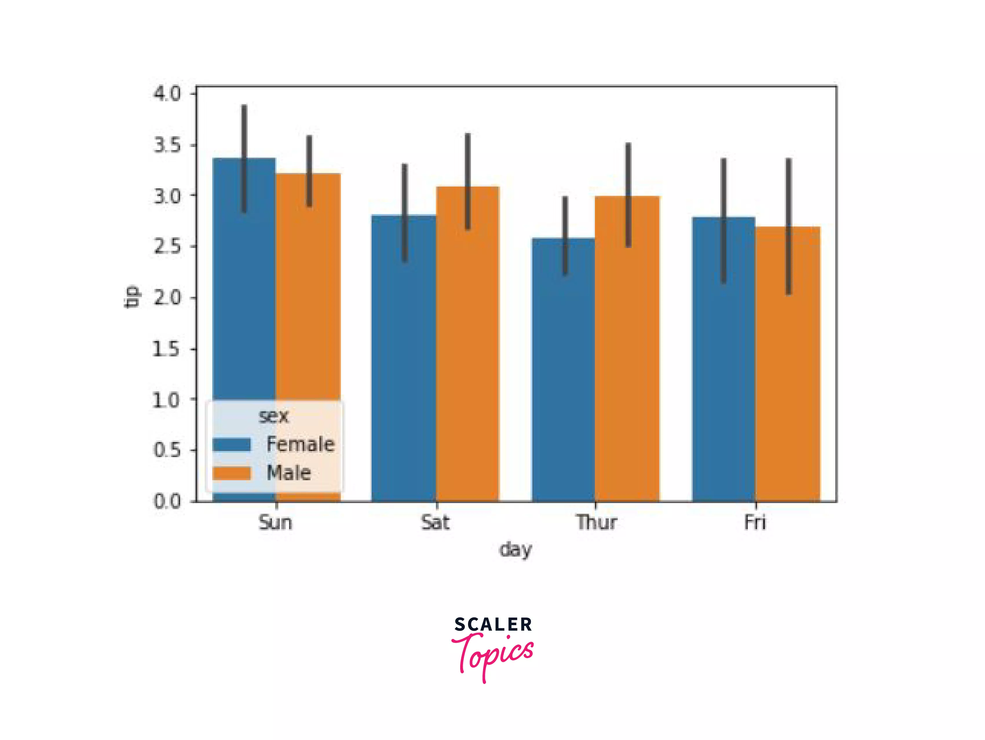
Well, that is certainly a pleasing plot.
Histogram:
Let's try and create a histogram of the same data, using the histplot() function. An extra parameter that we would be using in this function is the kde parameter which is essentially short for kernel density estimation. As we know, that histogram creates bins (value ranges) and they look like bar charts. The kde parameter when set to True, smoothens out these bars and gives a more continuous estimate.
Take a look at the example below where we see the total bill according to gender:
Output:
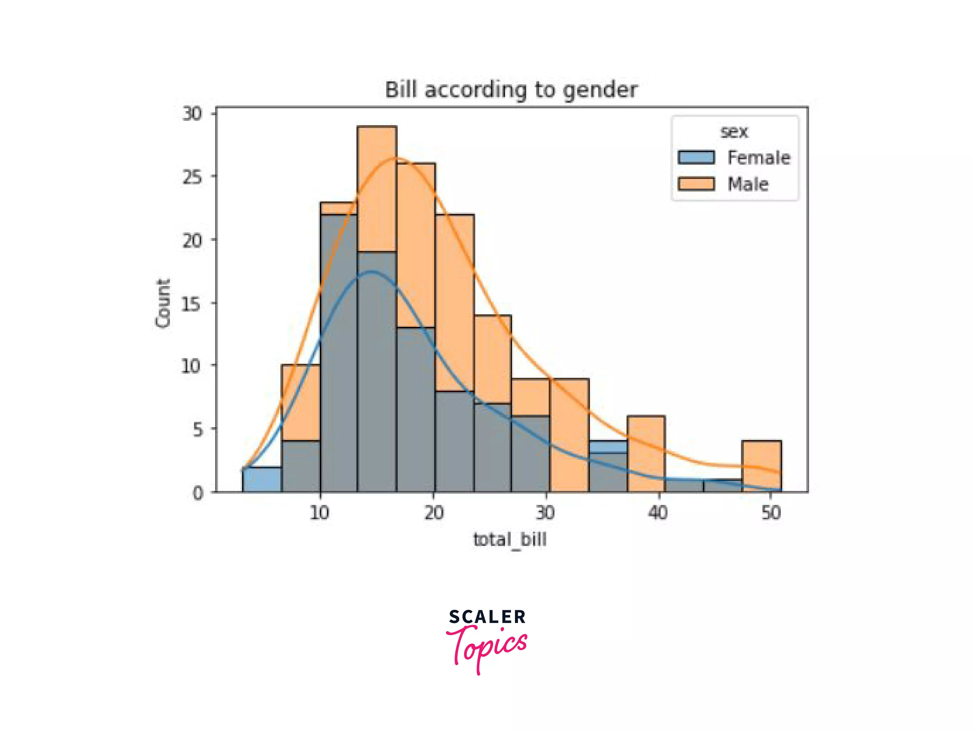
As you can see, we have a neatly plotted histogram along with a more smoothened distribution.
Bokeh
Let's now take a look at another library, Bokeh. This library is mainly used when you want to make highly interactive visualizations with your data. This interactiveness is added with the help of HTML and JavaScript, and that is why Bokeh is a powerful tool to create projects, charts and web applications that use data visualization.
To install Bokeh using the pip package manager:
For further data visualizations, let's switch things up a little by taking a different data set. We're going to use the extended titanic dataset, that is available here.
Output:
| index | PassengerId | Survived | Pclass | Name | Sex | Age | SibSp | Parch | Ticket | Fare | Cabin | Embarked |
|---|---|---|---|---|---|---|---|---|---|---|---|---|
| 0 | 1 | 0 | 3 | Braund, Mr. Owen Harris | male | 22.0 | 1 | 0 | A/5 21171 | 7.25 | NaN | S |
| 1 | 2 | 1 | 1 | Cumings, Mrs. John Bradley (Florence Briggs Thayer) | female | 38.0 | 1 | 0 | PC 17599 | 71.2833 | C85 | C |
| 2 | 3 | 1 | 3 | Heikkinen, Miss. Laina | female | 26.0 | 0 | 0 | STON/O2. 3101282 | 7.925 | NaN | S |
| 3 | 4 | 1 | 1 | Futrelle, Mrs. Jacques Heath (Lily May Peel) | female | 35.0 | 1 | 0 | 113803 | 53.1 | C123 | S |
| 4 | 5 | 0 | 3 | Allen, Mr. William Henry | male | 35.0 | 0 | 0 | 373450 | 8.05 | NaN | S |
So as you can see, in this dataset, we have 13 columns:
- index
- survived - 0 if person did not survive, 1 if they survived
- pclass - passenger class in titanic
- sex
- age
- sibsp - number of siblings or spouses that were aboard
- parch - number of parents or children that were aboard
- ticket
- fare - passenger fare
- cabin - does the location of the passenger's cabin influence their chances of survival?
- embarked - port at which passenger embarked (C = cherbourg, Q = Queenstown, S = Southampton)
Before we begin with plotting using bokeh, we must import the libraries required to plot.
Scatter Plot:
Just as how we made scatter plots earlier using the scatter method, we will do the same here as well. First, we're going to import a color palette, create a figure object, and then call the scatter function on the object.
Output:
Now in this output, you must have noticed that the top right corner has some extra symbols. This is what makes the bokeh plots stand out, they are interactive.
In order, the symbols are:
- The pan tool -- used to move the graph within the figure
- The box zoom tool -- helps you to zoom into an area within the plot figure
- Wheel zoom tool -- same functionality as the box zoom tool, except this is done using the wheel of the mouse
- Save tool -- used to save the plot as a png file
- Reset tool -- return to the default settings of the plot
- Help symbol -- use it if you'd like to learn more about the tools available in this module.
Line Plot:
To create a line chart, we will use the figure_object.line() function and show the graph using show(figure_oject).
Let's look at the code to plot the frequencies of Fare:
Output:
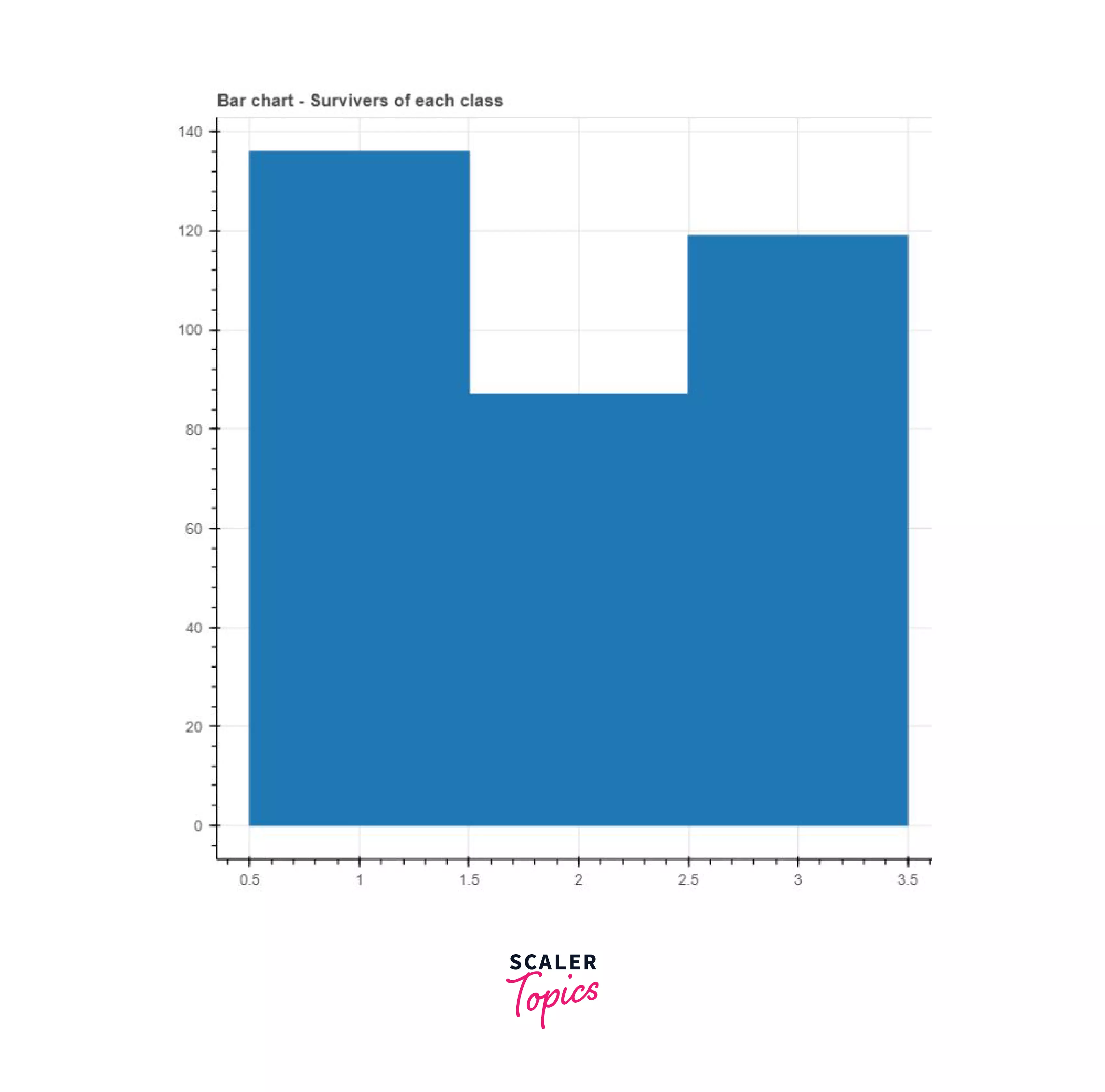
Bar Chart:
As you might know, there are two types of bar charts -- vertical and horizontal. To create the vertical bar chart, we can make use of the vbar() function, and for the horizontal bar chart, we can use the hbar() function.
Say we wanted to create a vertical bar chart that represented the number of survivors per passenger class. First, we'd have to group the survivers of all these passenger classes using the group_by() function and then create the chart.
Output:
Pie chart:
Now, let's take complete advantage of the fact that bokeh provides us with great interactiveness. The code may look complicated at first, but have patience and go through it multiple times.
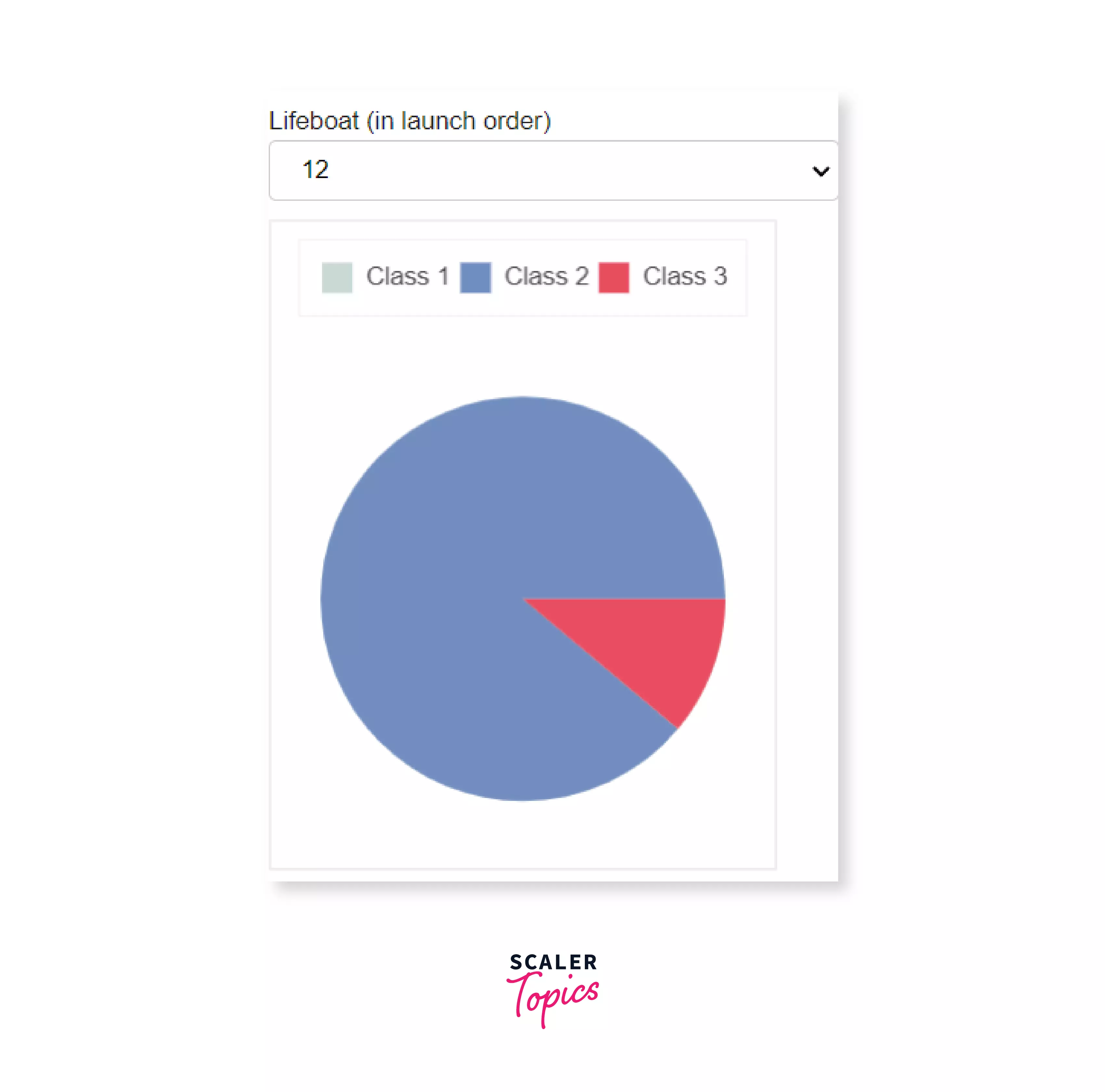
Let's create an interactive pie chart that gives us the distribution of the classes among all the survivors of Titanic on the lifeboats from the extended titanic dataset. Additionally, we will also add a dropdown menu to select a lifeboat.
First, we will explore the lifeboats column, and then we're going to create a copy of our complete dataset that contains just the lifeboat and passenger class columns for ease of use.
Output:
| Value | Count |
|---|---|
| 13 | 42 |
| C | 41 |
| 15 | 38 |
| 14 | 34 |
| 4 | 31 |
| 10 | 29 |
| 5 | 29 |
| 9 | 26 |
| 3 | 26 |
| 11 | 26 |
| 8 | 24 |
| 16 | 23 |
| 7 | 22 |
| 6 | 21 |
| 12 | 18 |
| D | 18 |
| 2 | 14 |
| ? | 12 |
| A | 11 |
| B | 9 |
| 1 | 5 |
| 14? | 1 |
| A[64] | 1 |
| 15? | 1 |
Name: Lifeboat, dtype: int64
So as you can see, we don't have just some numbers, we also have some odd data, which we will clean.
WE're now going to filter out the entries that have NaN or '?' and remove any unnecessary symbols from the column.
This way, we have a clean column. Next, we're going to make use of the pandas get_dummies() method to create dummy variables from our 'Pclass' column so that we can get a count of the number of people from a particular class were present in each of the lifeboats. To avoid long column names, we're going to set the prefix and prefix_sep parameters of the get_dummies() function as empty.
Next, the rows must be grouped according to the values present in the Lifeboat column, followed by the summation of the number of males and females in them.
We can also arrange the lifeboats according to the order in which they were launched. This information can be gathered from Wikipedia.
Viewing the number of people in a particular class of the titanic might not be the best option as those numbers wouldn't really give us a good idea. So instead, we can see the percentage of people per class in a particular lifeboat. For this purpose, we will add 3 extra columns for every class representing their percent.
Since we are making a pie chart, we would also require the angles in radians for every sector that we are representing. To represent these angles, we will create 3 new columns - 1_ang, 2_ang, and 3_ang.
Output:
| Index | Lifeboat | 1 | 2 | 3 | 1_per | 2_per | 3_per | 1_ang | 2_ang | 3_ang |
|---|---|---|---|---|---|---|---|---|---|---|
| 0 | 7 | 21 | 1 | 0 | 95.454545 | 4.545455 | 0.0 | 5.997586 | 0.285599 | 0.0 |
| 1 | 5 | 29 | 0 | 0 | 100.000000 | 0.000000 | 0.0 | 6.283185 | 0.000000 | 0.0 |
| 2 | 3 | 26 | 0 | 0 | 100.000000 | 0.000000 | 0.0 | 6.283185 | 0.000000 | 0.0 |
| 3 | 8 | 24 | 0 | 0 | 100.000000 | 0.000000 | 0.0 | 6.283185 | 0.000000 | 0.0 |
| 4 | 1 | 5 | 0 | 0 | 100.000000 | 0.000000 | 0.0 | 6.283185 | 0.000000 | 0.0 |
So here in our df1 data frame, we have the percentages and angles of all the lifeboats. However, on one pie chart, it is only possible to display the passenger class distribution of one particular lifeboat. And so, we are going to create another data frame, df1_plot, which will be used for plotting.
All the data that is required, i.e. the percentages and the angles will be passed on to the df1_plot data frame from the df1 data frame whenever a lifeboat is selected.
Here's how we create the df1_plot dataframe:
Output:
| class | percent | angle | color | |
|---|---|---|---|---|
| 0 | Class 1 | NaN | NaN | #c9d9d3 |
| 1 | Class 2 | NaN | NaN | #718dbf |
| 2 | Class 3 | NaN | NaN | #e84d60 |
Now, in Bokeh, if you need to interact with your data, you should make use of the data object provided by Bokeh -- ColumnDataSource (CDS). This data object allows you to add multiple functionalities like streaming, linking, etc. You can read more about it in the documentation.
To create the CDS, you can simply input a pandas data frame. Here, we would require two CDS objects, one called s1, and the other called s1_plot where we will use s1 to store all the percentages for every lifeboat, and the s1_plot will contain the information for only the lifeboat that we will plot at that moment, i.e. the one selected from the drop-down menu.
We will also make use of the s1 data frame when we need to update s2_plot to plot a new pie chart.
Now, to create a pie chart in bokeh, the wedge() function is used. It has two parameters - the start_angle and end_angle which will be calculated by making use of the function cumsum() provided by bokeh. Read more about the pie chart here.
To add the drop-down menu, along with an object Select that helps a user select a lifeboat and a Please choose option which is the default one (when a lifeboat isn't selected by the user) we will use JavaScript. If the value is not the default value (please choose), i.e. the user has selected a lifeboat, we will call a function - js_on_charge(). This function will update the s1_plot data frame after taking the information from s1.
This code requires some basic understanding of JavaScript.
Now, when we execute this function, we get the output as:
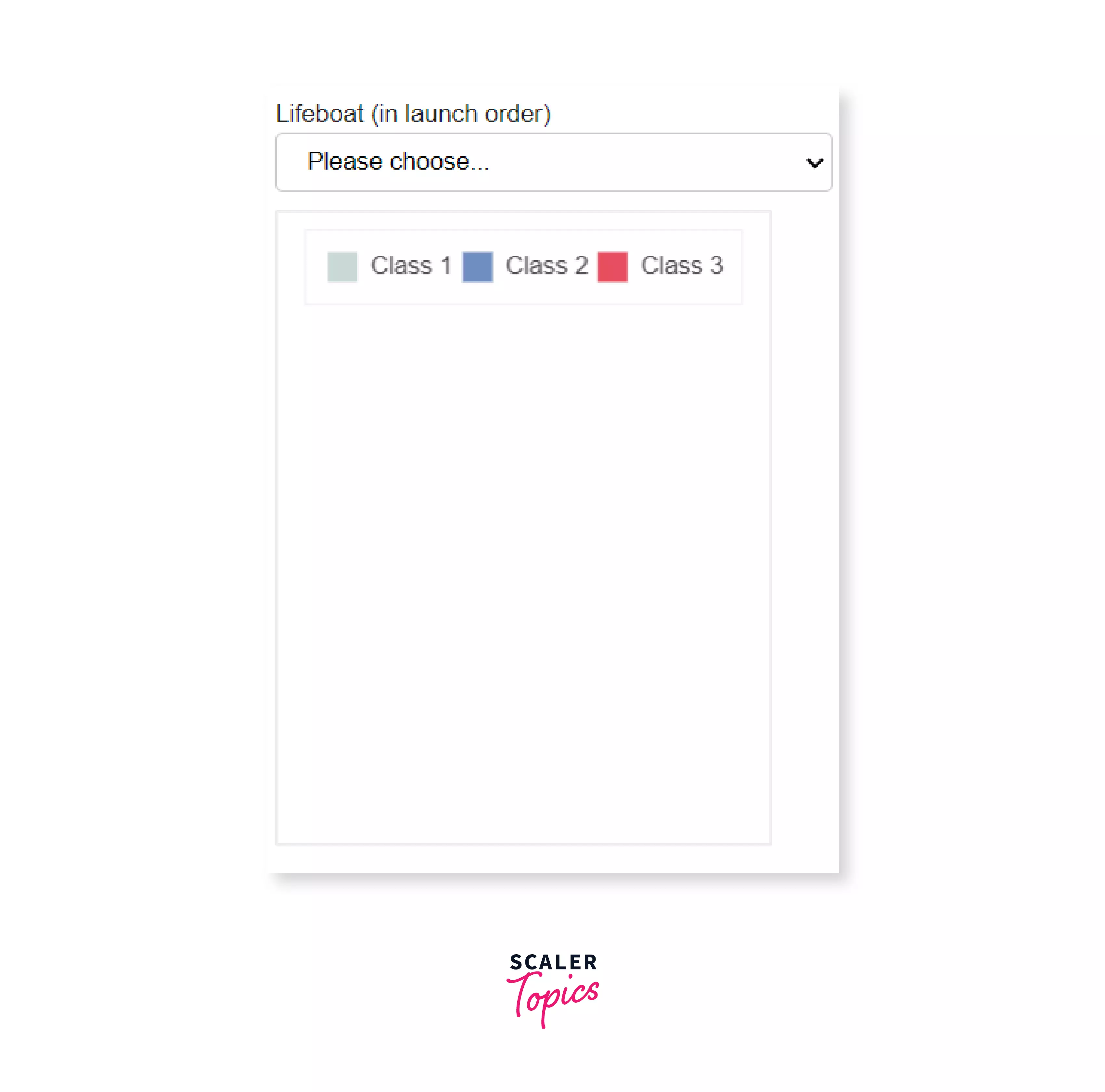
Selecting a lifeboat:
Run this piece of code on the extended dataset and note how interactive the graph is by yourself, as practice.
Now say somewhere in your graph, to change the values or increase interactiveness in your web application or graph, you wanted to add a slider. You can add objects such as these (called widgets in Bokeh) easily. Bokeh has given us features that are similar to HTML forms such as sliders, buttons checkboxes, etc. These kind of features are useful in making your visualizations more attractive.
By adding widgets to your plot, you will be able to increase the interactiveness by allowing the user to change the parameters of the plot, or modify the input data.
Adding Widgets in Bokeh:
Some of the very commonly used widgets in Bokeh are:
- Buttons
- CheckboxGroup
- RadioGroup
- Sliders
Let's write some code to add these widgets to your plot. Note that you will require some basic knowledge of JavaScript.
The output of these widgets will be shown on a new HTML page.
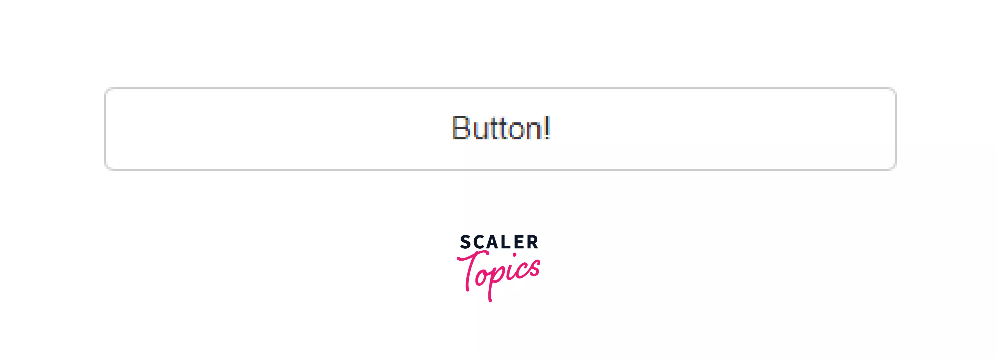
Adding Button
Output:
Adding Group of Checkboxes
Output:

Adding Group of Radioboxes
Output:

Adding a slider
Output:

Plotly
After the largest section, we come to our last library - Plotly. Plotly is special as it provides a user with more hover tool capabilities which helps the user in the detection of anomalies or outliers in the data. It also allows us to customize the plots to our liking.
Again, to install plotly, simply run:
in your terminal.
Back to our tips dataset.
Scatter plot:
Plotly has a function scatter() in the plotly.express module and just like seaborn, you are required to add one argument - dataset.
Let's look at the code:
Output:
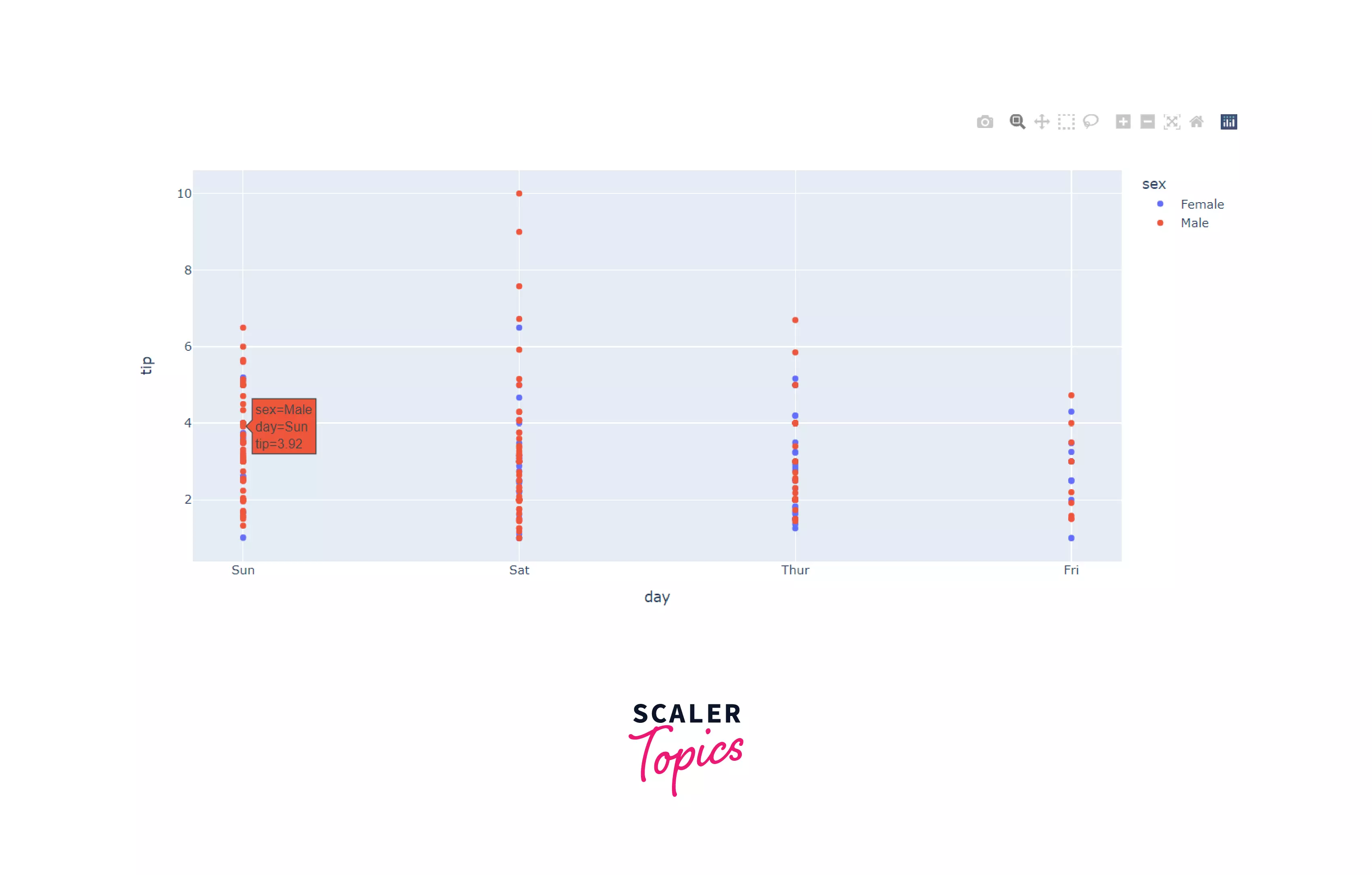
As you can see, hovering over one of the data points shows the details of that data point, i.e. customer details. The graphs generated by plotly are interactive as well.
Line plot:
Let's create a line plot for the tip given by each gender.
Output:
In the same way, we can create bar graphs and histograms using the bar() and histogram() functions. Inputs to these functions are the same as line and scatter plots. Try them on your own for practice!
To learn more about the module, check out the documentation.
Comparison between Matplotlib and Seaborn
We've learned about the top 4 libraries for data visualization in Python, let's also quickly learn the differences between the top 2 libraries - Matplotlib and Seaborn.
| Matplotlib | Seaborn |
|---|---|
| Used to plot basic graphs such as line graphs, bar plots, etc | Used to plot statistics related charts, and helps in charting complex visualizations by using lesser commands |
| Matplotlib works mainly with arrays and datasets | Seaborn only works with entire datasets |
| With data arrays or frames, matplotlib acts productively. It regards them as objects. | Seaborn is more functional and organized as compared to Matplotlib. The entire dataset is treated as a solitary unit. |
| You can customize matplotlib and pair it up conveniently with NumPy and Pandas for exploratory data analysis. | Seaborn is used mainly for statistical analysis, as it has a plethora of inbuilt themes. |
You now know the basics of data visualization in Python and can create powerful visualizations to convey the story your data represents!
Scaler Placement Report and Statistics
Scaler learners achieved 2.5x salary growth with average post-Scaler CTC reaching ₹23L.
Conclusion
- Representing your data, conveying the story your data contains in pictorial formats such as graphs is known as data visualization. Python provides a plethora of libraries for data visualization. Some of the prominent libraries are - Matplotlib, Seaborn, Bokeh, and Plotly.
- To install the libraries, use: pip install <library_name>
- Some of the common plots are:
- Scatter plot
- Line graph
- Bar chart
- Pie chart
- Histogram
- Matplotlib: This library is a low-level, easy to use library for data visualization in Python and it is built on NumPy arrays.
- Seaborn: It is a library that has a high level interface, and it is built on top of matplotlib, which means that it has added functionalities.
- Bokeh: Let’s now take a look at another library, Bokeh. This library is mainly used when you want to make highly interactive visualizations with your data. This interactiveness is added with the help of HTML and JavaScript.
- Some of the widgets that you can add in Bokeh:
- Buttons
- CheckboxGroups
- RadioGroups
- Sliders
- Some of the widgets that you can add in Bokeh:
- Ploty: Plotly is special as it provides a user with more hover tool capabilities which helps the user in the detection of anomalies or outliers in the data.