HTML Forms | Input Types
 FREE
FREE

Abstract
Web forms are an important part of any website. It allows our website visitors to get in touch with us and send information to our database, which may include orders and queries. HTML can be used to create web forms. Throughout this tutorial, you will be introduced to all the HTML input types: text boxes, text areas, radio buttons, check boxes, dropdown lists, hidden fields, file upload, and buttons. A successful implementation of the code is crucial for the success of the HTML form. With that, let’s get started!
Introduction to HTML Forms
The HTML forms are sections of a document that contain fields for text entries, passwords, submit buttons, etc. to facilitate data entry.
HTML forms are commonly used to collect user input. This information is most often sent to a server for processing.
Use of HTML Forms
HTML Forms are useful when we want to collect data from someone who visits your website. For instance, when you register/login for services like Amazon, Myntra, or Facebook, you enter information such as Name, Email, and Password into their web/app forms. A web page's contact form displays input boxes and options through HTML markup and CSS.
Syntax of HTML Forms
This is the general syntax of a HTML Form -- The HTML <form> </form> element is used to create an HTML form for user input:
The <form> element is a container for different types of input elements, such as: text fields, checkboxes, radio buttons, submit buttons, etc.
Introduction to HTML <input> element
HTML <input> elements are fundamental form elements. They are used to create the Form fields. The Form fields are used to take input from users. We can use different input fields to collect different information from users. We may, for example, have a text and email field in a contact form, whereas we may have check boxes and radio buttons on a survey form.
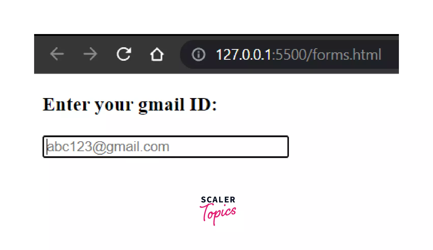
For example, here we are creating a email field using the <Input type="email"> to collect the email address of the user.
Output:

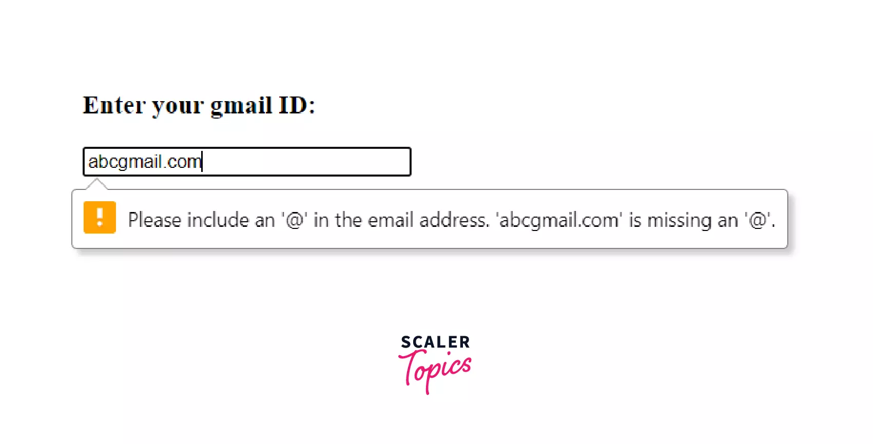
In the above example, the input field is of 'type' email, so, it will always expect the user to enter an email address. The form is self validating. So, if we enter an incorrect email address (exg. skip '@'), then it will immediately it will throw an error suggesting an email field is expected. Let's see how --
Example of an invalid entered Email:
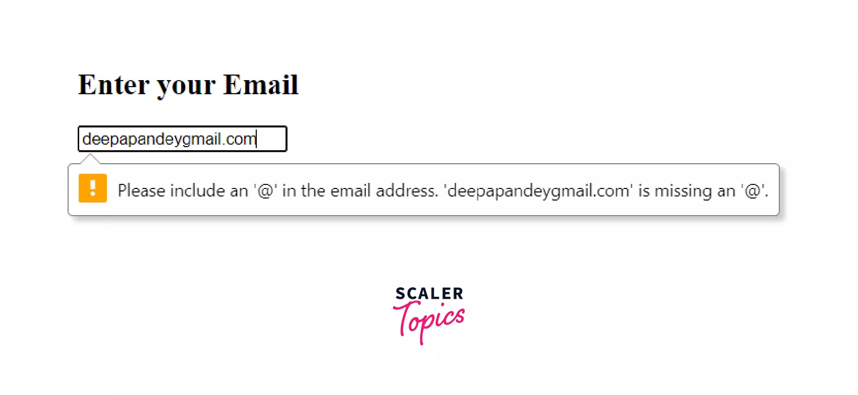
So, here the form is expecting us to include an '@' in the email address, since we have provided it's type as email.
Depending on the value present in the type attribute, the input element can provide a wide variety of fields.
Using the <input> HTML element, you can create interactive controls for web-based forms. Because, once you add the "type" attribute, there are multiple self-validations provided by the HTML forms.
HTML <input> types
The behavior of an <input> depends greatly on its type attribute. If no type attribute is specified, 'text' attribute is used by default.
Here we will discuss the different types with details and their examples --
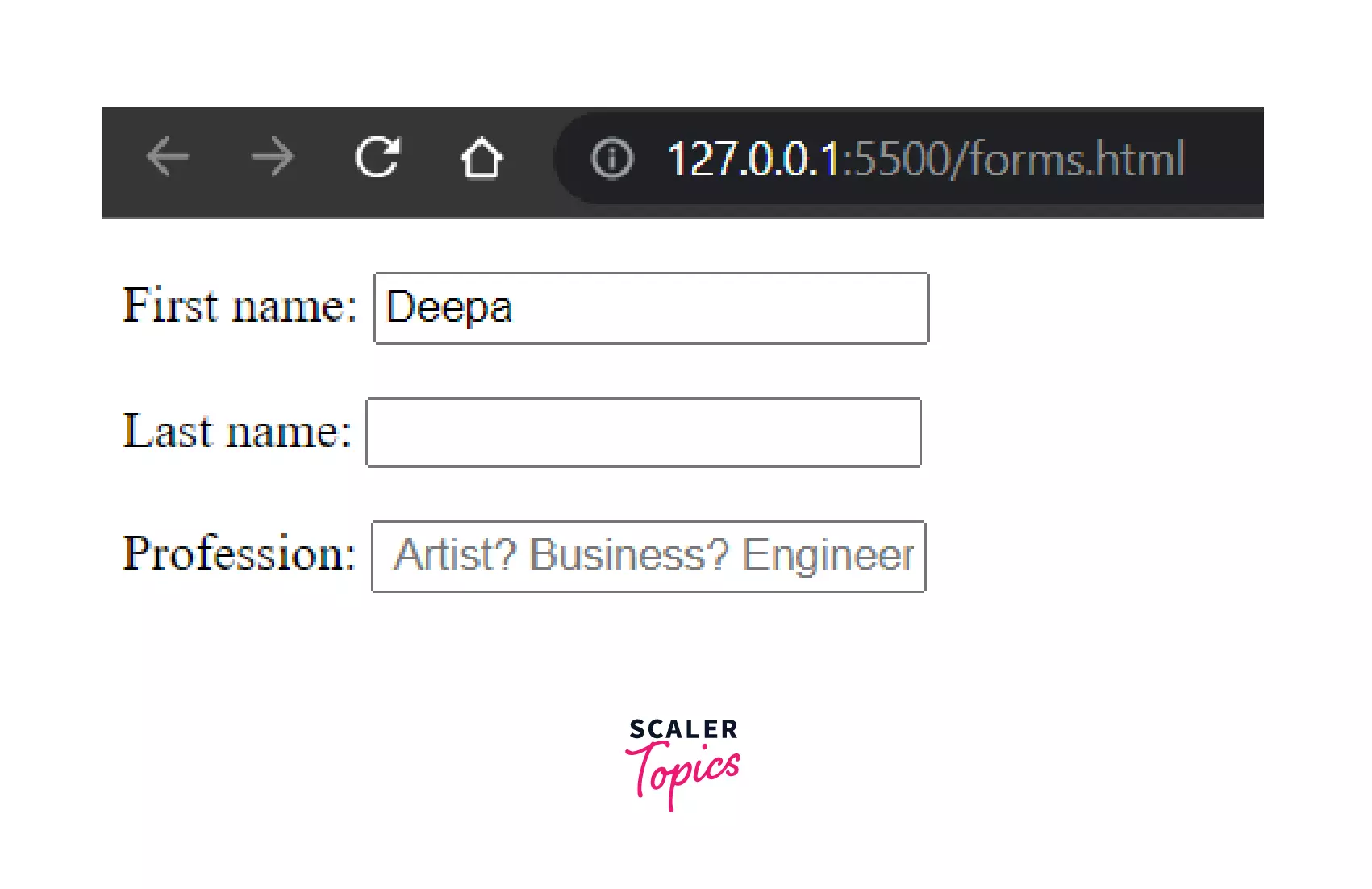
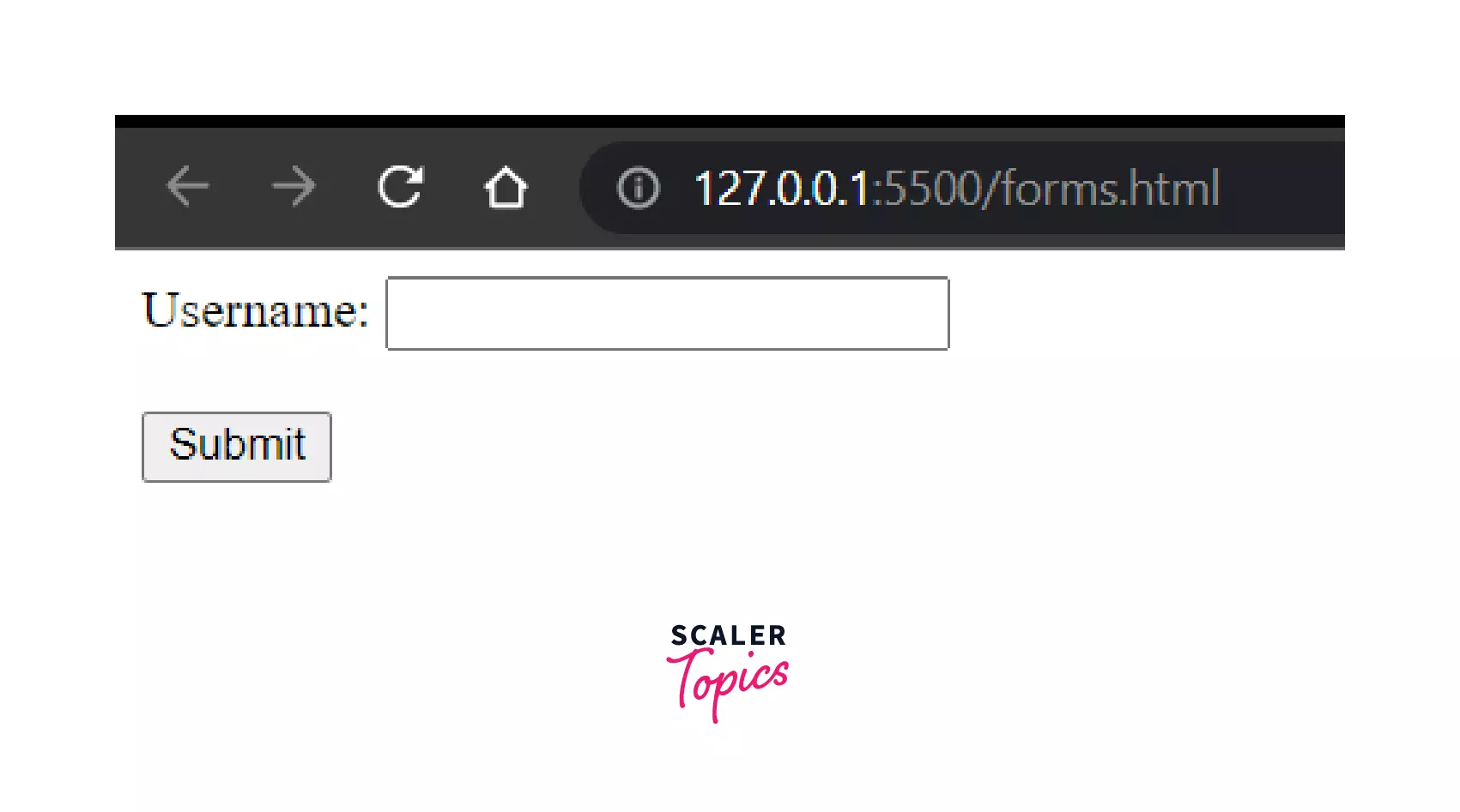
Input Type "Text"
An input element with the type property “text” specifies a text input field. This field has a text box where users can edit a line of plain text. Text controls collect small text strings like titles, names, tags, etc.
Example of a Text Input Field:
Output:
Scaler Placement Report and Statistics
Scaler learners achieved 2.5x salary growth with average post-Scaler CTC reaching ₹23L.
Let us briefly understand the input elements used here --
- action: The form action attribute specifies what should happen to the form data when the form is submitted on a web page. The value of the action attribute indicates where the form data should be sent.
- type: The type attribute specifies the type of <input> element to display. If the type attribute is not specified, the default type is "text".
- value: The value attribute is a DOMString that contains the current value of the text entered into the text field. It specifies the value associated with the input that is sent to the server when the form is submitted. Here, we have already given a default value for the First Name field.
- placeholder: The placeholder attribute specifies a short hint that describes the expected value of an input field. Here, we have provided a placeholder in profession field.
Additional attributes
Few additional attributes in the input field may include - maxlength, minlength, pattern, readonly, size, spellcheck, list etc.
Transform Your Career
Choose from our industry-leading programs designed for career success
Modern Software and AI Engineering Program
Master full-stack development with AI integration

 +1000 more
Modern Data Science and ML with specialisation in AI
Advanced data science techniques with AI specialization
+1000 moreAdvanced AIML with Specialisation in Agentic AI
Deep dive into AIML with focus on Agentic systems
+1000 moreDevOps, Cloud & AI Platform Engineering
Build and manage AI-powered cloud infrastructure
+1000 moreAI Engineering Advanced Certification by IIT-Roorkee
Premier AI engineering certification from IIT-Roorkee
Input Type "Password"
<input> elements of type password provide a way for the user to securely enter a password. We can enter our password which will appear as a plain text editor control where the text is obscured so that it cannot be read, usually by replacing each character with a symbol such as an asterisk ("*") or a dot ("•").
Example:
Output:
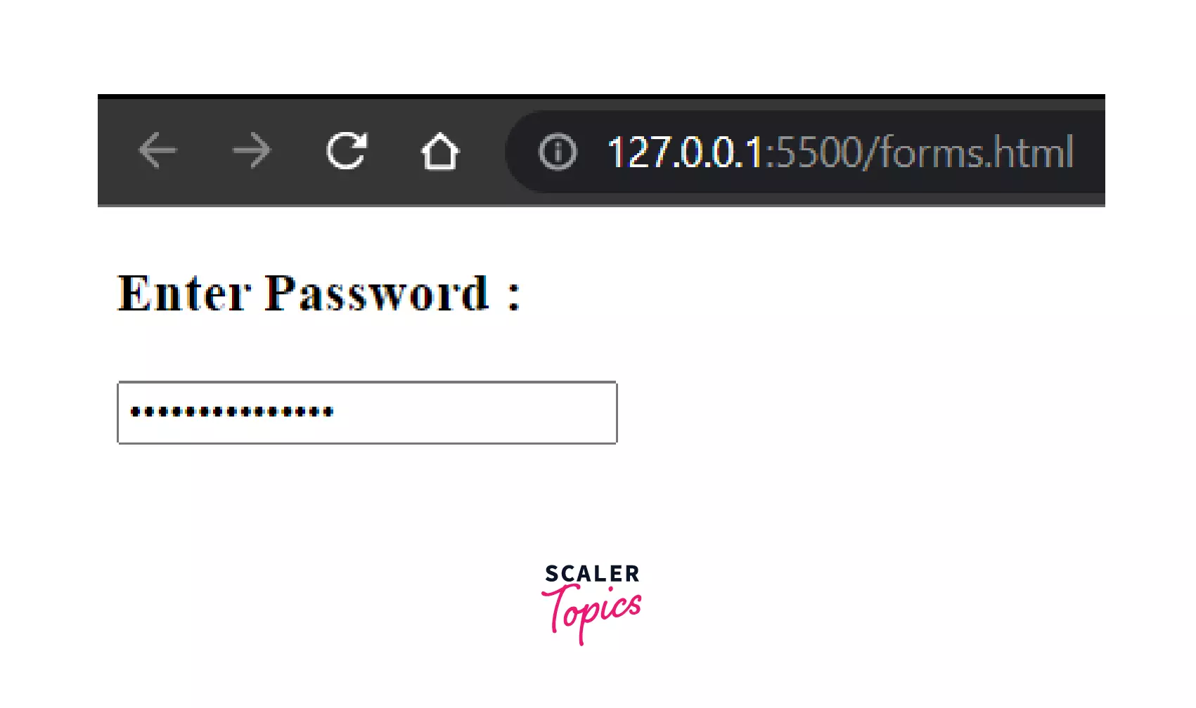
In the above example, we have demonstrated the usage of password field. We have also specified the required field here, which means, it is mandatory to enter the password. Additionally, we have also mentioned the minlength field here, which suggests the minimum length of the password that will be accepted. However, adding the "required" or "minlength" fields in the "password" input type are optional.
Supported Common Attributes : The common attributes supported by the password field is are: autocomplete, inputmode, maxlength, minlength, pattern, placeholder, readonly, required, and size.
Input Type "Submit"
Input elements of type submit defines a button for submitting form data to a form-handler. Basically, Form-Handler is a piece of code, that runs on the server to process the data(input data) we have provided to the forms.
When the user agent receives a click event (usually after clicking a button), it submits the form to the server.
The form-handler is specified in the form's action attribute:
OUTPUT:

Here, on submitting the form, it will redirect to the page specified in the form's action attribute. And, the entered data will be sent to the server on clicking the submit button.
In case of the Input type submit , if the value attribute is ommited, the button will have a by-default text "Submit".
Input Type "Reset"
<input> elements of type reset are kind of buttons, on clicking which it resets all of the inputs in the form to their initial values.
Example:
Output:
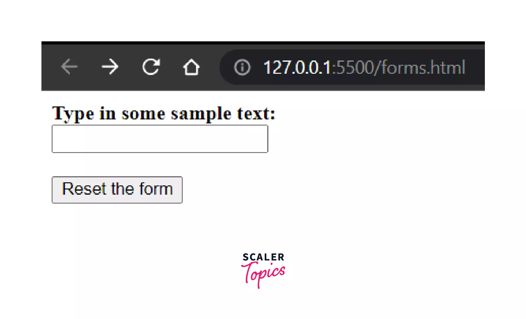
Note: If you omit the value attribute from input, you get a button with the default label Reset.
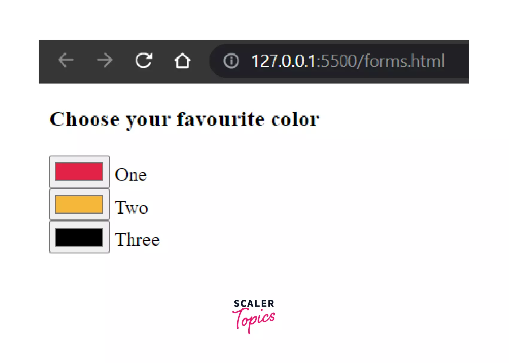
Input Type "Radio"
<input> elements of type radio are generally used as a collection of radio buttons describing a set of related options. Only one radio button in a given group can be choosen at a time. Radio buttons are typically rendered as small circles, which are filled or highlighted when selected.
Example:
Output:
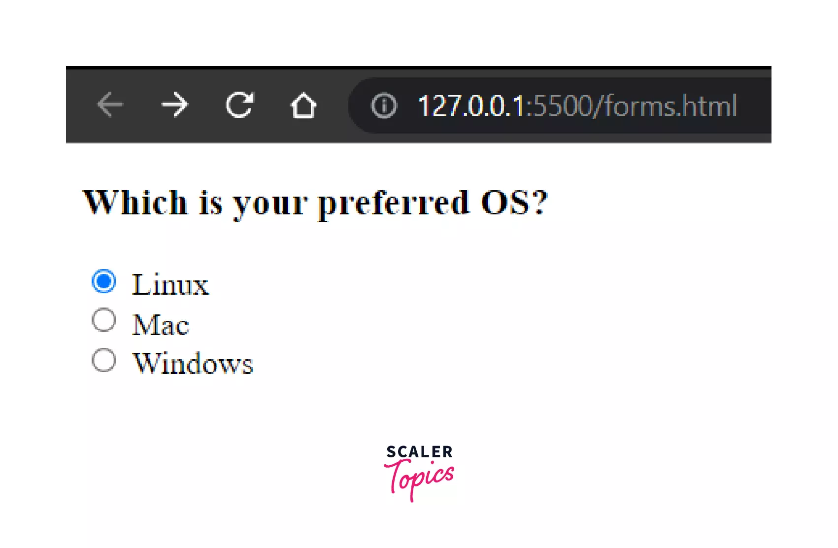
So, here we can choose one value out of the multiple options provided to us.
Input Type "Checkbox"
<input> elements of type checkbox are rendered by default as boxes, that are checked (ticked) when clicked. A checkbox allows you to select zero or more values for submission in a form.
Example:
Output:
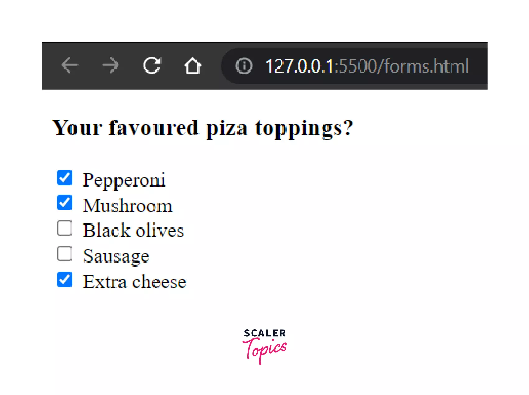
As shown in the example, we can select any number of values from the checkbox.
The value attribute is not displayed on the client-side, but on the server this is the value given to the data submitted with the checkbox's name. Like, in this example, we've got a name of topping1, and a value of Pepperoni. When the form is submitted, the data name/value pair will be topping1=Pepperoni along with the other values selected. If the value attribute was omitted, the default value for the checkbox is on, so the submitted data in that case would be topping1=on
Note: Checkboxes are similar to radio buttons, but with an important distinction: radio buttons are designed for selecting one value out of a set, whereas a checkbox allows you to select 0 to multiple options from a given set.
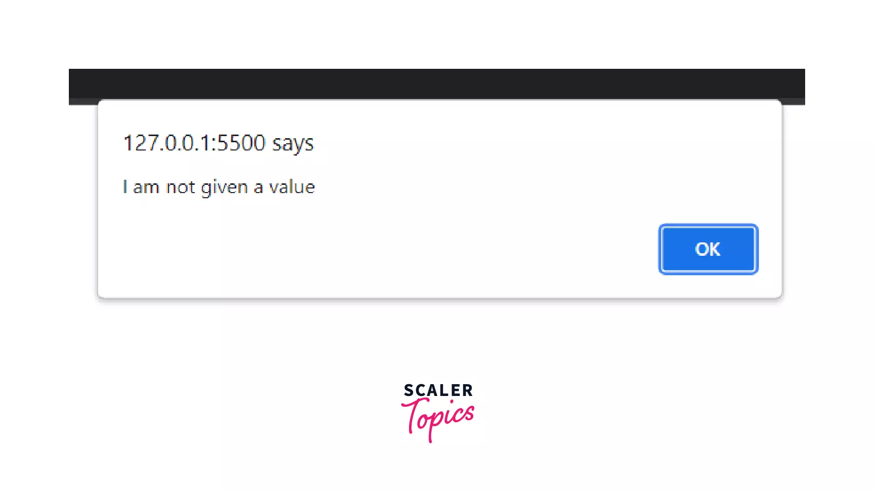
Input Type "Button"
<input> elements of type button are rendered as simple push buttons. We can code them to control any functionality we want, anywhere on our webpage, such as any animations or change of color when we perform some activity.
For example, you must have worked with event handlers, which are for handling any event. Event can be anything like a click on the button, or a hover over the button or anything that responds when we perform any action on them(suppose a link changes it's color after we have clicked on it). So, that can be done using the buttons by providing them with an event handler function(a function that handles event). Using them, we can define functions like onClick(), onHover(), onDoubleClick(), etc. to respond to the actions/events of users in the buttons.
Example:
Output:
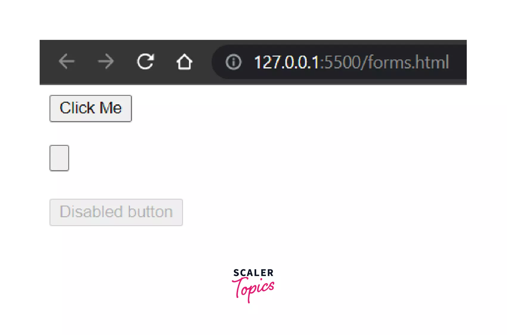
Result when "Click Me" is clicked:
While <input> elements of type button are still perfectly valid HTML, the newer <button> element is now the favored way to create buttons. Given that, a <button>’s label text is inserted between the opening and closing tags, you can include HTML in the label, and even images can be included, so it is a more preferred way.
Input Type "Color"
<input> elements of type color provide a UI element that let's user specify a color, either by using a visual color picker or by entering the color into a text field in #rrggbb hexadecimal format.
Example:
Output:
If you don't specify a value, the default is #000000 (black). Colors in any other format (such as CSS color names or CSS color functions, such as rgb() or rgba()) must be converted to hexadecimal before setting a value. For example, the RGB red color code - (255,0,0), must be converted into hexadecimal, prior to setting any value: Hex Code RGB - FF0000.
Input Type "Date"
<input> elements of type="date" create input fields that allows the user to enter a date, either with a textbox that validates the input or a special date picker interface.
Example:
Output:
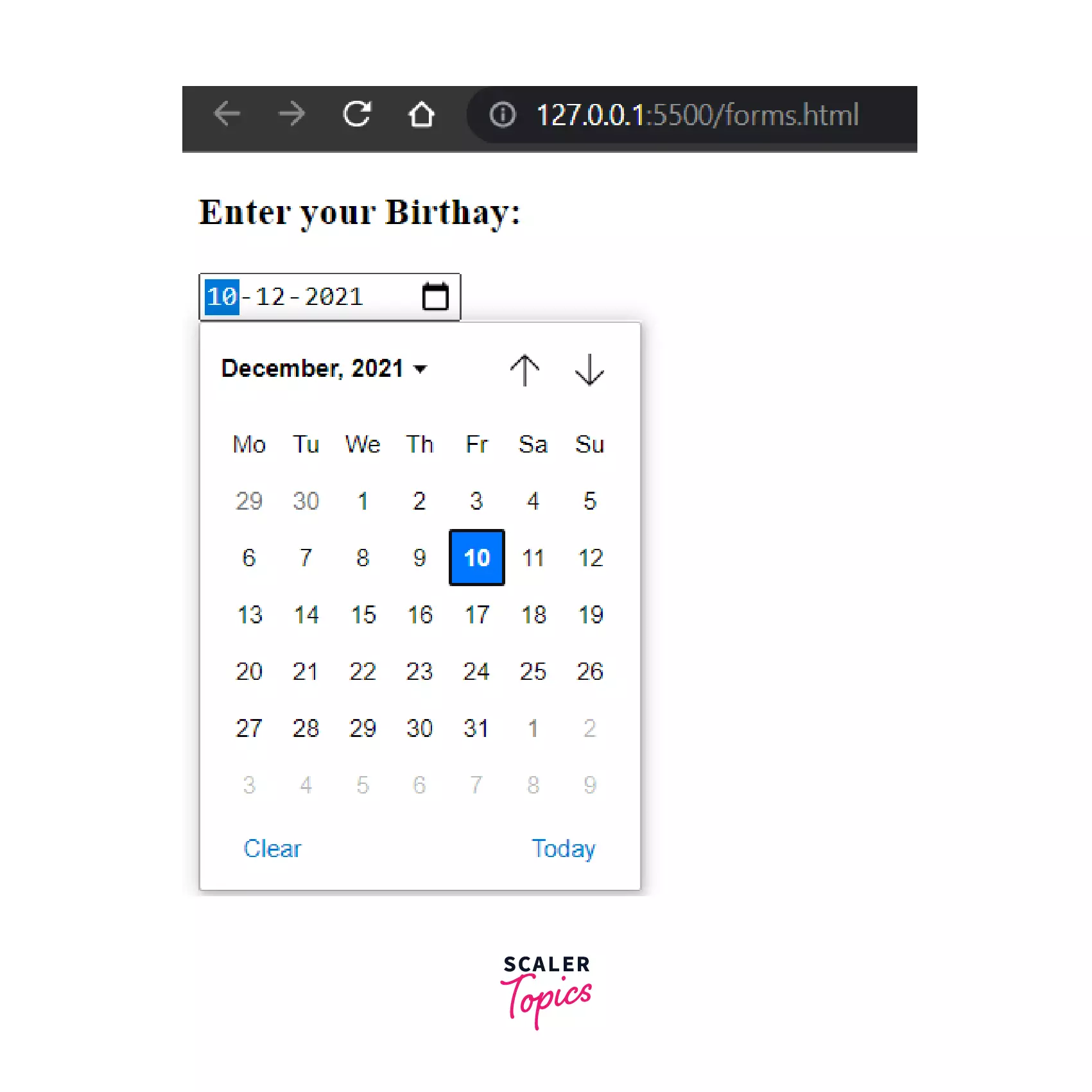
The date is formatted according to ISO 8601. We also have max, min and step attributes supported with date to add desired restrictions to the date.
The ISO 8601 date format is as follows: YYYY-MM-DDTHH:mm
Turn Learning into Career Growth
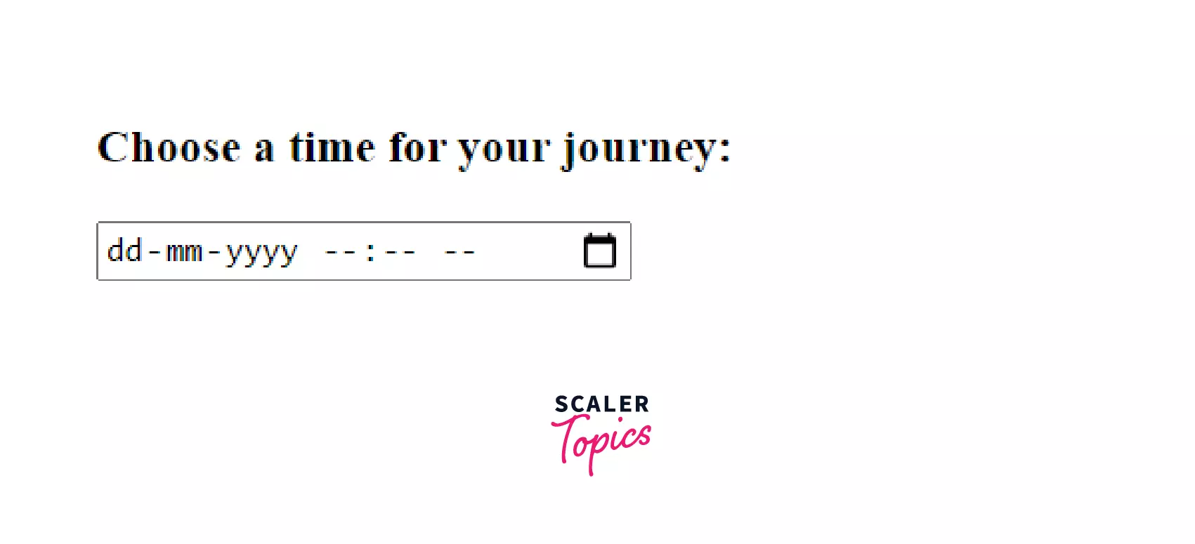
Input Type "Datetime-local"
<input> elements of type datetime-local creates the type of input fields that lets the user to easily enter both the date and time, including the year, month, and day as well as the time in hours and minutes.
Example:
Output:
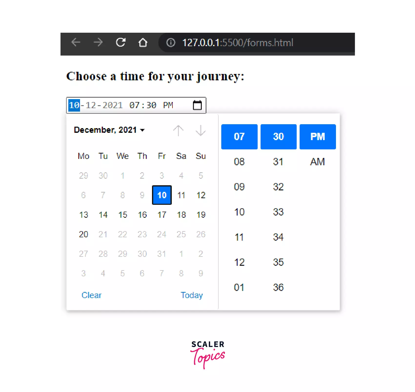
Here the value, min and max date attributes are optional and if omitted, it will be displayed in format -
Notable points -
- The date/time value is always formatted in the format: YYYY-MM-DDThh
. When the value in the above example is submitted to the server, it will look something like journey-time=2021-12-10T19:30. It means, the date is 2021-12-10 and the time is 19:30(in 24-hours format). - Other attributes supported by Datetime-local are autocomplete, list, readonly, and step.
Input Type "Email"
<input> elements of type email are used to allow the user to enter and edit an e-mail address. A list of e-mail addresses are also accepted if the multiple attribute is specified. Before submitting the form, it is checked to see if the input value is empty or if it is a properly formatted e-mail address (or list of e-mail addresses).
Example:
Output:
Here, an interesting thing is, the form will automatically invalidate if we don't provide an email, because we have specified the 'type' field as email.
For example, if we don't provide an '@'
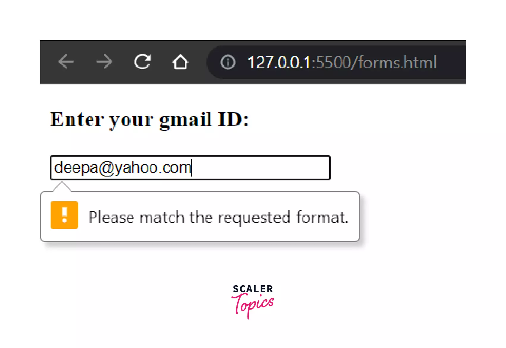
Again, in the above code, we can see that we have provided a pattern which is ==pattern=".+@gmail.com== " so if we provide any email address which doesn't have gmail.com in it, it will not be accepted.
For example,
We can also provide a list of email addresses by adding the multiple attribute(in that case, even entering 0 email address is also acceptable).
Input Type "File"
<input> elements with type="file" allows the user to choose one or more files from their device storage. Once chosen, the files can be uploaded to a server using form submission. We can also use the file in our JavaScript code and manipulate using the File API.
Example:
Output:
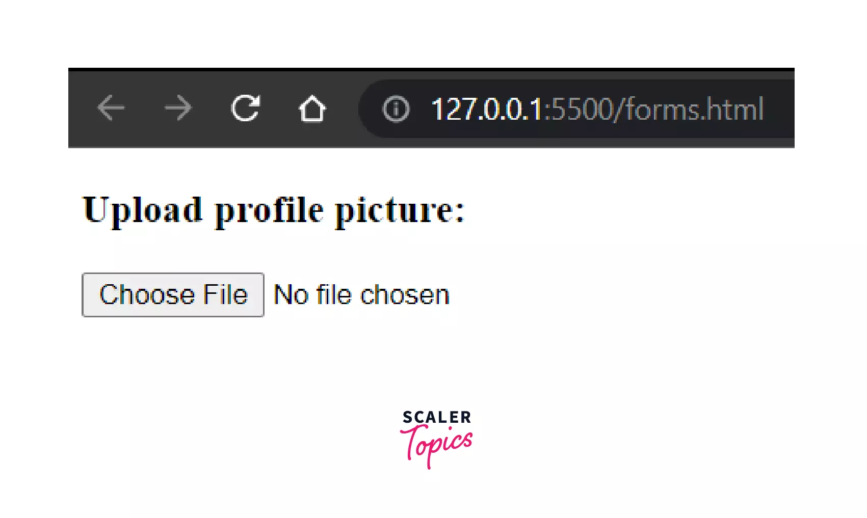
The accept attribute value is a string that defines the file types the file input should accept. We also have the capture attribute which specifies which camera to use to capture the of image or video data. The 'multiple' attribute is specified when we want to upload multiple files.
Input Type "Hidden"
<input> elements of type hidden allows the web developers to include data that cannot be seen or modified by users when a form is submitted. For example, we never want our userID to be displayed in the URL while submitting any form. So, the hidden inputs are completely invisible in the rendered page.
Example:
Output:
Here, the userID will go hidden with the form and won't be visible anywhere in the page's content.
Input Type "Month"
<input> elements of type month create input fields that allows the user to enter a month and year. The string value is in the format "YYYY-MM", where YYYY is the four-digit year and MM is the month number.
EXAMPLE:
OUTPUT:
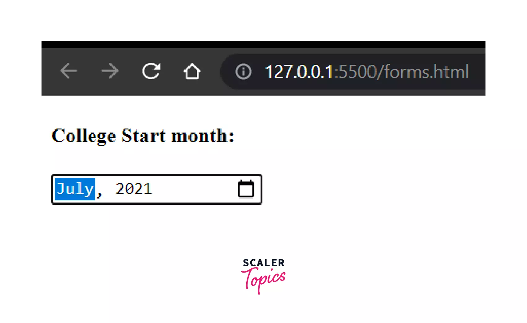
So, depending upon the browser support, we will be provided with a date picker here.
Input Type "Number"
<input> elements of type number allows the user enter a number. They include built-in validation. They reject any non-numerical entries. We also can have an attached stepper to increase or decrease the count tapping on it.
EXAMPLE:
OUTPUT:
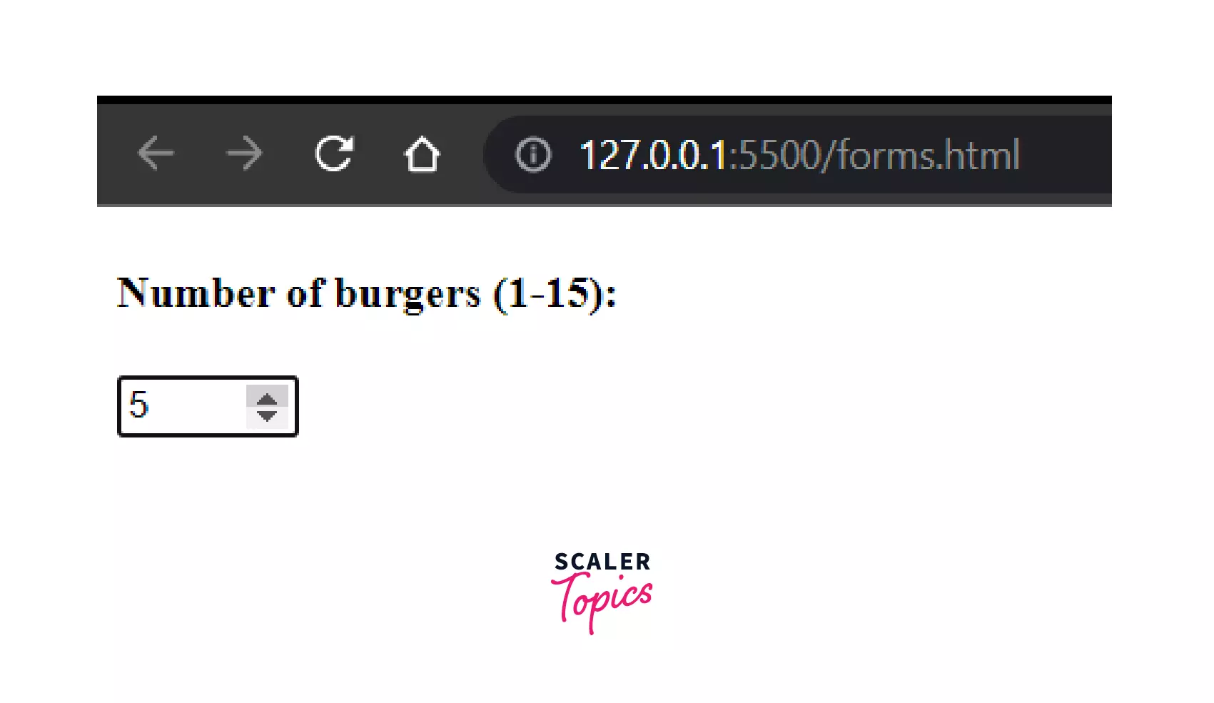
Additionally, the other attributes supported by Number are -- min, max, readOnly, placeholder, step and list.
Input Type "Range"
The user can specify a numeric number that must not be less than a specified value and not more than another value using <input> elements of type range. No precise value is required . Usually, depending upon the browser support, it is represented using a slider or dial control.
EXAMPLE:
OUTPUT:
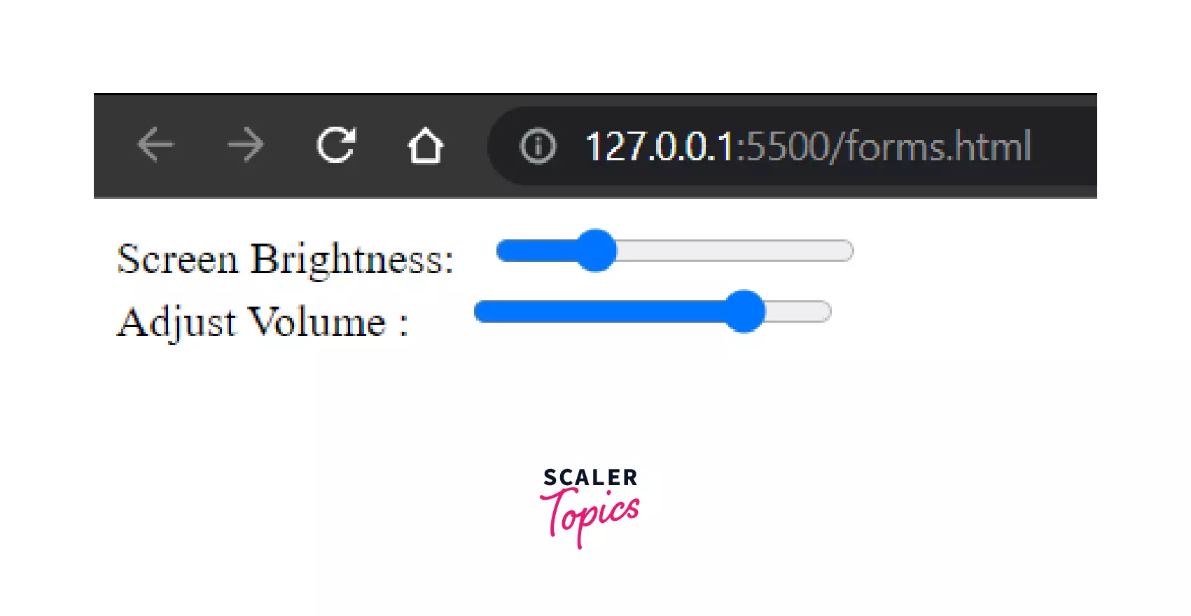
The default value is halfway between the specified minimum and maximum, but if the minimum value is greater than the maximum then the default is set to the value of the min attribute. Range also has the step attribute.
Input Type "Search"
<input> elements of type search are allow the users to enter their search queries.
**EXAMPLE:**
OUTPUT:
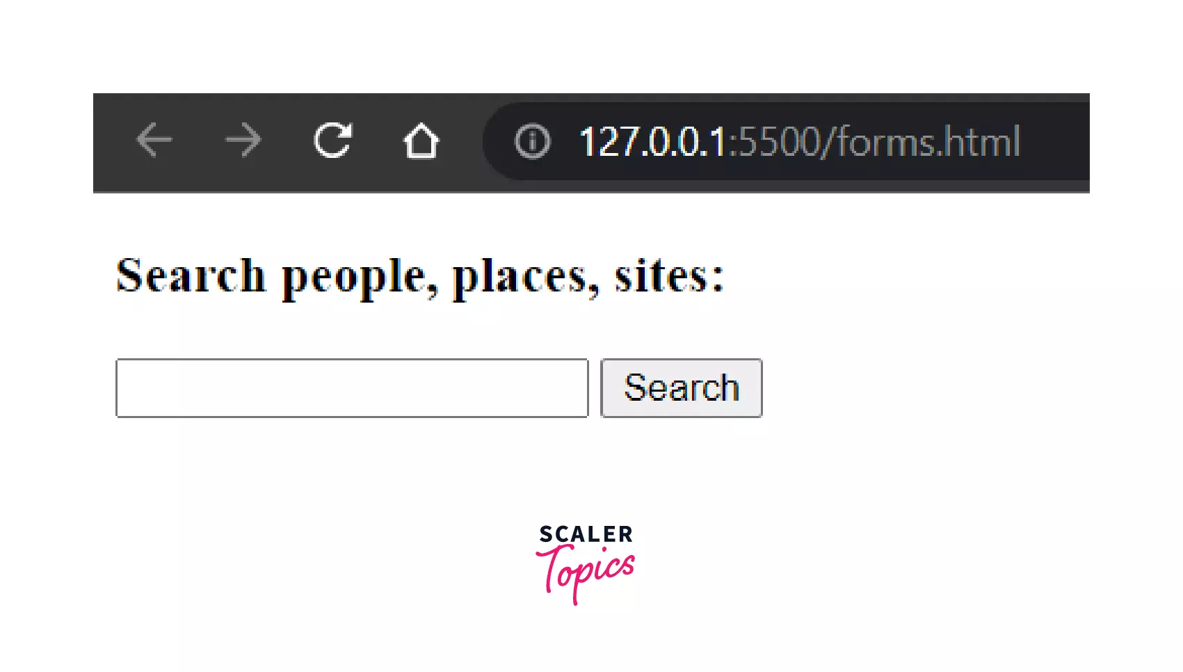
The supported attributes for search are -- autocomplete, list, maxlength, minlength, pattern, placeholder, required and size.
Input Type "Tel"
<input> elements of type tel are used to let the user enter and edit a telephone number. However, there is no form validations present here, because of the varied telephone numbers around the world. In the mobile phones, they present with a customized keypad for entering the phone numbers.
EXAMPLE:
OUTPUT:
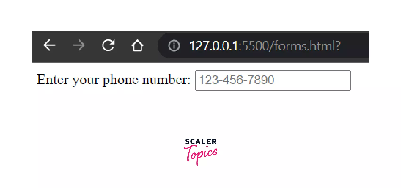
In the above example, we have provided a pattern for the phone number which suggests that - there should be {3} digits between [0-9], another {3} digits between [0-9] followed by {4} digits between [0-9]. We have provided the 'placeholder' for clear understanding. Other attributes supported by this tel input type is - autocomplete, list, maxlength, minlength, pattern, placeholder, readonly, and size.
Input Type "Time"
<input> elements of type time creates input fields that allow the user to easily enter a specific time (hours and minutes, and optionally seconds). The UI varies from browser to browser.
EXAMPLE:
OUTPUT:
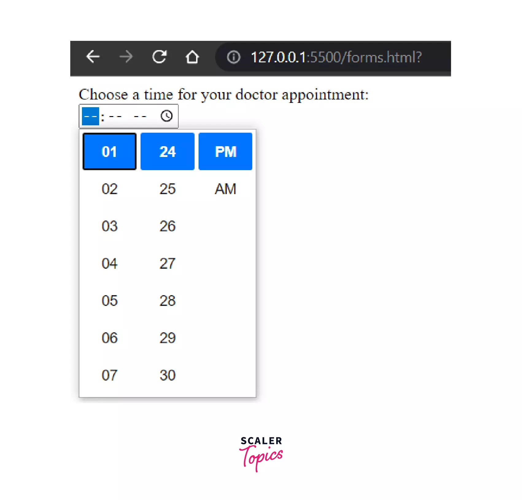
In Chrome/Opera browsers the time control have slots to enter hours and minutes in 12 or 24-hour format.
Input Type "Url"
<input> elements of type url allows the user to enter and edit any URL.
EXAMPLE:
OUTPUT:
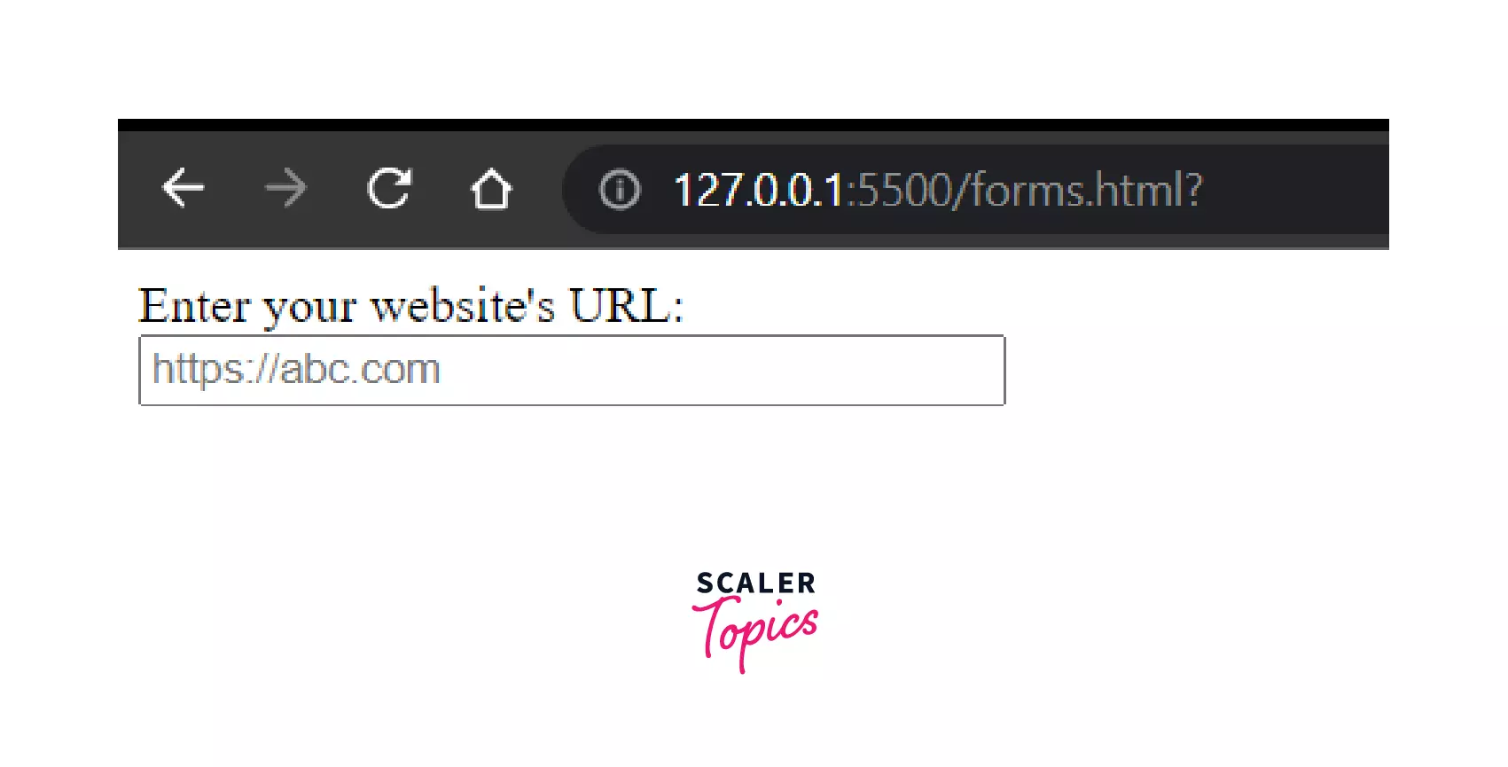
It contains in-built validations to ensure whether the URL entered is correct or not before submitting the form. If we enter an URL that doesn't meets the expected pattern pattern="https://.*" then an error will be thrown. Commonly supported attributes for this URL field are - autocomplete, list, maxlength, minlength, pattern, placeholder, readonly, required and size.
Input Type "Week"
<input> elements of type week creates input fields allowing the user to easily enter the year and the ISO 8601 week number in that year.
EXAMPLE:
OUTPUT:
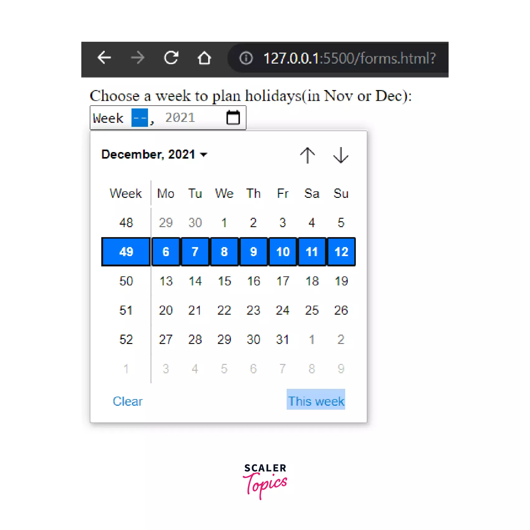
We can also specify a default week, by using the value attribute. Other supported attributes include - autocomplete, list, readonly, and step.
Conclusion
Here, we come to the end of the tutorial. It has provided you with a detailed understanding of all kinds of inputs in the HTML forms and relavant relevant examples. Let's summarize what we have learned throughout --
- HTML <input> element.
- List of all types of <input> elements of HTML.
- Illustrative examples to demonstrate their usage.
 Google
 Amazon
 Microsoft
 Flipkart
 Adobe1200+ more