Bar Plot in Python
Overview
Exploring data is one of the significant works of data scientists. Representing data and interpreting or extracting important information has been a major work of data scientists, and it is called exploratory data analysis. There are different ways to explore the data.
For exploring data, we can use histograms, pie charts, bar charts, line plots, etc. However, in this article, we will learn about bar plots and how to implement them.
A barplot or bar chart is a graph representing the data in the form of rectangular bars with lengths and heights proportional to the value they represent. A bar plot can be plotted horizontally or vertically. There are several libraries and many programming languages in which we can create bar plots. For example, we can plot the barplot in Python using libraries like matplotlib, seaborn, or plotly.
What are Bar Plots?
The bar plots are the graphs that represent the data in the form of rectangular bars. The length and heights of rectangular bars of the bar charts represent the data distributed in the dataset. We have one axis that represents a particular category of a dataset's column, and the other axis represents the associated values or counts. The axis mentioned above can be either horizontal or vertical axis. So, the bar plot can be plotted as horizontally or vertically. A vertical bar chart is often called a column chart.
Transform Your Career
Choose from our industry-leading programs designed for career success
Modern Software and AI Engineering Program
Master full-stack development with AI integration

Modern Data Science and ML with specialisation in AI
Advanced data science techniques with AI specialization
Advanced AIML with Specialisation in Agentic AI
Deep dive into AIML with focus on Agentic systems
DevOps, Cloud & AI Platform Engineering
Build and manage AI-powered cloud infrastructure
AI Engineering Advanced Certification by IIT-Roorkee
Premier AI engineering certification from IIT-Roorkee
How to Create Bar Plots in Python?
There are several ways from which we can create our bar plots. We will cover the most common and easy Python methods to plot the bar plots.
These methods/libraries are useful for data visualization and interpreting meaningful information from the datasets. These methods/libraries that are available and make our work easy to create a bar plot in Python are :
- Pandas
- Matplotlib
- Seaborn
- Plotly
Pandas
Pandas library is generally used for working with data frames. Pandas is one of the packages used to import and analyze data much easier.
In Pandas, we can also create a bar plot using the following syntax :
Syntax:
Parameters:
-
x:
It is the label or the position that allows the plotting of one column versus another. If not specified, the index of the Dataframe is used. -
y:
It is also the label or the position that allows plotting one column versus another. If not specified, all numerical columns are used.
Returns: A matplotlib bar plot or a numpy array will be returned.
Code:
Output:
Explanation:
In the code, initially, some inbuilt python libraries are imported, like pandas, matplotlib, and numpy. In the above code, we have plotted our bar plot using the pandas' library, and the matplotlib library is used for saving the pandas' barplot. Next, using the numpy library, some random datasets have been generated, and that data is used to plot our bar plot.
Matplotlib
Matplotlib is one of the most popular libraries for creating plots in Python. For example, matplotlib API in Python provides the bar() function, which can be used to create bar plots.
Syntax:
Parameters:
-
x :
It is the sequence of scalars representing the x coordinates of the bars. align controls if x is the bar center(default) or left edge. -
height :
It is a scalar or sequence of scalars representing the height(s) of the bars. -
weight:
It is a scalar or array-like value, although optional. However, the width(s) of the bars is by default 0.8. -
bottom:
It is a scalar or array-like value, although optional. Nevertheless, the coordinate(s) of the bars is by default None. -
align:
It aligns the plot in either center or edge. Also, this is an optional parameter; hence by default, it is always the center.
Returns:
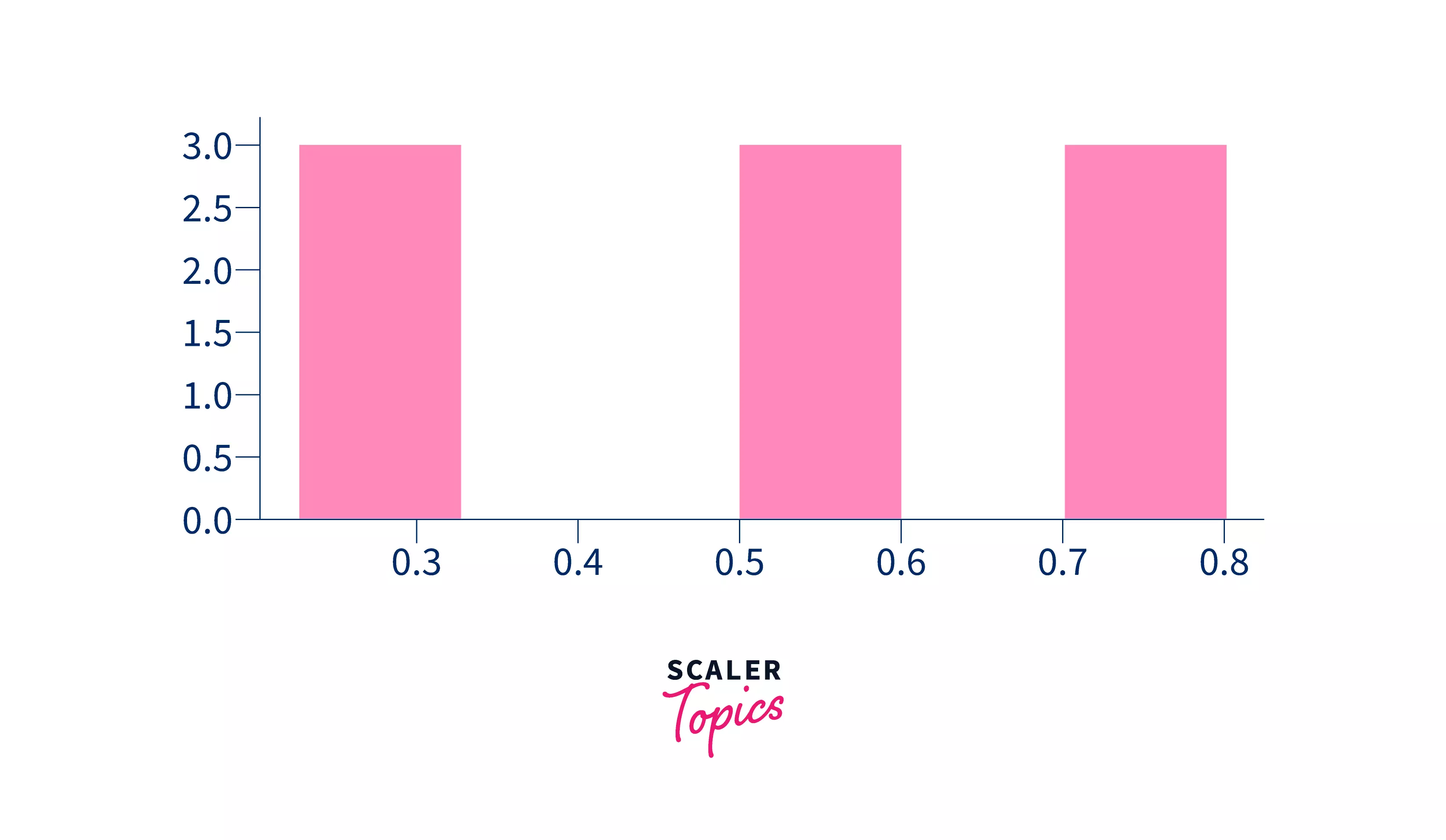
The function creates a bar plot bounded with a rectangle depending on the given parameters. A simple example of the bar plot represents the number of students enrolled in different courses at an institute.
Code:
Output:
Explanation:
In the above code, the bar plot is plotted using the matplotlib library. As mentioned, it is one of the popular and most widely used libraries for data visualization, as its syntax is simple and easy to use and remember.
Seaborn
Seaborn is also a visualization library like matplotlib and is widely used for presenting data.
Syntax:
Parameters:
-
data:
data parameter represents the data frame we will use to plot the bar plot. -
x:
x represents that horizontal axis, and x will be the particular column of the data frame used in our data. -
y:
y represents that vertical axis, and y will be the particular column of the data frame used in our data.
Returns:
Like matplotlib, it will also return a barplot according to the given data.
Code:
Output:
Turn Learning into Career Growth
Plotly
Plotly is an amazing data visualization library that can create interactive presentations, zoom into locations, and handle various design representations. It is widely used for readable representations, and we can hover over the chart to read the data represented. It is also used for higher-dimensional data representation and has abstraction to represent data science and Machine learning visualizations. We use Plotly.express as px for importing plotly.
Syntax:
Parameters:
-
data:
data parameter represents the data frame we will use to plot the bar plot. -
x:
x represents that horizontal axis, and x will be the particular column of the data frame used in our data. -
y:
y represents that vertical axis, and y will be the particular column of the data frame used in our data.
Returns:
Like matplotlib, it will also return a barplot according to the given data.
Code:
Output:
Scaler Placement Report and Statistics
Scaler learners achieved 2.5x salary growth with average post-Scaler CTC reaching ₹23L.
Functions of Barplots
We can create various types of bar plots using our mentioned libraries.
Some of the different bar plots we can create using matplotlib are:
- Multiple Bar plots
- Stacked Bar plots
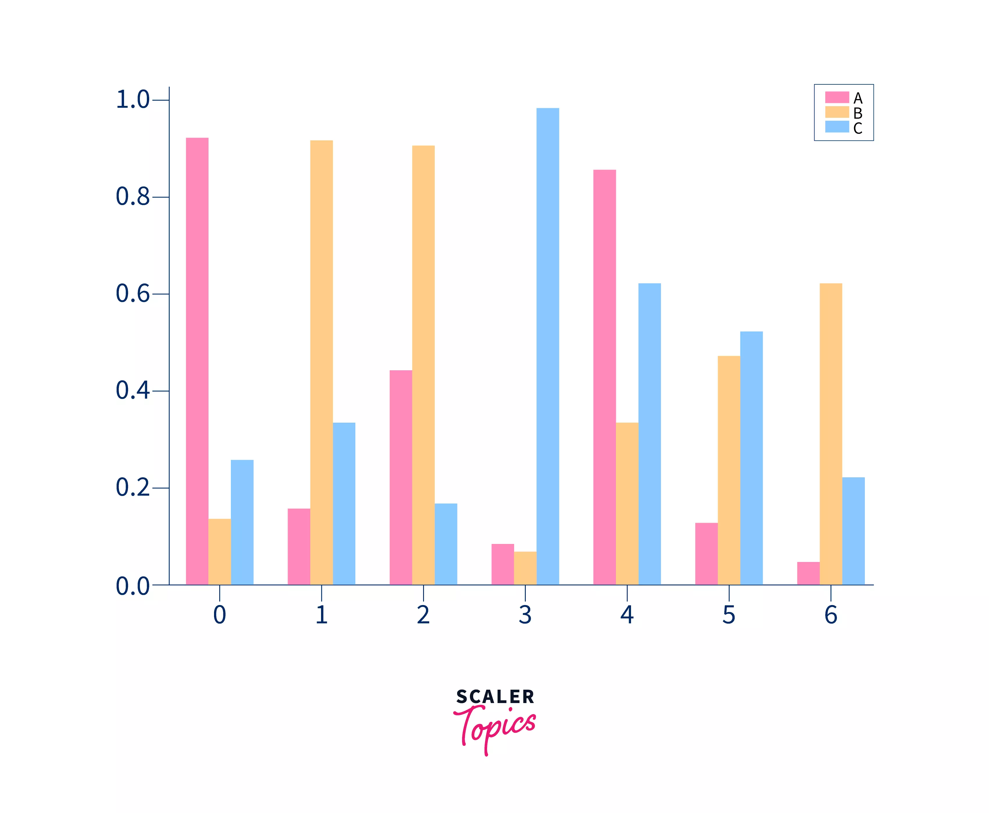
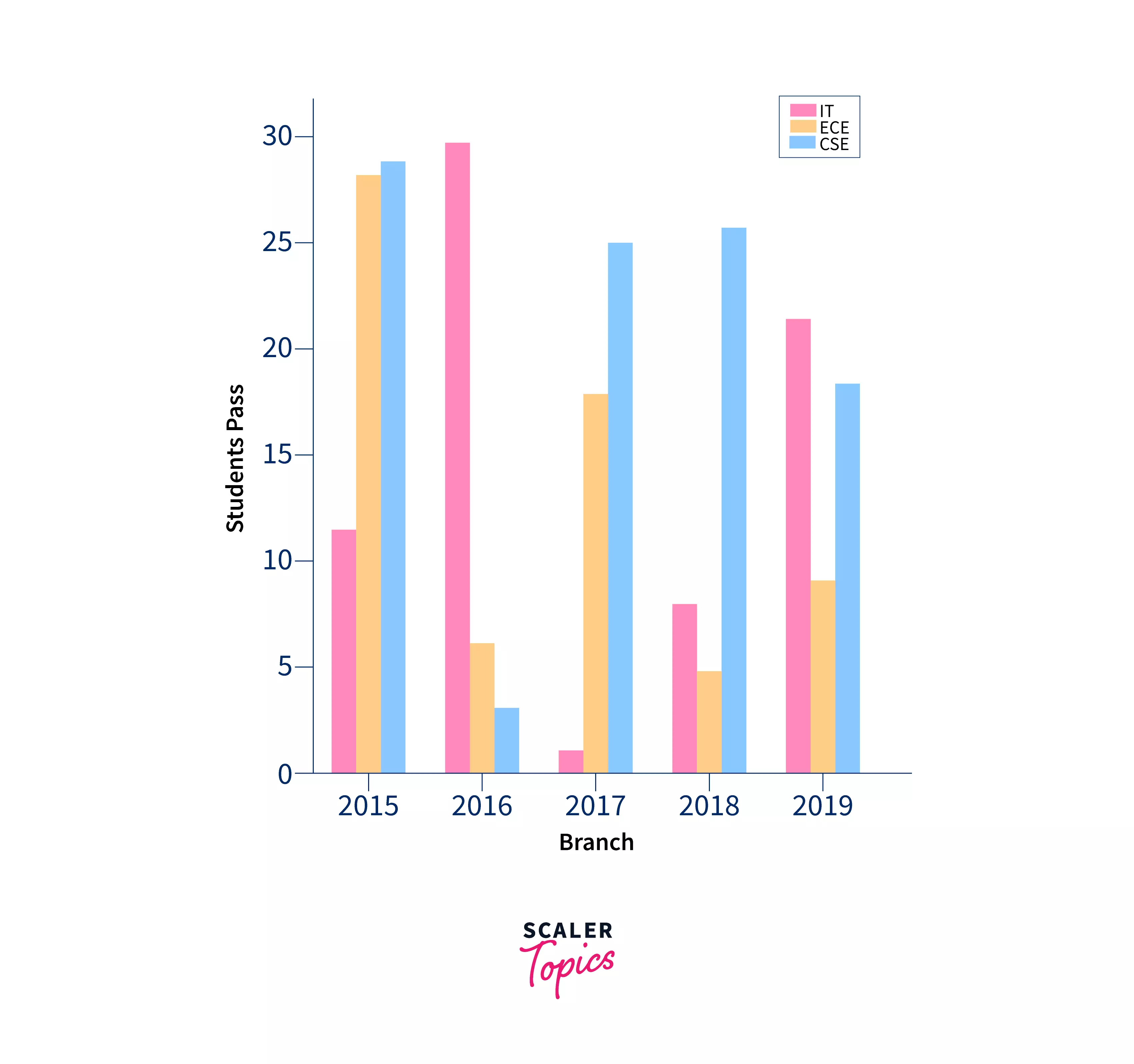
Multiple Bar Plots
Multiple bar plots are used when a comparison among the data set is to be done when one variable is changing. We can easily convert it into a stacked area bar chart, where each subgroup is displayed one on top of the others. It can be plotted by varying the thickness and position of the bars. For example, the following bar plot shows the number of students who passed in the engineering branch.
Code:
Output:
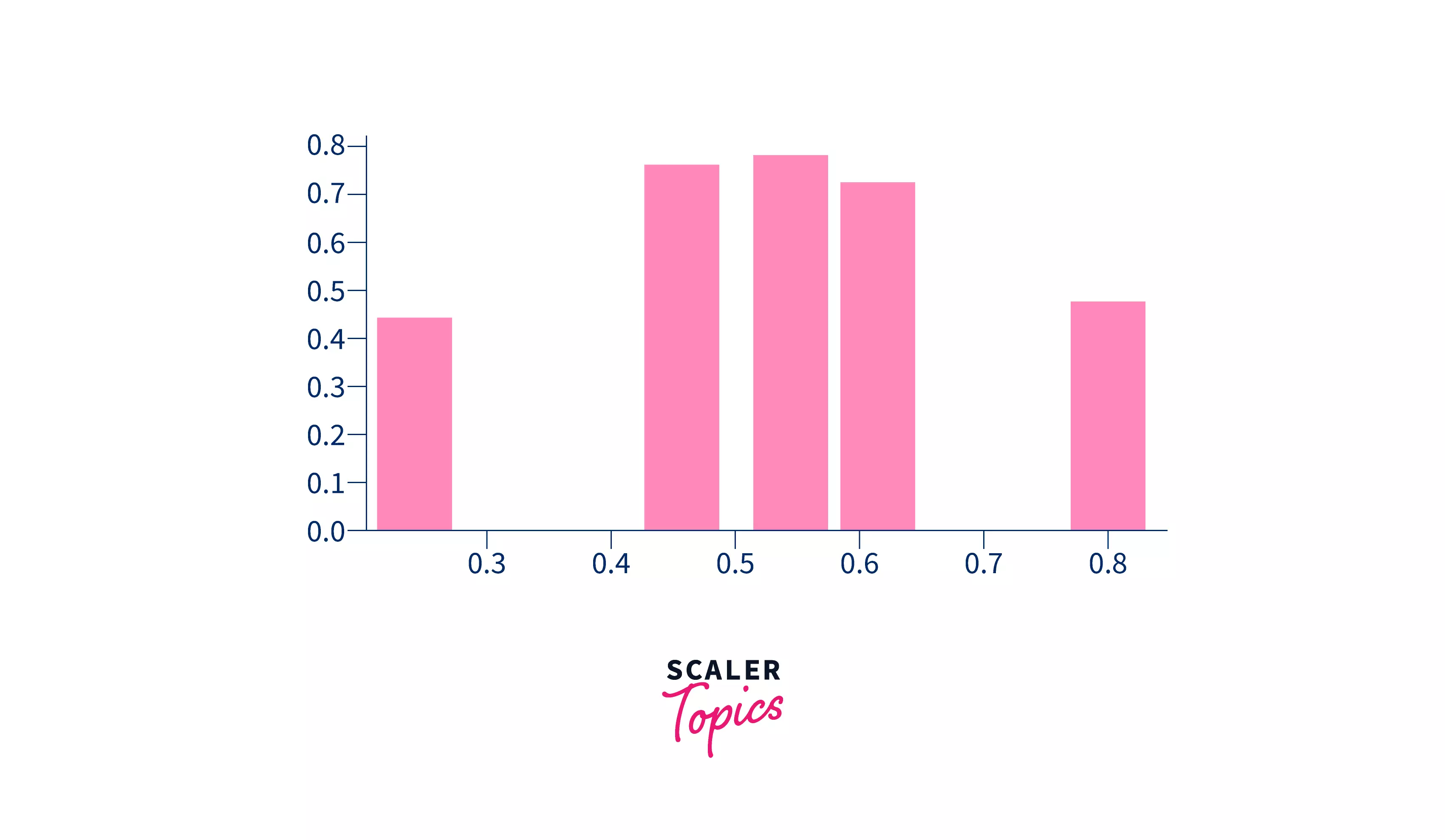
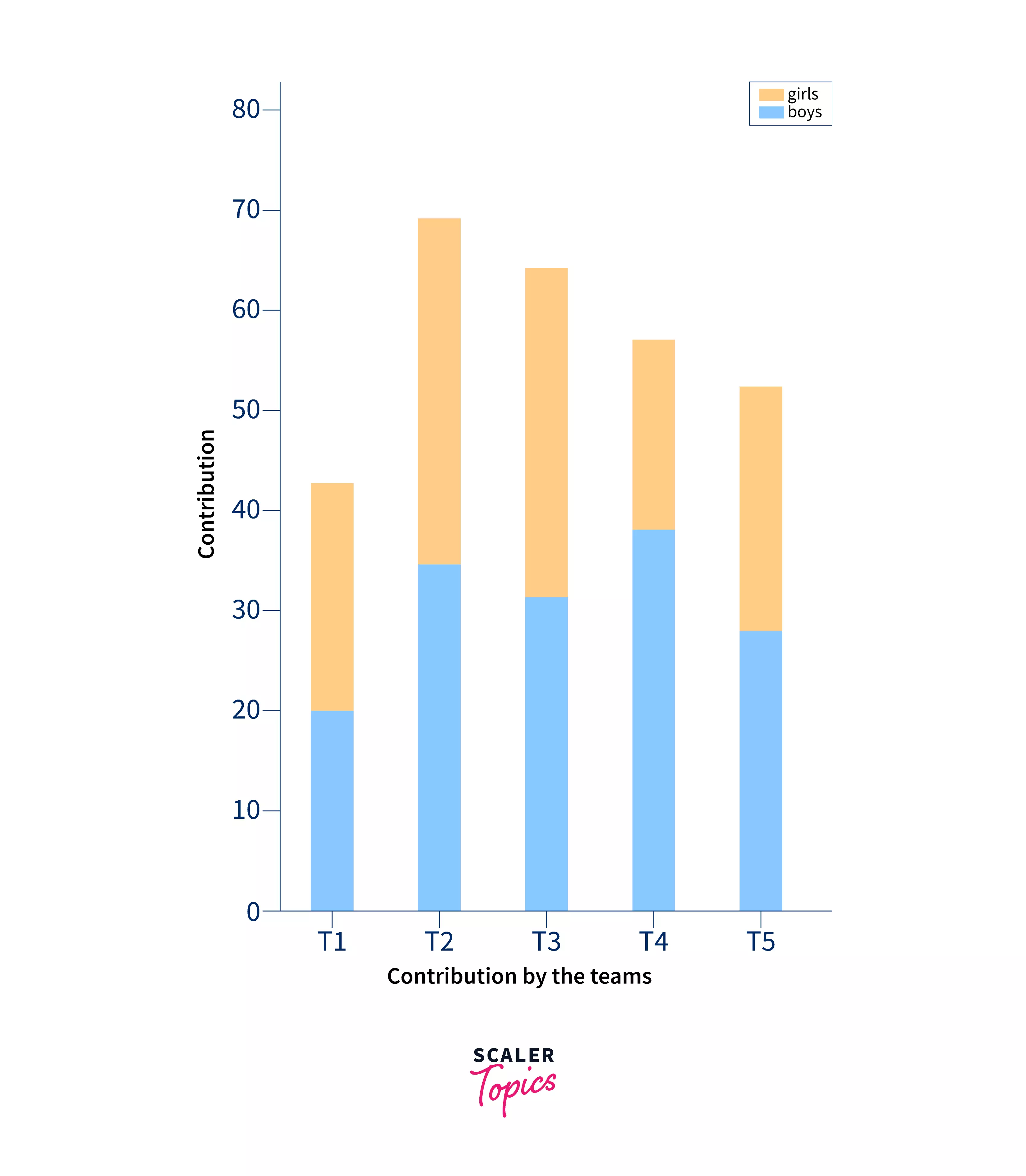
Stacked Bar Plots
Stacked bar plots represent different groups on top of one another. The bar height depends on the resulting height of the combination of the groups' results. It goes from the bottom to the value instead of from zero to the value. For example, the following bar plot represents the contribution of boys and girls to the team.
Code:
Output:
Conclusion
- In this article, we have discussed bar plots using different libraries like pandas, matplotlib, seaborn, and plotly.
- We have seen different approaches for creating the bar plots, but out of the four approaches, the most widely used method of creating the plots is matplotlib. However, for the most efficient and cool plots, we can either use seaborn or plotly because they give more clarity and a better understanding of plots.
- At last, we have multiple and stacked plots. Multiple plots are used when comparison among the data within multiple variables.
- Stacked bar plots represent different groups on top of one another.