::placeholder in CSS
 FREE
FREE

Overview
Selectors are patterns in CSS that are used to pick the element(s) that you want to style. The CSS::placeholder selector is a pseudo-element that allows you to pick from components with placeholder text and style them.
The placeholder property specifies a hint that explains the intended value of an input field, which is used to set the placeholder text. This placeholder color CSS article includes syntax and examples for using the CSS::placeholder selector.
Introduction to ::placeholder in CSS
- In the CSS pseudo-element, the placeholder selector is used to customize the placeholder text by changing the text color and modifying the style of the text. The::first-line pseudo-element is the only subset of CSS property that is applicable and can be used in a rule with the selector::placeholder.
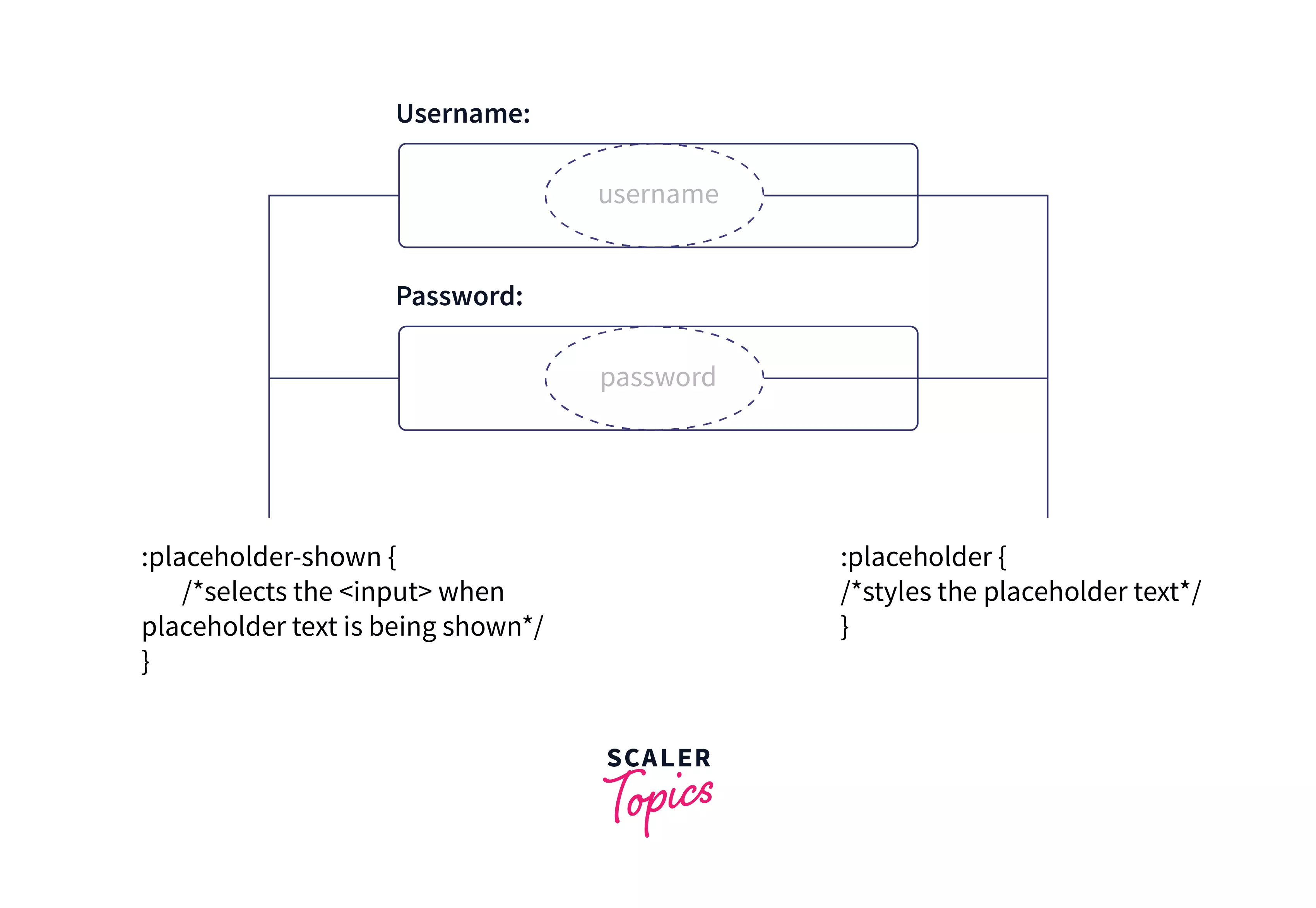
- The::placeholder selector creates form components with placeholder text and allows you to customize them. The placeholder text appears as a transparent or light grey color for most browsers by default.
- The placeholder property specifies a hint that explains the intended value of an input field, which is used to set the placeholder text.
Transform Your Career
Choose from our industry-leading programs designed for career success
Modern Software and AI Engineering Program
Master full-stack development with AI integration

 +1000 more
Modern Data Science and ML with specialisation in AI
Advanced data science techniques with AI specialization
+1000 moreAdvanced AIML with Specialisation in Agentic AI
Deep dive into AIML with focus on Agentic systems
+1000 moreDevOps, Cloud & AI Platform Engineering
Build and manage AI-powered cloud infrastructure
+1000 moreAI Engineering Advanced Certification by IIT-Roorkee
Premier AI engineering certification from IIT-Roorkee
Usage of ::placeholder in CSS
- If the placeholder text has enough color contrast, it can be read as typed input. Placeholder text will likewise disappear when a user inserts content into an element. Both of these factors can make it challenging to complete a form successfully, especially for persons with cognitive issues.

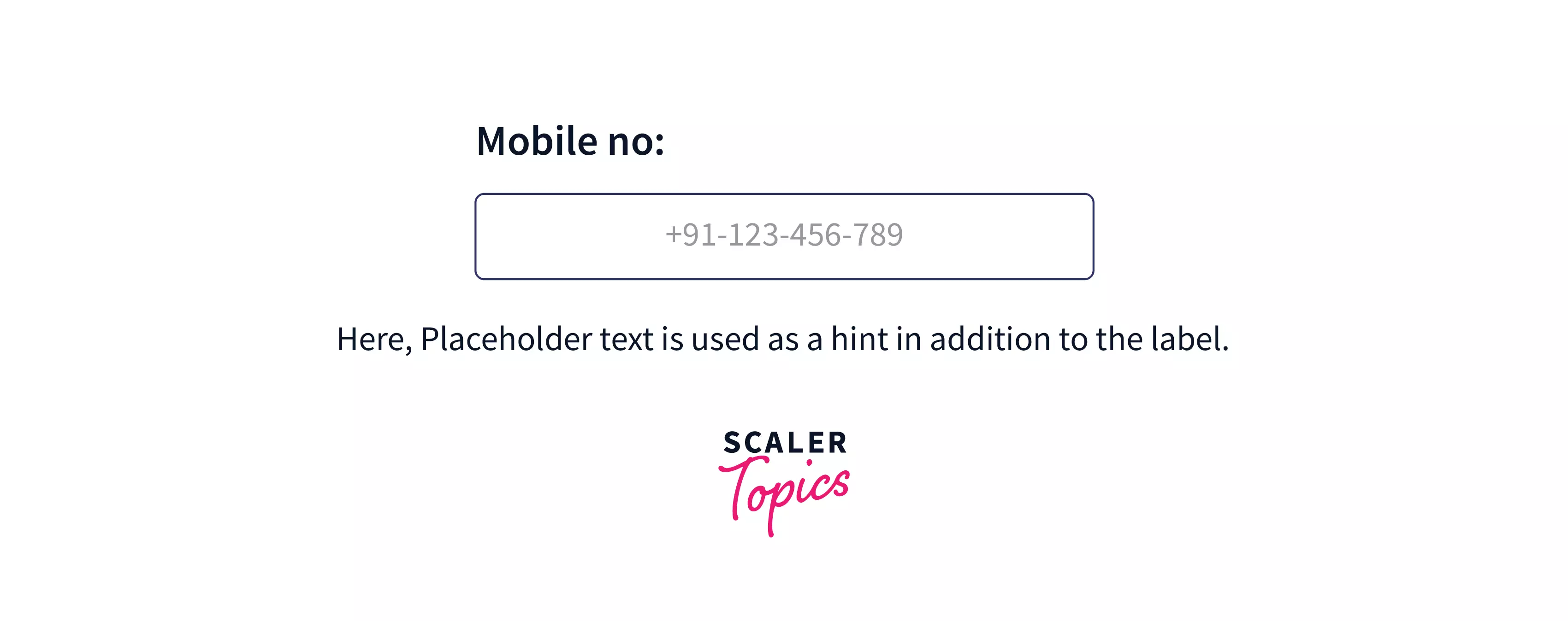
- Another method for giving placeholder information is to add it outside of the input in close visual vicinity, then utilize aria-describedby to associate with its suggestion programmatically.
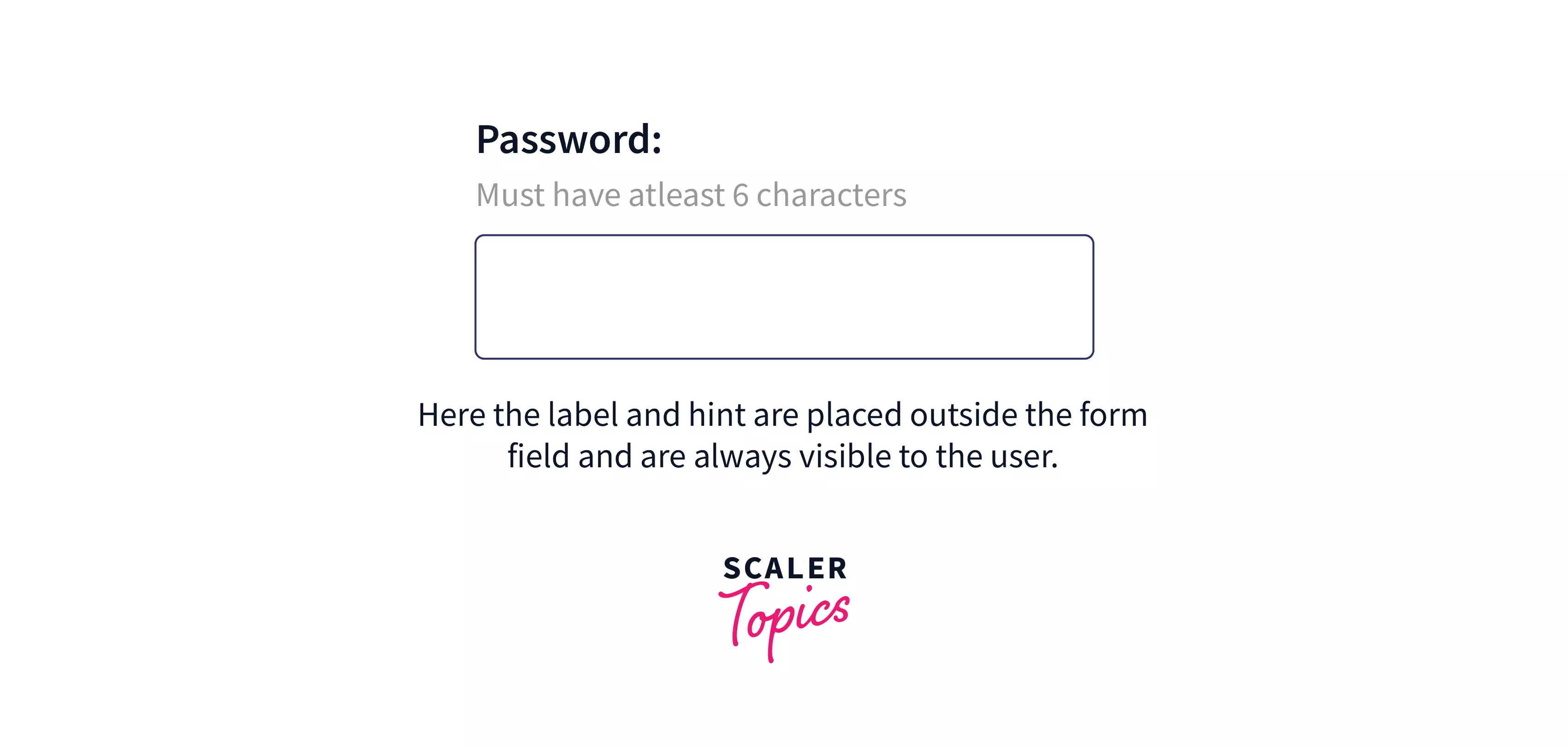
- The hint content is available with this implementation even if the information is entered into the input field, and the input appears free of preexisting input when the page is loaded.
Most screen reading software will use aria-describedby to read the hint after the label text of the input is announced, and the user can mute it if they deem the extra information unnecessary.
- The aria-describedby attribute contains a list of the element ids that describe the object. It provides a link between widgets or groups and the text that explains them. Form controls are not the only ones that can use the aria-described by attribute. It can also be used to link static text to widgets, groupings of items, regions with headings, definitions, and other elements.
Scaler Placement Report and Statistics
Scaler learners achieved 2.5x salary growth with average post-Scaler CTC reaching ₹23L.
Syntax
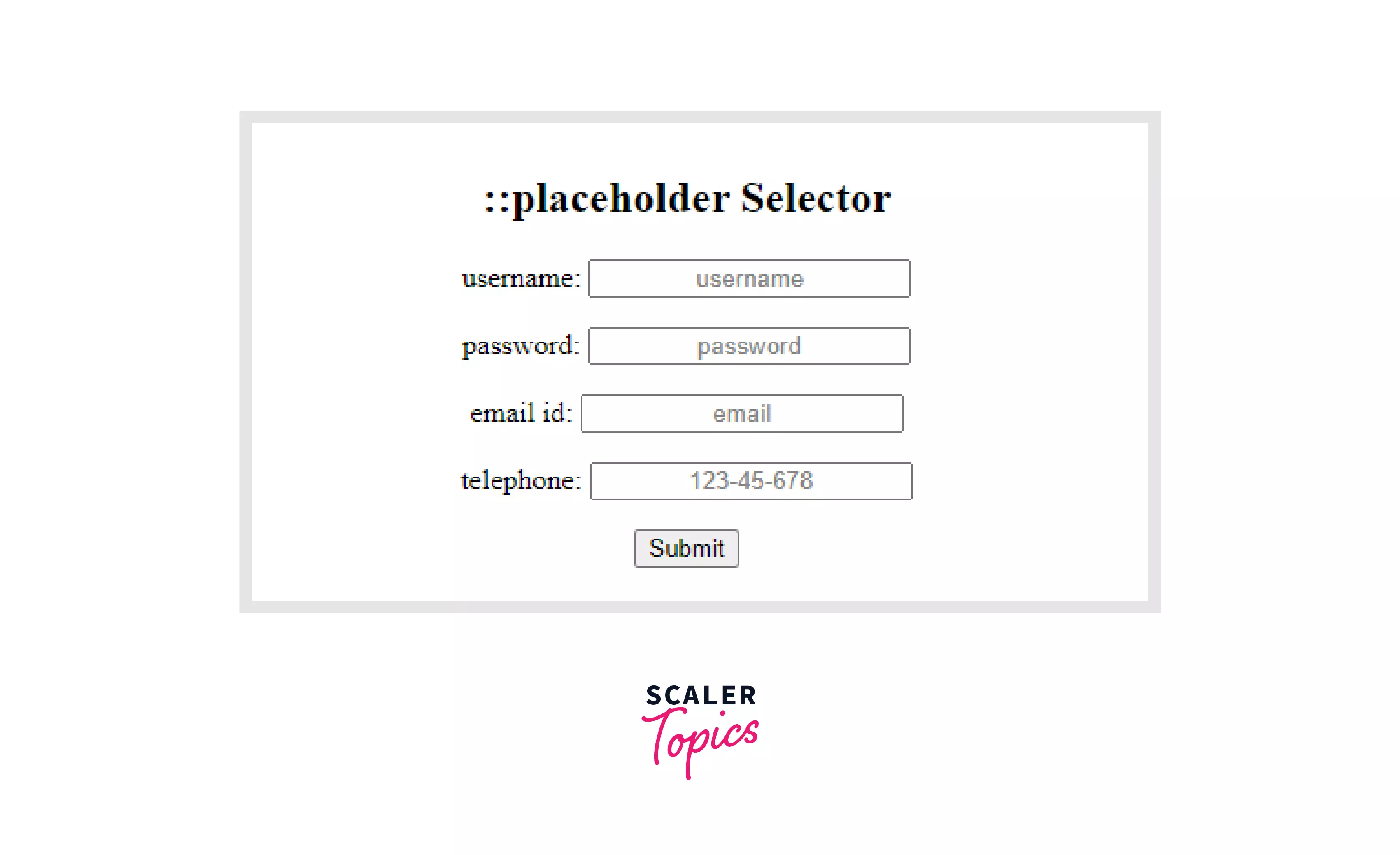
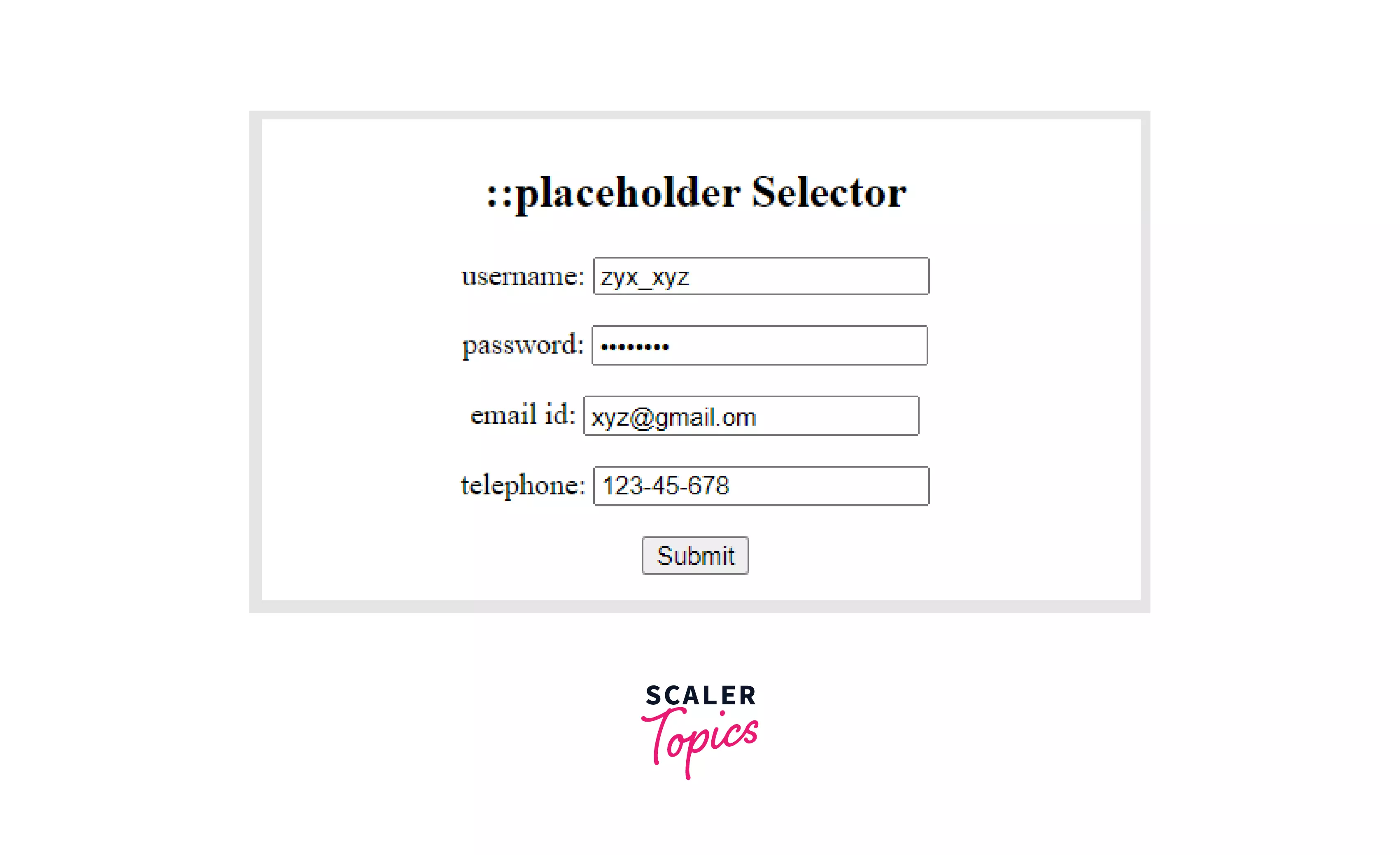
Example: In this example, we'll look at how to utilize the the::placeholder selector to generate placeholder text with an attribute indicating the hint that defines the intended value of an input field.
Output:
Note: A placeholder provides a suggestion that explains the expected value of an input field. After entering the desired value, the style will immediately get deleted.
Supported Styles
The pseudo-element supports the styling of these properties:
| Properties | Description |
|---|---|
| vertical-align: | The CSS vertical-align property controls how components on a line are aligned with one another. |
| color: | The CSS color property is used to change the color of text, the backdrop of a webpage, and the color of borders. |
| background properties: | The background property of CSS is used to define the background effects on an element. It's a shorthand property, which means you can write numerous CSS properties in one. |
| word-spacing: | This CSS property is used to specify the amount of space between words. We can change the space between the words by using this feature. A big negative or positive word-spacing value will make the word unreadable. If we utilize a very large positive value, we will see words that look like a succession of unconnected and distinct words. A very big negative value will cause the words to overlap, rendering the word recognizable. |
| line-height: | The CSS line-height property specifies the smallest height of line boxes within an element. It distinguishes between two lines of your material. It specifies how much space is left above and below inline elements. |
| text-decoration: | The text-decoration shorthand CSS property determines how decorative lines appear on text. It highlights selected text with an underline, overline, line-through, or a mix of lines. |
| font properties: | The CSS Font property is used to customize the appearance of text. You can modify the text size, color, style, and more by using the CSS font property. |
| text-transform: | The text-transform CSS property describes how to capitalize the text of an element. It can be used to make the text seem all-uppercase, all-lowercase, or capitalized on each word. |
| letter-spacing: | The letter-spacing CSS property determines how text letters are spaced horizontally. While rendering the text, this value is applied to the natural space between characters. Positive letter-spacing values lead characters to spread further apart, whereas negative letter-spacing values bring characters closer together. |
| text-indent: | The text-indent CSS property specifies the amount of space (indentation) that appears before lines of text in a block. |
| opacity: | The opacity CSS attribute determines an element's opacity. Opacity is the extent to which the content behind an element is obscured, and it is the inverse of transparency. |
How to Change CSS Placeholder Color?
Step 1) Insert HTML:
Insert an input element with the placeholder attribute.
Step 2) Include CSS:
The placeholder text is grey in most browsers. To modify this, use the non-standard::placeholder selector to style the placeholder. Since Firefox assigns a lower opacity to the placeholder, we use opacity: 1 to compensate.
Example 1: In this example, we will discuss how to use the the::placeholder selector for different browsers because the compatibility of the placeholder selector varies for different browsers.
Output:
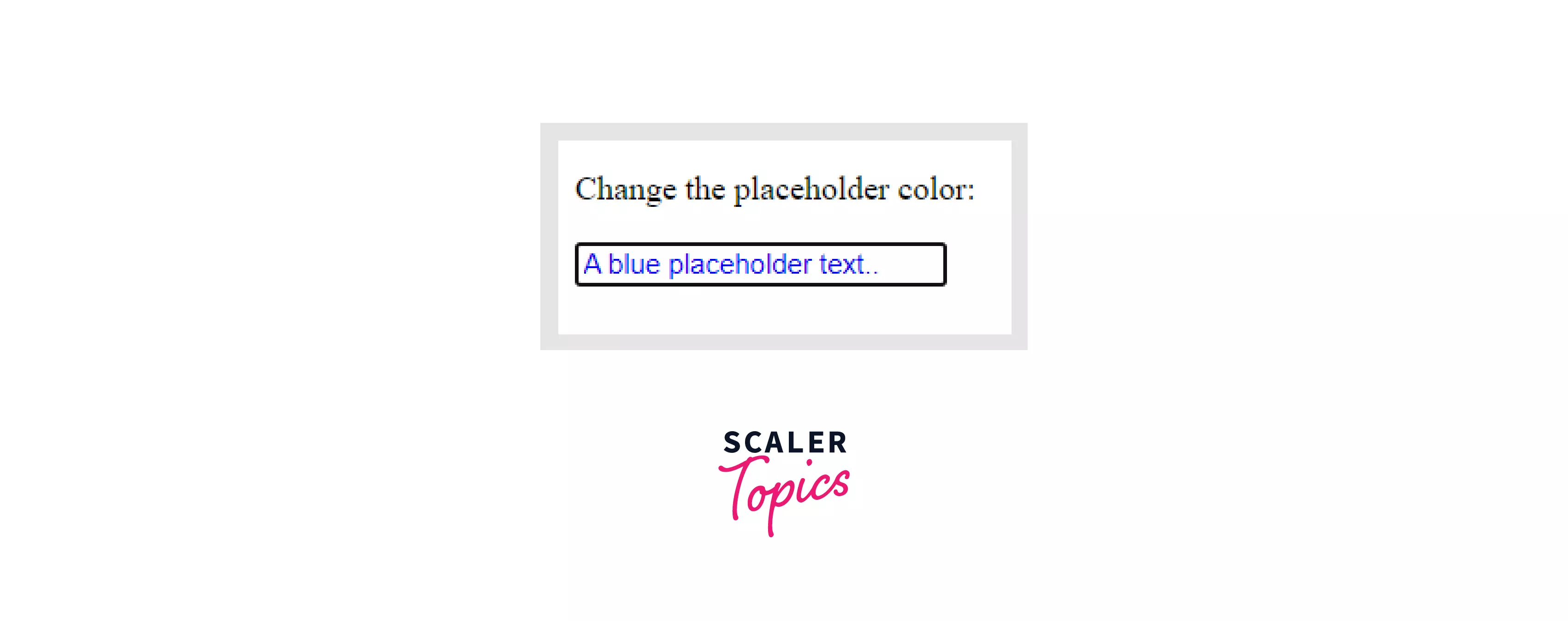
Note: The placeholder text is light grey by default in most browsers.
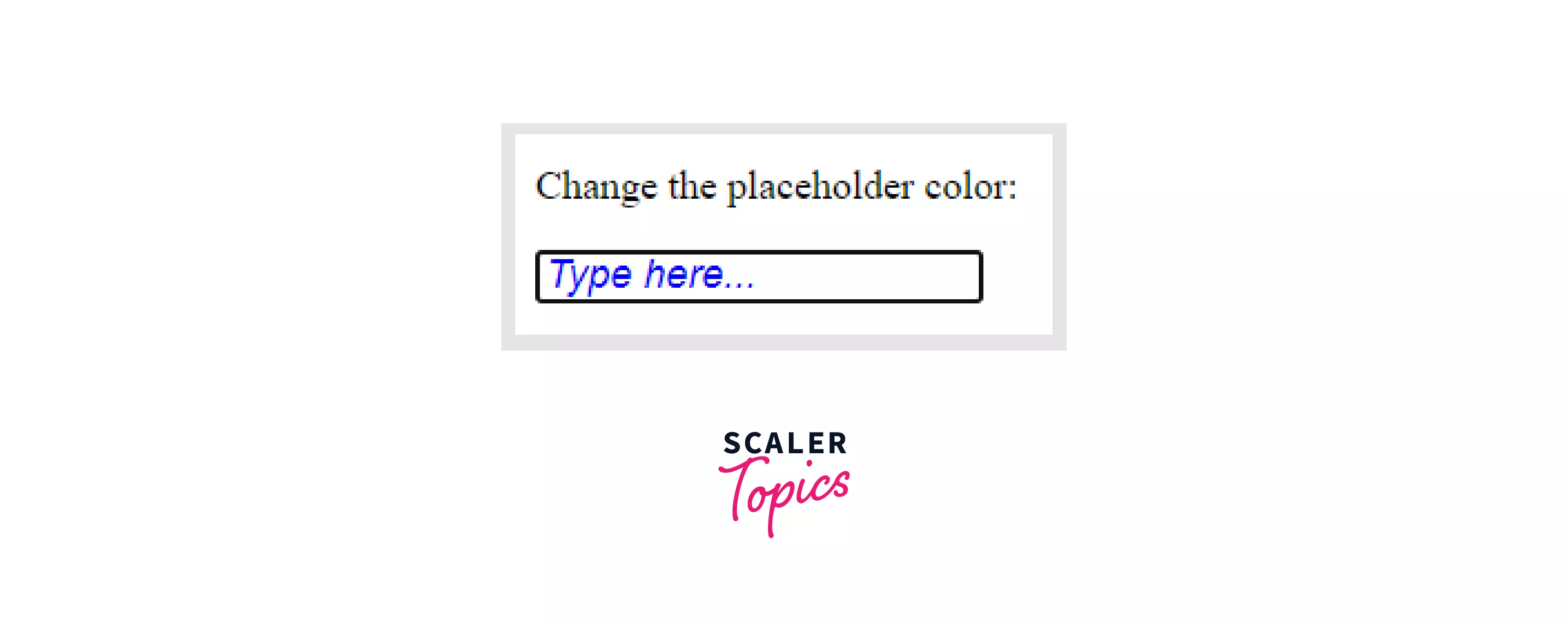
Example 2: In this example, we are going to style the default placeholder for an input tag. You can change the properties of placeholder text and can make it more engaging for the user.
Output:
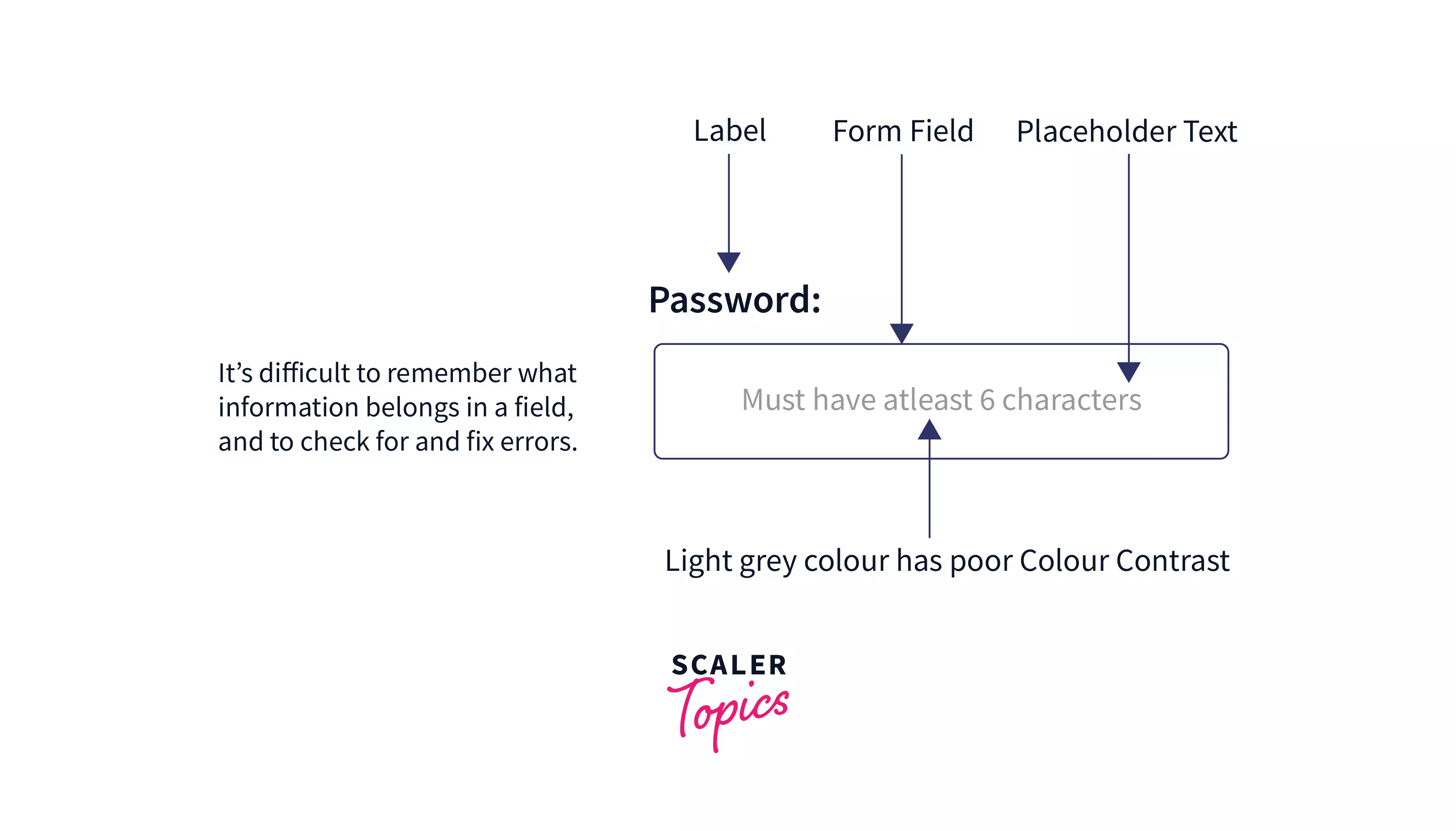
Accessibility Concerns of Placeholders
One thing to notice is that placeholder text is often inaccessible. Although accessibility software and modern browsers are improving, there is still a long way to go. The following are three of the most serious accessibility issues:
-
The placeholder text's default light-grey color has poor color contrast against most backgrounds. The poor color contrast makes it harder for visually impaired persons to read the text. This is a complicated problem to tackle because not all browsers allow you to alter placeholder text with CSS.
-
Users with cognitive or motor limitations have a more significant hardship. As we've seen, placeholders can be problematic for all users: disappearing placeholders raise memory load; persistent dimmable placeholders cause confusion because they appear clickable but aren't; and placeholders that don't disappear demand extra keyboard or mouse input to delete.
These challenges are exacerbated for those who have cognitive or motor limitations.
- Some screen readers might not read placeholder text aloud. If their software does not speak the placeholder content, blind or visually impaired users may completely miss the hint.
Browser Support
The CSS ::placeholder selector is supported by the following browsers on a basic level:
- Google Chrome 4.0
- Microsoft Edge 10.0
- Firefox 4.0
- Safari 5.0
- Opera 15.0
Note: Except for Internet Explorer, all major browsers support the placeholder attribute.
Conclusion
- You can customize the placeholder text of a form element with the::placeholder pseudo-element (or, in some situations, a pseudo-class, depending on the browser implementation). Like any pseudo-element, you can scope it to specific elements as needed.
- This article covered the fundamentals of CSS::placeholder selector and how to utilize CSS::placeholder with examples. You're now ready to use the::placeholder selector like a CSS pro!
 Google
 Amazon
 Microsoft
 Flipkart
 Adobe1200+ more