Box sizing in CSS
 FREE
FREE

Overview
Box sizing in CSS is a property that defines how the height and width are applied to an HTML element, i.e., whether the height and width mentioned in the CSS pertain only to the content section or include a padding border.
What is the Box sizing in CSS Property?
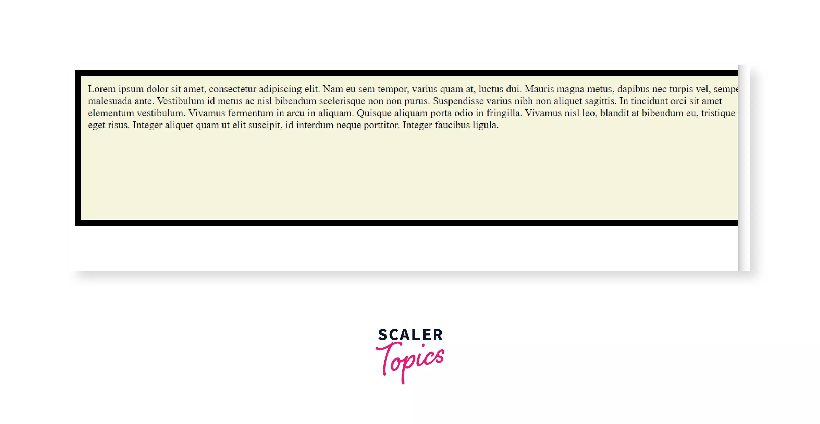
Let us take a simple example where we make an HTML element with a width of 100% of the body and padding and border of 10px each.
CSS:
As soon as we add that padding and border, we see the horizontal scroll bar, indicating our element has exceeded the 100% width of the body. This means our padding and border are getting added on top of the 100% width that we have already specified.
Output:
This was something bothering the developers for years. So finally, in CSS3, the new property box-sizing was introduced, which made the layout design much simple and more intuitive.
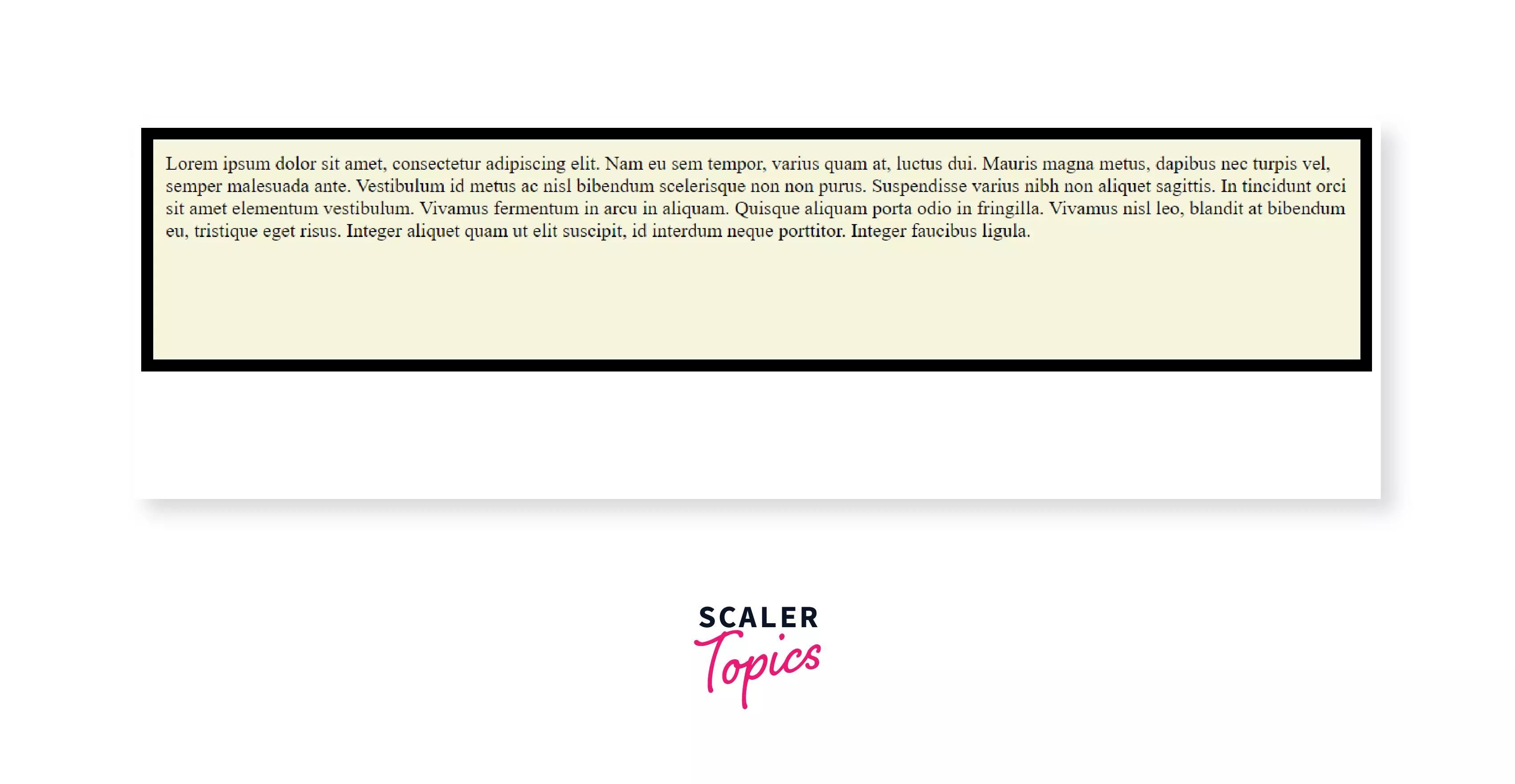
If we add Box sizing in CSS, the above issue gets resolved, and the output can be seen in the image below:
The CSS box-sizing property tells the browser whether the CSS height and width of the HTML elements include the borders and paddings as well or not. This property allows us to redefine the CSS box model and include the padding and the border together with the content section so that the rendered dimensions look the same as the CSS dimensions.
Not including the padding and border in the dimensions will give us the default CSS Box Model, whereas including them will give us the Alternative CSS Box Model.
This property applies to all elements with width and height properties, and it is not an inheritable property.
NOTE: If no value of a particular property is specified, but still the element gets the computed value of that property from its parent element, then the property is said to be an inheritable property.
Syntax:
Transform Your Career
Choose from our industry-leading programs designed for career success
Modern Software and AI Engineering Program
Master full-stack development with AI integration

 +1000 more
Modern Data Science and ML with specialisation in AI
Advanced data science techniques with AI specialization
+1000 moreAdvanced AIML with Specialisation in Agentic AI
Deep dive into AIML with focus on Agentic systems
+1000 moreDevOps, Cloud & AI Platform Engineering
Build and manage AI-powered cloud infrastructure
+1000 moreAI Engineering Advanced Certification by IIT-Roorkee
Premier AI engineering certification from IIT-Roorkee
Different values of Box sizing in CSS
There are mainly two different values of the Box sizing in CSS
- content-box (default)
- border-box
There is another value known as padding-box, which is now deprecated.
The following picture will make it clear which region each of these values indicates:
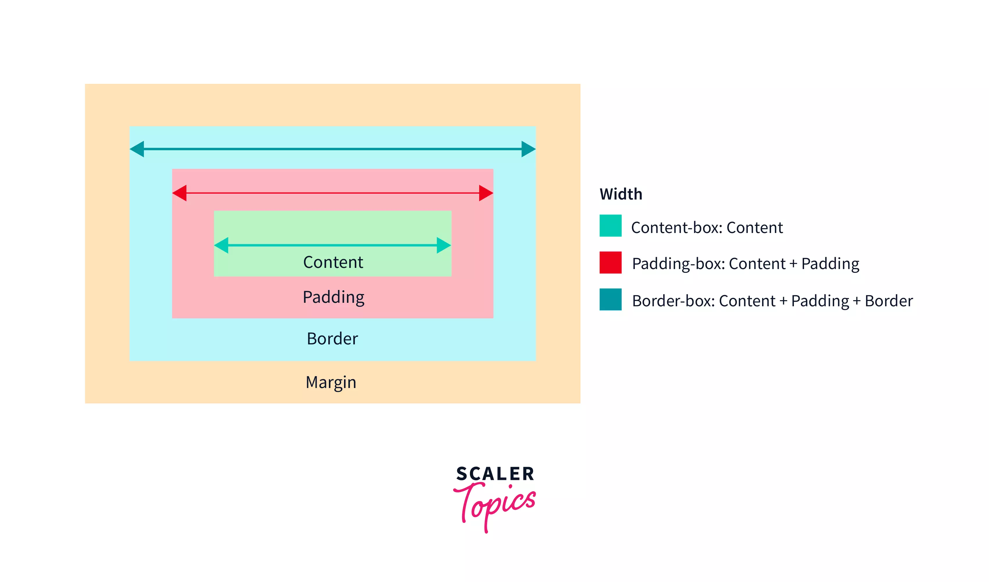
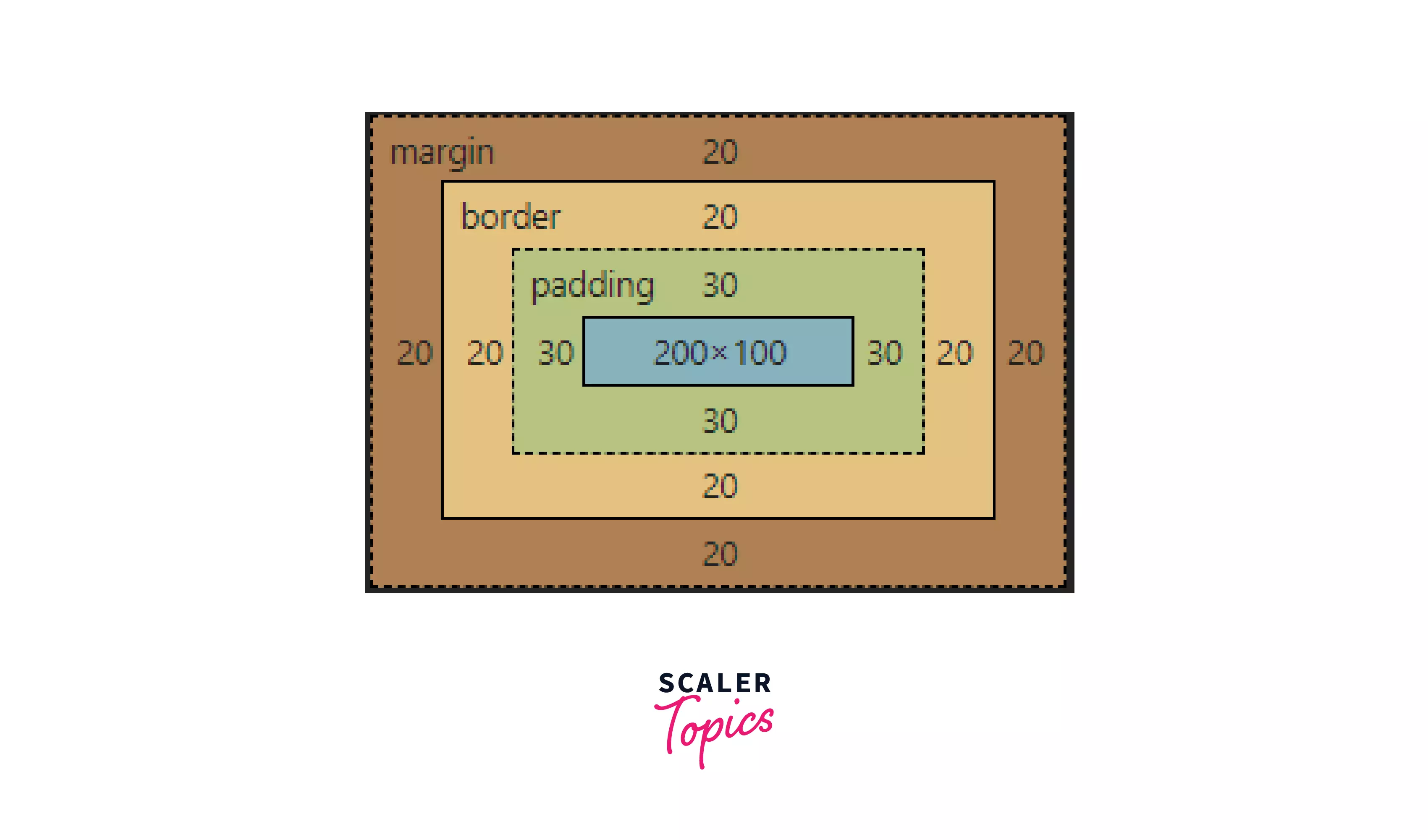
In the above picture, we have the standard CSS box model representing the content section, the padding section, the border section, and the margin section.
- The blue line (C1 to C2) represents the extent of the CSS width if the box-sizing value is set to content-box.
- The orange line (P1 to P2) represents the same if the box-sizing value is set to padding-box.
- The green line (B1 to B2) represents the same if the box-sizing is set to border-box.
NOTE: only width is shown in the picture; similarly, height also follows.
Let’s look into each of these values of the Box sizing in CSS
content-box:
Specifying the value of box-sizing as content-box means the CSS height and width only include the content section, i.e., the padding and border are not a part of the height and width.
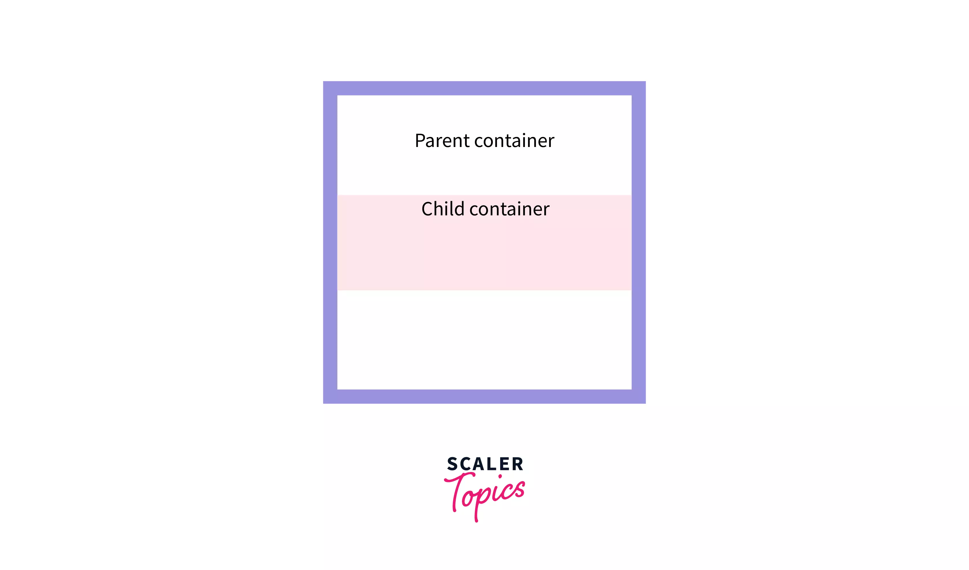
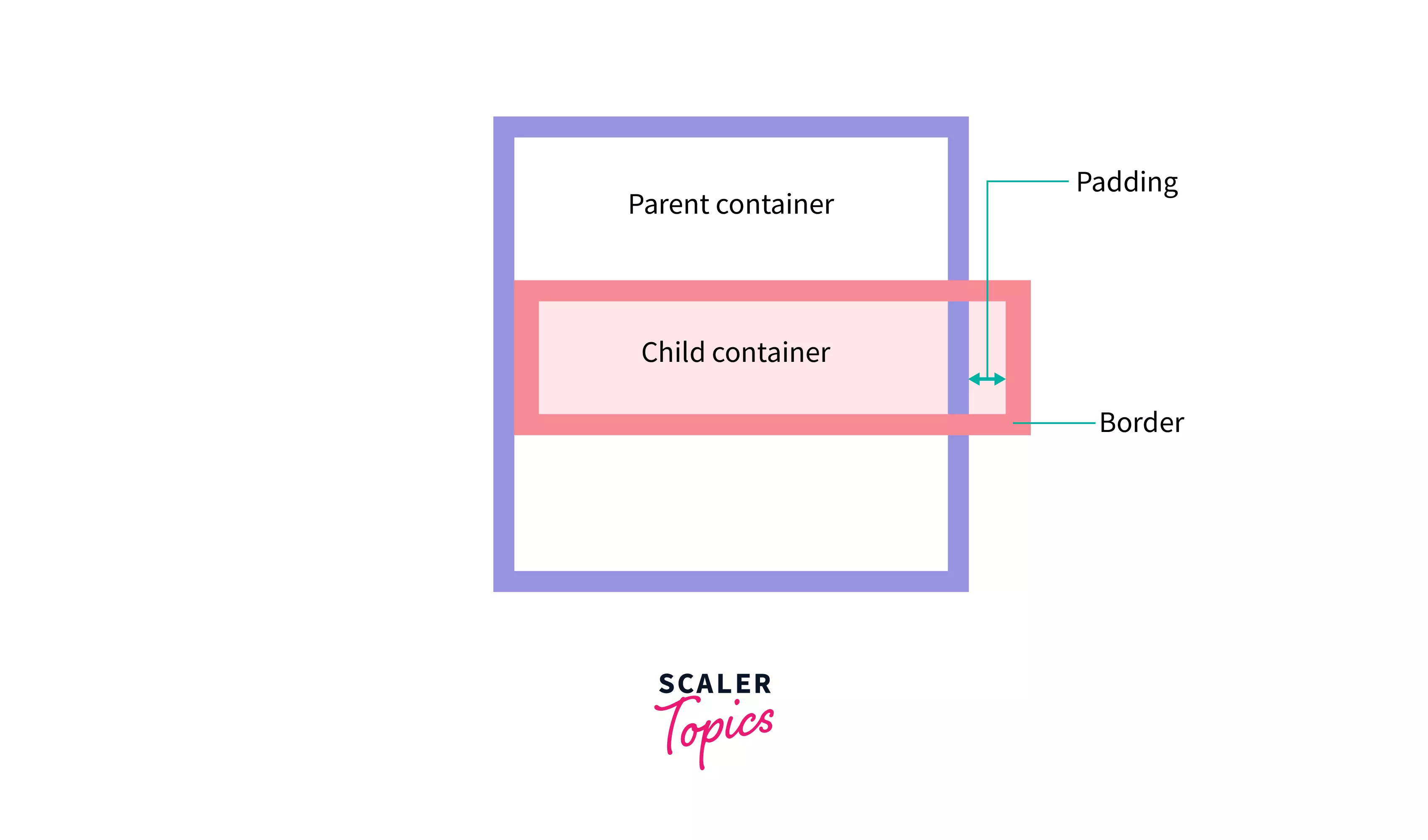
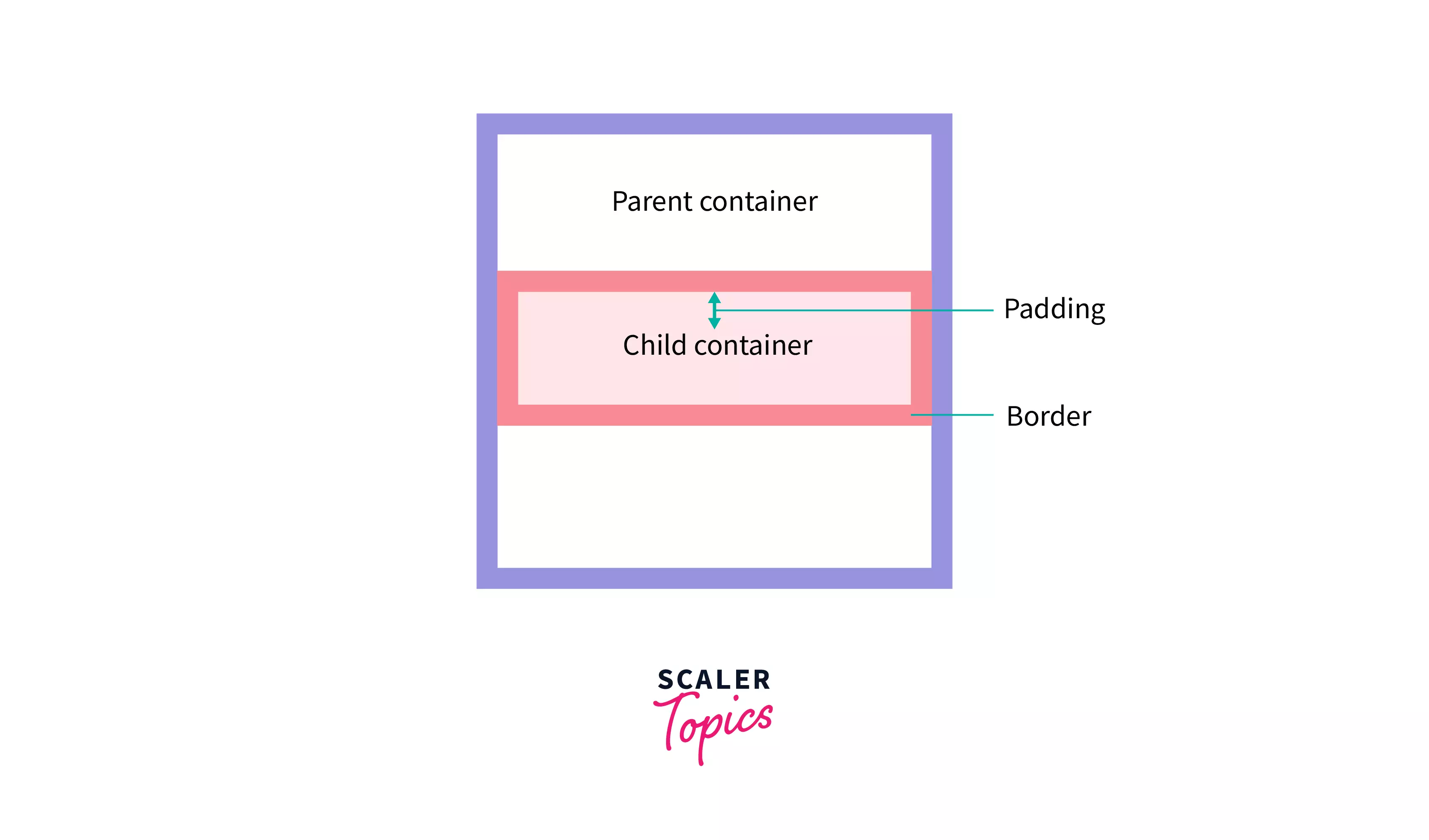
The first picture has no padding and border and fits the parent container (width of the child set to 100% of the parent width). In the second picture, as we add some padding and border, we can see the child container overflows.
This is what we mean by, not including the padding and border in the mentioned CSS dimensions.
Syntax:
This is the default value of the CSS box-sizing property, so we do not need to specify it explicitly.
We can say that The box-sizing property is never absent. Just that it stays a bit hidden by the default CSS. Setting box-sizing as content-box provides you the default CSS box model.
In the following example, we shall see how the render dimensions are calculated and how they differ from the CSS height and width. We shall also better understand the content box using the Chrome Developer Tool.
HTML:
CSS:
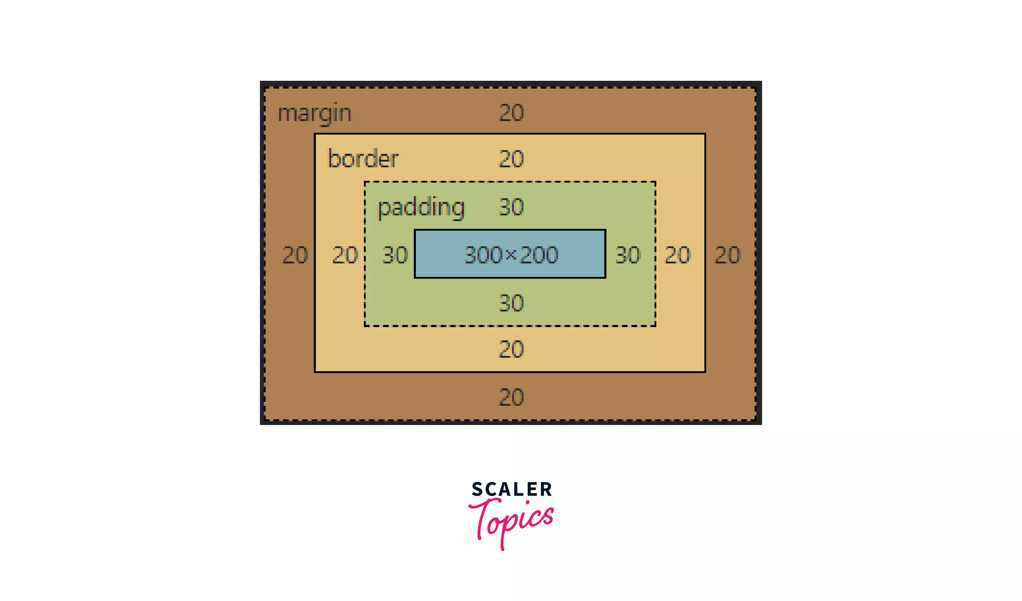
The above CSS code specifies the height and width of the h1 element to be 200px and 300px, respectively (we will see in a bit which height and width we are talking about here).
Alongside it adds uniform padding of 30px, a border with uniform width of 20px, and a uniform margin of 20px. Finally, the value of the box-sizing property is set to content-box.
Output & Chrome Developer Tools view:
Look at the first picture; that is our actual view of the HTML element in the browser. And in the second picture, we have the Box Model view from our Chrome Developer Tools.
We can see it is only the content section that gets the dimensions of the width and height as set in the CSS code above.
To find the rendered width and height of the HTML element, we need to add the dimensions of the padding and the border along with the mentioned dimensions 300x200.
Render width of the element after adding the padding (30 px) and the border (20 px) becomes 400 px.
Similarly, the rendered height of the element becomes 300 px.
Thus, it is obvious that the HTML elements are often bigger than what you expect. Not very intuitive, right? So, here comes to the rescue the box-sizing: border-box property.
border-box:
When the box-sizing property is set to border-box in an HTML element, the dimension of the HTML element includes the borders, i.e., the padding and the borders are included along with the content.
Thus the rendered dimensions become the same as the CSS height and width.
You will often hear the word “box-sizing border-box” pronounced together, as this is what we usually refer to when we talk about box-sizing property.
Note: the margins are NOT included.
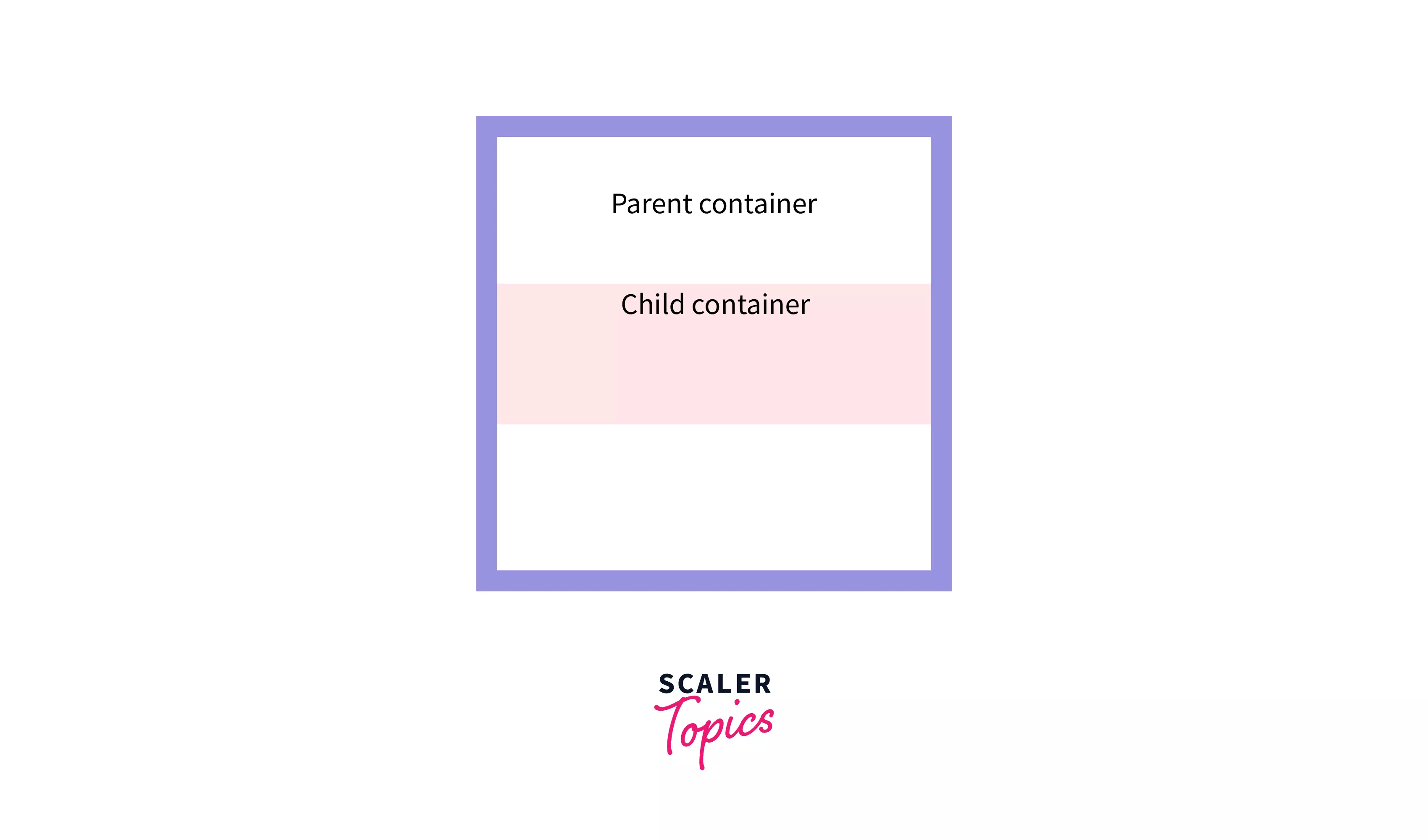
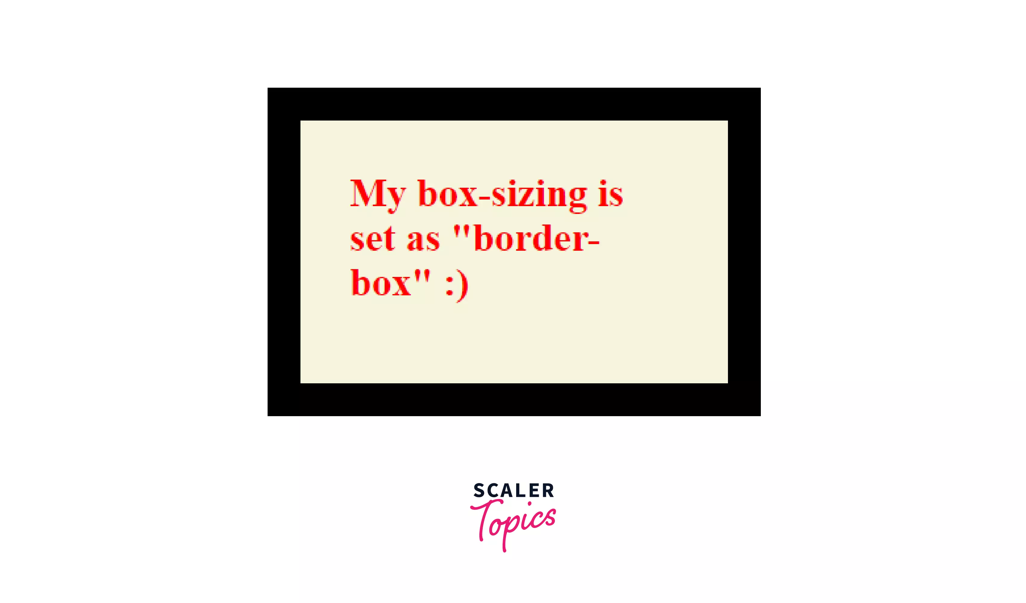
The first picture is similar to the one above, with no padding and border, and fits the parent container (width of the child set to 100% of the parent width). We add some padding and border, and we can see the child container does NOT overflow.
This is what we mean when we say,“ the dimension of the HTML element includes the border-box, i.e., the padding and the borders as well”.
Syntax:
So this property redefines our good old CSS Box Model to what you might know as the Alternative Box Model.
The following example shows how the rendered dimensions are exactly the same as the CSS height and width. We shall also develop a better understanding of the border-box using the Chrome Developer Tool.
HTML:
CSS
The above CSS code specifies the height and the width of the h2 element to be 200px and 300px, respectively (we shall again see in a bit which height and width we are talking about).
Alongside we are adding uniform padding of 30px, a uniform border of width of 20px, and a uniform margin of 20px. Finally, we mention the value of the box-sizing property as border-box.
Output & Chrome Developer Tools view:
Now, take a look at these two pictures. The first is our actual view of the HTML element in the browser, and the second is the view from our Chrome Developer Tools.
We can see the dimensions mentioned in the CSS code are 300x200, whereas the content section, as in the developer tool, is only 200x100
Rendered width of the element after adding the padding (30 px) and the border (20 px) becomes 300 px. Similarly, the rendered height of the element becomes 200 px. Thus we can see the rendered and CSS dimensions are the same.
This is obviously very intuitive, and we get to see the exact reflection of our code in the browser.
padding-box:
As you can guess from the name, this is between border-box and content-box. The height and width mentioned in the CSS code include the padding along with the content section. In other words, the border is not included within the CSS dimensions.
This box-sizing property has been deprecated and is no longer used in modern websites.
Syntax:
This type of box-sizing is not standard, and thus there isn’t great cross-browser support.
Creating layouts with Box sizing in CSS
Now that we have discussed the working of both the border-box and the content-box values for the CSS box-sizing property let us look at how this would be helpful in practical development.
Let us assume a scenario where you want to make an HTML element cover exactly half of the browser window in terms of width, and you want it to be “Responsive”.
Let us now see what the two different box-sizing values look like, and we shall let you think a bit about which value you prefer.
NOTE: Responsive means making the element fit different screen sizes automatically without writing separate CSS for each screen size.
So, for this example, we are taking two divs, both having similar CSS dimensions of the height of 200px, width set to 50% of the body, padding of 30px, and border of 20px. The only property difference is one has box-sizing: content-box and another has box-sizing: border-box.
CSS that is common to both divs:
Now, have a look at the picture below:
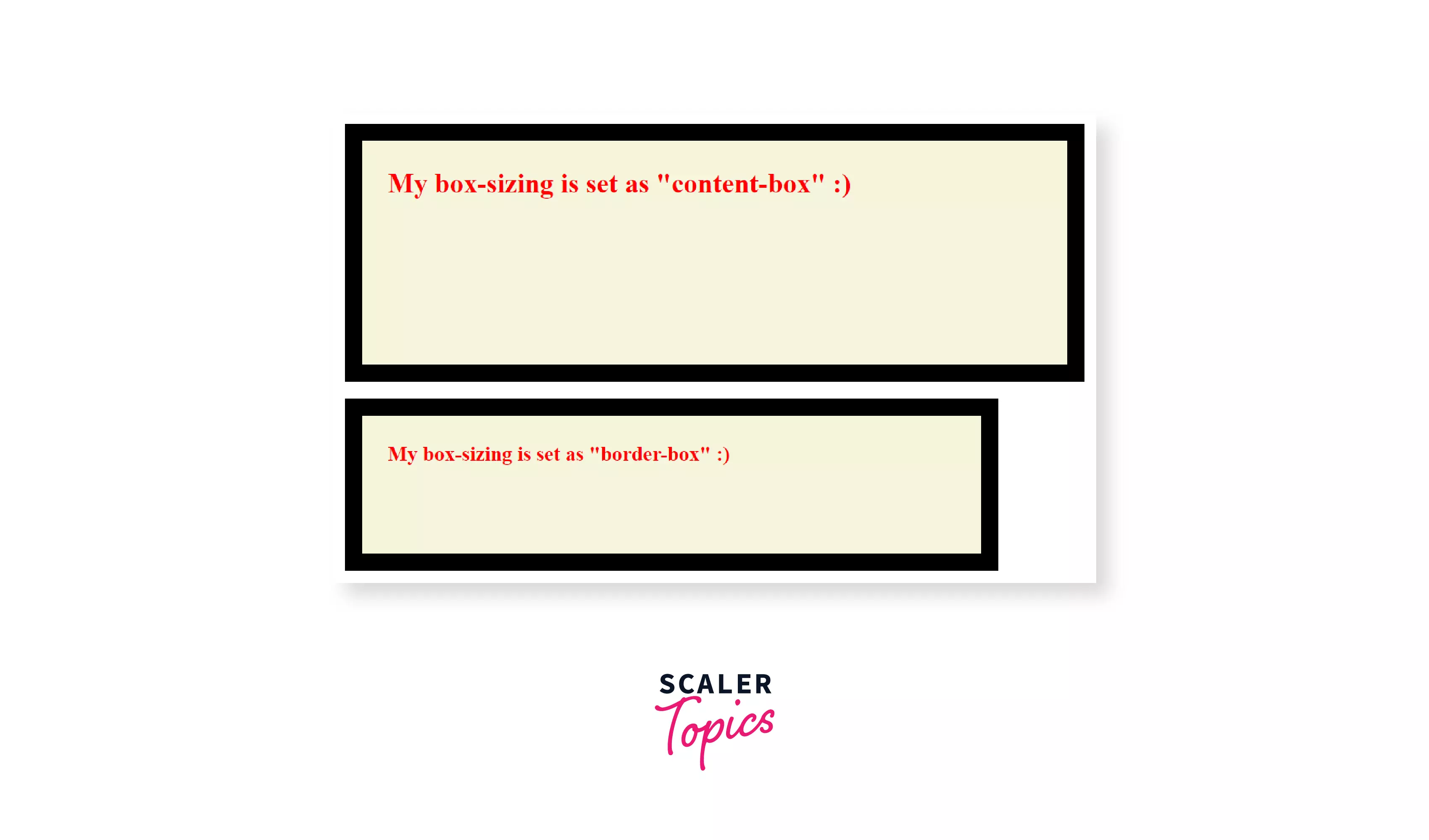
What do you think? Which value is better for making these types of layouts?
- content-box
- border-box
Ans: It is the border-box value. It gives us so much control over the exact dimensions of the HTML elements.
For the same reason, many developers prefer this alternative Box Model or the box-sizing: border-box property over the regular content-box. It eliminates many issues that might arise when paddings and borders are added.
CSS box-sizing reset
Resetting box-sizing means redefining the CSS box model by setting the box-sizing property to border-box instead of the default content-box for the entire HTML file.
This saves our time and reduces repeating the same code, “box-sizing: border-box;” in every HTML element.
A good old way to do this is by simply setting the box-sizing to border-box for all elements using the * generic selector.
CSS
But this does not include the pseudo-element and might cause some unexpected issues.
So a little better way is to include the pseudo-elements. And the code snippet goes as follows:
CSS:
Again this causes issues like we can’t set some elements to have content-box as their box-sizing if we want to.
The best practice is setting the box-sizing of the html tag to border-box and using the inheritance property. The code snippet goes as follows:
CSS:
This is a more flexible reset as it allows us to change the box-sizing to content-box if we want to for some specific element and includes the pseudo-elements.
Summary
-
The box-sizing property of CSS allows us to modify how the dimensions of the HTML elements are applied.
-
Box sizing in CSS can be applied to all elements having height and width and is not an inheritable property.
-
There are primarily two values for Box sizing in CSS
- content-box
- border-box
-
The padding-box property is also present, but it is deprecated, so it no longer has great cross-browser support.
-
content-box: This is the default property, and applying this property means we want the dimensions mentioned in CSS to pertain only to the content section of the HTML element (not including the padding and the border).
-
border-box: applying this property means we want the dimensions mentioned in the CSS to include the padding and the border along with the content section.
-
box-sizing property is useful for making layouts as it gives us more control over the exact dimensions, as seen in the browser.
-
Resetting the Box sizing in CSS is an effective way of using the border-box value throughout the web page without mentioning it repeatedly for every HTML element.
 Google
 Amazon
 Microsoft
 Flipkart
 Adobe1200+ more