What Is The CSS Box Model?
 FREE
FREE

Introduction
Website UI design is the ultimate goal while we work in the domains of HTML and CSS. To achieve this, we first need to understand how elements on a webpage are laid out. While laying out a document, the browser's rendering engine represents each element as a rectangular box according to the standard CSS basic box model. The browser uses the box model to determine the element's size, how it should appear, and where it should be positioned on the web page. The characteristics of these elements, such as color, background, size and style of the border, and so on, are all determined by the properties of CSS.
What Is The CSS Box Model?
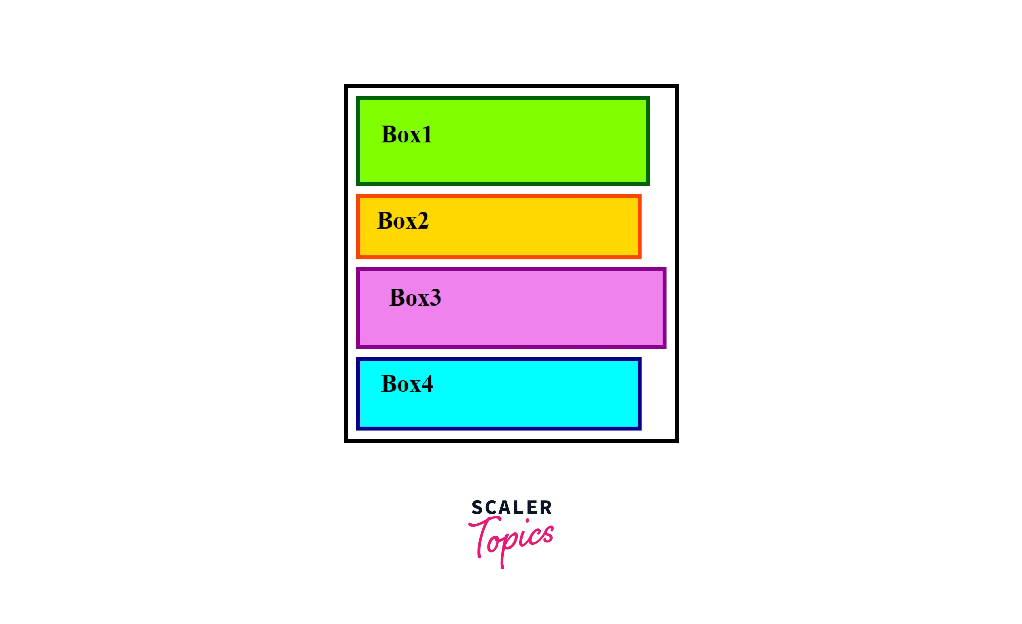
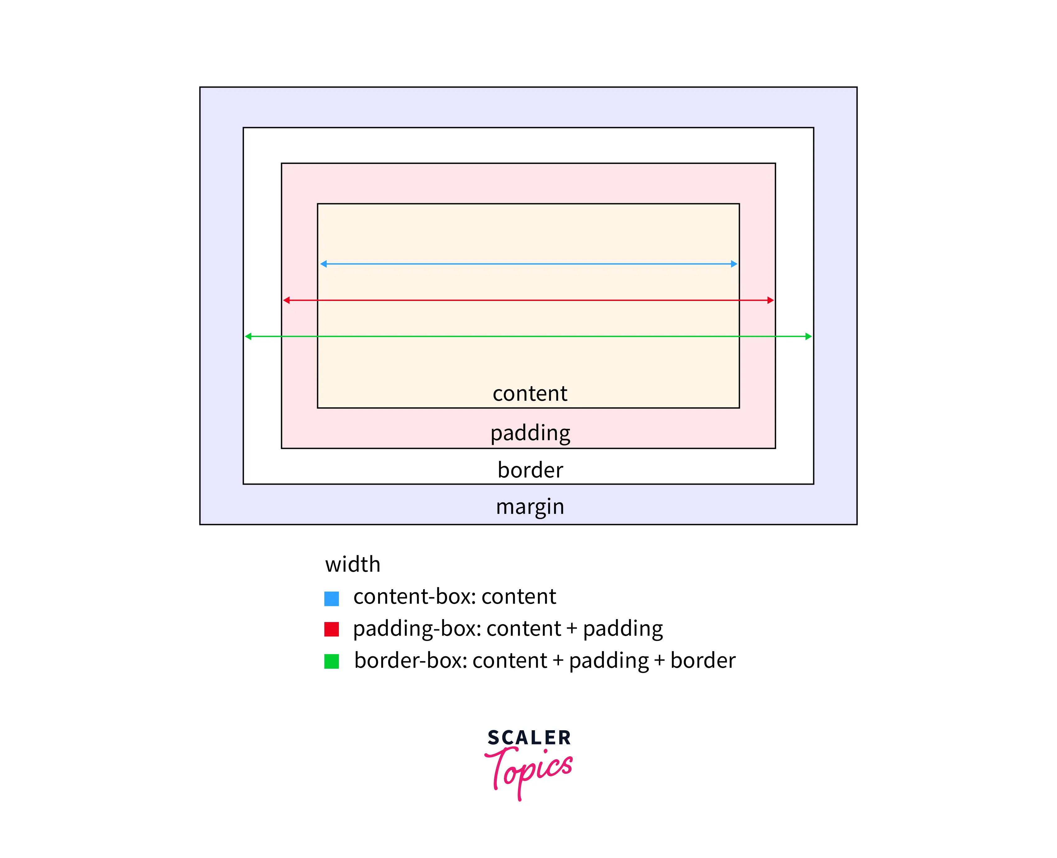
The CSS Box Model describes all the HTML elements of the webpage as rectangular boxes. As shown in the graphic below, let it be the logo, contents of the navigation bar or buttons, everything is a box.

A CSS basic box model consists of a content area, where any text, images, or other HTML elements are displayed. This is optionally surrounded by padding (space inside the element's border), a border (wraps the content area and padding), and a margin (space outside the element's border), on one or more sides. In the standard box model, if you give a box width and a height attribute, this defines the width and height of the content area of the element. Any padding and border is then added to that width and height to get the total size of the box.
Takeaway:
- In CSS box model, each element is represented as a rectangular box.
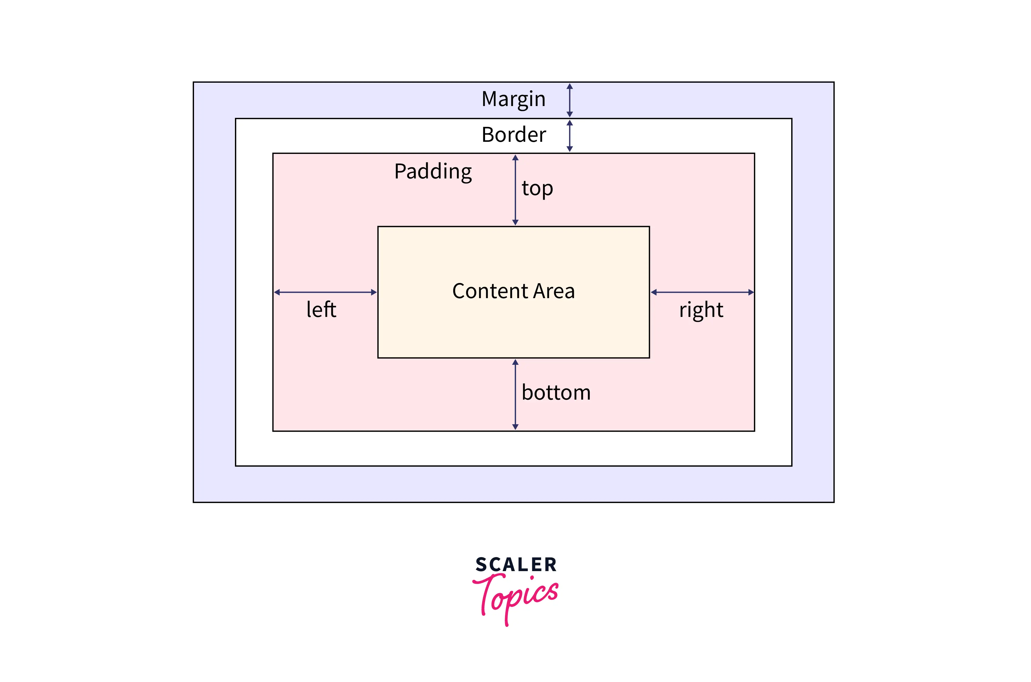
Diagram of The CSS Box Model
The following diagram illustrates the CSS box model.
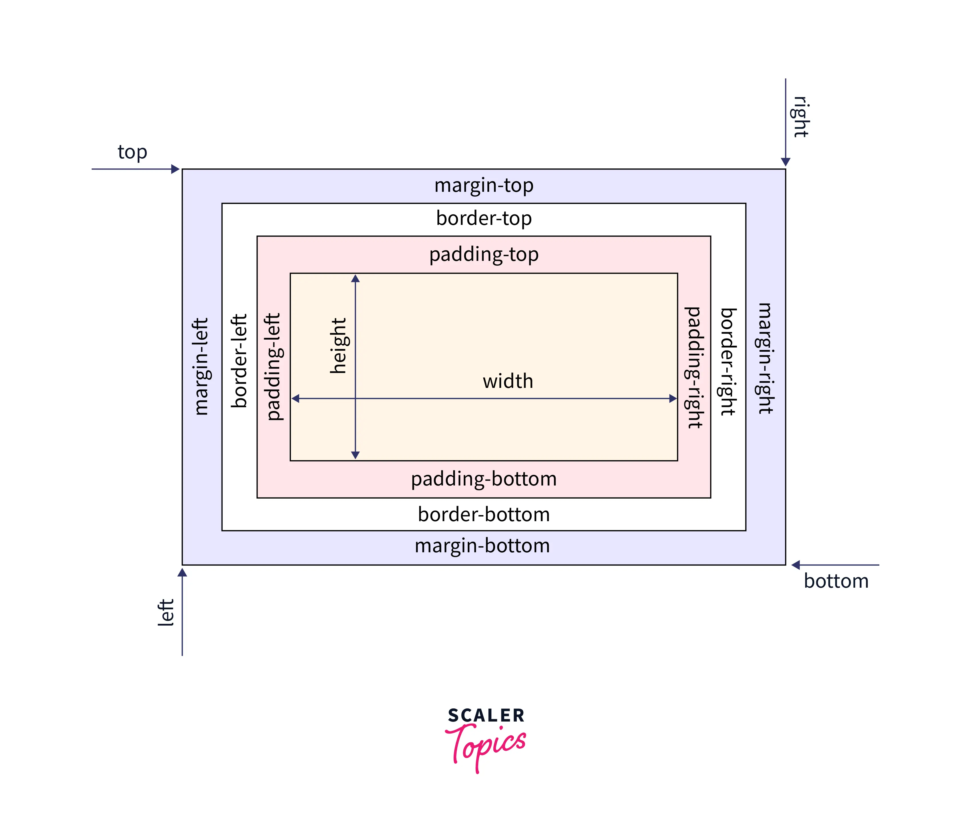
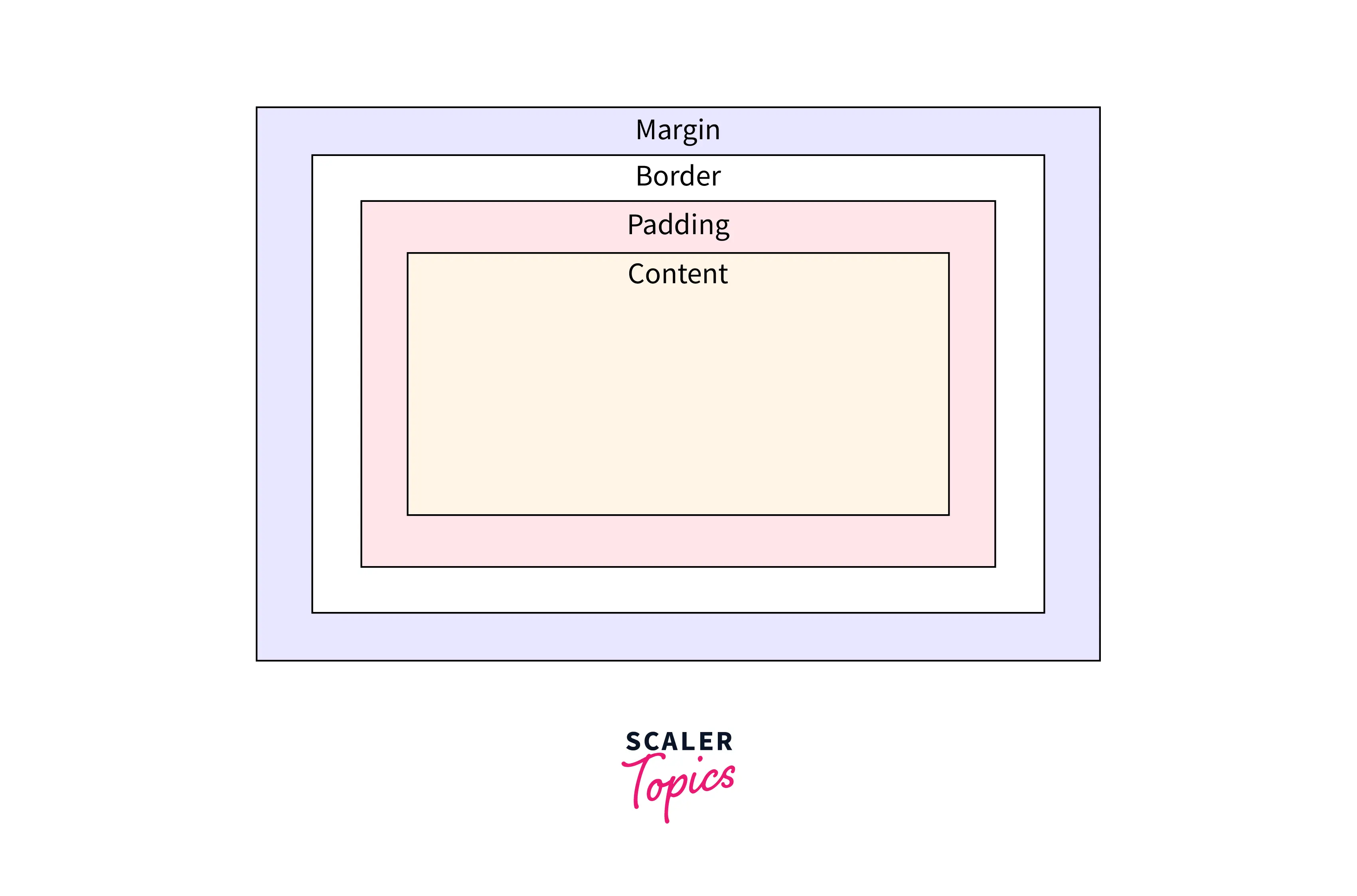
The whole webpage layout is the arrangement of these HTML elements that are represented as boxes. Here, the content-area is the innermost layer of the box model that contains the main content of the element, like text or an image. The next layer is the padding area, which creates extra space around the content area and within the element's border. The border area is the third layer, which exists as a boundary between the padding and margin of the box. It wraps the content area and the padding and can be styled in many ways. The outermost layer is the margin, which creates extra space outside the element, generally used to separate the element from other elements on the web page.
What is the Purpose of the CSS Box Model?
The purpose of the CSS Box Model is to define all the elements on the webpage as a box. The browser uses the CSS box model to determine how an element should appear and how it should be positioned on a web page. It serves as a toolkit for positioning the elements, their content, and the elements surrounding them. The CSS Box Model, in a nutshell, is a layout guide for the elements on the webpage.
Why is the CSS Box Model Important?
If you’re planning to build a webpage layout, you will see it depends entirely on the sizing and positioning of the HTML elements. The browser uses the CSS Box Model to define how HTML elements are displayed on the webpage. If you don't have a basic understanding of the box model, you will end up building layouts that work fine in certain browsers but break in others. That's why it is important to understand how margins, borders, padding, and contents all work together to create the page's layout.
Transform Your Career
Choose from our industry-leading programs designed for career success
Modern Software and AI Engineering Program
Master full-stack development with AI integration

 +1000 more
Modern Data Science and ML with specialisation in AI
Advanced data science techniques with AI specialization
+1000 moreAdvanced AIML with Specialisation in Agentic AI
Deep dive into AIML with focus on Agentic systems
+1000 moreDevOps, Cloud & AI Platform Engineering
Build and manage AI-powered cloud infrastructure
+1000 moreAI Engineering Advanced Certification by IIT-Roorkee
Premier AI engineering certification from IIT-Roorkee
Properties of the CSS Box Model
These are the following properties in the CSS box model.
- Content The content area contains the real content of the element, such as text, an image, or a video player. It is the area where the content gets displayed on the webpage. Its dimensions can be modified using properties like width and height.
- Padding The padding area is the space around the content area and within the element's border. It creates extra space inside the element's border and uses the same background as the element itself. The dimensions of the padding is determined by the padding-top, padding-right, padding-bottom, padding-left, and shorthand padding properties.
- Border The border area is the space around the padding area and within the margin. It includes the element's borders and wraps the content and any padding. Its size and style can be controlled using border and related properties. For example, it can be set to dotted, dashed, solid, double, none, or hidden. It can also have rounded corners using the border-radius property.
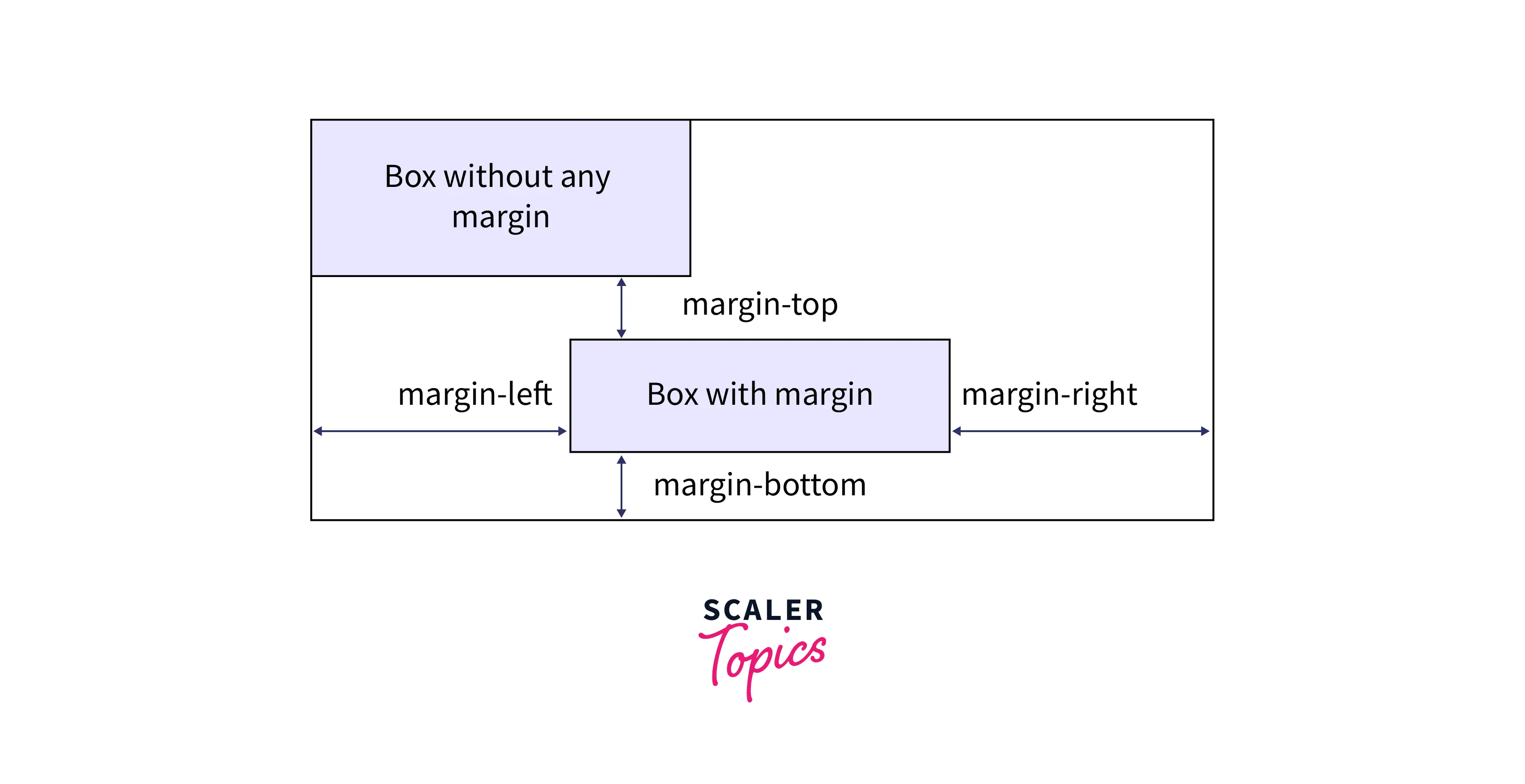
- Margin The margin area is the transparent space outside the element's border and doesn't have any background color. The margin wraps the content, padding, and border and mostly used to separate the element from other HTML elements on the web page. The size of the margin area is specified using the margin-top, margin-right, margin-bottom, margin-left, and shorthand margin properties.
Padding Vs Margin
One can get easily confused between padding and margin as they both give the effect of adding space. The key differences between padding and margin are listed below.
| Padding | Margin |
|---|---|
| Padding is the inner space of an element i.e. the space inside the element’s border. | Margin is the outer space of an element i.e. the space outside the element’s border. |
| The styling of an element, such as the background color, affects the padding. | The styling of an element, such as the background color, does not affect the margin. |
| It does not allow negative values. | It can have negative values that draws the element closer to its neighbors than it would be by default. |
Takeaway:
- Padding provides space within the element, whereas margin provides space outside the element.
- The margin property allows negative values.
Scaler Placement Report and Statistics
Scaler learners achieved 2.5x salary growth with average post-Scaler CTC reaching ₹23L.
How to Use CSS box-model Properties
The following example illustrates the use of the CSS Box model properties:
HTML
After the execution of above code, the output will look like
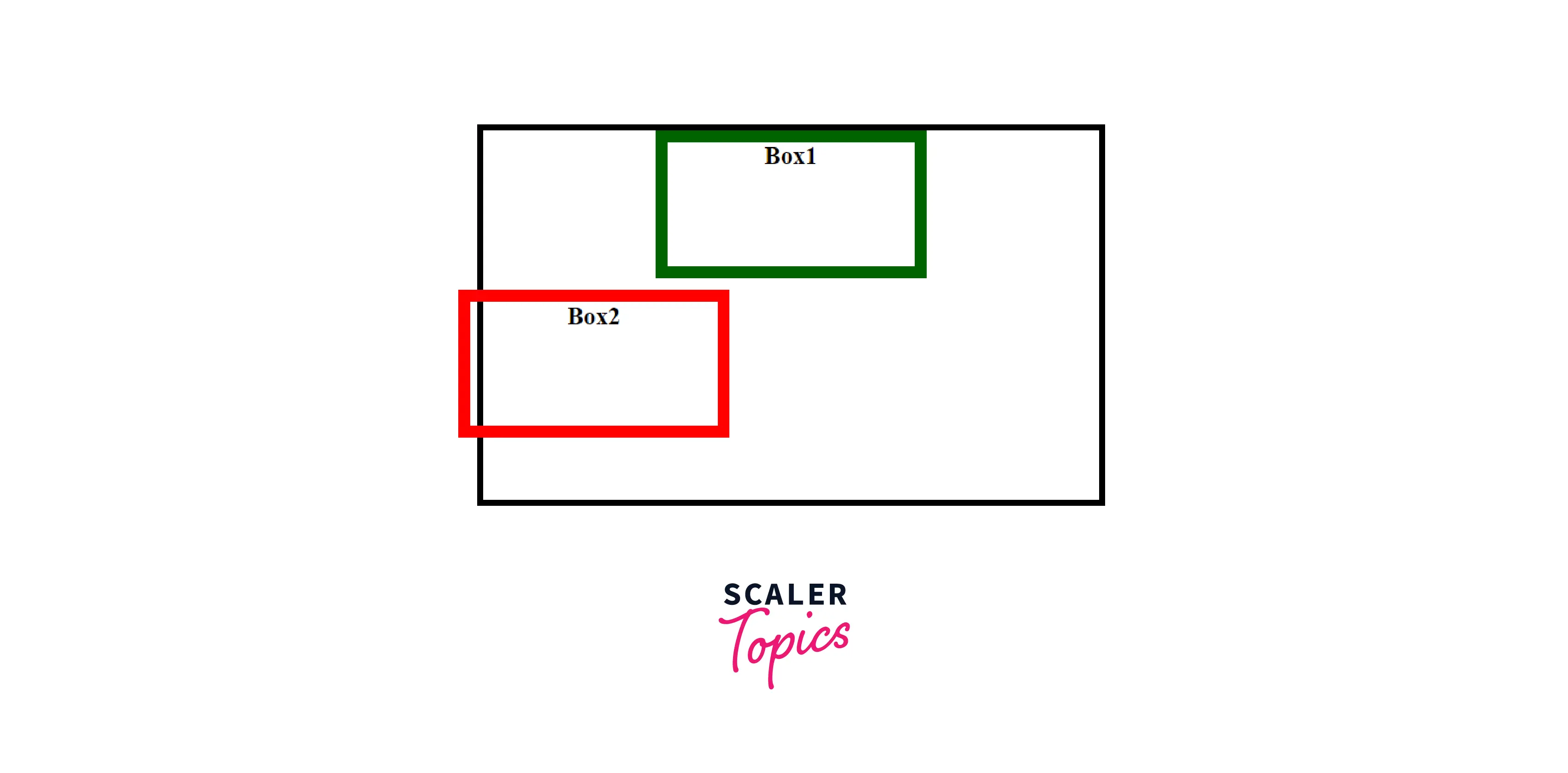
As we can see in the above code, box1 has a margin of 20px and box2 has a margin of 100px, so we might think the total distance between box1 and box2 is 120px. But this is not the case, here comes the concept of margin collapsing.
This means an elements top and other element’s bottom margin are collapsed into a single margin that is equal to the larger of the two margins. And if both the element’s top and bottom margins respectively have the same value, then the distance between them is that value (and they are not added together). In the above case, the distance between them is 100px (not 120px).
Scaler Placement Report and Statistics
Scaler learners achieved 2.5x salary growth with average post-Scaler CTC reaching ₹23L.
How To Use the Padding Property in CSS
The padding sits between the border and the content area. Unlike margins, padding cannot have negative values, so the value must be 0 or positive. Padding is commonly used to push the content away from the border. This property is a shorthand property for setting padding-top, padding-right, padding-bottom, and padding-left in a single declaration.
The padding property may be defined using one, two, three, or four values:
- When one value is specified, it applies the same padding to all four sides.
- When two values are specified, the first padding applies to the top and bottom, the second to the left and right.
- When three values are specified, the first padding applies to the top, the second to the right and left, the third to the bottom.
- When four values are specified, the paddings apply to the top, right, bottom, and left.
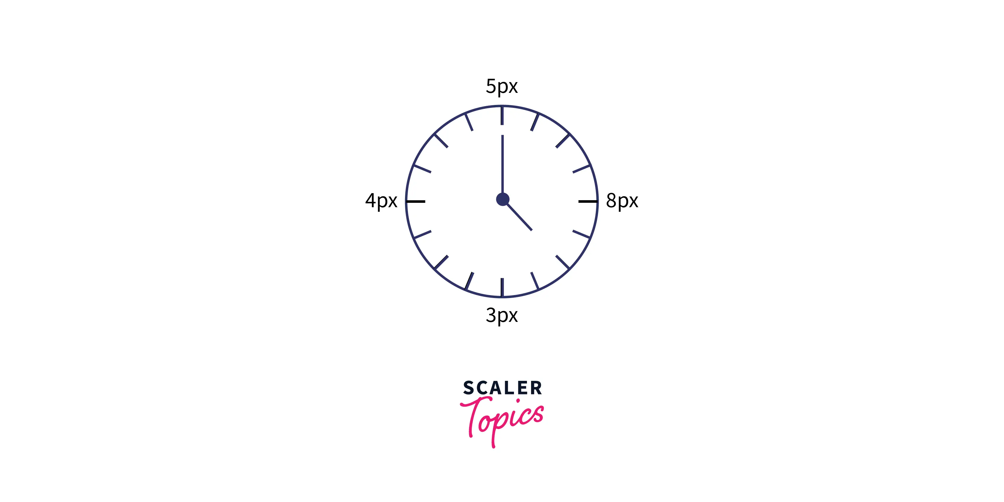
Another approach to remember the order is by imagining a clock inside the box (an HTML element), and from the top, start moving clockwise i.e. TOP -> RIGHT -> BOTTOM -> LEFT For example, four values are given i.e. 5px, 8px, 3px, and 4px. Now, imagine how the hands would rotate on a clock: 5px starts in the 12 o'clock position, then 8px in the 3 o'clock position, then 3px in the 6 o'clock position, and 4px in the 9 o'clock position, as shown in the diagram below.
The easiest way to find out how the padding shorthand property will work with one, two, three, and four values, is to look at the example below. Here, we will assign the same width, height, and border to each of the four div elements and see how the padding makes a difference.
HTML
After the execution of above code, the output will look like
Even though these boxes have the same width, height, and border, they still differ in size. The reason is these boxes are set to different padding values. It creates extra white space around an element's content area and uses the same background as the element itself. Let’s go to the computed section on your developer console, for box3, it will give you a clear idea of the padding property.

In the above code, for box3, the padding property has 3 values i.e. 15px, 20px and 25px. So, the box will have 15 pixels of padding on the Top, 20 pixels on the Left and Right, and 25 pixels on the Bottom, same as shown in the above diagram.
Padding Properties
These are the following longhand padding properties of CSS, as shown in the diagram below:
- padding-top: The padding-top property of CSS sets the height of the padding area on the top of an element.
- padding-right: The padding-right property of CSS sets the width of the padding area on the right of an element.
- padding-bottom: The padding-bottom property of CSS sets the height of the padding area on the bottom of an element.
- padding-left: The padding-left property of CSS sets the width of the padding area on the left of an element.
The padding shorthand property of CSS sets the padding area on all four sides of an element in a single declaration. But the above longhand properties of padding allow us to specify the padding area for each side of an element. In the following example, we have set different padding for all four sides of a div element using longhand padding properties.
HTML
Here’s the image of the computed section on the developer console, the element will have padding as specified.
How to use the Border Property in CSS
The border shorthand CSS property sets an element's border. This border property is a shorthand property for setting border-color, border-style and border-width in a single declaration. You can use one, two, or three of the values to specify the border property. It doesn't matter whatever order the values are in.
- <line-width> : It sets the width of the border for all four sides of an element. The width can be specified in px, cm, em, etc or by using one of the three keywords: thin, medium, or thick. The default value is medium if not mentioned.
- <line-style> : It sets the style of the border for all four sides of an element. The style can be specified using keywords, such as none, dashed, double, solid, etc. The default value is none if not mentioned.
- <color> : It sets the color of the border for all four sides of an element. The color can be specified using keywords, such as purple, yellow, etc., or hex and rgb values. The default value is currentcolor if not mentioned.
Note: If the border's style isn't specified, it will be invisible. This is because the style is set to none by default.
When you want all four borders to be the same, you can use the border shorthand property. But if you want to make them different from each other, you can use the longhand border-width, border-style, and border-color properties.
The following example will help us to understand border property better
HTML
After the execution of above code, the output will look like
Inputs of the Border Property
The longhand border properties set the values of the width, style, and color of the border. These are the following border properties of CSS that are used most
Turn Learning into Career Growth
Border-width
The border-width property of CSS sets the width of an element's border. This property is a shorthand for the following CSS properties:
- border-bottom-width
- border-left-width
- border-right-width
- border-top-width
This border-width property can also be defined using one, two, three, or four inputs, same as the padding property, and follows the same pattern. The values are either the explicit positive values or a keyword. The border-width property can have the following values:
- length - specifies the border's width in px, cm, em, rem, etc.
- keyword - it can be thin, medium, or thick (Here, thin ≤ medium ≤ thick).
The default value of border-width property is medium if not defined by the user.
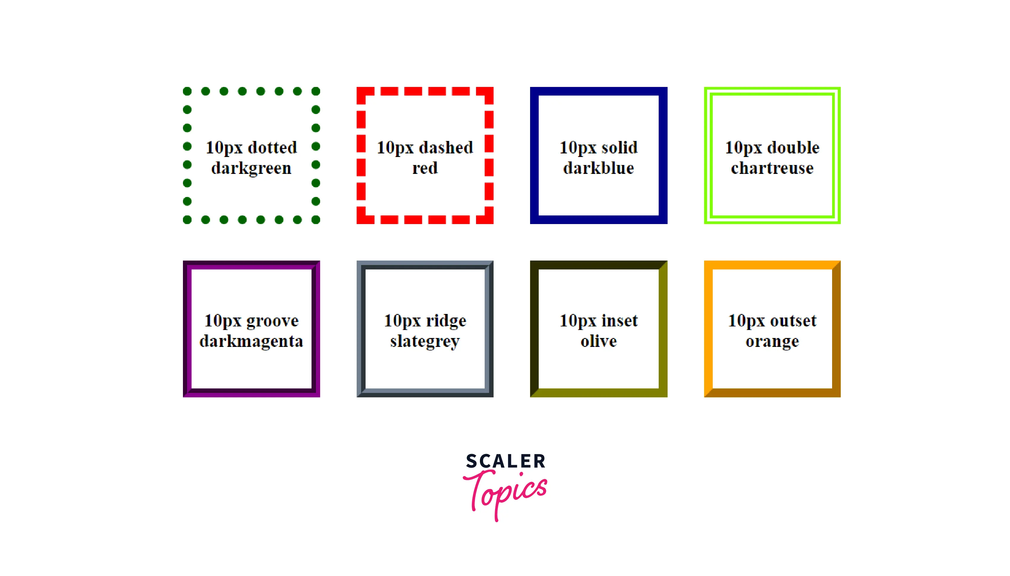
Border-style
The border-style property of CSS sets the line style for all four sides of an element's border. This property is a shorthand for the following CSS properties:
- border-top-style
- border-right-style
- border-bottom-style
- border-left-style
This property can also be defined using one, two, three, or four inputs, same as the padding property, and follows the same pattern. The border-style property can have the following keyword values:
- none
- hidden
- dotted
- dashed
- solid
- double
- groove
- ridge
- inset
- offset
The default value of border-style property is none if not defined by the user. It means that if the style of the border is not defined it will be invisible.
Border-color
The border-color property of CSS sets the color of an element's border. This property is a shorthand for the following CSS properties:
- border-bottom-color
- border-left-color
- border-right-color
- border-top-color
This property can also be defined using one, two, three, or four inputs, same as the padding property, and follows the same pattern. The border-color property can have the following keyword values:
- keyword - specifies the border's color using keywords, such as 'red', 'blue', etc.
- HEX - specifies the border's color using hexadecimal values, such as "#800080", #ff0000, etc.
- RGB - specifies the border's color using RGB values, such as "rgb(255,0,0)", rgb(123, 255, 0), etc.
The default value of border-color property is currentColor if not defined by the user. It means that it inherits the value of color property of the element.
Borders can be styled in a wide variety of ways. Let’s have fun with these border properties in the following example
HTML
After the execution of above code, the output will look like
Takeaway
- The order in which the border property's values are specified makes no difference.
- The border won't be visible if the border-style is not specified as the default value is none.
- The border-radius property allows to have rounded corners.
How to Use Margin Property in CSS
The margin property sets the margin area on all four sides of an element. They create extra space around an element. This margin property is a shorthand property for setting margin on all four sides in a single declaration. The margin for each side of an element can be specified using following CSS properties:
- margin-top
- margin-right
- margin-bottom
- margin-left
In the margin attribute, we can put positive values, negative values, or an auto keyword. The auto keyword allows the browser to select a suitable margin. In certain cases, this value can be used to center an element within its container. And when we use negative values, it draws the element closer to its neighbors than it would be by default.
In the following example, there are two block-level boxes, the first box uses the margin shorthand property to add margin on all four sides. The second box uses margin longhand properties, i.e., margin-top, margin-right, margin-bottom, and margin-left. Let's try the program below for a better understanding of the margin property. HTML
After the execution of above code, the output will look like
In the above code, when the margin is set to auto in box1, it makes the box horizontally centered and sets 0 margin on top and bottom. Whereas in box2, it sets the margin as mentioned i.e. 10px of margin on top, 0 margin on right, 30px of margin on bottom and -20px of margin on left, which makes the box positioned outside its parent container.
Takeaway:
- auto keyword makes the element horizontally centered.
- When negative values are used, the element is drawn closer to its neighbours than it would be by default.
The Box-sizing Property
The box-sizing property of CSS sets how the total width and height of the elements are calculated. Designing layouts can be challenging as the page's layout depends almost entirely on the size and spacing of these HTML elements. And if you are unaware of how to size these elements, things can get out of control, resulting in unexpected calculations, thus making it difficult to create responsive websites. This property makes it much easier to size these elements on the webpage.
The width and height you provide to an element in the CSS box model are applied only to the element's content area by default. If the element has any border or padding, it is added to the width and height to determine the size of the box displayed on the screen. This means that when setting width and height, you must adjust the value to account for any border or padding that may be applied. The values are listed below:
-
content-box This value gives you the default CSS box-sizing behavior. For example, if you set an element's width to 100 px, and add a border of 5 px and padding of 10px, then the border and padding will be added to the box’s size, resulting in an element that is wider than 100 px. Here, the dimensions of the element are calculated as: width = width of the content, and height = height of the content.
-
border-box This value tells the browser to include any border and padding in the values you specify for an element's width and height. For example, if you set an element's width to 100 px, and add a border of 5 px and padding of 10px, this value will make that 100 px to include the border and padding you have added, the element’s width will remain 100px but the content area will shrink to absorb that extra width. Here the dimensions of the element are calculated as: width = border + padding + width of the content, and height = border + padding + height of the content.
-
padding-box This value was supported only by Firefox and now it is deprecated.
In the following example, we create three block-level boxes of same width and height and assign the box-sizing values to the boxes, i.e., the first box will have a default setting, the second box set to border-box, and the third box set to content-box. Now, we will add some border and padding to the boxes and see the difference visually, which will help us to understand the CSS box-sizing property better.
HTML
After the execution of above code, the output will look like
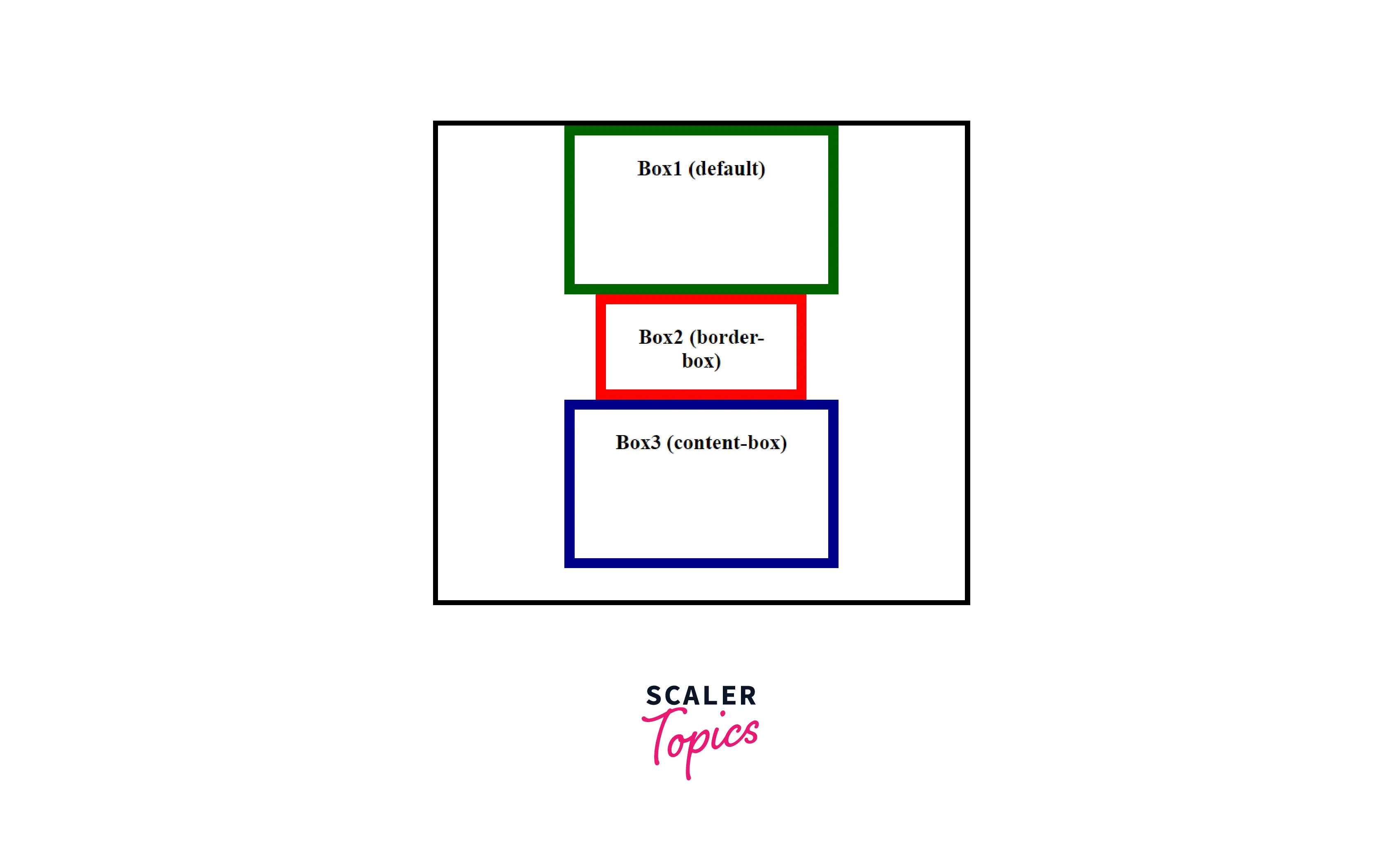
Explanation Initial width of the box = 200px Initial width of the box = 100px Padding = 20px Border = 10px
Box1 (default) By default, box-sizing value is set to content-box, i.e., border and padding is added outside the box. width = 260px (200 + 20 + 20 +10 + 10) height = 160px (100 + 20 + 20 + 10 + 10)
Box2 (border-box) Here, border and padding is added inside the box. width = 200px (140 + 20 + 20 +10 + 10) height = 100px (40 + 20 + 20 + 10 + 10)
Box3 (content-box) Here, border and padding is added outside the box. width = 260px (200 + 20 + 20 +10 + 10) height = 160px (100 + 20 + 20 + 10 + 10)
Takeaway:
- content-box is the default value for box-sizing property.
- When chosen content-box, padding and border is not included in an element’s width and height.
- When chosen border-box, padding and border is included in an element’s width and height.
What Is the Difference Between Content-Box and Border-Box in CSS?
The key differences between content-box and border-box are listed below.
| content-box | border-box |
|---|---|
| Padding and borders are not included in an HTML element’s (it can be div, span, etc) width and height. | Padding and borders are included in an HTML element's (it can be div, span, etc) width and height. |
| By adding border and padding, the element's dimensions will change, i.e., they end up taller and wider than the specified dimensions. | By adding border and padding, the element's dimensions will remain the same as the specified dimensions, but the content area will shrink to absorb the extra width from padding and border. |
| This is the default value, it doesn't matter whether the user mentions it or not. | The user has to mention this value in the program. |
What Values are Assigned to Box Model Properties?
There are two types of units which can be assigned to box model properties i.e. relative and absolute. The following are all absolute length units, implying they are not relative to anything else and are considered to always be the same size.
- px: CSS pixels.
- cm: Centimeters.
- mm: Millimeters.
Relative length units are relative to something else, perhaps the size of the parent element's font, or the size of the viewport. Some of them are listed below.
- em: Font size of the parent, in the case of properties like font-size, and font size of the element itself, in the case of other properties like width.
- ex: The height of the character “x” also known as the font’s x-height.
- rem: The font size of the root element.
- vw: 1% of the viewport's width.
- vh: 1% of the viewport's height.
- vm: The smaller value of vw and vh.
We can also use the percentage(%), a CSS data type to represent a percentage value. It is often used to define a size as relative to an element's parent object. It represents a fraction of some other value such as 50%.
Takeaway
- Percentage values are always relative to another quantity.
Calculating Widths and Heights In The Box Model
When we set the width and height properties of an element with CSS, we just set the width and height of the content area of the box. To calculate the total size of an element, we must also add padding, borders and margins.
The total width taken by the element on the page will be: Total element width = width + left padding + right padding + left border + right border + left margin + right margin The total height taken by the element on the page will be: Total element height = height + top padding + bottom padding + top border + bottom border + top margin + bottom margin
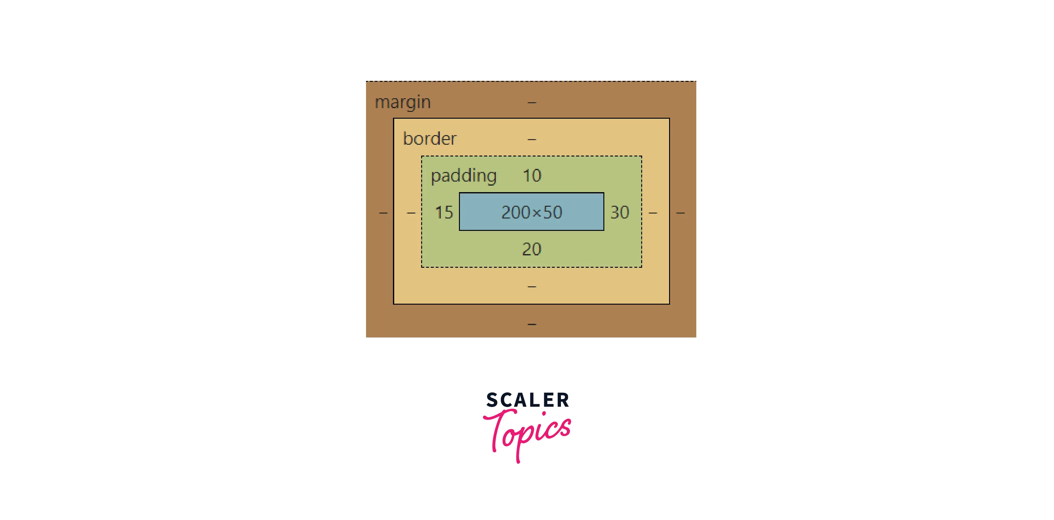
Let's create a div element with width of 200px and height of 100px. We will add some padding, border, and margin and then calculate the total width and height of the element on the page using the above formula.
HTML
After the execution of the above code, let’s have a look in the computed section of the developer console area.
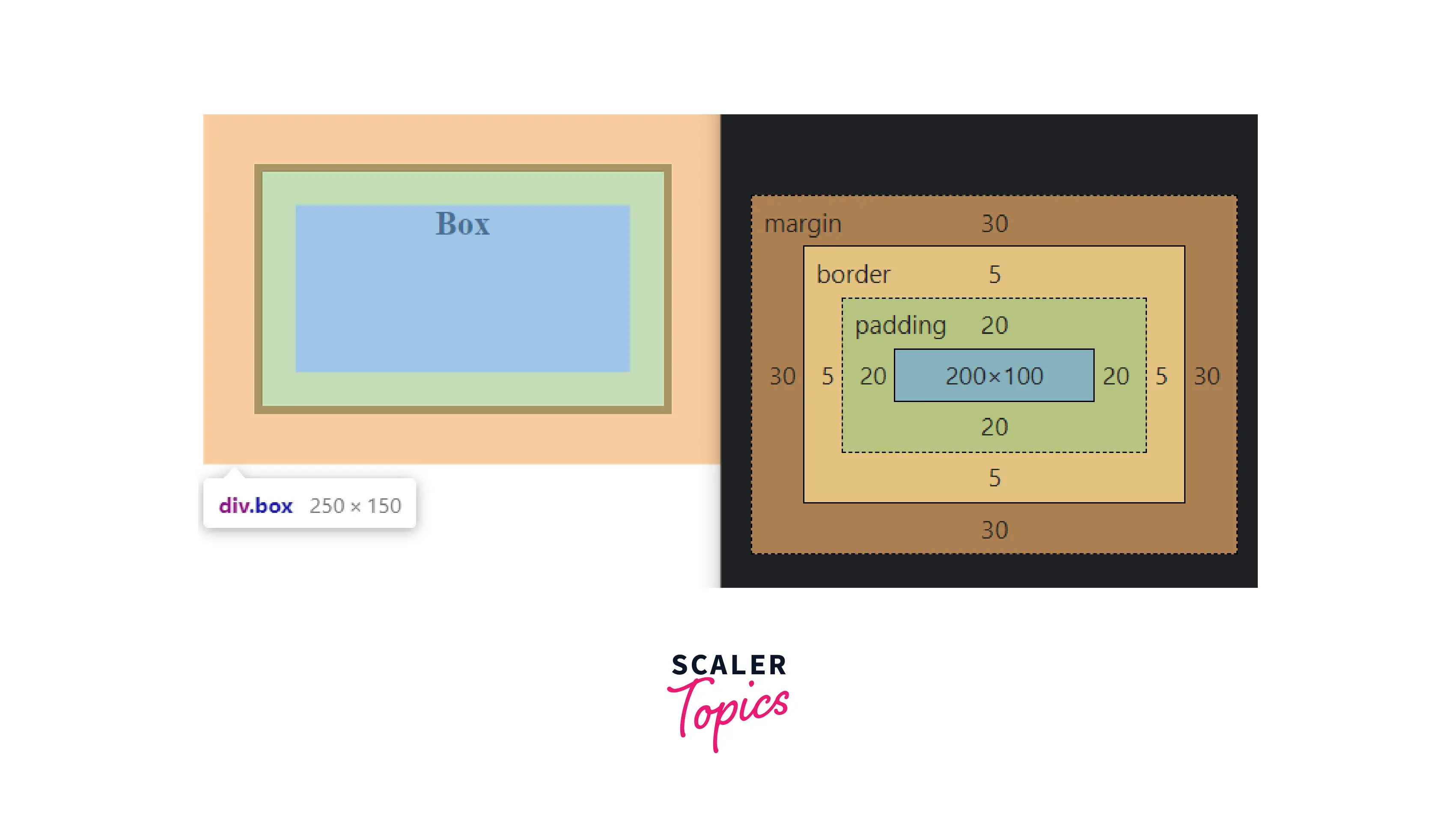
In the above diagram, the initial width of the content area is 200px and height is 100px. The dimensions of the box after defining the border, and padding is 250px wide (200 + 20 + 20 + 5 + 5) and 150px high (100 + 20 + 20 + 5 + 5).
Note: The margin is not counted towards the actual size of the box, it affects the total space that the box will take up on the page, but only the space outside the box. The box's area stops at the border, it does not extend into the margin. But we need to add padding, border, and margin to calculate the actual space taken by the element on the webpage.
So, the actual space taken up by the element on the web page will be 310px wide (200 + 20 + 20 + 5 + 5 + 30 + 30) and 210px high (100 + 20 + 20 + 5 + 5 + 30 + 30).
Conclusion
- The Box Model consists of: margins, borders, padding, and the content area.
- The padding sits between the border and the content area.
- The border is drawn between the margin and the padding of the box.
- The margin is the space around your box that is not visible and it pushes other elements away from the box.
- The box-sizing property defines how the width and height of an HTML element is calculated, i.e., padding and borders are included or not.
- The box-sizing property has two values, the content-box that doesn't include the element's border and padding in the specified dimension of the element, whereas the border-box includes the element's border and padding in the specified dimension of the element.
- CSS box model properties are used to determine how HTML elements should appear and how they should be placed on a web page to make it visually appealing.
 Google
 Amazon
 Microsoft
 Flipkart
 Adobe1200+ more