CSS Tricks
 FREE
FREE

Overview
Areas of web development are progressing day by day. But whenever it comes to the front end, we mostly have HTML and CSS in our mind. CSS is an ocean of properties. So when it comes to applying to our websites, you must have to have in-depth knowledge of it. Sometimes it might seem boring. But there are a few tips and tricks which make it fun. You can achieve advanced layout and effects with CSS alone. Experimenting and exploring it makes it more interesting.
Let's explore some of the unique tips and tricks in CSS which help us design stunning websites.
Advanced CSS Tricks and Tips
Vertical Align with Flex
The flexbox is a one-dimensional layout concept for flexible box modules that allows for precise alignment and space distribution between objects. It deals with either a row or a column and improves the accuracy and speed of positioning and alignment.
Let's look at an example.
Output:
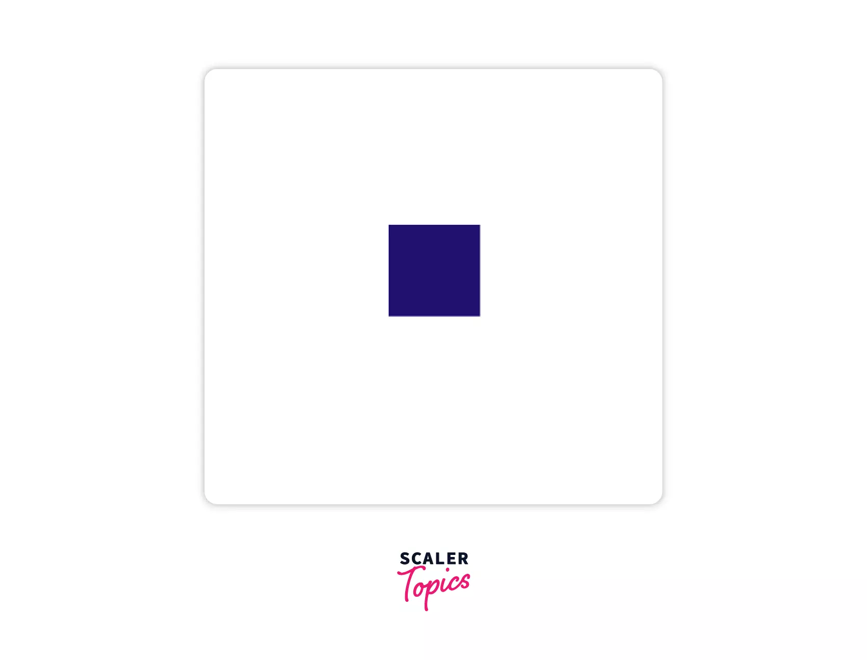
Here we applied the align-items and justify-content property to the flex item to align it in the center.
Blend Modes
We can apply a lot of effects to our images using CSS. Two such CSS property that helps us with this are the mix-blend-mode and background-blend mode. The background-blend mode defines the blending mode of each layer in the background, whereas the mix-blend mode defines the blending with its immediate parent background.
Syntax:
mix-blend-mode:
background-blend-mode:
Example 1
Output
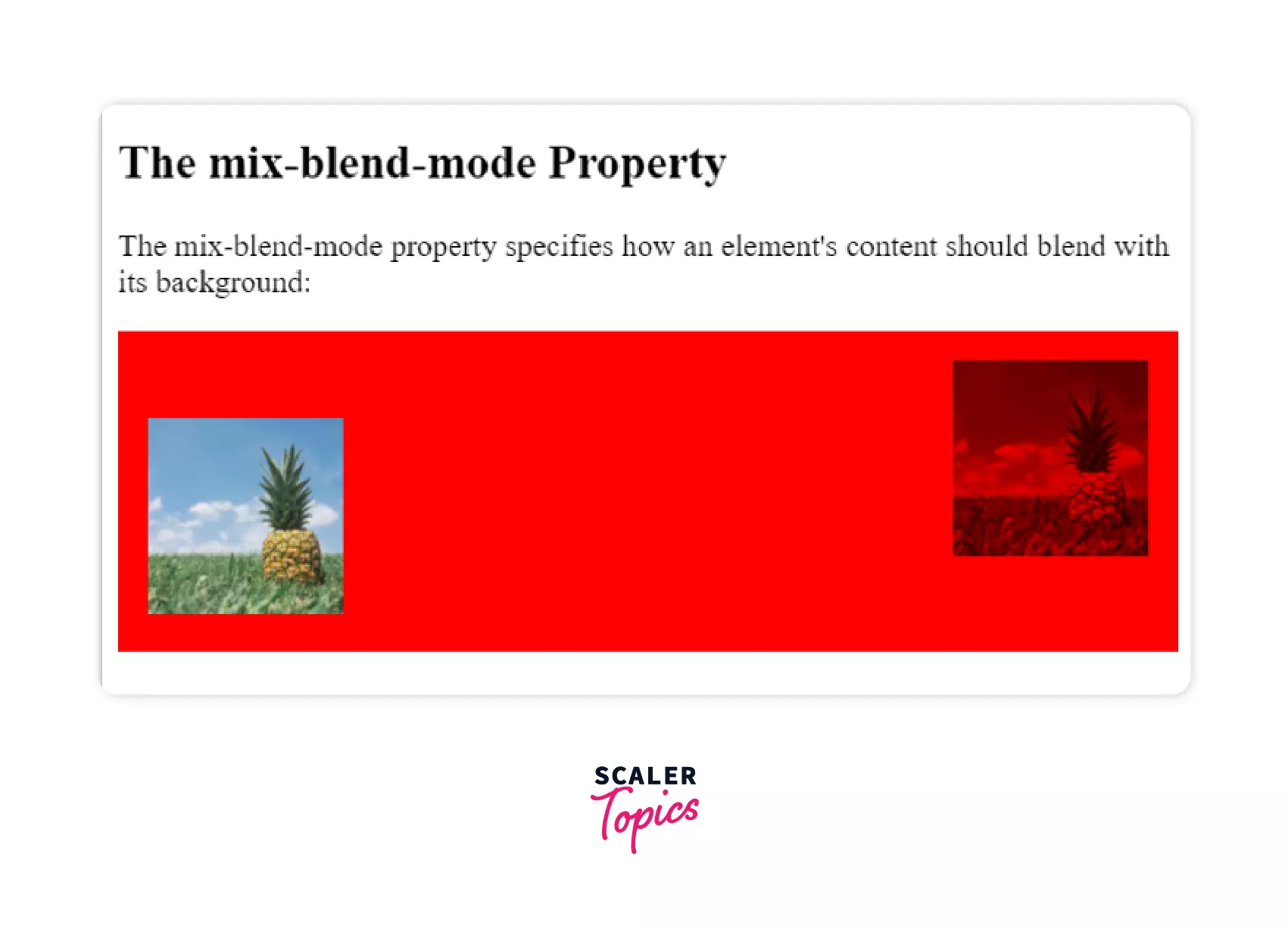 In this example, the mix-blend-mode property is used to blend the image with its background.
Example 2
Output
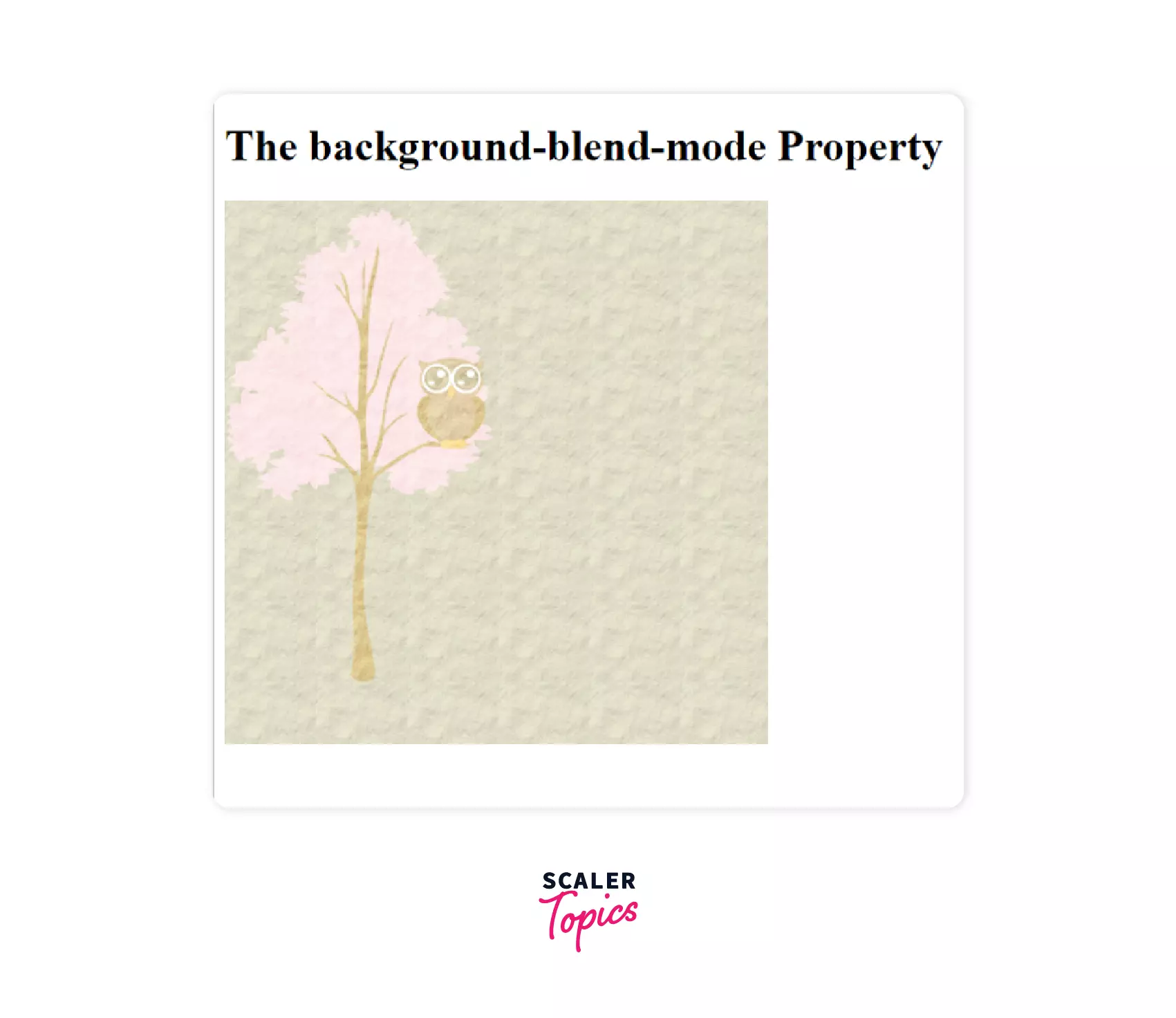 Unlike mix-blend-mode, background-blend-mode can blend an image with any number of background layers.
Parallax scrolling
Parallax scrolling is a modern trend used by web designers to create a 3D scrolling effect. Here, different layers in the background move at different speeds to create an optical illusion. It appears like magic in the eyes of the viewer. Let's take a look at it.
Example
While scrolling through the page, you would have understood what parallax scrolling is all about. It creates a beautiful illusion in our eyes of moving backgrounds. You can make changes using the transform property.
Scaler Placement Report and Statistics
Scaler learners achieved 2.5x salary growth with average post-Scaler CTC reaching ₹23L.
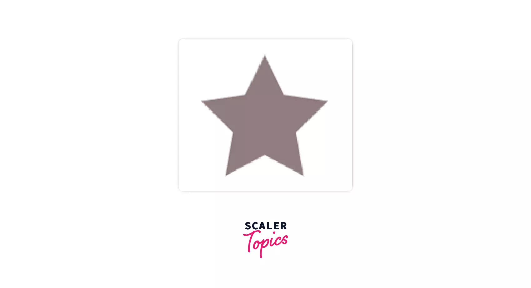
CSS Shapes
It seems very interesting to draw different shapes using CSS. Whether it's a rectangle, a trapezium, or a star, we can make all of them easily by writing a few lines of code.
Example
Output
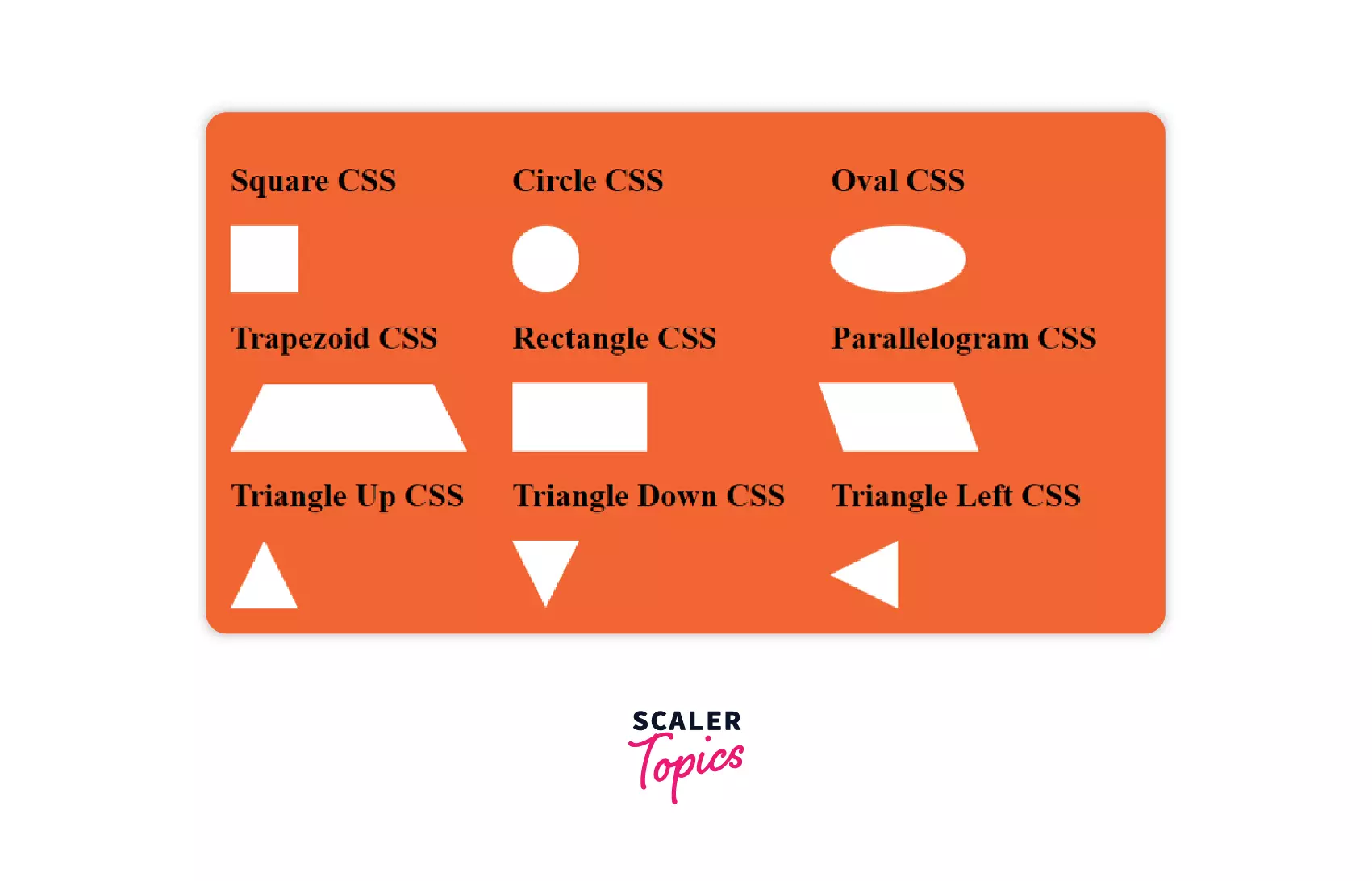 Here, we have made different shapes by styling divs using properties like trnasform, background-color, border, etc.
Truncate Strings in CSS
We all must have used the three dots to replace long texts in real life. But do you know it is possible in CSS too?
Yes, it is using the overflow property in CSS. It helps us when long texts don't fit in smaller containers.
Let's try it.
Example
Output
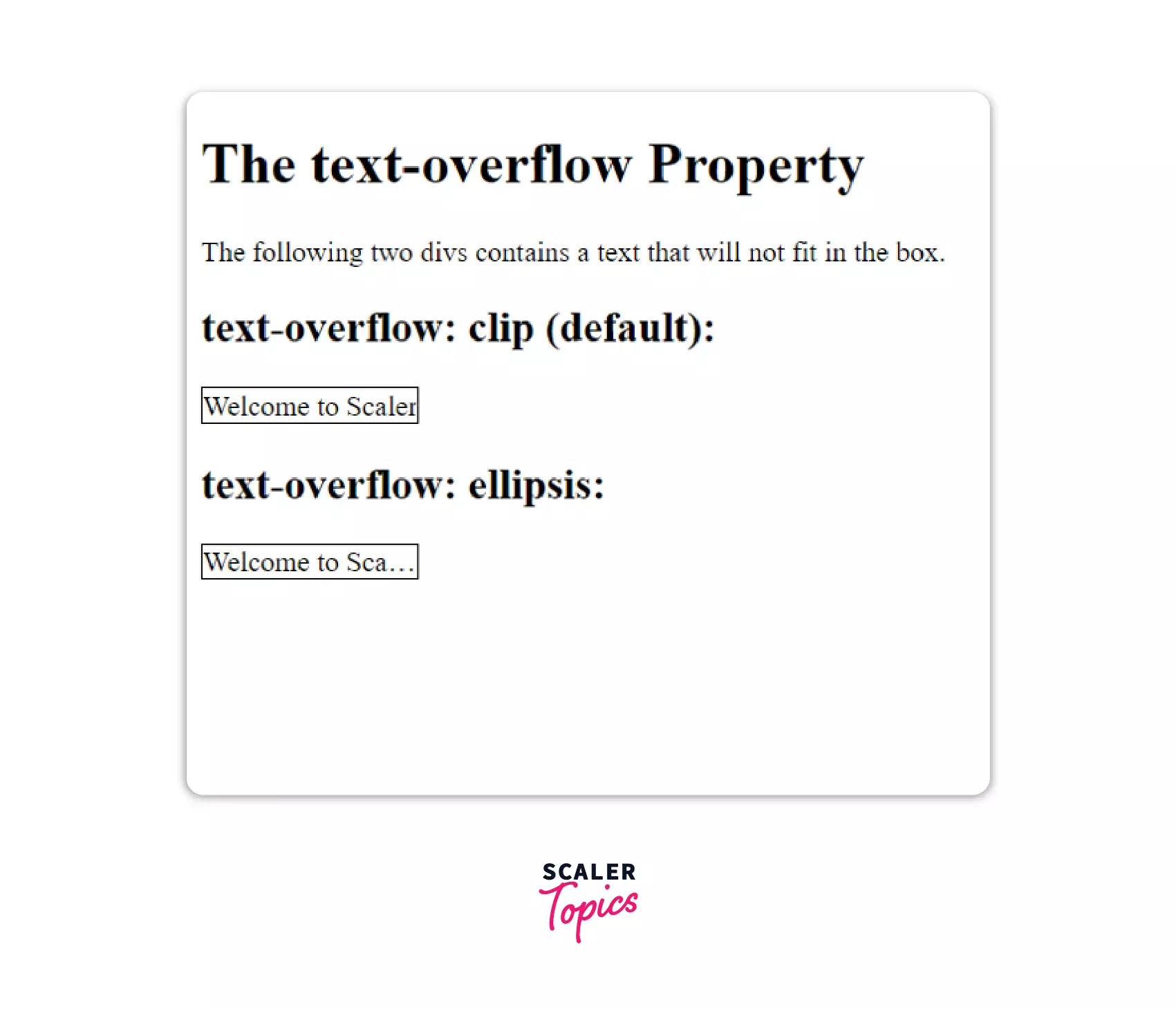 In this example, we see how the text-overflow property gives a better way of handling overflowing content.
It can take many values:
We have used white-space: nowrap and overflow: hidden property to stop the overflown text from wrapping and hiding the content.
Transform Your Career
Choose from our industry-leading programs designed for career success
Modern Software and AI Engineering Program
Master full-stack development with AI integration

 +1000 more
Modern Data Science and ML with specialisation in AI
Advanced data science techniques with AI specialization
+1000 moreAdvanced AIML with Specialisation in Agentic AI
Deep dive into AIML with focus on Agentic systems
+1000 moreDevOps, Cloud & AI Platform Engineering
Build and manage AI-powered cloud infrastructure
+1000 moreAI Engineering Advanced Certification by IIT-Roorkee
Premier AI engineering certification from IIT-Roorkee
Clip Path
The clip-path property helps us decide which part of the image or element shows. It shows the required portion and hides the rest.
Example
Output
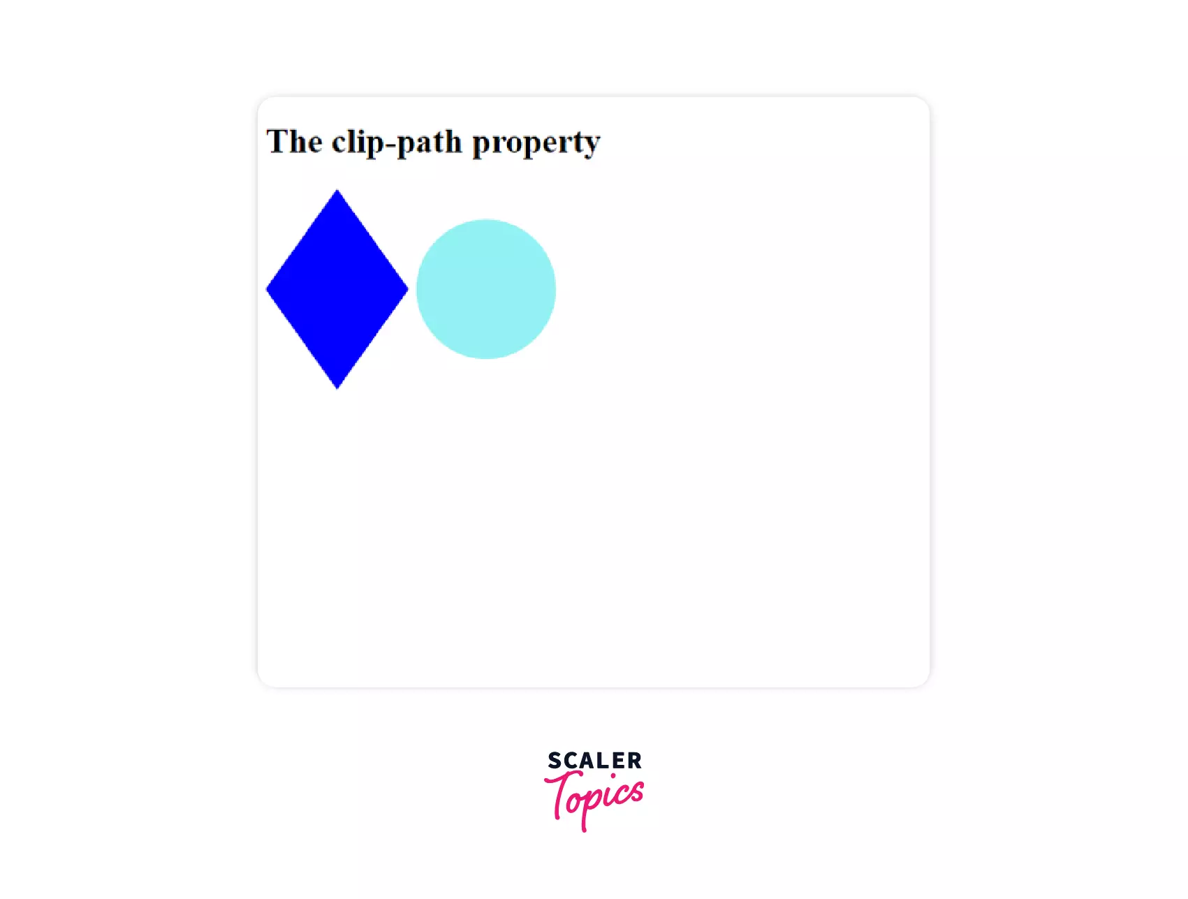 In the above example, we use the clip-path property to cut images into diamond and circle shapes.
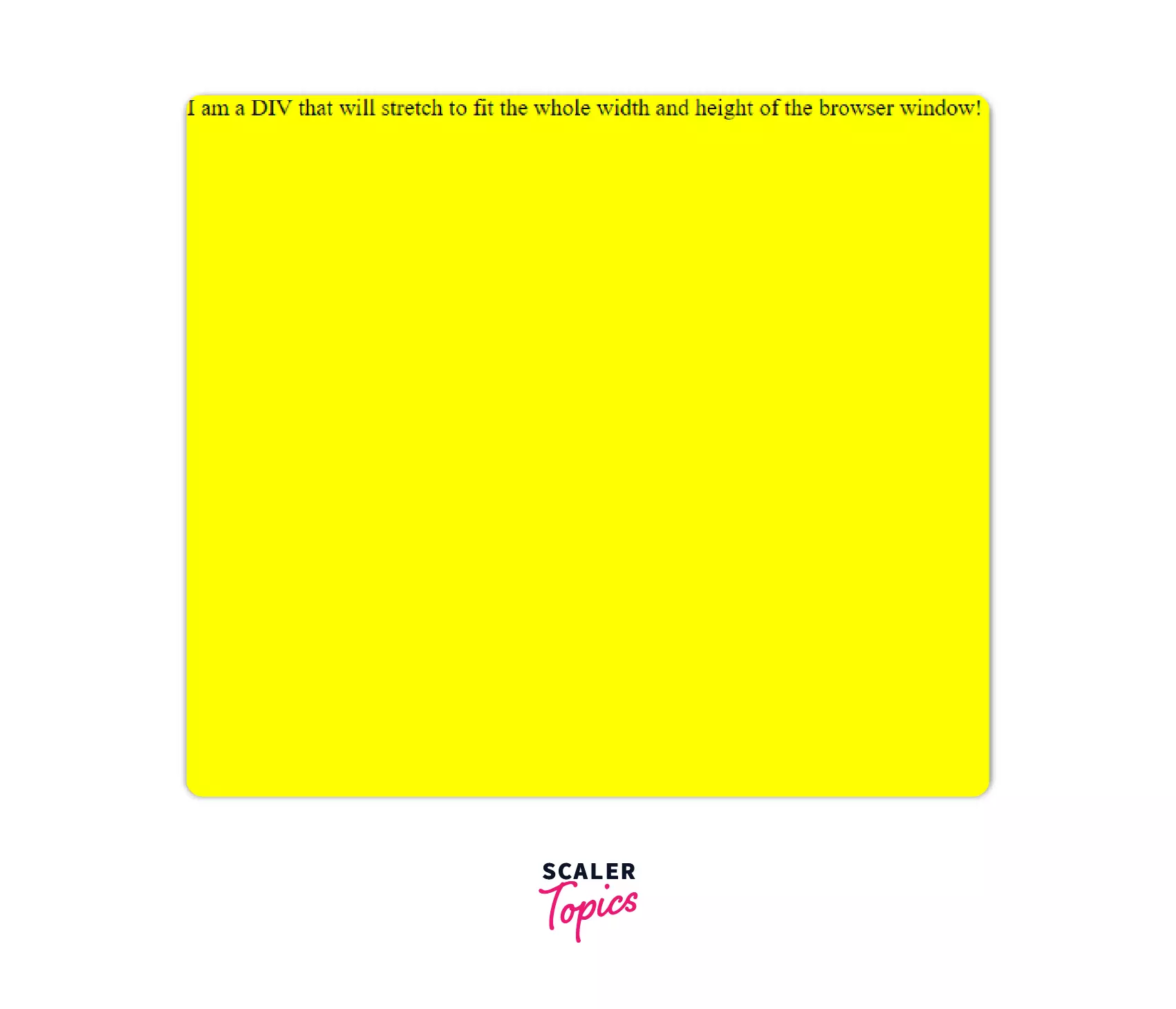
Full Height and Full Width
To get the full height and width of the container, we used the percentage units. We made sure the body has 100% height and width so that the container gets the same as its full height and width.
Example
Output
But the percentage is always a relative value. It will always take the dimensions of its parent container. So, lately, developers have been using viewport units to measure sizes. 1vh refers to 1% of the viewport height, and 1vw refers to 1% of the viewport width.
Example
Output
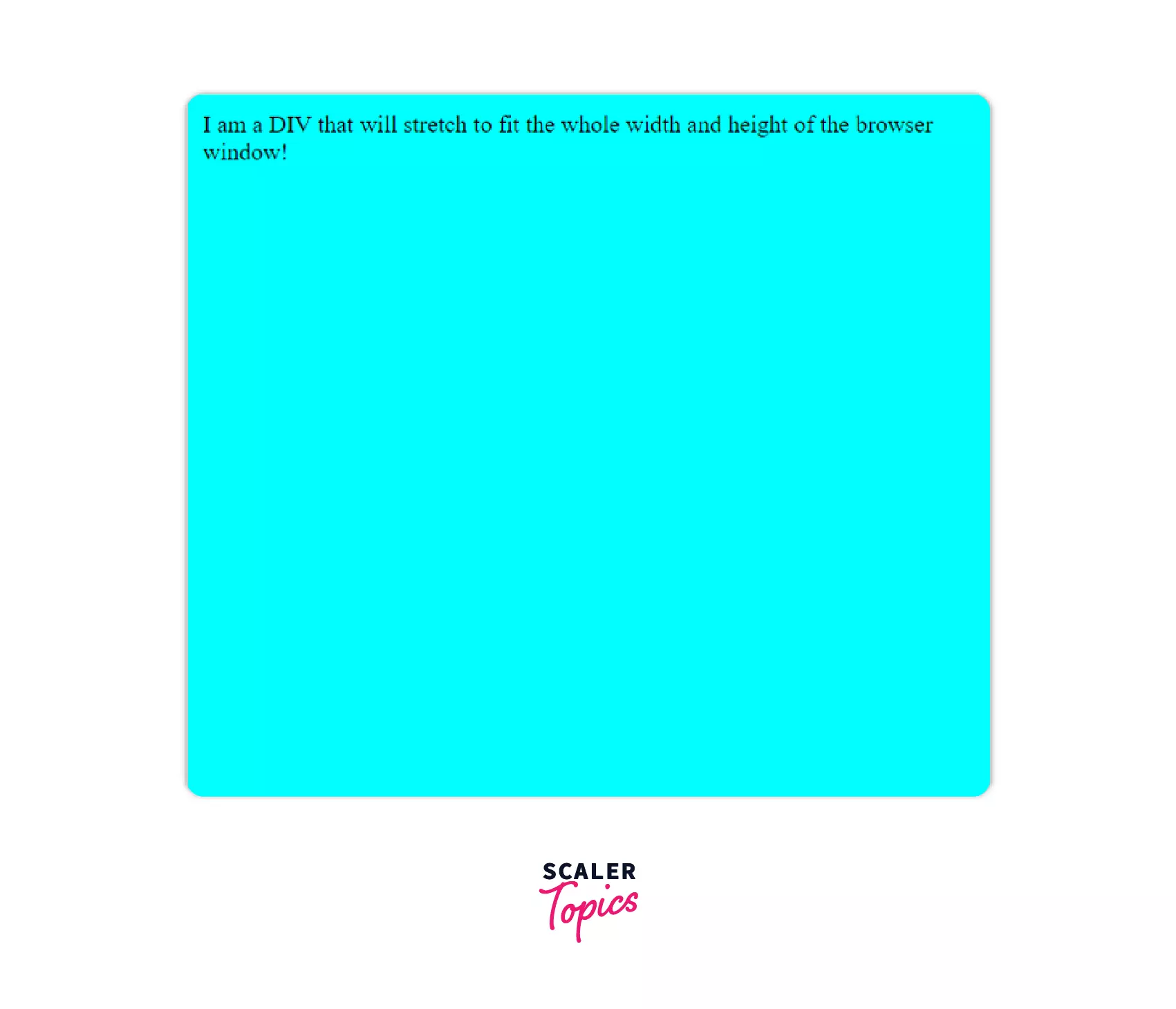
Image Filters
We often use filters in our images to make them beautiful. In the same way, CSS also applies various filters to its image. There are many filters.
Syntax
Example
Output
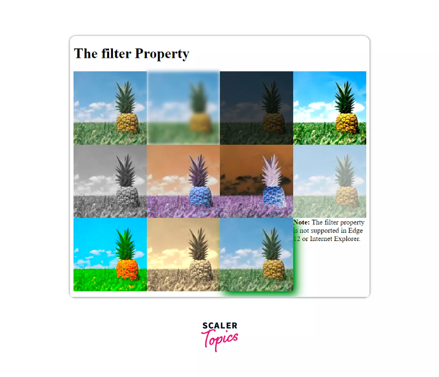
You can apply them one by one or many by separating them with spaces.
Let's see the result by applying multiple filters at once.
Example
Output
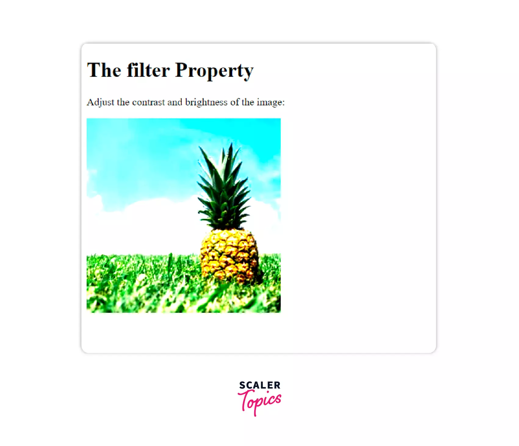
In the above example, we have applied the contrast and brightness filters simultaneously. You can use as many filters as you want.
Element Rotation
We can rotate elements to any degree across a fixed point. It is done using the transform property by specifying the angle to be rotated as rotate(a). It can be either clockwise or anti-clockwise, depending on the sign of the angle.
Let's play with it.
Syntax: The CSS transform property can take multiple values like:
Let's play with it.
Example
Output
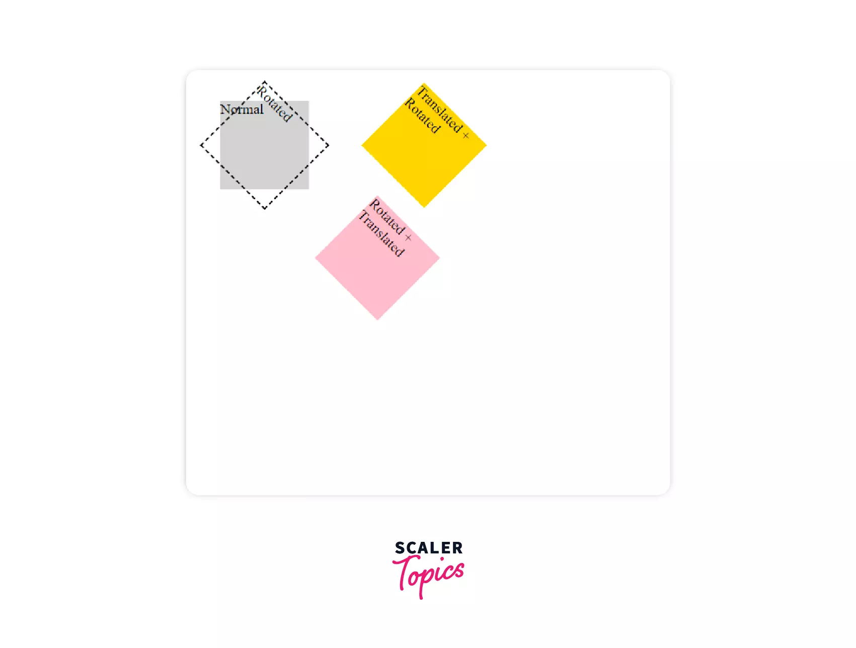 In the above, we can see how translation and rotation works. The yellow div is first translated in X and then rotated 45 degrees. The pink div first rotates by 45 degrees. Rotating an element rotates its axis. Then it is translated in its new X direction.
Mask
Masking is helpful for graphic designers to design elements by putting a mask layer over them. It uses the mask-image property that may contain png, SVG, or CSS gradient.
Example 1
Output
 Here we have masked a div with an SVG of any shape. It helps us put any color or image inside a given figure.
Example 2
Output
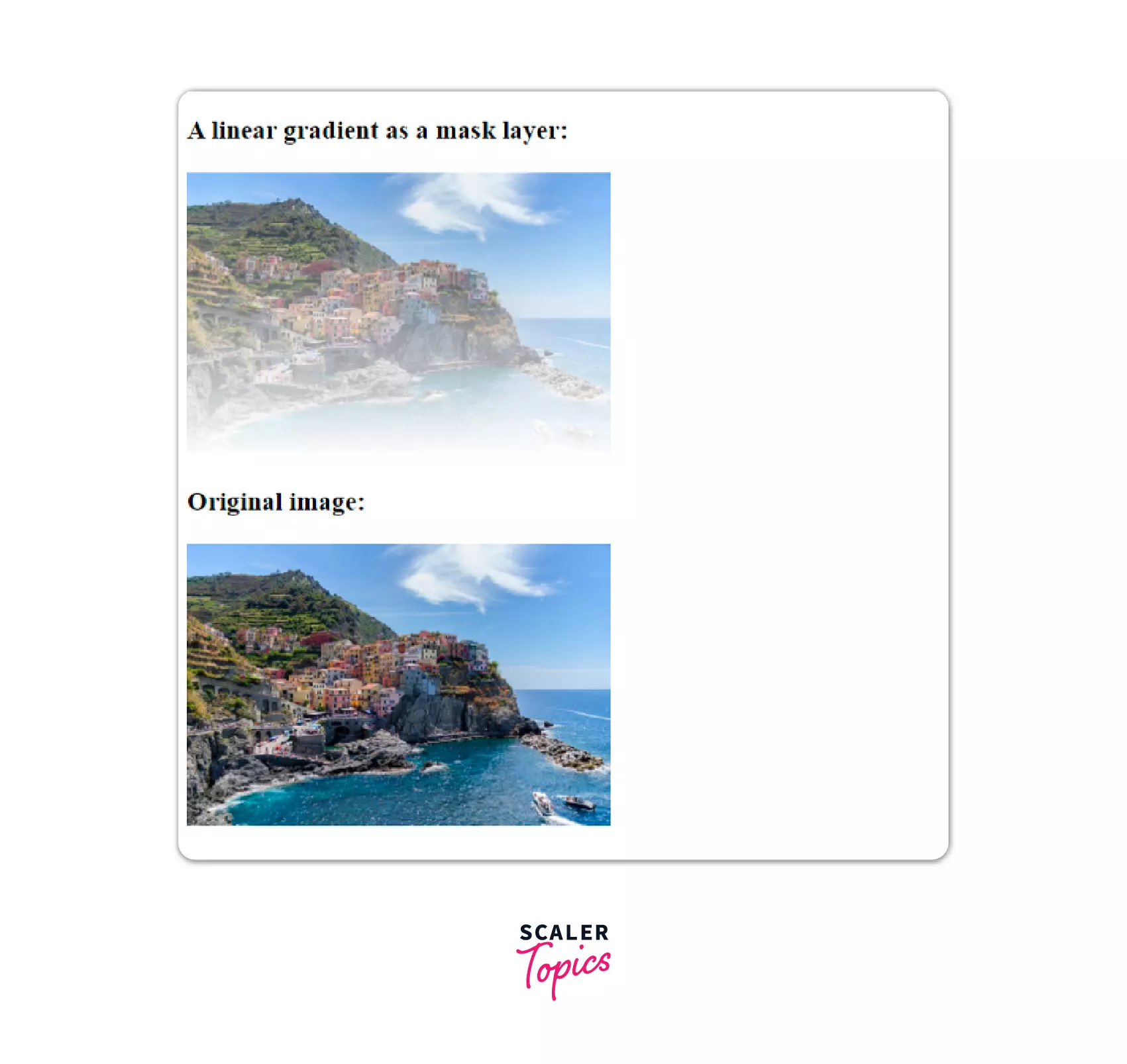 In the above example, we have masked a linear gradient layer on an image to give it a beautiful effect.
Zoom on Hover
We often find the zoom button in the image gallery. The idea is to see an enlarged version of the hovered image.
Let's see it through an example.
Example
Output
In the above example, the image is scaled by 1.5 using the transform property.
Scaler Placement Report and Statistics
Scaler learners achieved 2.5x salary growth with average post-Scaler CTC reaching ₹23L.
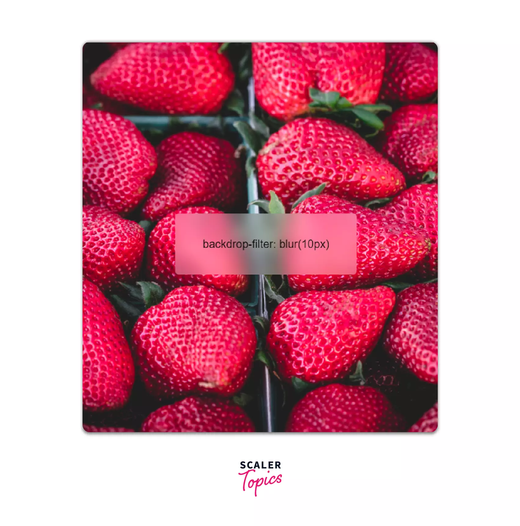
Frosted Glass CSS
The frosted glass effect creates a blur and brightening effect behind the content. We can achieve this using the backdrop-filter CSS property. Let's see how it works.
Example
Output
Turn Learning into Career Growth
CSS Only Carousel
Building a carousel seems challenging to those who don't know Jquery and Javascript. But CSS has a solution to almost all our problems. CSS-only carousel makes it easy.
Example
Output
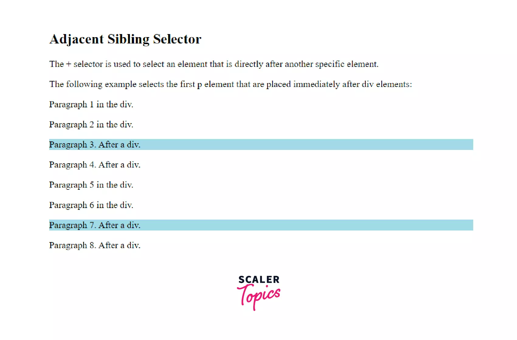
Maximizing CSS Sibling Selectors
Adjacent sibling selectors are used to selecting the next sibling after the specified element. Adjacent means "next to" or beside, whereas siblings are those with the same parents. These work well when we are working with a list of items.
Let's explore it with an example.
Example
Output
It styles the paragraphs which come immediately after a div.
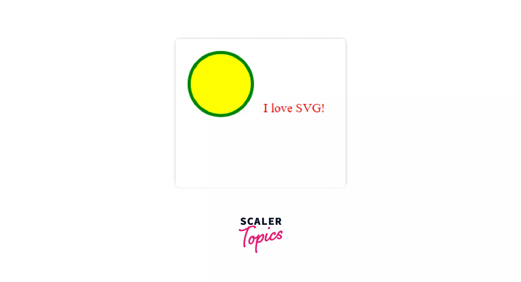
Using SVG for Icons and Logos
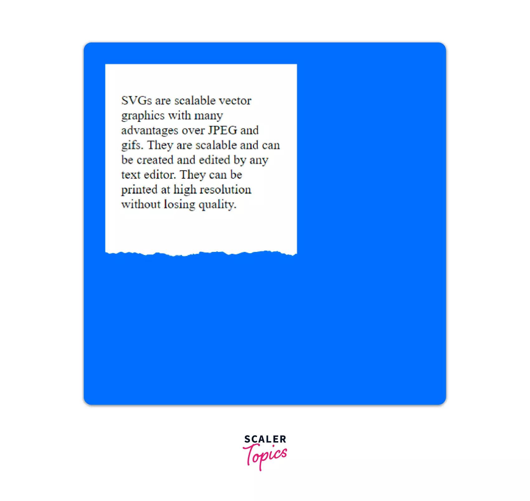
SVGs are scalable vector graphics with many advantages over JPEG and gifs. They are scalable and can be created and edited by any text editor. They can be printed at high resolution without losing quality.
Example 1
Output
SVGs can be background-images just like other png or jpeg. It gives different effects to the page while maintaining sharpness.
Example 2
Output
Curve Text Around a Floating Image
Images can be of different shapes. But it is interesting to find out that text can be wrapped in a shape other than the images. It is because the shape of the image is not constant. So, let's look at how to curve text around a floating image.
Example
Output
In this example, we have seen curve text around an image. It uses the shape-outside property. It cuts out the extra space outside the shape of the div to let the text wrap in a curve around the image.
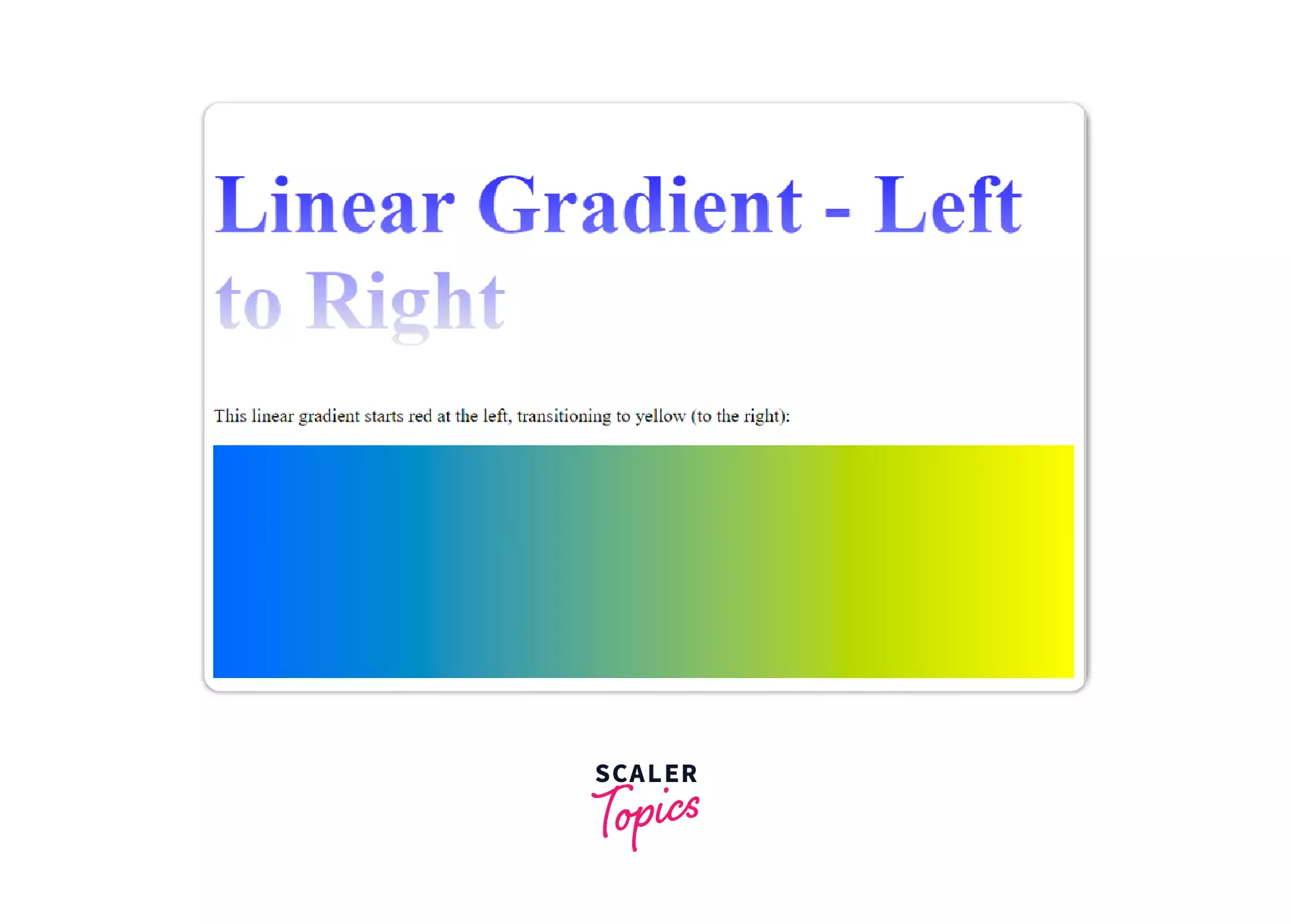
Gradients and Gradient Text
In our childhood, we all have used gradients in Word and Paint. It looked exactly like this.
But including it in website was tough. The only way was to create an image with a gradient and use it as background. But CSS has made it possible. Now we can not only add the gradients to the background but also to the text. Let's have some fun with colors.
Example
Output
Style Broken Images
Sometimes we end up with the wrong URL of images which leads to not getting the required image. These are called broken images. CSS gives us the chance to write error messages to communicate better with the users. We use the attr() function to display the URL and after and before classes to display the message.
Example
Output
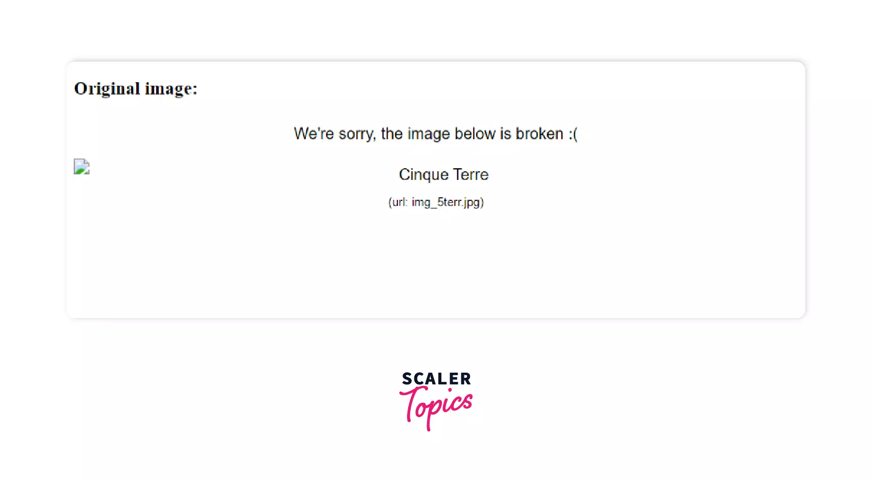 Here we get an error message displaying "We're sorry, the image below is broken" as the image is not present at the given URL. We have used the attr function to display the source URL after the broken image.
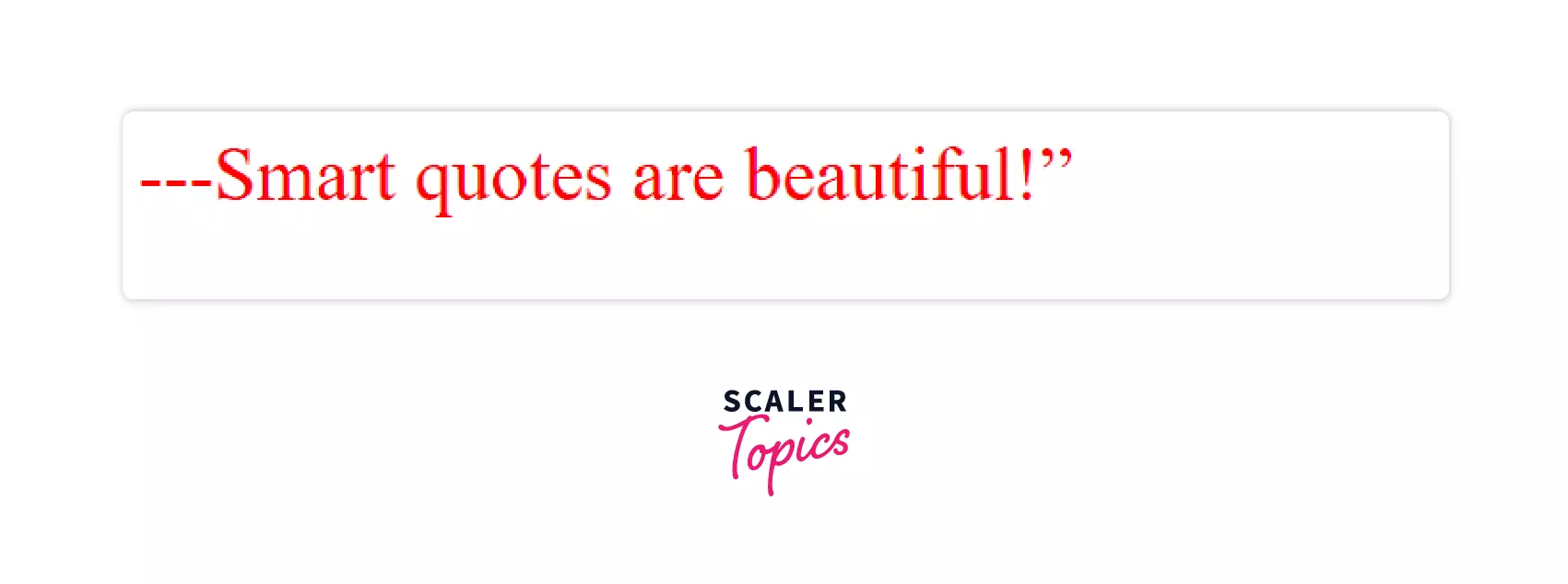
Smart Quotes in HTML/CSS
We have used the q tag to include quotations on our web page. But have you ever thought of customizing the quotes? If not, then let's do it together. We can use the quotes property to customize the opening and closing tag.
Let's look at an example.
Example
Output
Comma-Separated Lists
The list has always been a form of displaying information in an organized manner. CSS makes it more usable by adding commas at the end of it.
Example
Output
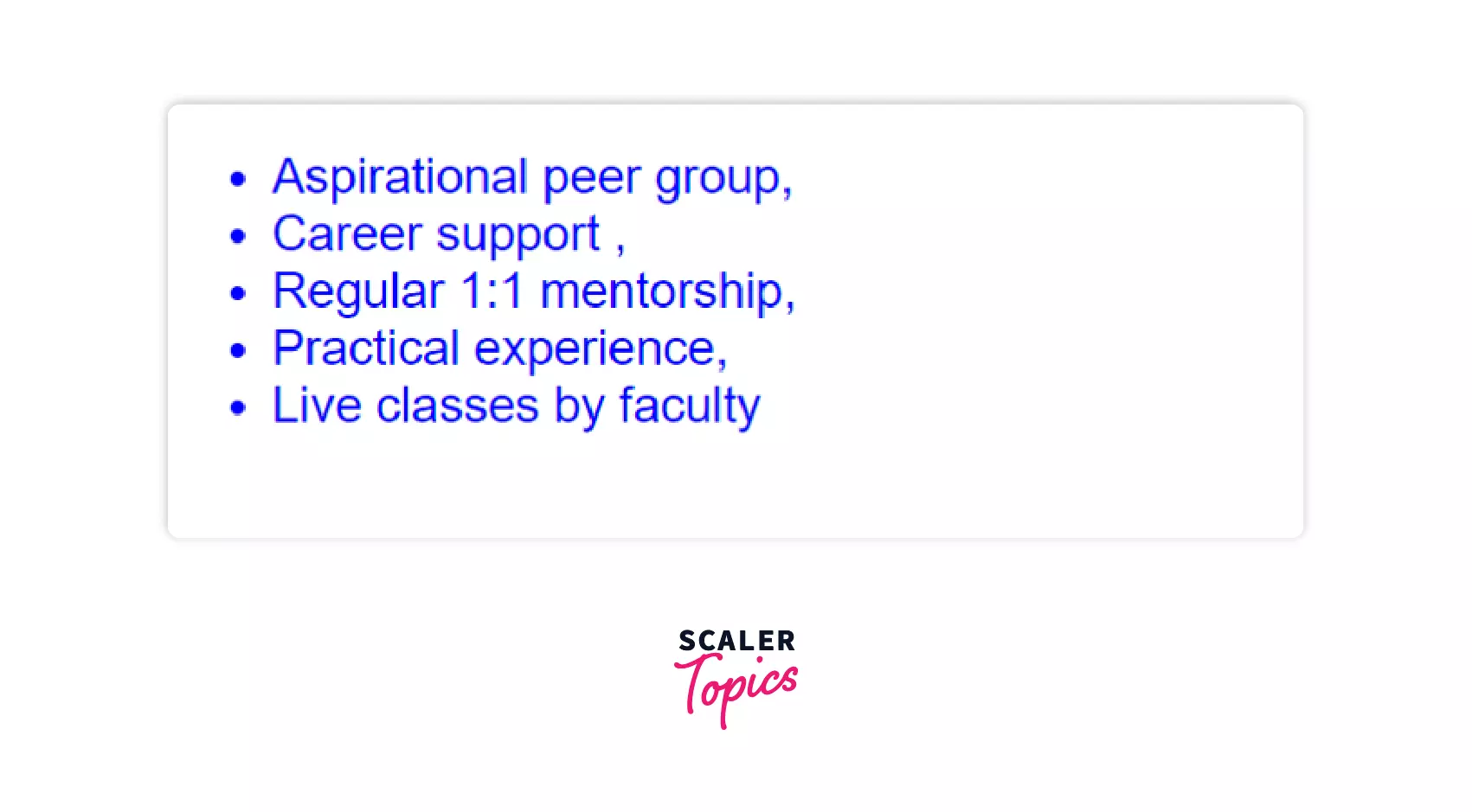
Comma seperated lists have multiple uses in our daily life like writing address formats, displaying data records, etc.
CSS Keylogger
CSS attribute selectors make it possible to request resources from an external server as a background image.
Syntax
The code selects all the inputs of the type password that end with a.
CSS Smooth Scrolling
CSS provides the smooth scroll-behavior property that helps us smoothly scroll through the complete page. This used ids for the sections we have to scroll. Let's scroll through it.
Example
Conclusion
- The tips and tricks shared in the article help us create spectacular websites and apps.
- For this to be possible, you must have a good understanding of CSS. It is more than styling div and text.
- We can make animations and shapes only through CSS.
- We hope that these tips and tricks are proved valuable and give you a better coding experience.
 Google
 Amazon
 Microsoft
 Flipkart
 Adobe1200+ more