flex-basis CSS
 FREE
FREE

Build an AI-First Career, Master the Complete Skillset
Choose from our industry-leading programs designed for career success
Modern Software and AI Engineering Program
Master full-stack development with AI integration


 +1000 more
Modern Data Science and ML with specialisation in AI
Advanced data science techniques with AI specialization
+1000 moreAdvanced AIML with Specialisation in Agentic AI
Deep dive into AIML with focus on Agentic systems
+1000 moreDevOps, Cloud & AI Platform Engineering
Build and manage AI-powered cloud infrastructure
+1000 moreAI Engineering Advanced Certification by IIT-Roorkee
Premier AI engineering certification from IIT-Roorkee

AI Forward Deployed Engineer Program
Full-stack engineering, production AI and client-facing consulting
+1000 moreOverview
The flex-basis property of CSS is used to set the initial main size of any flex item. A flex item is a direct child element in any flex container. Using CSS Flexbox, you can arrange and organize items on a web page in a single direction, i.e., horizontally and vertically. If we have not set the size of the content box using the box-sizing property, then the flex-basis sets (or defines) the content box's size.
What is the flex-basis Property in CSS?
The flex-basis property in CSS is used to set the main size of the flex item. It is a sub-property of the flexible box layout module in CSS. It generally describes or sets the initial size of any flex item, even before any available space is distributed with respect to its flex factors.
If the flex shorthand is skipped from the flex-basis property, then its specified value becomes the length zero.
However, the flex-basis property does not have any impact on the item if the item is not a flexible item.
Example:
In the above example, the flex-basis is set to 50px for the content.
Syntax of Flex Basis Property
The syntax of the flex-basis property in CSS is given below -
Also, please note that for any width, the negative lengths are invalid.
Let us look at the detailed property of the flex-basis in CSS:
The flexbox property is either defined by the keyword content or the <'width'>.
How Scaler Transformed Careers in Different Fields
Scaler learners achieved 2.5x salary growth with average post-Scaler CTC reaching ₹23L.
 Google
 Amazon
 Microsoft
 Flipkart
 Adobe1200+ more
Values of the Flex Basis in CSS
Default Value: <'width'> : It specifies the width value of the flex-basis in CSS. The default value for the width is auto. If the flex-basis value is set to auto, then the element sizes itself according to the size property. The flex-basis takes the absolute length, which is the percentage of the parent flex container's main size property.
Property Value: The property values of the flex-basis in CSS are specified below :
initial: The initial property is used to set the property to its default value. number: The number is basically the length unit that determines the initial length of that item.
auto: This is the default value of the flex-basis. In case the length value is not specified, then the length will be set according to the content.
inherit: The inherit property states that the property can inherit its value from the parent element.
Examples
Let us now look at some practical examples to understand the working of flex-basis in CSS.
Before that, please note that the formal syntax of the Flex basis in CSS is:
Syntax:
Example 1: Let us look at the example below to understand the working of the flex-basis with every parameter.
HTML Code:
CSS Code:
Output:
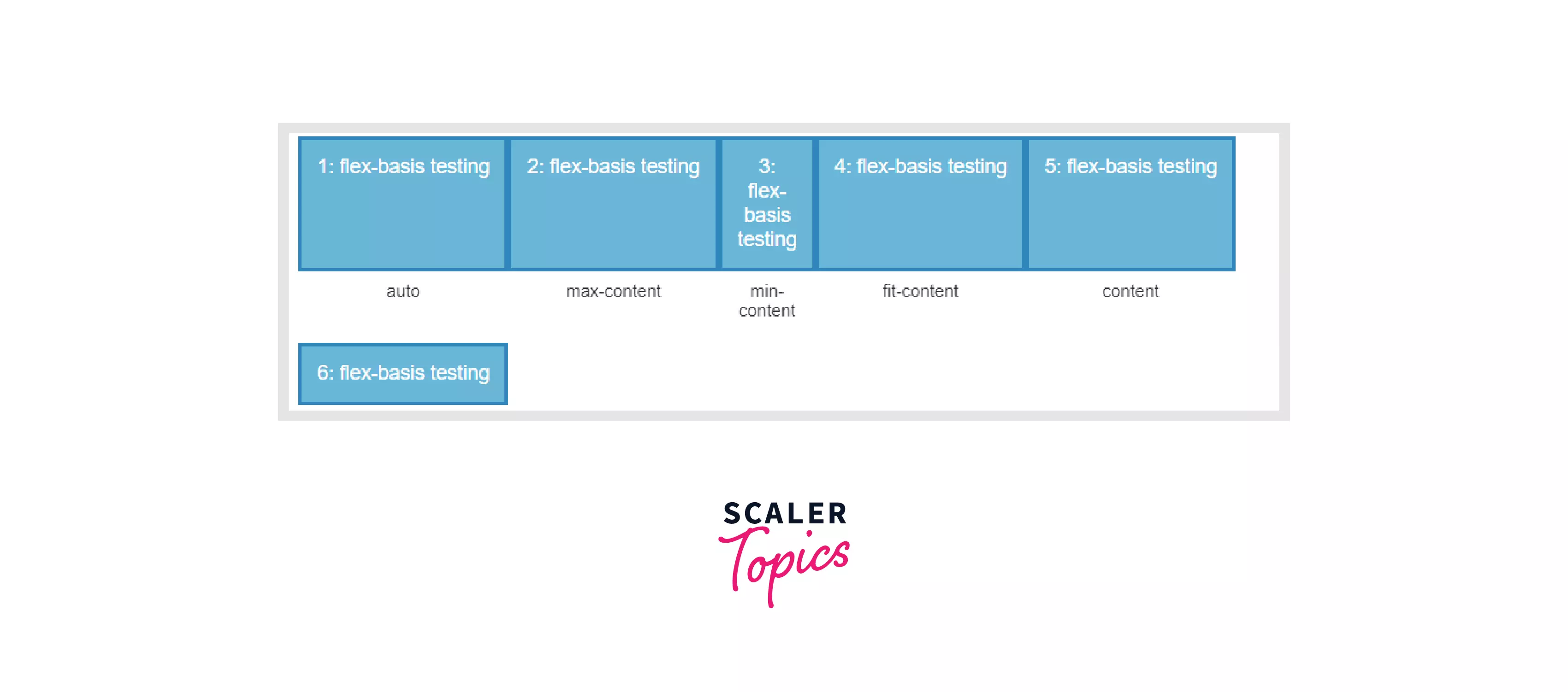
Explanation: In the above code, we have tried to demonstrate the working of the flex-basis in CSS with various properties. For example, auto, max-content, min-content, fit-content etc.
After we set the mentioned attributes for the flex-basis property, our final content will be displayed accordingly.
For example, auto in CSS is the default value for multiple box-model properties like width, height, margin, background size, etc. It's also the default value for position properties like top and bottom, left and right, and z-index.
Similarly, the max-content represents the maximum width or height of the content. For example, in the above example, the content will not wrap even if it overflows. And, the min-content sizing keyword represents the intrinsic minimum width of the content.
Also, the fit content means that the box will use up the available space. But will never grow more than the max-content.
Example 2:
HTML Code:
CSS Code:
Output:
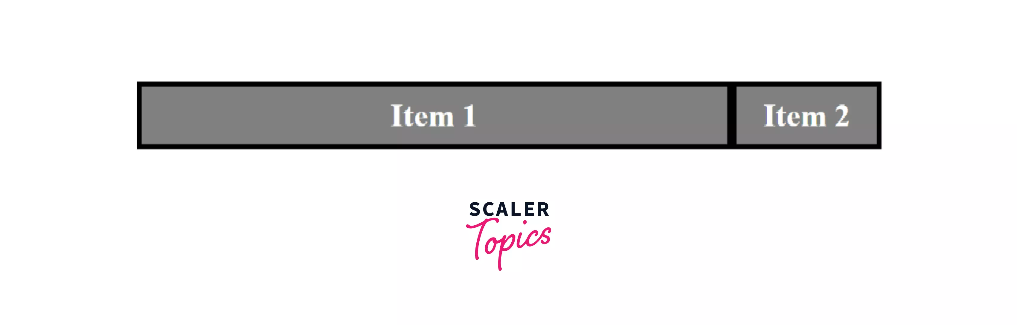
Explanation: In the above code, the flex item has a size set to the relative units, and hence we are getting the output restructured according to the corresponding sizes. We have specified the flex size according to the em unit. The "em" unit is relative to the font size of the element. For example, 5em means five times the size of the current font. The font-size property is basically used to change the size of a font. And, by using 5em, we will increase the size of the content by five times.
Turn Learning into Career Growth
Conclusion
In this article, we learned about flex-basis in CSS. Let us summarise what we have learned throughout:
- The flex-basis property of CSS is used to set the initial main size of any flex item.
- If we have not set the size of the content box using the box-sizing property, then the flex-basis sets (or defines) the content box's size.
- The flex-basis property does not have any impact on the item if the item is not a flexible item.
- The flex-basis property is specified either with the keyword "content" or "width".
Related Articles
You can also learn more about CSS from the below CSS articles in scaler topics.