flex-direction CSS Property
 FREE
FREE

Overview
Flex direction in CSS is a sub-property of the flexible box layout module. It establishes the main axis, thus defining the direction flex items are ordered or placed in the flex container.
By default, the flex items are placed in the row direction (horizontally left to right).
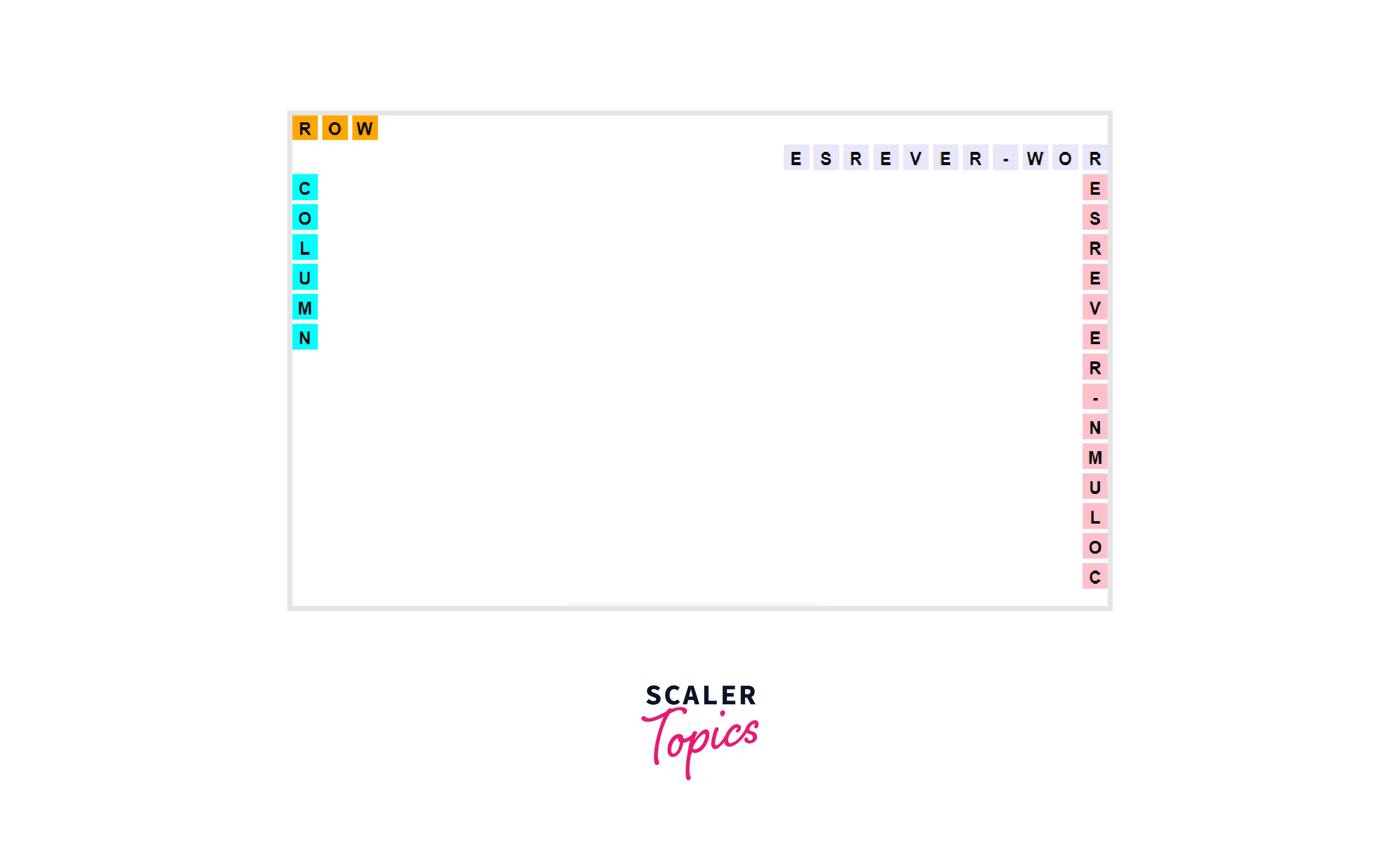
What is flex-direction in CSS ?
- Main-axis is the primary axis where the flexbox is laid. The main axis is used as a primary axis for the flex-container to align the flex items and is set using the flex-direction property.
- The property specifies the direct path of the flexible items inside the container.
- The directions are specified from left to right and from top to bottom.

How does flex-direction in CSS Work ?
To use flex-direction follow the steps mentioned below :
-
At first, to create a flexbox layout you have to set the display property of CSS to flex. The code to create a flexbox is :
Example :
-
To create a flex-direction that helps to add elements the following code is used :
Flex items can have the following values as well :
- row
- column
- row-reverse
- column-reverse
Example :
flex-direction
The flex-direction property in CSS specifies the direction of the flexible items. If the element is not a flexible item, the flex-direction property has no effect.

Transform Your Career
Choose from our industry-leading programs designed for career success
Modern Software and AI Engineering Program
Master full-stack development with AI integration

 +1000 more
Modern Data Science and ML with specialisation in AI
Advanced data science techniques with AI specialization
+1000 moreAdvanced AIML with Specialisation in Agentic AI
Deep dive into AIML with focus on Agentic systems
+1000 moreDevOps, Cloud & AI Platform Engineering
Build and manage AI-powered cloud infrastructure
+1000 moreAI Engineering Advanced Certification by IIT-Roorkee
Premier AI engineering certification from IIT-Roorkee
Syntax
Attributes :
- row :
The flex-items are positioned horizontally. - row-reverse :
The flex-items are positioned horizontally but in opposite direction. - column :
The flex-items are positioned vertically. - column-reverse :
The flex-items are positioned vertically but in opposite direction.
Values
Default Value
The default value set to the flex-direction property is a row. In this case, the flexbox items are ordered in the way the text direction is placed, along the main axis.
Property Value
There are four property values of flex-direction :
- row
- row-reverse
- column
- column-reverse
Global Values
The following global values can be assigned to flex-direction :
- inherit :
inherit inherits the flex-direction property from the parent element. - initial :
initial set the flex-direction property to its default value(row).
Turn Learning into Career Growth
Description
The flex-direction can be set using the above values.
Moreover, flex-direction can be used together with media queries to create a different layout for different screen sizes/devices :
Code :
Output : 1
When screen size is greater than or equal to 400px.
Output : 2
When the screen size is less than 400 px.

Example
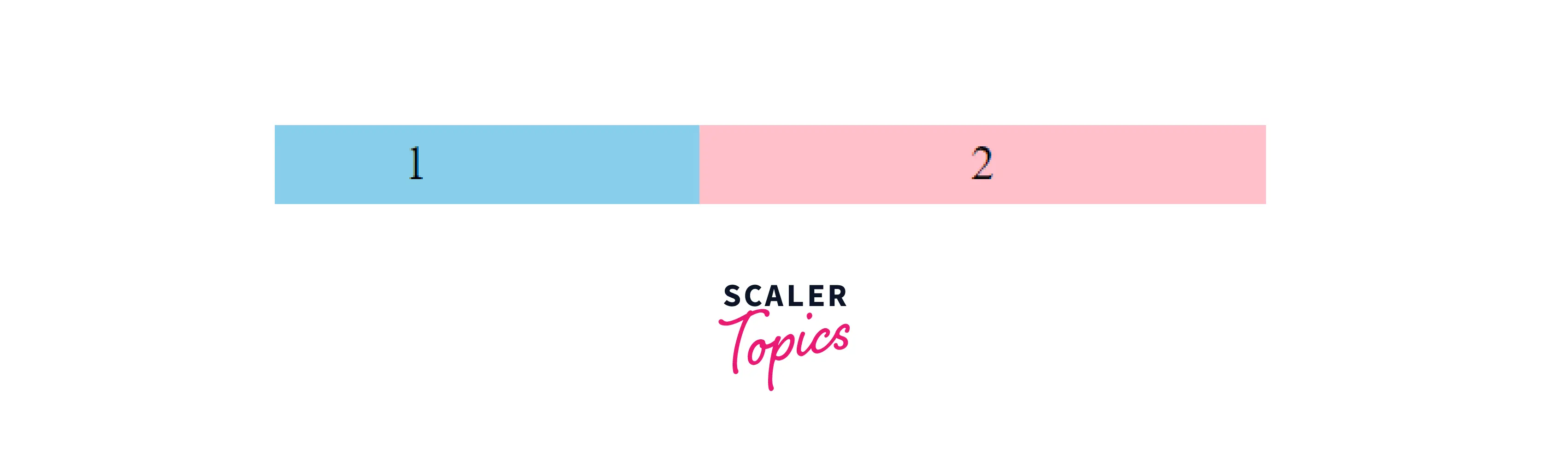
flex-direction: row;
When set to row, the flex-direction flex items horizontally in the same direction as the text.
Example :
HTML :
CSS :
Output :
flex-direction: row-reverse;
The "flex-direction" when set to row-reverse positions flex items horizontally but in the opposite direction as the text.
Example :
HTML :
CSS :
Output :
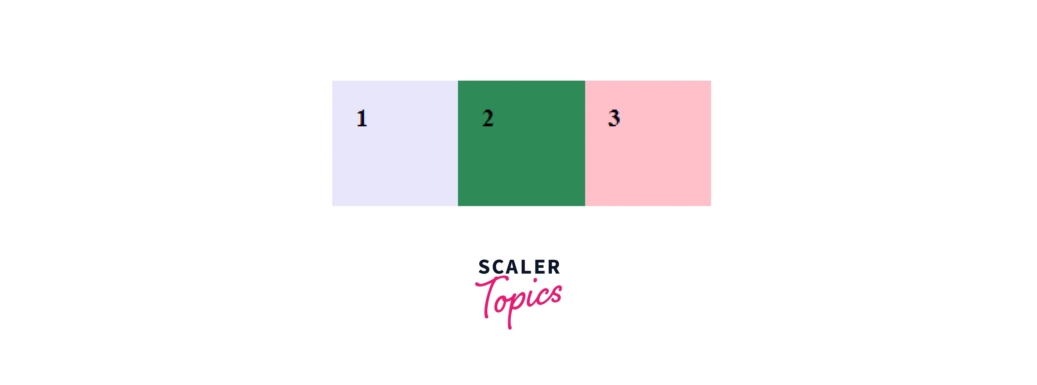
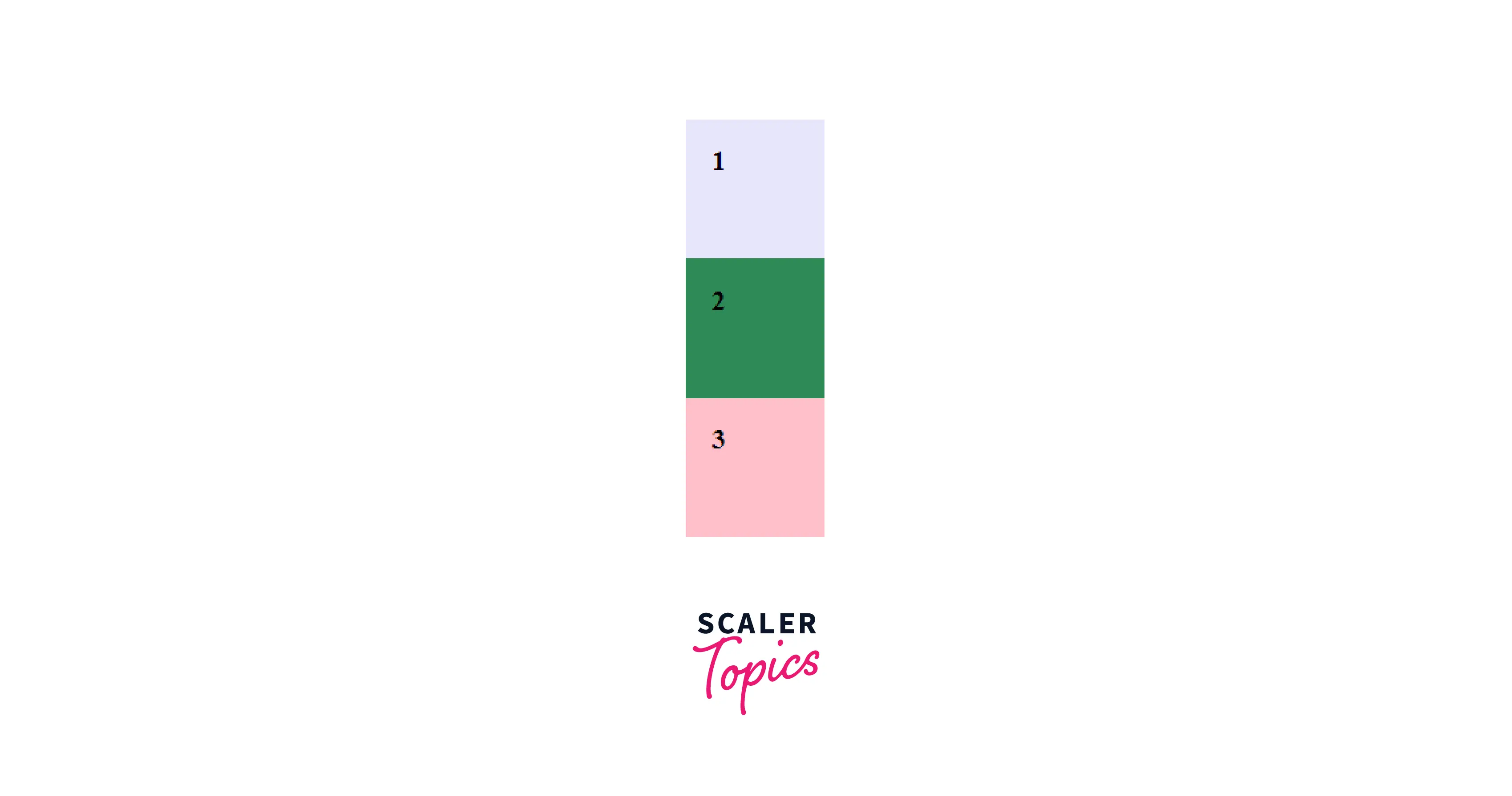
flex-direction: column;
The flex-items are positioned vertically with the help of the flex-direction column.
Example :
HTML :
CSS :
Output :
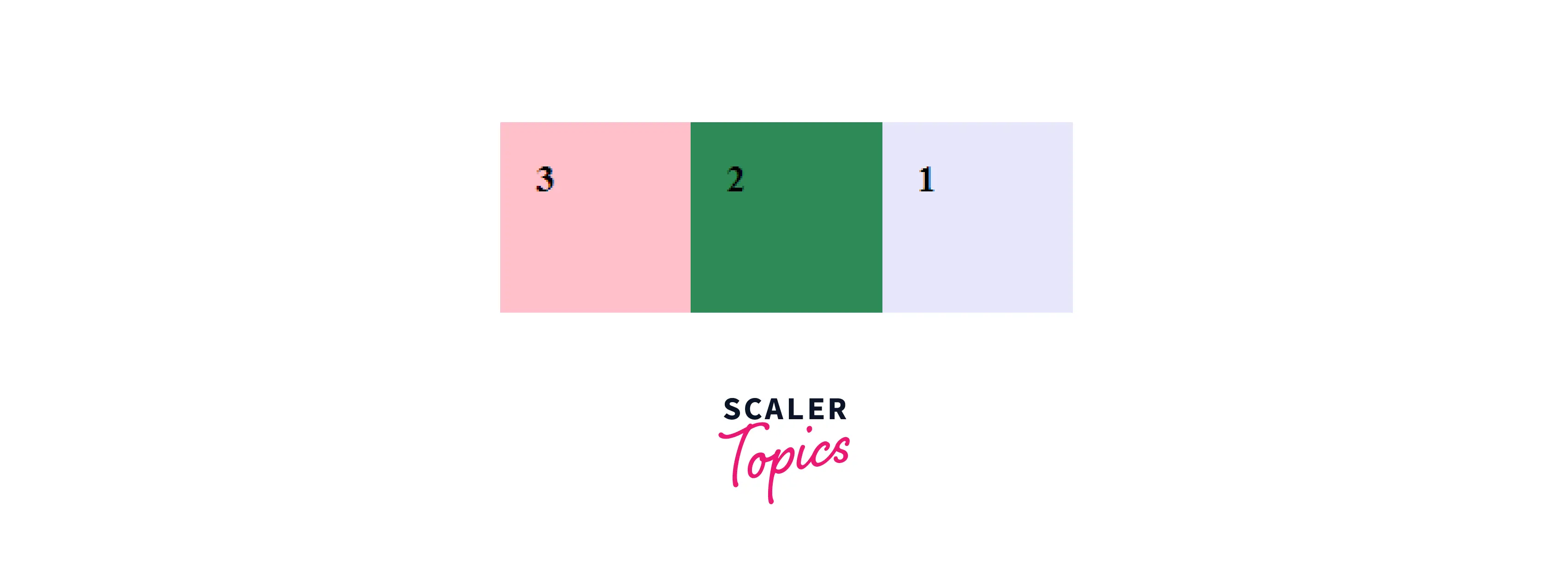
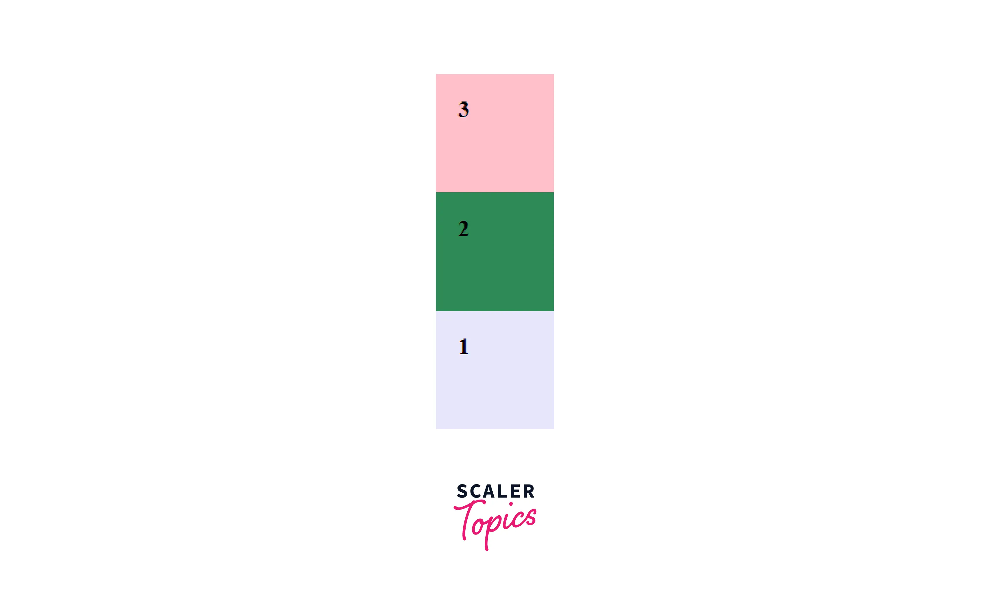
flex-direction : column-reverse;
The flex-items are positioned vertically but in the opposite direction with the help of the flex-direction column-reverse. That is the flexbox items are ordered the opposite way as the text direction, along the cross-axis.
Example :
HTML :
CSS :
Output :
Conclusion
- The CSS "flex-direction" property defines how the flex items are placed in the flex container.
- It defines the direct path of the flexible items inside the container. The directions are specified from left to right and from top to bottom.
- The four values of flex-direction are :
- row
- row-reverse
- column
- column-reverse
- The default value is row.
Scaler Placement Report and Statistics
Scaler learners achieved 2.5x salary growth with average post-Scaler CTC reaching ₹23L.
See Also:
 Google
 Amazon
 Microsoft
 Flipkart
 Adobe1200+ more