CSS Font-Size Property
 FREE
FREE

Overview
Font-size is a CSS property that defines the size of the text. We can specify sizes with the help of various units like px and em, percentages, or predefined keywords. The unit px describes the font size in terms of pixels, also used to determine image's size. We also use various sizing units that work with relative sizing. They consider the relative font size to their parent font size.
The body text size has been set to a value of 12px by default. CSS also has predefined absolute size keywords for sizing like xx-small, x-small, small, medium, large, x-large, and xx-large. These keywords are not very precise like the others. Smaller and larger are relative keyword sizes used for relative sizing with their parent element.
Syntax
Word-wrap in CSS
Let's discuss the sizing values considering a browser with a default font size of 16px.
xx-smal
It specifies the font size as 9px.
x-small
It specifies the font size as 10px.
small
It specifies the font size as 13px.
medium
It specifies the font size as 16px.
large
It specifies the font size as 18px.
x-large
It specifies the font size as 24px.
xx-large
It specifies the font size as 32px.
xxx-large
It specifies the font size as 48px.
larger
larger is a relative unit keyword with a font size larger than the parent elements font size. It separates the sizes in the ratio used by the adjacent absolute keywords.
smaller
larger is a relative unit keyword with a font size larger than the parent elements font size. It separates the sizes in the ratio used by the adjacent absolute keywords.
<length>
It is a positive value that specifies the font size. The length value can be in any unit as pt, px, cm, mm, rem, etc. For most relative units of font like em, the value depends on the parent elements font size. Another root-based relative measurement unit rem depends on the root ( <html> ) element's font size. The length value cannot be negative.
<percentage>
We can represent the font size using a positive percentage value that takes the parent element's font size as a reference.
Examples
Example 1
Output
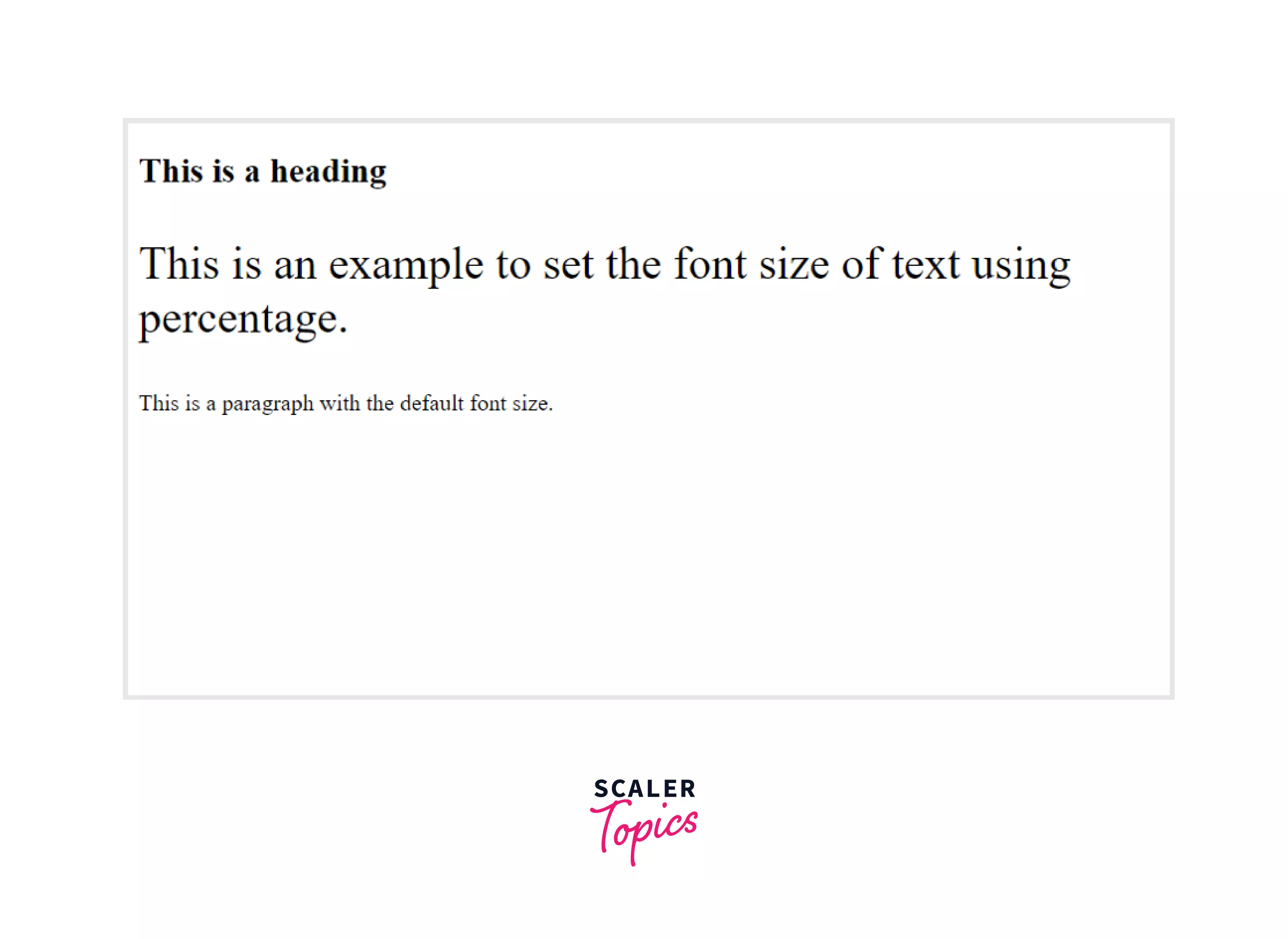
In the above example, we have specified the font size of the paragraph element to be 200%. The unit percentage is relative to the browser's default font size.
The below image shows how the text appears on the screen:
Example 2
Output
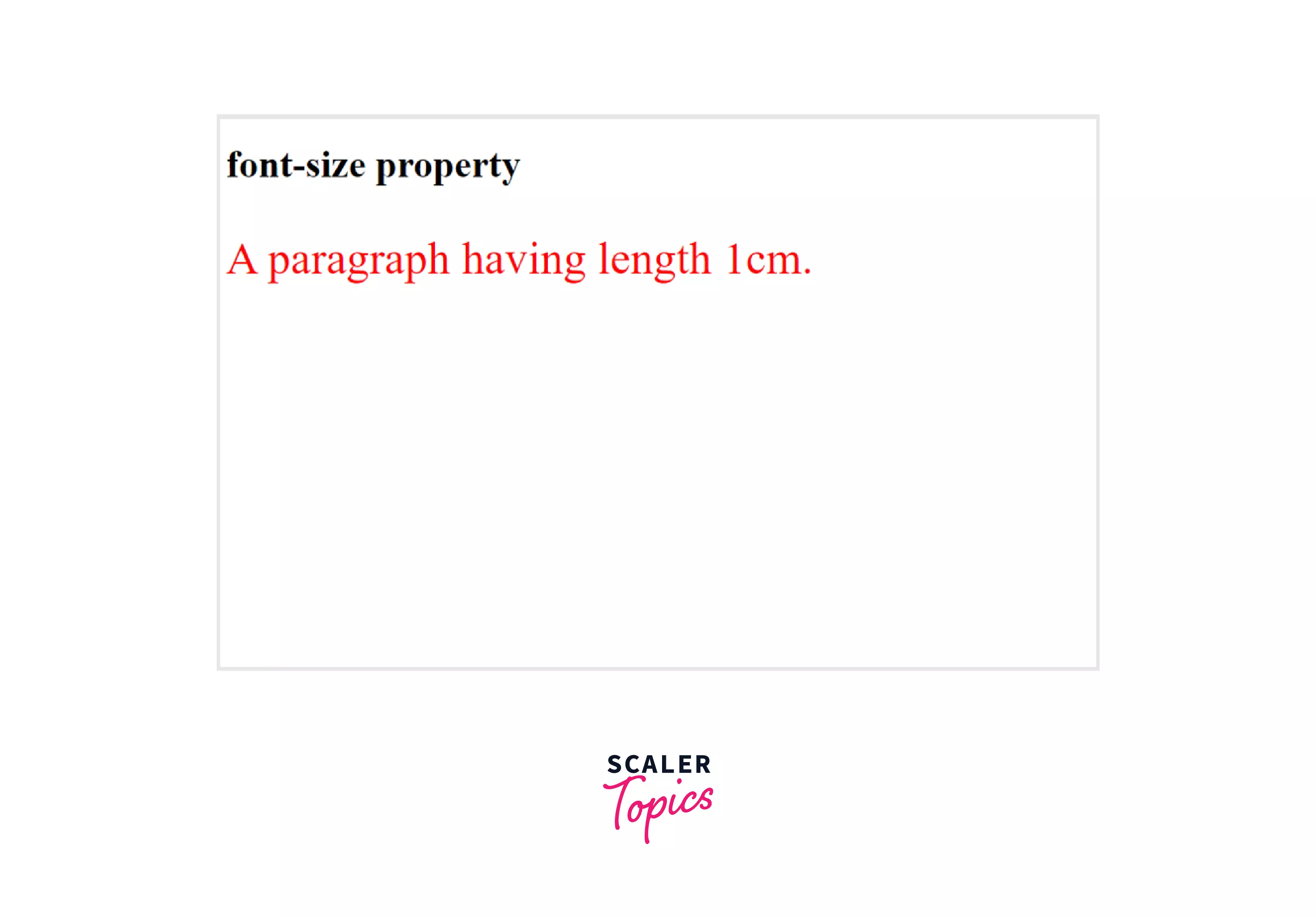
In the above example, we have specified the font size of the paragraph element as 1cm.
The below image shows how the text appears on the screen:
Setting fontsize in CSS
Keywords
We can use two types of keywords to set the font size of the text in CSS - Absolute and Relative keywords.
Transform Your Career
Choose from our industry-leading programs designed for career success
Modern Software and AI Engineering Program
Master full-stack development with AI integration

 +1000 more
Modern Data Science and ML with specialisation in AI
Advanced data science techniques with AI specialization
+1000 moreAdvanced AIML with Specialisation in Agentic AI
Deep dive into AIML with focus on Agentic systems
+1000 moreDevOps, Cloud & AI Platform Engineering
Build and manage AI-powered cloud infrastructure
+1000 moreAI Engineering Advanced Certification by IIT-Roorkee
Premier AI engineering certification from IIT-Roorkee
1. Absolute Keywords
Absolute keywords set the font size of the text that doesn't depend on the changes in the font size of other elements on the web page. It depends on the default font size of the web page. Below is the list of absolute keywords used to set the font size of text with their values.
- xx-small (9px)
- x-small (10px)
- small (13px)
- medium (16px)
- large (18px)
- x-large (24px)
- xx-large (32px) For the above set of values, we have taken the default font size of the current browser to be 16px. The medium keyword has the same font size.
Example
Output
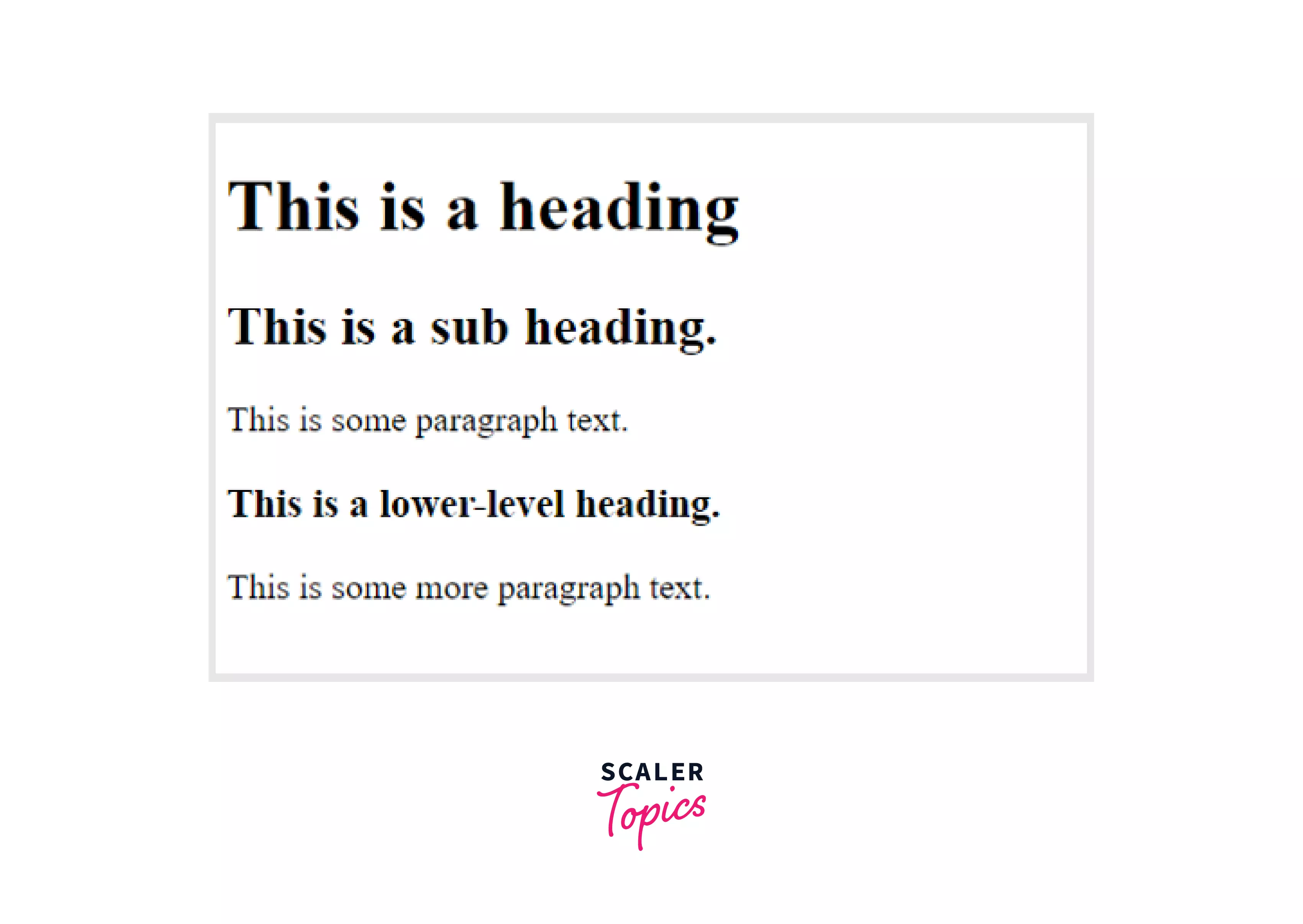
In the above example, we have set the font size of all <h1> elements to xx-large which is equivalent to 32px, <h2> elements to x-large which is equivalent to 24px and <h1> elements to large which is equivalent to 18px. The <p> element takes the default font size equivalent to 16px. Here, we have specified sizes using keywords set by the browser instead of pixels. The below image shows how the text appears on the screen:
2. Relative keywords
The word relative means depending on something else. Thus relative keywords are those sets of units whose font size changes relative to the font size of other elements on the web page. The relative keywords of font size used by developers are smaller and larger. We can use these font sizes when we want to change the size of our text accordingly with the change of other font sizes on the page.
Scaler Placement Report and Statistics
Scaler learners achieved 2.5x salary growth with average post-Scaler CTC reaching ₹23L.
Example
Output
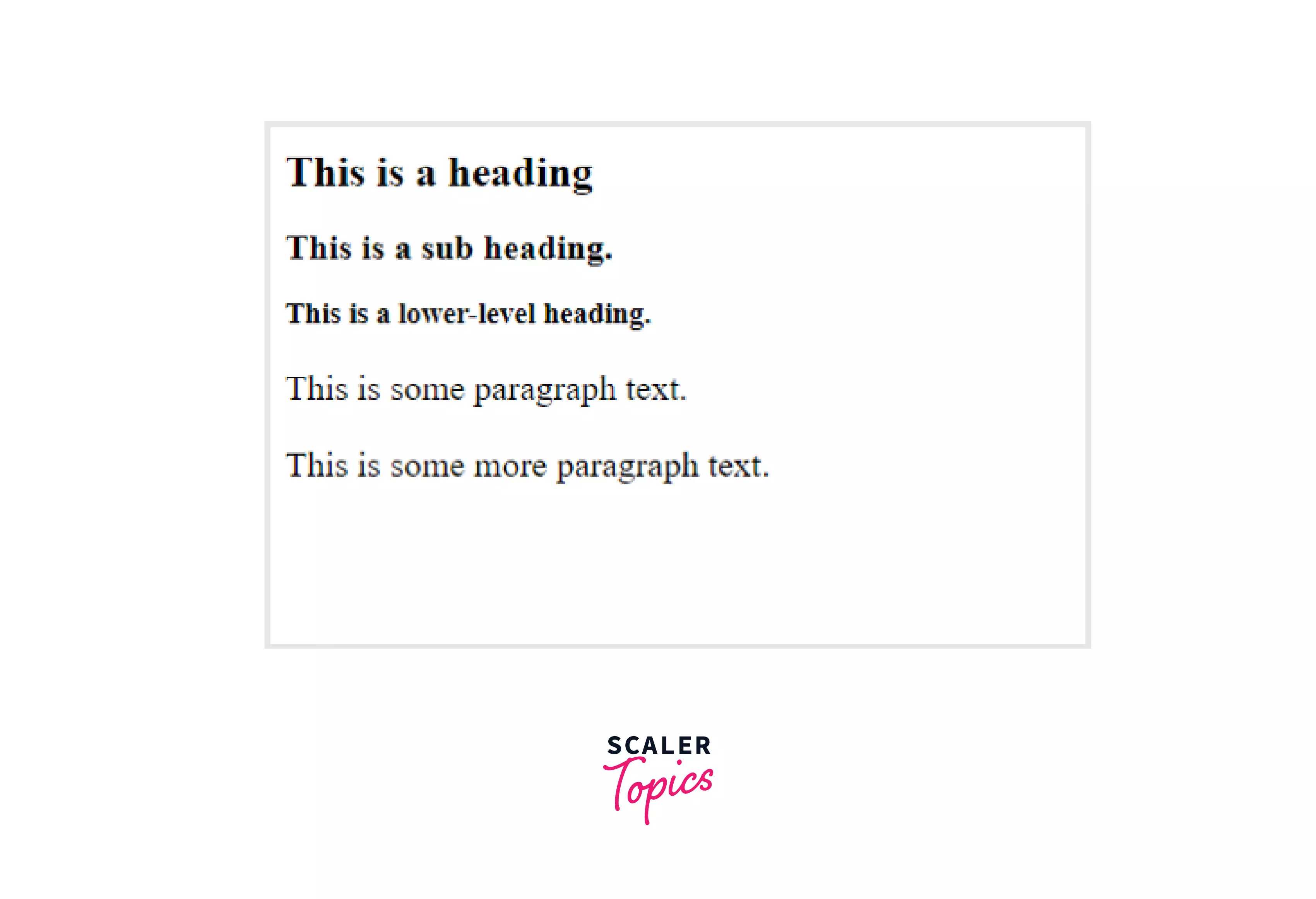
In the above example, we have set the font size of all <h2> elements to medium, which is equivalent to 16px, <h1> element to larger, and <h3> elements to smaller. The <p> element takes the default font size equivalent to 16px. Here, we have specified sizes using relative keywords. The keyword larger makes the text larger than the default size of the browser. The keyword smaller makes the text smaller than the default size of the browser. The below image shows how the text appears on the screen:
Pixels
Using pixels to size texts is the most common way we all have used as developers. Pixels are absolute measurement units that help us to be more precise. Web browsers and operating systems do not affect pixel units as they appear the same on all screens and browsers. With all the advantages, pixel units do have one disadvantage accessibility. We cannot customize the font size of the text that is defined using pixels on a few browsers, making it inaccessible and difficult to use for visually impaired users.
Example
Output
In the above example, we have set the font size of all <h1> elements to 40px, <h2> elements to 30px and <p> elements to 18px. The below image shows how the text appears on the screen:
ems
ems units are another way of setting font sizes in CSS. These are relative units of measurement, taking the font size of their parent element as reference. Developers use em units instead of pixels as it allows to resize the text according to the changing size of the parent element.
Let us understand it with an example. We have a paragraph of text written inside a container. The container specified a font size of 15px. If the user sets the font size of the text inside the container to be 1em, that means the font size of the paragraph of text will be the same, i.e., 20px. Thus, it will take the font size of its parent element. If the specified font size of text is 2em, then it will have twice the font size of its parent element.
The default value of font size in most browsers is 16px. If we do not specify any font size for the text or its parent element does not have a specific font size, it takes the default font size of that browser which is usually 16px. Thus by default, 1em corresponds to a font size of 16px and 2em to a font size of 32px.
Let's understand it with the help of an example, taking the font size of the web page as 16px. Thus to calculate the font size of the text in em, we have to divide by 16px. So if we want our heading to appear in the size of 24px, it is equal to 1.5 em ( 24px / 16px = 1.5 em ).
Example
Turn Learning into Career Growth
Output
In the above example, we have set the font size of all <h1> elements to 2.5em which is equivalent to 40px, <h2> elements to 1.875em which is equivalent to 30px and <p> elements to 1.125em which is equivalent to 18px. The below image shows how the text appears on the screen:
rem
The measurement unit rem stands for root em, a new property of CSS3 used to set the font size of the text. It is a relative measurement unit that takes its reference from the root <HTML> element instead of its parent element. The rem values are highly used in a web page as it specifies a font size that is not affected by the size of its parent element. Instead, it takes the font-size value relative to the entire document. Let us understand it better with the help of an example. If the default font size of our web page is 16px and we want all the <h1> elements to appear at 40px, then we can set the font sizes as 2.5rem.
Example
Output
In the above example, we have set the font size of all <h1> elements to 2.5rem which is equivalent to 40px, <h2> elements to 1.875rem which is equivalent to 30px and <p> elements to 1rem which is equivalent to 16px. The below image shows how the text appears on the screen:
Ex
The ex measurement unit is also a dynamic unit to set an element's font size. It uses the x-height of the current fontsize in CSS as the reference. The value gets multiplied by the referenced font size, thus increasing the font size relatively.
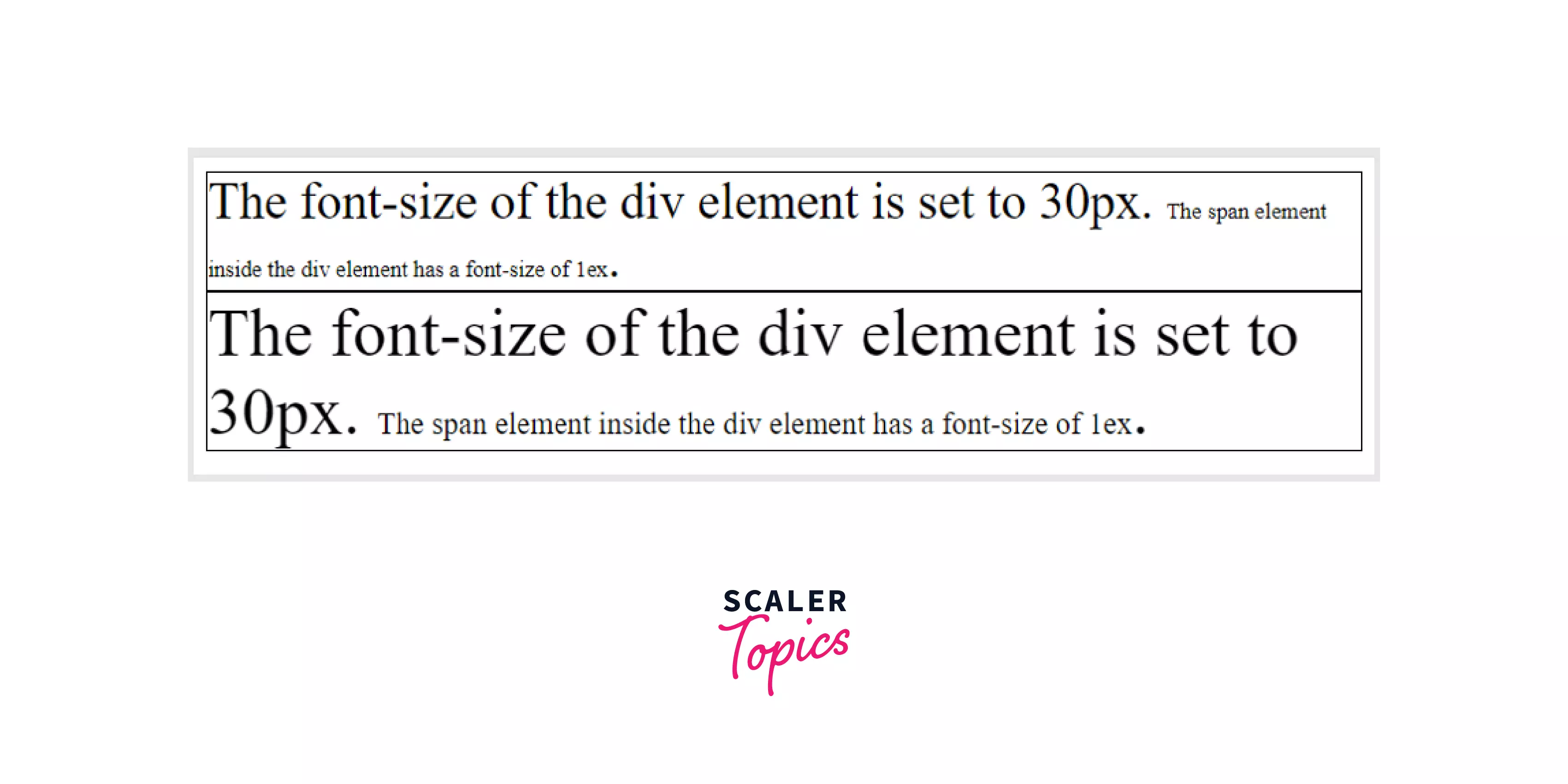
Example
Output
In the above example, we have set the font size of all the text inside div1 as 30px and inside div2 as 40px. The text inside the span element has a font size of 1ex. But, it is visible that they both have different sizes. It is because the ex measurement unit is relative to the inherited font of the current element. The below image shows how the text appears on the screen:
Viewport units (vw)
Viewport units are measurement units that use the percentage of the viewport size of the browser as a reference.
Viewport units represent a percentage of the browser's viewport size. Thus, 1% of the viewport height is equal to 1vh. If a viewport has a height of 2000px, then 1vh is equal to 20px.
Viewports units are used for measurements when we want the size of the text to change according to the browser's size. It gives a better user experience as it automatically adapts itself to different browsers and devices of various sizes.
Let us understand it better with the help of an example.
Example 1
Output
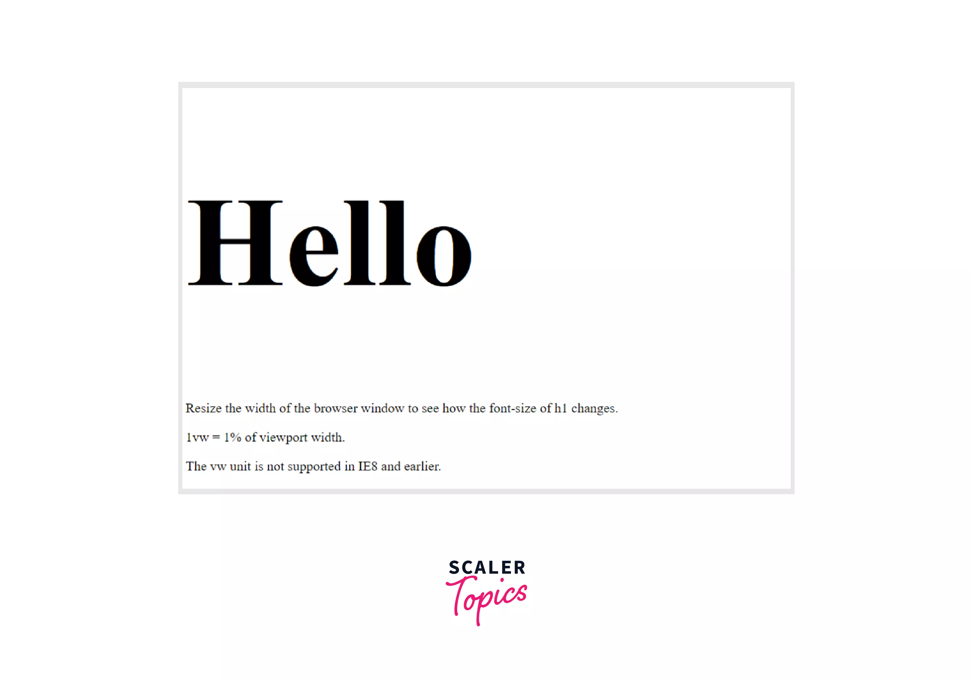
In the above example, we have set the font size of all the text inside the <h1> element to be 20vw. The text inside the <p> element has the default font size. Here, the font size of 20vw changes with the size of the browser. The font size of 20vw equals 20% of the browser width. You can resize the height of the browser to see the changes in the size of the heading. The below image shows how the text appears on the screen:
Example 2
Output
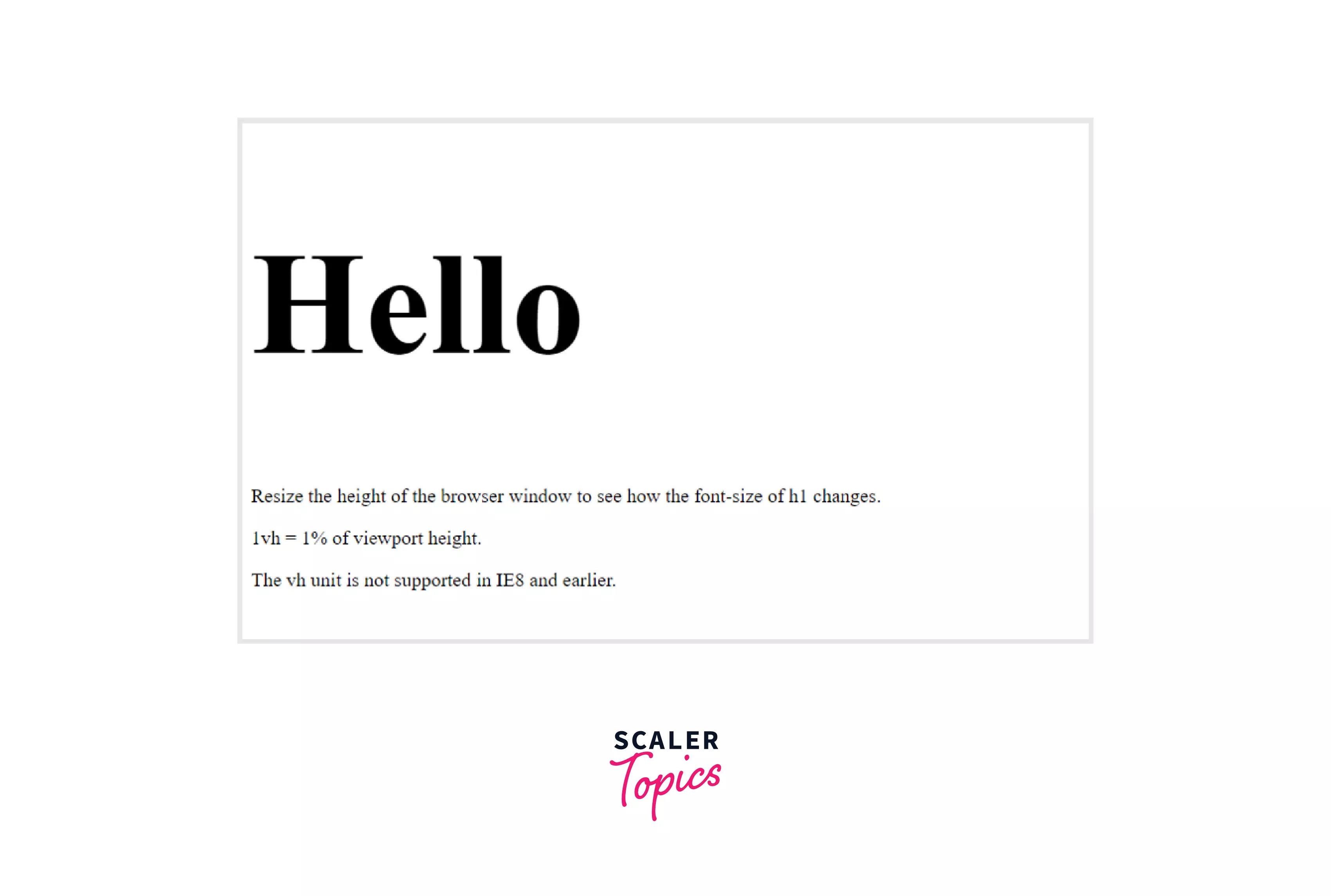
In the above example, we have set the font size of all the text inside the <h1> element to be 20vh. The text inside the <p> element has the default font size. Here, the font size of 20vh changes with the size of the browser. The font size of 20vh equals 20% of the browser height. You can resize the height of the browser to see the changes in the size of the heading. The below image shows how the text appears on the screen:
Browser Support
Below is a list of the first browser version that completely supports the following fontsize in CSS.
| Measurement Unit | Chrome | Microsoft Edge | Mozilla Firefox | Safari | Opera |
|---|---|---|---|---|---|
| em, ex, %, px, cm, mm, in, pt, pc | 1.0 | 3.0 | 1.0 | 1.0 | 3.5 |
| rem | 4.0 | 9.0 | 3.6 | 4.1 | 11.6 |
| vh, vw | 20.0 | 9.0 | 19.0 | 6.0 | 20.0 |
Conclusion
- Fontsize in CSS is a property used to change the size of various elements in HTML.
- We use many measurement units like em, px, rem, cm, vh, vw, etc.
- They exist in mainly two categories - Relative units and Absolute units.
- Absolute units are measurement units that do not depend on anything in the webpage or the browser's size.
- Relative units are those measurement units that depend on the font size of the parent element or vary according to the browser's size.
Related Properties
You can also refer to similar articles on related topics like:
 Google
 Amazon
 Microsoft
 Flipkart
 Adobe1200+ more